
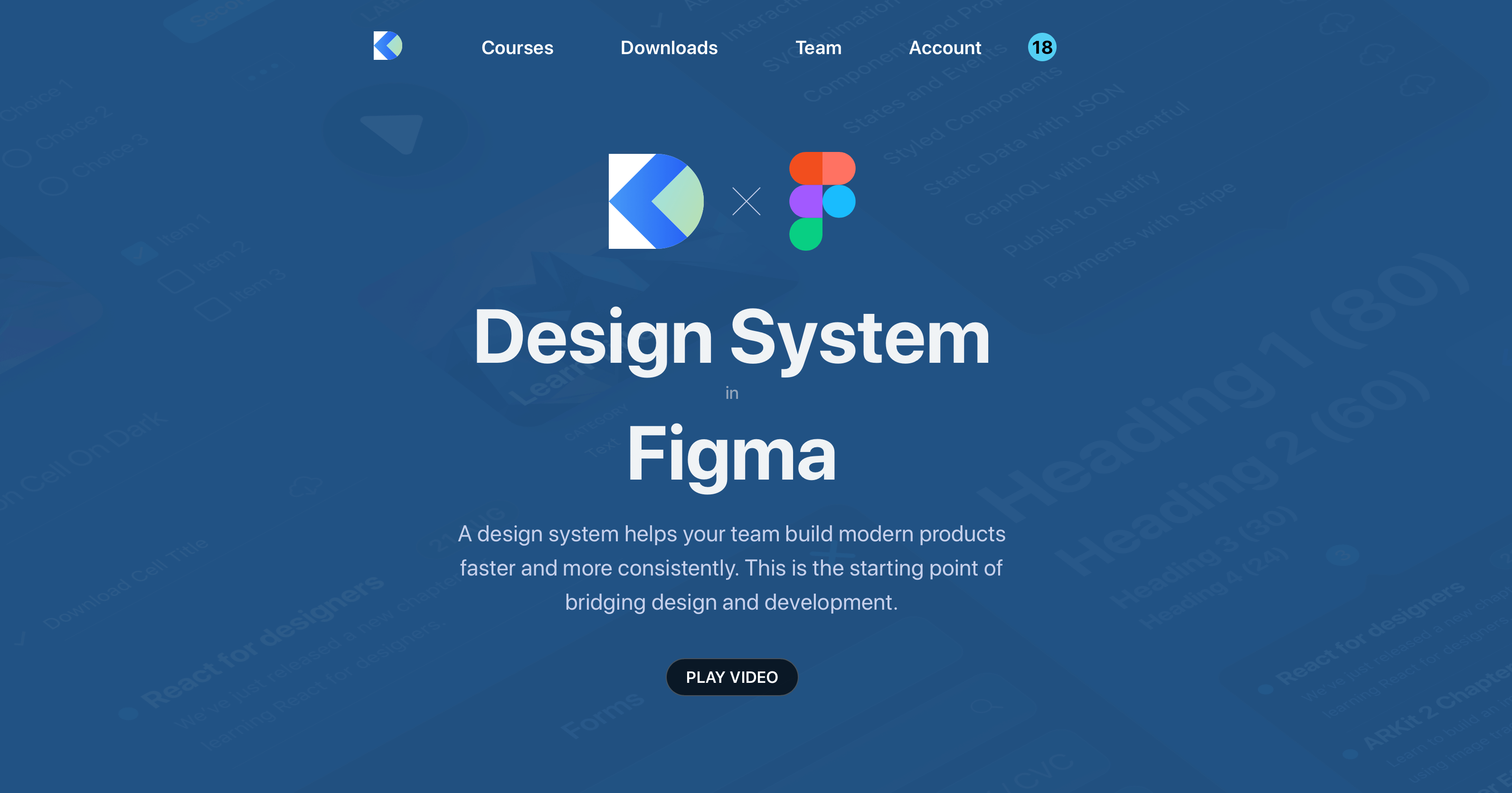
Design Systems
Add to favorites
Create design systems for a better workflow.
UI Design Handbook
1
UI Design Aesthetic
3:52
2
Design for accessibility
1:59
3
Localization
1:14
4
Color Selection
5:06
5
Pick Fonts
3:35
6
Font Managers
2:06
7
Icon Organizer
2:59
8
UI Sound Design
4:25
9
Stock Images
1:29
10
Image optimization
1:46
11
Illustrations
1:38
12
Realistic Mockups
2:47
13
UI 3D Assets
2:29
14
Introduction to Animations
5:09
15
UI Animation Resources
1:45
16
Apple Watch Faces
2:06
17
Designing for Apple Watch
4:24
18
Designing for Apple TV
1:58
19
Design for Game Center
3:43
20
Designing for CarPlay
1:37
21
Designing App Clips
7:05
22
Designing Widgets
3:29
23
Design Systems
1:27
24
UI Kits
3:33
25
Prototyping Tools
3:22
26
Voice prototyping
2:14
27
Prototyping with Code
3:01
28
Turn your Designs into Code
2:18
29
Version Control Tools
2:12
30
Developer Handoff
1:05
31
Color Theory
10:35
32
Dark Interfaces
3:53
33
Icons
10:32
34
Background Patterns
5:41
35
Typographic Scales
2:40
What is a design system?
A design system is a collection of reusable UI components. In it, you can define UI elements such as buttons as well as text elements and other elements that you're sure will be reused throughout the design file. This makes the design workflow very easy.

Why are design systems useful?
One of the major benefits of a design system is consistency. Having a design system that has things like colors, typography, spacing and many such other items clearly defined ensures consistency across the design file. It also makes the design workflow smoother and faster.

Design System Course
If you would like to learn more about the process, we at Design+Code made a course on how to create a design system using Figma as your design tool.
Create your own design system
There are a lot of resources and tools available to help you get started with design systems. In the upcoming sections, we've discussed some amazing ones.
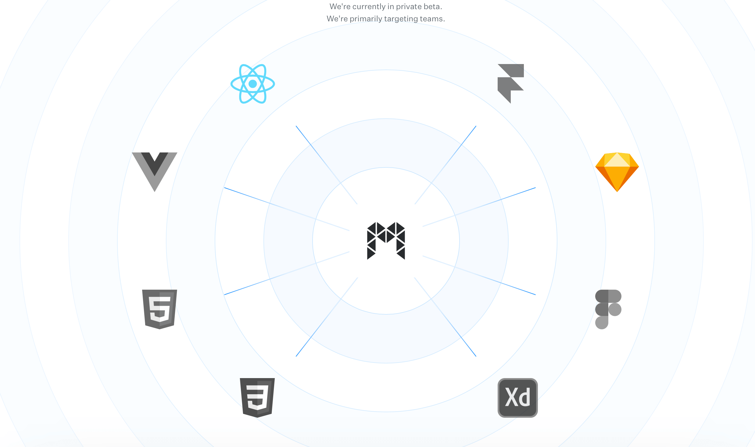
Modulz
Modulz is an interesting tool. It is a visual code editor that is focused on creating design systems. Currently, they are in private beta but you can apply for access to it through their website.
Lonna
Lonna by Devin Abbott is a WIP. It contains a number of tools to create design systems such as components. Lonna also has a GUI editor for working with component files. Currently, there's support for iOS, macOS, ReactDOM, React Native and React SketchApp.
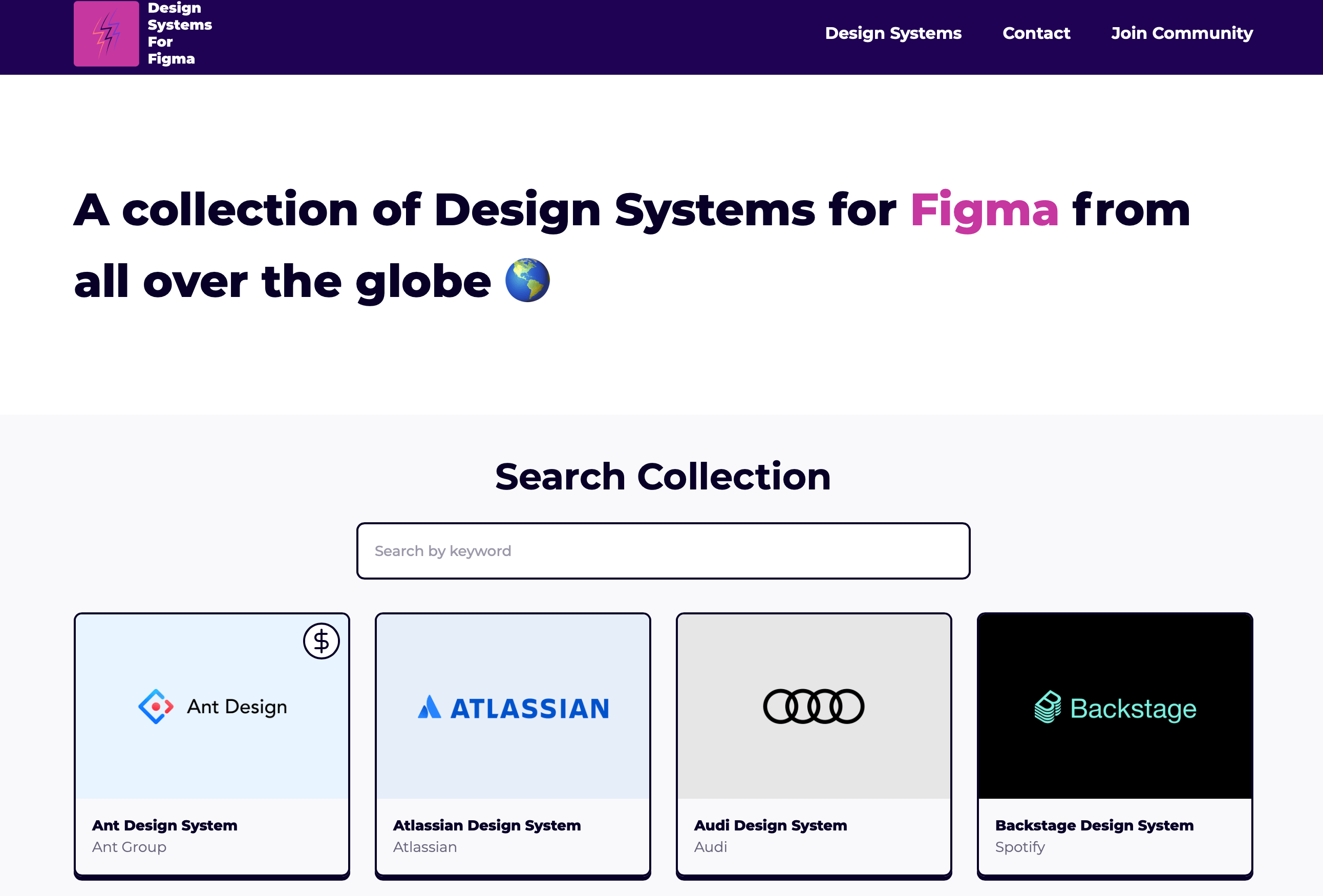
Design Systems for Figma
DSFF is a collection of design systems. Most of these are free. All you've to do is duplicate the Figma file and use it as an inspiration.
Base Web
Base Web is created by Uber. It is an open source React UI framework that can help any team start the process of creating a design system. Base Web provides various reusable UI components such as the date picker that you can easily use.

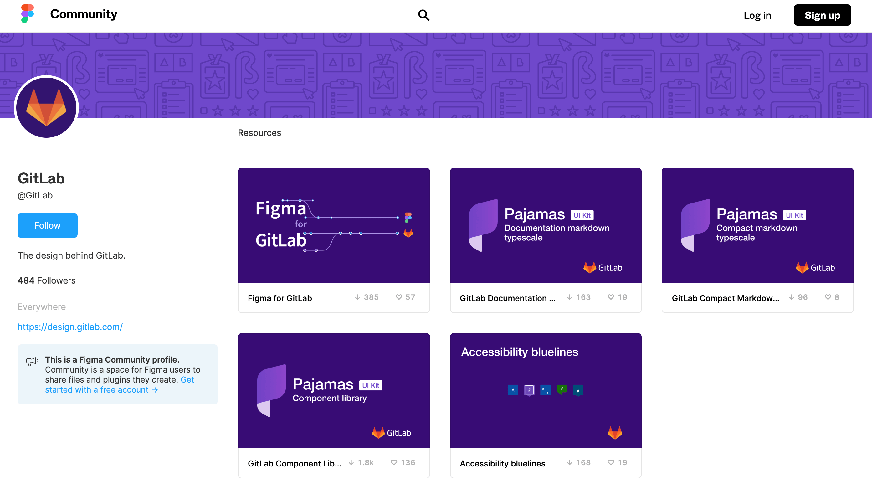
Pajamas by GitLab
Pajamas is a very interesting design system. It contains a lot of things including accessibility bluelines as well as a component library.
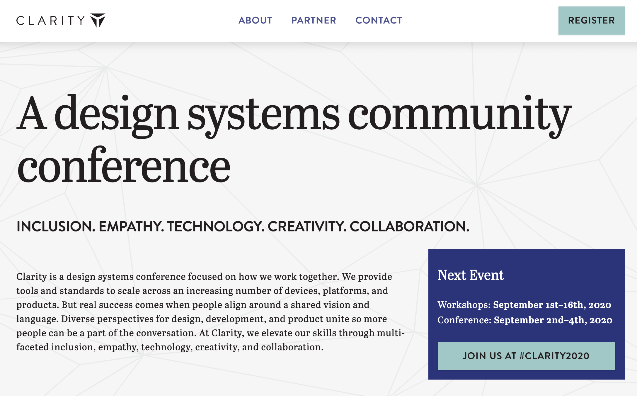
Clarity
Clarity is the first and only design systems conference. It is a platform where professionals such as designers, developers as well companies come together to discuss how they work with design systems. You can register to attend the conference via their website.
Further information
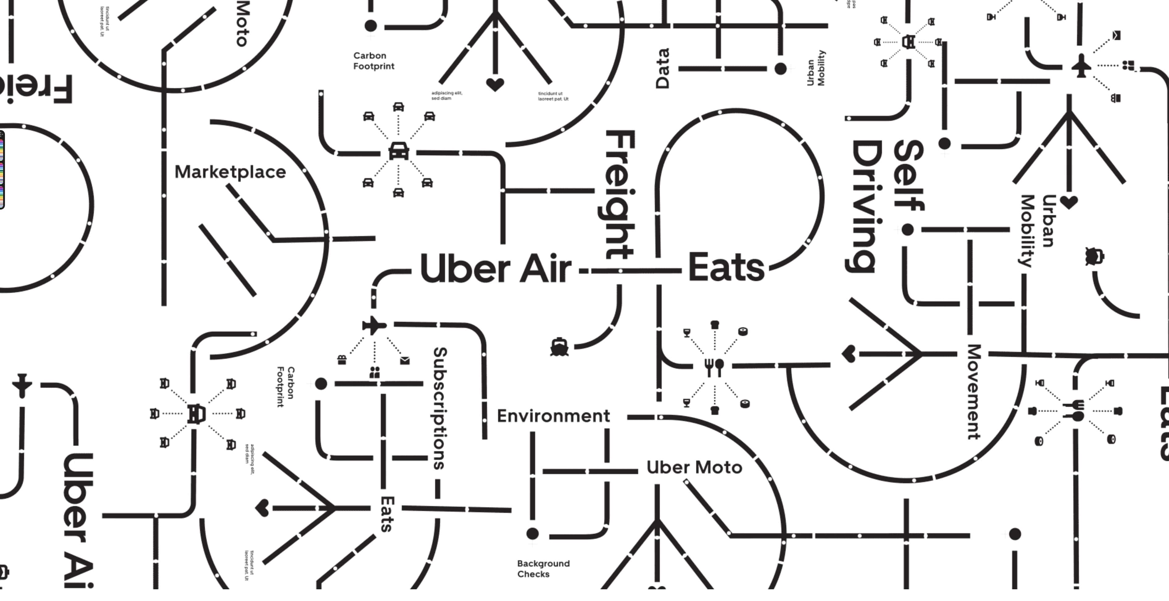
There still a lot you can learn about the design system process. Spectrum by Adobe, is one of the most complete design system examples. Carbon by IBM, is also another good example of how to organize a design system. Another good example is Uber, Marco Paglia talks more about how the Uber design system is structured.
Working with components
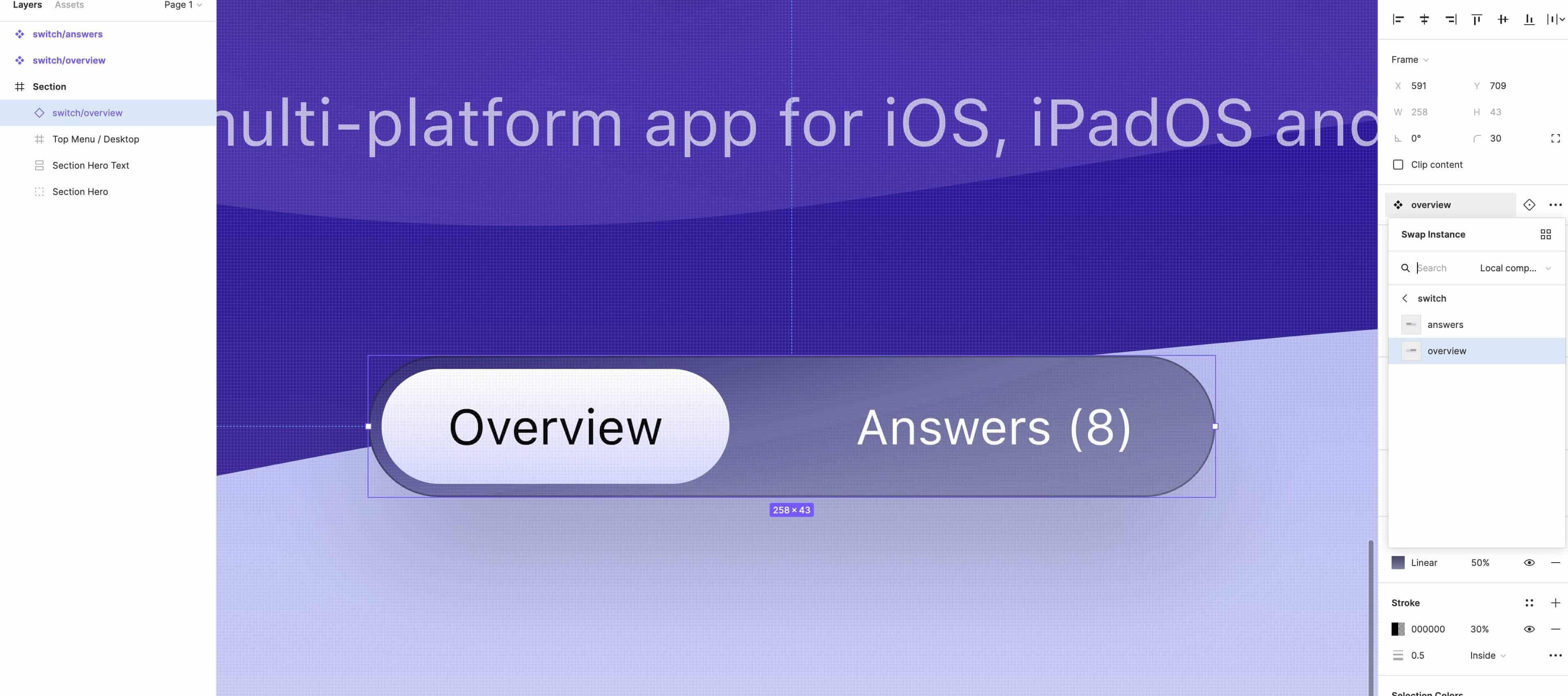
To create a design system, we need to have a good understanding of components. For this exercise we will show you two examples on how to create components and how to work with them. Let’s start with this Navigation Bar Control that you will find in the exercise file.
Once, you convert the assets to components, you will notice that the color of the frame that hosts the assets will change from light blue to purple. Also, a small icon will appear on the top left corner of the frame, which represents the main component. This is the parent component.
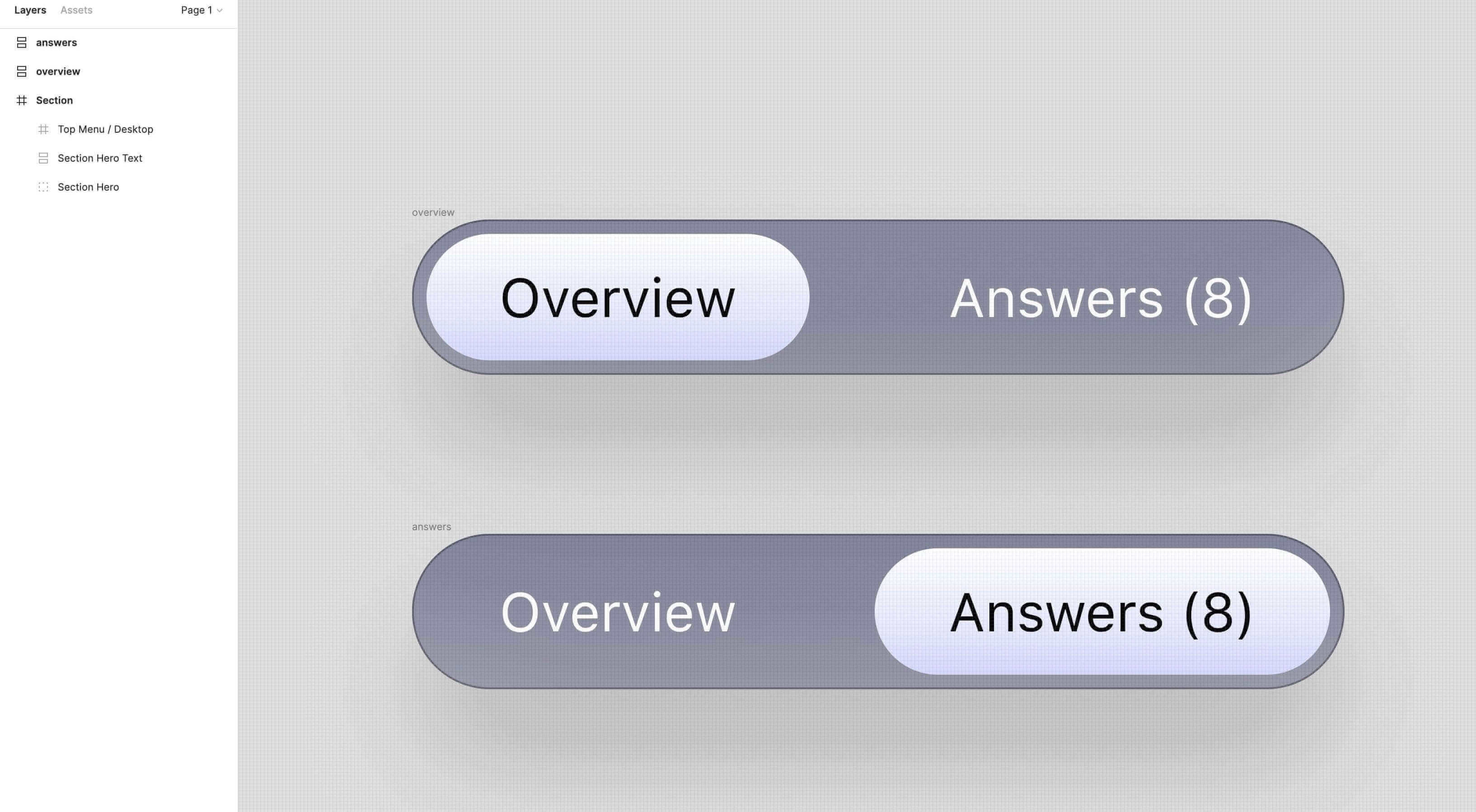
Now, we will rename both components and add the word switch/ before the name. Adding this text will help us group both components. We will see more specifically how to work with these in the next steps.

Now we can go to the left side bar and click on the Assets tab, so we can preview our components. If we select a component, you will notice that in the right side bar of the UI we also have our two components as options, and we can switch between them by selecting them from the side bar.
We can apply the same steps for the new examples. Let’s select all the cards and convert them to components. Rename the cards and add the word cards/ to all the components so we can group them.

Now select any of the cards, and you will notice that on the right side bar we will have the rest of the cards as options. From the side bar, you can select any of the cards, and it will change in the UI.

Conclusion
Creating a design system may sound like a lot of work but in the long run it's very efficient and you'll actually end up saving time. Having all your reusable components in the same place makes the design file more organized and easy to use. It will also ensure that the design remains consistent throughout.
Learn with videos and source files. Available to Pro subscribers only.
Purchase includes access to 50+ courses, 320+ premium tutorials, 300+ hours of videos, source files and certificates.
Templates and source code
Download source files
Download the videos and assets to refer and learn offline without interuption.
Design template
Source code for all sections
Video files, ePub and subtitles
ui-design-handbook-design-systems
1
UI Design Aesthetic
Learn about UI design aesthetics.
3:52
2
Design for accessibility
Learn about accessibility in design.
1:59
3
Localization
Read more about the importance of localization.
1:14
4
Color Selection
Select colors for your projects
5:06
5
Pick Fonts
Select the most suitable fonts for your design.
3:35
6
Font Managers
Manage your fonts more efficiently.
2:06
7
Icon Organizer
Organize your icons in a better way.
2:59
8
UI Sound Design
Importance of sound in UI design
4:25
9
Stock Images
Find the right images for your UI
1:29
10
Image optimization
Optimize your images to improve performance.
1:46
11
Illustrations
Add illustrations to your design project
1:38
12
Realistic Mockups
Resources to add realistic mockups to your design.
2:47
13
UI 3D Assets
Work with 3D assets in your design projects
2:29
14
Introduction to Animations
Learn about basic animations in UI design.
5:09
15
UI Animation Resources
List of tools and resources for UI animation.
1:45
16
Apple Watch Faces
Create customizable watch faces for the Apple watch
2:06
17
Designing for Apple Watch
Getting started with Apple Watch Design
4:24
18
Designing for Apple TV
Learn the basics steps to design for Apple TV
1:58
19
Design for Game Center
Learn how to design for Game Center
3:43
20
Designing for CarPlay
Learn the basics of designing for CarPlay
1:37
21
Designing App Clips
Learn how to design app clips for iOS
7:05
22
Designing Widgets
Design widgets for your applications.
3:29
23
Design Systems
Create design systems for a better workflow.
1:27
24
UI Kits
Learn more about UI Kits and where to find them.
3:33
25
Prototyping Tools
Learn about prototyping tools.
3:22
26
Voice prototyping
Take a look at voice prototyping.
2:14
27
Prototyping with Code
Read more about prototyping with code.
3:01
28
Turn your Designs into Code
Learn how to turn your Designs into Code.
2:18
29
Version Control Tools
Share and synchronize your files with your team
2:12
30
Developer Handoff
Learn more about developer handoff.
1:05
31
Color Theory
Understand color theory to select the best color themes for your application.
10:35
32
Dark Interfaces
Add dark mode to your application.
3:53
33
Icons
Learn more about UI icons.
10:32
34
Background Patterns
Create beautiful background patterns.
5:41
35
Typographic Scales
Learn more about typographic scales.
2:40
Meet the instructor
We all try to be consistent with our way of teaching step-by-step, providing source files and prioritizing design in our courses.
Daniel Nisttahuz
Senior Product Designer at Design+Code
Motion Designer @Design+Code
7 courses - 12 hours

UX Design Handbook
Learn about design thinking, with exercises. Free tutorials for learning user experience design.
2 hrs
UI Design Handbook
A comprehensive guide to the best tips and tricks for UI design. Free tutorials for learning user interface design.
2 hrs
Create a Promo Video in After Effects
In this course we will show you how to create a promo video using After Effects.
2 hrs
Animating in Principle
Learn how to animate interactive user interfaces from Figma to Principle. Get to design the app flow for multiple screens, interactions, and animations. At the end of the course, you will have a beautiful prototype that you can share with stakeholders.
1 hrs
Video Editing in ScreenFlow
Learn different techniques, transitions actions and effects to edit a video using Screeflow
1 hrs
Motion Design in After Effects
Learn animation and motion design with After Effects
3 hrs
Learn iOS 11 Design
Learn colors, typography and layout for iOS 8
1 hrs