
Typographic Scales
Add to favorites
Learn more about typographic scales.
UI Design Handbook
1
UI Design Aesthetic
3:52
2
Design for accessibility
1:59
3
Localization
1:14
4
Color Selection
5:06
5
Pick Fonts
3:35
6
Font Managers
2:06
7
Icon Organizer
2:59
8
UI Sound Design
4:25
9
Stock Images
1:29
10
Image optimization
1:46
11
Illustrations
1:38
12
Realistic Mockups
2:47
13
UI 3D Assets
2:29
14
Introduction to Animations
5:09
15
UI Animation Resources
1:45
16
Apple Watch Faces
2:06
17
Designing for Apple Watch
4:24
18
Designing for Apple TV
1:58
19
Design for Game Center
3:43
20
Designing for CarPlay
1:37
21
Designing App Clips
7:05
22
Designing Widgets
3:29
23
Design Systems
1:27
24
UI Kits
3:33
25
Prototyping Tools
3:22
26
Voice prototyping
2:14
27
Prototyping with Code
3:01
28
Turn your Designs into Code
2:18
29
Version Control Tools
2:12
30
Developer Handoff
1:05
31
Color Theory
10:35
32
Dark Interfaces
3:53
33
Icons
10:32
34
Background Patterns
5:41
35
Typographic Scales
2:40
What is Typography Scale?
The typographic scale is used to create a balanced and friendly font sizing, which uses a range of type sizes related to each other since they grow by the same ratio. Using this method will help us develop a type system that is scalable and adaptive.

Type of Scales
Selecting a scale depends on specific needs, and sometimes this can be tricky. Always choose a scale based on the type ratio that we need for our designs. However, we can always develop our system once we fully understand how type scale works.

High Contrast Scales
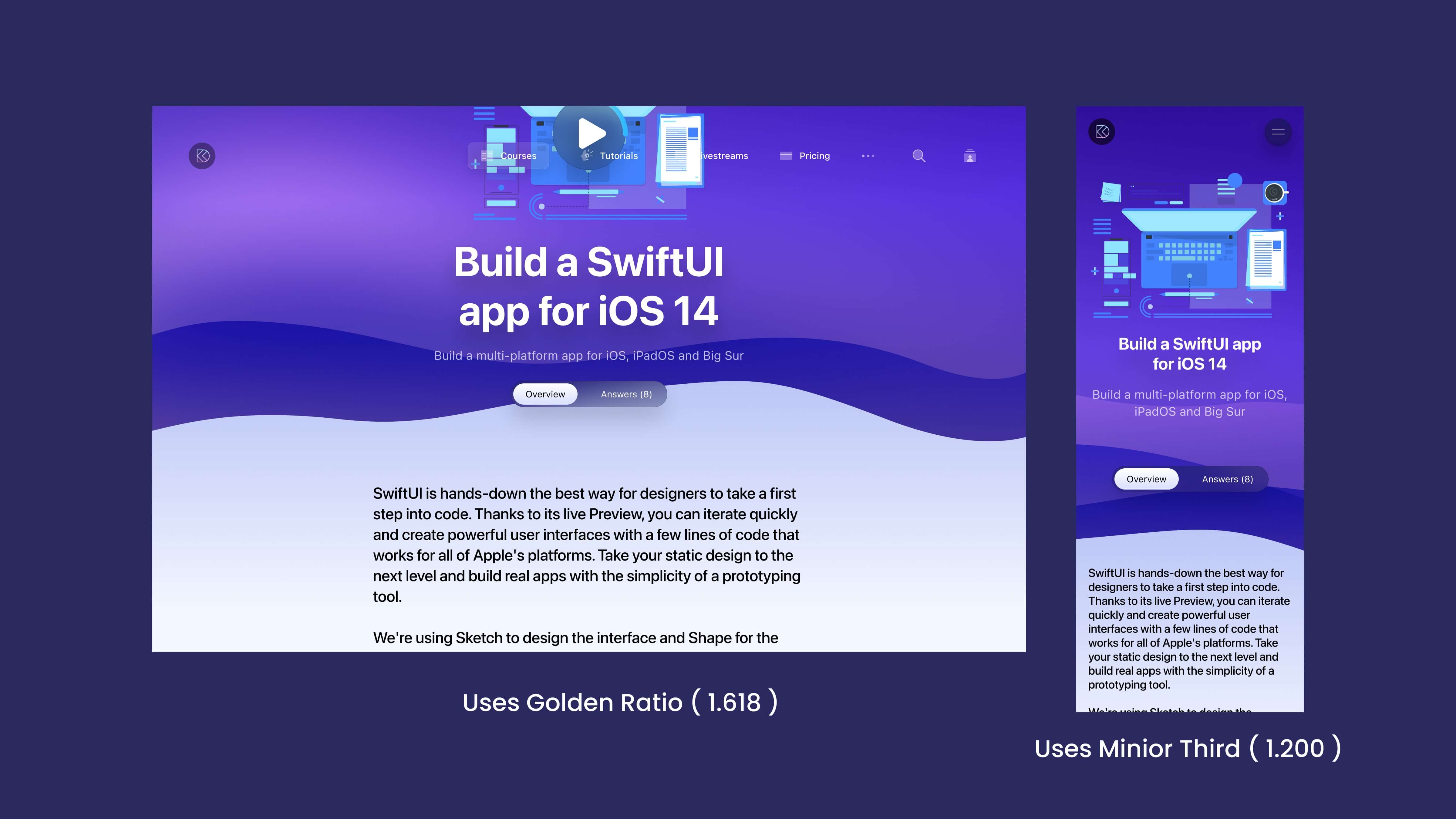
Designs that demand a fair amount of contrast between types can use high contrast and hugely benefit from Augmented Fourth, Perfect Fifth, and Golden Ratio. These can be a perfect fit for large screen devices.
Medium Contrast Scales
Medium contrast can use The Major Third, Major Second, or Perfect Fourth scales as the contrast between types is not drastic and can fit more content.
Low Contrast Scales
Designs that should be versatile, such as dashboards and mobile apps, often use low-contrast scales as they allow the content to be flexible. Low contrast scales include Minor Second and Major Second.
Responsive Type Scales
Type scale that is responsive and feels more comfortable to read across multiple screen sizes is essential. Developing a responsive type scale can be tricky. We can either bring in a second ratio or have multiple type scales for different screen sizes.
Adding a Second Type Scale
This can be any ratio we want. Adding a second type scale allows us to have more flexibility, making our type scale a little looser to allow well-defined type sizes for much higher contrast across different screen sizes.
Multiple Type Scales
We will use a small ratio as there is less distraction in smaller screen sizes, and as the size increases, we can increase the ratio to bring more contrast to the type to avoid distractions to the user.
Recommended Reading
I recommend reading this article on Typographic Scale by Spencer Mortensen.

Type Scale Calculator
This is a visual type calculator that helps you pick the right type scale ratio for your design.

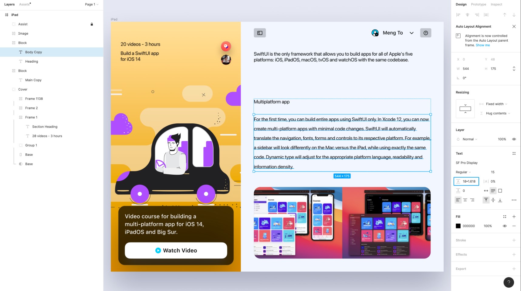
Creating a Typographic Scale
Usign the Golden Ratio Number to improve contrast and readability of our typography
- Select the Body Copy text layer and navigate to its text options. Multiply the Line Height with the Golden Ratio number 1.618
![TypographicScale 07]()
- Now, select the Heading text layer and multiple the Font Size with the Golden ratio number and change the font weight to Bold from Regular
![TypographicScale 08]()
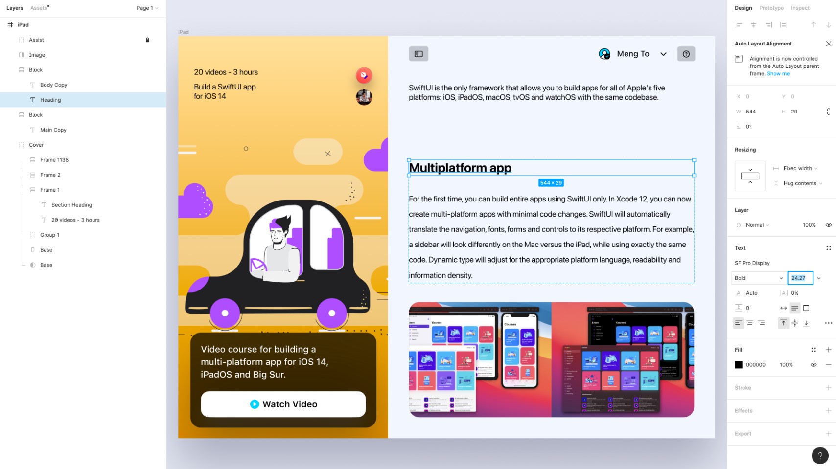
- Copy the Text Property of the Body Copy and paste it to the Main Copy Layer. Also copy the Heading Text Property and paste it to the Section Heading Layer.
![TypographicScale 09]()

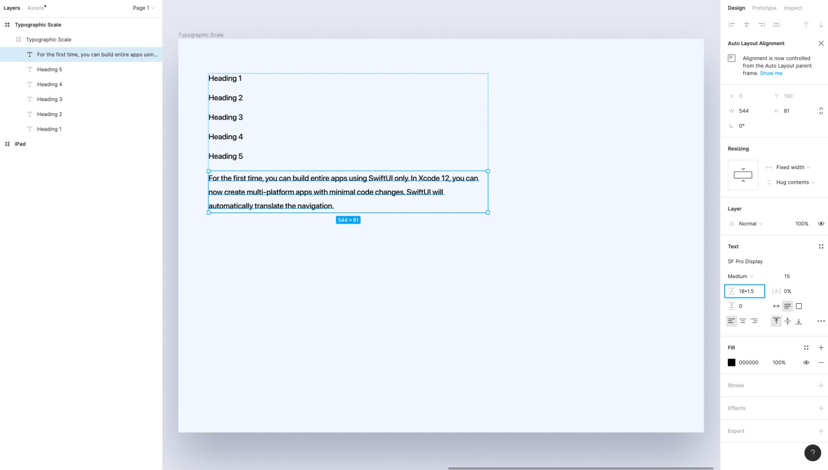
Creating a custom typographic scale
- Create a Frame and Add "6" Text layers five for Headings and one for body copy with a common font size (15px).
![TypographicScale 10]()
- Select the Body Copy and Multiply the Line Height with 1.5 or choose your own common multiplier.
![TypographicScale 11]()
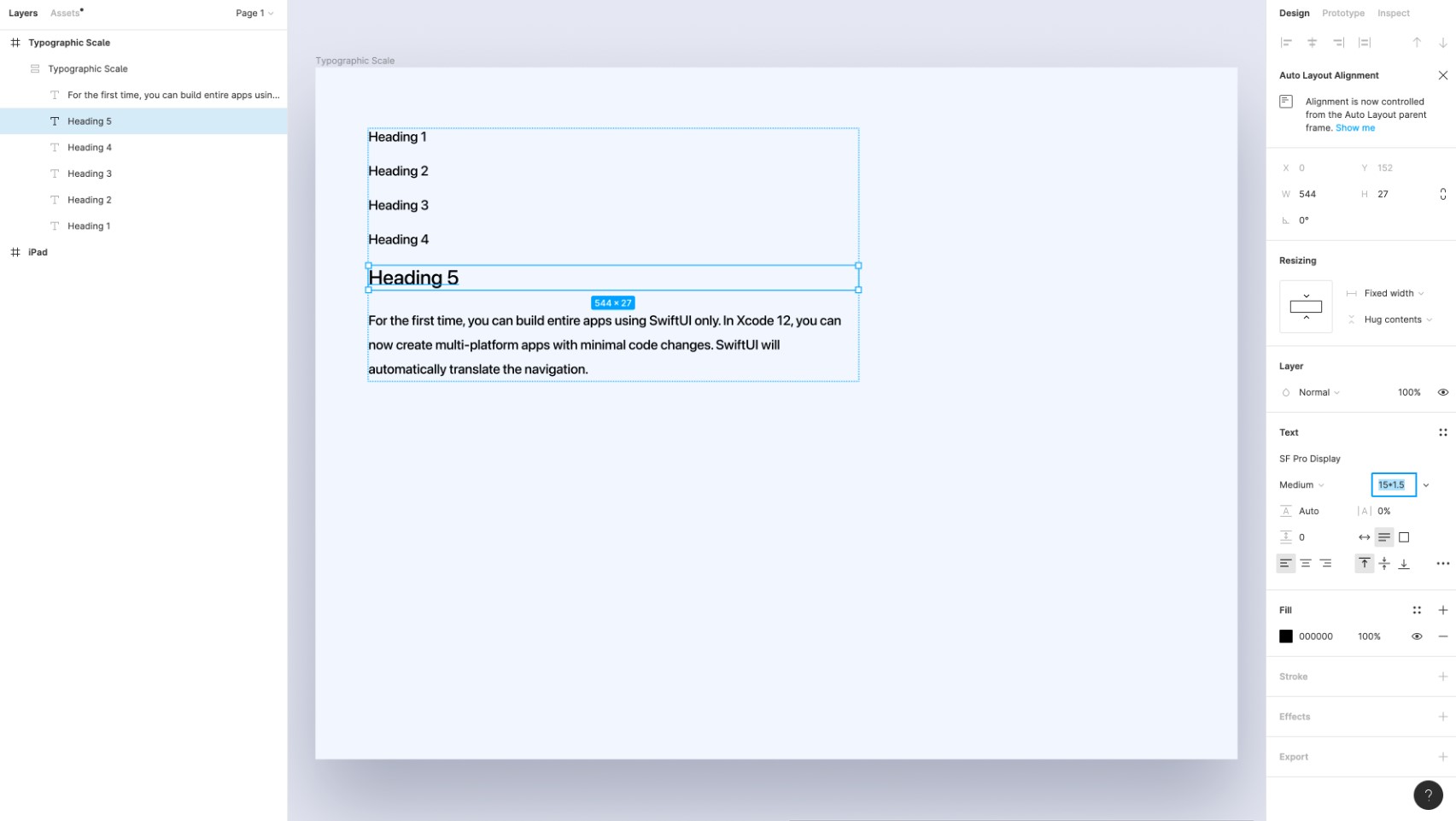
- Now select the Heading 5 text layer and multiple the font size with the common multiplier which is 1.5 in this case.
![TypographicScale 12]()
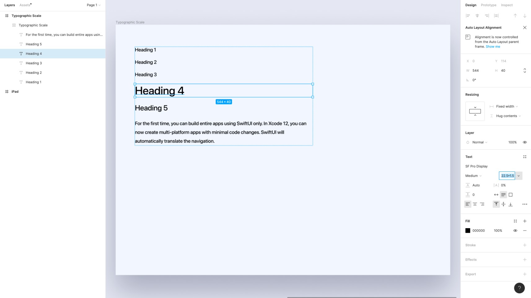
- Copy the heading 5 text property and apply it to heading 4. Multiply it with 1.5.
![TypographicScale 13]()
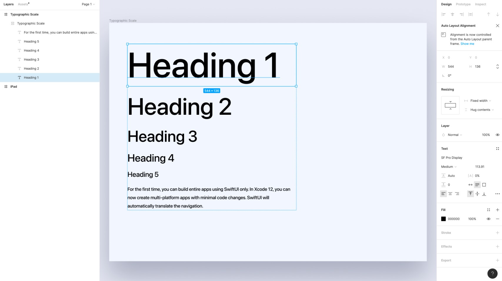
- Repeat the same for the rest of the text layers and you'll get a perfect typographic scale with a good contrast.
![TypographicScale 14]()
- Now for the final step, change the font weight of Heading 1 and 2 to Bold from Medium, and the Heading 3 to Semi-Bold.
![TypographicScale 15]()


Conclusion
The typographic scale helps us in building a type system that is scalable and responsive. This method also helps a lot when it comes to having a good contract and balancing our typography.
Learn with videos and source files. Available to Pro subscribers only.
Purchase includes access to 50+ courses, 320+ premium tutorials, 300+ hours of videos, source files and certificates.
Templates and source code
Download source files
Download the videos and assets to refer and learn offline without interuption.
Design template
Source code for all sections
Video files, ePub and subtitles
ePub
Assets
Videos
1
UI Design Aesthetic
Learn about UI design aesthetics.
3:52
2
Design for accessibility
Learn about accessibility in design.
1:59
3
Localization
Read more about the importance of localization.
1:14
4
Color Selection
Select colors for your projects
5:06
5
Pick Fonts
Select the most suitable fonts for your design.
3:35
6
Font Managers
Manage your fonts more efficiently.
2:06
7
Icon Organizer
Organize your icons in a better way.
2:59
8
UI Sound Design
Importance of sound in UI design
4:25
9
Stock Images
Find the right images for your UI
1:29
10
Image optimization
Optimize your images to improve performance.
1:46
11
Illustrations
Add illustrations to your design project
1:38
12
Realistic Mockups
Resources to add realistic mockups to your design.
2:47
13
UI 3D Assets
Work with 3D assets in your design projects
2:29
14
Introduction to Animations
Learn about basic animations in UI design.
5:09
15
UI Animation Resources
List of tools and resources for UI animation.
1:45
16
Apple Watch Faces
Create customizable watch faces for the Apple watch
2:06
17
Designing for Apple Watch
Getting started with Apple Watch Design
4:24
18
Designing for Apple TV
Learn the basics steps to design for Apple TV
1:58
19
Design for Game Center
Learn how to design for Game Center
3:43
20
Designing for CarPlay
Learn the basics of designing for CarPlay
1:37
21
Designing App Clips
Learn how to design app clips for iOS
7:05
22
Designing Widgets
Design widgets for your applications.
3:29
23
Design Systems
Create design systems for a better workflow.
1:27
24
UI Kits
Learn more about UI Kits and where to find them.
3:33
25
Prototyping Tools
Learn about prototyping tools.
3:22
26
Voice prototyping
Take a look at voice prototyping.
2:14
27
Prototyping with Code
Read more about prototyping with code.
3:01
28
Turn your Designs into Code
Learn how to turn your Designs into Code.
2:18
29
Version Control Tools
Share and synchronize your files with your team
2:12
30
Developer Handoff
Learn more about developer handoff.
1:05
31
Color Theory
Understand color theory to select the best color themes for your application.
10:35
32
Dark Interfaces
Add dark mode to your application.
3:53
33
Icons
Learn more about UI icons.
10:32
34
Background Patterns
Create beautiful background patterns.
5:41
35
Typographic Scales
Learn more about typographic scales.
2:40
Meet the instructor
We all try to be consistent with our way of teaching step-by-step, providing source files and prioritizing design in our courses.
Surya Anand
Designer
Curious about learning to design
3 courses - 10 hours
iOS Design Handbook
A complete guide to designing for iOS 14 with videos, examples and design files
2 hrs
UI Design Handbook
A comprehensive guide to the best tips and tricks for UI design. Free tutorials for learning user interface design.
2 hrs
Figma Handbook
A comprehensive guide to the best tips and tricks in Figma. Not affiliated with or endorsed by Figma, Inc.
6 hrs