Color Theory
Add to favorites
Understand color theory to select the best color themes for your application.
UI Design Handbook
1
UI Design Aesthetic
3:52
2
Design for accessibility
1:59
3
Localization
1:14
4
Color Selection
5:06
5
Pick Fonts
3:35
6
Font Managers
2:06
7
Icon Organizer
2:59
8
UI Sound Design
4:25
9
Stock Images
1:29
10
Image optimization
1:46
11
Illustrations
1:38
12
Realistic Mockups
2:47
13
UI 3D Assets
2:29
14
Introduction to Animations
5:09
15
UI Animation Resources
1:45
16
Apple Watch Faces
2:06
17
Designing for Apple Watch
4:24
18
Designing for Apple TV
1:58
19
Design for Game Center
3:43
20
Designing for CarPlay
1:37
21
Designing App Clips
7:05
22
Designing Widgets
3:29
23
Design Systems
1:27
24
UI Kits
3:33
25
Prototyping Tools
3:22
26
Voice prototyping
2:14
27
Prototyping with Code
3:01
28
Turn your Designs into Code
2:18
29
Version Control Tools
2:12
30
Developer Handoff
1:05
31
Color Theory
10:35
32
Dark Interfaces
3:53
33
Icons
10:32
34
Background Patterns
5:41
35
Typographic Scales
2:40
Color Theory
The most important thing you need to learn, as a designer, is the color wheel. Understanding how the color wheel works and what colors go well together will help you create a more knowledgeable design.

Primary Colors
The primary colors are the ones that you can combine to create other colors. The main primary colors are red, yellow and blue. These colors cannot be formed or created from the combination of other colors.

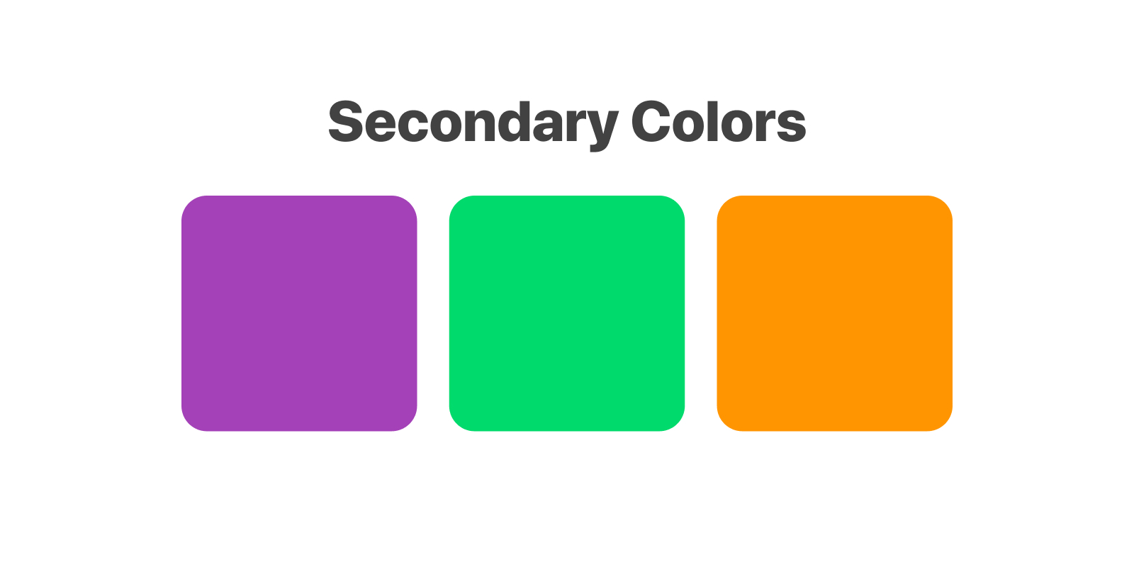
Secondary Colors
These colors are the result of mixing the primary colors like purple (combination of red + blue), green (combination of blue + yellow) and orange (combination of red + yellow).
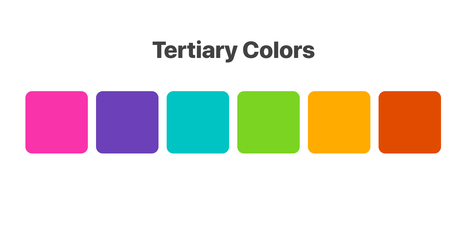
Tertiary Colors
The tertiary colors are created by combining a primary color with a secondary color. Some examples include blue-green and orange-yellow.
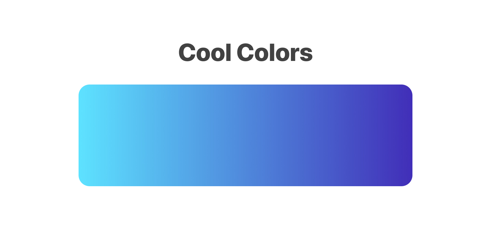
Cool Colors
Cool colors are generally associated with peace, serenity or calmness. These include shades of green, blue and purple. Such colors are not very overpowering and are soothing in nature.
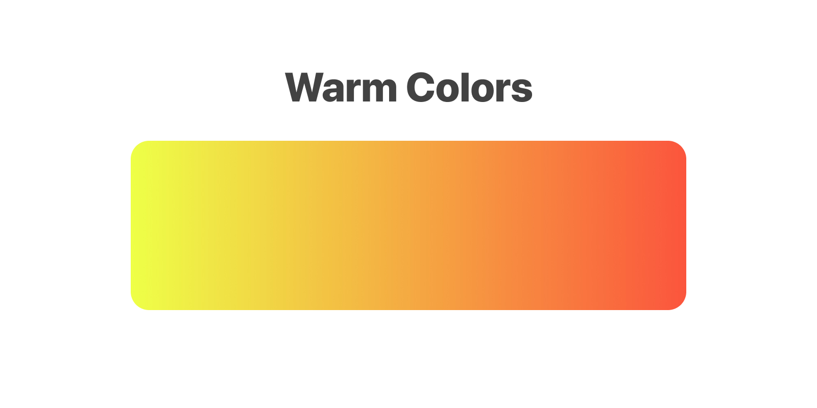
Warm Colors
Warm colors are in turn associated with energy, brightness, action and warmth. Such colors include shades of yellow, orange and red.
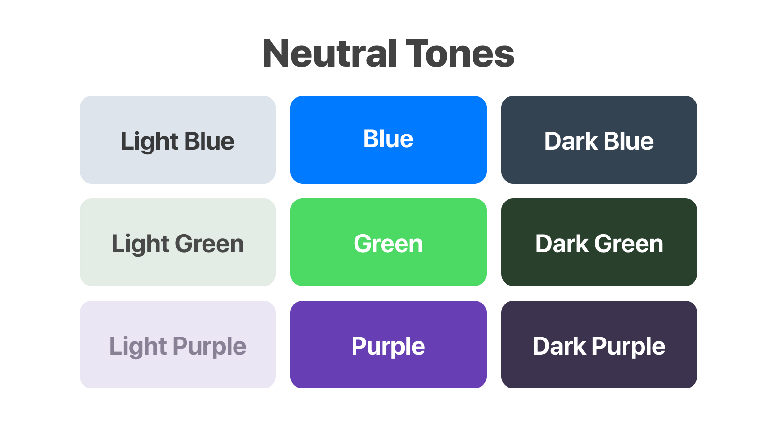
Neutral Tones
Perhaps the most important aspect of colors are the neutral tones. These are the neutralizers and as such these keep your designs from feeling too heavy. Most importantly, the neutral tones are easy on the eye and defer the user's attention to the content. You can use these as backgrounds.
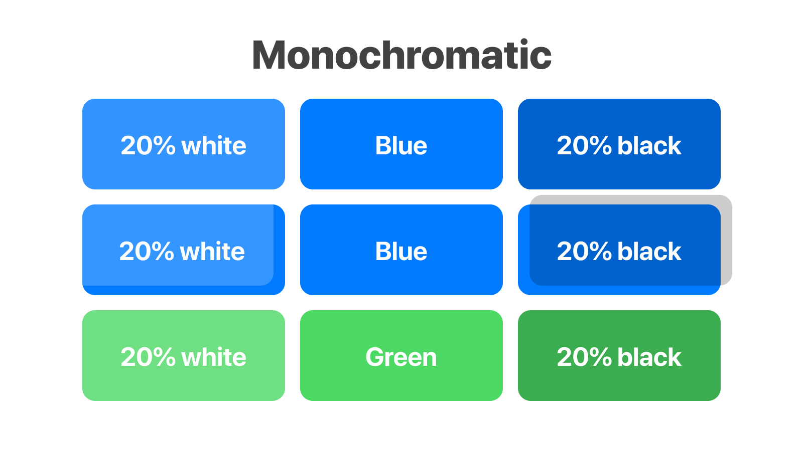
Monochromatic
A monochromatic color is created when we use one strong color with multiple variations of that one color. The most common scenario is to have one main color and then, applying a 10-90% white or black layer on top. Sticking to one main color can prove to be a wise decision, especially for those who are not comfortable with colors yet. Simplification always helps new concepts.
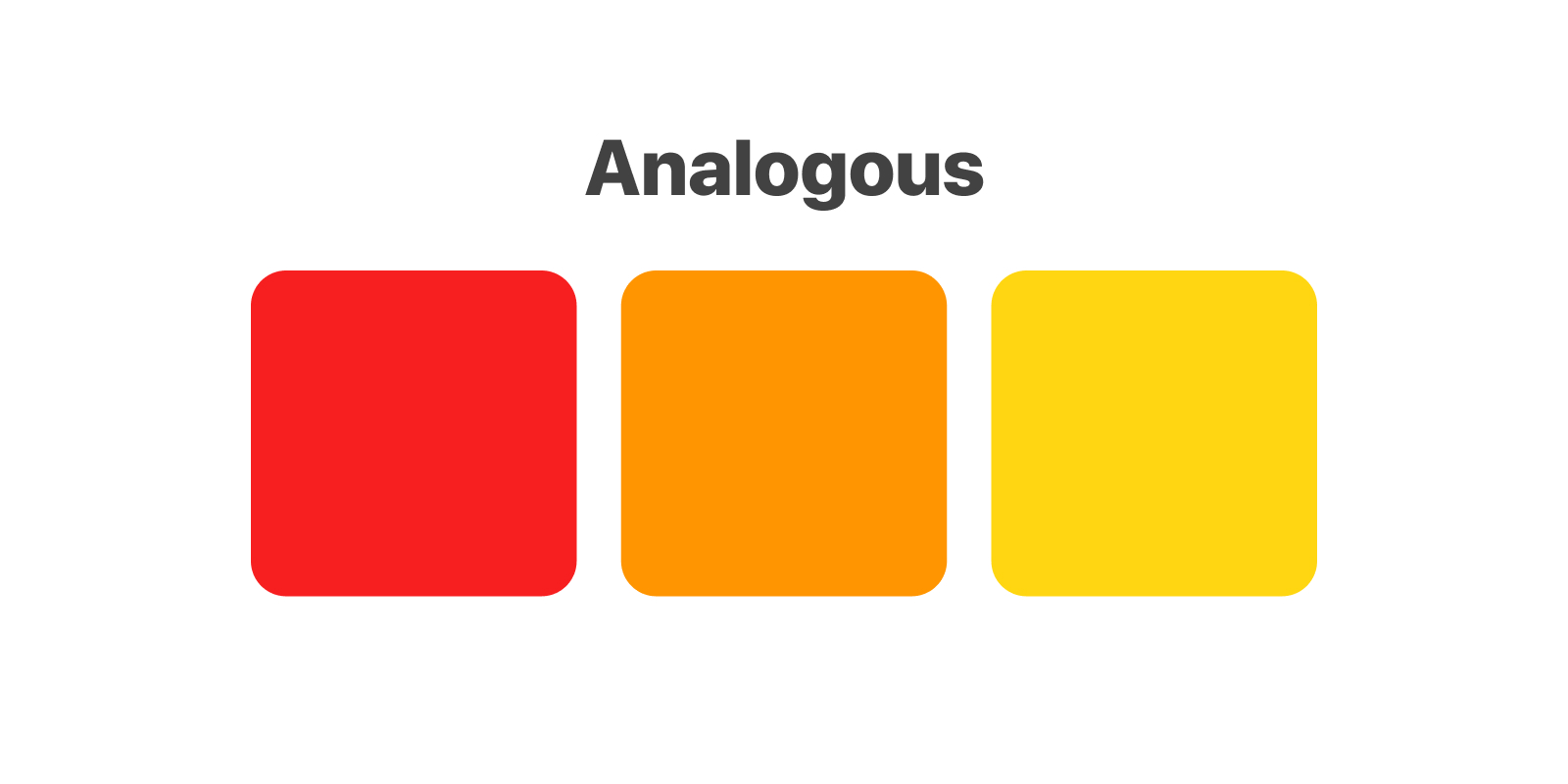
Analogous
Analogous colors refer to colors that are next to each other on the color wheel like red, orange and yellow. Although it is a difficult color palette as colors can end up overpowering each other, an analogous color scheme is very pleasing to the eye as it can be often found in nature such as the sunset.
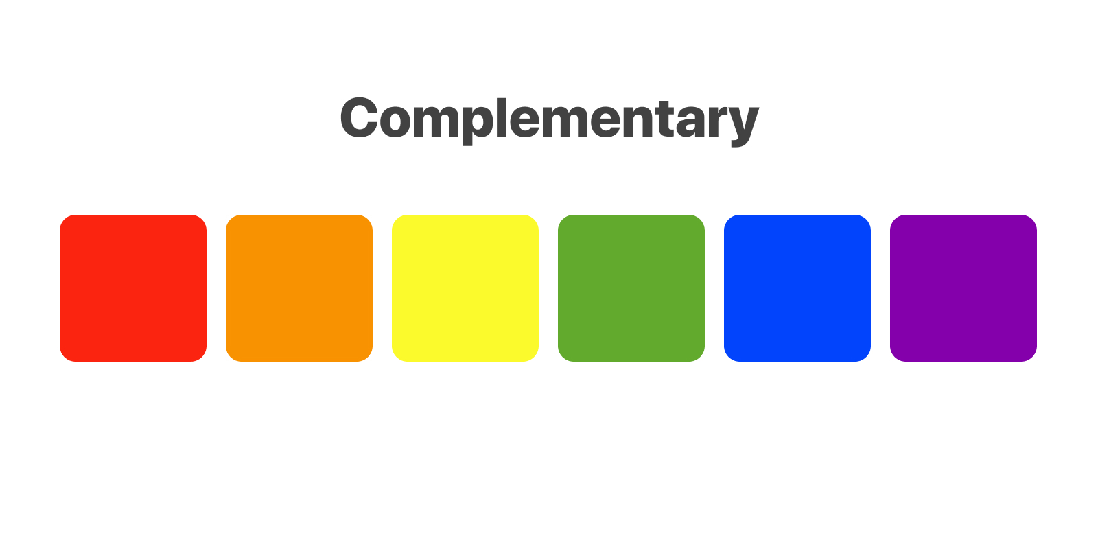
Complementary
A complementary color palette consists of two colors that are opposite on the color wheel such as red and green. Since there is a strong contrast of complementary colors, it is useful to select one color that is dominating and another that highlights other important elements in the page.
Triadic
A triadic color palette is when you use three colors that are equally spaced around the wheel. This is very useful as you can use one color as the background and the remaining ones for the content or other elements. These colors help with creating a palette that is bright and dynamic.

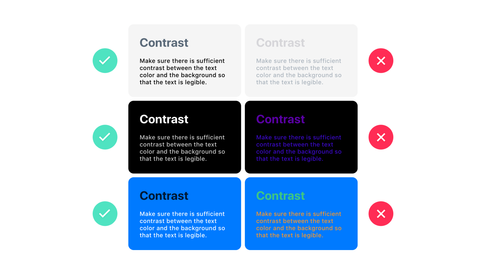
Contrast
Colors shouldn’t be in the way of legibility. Contrast is needed to allow comfortable reading and to immerse the viewer. For good contrast, use opposite ends: white against black, light blue against dark blue, high brightness against low brightness.
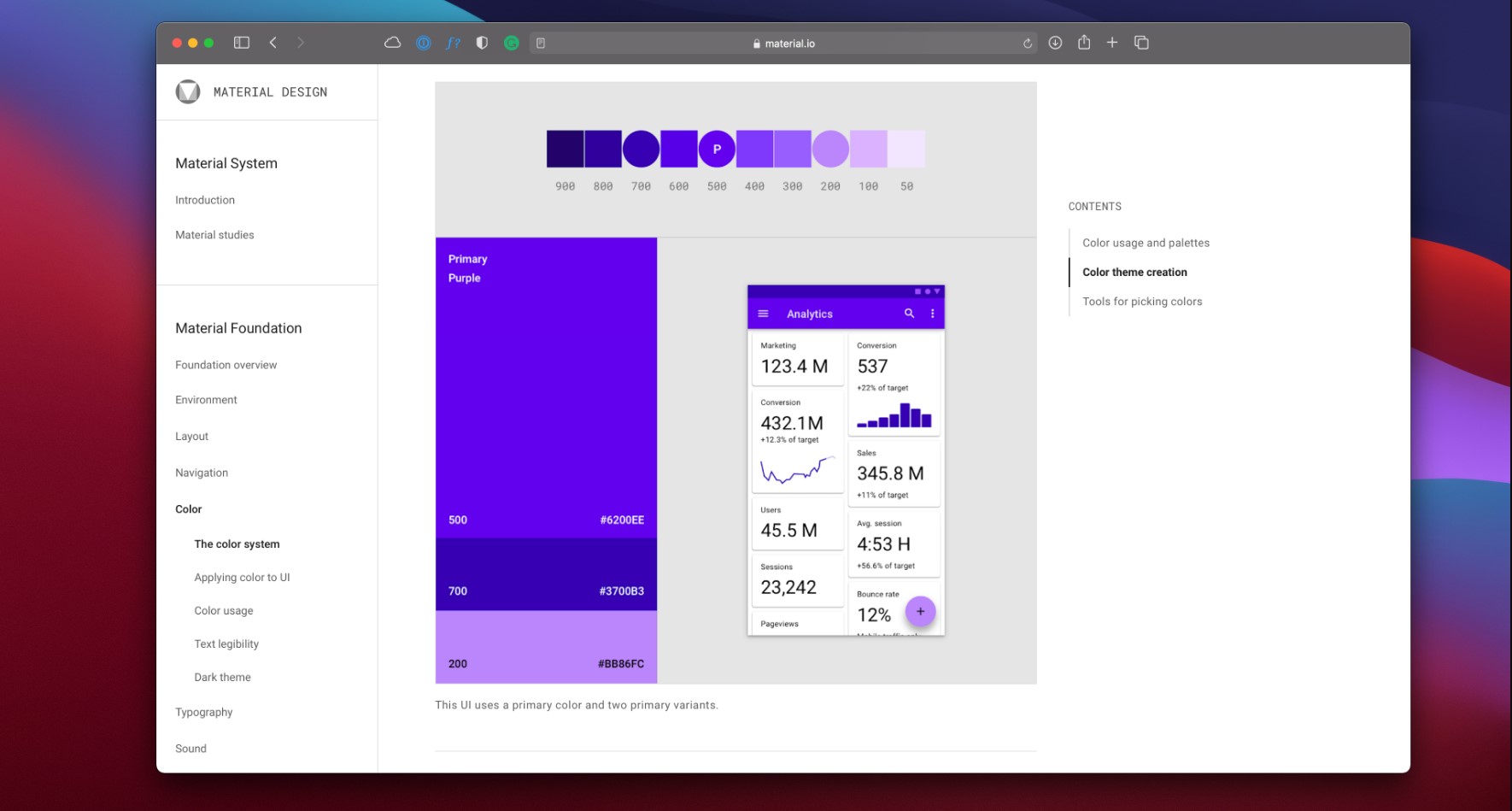
Material Design Color System
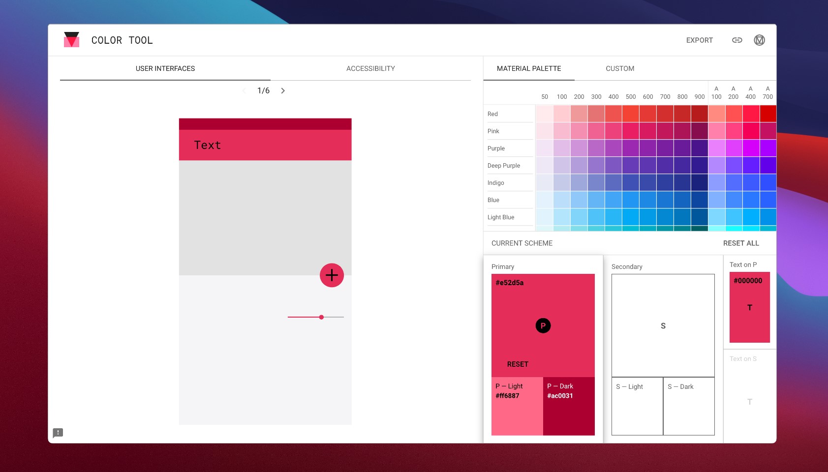
You can use the color tool from the Material Design Color System. With this tool you can create color palettes for your UI. The app allows you to preview your color palette in some UI samples they provide, and if you update a color, you can see the new color updated in real-time.
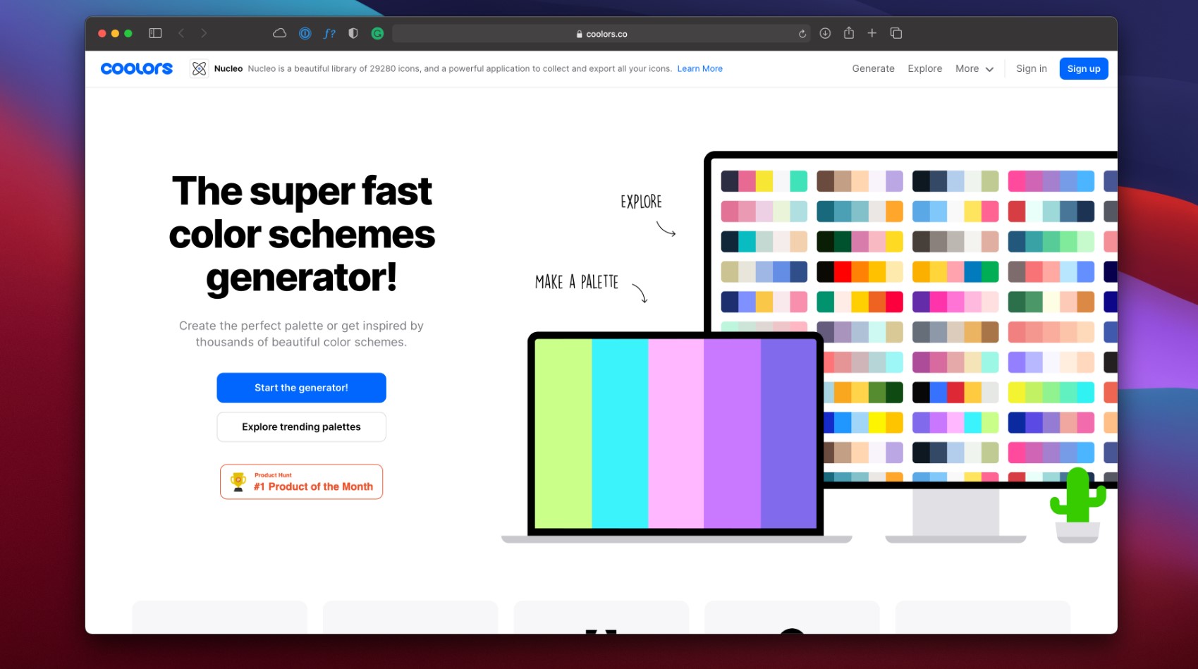
Coolors
If you are adventurous and like to experiment with random color palettes, Coolors is the tool.
You can look at different color palettes from other designers and create yours. On its mobile version, you can quickly generate color palettes based on different methods like monochromatic, analogous, complementary, triadic, square, and more.
Gradient Hunt
Gradient Hunt is an exquisite tool to browse different types of gradients and color palettes. It has numerous gradient colors that can help you find the gradient you were looking for your UI.

Create color schemes
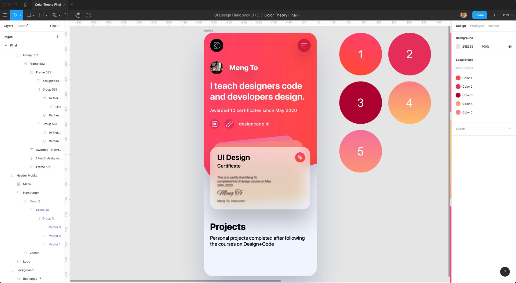
In this exercise, we will create a new color palette for our UI using tools like Material Design Color System (MDCS) and Gradient Hunt. Head to the Figma file, here you will find our sample UI. The goal of this exercise is to change the colors of this UI to new ones.

To make our task more manageable, we've created seven circles with our UI's color styles. We need to update these color styles with our new color palette. The goal will be to change this purple-bluish style for something more pink-reddish.

Now let’s go to MDCS's color tool, and look for shades of red. We will use these two shades: #E6315B and #AD0032. I will take a screenshot of the primary colors and drag the screenshot to the Figma file.
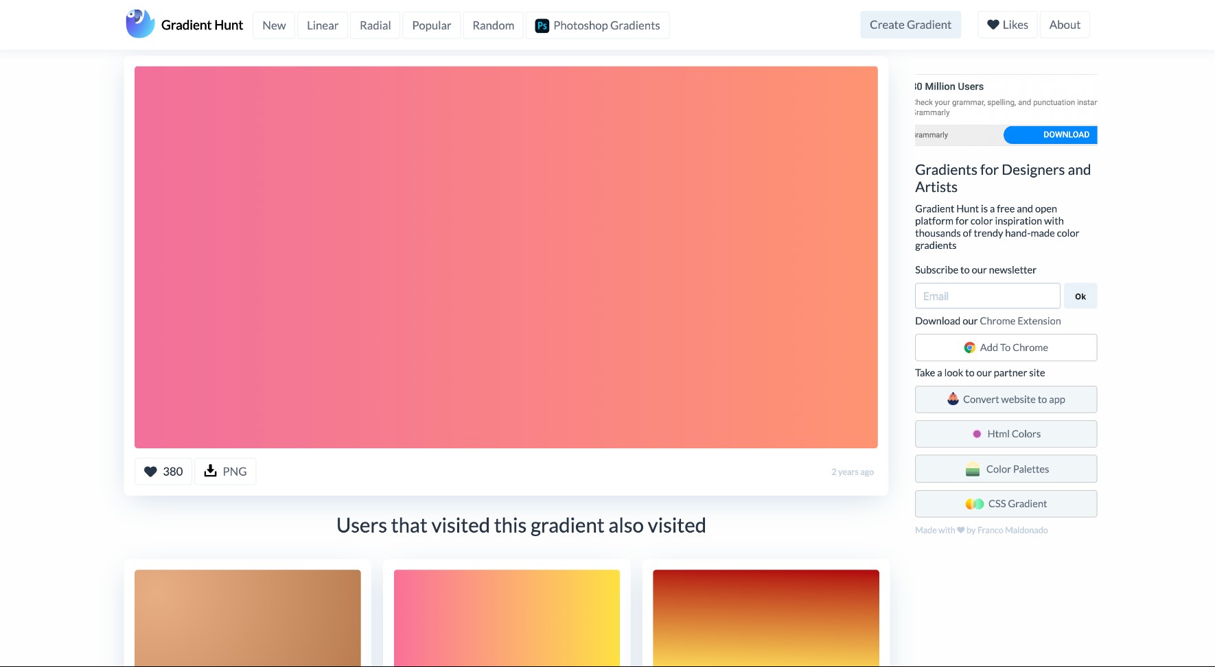
Next, go to gradient hunt. Here, look for some pinkish gradients which will go well with our UI. We will pick this first gradient: red and orange. (#F2709C - #FE9275)
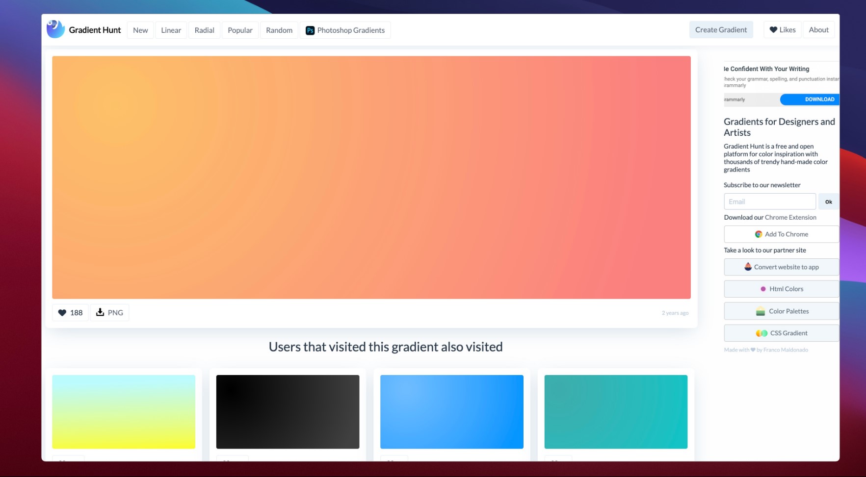
We will also use this other gradient: orange and yellow (#FB8180 - #FDBC6A).
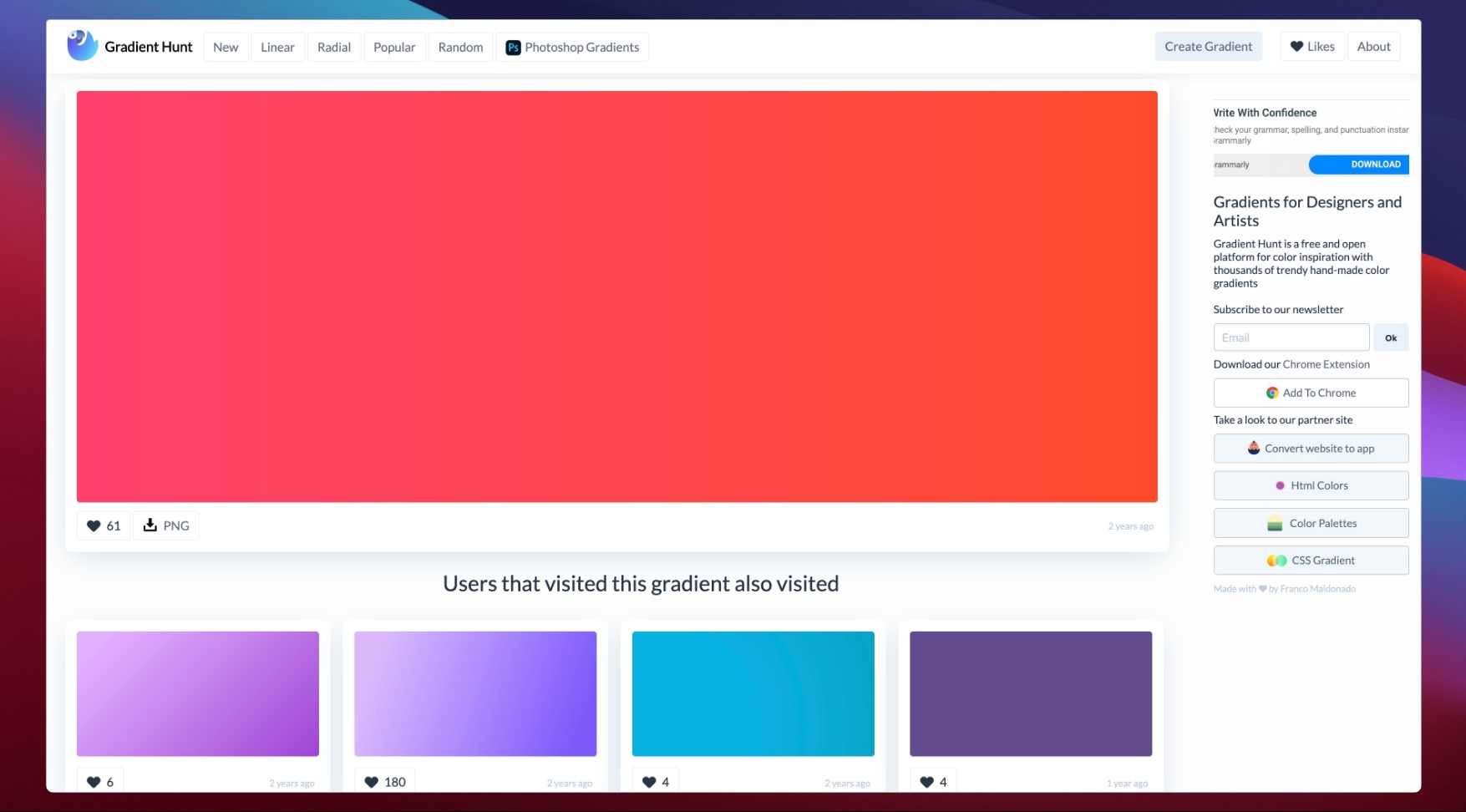
Then let's look for our last gradient, which will be a pink-reddish one (#FF4069 - #FF4A2F).
Now that we have all these gradients, let's download the PNG version of them or copy the gradient code to use them in our Figma file.

Let's change the current color styles for the new colors we selected. I numbered the current color styles, and I will replace those colors: C → 1, D → 2, E → 3, B → 4, and A → 5.

We will make some minor changes. Select the small circle for the pencil icon, and we will use the color style 1 for it.

Also, for the second and third lines of the hamburger icon, let's use color style 5.
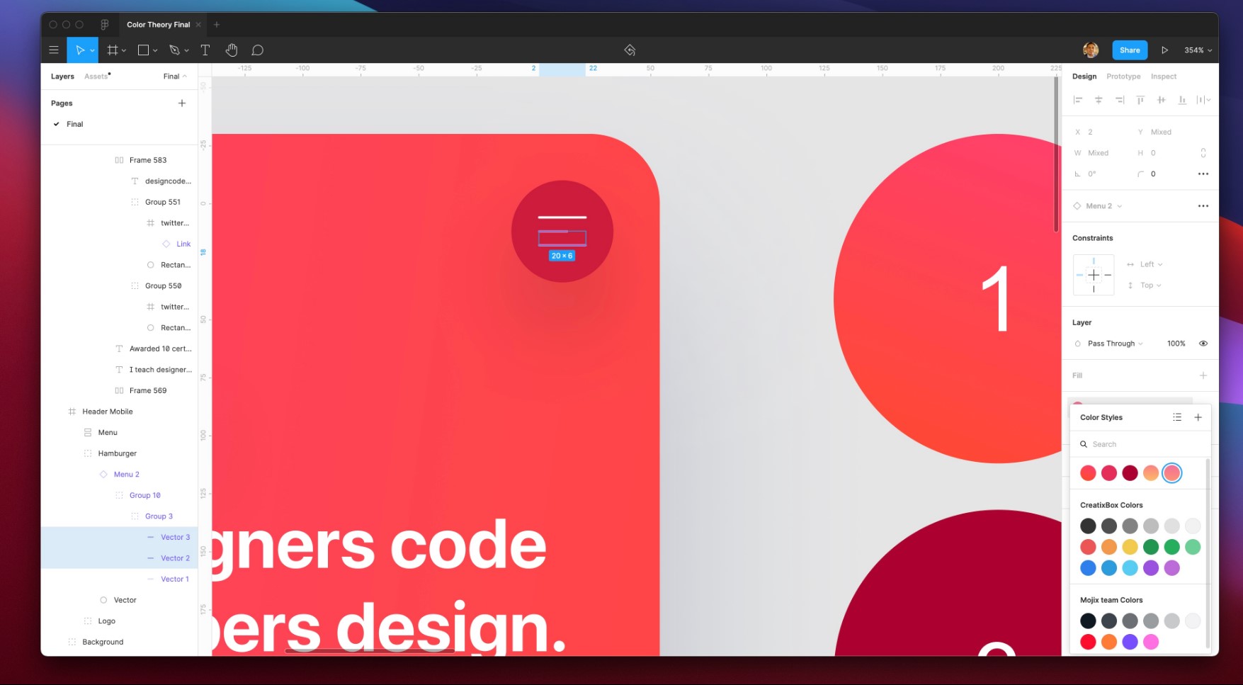
Finally, as you can see, we changed our original UI's look and feel to this reddish new vibe.
Conclusion
Sometimes it takes a little bit of time and patience when looking for the right colors for your UI. Hopefully, you now have a better idea of how to create color schemes that are visually pleasing to the eye.
Learn with videos and source files. Available to Pro subscribers only.
Purchase includes access to 50+ courses, 320+ premium tutorials, 300+ hours of videos, source files and certificates.
Templates and source code
Download source files
Download the videos and assets to refer and learn offline without interuption.
Design template
Source code for all sections
Video files, ePub and subtitles
ePub
Assets
Videos
1
UI Design Aesthetic
Learn about UI design aesthetics.
3:52
2
Design for accessibility
Learn about accessibility in design.
1:59
3
Localization
Read more about the importance of localization.
1:14
4
Color Selection
Select colors for your projects
5:06
5
Pick Fonts
Select the most suitable fonts for your design.
3:35
6
Font Managers
Manage your fonts more efficiently.
2:06
7
Icon Organizer
Organize your icons in a better way.
2:59
8
UI Sound Design
Importance of sound in UI design
4:25
9
Stock Images
Find the right images for your UI
1:29
10
Image optimization
Optimize your images to improve performance.
1:46
11
Illustrations
Add illustrations to your design project
1:38
12
Realistic Mockups
Resources to add realistic mockups to your design.
2:47
13
UI 3D Assets
Work with 3D assets in your design projects
2:29
14
Introduction to Animations
Learn about basic animations in UI design.
5:09
15
UI Animation Resources
List of tools and resources for UI animation.
1:45
16
Apple Watch Faces
Create customizable watch faces for the Apple watch
2:06
17
Designing for Apple Watch
Getting started with Apple Watch Design
4:24
18
Designing for Apple TV
Learn the basics steps to design for Apple TV
1:58
19
Design for Game Center
Learn how to design for Game Center
3:43
20
Designing for CarPlay
Learn the basics of designing for CarPlay
1:37
21
Designing App Clips
Learn how to design app clips for iOS
7:05
22
Designing Widgets
Design widgets for your applications.
3:29
23
Design Systems
Create design systems for a better workflow.
1:27
24
UI Kits
Learn more about UI Kits and where to find them.
3:33
25
Prototyping Tools
Learn about prototyping tools.
3:22
26
Voice prototyping
Take a look at voice prototyping.
2:14
27
Prototyping with Code
Read more about prototyping with code.
3:01
28
Turn your Designs into Code
Learn how to turn your Designs into Code.
2:18
29
Version Control Tools
Share and synchronize your files with your team
2:12
30
Developer Handoff
Learn more about developer handoff.
1:05
31
Color Theory
Understand color theory to select the best color themes for your application.
10:35
32
Dark Interfaces
Add dark mode to your application.
3:53
33
Icons
Learn more about UI icons.
10:32
34
Background Patterns
Create beautiful background patterns.
5:41
35
Typographic Scales
Learn more about typographic scales.
2:40
Meet the instructor
We all try to be consistent with our way of teaching step-by-step, providing source files and prioritizing design in our courses.
Daniel Nisttahuz
Senior Product Designer at Design+Code
Motion Designer @Design+Code
7 courses - 12 hours

UX Design Handbook
Learn about design thinking, with exercises. Free tutorials for learning user experience design.
2 hrs

UI Design Handbook
A comprehensive guide to the best tips and tricks for UI design. Free tutorials for learning user interface design.
2 hrs

Create a Promo Video in After Effects
In this course we will show you how to create a promo video using After Effects.
2 hrs

Animating in Principle
Learn how to animate interactive user interfaces from Figma to Principle. Get to design the app flow for multiple screens, interactions, and animations. At the end of the course, you will have a beautiful prototype that you can share with stakeholders.
1 hrs

Video Editing in ScreenFlow
Learn different techniques, transitions actions and effects to edit a video using Screeflow
1 hrs

Motion Design in After Effects
Learn animation and motion design with After Effects
3 hrs

Learn iOS 11 Design
Learn colors, typography and layout for iOS 8
1 hrs
