
Intro to iOS 14 Design
Add to favorites
A complete guide to designing for iOS 14 with videos, examples and design files
iOS Design Handbook
1
Intro to iOS 14 Design
4:13
2
iOS Colors
5:28
3
Typography and Dynamic Type
5:33
4
Background Blur and Gradients
4:19
5
Adaptive Layout
4:19
6
Do's and Don'ts
6:52
7
Design for Touch
7:46
8
iOS Native UI Elements
8:10
9
iOS Icons
3:44
10
Design for iPad
8:11
11
Design the Sidebar
7:16
12
Design Widgets
6:31
13
Animations
5:23
14
App Clips
7:05
15
Design for Apple Watch
6:16
16
Modals
6:17
17
Onboarding
6:51
18
Launch Screen
5:35
19
Design for Accessibility
4:12
20
Design for macOS Big Sur
6:31
Evolution of iOS
Let’s start from the beginning and look at the image below. On the left, a hyper realistic design, also known as Skeuomorphic. It was effective to introduce strong metaphors because in 2007, few were familiar with having a super computer in your pocket. In the middle, we got rid of all ornaments in favor of flat colors, beautiful typography and high-resolution content. Since most of us got increasingly comfortable with technology, it was no longer necessary to adorn our designs with heavy decorations.
On the right, a screen from iOS 14. Titles are much bolder, and as a result more readable. Because of the taller screens, it is now much more common to see the bottom navigation (known as Tab bar). Designers today have to adapt their layouts against multiple resolutions and pixel densities. The good news is that we have better tools, like Sketch and Xcode to prepare us for these modern techniques.

Large Titles
More than ever, iOS is going back to its roots. Bold fonts are everywhere. Titles are big and black. Since screens are now about twice as tall as they were, it only makes sense to have large titles. Another reason for large fonts is accessibility. With billions of people using their phone daily from all age groups, it is important to make the content as clear and readable as possible. Accessibility lets users set very large fonts for apps that support it. In iOS, all of Apple’s stock apps support that option. Because of that reason, you’ll find that users are now expecting it.
Cards
Bigger screens mean more space for content. Before the bigger iPhones, it made sense to rid of any container and give maximum space to content. But with the iPhone X and 8, that is no longer the case. We can make navigation easier by including the status, navigation and tab bars, and use cards as a way to better organize sections. Cards with rounded corners are a good way to make the content seem more tactile and approachable. You can use blurred backgrounds and drop shadows to add depth and context to your design.
The State of iOS Design
Design is now much simpler, allowing us to focus on animation and function, rather than intricate visual details. Before iOS 7, I spent a big part of my day designing intricate textures like wood, leather and chrome. Today, I spend that same amount of time on animation and code. It is no longer about the static design, but how to make it come alive, engaging our users on a deeper level. It is also the reason why I wrote this book to be more than merely about visual design. Animations and code has never been this important, or feasible from a technical standpoint. That’s why we can witness a new prototyping tool and coding framework almost every single week. Design has become extremely broad, but at the same time, interconnected with many disciplines at once. A single designer can grow to be independent in their execution while being a better collaborator with engineers as they understand better the craft of each discipline.
Even if you're designing for a totally different platform, the same design notions remain, and you can apply the same techniques that you've learned on the Web and Print. iOS is a platform where design goes back to its roots. It reads like a modern magazine, with beautiful typography and simple layouts. The things you'll learn in this book will serve you tremendously well on your journey to design the best products anywhere.
Core Philosophies
Let’s review the basics. iOS is driven by 3 core philosophies: deference, clarity and depth. Inspired by those design principles, I've broken down their meanings into actionable items that are much simpler and more visual than those explained in the guidelines.
Deference
Your content should be the hero, everything else is secondary. Use elements that complement it and avoid distracting visuals that compete with your content. For example, use beautiful animations that gracefully transition from one screen to another, thus ensuring that the users don’t get lost. Blurred backgrounds keep context of where the user is while allowing focus on the front content. If in doubt, start from a provided template and work from there.
Simplify
Your user interface should be stripped down to the core aesthetic. Every time you add an element, ask yourself: is this necessary? Unless your app is a game or a specific theme, temper your use of heavy textures, 3D effects and multiple shadows. Instead, focus on functional colors, harmonious gradients, and beautiful typography.

Maximize Content
The content should fill the whole screen, giving maximum space to its inner elements. Avoid nested containers and maximize the scrolling areas to allow more room for interactions.

Colors
Use a prominent color to show that an element is tappable or that it’s highlighted. Picking the right colors and neutral tones can make or break your design. Blue is a safe choice for buttons and states. Also, a white or extra light gray background against black texts is recommended as a starting point. This provides excellent contrast, which is perfect for readability.

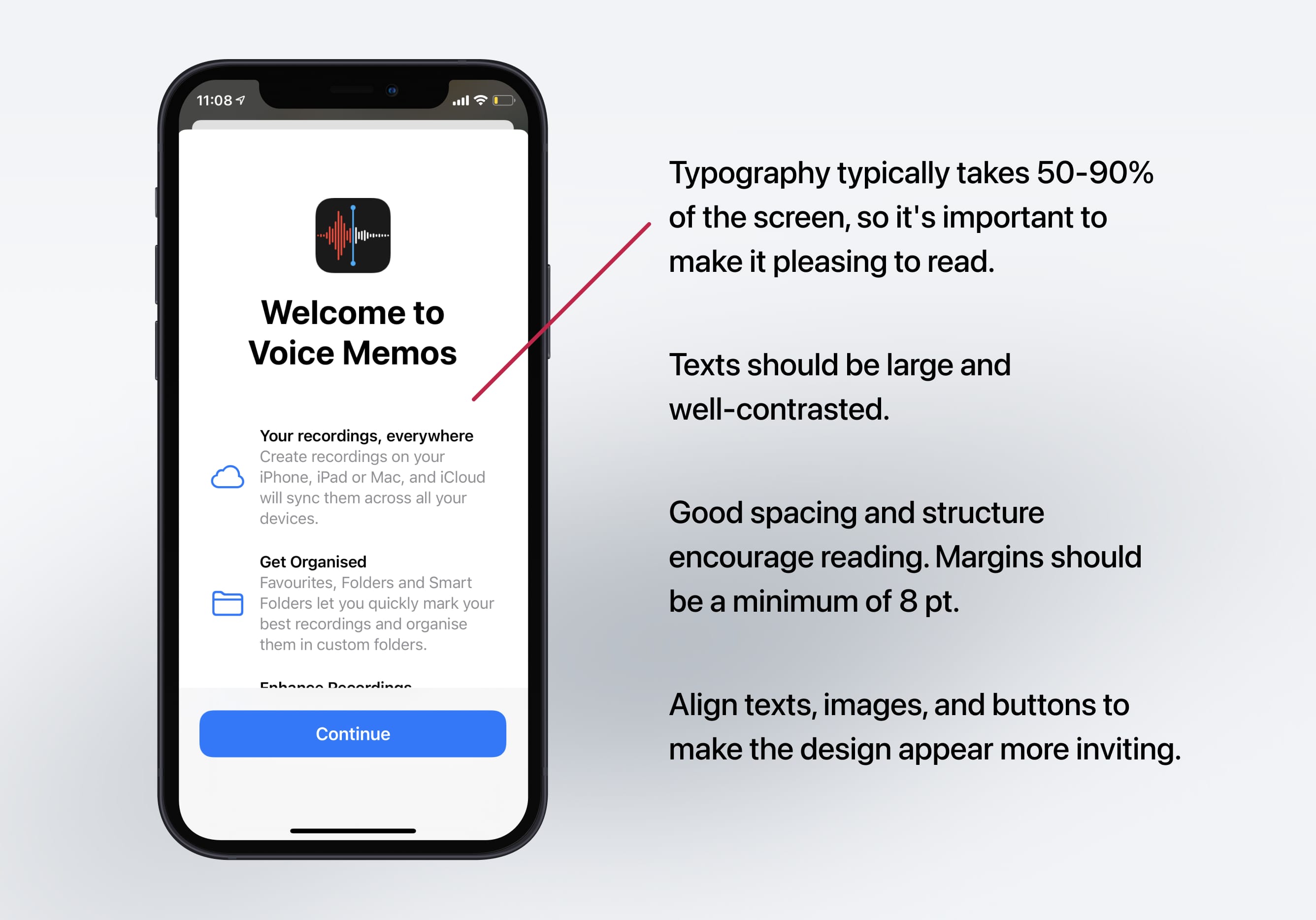
Typography is Content
Because of the simplification of the user interface and the focus on the content, your typography will occupy from 50-90% of the screen. Therefore, it is paramount to pick a beautiful font and set its weight, line-height, and color to be visually pleasing and optimal for reading at any size. The default San Francisco font is the recommended option as it was designed for legibility. Apple uses it in all their apps.
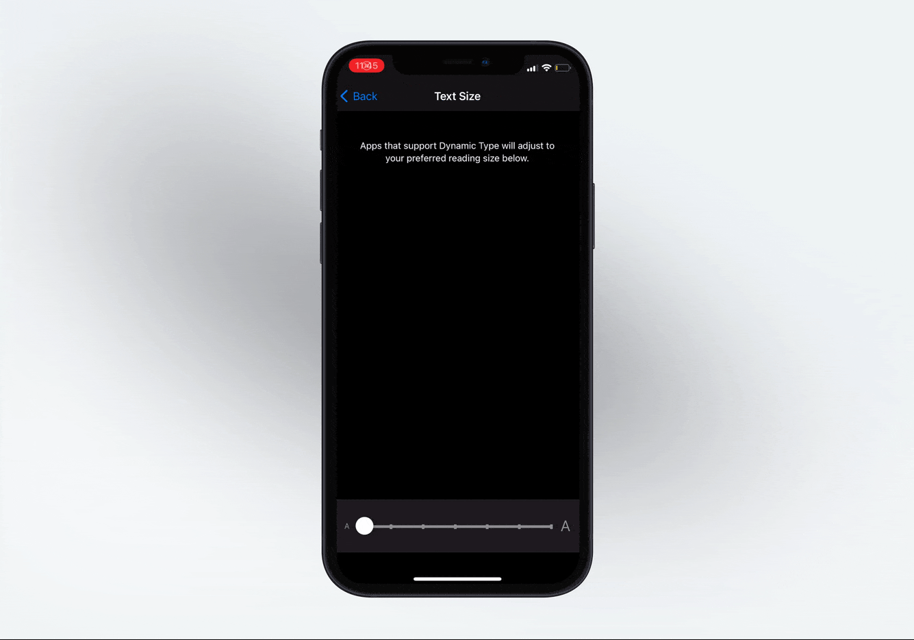
Dynamic Type
Accessibility is a prominent theme in iOS design. Apple provides you access to dynamic font presets, as shown in this image. Like this, if you set your text to Body, and enable Dynamic Type, the system will automatically increases the size based on the user’s preferences.
Negative Space
Use negative space to bring focus to the content. The less you see, the more you can focus on a few things at once. Negative spacing gives breathing room. Don't overwhelm your screen with too much structure or unneeded visual elements. If in doubt, make use of the default margins in Xcode. Apple typically uses between 8 pt to 16 pt for their margins.

Clarity
Make things obvious. Buttons should be self-explanatory and typography should be big and readable at a comfortable distance. Your content should clearly indicate what your app is about. For example, if it's a coffee app, then you should be reminded of the coffee beans, espresso, and brown colors of coffee.
Make the Text Readable
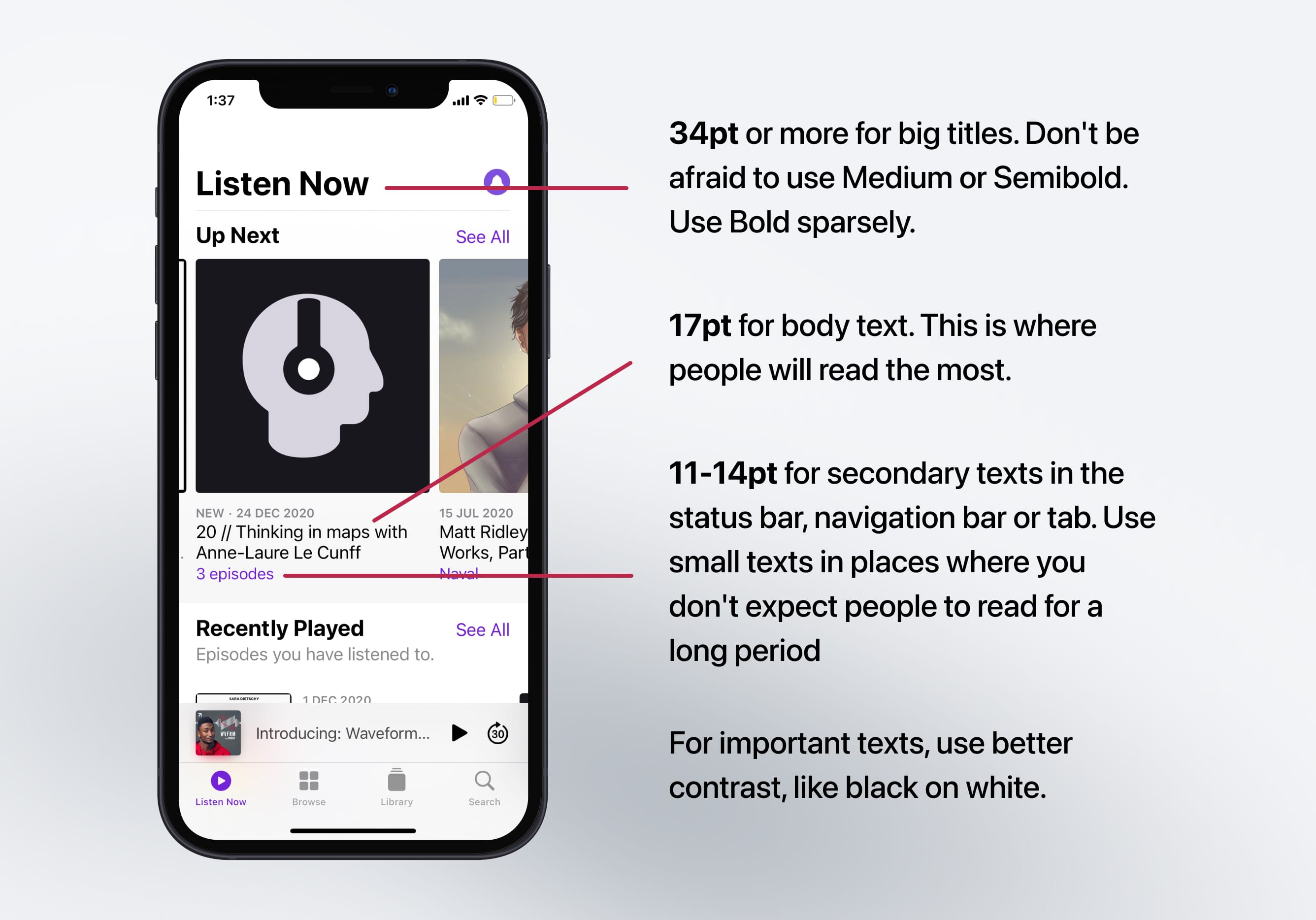
Titles should be big and well-contrasted. Captions should be short and easy to glance. The body texts should be well-spaced and not too long per line to avoid reading fatigue.
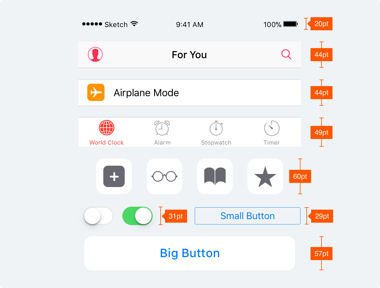
Body texts should also have a minimum size of 11pt. The optimal size for reading is 17pt to 20pt. Screen titles should be sized to 34 pt or more while secondary titles should be set at 20 pt to 30 pt.
Align texts with other elements to make them easy to scan. Finally, use black or dark gray against a light background for the best contrast.
Use Obvious Icons
Icons should not be ambiguous; they should clearly indicate what the symbol means. Whenever possible, use text to accompany the icon. Once you use an icon, don't reuse another variation of the same icon elsewhere as that will confuse your users. Likewise, don't use generic texts such as “Back” or “Submit”, instead be specific: “Back to Home” or "Sign up a new account". Design sharp, vectorized icons to make it easy to adapt to different screen densities. Make sure that your assets work for 1x, 2x (retina) and 3x (super retina) screens.
Descriptive Screens
Each page should clearly explain what it does. There should be minimal branding that is replaced by a clear screen title and highlighted state from the tab bar. Be thoughtful with the selection of images to best represent the sections.

Meaning in colors
Colors have meaning. Use red, green, blue and neutral tones wisely to indicate destructive actions, affirmative actions, links and inactive states, respectively. Avoid confusing your users by using these colors for different purposes. For example, don’t use green on a button that indicates “Delete”.

Design for touch
Buttons should be easily tappable. Their sizes should be between 30-60pt wide. The optimal size is 44pt. On rare occasions, set to 22pt for links inside texts, but use cautiously as they become hard to tap. Even text buttons have a tappable zone of at least 30pt. When opening pictures, make sure to include the ability to pinch to zoom and take advantage of the swipe gestures to easily navigate to previous screens one-handed.
Landscape Mode
Users often use the iPads and larger iPhones in landscape. In that mode, apps will appear without the status bar and with smaller navigation and tab bars. Sometimes, it will show an extra menu on the left, similar to what you’d find on the iPad. Adaptive layouts, a way to resize your layout based on screen size, is now common practice. Thanks to Auto Layout and Size Classes in Xcode, modifying the layout based on device orientation is fairly easy. So don’t be afraid to support this in your designs.
Depth
Perhaps the hardest part to understand is depth. It's a very abstract concept, but at the same time very powerful and unique. Depth is the idea that everything should be contextual and transitional. In real life, when you walk from a room to another, you get a sense of progression and distance. That way you don't get lost. That same concept should be applied to user interface.
Indifference towards people and the reality in which they live is actually the one and only cardinal sin in design. – Dieter Rams
Transitional Interface
One of the most exciting and unique aspects of iOS is the animation. Every screen transitions from one to another. The home screen zooms into a folder, then zooms into an app. Animations used to be hard to execute, but thanks to Xcode, they are made more accessible than ever. In fact, you will learn exactly these techniques in the SwiftUI chapter.
Blurred Background
Keeping context of the background UI shouldn't compromise the clarity of your content. Blurring the background not only allows you to keep its natural colors, but also brings focus to the foreground. Blurring isn't an invention, it's something that already exists in real life; as you focus on something, everything else become blurry.
Animations
Animation not only serves to transition from one screen to another, it also adds playfulness and delight to your design. It brings importance to an element that would otherwise be ignored. Notifications are more noticeable and the weather is better understood when there is rain pouring in the background.
Although animations are encouraged, they should not be overdone. They should not distract your users from the content or give them motion sickness. Gratuitous, forceful animations can become overwhelming to your users. Instead, make them discoverable when users manipulate the content, or use them to gracefully direct attention to an on boarding process.
Finally, be realistic in the way animations are demonstrated. A modal that slides from the bottom should be dismissed back to the bottom of the screen. That way, users can appreciate the physicality of the elements, even if they’re digital.
Gestures
With the introduction of bigger screens, the back button is now too high for the thumb to easily reach. So, while less obvious than a visible button, a gesture can be an extension to an already visible interaction. It makes it easier for power users. We're all becoming power users, that's why we require less visual cues and more useful functions.
Long Press and Contextual Menu
The contextual menu allows people to quickly access options inside and outside of your app. Think of it like the keyboard shortcuts on your Mac – they enable people to do repeated tasks quicker. You have to design shortcuts that make power users more productive. But just like Keyboard shortcuts, essential features shouldn’t be exclusive to the contextual menu. Your users must be able to operate your app normally without it.
For example, users can long press your App Icon to find frequently used items. Inside an app, mail content can be peeked and links can be peeked before entering full-screen.
Haptic Feedback
Haptics enhances the user experiences as it provides people a sense of touch when interacting with an app. Haptics improves touch gestures and interactions like scrolling through a picker or toggling a switch offering a delightful experience for the user.
Widgets
Widgets help the user to have a glance and access key information/content from your app right from their home screen without even having to open the app. This makes the overall experience of your app more accessible.

Launch Screen
A launch screen is a placeholder screen that appears when your app starts and will be quickly replaced by the app's first screen once it loads completely. Displaying a launch screen creates an illusion that your app is quick to launch by subtlety displaying what to expect.
The launch screen should mimic your app's first screen without any texts, images, or vibrant colors so keep your design as simple as possible.

Sounds
Sounds are minimally used in apps, but when they're played, they can transform a mundane task into a truly rewarding experience. People can recognize your app without even seeing it in meaningful places such as the push notifications. When the sound gives the right impression, you win a lot with a minimal amount of effort.
Navigation
Navigation Bar
The Navigation Bar is used for quick information about the screen. The left portion can be used for placing Back, Profile, Menu buttons whereas the right portion is generally used for action buttons like Add, Edit, Done.
Tab Bar
The Tab Bar is the main navigation between multiple screens. Avoid the Hamburger menu if you have few items. Menus that are always visible will increase usage since obvious always win. Additionally, it is encouraged to add text next to your icons as most people won’t instantly recognize symbols, especially when they’re not universally known.
Sidebar
A sidebar provides app-level navigation for a list of collections based on the content of your app. Having a sidebar makes navigating within the app more convenient for the users. This also offers more customization to the users, meaning they can pick the necessary shortcuts.
Platforms
Thanks to SwiftUI, we can now design for multiple platforms at once. The OS does a great job at translating the controls and adapting the layout to its respective platform.
iPadOS
iPadOS gives users the best of both worlds by consolidating the key experiences from iOS and macOS. iPadOS is born from iOS to push and utilize the larger screens of the iPad for a better experience while offering distinct experiences. This opens a whole new way to interact with apps, unlike before.
macOS Big Sur
Big Sur is the latest version of Apple's macOS. Introducing a beautifully redesigned user interface that embraces the use of rounded corners, translucency, and app accent colors. Big Sur's design language promotes consistency with all platforms to make it more accessible and friendly when transitioning from iOS or iPad.
Apple Watch
Apple Watch was introduced in 2015. It was highly anticipated by developers, designers and the media. It was indeed the first wearable that broke every expectation, placing Apple as the number one watch manufacturer globally. Now more than ever, there are many resources for designers and developers to create great apps for the Apple Watch.
Apple TV
Apple TV is the perfect platform to connect with users in different ways like gaming, entertainment, home utility and more. And there are different ways you can interact with the TV, by voice or external hardware like the Siri Remote or gaming controllers.
Further Reading
A high level and essential read
written by Apple. It’s always kept up-to-date and is pretty exhaustive with its list of features. I would suggest to at least skim through it and only read the portions that you need, as it gets very detailed.

Learn with videos and source files. Available to Pro subscribers only.
Purchase includes access to 50+ courses, 320+ premium tutorials, 300+ hours of videos, source files and certificates.
Templates and source code
Download source files
Download the videos and assets to refer and learn offline without interuption.
Design template
Source code for all sections
Video files, ePub and subtitles
ios-design-handbook-intro-to-ios-14-design
1
Intro to iOS 14 Design
A complete guide to designing for iOS 14 with videos, examples and design files
4:13
2
iOS Colors
Learn how to work with colors in iOS 14
5:28
3
Typography and Dynamic Type
Learn to make the content clear and readable
5:33
4
Background Blur and Gradients
Creating contrast between contents using blurs and apply gradients from analogous colors
4:19
5
Adaptive Layout
Learn to make your designs adaptive to different device screen sizes and orientation
4:19
6
Do's and Don'ts
Things to keep in mind while designing for iOS
6:52
7
Design for Touch
Keeping your content reachable using different touch techniques
7:46
8
iOS Native UI Elements
Learn and benefit from using Apple's UI resources
8:10
9
iOS Icons
Learn how to find great icons and customize them
3:44
10
Design for iPad
How bigger screens affect your design
8:11
11
Design the Sidebar
How to design a sidebar for iPad
7:16
12
Design Widgets
Displaying important and useful information using widgets for quick glances
6:31
13
Animations
Good animations enhance, bad animations distract
5:23
14
App Clips
Make use of a specific feature in your app through app clips
7:05
15
Design for Apple Watch
Designing for people on the go
6:16
16
Modals
Provide more focused experience by presenting your content in a temporary modal view
6:17
17
Onboarding
Learn to design meaningful experiences with clear onboarding flows and patterns
6:51
18
Launch Screen
Hint users about loading content through launch screens
5:35
19
Design for Accessibility
Basic rules and system to improve app accessibility
4:12
20
Design for macOS Big Sur
Designing an app with translucency and sidebar layout for macOS Big Sur
6:31
Meet the instructors
We all try to be consistent with our way of teaching step-by-step, providing source files and prioritizing design in our courses.
Surya Anand
Designer
Curious about learning to design
3 courses - 10 hours
iOS Design Handbook
A complete guide to designing for iOS 14 with videos, examples and design files
2 hrs
UI Design Handbook
A comprehensive guide to the best tips and tricks for UI design. Free tutorials for learning user interface design.
2 hrs
Figma Handbook
A comprehensive guide to the best tips and tricks in Figma. Not affiliated with or endorsed by Figma, Inc.
6 hrs
Meng To
I design, code and write
Meng To is the author of Design+Code. Meng started off his career as a self-taught designer from Montreal and eventually traveled around the world for 2 years as his US VISA was denied. During his travels, he wrote a book which now has 35,000 readers.
40 courses - 194 hours
Master AI Prompting for Stunning UI
Learn how to leverage AI tools like Aura for creating beautiful designs, working with templates, and experimenting with advanced prompts. A concise guide for designers and developers to level up their skills.
10 hrs
Build SwiftUI apps for iOS 18 with Cursor and Xcode
In this course, we'll explore the exciting new features of SwiftUI 6 and Xcode 16 for building iOS 18 apps. From mesh gradients and text animations to ripple effects, you'll learn how to create polished, highly custom apps using the latest workflows. We'll also dive into using Cursor and Claude AI for AI-driven coding, helping you start strong and customize your apps.
5 hrs
Create your Dream Apps with Cursor and Claude AI
Learn to build your dream web apps from the ground up using Cursor, Claude AI, and a suite of powerful AI tools. This course covers everything you need, including React for frontend development, Firebase for backend integration, and Stripe for handling payments. You’ll also dive into advanced AI tools like Claude Artifacts, Galileo AI, v0.dev for UI, Ideogram for design generation, and Cursor Composer for full-scale development.
6 hrs
Build a React Site from Figma to Codux
In this course, you'll learn to build a website from scratch using Codux, starting with a Figma template. You’ll master responsive design, collaborate with developers on a real React project, export CSS from Figma using Locofy, set up breakpoints with media queries, add CSS animations, improve SEO, create multiple pages with React Router, and publish your site. By following best practices, you’ll bridge design and development, improve your web design skills.
2 hrs
Create 3D UI for iOS and visionOS in Spline
Comprehensive 3D Design Course: From Basics to Advanced Techniques for iOS and visionOS using SwiftUI
3 hrs
Master No-Code Web Design with Framer
In this free Framer course, you'll learn to create modern, user-friendly interfaces. Start with dark mode and glass designs, then move from Figma to Framer, using vectors and auto layout for responsive websites. Add animations, interactive buttons, and custom components with code. Finally, you'll craft a design system suitable for teamwork or solo projects, all in a straightforward and practical approach.
4 hrs
Build SwiftUI Apps for iOS 17
In this course, we’ll be exploring the fresh and exciting features of SwiftUI 5! As we craft a variety of iOS apps from the ground up, we'll delve deep into the treasure trove that is SwiftUI's user interface, interactions, and animations.
4 hrs
Build Beautiful Apps with GPT-4 and Midjourney
Design and develop apps using GPT-4 and Midjourney with prompts for SwiftUI, React, CSS, app concepts, icons, and copywriting
4 hrs
Build SwiftUI apps for iOS 16
Create animated and interactive apps using new iOS 16 techniques using SwiftUI 4 and Xcode 14
5 hrs
Build a 3D Site Without Code with Framer
Design and publish a responsive site with 3D animation without writing a single line of code
3 hrs
Create 3D Site with Spline and React
Design and code a landing page with an interactive 3D asset using Spline and CodeSandbox
1 hrs
Build an Animated App with Rive and SwiftUI
Design and code an iOS app with Rive animated assets, icon animations, custom layouts and interactions
3 hrs
Build a SwiftUI app for iOS 15 Part 3
Design and code a SwiftUI 3 app with custom layouts, animations and gestures using Xcode 13, SF Symbols 3, Canvas, Concurrency, Searchable and a whole lot more
4 hrs
Build a SwiftUI app for iOS 15 Part 2
Design and code a SwiftUI 3 app with custom layouts, animations and gestures using Xcode 13, SF Symbols 3, Canvas, Concurrency, Searchable and a whole lot more
3 hrs
Build a SwiftUI app for iOS 15
Design and code a SwiftUI 3 app with custom layouts, animations and gestures using Xcode 13, SF Symbols 3, Canvas, Concurrency, Searchable and a whole lot more
4 hrs
React Livestreams
Learn how we can use React Hooks to build web apps using libraries, tools, apis and frameworks
4 hrs
Design Founder Livestreams
A journey on how we built DesignCode covering product design, management, analytics, revenue and a good dose of learning from our successes and failures
2 hrs
SwiftUI Advanced Handbook
An extensive series of tutorials covering advanced topics related to SwiftUI, with a main focus on backend and logic to take your SwiftUI skills to the next level
4 hrs
iOS Design Handbook
A complete guide to designing for iOS 14 with videos, examples and design files
2 hrs
SwiftUI Handbook
A comprehensive series of tutorials covering Xcode, SwiftUI and all the layout and development techniques
7 hrs
Build a web app with React Hooks
Learn how we built the new Design+Code site with React Hooks using Gatsby, Netlify, and advanced CSS techniques with Styled Components.
4 hrs
UI Design Handbook
A comprehensive guide to the best tips and tricks for UI design. Free tutorials for learning user interface design.
2 hrs
Figma Handbook
A comprehensive guide to the best tips and tricks in Figma. Not affiliated with or endorsed by Figma, Inc.
6 hrs
SwiftUI for iOS 14
Build a multi-platform app from scratch using the new techniques in iOS 14. We'll use the Sidebar and Lazy Grids to make the layout adaptive for iOS, iPadOS, macOS Big Sur and we'll learn the new Matched Geometry Effect to create beautiful transitions between screens without the complexity. This course is beginner-friendly and is taught step-by-step in a video format.
3 hrs
SwiftUI Livestreams
This is a compilation of the SwiftUI live streams hosted by Meng. Over there he talks and teaches how to use design systems, typography, navigation, iOS 14 Design, prototyping, animation and Developer Handoff.
19 hrs
UI Design Livestreams
This is a compilation of the UI live streams hosted by Meng. Over there he talks and teaches how to use design systems, typography, navigation, iOS 14 Design, prototyping, animation and Developer Handoff.
26 hrs
UI Design for Developers
In this course we'll learn how to use design systems, set up break points, typography, spacing, navigation, size rules for adapting to the iPad, mobile and web versions, and different techniques that translate well from design to code.
3 hrs
Build an app with SwiftUI Part 3
This course was written for designers and developers who are passionate about design and about building real apps for iOS, iPadOS, macOS, tvOS and watchOS. SwiftUI works across all of those platforms. While the code is not a one-size-fits-all, the controls and techniques involved can apply to all platforms. It is beginner-friendly, but it is also packed with design tricks and cool workflows about building the best UIs and interactions.
4 hrs
Build an app with SwiftUI Part 2
This course was written for designers and developers who are passionate about design and about building real apps for iOS, iPadOS, macOS, tvOS and watchOS. SwiftUI works across all of those platforms. While the code is not a one-size-fits-all, the controls and techniques involved can apply to all platforms. It is beginner-friendly, but it is also packed with design tricks and cool workflows about building the best UIs and interactions.
4 hrs
Build a full site in Webflow
Webflow is a design tool that can build production-ready experiences without code. You can implement CSS-driven adaptive layouts, build complex interactions and deploy all in one tool. Webflow also comes with a built-in content management system (CMS) and Ecommerce for creating a purchase experience without the need of third-party tools.
3 hrs
Advanced Prototyping in ProtoPie
ProtoPie is a cross-platform prototyping tool that creates prototypes nearly as powerful as those made with code, with half of the efforts, and zero code. It's perfect for designers who want to quickly experiment with advanced interactions using variables, conditions, sensors and more.
3 hrs
Build an app with SwiftUI Part 1
This course was written for designers and developers who are passionate about design and about building real apps for iOS, iPadOS, macOS, tvOS and watchOS. SwiftUI works across all of those platforms. While the code is not a one-size-fits-all, the controls and techniques involved can apply to all platforms. It is beginner-friendly, but it is also packed with design tricks and cool workflows about building the best UIs and interactions.
4 hrs
React Native for Designers Part 2
React Native is a popular Javascript framework that builds on top of React by using native components to create a real mobile app indistinguishable from one made using Xcode or Android Studio. The main difference with native development is that you get to use CSS, hot-reload, Javascript and other familiar techniques that the Web has grown over the past decades. Most importantly, you're building for both iOS and Android using the same codebase.
3 hrs
React Native for Designers
React Native is a popular Javascript framework that builds on top of React by using native components to create a real mobile app indistinguishable from one made using Xcode or Android Studio. The main difference with native development is that you get to use CSS, hot-reload, Javascript and other familiar techniques that the Web has grown over the past decades. Most importantly, you're building for both iOS and Android using the same codebase.
5 hrs
Design System in Figma
Learn how to use and design a collaborative and powerful design system in Figma. Design Systems provide a shared library of reusable components and guidelines and that will let you build products much faster
3 hrs
React for Designers
Learn how to build a modern site using React and the most efficient libraries to get your site/product online. Get familiar with Grid CSS, animations, interactions, dynamic data with Contentful and deploying your site with Netlify.
3 hrs
Swift Advanced
Learn Swift a robust and intuitive programming language created by Apple for building apps for iOS, Mac, Apple TV and Apple Watch
9 hrs
Learn Swift
Learn Swift a robust and intuitive programming language created by Apple for building apps for iOS, Mac, Apple TV and Apple Watch
4 hrs
Learn Sketch
Learn Sketch a design tool entirely vector-based and focused on user interface design
5 hrs
Learn iOS 11 Design
Learn colors, typography and layout for iOS 8
1 hrs