Design for Touch
Add to favorites
Keeping your content reachable using different touch techniques
iOS Design Handbook
1
Intro to iOS 14 Design
4:13
2
iOS Colors
5:28
3
Typography and Dynamic Type
5:33
4
Background Blur and Gradients
4:19
5
Adaptive Layout
4:19
6
Do's and Don'ts
6:52
7
Design for Touch
7:46
8
iOS Native UI Elements
8:10
9
iOS Icons
3:44
10
Design for iPad
8:11
11
Design the Sidebar
7:16
12
Design Widgets
6:31
13
Animations
5:23
14
App Clips
7:05
15
Design for Apple Watch
6:16
16
Modals
6:17
17
Onboarding
6:51
18
Launch Screen
5:35
19
Design for Accessibility
4:12
20
Design for macOS Big Sur
6:31
Touch Targets
In the first section, we'll talk about touch targets. Interactive elements such as buttons should have an appropriate size so that the user can accurately tap the target with their finger. The general rule is 44pt for buttons and 12pt for small text, 17pt for body text and 20pt+ for titles. Interacting with these elements should feel natural to the user.

Navigation
Navigating across the application should be made as easy as possible. If you make the navigation flow complex, users might get frustrated. As a designer, you need to ensure that doesn't happen. Make sure that the navigation elements are visible and consistent across the app.

Content
Having way too much content is not highly recommended as it just ends up making your application look cluttered. Don't add in elements that are unnecessary just for the sake of adding them. The layout of your application should always look clean.
Thumb Zone
As mobile users, most of us use our thumbs to operate our devices. The thumb zone refers to the area on your screen that is convenient as well as easily reachable by your thumb. This excludes the area at the top of the screen. Always make sure that the gestures we'll be discussing below are within this thumb zone. However, please do keep in mind that not all users navigate an app using their thumb.

Tab Bar
The Tab Bar is the main navigation between multiple screens. Avoid the Hamburger menu if you have few items. Menus that are always visible will increase usage since obvious always win.
Giving Feedback
It is important to provide feedback to users especially when they perform an action. Feedback can help a user understand either the result of the action performed or the steps they should proceed with next. A good example would be showing a message or an animation when the user clicks a button or when the action is finished.
Haptic Feedback
Haptics enhances the user experiences as it provides people a sense of touch when interacting with an app. Haptics improves touch gestures and interactions like scrolling through a picker or toggling a switch offering a delightful experience for the user.
Long Press and Contextual Menu
The contextual menu allows people to quickly access options inside and outside of your app. Think of it like the keyboard shortcuts on your Mac – they enable people to do repeated tasks quicker. You have to design shortcuts that make power users more productive. But just like Keyboard shortcuts, essential features shouldn’t be exclusive to the contextual menu. Your users must be able to operate your app normally without it.
For example, users can long press your App Icon to find frequently used items. Inside an app, mail content can be peeked and links can be peeked before entering full-screen.
Gesture
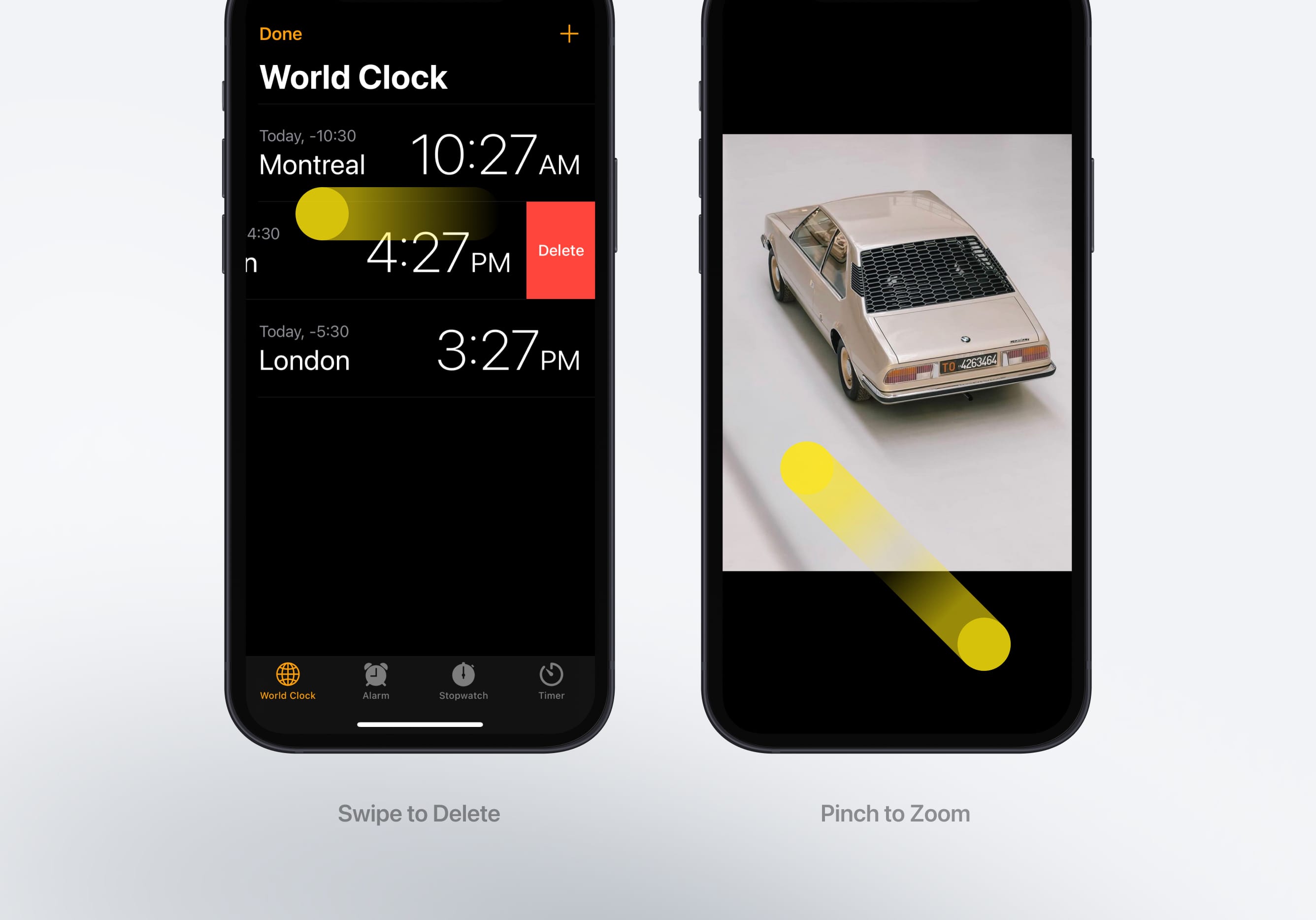
With the introduction of bigger screens, the back button is now too high for the thumb to easily reach. So, while less obvious than a visible button, a gesture can be an extension to an already visible interaction. It makes it easier for power users. We're all becoming power users, that's why we require less visual cues and more useful functions.
Aim to use standard gestures since users have more muscle memory from using these common gestures. Try and avoid interfering with systemwide gestures like screen-edge gestures that provide access to the Home screen, app switcher, Notification Center, Control Center, and Dock.
Gestures must act as an extension to shortcuts but not to replace important navigation and actions performed by the app.

List of Gestures
There are a lot of gestures a user can perform while on a touchscreen device. Some of these include:
- Drag
- Flick
- Pinch-in and out
- Swipe
- Double tap
- Long Press (touch and hold)
- Rotate
- Shake
Multifinger gestures
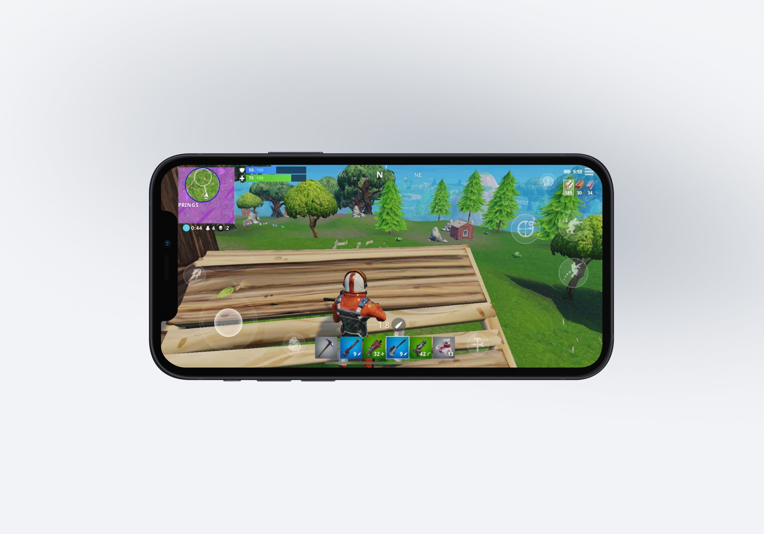
These gestures are best if your app has to deal with multiple controls simultaneously as it provides a better user experience. The best use case of this is on gaming, VR/AR, and drawing apps. You can also use multi-finger gestures like Three-finger pinch/Swiple too on normal apps but more sure not to complicate things always aim to keep everything simple.

Learn with videos and source files. Available to Pro subscribers only.
Purchase includes access to 50+ courses, 320+ premium tutorials, 300+ hours of videos, source files and certificates.
Templates and source code
Download source files
Download the videos and assets to refer and learn offline without interuption.
Design template
Source code for all sections
Video files, ePub and subtitles
ios-design-handbook-design-for-touch
1
Intro to iOS 14 Design
A complete guide to designing for iOS 14 with videos, examples and design files
4:13
2
iOS Colors
Learn how to work with colors in iOS 14
5:28
3
Typography and Dynamic Type
Learn to make the content clear and readable
5:33
4
Background Blur and Gradients
Creating contrast between contents using blurs and apply gradients from analogous colors
4:19
5
Adaptive Layout
Learn to make your designs adaptive to different device screen sizes and orientation
4:19
6
Do's and Don'ts
Things to keep in mind while designing for iOS
6:52
7
Design for Touch
Keeping your content reachable using different touch techniques
7:46
8
iOS Native UI Elements
Learn and benefit from using Apple's UI resources
8:10
9
iOS Icons
Learn how to find great icons and customize them
3:44
10
Design for iPad
How bigger screens affect your design
8:11
11
Design the Sidebar
How to design a sidebar for iPad
7:16
12
Design Widgets
Displaying important and useful information using widgets for quick glances
6:31
13
Animations
Good animations enhance, bad animations distract
5:23
14
App Clips
Make use of a specific feature in your app through app clips
7:05
15
Design for Apple Watch
Designing for people on the go
6:16
16
Modals
Provide more focused experience by presenting your content in a temporary modal view
6:17
17
Onboarding
Learn to design meaningful experiences with clear onboarding flows and patterns
6:51
18
Launch Screen
Hint users about loading content through launch screens
5:35
19
Design for Accessibility
Basic rules and system to improve app accessibility
4:12
20
Design for macOS Big Sur
Designing an app with translucency and sidebar layout for macOS Big Sur
6:31
Meet the instructor
We all try to be consistent with our way of teaching step-by-step, providing source files and prioritizing design in our courses.
Surya Anand
Designer
Curious about learning to design
3 courses - 10 hours

iOS Design Handbook
A complete guide to designing for iOS 14 with videos, examples and design files
2 hrs

UI Design Handbook
A comprehensive guide to the best tips and tricks for UI design. Free tutorials for learning user interface design.
2 hrs

Figma Handbook
A comprehensive guide to the best tips and tricks in Figma. Not affiliated with or endorsed by Figma, Inc.
6 hrs
