Do's and Don'ts
Add to favorites
Things to keep in mind while designing for iOS
iOS Design Handbook
1
Intro to iOS 14 Design
4:13
2
iOS Colors
5:28
3
Typography and Dynamic Type
5:33
4
Background Blur and Gradients
4:19
5
Adaptive Layout
4:19
6
Do's and Don'ts
6:52
7
Design for Touch
7:46
8
iOS Native UI Elements
8:10
9
iOS Icons
3:44
10
Design for iPad
8:11
11
Design the Sidebar
7:16
12
Design Widgets
6:31
13
Animations
5:23
14
App Clips
7:05
15
Design for Apple Watch
6:16
16
Modals
6:17
17
Onboarding
6:51
18
Launch Screen
5:35
19
Design for Accessibility
4:12
20
Design for macOS Big Sur
6:31
Rounded Corners
Content clipping can also occur in the corners of the iPhone X. Unless you hide the status bar or home indicator, you shouldn’t face this issue, since they cover the corner areas. However, for apps that are used mostly in full-screen, like Camera, it will be important to ensure that there is enough margin in the corners. To perfectly follow the rounded corners, a radius of around 16 pt is recommended for your buttons.

Button and Font Sizes
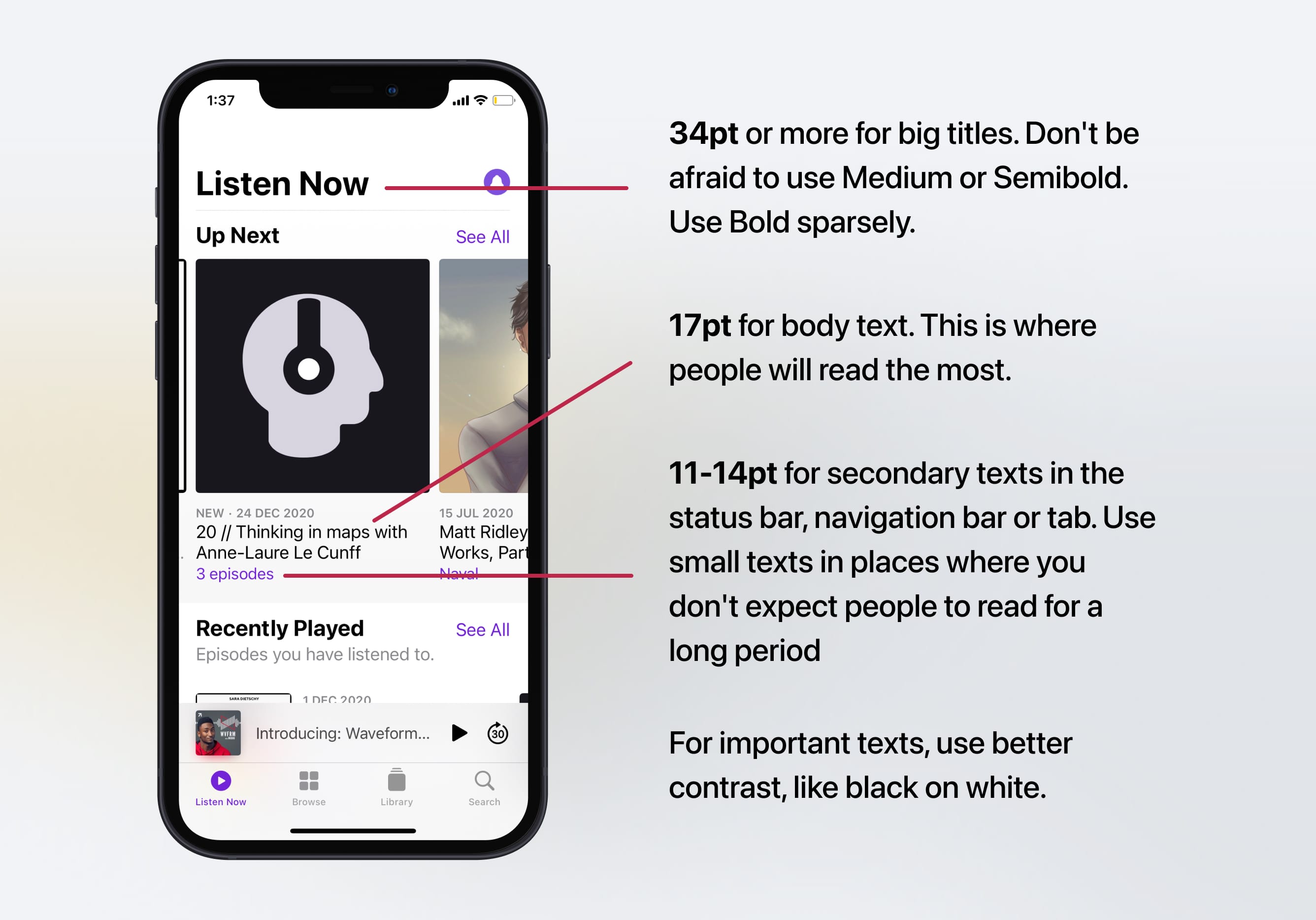
The general rule is 44pt for buttons and 12pt for small text, 17pt for body text and 20pt+ for titles.
Spacing and Alignment
A general rule is to have a minimum padding or margin of 8pt. This creates enough breathing room, which makes the layout easier to scan and the text more readable. Also, UI elements should be aligned and texts should have the same baseline position.
Modals
The Alert dialog is used for conveying critical information and prompting quick actions. Alerts should be kept minimal and exiting must be obvious.
Line Height
The line height should be between 120% to 145% of the font size. In the image below, the right example has a line height that equals the font size (100%). In the left, I applied a 145% scale. The difference is substantial. Now, multiply that quantity of words by 10 and you get an idea of how frustrating it can be to have to read such condensed text.
![]()
45-90 Characters Per Line
When your line is too long, the reader will have a hard time focusing. The overwhelming amount of text per line wears them off, because each jump to a new line gives excitement and that happens less when lines are too long.
![]()
Make the text readable
Titles should be big and well-contrasted. Captions should be short and easy to glance. The body texts should be well-spaced and not too long per line to avoid reading fatigue.
Body texts should also have a minimum size of 11pt. The optimal size for reading is 17pt to 19 pt. Screen titles should be sized to 34 pt or more while body titles should be set at 20 pt to 30 pt. Align texts with other elements to make them easy to scan. Finally, use black or dark gray against a light background for the best contrast.

Designing in 1x
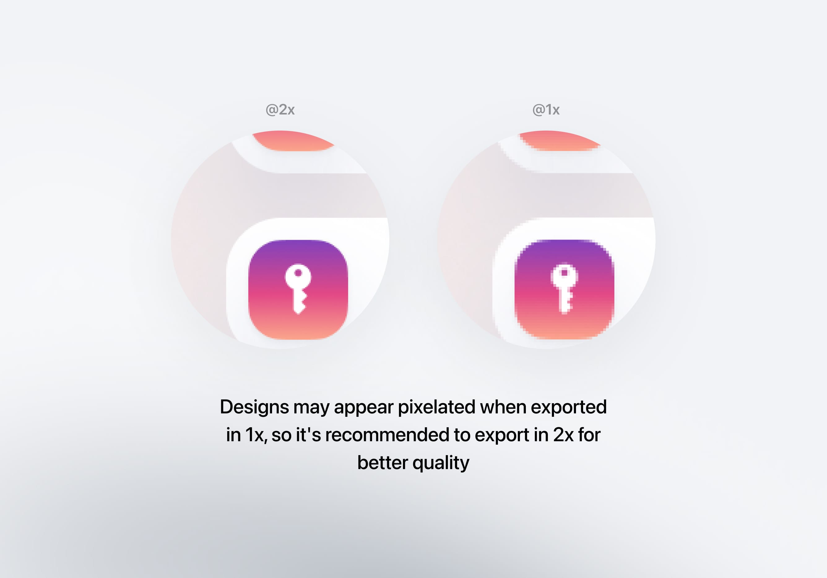
When you're designing, you need to be aware of the pixel density that you're designing in. Ever since the introduction of @3x screens (iPhone 8 Plus), most designers are going back to designing in 1x. That way, exporting assets for all the pixel densities is easier and far more accurate. For each asset, you need to create @1x, @2x and @3x files, so that they work on all iPhones and iPad devices.

Animations
Animations make your applications more visually pleasing. However, having an excess of animations might cause performance issues. Keep in mind to use these moderately so as not to affect the user experience negatively. Animations should enhance the app experience. Good animations should provide feedback on taps and gestures, and give a sense of direct manipulation.
![]()
Touch Targets
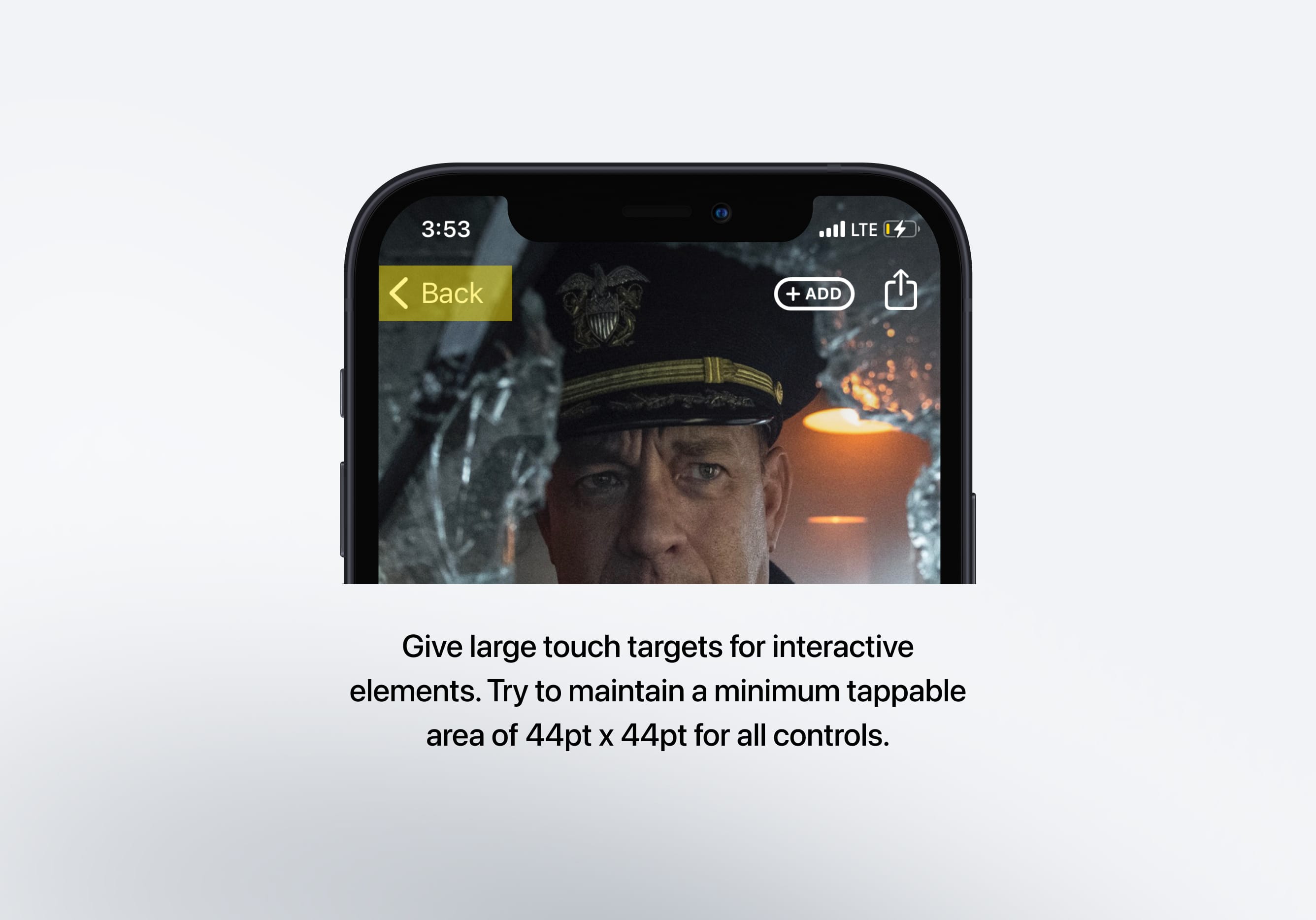
Interactive elements such as buttons should have an appropriate size so that the user can accurately tap the target with their finger. The general rule is 44pt for buttons and 12pt for small text, 17pt for body text and 20pt+ for titles. Interacting with these elements should feel natural to the user.

Color Contrast
Colors shouldn’t be in the way of legibility. Contrast is needed to allow comfortable reading and to immerse the viewer. For good contrast, use opposite ends: white against black, light blue against dark blue, high brightness against low brightness.
![]()
Giving Feedback
It is important to provide feedback to users especially when they perform an action. Feedback can help a user understand either the result of the action performed or the steps they should proceed with next. A good example would be showing a loading spinner when the data is loading just so the user doesn't keep wondering what's happening while they wait.
Learn with videos and source files. Available to Pro subscribers only.
Purchase includes access to 50+ courses, 320+ premium tutorials, 300+ hours of videos, source files and certificates.
Templates and source code
Download source files
Download the videos and assets to refer and learn offline without interuption.
Design template
Source code for all sections
Video files, ePub and subtitles
ios-design-handbook-dos-and-donts
1
Intro to iOS 14 Design
A complete guide to designing for iOS 14 with videos, examples and design files
4:13
2
iOS Colors
Learn how to work with colors in iOS 14
5:28
3
Typography and Dynamic Type
Learn to make the content clear and readable
5:33
4
Background Blur and Gradients
Creating contrast between contents using blurs and apply gradients from analogous colors
4:19
5
Adaptive Layout
Learn to make your designs adaptive to different device screen sizes and orientation
4:19
6
Do's and Don'ts
Things to keep in mind while designing for iOS
6:52
7
Design for Touch
Keeping your content reachable using different touch techniques
7:46
8
iOS Native UI Elements
Learn and benefit from using Apple's UI resources
8:10
9
iOS Icons
Learn how to find great icons and customize them
3:44
10
Design for iPad
How bigger screens affect your design
8:11
11
Design the Sidebar
How to design a sidebar for iPad
7:16
12
Design Widgets
Displaying important and useful information using widgets for quick glances
6:31
13
Animations
Good animations enhance, bad animations distract
5:23
14
App Clips
Make use of a specific feature in your app through app clips
7:05
15
Design for Apple Watch
Designing for people on the go
6:16
16
Modals
Provide more focused experience by presenting your content in a temporary modal view
6:17
17
Onboarding
Learn to design meaningful experiences with clear onboarding flows and patterns
6:51
18
Launch Screen
Hint users about loading content through launch screens
5:35
19
Design for Accessibility
Basic rules and system to improve app accessibility
4:12
20
Design for macOS Big Sur
Designing an app with translucency and sidebar layout for macOS Big Sur
6:31
Meet the instructor
We all try to be consistent with our way of teaching step-by-step, providing source files and prioritizing design in our courses.
Surya Anand
Designer
Curious about learning to design
3 courses - 10 hours

iOS Design Handbook
A complete guide to designing for iOS 14 with videos, examples and design files
2 hrs

UI Design Handbook
A comprehensive guide to the best tips and tricks for UI design. Free tutorials for learning user interface design.
2 hrs

Figma Handbook
A comprehensive guide to the best tips and tricks in Figma. Not affiliated with or endorsed by Figma, Inc.
6 hrs
