
Background Blur and Gradients
Add to favorites
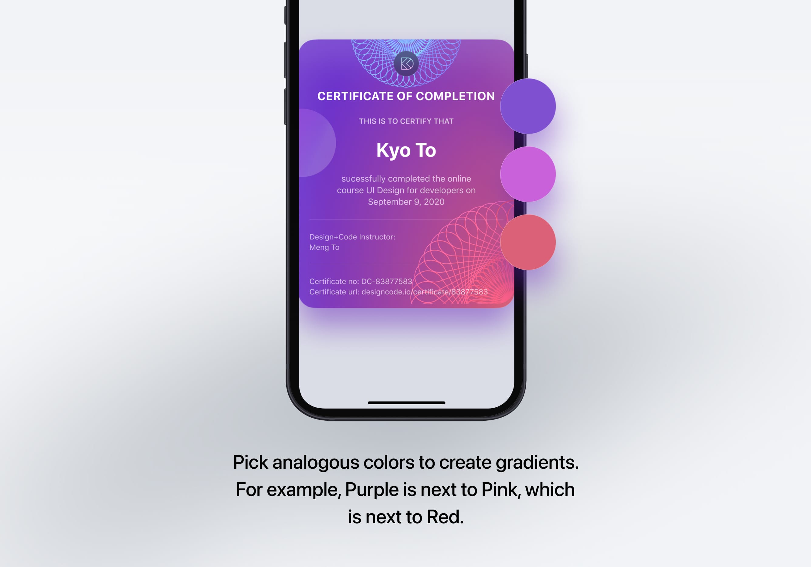
Creating contrast between contents using blurs and apply gradients from analogous colors
iOS Design Handbook
1
Intro to iOS 14 Design
4:13
2
iOS Colors
5:28
3
Typography and Dynamic Type
5:33
4
Background Blur and Gradients
4:19
5
Adaptive Layout
4:19
6
Do's and Don'ts
6:52
7
Design for Touch
7:46
8
iOS Native UI Elements
8:10
9
iOS Icons
3:44
10
Design for iPad
8:11
11
Design the Sidebar
7:16
12
Design Widgets
6:31
13
Animations
5:23
14
App Clips
7:05
15
Design for Apple Watch
6:16
16
Modals
6:17
17
Onboarding
6:51
18
Launch Screen
5:35
19
Design for Accessibility
4:12
20
Design for macOS Big Sur
6:31
Where to Use Background Blur
Unless there is overlaying content, you shouldn't use Blurs everywhere. There are a few key places that you should use Blurs to direct user's attention to the important Information. Most often, there is enough contrast between background and foreground content; this is enough. It's about finding the right places to use rather than using it throughout.
To Increase Contrast
Often, when we have to display texts over an image, legibility takes a hit back. Using background blur, we can quickly resolve this problem and increase the contrast between the text content and the background image.

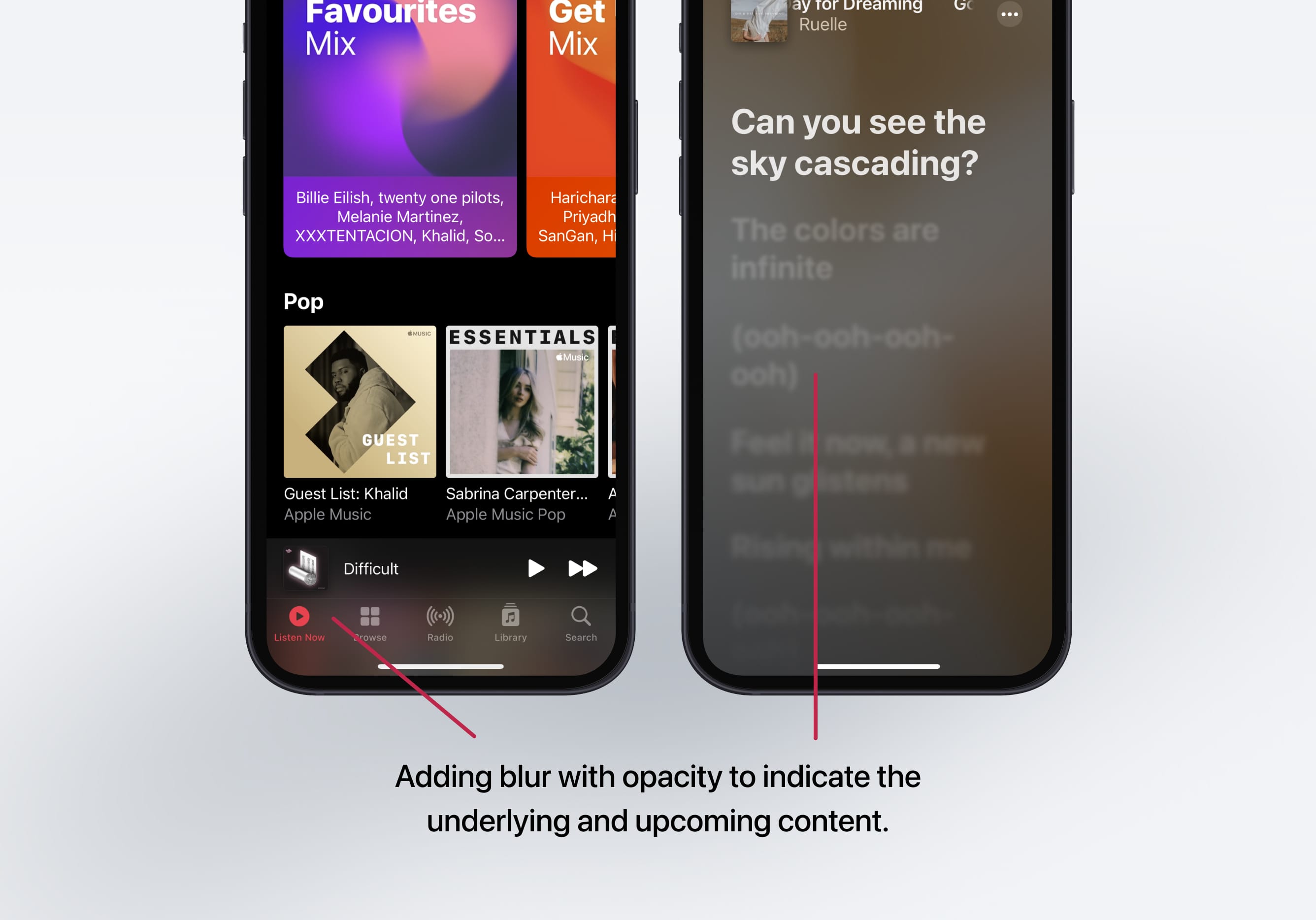
To Indicate
Anything that requires a bit of effort but rewarding or beneficial to the user is always a win. You can make use of the Background Blur to hint users about the underlying and imminent content. This is a great way to enhance the user experience of your app.
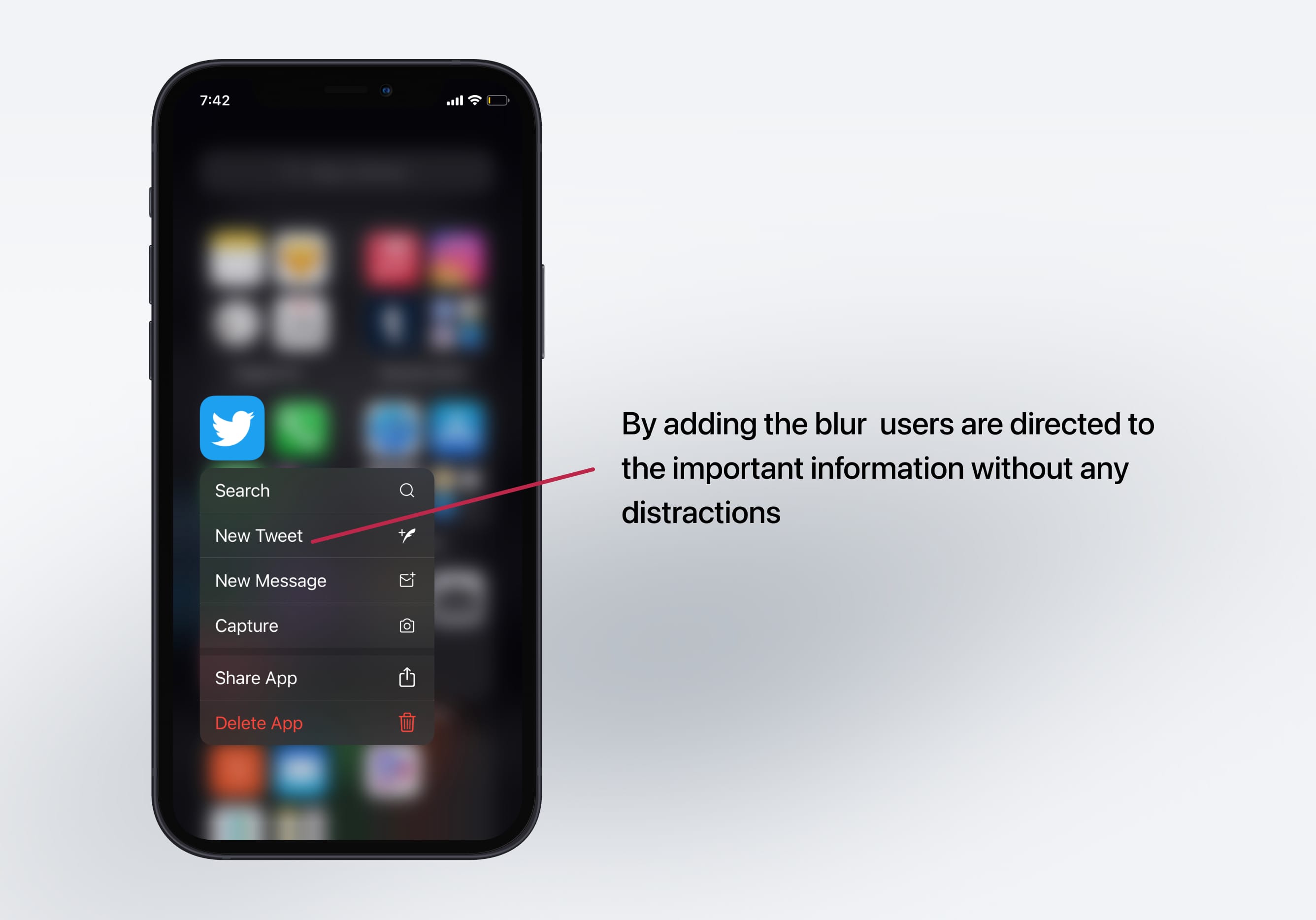
To bring focus
By adding a simple blur, you can direct users to the important content by eliminating everything surrounding it subtly.
System-Defined Materials
Apple provides materials designed for a specific purpose. For example, materials exist for matching the default theme. These materials have the right amount of translucency, blurring, and vibrancy values applied to make it easier for you to choose from based on what you need.

Vibrancy
Vibrancy increases user's visual perception by either making UI elements darker or brighter by altering the color's saturation value. Vibrant UI elements like labels and fills work well with iOS materials. Apple provides several vibrancy levels ranging from highest contrast to lowest, and pairing them with the right material is key to maintain legibility.
Dynamic
Using a Background Blur with an opacity quickly captures the design's look and feel. It also adapts to the background changes accordingly while maintaining consistency without making any changes manually to the foreground content. This doesn't happen when using a solid color as a separator.

Gradients
Gradients enable your design to leave a better impression compared to solid colors. Gradients are often used everywhere. The key is to find the right balance between not having any gradients at all to over-saturating your app with gradients.

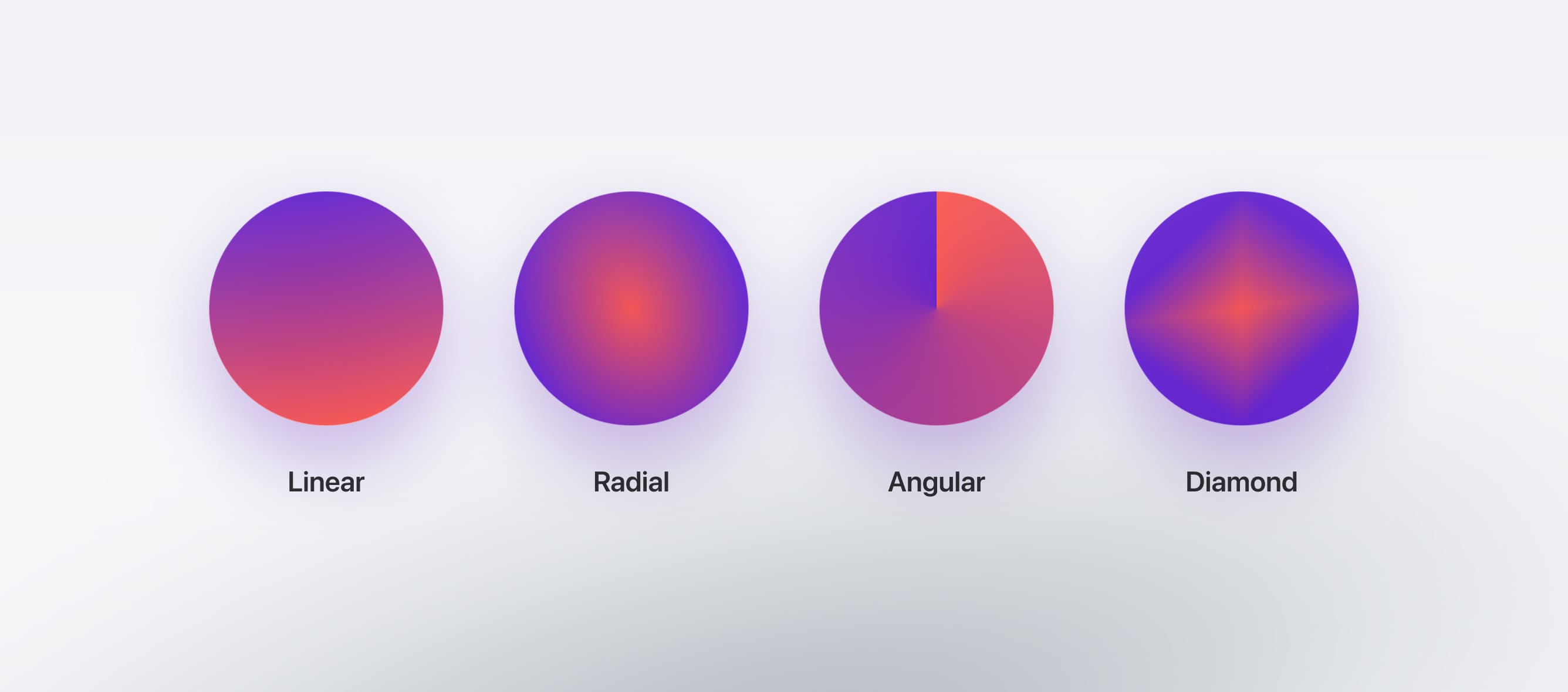
Gradient Styles
Linear gradient is the most common and widely used gradient out there. In a linear gradient, the colors of the gradient blend from start color to end color in a straight line
Radial gradient is the one in which the color has one starting point and then it emanates outwards
Angle gradient you can use angles to define the direction of your gradient. Starts counter clockwise and the space between the start and the end points defines the angle.
Creating better Gradients
Working with gradients can be a little tricky because it’s really easy to go overboard. When working with gradients, I recommend picking analogous colors meaning to choose nearby colors to your main color or have colors with different saturation levels, which makes the gradient look more subtle and natural.
Resources
These resources will be really helpful to you when working with gradients!
Learn with videos and source files. Available to Pro subscribers only.
Purchase includes access to 50+ courses, 320+ premium tutorials, 300+ hours of videos, source files and certificates.
Templates and source code
Download source files
Download the videos and assets to refer and learn offline without interuption.
Design template
Source code for all sections
Video files, ePub and subtitles
ios-design-handbook-background-blur-and-gradients
1
Intro to iOS 14 Design
A complete guide to designing for iOS 14 with videos, examples and design files
4:13
2
iOS Colors
Learn how to work with colors in iOS 14
5:28
3
Typography and Dynamic Type
Learn to make the content clear and readable
5:33
4
Background Blur and Gradients
Creating contrast between contents using blurs and apply gradients from analogous colors
4:19
5
Adaptive Layout
Learn to make your designs adaptive to different device screen sizes and orientation
4:19
6
Do's and Don'ts
Things to keep in mind while designing for iOS
6:52
7
Design for Touch
Keeping your content reachable using different touch techniques
7:46
8
iOS Native UI Elements
Learn and benefit from using Apple's UI resources
8:10
9
iOS Icons
Learn how to find great icons and customize them
3:44
10
Design for iPad
How bigger screens affect your design
8:11
11
Design the Sidebar
How to design a sidebar for iPad
7:16
12
Design Widgets
Displaying important and useful information using widgets for quick glances
6:31
13
Animations
Good animations enhance, bad animations distract
5:23
14
App Clips
Make use of a specific feature in your app through app clips
7:05
15
Design for Apple Watch
Designing for people on the go
6:16
16
Modals
Provide more focused experience by presenting your content in a temporary modal view
6:17
17
Onboarding
Learn to design meaningful experiences with clear onboarding flows and patterns
6:51
18
Launch Screen
Hint users about loading content through launch screens
5:35
19
Design for Accessibility
Basic rules and system to improve app accessibility
4:12
20
Design for macOS Big Sur
Designing an app with translucency and sidebar layout for macOS Big Sur
6:31
Meet the instructor
We all try to be consistent with our way of teaching step-by-step, providing source files and prioritizing design in our courses.
Surya Anand
Designer
Curious about learning to design
3 courses - 10 hours
iOS Design Handbook
A complete guide to designing for iOS 14 with videos, examples and design files
2 hrs
UI Design Handbook
A comprehensive guide to the best tips and tricks for UI design. Free tutorials for learning user interface design.
2 hrs
Figma Handbook
A comprehensive guide to the best tips and tricks in Figma. Not affiliated with or endorsed by Figma, Inc.
6 hrs