
Adaptive Layout
Add to favorites
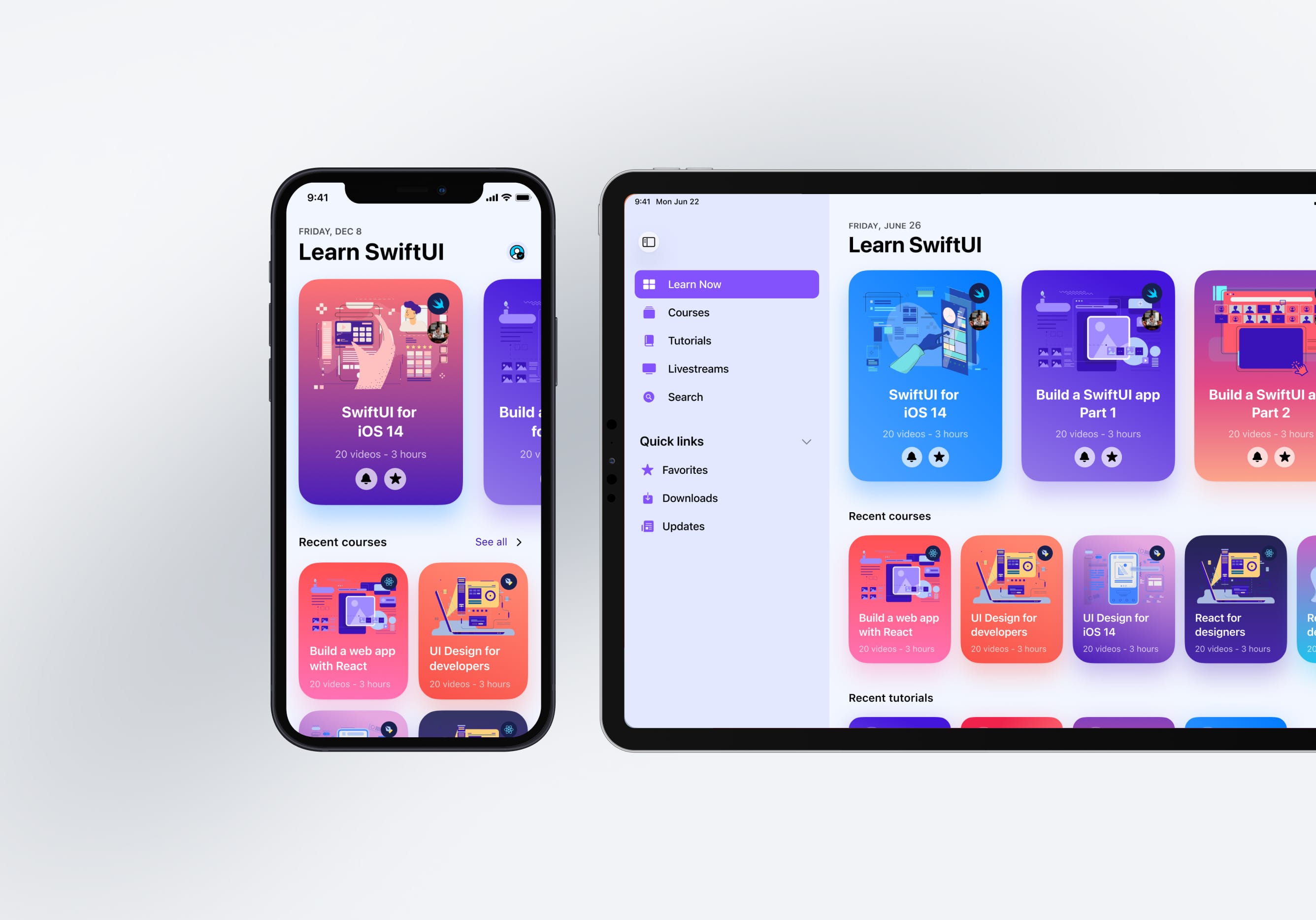
Learn to make your designs adaptive to different device screen sizes and orientation
iOS Design Handbook
1
Intro to iOS 14 Design
4:13
2
iOS Colors
5:28
3
Typography and Dynamic Type
5:33
4
Background Blur and Gradients
4:19
5
Adaptive Layout
4:19
6
Do's and Don'ts
6:52
7
Design for Touch
7:46
8
iOS Native UI Elements
8:10
9
iOS Icons
3:44
10
Design for iPad
8:11
11
Design the Sidebar
7:16
12
Design Widgets
6:31
13
Animations
5:23
14
App Clips
7:05
15
Design for Apple Watch
6:16
16
Modals
6:17
17
Onboarding
6:51
18
Launch Screen
5:35
19
Design for Accessibility
4:12
20
Design for macOS Big Sur
6:31
Why adaptive design?
Adaptive design is crucial as it allows your application to reach a wider audience. As you create designs that are adaptive irrespective of the screen size or the device the user is using, you get more control regarding how you'd like your layout to look like across devices such as iPhones or iPads.
Screen Size
When it comes to iOS devices, you've a variety of screen sizes. Ensuring that your application works spectacularly across all these is of utmost importance. Designing your content in a manner that it adapts well irrespective of the screen size is something you'll need to do is you want your app to be used by a wider audience.

Screen Orientation
In the above section, we talked about the importance of designing a layout that is adaptive across multiple screen sizes, but what about when the user switches to landscape mode from portrait mode or vice-versa? This is another thing you'll have to take into consideration, make sure that your app supports both these orientations.
Landscape Mode
In landscape, the status bar is hidden to maximize content space. The navigation bar is reduced to 32 pt, the tab bar to 30 pt and the home indicator, to 23 pt. While most users won’t switch to landscape mode on the iPhone, there are still important scenarios for this usage. For example, for viewing a landscape photo, a full-screen video, or for reading an article with larger texts. After they’re finished, it’s counter intuitive to have to switch back to portrait, especially if the device is docked or held comfortably in a landscape position.
If your app is already adaptive for iPads, why not support iPhone’s landscape as well? A large gain with minimal effort, as most modern apps are designed with adaptive layouts in mind.
Do not exactly translate your designs for landscape mode. Focus on only having the important content/controls on the viewport. Place elements on either side of the screen. Aim not to cover the entire screen to make it easier for users to navigate. As you see in the example, the modal does not take the screen's entire width in landscape mode but just utilizing a small portion.

Size Classes
Size Classes allow you to categorize screen widths and heights, and set conditions based on those combinations. Since the layout can be pretty different between Portrait and Landscape, or between iPhone and iPad, Size Classes are essential for customizing your layout beyond the normal Auto Layout constraints. There are 3 types of Size Classes for both width and height: Compact, Regular and Any. By combining these, you will affect several devices at once. For example, Compact (width) x Regular (height) will target all iPhones in Portrait, but won’t affect Landscape or iPad.

Auto Layout
Almost all the design tools out there give you access to the auto layout feature. As the name suggests, auto layout is dynamic and adjusts the container height when you're adding or removing child elements. This is an excellent starting point when it comes to designing adaptive layout.
Constraints
Again, this is another feature that you get access to with most design tools if not all. Settings constraints while designing any application ensures that the design is highly adaptive, no matter what screen size it is.
Rounded Corners
Content clipping might occur for some corners in the iPhones. You're not likely to face this issue if you're hiding the status bar or home indicator since they cover the corner areas. However, for apps that are used mostly in full-screen, it is important to ensure that there is enough margin in the corners. A radius of around 16pt is recommended for your buttons for perfectly rounded corners.

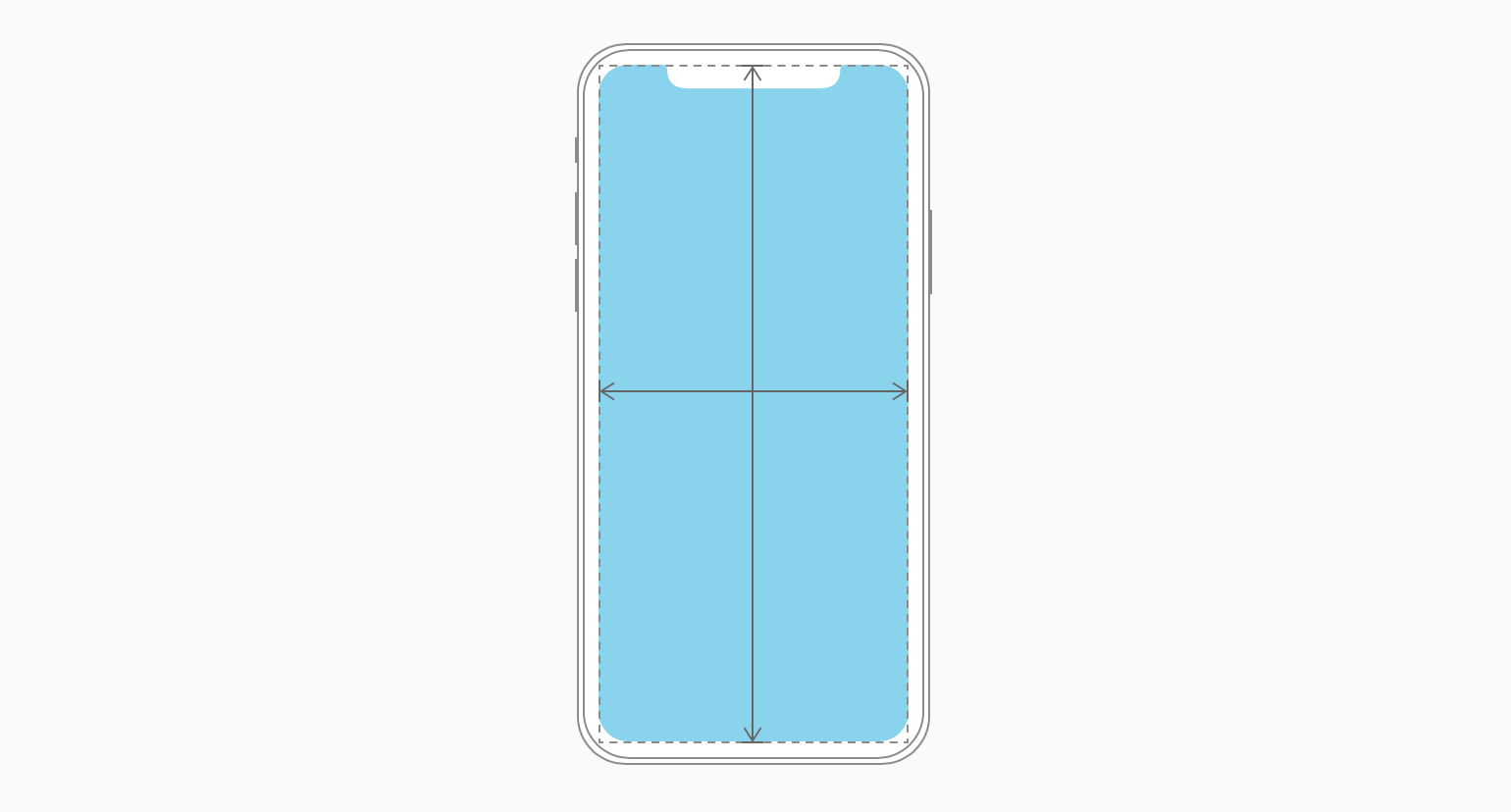
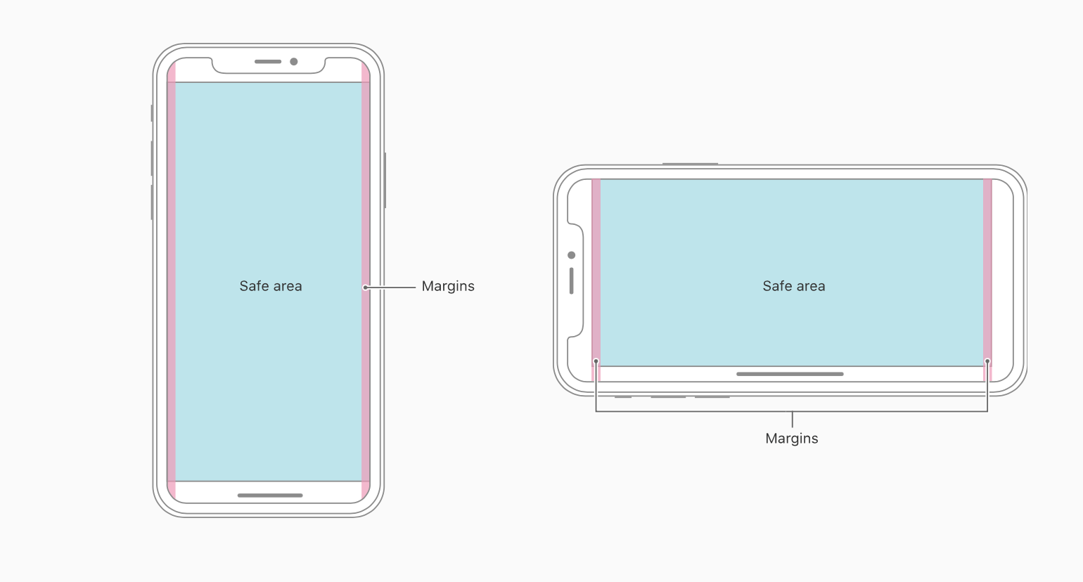
Safe Area
When designing for the iPhone, the rounded corners and the notch can clip the content. That should be avoided at all time. Using the safe area layout guide, you can push the content where the notch wouldn’t be, thus ensuring that no clipping will occur.
In general, backgrounds should not follow the safe area guide, while content such as texts, images and buttons should follow these guides.
Dynamic Type
Apple provides you access to dynamic font presets, as shown in this image. Like this, if you set your text to Body, and enable Dynamic Type, the system will automatically adapt by increasing the size based on the user’s preferences.

Dynamic System Colors
In addition to system colors, iOS gives you access to certain dynamic system colors that adapt to both light and dark mode perfectly. These include colors for links, labels, placeholder text, separators, etc. A more comprehensive list can be found in the documentation.

Preview Layout
Finally, what better way to test whether your layout works perfectly than to preview the layout for multiple screen sizes? I highly recommend doing this as it will allow you to check if there are any issues with your layout, and if there are, you can correct those right away.
Additional Layout Considerations
Make sure that your app utilises the full width and height of the screen, don't leave any blackspaces occupying your designs. The full-screen iPhone models have a taller status bar compared to other models. Make sure to dynamically position your content in this case. Read more about Adaptivity on Apple's Human Interface Guidelines.

Learn with videos and source files. Available to Pro subscribers only.
Purchase includes access to 50+ courses, 320+ premium tutorials, 300+ hours of videos, source files and certificates.
Templates and source code
Download source files
Download the videos and assets to refer and learn offline without interuption.
Design template
Source code for all sections
Video files, ePub and subtitles
ios-design-handbook-adaptive-layout
1
Intro to iOS 14 Design
A complete guide to designing for iOS 14 with videos, examples and design files
4:13
2
iOS Colors
Learn how to work with colors in iOS 14
5:28
3
Typography and Dynamic Type
Learn to make the content clear and readable
5:33
4
Background Blur and Gradients
Creating contrast between contents using blurs and apply gradients from analogous colors
4:19
5
Adaptive Layout
Learn to make your designs adaptive to different device screen sizes and orientation
4:19
6
Do's and Don'ts
Things to keep in mind while designing for iOS
6:52
7
Design for Touch
Keeping your content reachable using different touch techniques
7:46
8
iOS Native UI Elements
Learn and benefit from using Apple's UI resources
8:10
9
iOS Icons
Learn how to find great icons and customize them
3:44
10
Design for iPad
How bigger screens affect your design
8:11
11
Design the Sidebar
How to design a sidebar for iPad
7:16
12
Design Widgets
Displaying important and useful information using widgets for quick glances
6:31
13
Animations
Good animations enhance, bad animations distract
5:23
14
App Clips
Make use of a specific feature in your app through app clips
7:05
15
Design for Apple Watch
Designing for people on the go
6:16
16
Modals
Provide more focused experience by presenting your content in a temporary modal view
6:17
17
Onboarding
Learn to design meaningful experiences with clear onboarding flows and patterns
6:51
18
Launch Screen
Hint users about loading content through launch screens
5:35
19
Design for Accessibility
Basic rules and system to improve app accessibility
4:12
20
Design for macOS Big Sur
Designing an app with translucency and sidebar layout for macOS Big Sur
6:31
Meet the instructor
We all try to be consistent with our way of teaching step-by-step, providing source files and prioritizing design in our courses.
Surya Anand
Designer
Curious about learning to design
3 courses - 10 hours
iOS Design Handbook
A complete guide to designing for iOS 14 with videos, examples and design files
2 hrs
UI Design Handbook
A comprehensive guide to the best tips and tricks for UI design. Free tutorials for learning user interface design.
2 hrs
Figma Handbook
A comprehensive guide to the best tips and tricks in Figma. Not affiliated with or endorsed by Figma, Inc.
6 hrs