Design for Web
Add to favorites
Designing a Website from Scratch
Play video
Learn Sketch
1
Learn Sketch
23:28
2
Powerful Start in Sketch
22:49
3
Design for iOS 11
31:30
4
Design for iPhone X
28:23
5
Designing for iPad
11:36
6
Design for Web
25:12
7
Design for Web Part 2
25:11
8
Tricks and Keyboard Shortcuts
20:43
9
Sketch Plugins
12:09
10
Nested Symbols
9:14
11
Sketch Libraries
7:00
12
Version Control
18:53
13
Working with Data
10:29
14
Adaptive Layouts
7:33
15
Working with Vector
20:12
16
Exporting Assets
13:44
17
Styleguide and Handoff
9:11
18
Advanced Techniques
12:40
19
Intro to Framer
27:51
20
Previewing and Sharing
7:22
21
Prototyping in Keynote
3:33
Navigation Menu
The website doesn't have Tab Bar. A navigation menu is always on top of the screen and this is the convention style and behavior adapted by users. Most importantly, we should design aneasy-to-use and intuitive navigation menu for the users.

Scrolling
Scrolling is common also for websites too. Some designers are worried that some of the users don’t like to scroll , but the research results show that everybody scrolls. For example, Parallax Scrolling is one of the famous scrolling patterns, it’s always used by Apple on their product details page. We also are fond for it and you can see it on our Design+Code website.
Scrolling is a continuation; clicking is a decision. — Joshua Porter
Typography
Another thing to focus on is Typography because it’s one of the most noticeable elements in your design. For iOS design, there is a typography rule of 17px for the body text and 34pt for the large title. The web is using a similar strategy, but the base body text is 16px, this is easy for web development because of 1em = 16px. You can learn more about Web Typography here and here. There is no maximum size for the large title, and you can go crazy until 200px font size. There’s some websites using large titles, and the results are fantastic!
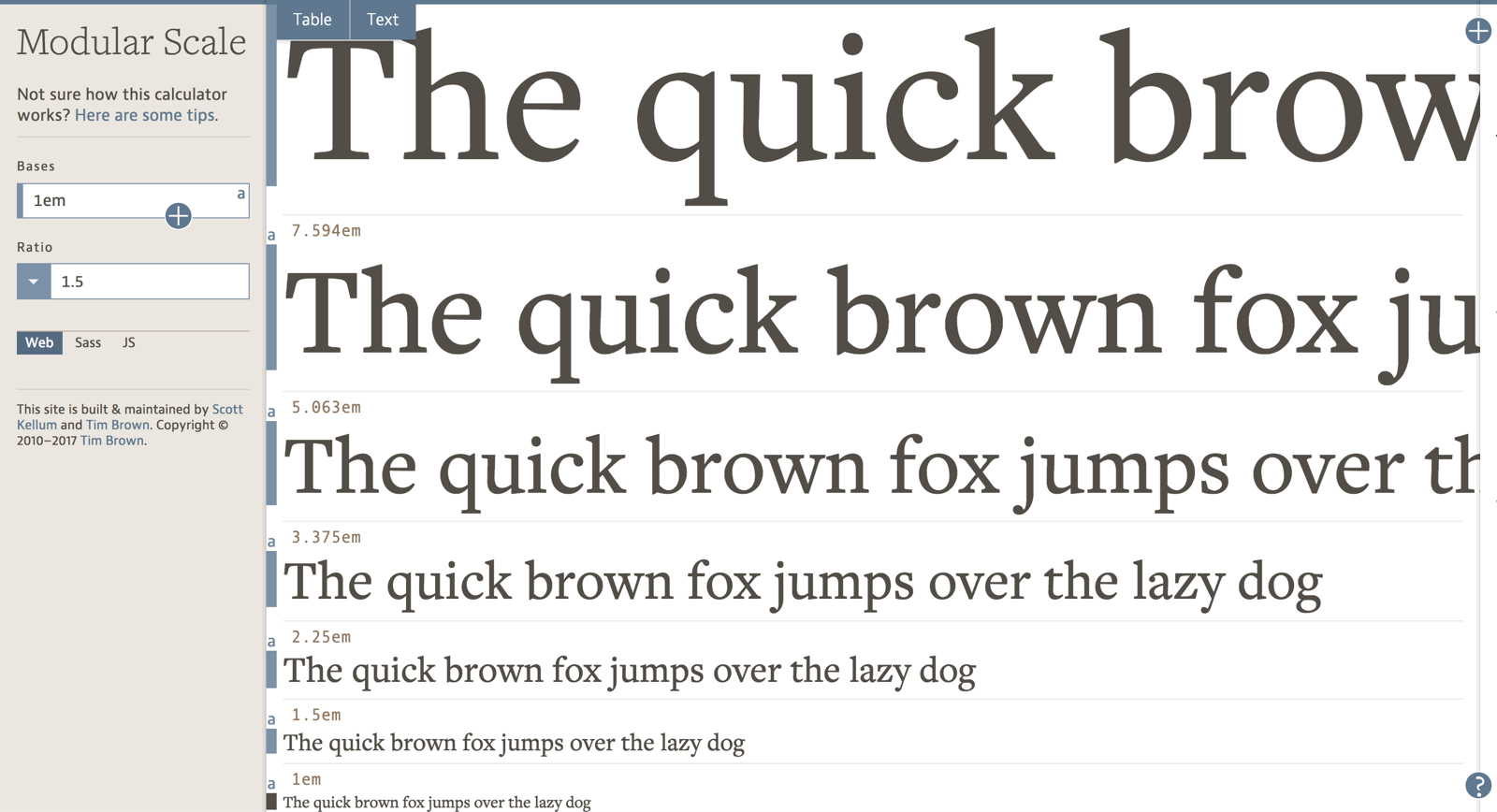
A Wild Wild West for Web
Apple has a Human Interface Guideline for iOS design, but there’s not an actual standard guideline for Web. So we’re free to use any techniques that gives the wow effect yet is user-friendly. Primarily your design should provide a similar experience, regardless of the device they are using.
Enough talking, let’s start designing the Design+Code landing page! You will need to download the assets required to follow this tutorial.
Grid System
Setting up a Grid System for your web design is good practice and very helpful when you're designing for various screen sizes. It will help web developers to match your design. There are some commonly used Grid Systems you can refer to the web, from 8 columns up to 16 columns grid. If you’re not sure which Grid System to use, you can stick to the 960 Grid System that’s mostly used for web. Otherwise, you can go with the default desktop 12 columns grid from the Bootstrap Framework. Ultimately, you can customize your own Grid System for your design, and there’s no limitation to this.

Regular Grid & Layout Grid
Let’s create an Artboard in Sketch by pressing A. Choose Responsive Web from the preset drop-down menu and select the Desktop HD (1440 x 1024) as our Artboard for this tutorial. Select the Artboard, then go to the top-right of the Sketch app Toolbar, you will see the View drop-down button there and click on it. The Grid Settings is set Regular Grid for the Artboard. We won’t use Regular Grid because Layout Grid is a better option to apply in the Grid System.
Choose the Layout Settings and then, a modal will be slide down and you can define columns and rows. When grids are applied to the Artboard, any objects will snap to the grid when you move it. You also can change the Colors of the grid and the Visuals of the grid to Fill Grid or Stroke Outline. Once you’ve set up a Layout Grid, select the Artboard and click on the View in the Toolbar and choose Show Layout to view the Grids on your Artboard. Or, you can simply press Control L to toggle the Layout Grid.
Using Rulers to Customize Grids
We’re using content width concept for the homepage Grid System. We have 1000px, 800px, 640px and 480px of content width. You can use Rulers to draw the guidelines and treat it as the custom grids to achieve the Grid System.
Let’s draw four rectangles sized at 1000px, 800px, 640px and 480px on the Artboard respectively. Then, align them to the center of the Artboard. Press Control R to activate the Rulers and select the first 1000px rectangle and hover to the top of the Rulers bar. The guideline will be snap automatically to the edge of the rectangle, click on the top Rulers bar, and a guideline will be created. Repeat the same method to create guidelines for all the left and right edges of the rectangles. Now, you have a set of custom Grid System for your design, and we are going to use this guideline quite often in this tutorial.
Hero Title
In the Hero Section there is Logo, Top Navigation Menu, Hero Title, iPhone X Mockup, Video Button, Stats and Background image . You can get most of the assets from the **assets folder ** that you have downloaded.
Top Navigation Menu
The navigation menu on the Design+Code website is relatively simple. We only have a logo on the top-left. Login and Pre-order text button is on the top-right. The Design+Code logo serves as a return to homepage button too.
First, draw a rectangle by pressing R, set it to full width and set the height to 800px. We will use this rectangle as a container for the Hero Section.
Let’s insert the Design+Code logo at the top-left of the Artboard and resize it to 44 x 44px. Give it a margin of 40px between the logo and the artboard. Then on the right side, insert two texts “Login” and “Pre-order” by pressing T. Set both of the font size to 20px SF Pro Display Medium in white. Give 40px right margin for Pre-order and also 40px gap between Login and Pre-order. Vertical-center-align both of the text layer with the logo. You can draw a rectangle and use it as a bound for the logo and the two buttons, uncheck the Fills because we want it to be transparent. Group the logo, the two buttons and the bound then, name it “Top Navigation”.
Background Image and iPhone X Mockup
Copy and paste the background-1.jpg to the Artboard. Resize the background image width to 1440px to fill the width of the homepage. Copy the iphone-x.png image and paste it above the background image then, place it within the 640px grid. You will notice that the background image height is taller than the Base layer. You can right-click the Base layer and set it as a Mask. Group all the Top Navigation, Background image, iPhone X mockup and the Mask then, name it “Hero Title”.
Hero Text and Text Style
There is a text file that has contents for the hero section. Copy the text “Learn to design & code for iOS 11” and paste in the Hero Title group within the 640px grid. Set the font size to 64px SF Pro Display Semibold and the colour to white. Resize the width of the text so that it won’t overlap with the iPhone X mockup. Notice the text is too flat so, we can add Shadows to give the text more depth. Select the text layer then, go to the Inspector panel and you can find Shadows in one of the options below. Click on the + icon and change the color to #5E37C4 with 100% opacity. Also, change the values to X:0, Y:20, Blur:40, Spread:0. Now, the Hero Text stands out more than the previous style.
We will use this header style for other sections too. To keep the style consistency, we can create a Text Style. Once the Text Style is set, you can apply it to other text layers to get the same style across the document. Let’s say you have multiple text layers that are using the same Text Style, and you change one of its properties, you can update them with ease by just clicking the Refresh icon besides Text Style. Let’s select the text layer, go to Inspector panel and click the No Text Style drop-down, choose the Create New Text Style from the menu. Just name it as “H1”.
Stats
Next, is the Design+Code statistics. We can attract people by placing those figures above the fold. All of these Stats are real data from Design+Code! You can copy the stats text in the assets folder 1. Go to Hero Title then, content text file. There are three stats content, and each of them contains three text layers. Let’s do the first stat, below is the font value for each of them:
- Watch: 15px, SF Pro Text Medium, White with 60% opacity
- 44 hours: 30px, SF Pro Display Bold, White
- of video lessons: 15px, SF Pro Text Medium, White
Stack these three layers from top to bottom and align them to the left. Next, draw a line with 130px of width, 3px of height , 3px of Radius and place it under the “of video lessons” text layer with an 8px gap. Change the color to gradient by clicking on the Fills in the Inspector panel then, choose the second option: Linear Gradient. Zoom in the line and move the top dot to the left and bottom dot to the right, with this, the gradients will appear from left to right. Set the left gradient color to #C86DD7 and the right color to #E95054. Group the three text layer as well as the line and name it “Stat”. Place them within the 640px grid with a margin-bottom of 40px.
Convert Stat to Symbol
We can convert the Stat group to Symbol because it is going to be used for other statistic content too. Select the Stat group and click on Create Symbol in the Toolbar. Now, you can duplicate the Stat Symbol and put in the text accordingly.
How to Choose Gradient Colors
If you cannot decide on what gradients to apply, you can try to decide on one color first. Then, change the value of H, which is Hue in the Color Picker. By default, the Color Picker is in RGB values, but we prefer to set the color with HSB. You can toggle between the RGB and HSB by hovering over the RGB/HSB label. Click on it and it will toggle accordingly. Let’s say you have decided the first color with #C86DD7, then select another gradient dot and set it as #C86DD7 too. Now, you can increase or decrease the Hue value to find the perfect gradient color that you like. These are our favourite tips for choosing gradient colors. You can also go to the Gradient website to use the gradient color you want.
Hero Body
The Hero Body section has a short description, a call-to-action button, and other discount info. Place this section will place within the 480px grid.
Let’s increase the height of the Artboard first. Then, insert the image-book.svg and image-book-shadow.png from the asset folder 2. Hero Body. Place the Book image in the center of the Artboard with a 120px top margin. Then, put the Book Shadow behind the Book and adjust accordingly.
Next, insert the text which you can get from the assets folder. Below are the Typeface, Weight, Font Size and Color for each of them:
- An interactive…: 32px, SF Pro Display Semibold, Black, Center Align
- Early access and Launch 11.14: 24px, SF Pro Display Regular, #888888, Center Align
- $12.99… and Plus, get 20% off…: 20px, SF Pro Display Regular, #888888, Center Align
For “An interactive…”, “$12.99…” and “Plus, get 20% off…”, resize their text container width to 480px, so that it is easy to snap within the 480px grid. For “Early access” and “Launch 11.14”, set their text container width to 240px, which is half compared to other text layers then, arrange them side by side. Give all these layers a top and bottom margins of 24px. Strike a line for the text “$12.99/month” and “$150” because this is the future pricing for Design+Code when the pre-order period is over. Select the text and go to the Inspector panel, click on the Option and choose the fourth option which is the Strikeline icon. Set the “Sketch”, “Angle” and “Paypal” text to bold because it will be a clickable link on the actual website.
Call-to-Action Button
The last thing for Hero Body section is the call-to-action button. Insert the text “Pre-order for $50” and set its font to 24px SF Pro Display Semibold white and center align. Draw a rectangle with 60px height and 30px of radius. Vertical-align the text in the middle of the rectangle and increase the rectangle width so that the text has 30px margins on the left and right.
Let’s give the button a Linear Gradient. Move the top dot to the button top-left and the bottom dot to bottom-right. The color on the left is #9C6FFF and on the right is #5334F5. Add a Shadow and set to black color with 15% opacity, X:0, Y:10, Blur:20 and Spread:0. Now the call-to-action button is more prominent. Lastly, group the rectangle and the “Pre-order for $50” text and name it “CTA”, an abbreviation for “Call-to-Action”. Then, align this button with the center of the Artboard and place it in between the “Early Access” and “$12.90…” text. Group all the elements here and name it “Hero Body”.
Demo Section
Next is the Demo section. In this part, we have the video demonstration of the Design+Code iOS app and a few reasons of why people should purchase the book. Since this is a Sketch mockup, we can’t insert a video file into Sketch, but what we can do is add an iPhone X mockup of the app.
Let’s draw a full-width rectangle with 700px for height and give a 120px spacing away from the Hero Body section. Insert the “background-2.jpg” image from the “3. Demo” folder to the top-right of the rectangle and resize it to 1440px width. Select both the rectangle and the image and click on the Mask icon in the Toolbar. Next insert a title in this section which is “Design, code this app.” and apply the H1 Text Style for it. Align the title to the center of the Artboard and 80px of margin-top.
Next, copy the “iphone-x-big.png” mockup and paste on top of the section background image. Align it with the center of the Artboard and leave 40px of margin-top to the title.
Demo Body
Below the iPhone X frame is the placement of contents which will be sitting inside the 640px grid. Insert the first content from the assets folder “3. Demo › content”. For the title, set it to 20px, SF Pro Display Bold, #5856d6 and change the text width to 160px. For the description font, set it to 24px, SF Pro Display Regular, black color and change the width to 448px. For the layer “Why Pre-order?”, give it a 32px margin right of the description. Select both of these text layers and click Align Top, leave a 40px gap between the iPhone X frame. Lastly, group both of the text layers and name it “Demo Reasons”. Then, you can repeat the same workflow for rest of the contents by duplicating the Demo Reasons group. Once you finished, just group them all as “Demo Body”.
Cool, now we have finished the Hero Section, Call-to-Action Section and Demo Section.
In part 2, we will cover the design of the “Chapter Section”, the “Benefits Section” and the “Footer”. Once you will finish part 2, you will have done the Design+Code landing page, so let’s get started!
Templates and source code
Download source files
Download the videos and assets to refer and learn offline without interuption.
Design template
Source code for all sections
Video files, ePub and subtitles
Videos
ePub
Assets
Subtitles
1
Learn Sketch
Introduction to Sketch Basic Tools
23:28
2
Powerful Start in Sketch
Strong Foundations for your Sketch Workflow
22:49
3
Design for iOS 11
Designing an iOS App from scratch in Sketch
31:30
4
Design for iPhone X
Designing and adapting for iPhone X in Sketch
28:23
5
Designing for iPad
Designing an iPad app from Scratch
11:36
6
Design for Web
Designing a Website from Scratch
25:12
7
Design for Web Part 2
Designing a Website from Scratch 2
25:11
8
Tricks and Keyboard Shortcuts
Boost your productivity in Sketch
20:43
9
Sketch Plugins
Essential Sketch Plugins for Designers and Developers
12:09
10
Nested Symbols
Design with More Flexibility by Nesting Symbols
9:14
11
Sketch Libraries
Share Symbols with Other Designers
7:00
12
Version Control
The Github for Designers
18:53
13
Working with Data
Make your design meaningful with real content
10:29
14
Adaptive Layouts
Working with Multiple Resolutions
7:33
15
Working with Vector
Vector Techniques in Sketch
20:12
16
Exporting Assets
Delivering Assets to Multiple Devices in Sketch
13:44
17
Styleguide and Handoff
Consistent design language in your team
9:11
18
Advanced Techniques
Master Sketch with these Tricks
12:40
19
Intro to Framer
Design and Code animations with Framer
27:51
20
Previewing and Sharing
Test drive on your devices
7:22
21
Prototyping in Keynote
Prototyping in Keynote Using Magic Move
3:33
Meet the instructor
We all try to be consistent with our way of teaching step-by-step, providing source files and prioritizing design in our courses.
Meng To
I design, code and write
Meng To is the author of Design+Code. Meng started off his career as a self-taught designer from Montreal and eventually traveled around the world for 2 years as his US VISA was denied. During his travels, he wrote a book which now has 35,000 readers.
40 courses - 194 hours

Master AI Prompting for Stunning UI
Learn how to leverage AI tools like Aura for creating beautiful designs, working with templates, and experimenting with advanced prompts. A concise guide for designers and developers to level up their skills.
10 hrs

Build SwiftUI apps for iOS 18 with Cursor and Xcode
In this course, we'll explore the exciting new features of SwiftUI 6 and Xcode 16 for building iOS 18 apps. From mesh gradients and text animations to ripple effects, you'll learn how to create polished, highly custom apps using the latest workflows. We'll also dive into using Cursor and Claude AI for AI-driven coding, helping you start strong and customize your apps.
5 hrs

Create your Dream Apps with Cursor and Claude AI
Learn to build your dream web apps from the ground up using Cursor, Claude AI, and a suite of powerful AI tools. This course covers everything you need, including React for frontend development, Firebase for backend integration, and Stripe for handling payments. You’ll also dive into advanced AI tools like Claude Artifacts, Galileo AI, v0.dev for UI, Ideogram for design generation, and Cursor Composer for full-scale development.
6 hrs

Build a React Site from Figma to Codux
In this course, you'll learn to build a website from scratch using Codux, starting with a Figma template. You’ll master responsive design, collaborate with developers on a real React project, export CSS from Figma using Locofy, set up breakpoints with media queries, add CSS animations, improve SEO, create multiple pages with React Router, and publish your site. By following best practices, you’ll bridge design and development, improve your web design skills.
2 hrs

Create 3D UI for iOS and visionOS in Spline
Comprehensive 3D Design Course: From Basics to Advanced Techniques for iOS and visionOS using SwiftUI
3 hrs

Master No-Code Web Design with Framer
In this free Framer course, you'll learn to create modern, user-friendly interfaces. Start with dark mode and glass designs, then move from Figma to Framer, using vectors and auto layout for responsive websites. Add animations, interactive buttons, and custom components with code. Finally, you'll craft a design system suitable for teamwork or solo projects, all in a straightforward and practical approach.
4 hrs

Build SwiftUI Apps for iOS 17
In this course, we’ll be exploring the fresh and exciting features of SwiftUI 5! As we craft a variety of iOS apps from the ground up, we'll delve deep into the treasure trove that is SwiftUI's user interface, interactions, and animations.
4 hrs

Build Beautiful Apps with GPT-4 and Midjourney
Design and develop apps using GPT-4 and Midjourney with prompts for SwiftUI, React, CSS, app concepts, icons, and copywriting
4 hrs

Build SwiftUI apps for iOS 16
Create animated and interactive apps using new iOS 16 techniques using SwiftUI 4 and Xcode 14
5 hrs

Build a 3D Site Without Code with Framer
Design and publish a responsive site with 3D animation without writing a single line of code
3 hrs

Create 3D Site with Spline and React
Design and code a landing page with an interactive 3D asset using Spline and CodeSandbox
1 hrs

Build an Animated App with Rive and SwiftUI
Design and code an iOS app with Rive animated assets, icon animations, custom layouts and interactions
3 hrs

Build a SwiftUI app for iOS 15 Part 3
Design and code a SwiftUI 3 app with custom layouts, animations and gestures using Xcode 13, SF Symbols 3, Canvas, Concurrency, Searchable and a whole lot more
4 hrs

Build a SwiftUI app for iOS 15 Part 2
Design and code a SwiftUI 3 app with custom layouts, animations and gestures using Xcode 13, SF Symbols 3, Canvas, Concurrency, Searchable and a whole lot more
3 hrs

Build a SwiftUI app for iOS 15
Design and code a SwiftUI 3 app with custom layouts, animations and gestures using Xcode 13, SF Symbols 3, Canvas, Concurrency, Searchable and a whole lot more
4 hrs

React Livestreams
Learn how we can use React Hooks to build web apps using libraries, tools, apis and frameworks
4 hrs

Design Founder Livestreams
A journey on how we built DesignCode covering product design, management, analytics, revenue and a good dose of learning from our successes and failures
2 hrs

SwiftUI Advanced Handbook
An extensive series of tutorials covering advanced topics related to SwiftUI, with a main focus on backend and logic to take your SwiftUI skills to the next level
4 hrs

iOS Design Handbook
A complete guide to designing for iOS 14 with videos, examples and design files
2 hrs

SwiftUI Handbook
A comprehensive series of tutorials covering Xcode, SwiftUI and all the layout and development techniques
7 hrs

Build a web app with React Hooks
Learn how we built the new Design+Code site with React Hooks using Gatsby, Netlify, and advanced CSS techniques with Styled Components.
4 hrs

UI Design Handbook
A comprehensive guide to the best tips and tricks for UI design. Free tutorials for learning user interface design.
2 hrs

Figma Handbook
A comprehensive guide to the best tips and tricks in Figma. Not affiliated with or endorsed by Figma, Inc.
6 hrs

SwiftUI for iOS 14
Build a multi-platform app from scratch using the new techniques in iOS 14. We'll use the Sidebar and Lazy Grids to make the layout adaptive for iOS, iPadOS, macOS Big Sur and we'll learn the new Matched Geometry Effect to create beautiful transitions between screens without the complexity. This course is beginner-friendly and is taught step-by-step in a video format.
3 hrs

SwiftUI Livestreams
This is a compilation of the SwiftUI live streams hosted by Meng. Over there he talks and teaches how to use design systems, typography, navigation, iOS 14 Design, prototyping, animation and Developer Handoff.
19 hrs

UI Design Livestreams
This is a compilation of the UI live streams hosted by Meng. Over there he talks and teaches how to use design systems, typography, navigation, iOS 14 Design, prototyping, animation and Developer Handoff.
26 hrs

UI Design for Developers
In this course we'll learn how to use design systems, set up break points, typography, spacing, navigation, size rules for adapting to the iPad, mobile and web versions, and different techniques that translate well from design to code.
3 hrs

Build an app with SwiftUI Part 3
This course was written for designers and developers who are passionate about design and about building real apps for iOS, iPadOS, macOS, tvOS and watchOS. SwiftUI works across all of those platforms. While the code is not a one-size-fits-all, the controls and techniques involved can apply to all platforms. It is beginner-friendly, but it is also packed with design tricks and cool workflows about building the best UIs and interactions.
4 hrs

Build an app with SwiftUI Part 2
This course was written for designers and developers who are passionate about design and about building real apps for iOS, iPadOS, macOS, tvOS and watchOS. SwiftUI works across all of those platforms. While the code is not a one-size-fits-all, the controls and techniques involved can apply to all platforms. It is beginner-friendly, but it is also packed with design tricks and cool workflows about building the best UIs and interactions.
4 hrs

Build a full site in Webflow
Webflow is a design tool that can build production-ready experiences without code. You can implement CSS-driven adaptive layouts, build complex interactions and deploy all in one tool. Webflow also comes with a built-in content management system (CMS) and Ecommerce for creating a purchase experience without the need of third-party tools.
3 hrs

Advanced Prototyping in ProtoPie
ProtoPie is a cross-platform prototyping tool that creates prototypes nearly as powerful as those made with code, with half of the efforts, and zero code. It's perfect for designers who want to quickly experiment with advanced interactions using variables, conditions, sensors and more.
3 hrs

Build an app with SwiftUI Part 1
This course was written for designers and developers who are passionate about design and about building real apps for iOS, iPadOS, macOS, tvOS and watchOS. SwiftUI works across all of those platforms. While the code is not a one-size-fits-all, the controls and techniques involved can apply to all platforms. It is beginner-friendly, but it is also packed with design tricks and cool workflows about building the best UIs and interactions.
4 hrs

React Native for Designers Part 2
React Native is a popular Javascript framework that builds on top of React by using native components to create a real mobile app indistinguishable from one made using Xcode or Android Studio. The main difference with native development is that you get to use CSS, hot-reload, Javascript and other familiar techniques that the Web has grown over the past decades. Most importantly, you're building for both iOS and Android using the same codebase.
3 hrs

React Native for Designers
React Native is a popular Javascript framework that builds on top of React by using native components to create a real mobile app indistinguishable from one made using Xcode or Android Studio. The main difference with native development is that you get to use CSS, hot-reload, Javascript and other familiar techniques that the Web has grown over the past decades. Most importantly, you're building for both iOS and Android using the same codebase.
5 hrs

Design System in Figma
Learn how to use and design a collaborative and powerful design system in Figma. Design Systems provide a shared library of reusable components and guidelines and that will let you build products much faster
3 hrs

React for Designers
Learn how to build a modern site using React and the most efficient libraries to get your site/product online. Get familiar with Grid CSS, animations, interactions, dynamic data with Contentful and deploying your site with Netlify.
3 hrs

Swift Advanced
Learn Swift a robust and intuitive programming language created by Apple for building apps for iOS, Mac, Apple TV and Apple Watch
9 hrs

Learn Swift
Learn Swift a robust and intuitive programming language created by Apple for building apps for iOS, Mac, Apple TV and Apple Watch
4 hrs

Learn Sketch
Learn Sketch a design tool entirely vector-based and focused on user interface design
5 hrs

Learn iOS 11 Design
Learn colors, typography and layout for iOS 8
1 hrs
