
iOS 16 Typography
Add to favorites
Design an iOS 16-ready UI from scratch in Sketch using the new SF font width styles, SF Symbols 4 and font pairing
Play video
UI Design for iOS 16 in Sketch
SF Width Styles
San Francisco, the system font for iOS has three new width styles: Condensed , Compressed , and Expanded to make your design more expressive.

Font Pairing
Every style is functional in its own right, but depending on the context, some will perform better than others. Combined with the regular width, we can pair other styles without using a custom font.

SF Symbols 4
When designing for iOS, we’re provided a library of 4,000 icons with weight variants and rendering modes that you can use on all Apple platforms, including macOS , iOS , iPadOS , watchOS and tvOS.
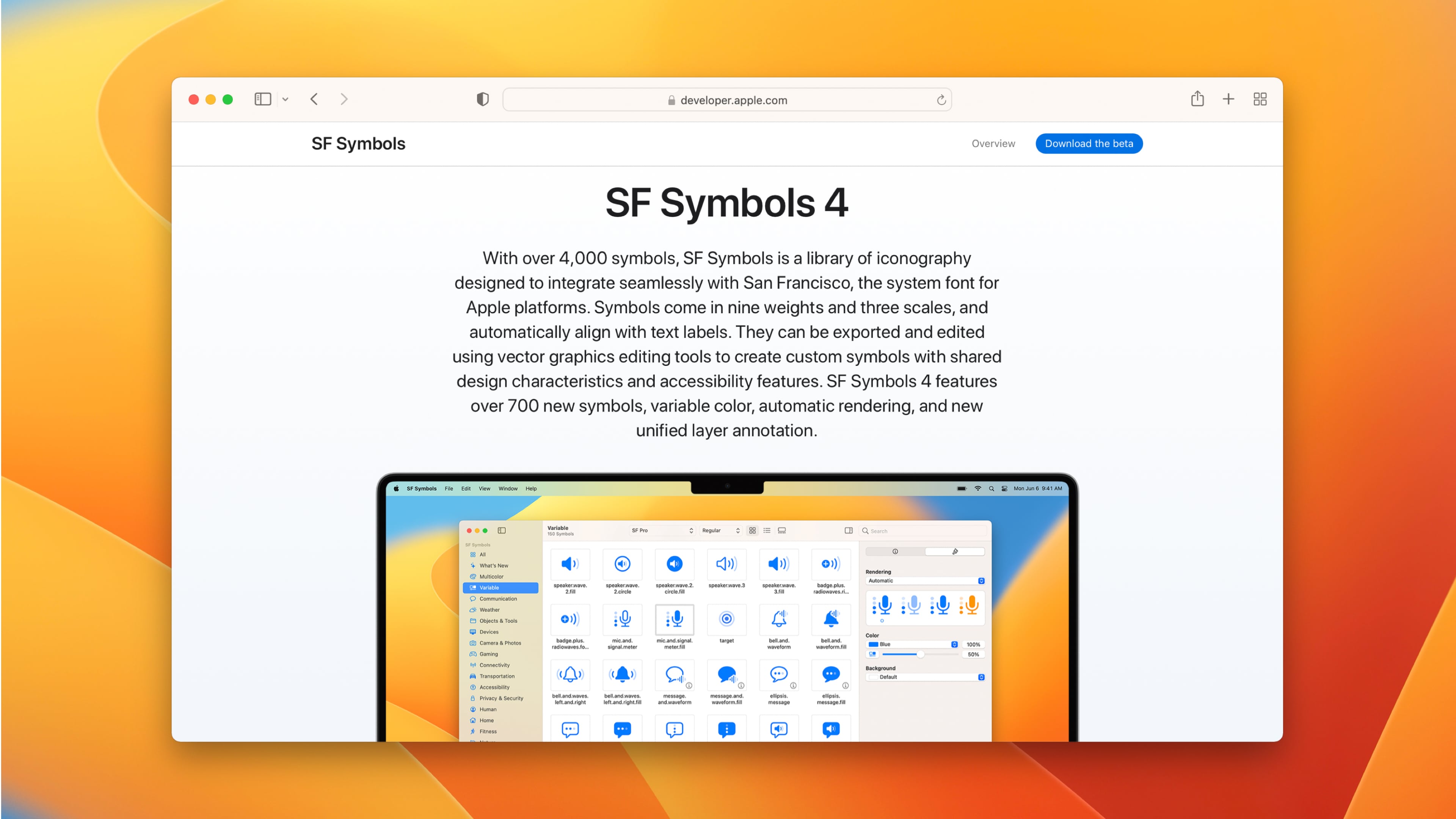
Rendering Modes
Each symbol can use one of four rendering modes which is useful to make your UI more customized:
- Automatic sets the recommended mode for each symbol.
- Hierarchical applies one color with varying opacity for each layer.
- Palette applies up to three colors across the layers.
- Multicolor may have preset colors combined with one selected color. For example, the delete badge is always red.
- __Monochrome __applies one color to all layers and is the most neutral rendering mode giving a uniform and consistent look.
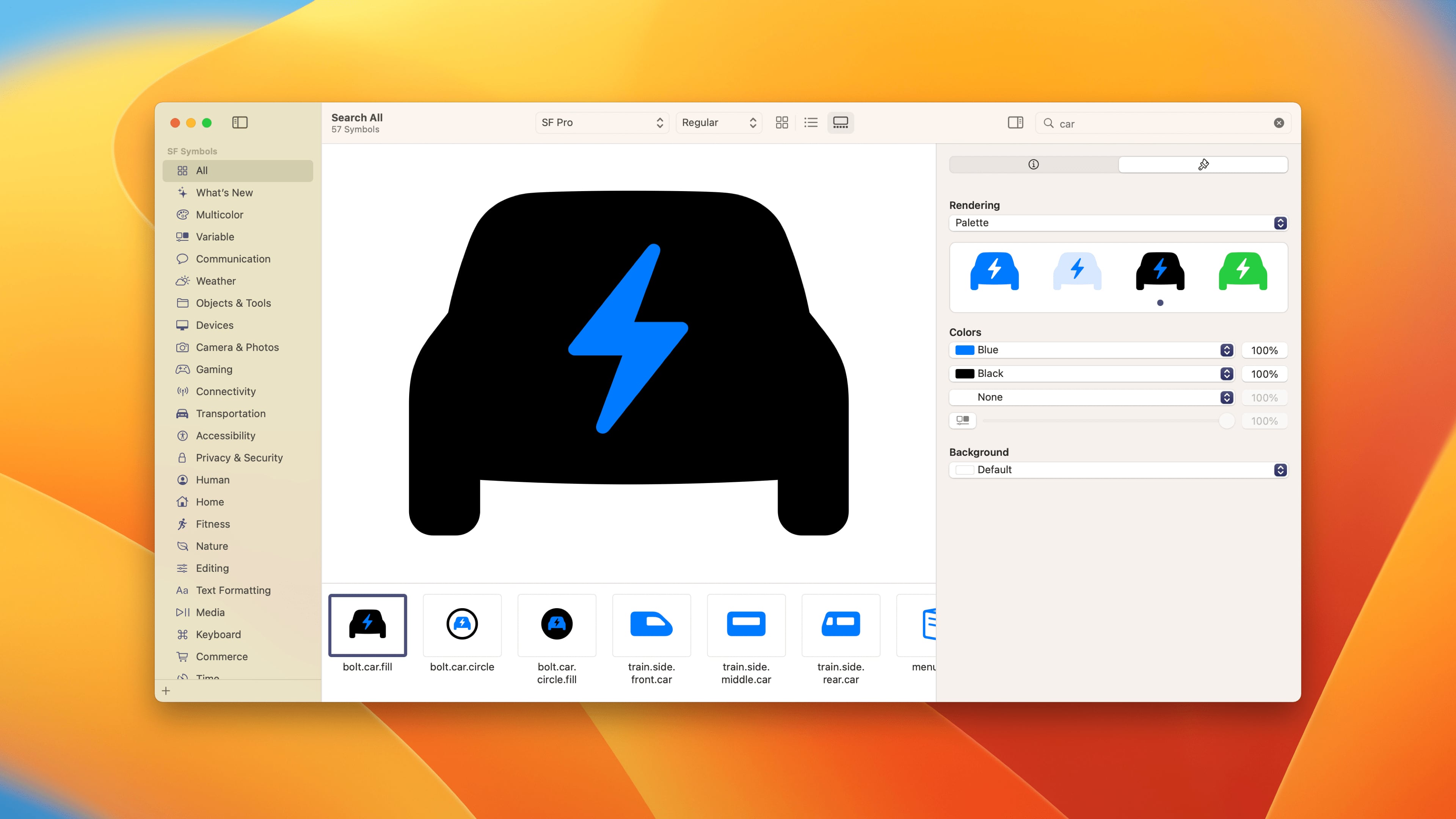
Variable Color
New in iOS 16, Variable Color allows you to customize the appearance of your icons using a percentage value. This is great for symbols that show a progress such as loading, sound volume, Wifi strength, etc.
Sponsored Course
This course is entirely free thanks to Sketch’s sponsorship. Sketch is the perfect design tool to create interfaces for iOS since Apple provides the UI Kit and Library. It is fully native, has real-time collaboration, developer handoff and prototyping.
To follow this course, make sure to install Sketch and download the assets file. You’re going to need to create an account. It’s free to try.
Typography Basics
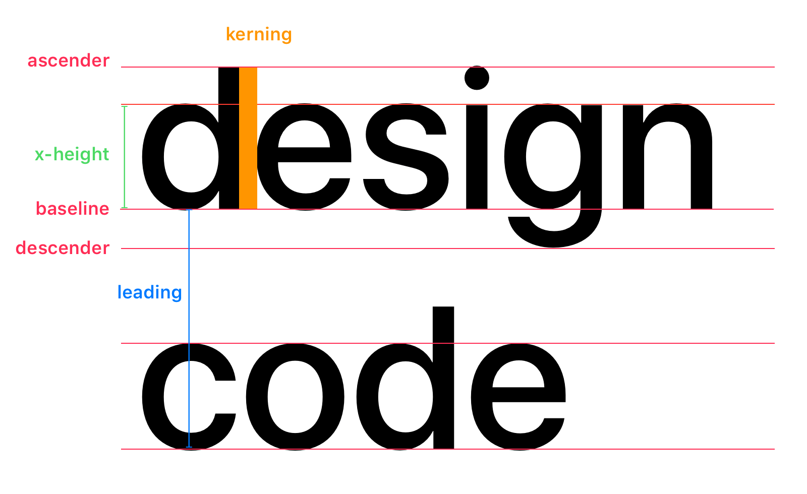
It’s important to learn these typography terms and know what they mean. These names will be employed often when explaining typography. Baseline refers to the line the text sits on whereas x-height is the height of lowercase characters. A descender is the part that goes past the baseline (letters g and p) whereas an ascender shows where the top of letters such as d and h touch.
San Francisco Font
The system font for Apple platforms is San Francisco which is made in-house by Apple. You can download the new fonts at this link . It’s beautiful, free and most importantly, designed for legibility. I encourage you to watch the video to understand how it affects the design for iOS.
Over the years, San Francisco has grown in parallel with an eco-system of products and experiences, providing new width styles, variants and families capable of adapting to the various needs of UI design.
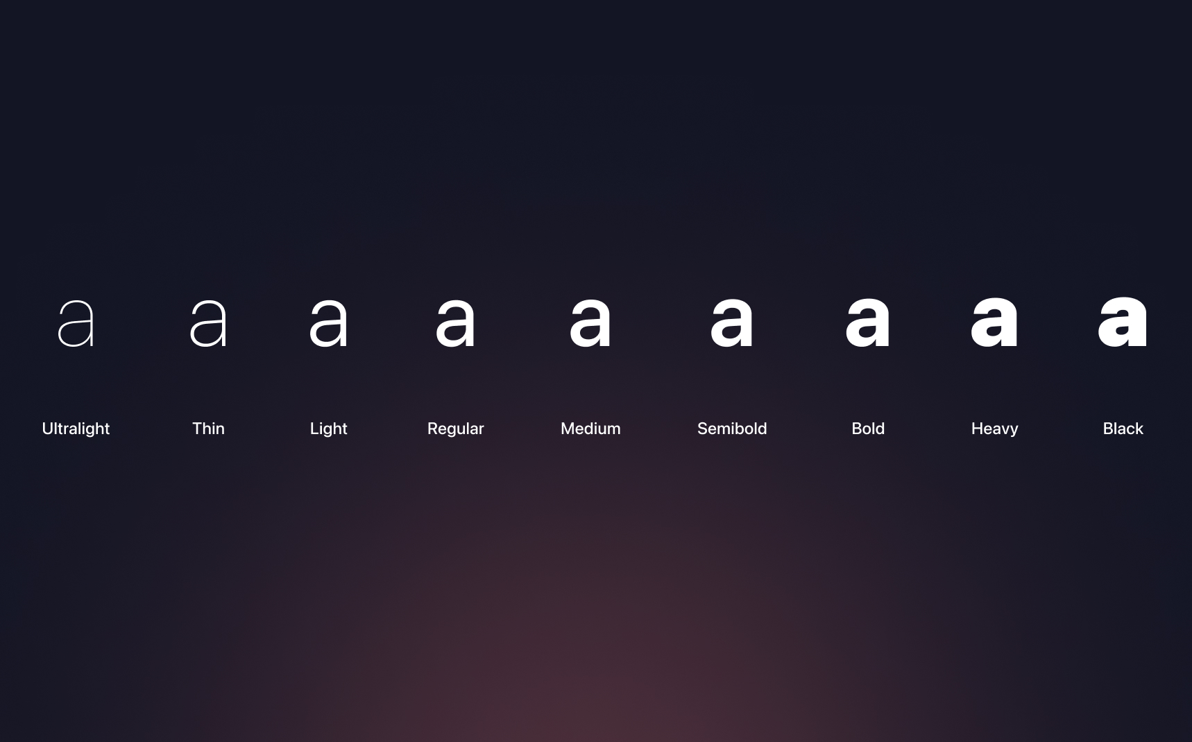
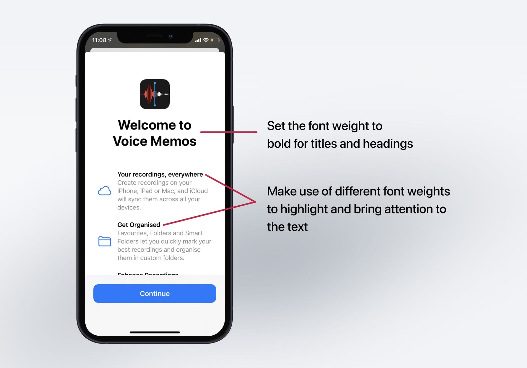
Font Weights
All of these font families together provide great functionality and a range of expression that allows text to be rendered in a variety of contexts. Most SF families come with a comprehensive palette of weights, spanning from Ultralight to Black , providing enough stylistic variation to create emphasis and typographic hierarchies.
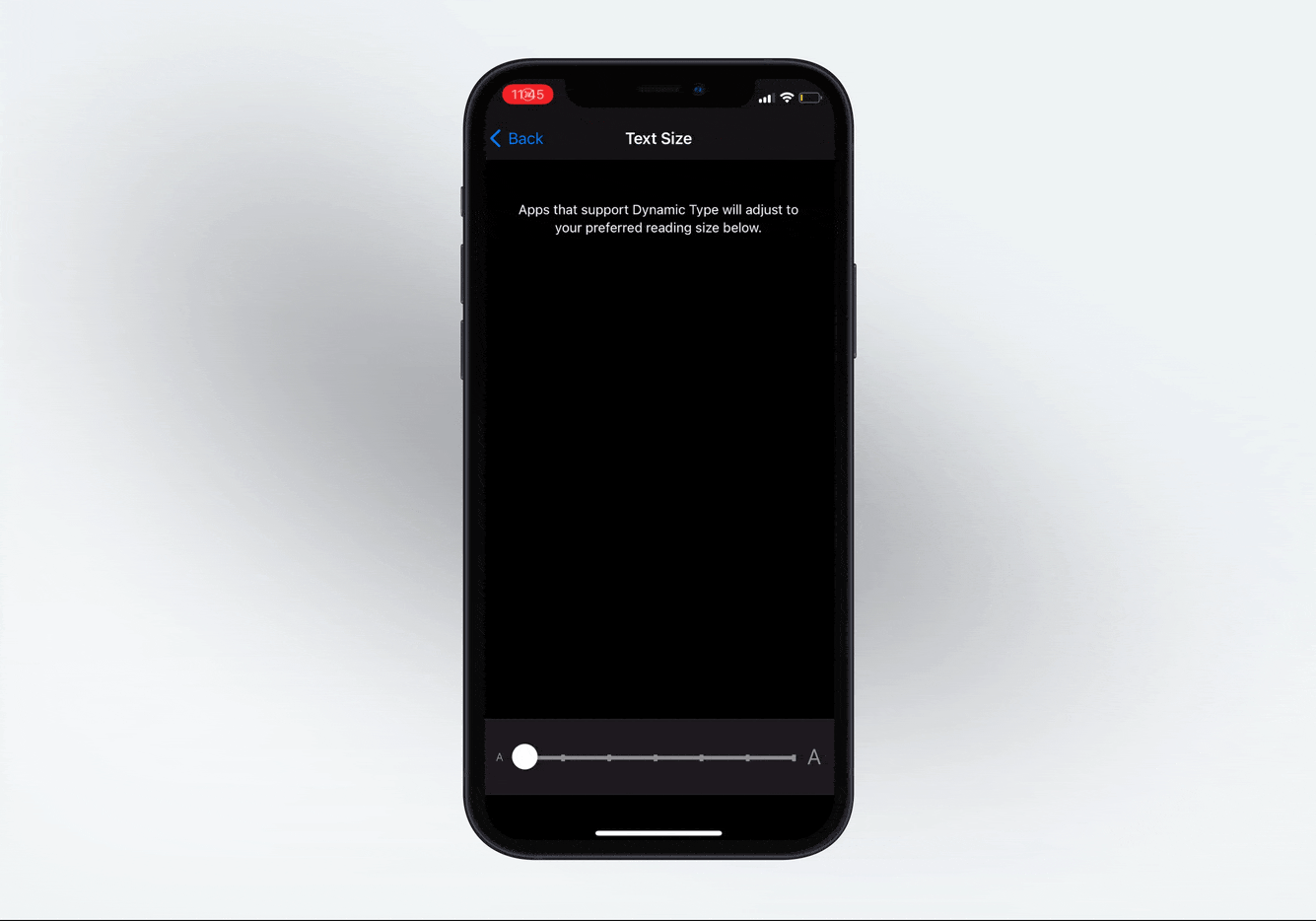
Dynamic Type
Accessibility is a prominent theme in iOS design. Apple provides you access to dynamic font presets, as shown in this image. Like this, if you set your text to Body, and enable Dynamic Type, the system will automatically increases the size based on the user’s preferences.
Body Text
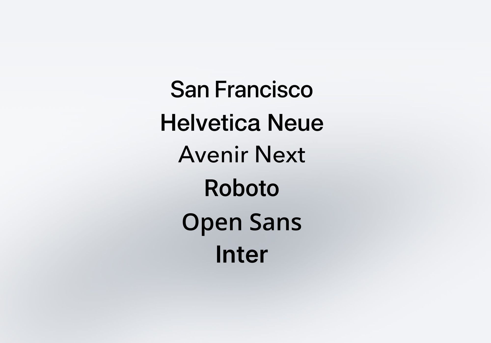
Pick a font that looks good in the body text. When in doubt, pick one that is both clean and comfortable to read. San Francisco, Helvetica Neue, Open Sans, Roboto, Proxima Nova, Inter and Museo Sans are popular ones. They’re all available for free on Google Fonts and Typekit (with a Creative Cloud account).
Font Size and Weight
In general, at 11-19 pt , use SF Text Regular . At 20-34 pt , use SF Display Medium and at 34 pt or more, use SF Display Bold . Please note that at bigger sizes, you can afford using thinner fonts like Light and Ultralight.
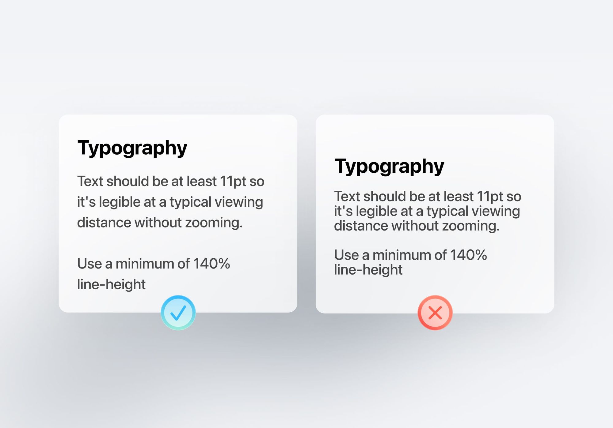
Line Height
The line height should be between 120% to 145% of the font size. In the image below, the right example has a line height that equals the font size (100%). In the left, I applied a 145% scale. The difference is substantial. Now, multiply that quantity of words by 10 and you get an idea of how frustrating it can be to have to read such condensed text.
45-90 Characters Per Line
When your line is too long, the reader will have a hard time focusing. The overwhelming amount of text per line wears them off, because each jump to a new line gives excitement and that happens less when lines are too long.

Use Your Typeface Wisely
It’s one thing to know about typefaces, it is another to know how to use it. Beautiful typography doesn’t just happen, you have to carefully curate and customize it. For instance, don’t force bold or italic if the font doesn’t support it. Use italics, underline, bold, lists and colors to reinforce the hierarchy and interactions.
Hierarchy
Creating a hierarchy is an important part of typography. This makes it easier to distinguish between text elements and improves the readability experience for the end user.
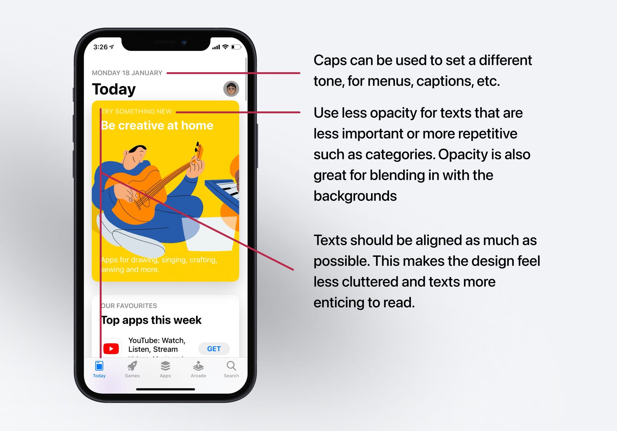
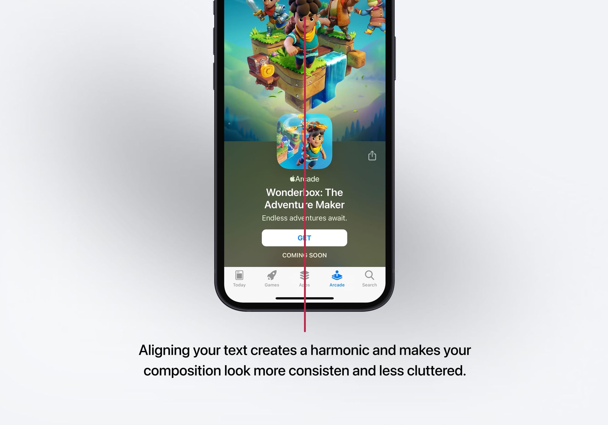
Text Alignment
Text can be aligned in one of the three ways - left , center and right . You can use left alignment for languages such as English whereas text can be right aligned for languages such as Arabic. Center alignment can be used for short lines of text that are in quotes.
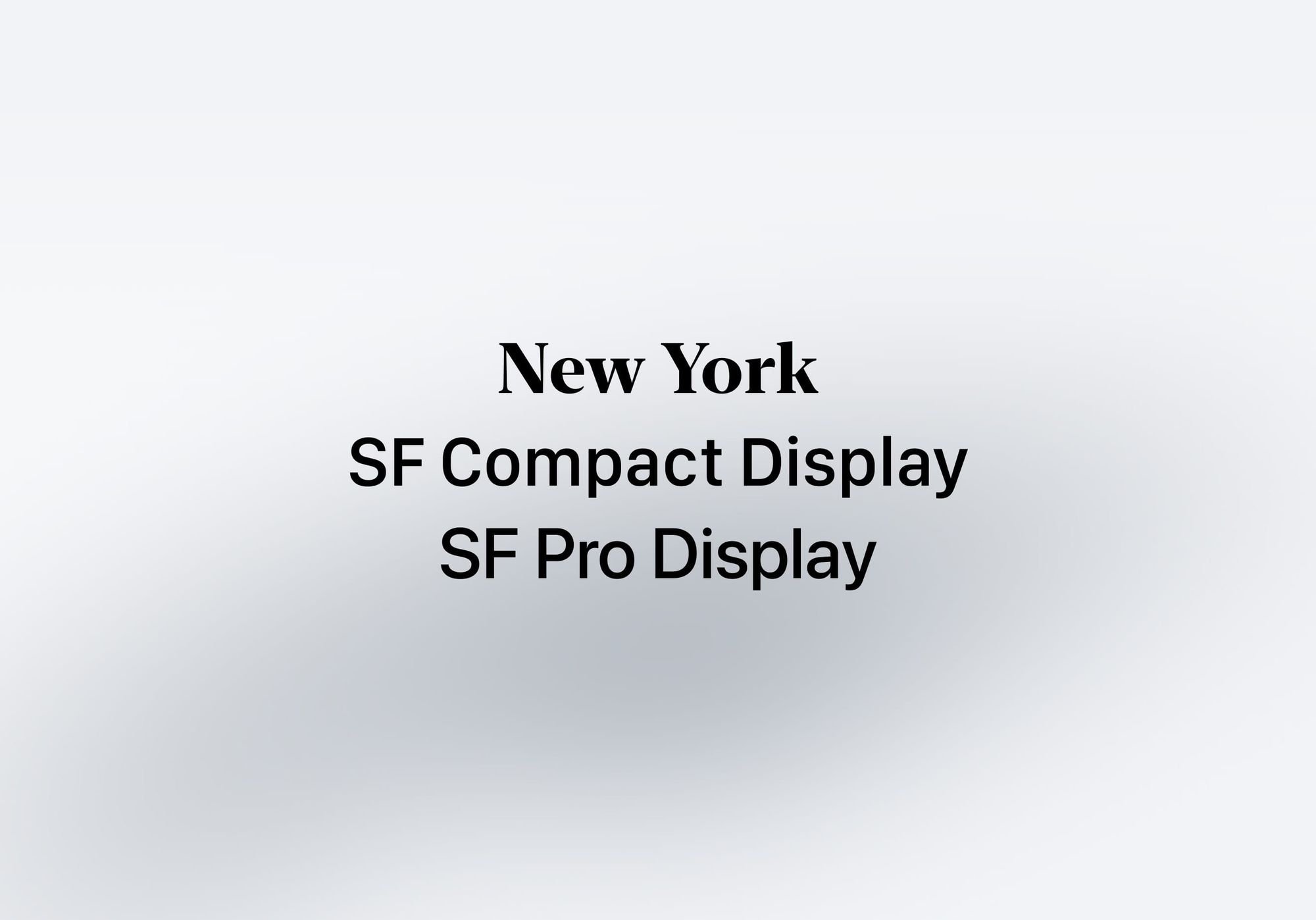
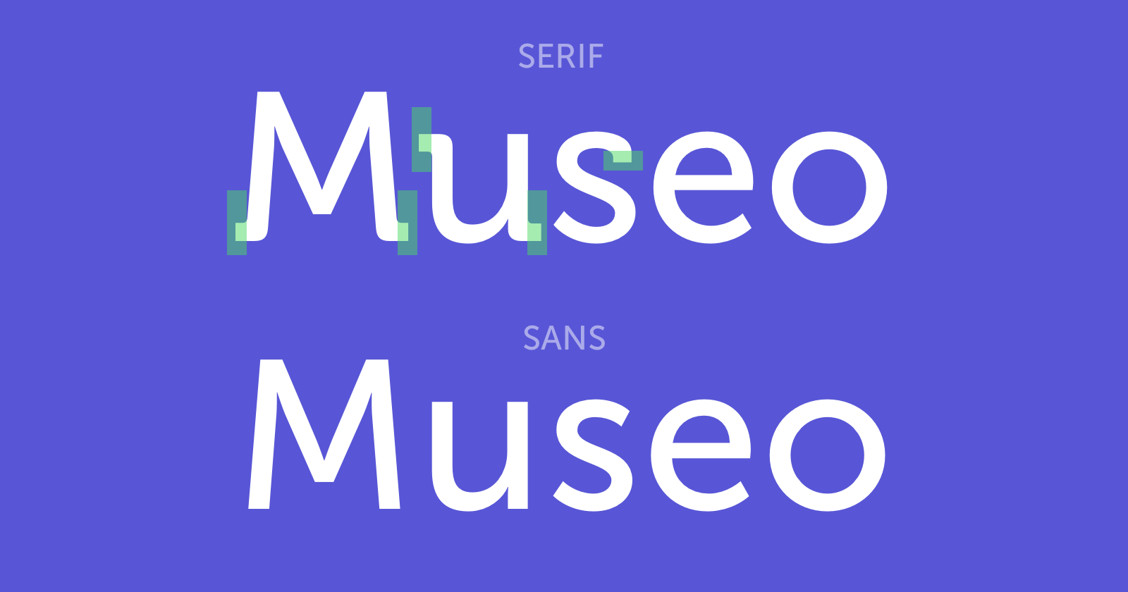
Serif & Sans Serif
A sans-serif typeface is one that does not have the small projecting features called "serifs" at the end of strokes. Both Serif and Sans are good choices. The Serif fonts are more commonly used in more traditional apps that encourage reading and storytelling such as Medium , Apple Books and The New York Times . It has a lot of charm. The Sans typefaces are more utilitarian and neutral, used widely in most modern apps. Its popularity also means that it's more generic. The amount of Sans serif typefaces out there is overwhelming, so pick carefully.
Additional Resources
Typography is an art form that is worth exploring. It goes well beyond iOS.
WWDC Typography Videos
Meet the expanded San Francisco font family: https://developer.apple.com/videos/play/wwdc2022/110381/ What's new in SF Symbols 4: https://developer.apple.com/videos/play/wwdc2022/10157/ Writing for interfaces: https://developer.apple.com/videos/play/wwdc2022/10037/ The details of UI typography: https://developer.apple.com/videos/play/wwdc2020/10175/
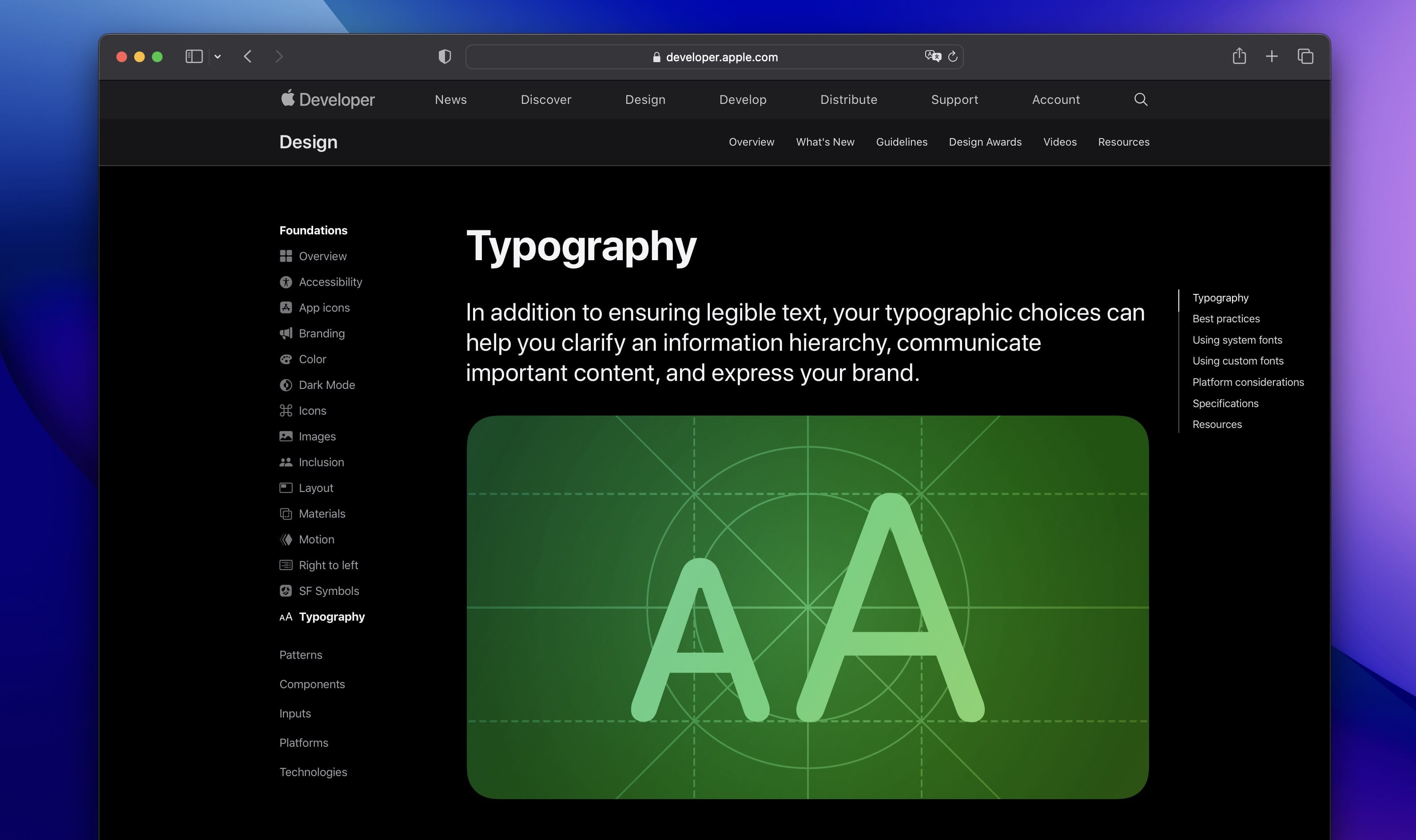
Apple Guidelines on Typography:
https://developer.apple.com/design/human-interface-guidelines/foundations/typography
Typography Guide
If you'd like to learn more about combining typefaces, apostrophes, quotes, dashes and brackets, I suggest heading to typogui.de.
A Five Minutes Guide to Better Typography
A real treat to read. Smartly designed to give you time to stop and think about each point. It’s also cleverly animated to give better impact.
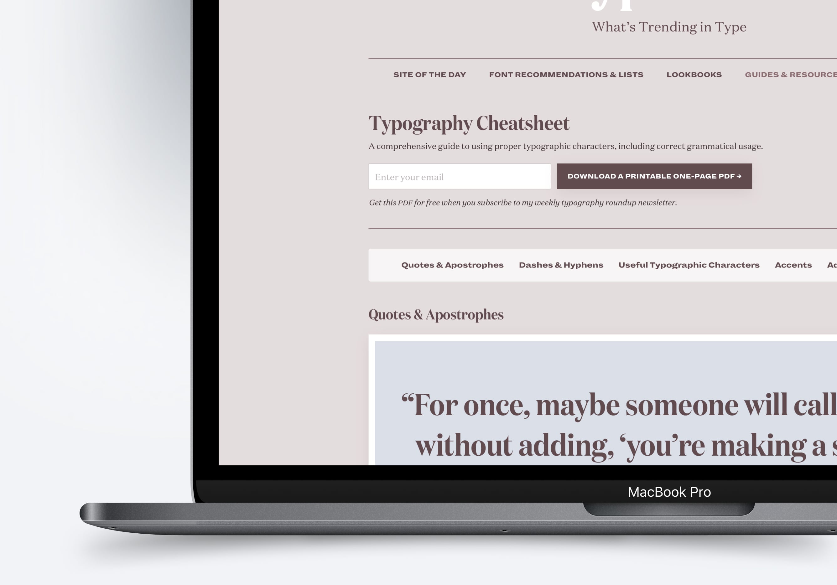
Typography Cheatsheet
This is a great resource when it comes to keeping with the latest fonts as well as the trends in typography. It includes guidelines on how to proper usage of characters as well as grammar.
Templates and source code
Download source files
Download the videos and assets to refer and learn offline without interuption.
Design template
Source code for all sections
Video files, ePub and subtitles
Videos
Subtitles
Assets
1
iOS 16 Design
A complete guide to designing for iOS 16 with videos, examples and design files
2:38
2
Colors and Gradients
Understanding the iOS 16 color system and how to use monochromatic, analogous and complementary colors
31:19
3
Layout and Spacing
Learn how to create a layout for iOS 16 using guides, negative spacing and grids
23:18
4
Material and Dark Mode
Combine background blur, blending modes and mesh gradients to create materials and colors for a dark mode UI
22:59
5
iOS 16 Typography
Design an iOS 16-ready UI from scratch in Sketch using the new SF font width styles, SF Symbols 4 and font pairing
5:33
6
SF Width Styles
Learn how to work and pair it with the new SF width styles: Condensed, Compressed, and Expanded
8:31
7
SF Symbols and Rendering Modes
Learn about the SF Symbols and its rendering modes
13:53
8
Variable Color
Learn how to use variable color to make SF Symbols more expressive
7:39
9
iOS 16 Navigation
Understanding navigation, content structure, action buttons and modals for iOS 16
2:54
10
Content Structure
Set the content navigation and custom tab bar with a floating action button using Sketch
18:58
11
Top Navigation
Learn about Navigation Bar using the back button, action button and segmented control
14:21
12
Modal Presentation
Learn about the Modal Presentation and Push transition
7:16
Meet the instructor
We all try to be consistent with our way of teaching step-by-step, providing source files and prioritizing design in our courses.
Sourasith Phomhome
UI Designer
Designer at Design+Code
19 courses - 72 hours
Master AI Prompting for Stunning UI
Learn how to leverage AI tools like Aura for creating beautiful designs, working with templates, and experimenting with advanced prompts. A concise guide for designers and developers to level up their skills.
10 hrs
Design Multiple Apps with Figma and AI
In this course, you’ll learn to design multiple apps using Figma and AI-powered tools, tackling a variety of real-world UI challenges. Each week, a new episode will guide you through a different design, helping you master essential UI/UX principles and workflows
4 hrs
SwiftUI Fundamentals Handbook
A comprehensive guide to mastering Swift programming fundamentals, designed for aspiring iOS developers. This handbook provides a structured approach to learning Swift's core concepts, from basic syntax to advanced programming patterns. Through carefully sequenced chapters, readers will progress from essential programming concepts to object-oriented principles, building a solid foundation for SwiftUI development. Each topic includes practical examples and clear explanations, ensuring a thorough understanding of Swift's capabilities. This handbook serves as both a learning resource and a reference guide, covering fundamental concepts required for modern iOS development. Topics are presented in a logical progression, allowing readers to build their knowledge systematically while gaining practical programming skills.
2 hrs
Design and Code User Interfaces with Galileo and Claude AI
In this course, you’ll learn how to use AI tools to make UI/UX design faster and more efficient. We’ll start with Galileo AI to create basic designs, providing a solid foundation for your ideas. Next, we’ll refine these designs in Figma to match your personal style, and finally, we’ll use Claude AI to turn them into working code—eliminating the need for traditional prototyping.
4 hrs
Design and Prototype for iOS 18
Design and Prototype for iOS 18 is an immersive course that equips you with the skills to create stunning, user-friendly mobile applications. From mastering Figma to understanding iOS 18's latest design principles, you'll learn to craft two real-world apps - a Car Control interface and an AI assistant.
3 hrs
Master Responsive Layouts in Figma
Creating responsive layouts is a must-have skill for any UI/UX designer. With so many different devices and screen sizes, designing interfaces that look great and work well on all platforms is necessary. Mastering this skill will make you stand out in the field. In this course, we'll start from scratch to create this beautiful design using Figma. You'll learn how to make layouts that are easy to use and work well on any device. We'll cover key concepts and tools to help you master responsive design in Figma.
2 hrs
UI UX Design with Mobbin and Figma
Mobbin is a powerful tool for UI/UX designers seeking inspiration and innovative design solutions. This platform offers a vast collection of real-world mobile app designs, providing a treasure trove of UI elements and layouts.
2 hrs
3D UI Interactive Web Design with Spline
Learn to create 3D designs and UI interactions such as 3D icons, UI animations, components, variables, screen resize, scrolling interactions, as well as exporting, optimizing, and publishing your 3D assets on websites
3 hrs
Design and Prototype for iOS 17 in Figma
Crafting engaging experiences for iOS 17 and visionOS using the Figma design tool. Learn about Figma's new prototyping features, Dev Mode, variables and auto layout.
6 hrs
Design and Prototype Apps with Midjourney
A comprehensive course on transforming Midjourney concepts into interactive prototypes using essential design techniques and AI tools
8 hrs
iOS Design with Midjourney and Figma
Learn the fundamentals of App UI design and master the art of creating beautiful and intuitive user interfaces for mobile applications
1 hrs
UI Design for iOS, Android and Web in Sketch
Create a UI design from scratch using Smart Layout, Components, Prototyping in Sketch app
1 hrs
UI Design a Camera App in Figma
Design a dark, vibrant and curvy app design from scratch in Figma. Design glass icons, lens strokes and realistic buttons.
1 hrs
UI Design for iOS 16 in Sketch
A complete guide to designing for iOS 16 with videos, examples and design files
3 hrs
Prototyping in Figma
Learn the basics of prototyping in Figma by creating interactive flows from custom designs
1 hrs
UI Design Quick Websites in Figma
Learn how to design a portfolio web UI from scratch in Figma
1 hrs
UI Design Android Apps in Figma
Design Android application UIs from scratch using various tricks and techniques in Figma
2 hrs
UI Design Quick Apps in Figma
Design application UIs from scratch using various tricks and techniques in Figma
12 hrs
Figma Handbook
A comprehensive guide to the best tips and tricks in Figma. Not affiliated with or endorsed by Figma, Inc.
6 hrs