
Layout and Spacing
Add to favorites
Learn how to create a layout for iOS 16 using guides, negative spacing and grids
Play video
UI Design for iOS 16 in Sketch
Resources
- https://developer.apple.com/design/human-interface-guidelines/components/menus-and-actions/buttons
- https://developer.apple.com/design/human-interface-guidelines/foundations/layout
- https://developer.apple.com/design/human-interface-guidelines/components/layout-and-organization/lists-and-tables
Important Guidelines
- Experience you provide should work well and remain familiar whether users rotate their device, resize a window, or switch between devices
- On iPhone and iPad, safe areas accommodate features like corner radiuses and sensor housings, and avoid interfering with interactive system elements like the home indicator and app switcher
- Place your main items near the leading edge of the screen as people tend to begin their search there
- The most important information should be visible immediately on the screen, so avoid cluttering the window or screen with unnecessary information
- Make it easier for people to find information by creating visual groupings
- An aligned app looks neat and organized will helps people focus and makes information easier to find
- Make sure you pay attention to the aspect ratio
Layout Grid
The 8 pt layout grid system is most commonly used because it allows both designers and developers to work more quickly and efficiently. Scalability is easy and consistent when using numbers like 8, 16, 24, 32, 40, 48, 56 to size and space elements. The majority of commonly used screen sizes are divisible by 8, making them easy to fit.
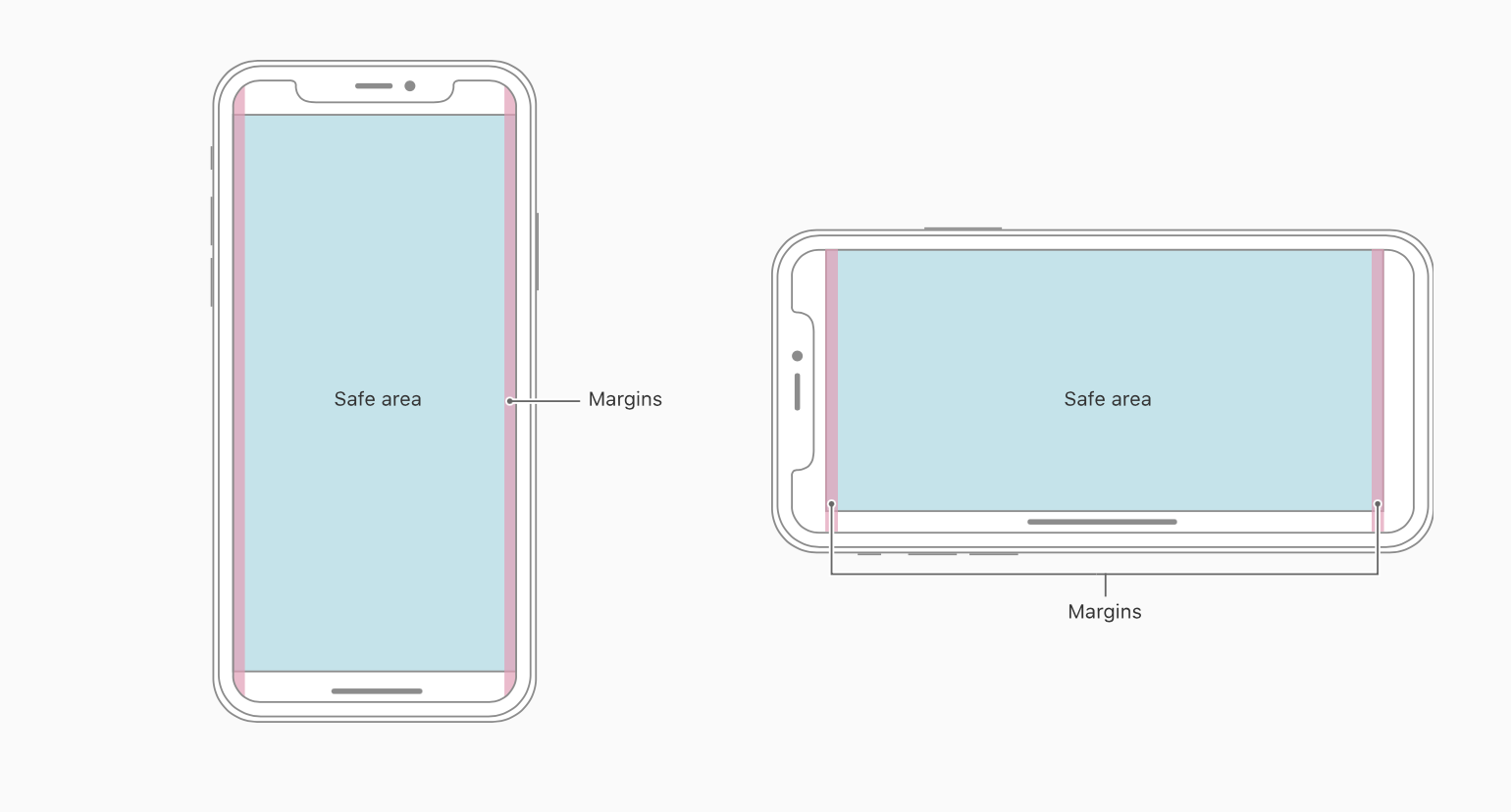
Safe Area
Safe areas are sections of a view not covered by toolbars, navigation bars, tab bars, or other views offered by a window. It is necessary to have safe regions for avoiding any interaction with a device's components, such as sensor housings and home indicators.
When designing for the iPhone, the rounded corners and the notch can clip the content. That should be avoided at all time. Using the safe area layout guide, you can push the content where the notch wouldn’t be, thus ensuring that no clipping will occur.
In general, backgrounds should not follow the safe area guide, while content such as texts, images and buttons should follow these guides. It helps you place your views within the visible portion of the interface and lay out the content.
Margins and Padding
What is the difference between a margin and a padding? Using either of them creates gaps around elements, but the method in which they do so differs. Space outside an element is controlled by the margin property, and space inside an element is controlled by the padding property.
Margin: is the element personal space — Amount of distance the element wants to keep from other elements. Use margin if an element needs some space around it or you do not want it to touch other elements.
Padding: is a measure of how far an element is from itself — Element distance from elements inside it. Use padding if content shouldn't touch container edges, you want to increase the size of the element like a button and if you want to center an element.
Buttons
In your app, buttons initiate immediate actions and provide clear, recognizable ways to perform tasks. Three main attributes to take into consideration are style based on visual style. Content which includes text or symbol to display its function and role that identifies a button’s meaning.
Well designed buttons will make an app feel more intuitive if quickly recognizable and simple to grasp. To fit a fingertip on a touchscreen, buttons must have a hit target of at least 44x44 points. It's critical to include enough space around a button on all displays so that users can identify it easily from surrounding components and information.
Design for Touch
Buttons should be easily tappable. Their sizes should be between 30-60pt wide. The optimal size is 44pt . On rare occasions, set to 22pt for links inside texts, but use cautiously as they become hard to tap. Even text buttons have a tappable zone of at least 30pt.

Screen 2
Let’s move on to the second screen. We will build multiple cards with different charts. To get started, duplicate Screen 1 and delete all the elements except the Status Bar, Home Indicator and the TabBar.
Title
Let’s add a title and name it Statistics.
- Use SF Pro, bold, size 34, fill color white
- Place title below status bar, set margin left 24 and top 48
![Layout and Spacing image 3]()

Statistics Cards
We will display different type of charts like path, ring and bar. Let’s begin by creating the body of the card.
- Create a rectangle 158x228 rectangle, corners 20, add smooth corner and rename it Card
- Set margin left 24 and top 40
- Add a linear gradient; color 1 #313A5B, color 2 #21273D
- Add border with width 1, inside, color #8671EC, 20% opacity
- Add shadow, fill color black, 30% opacity, X: 0, Y: 10 and Blur: 20
- Create a rectangle 158x144 rectangle from the top and hide it. Press on Command+G to group and rename it Chart
Chart Path
Blue Path: Use the vector tool and draw a wave similar to this and close the path. Rename it Blue Gradient.

- Add a linear gradient; color 1 #46A5FD, 50% opacity, color 2 #24293F, 0% opacity. Do not add any border for this one
- Duplicate Blue Gradient and rename it Blue
- Select layer Blue, press on Return key to edit
- In the inspector, click on Open path and delete the bottom-left and bottom-right points
- Add border with width 2, color to #96B8FF, center. Do not use fill color for this one
- Duplicate Blue and name it Blue Glow
- Add a linear gradient; color 1 #0004FC, 80% opacity, color 2 #00ADFB and color 3 #0004FC
- Change border width to 3, add gaussian blur to 2
- Select the Card layer, right-click and choose Mask to mask the paths

Pink Path : Use the vector tool and draw another wave similar to this and close the path. Rename to Pink Gradient.

- Add a linear gradient; color 1 #CE68FC, 50% opacity, color 2 #8F48B0, 10% opacity and color 3 #000000, 0% opacity . Do not add any border for this one
- Duplicate Pink Gradient and rename it Pink
- Select layer Pink, press on Return key to edit
- In the inspector, click on Open path and delete the bottom-left and bottom-right points
- Add border with width 2, linear gradient; color 1 #9267A7, color 2 #FFD2FF and color 3 #B596FF, center. Do not use fill color for this one
- Duplicate Pink and name it Pink Glow
- Add a linear gradient; color 1 #FC00F5, color 2 #F800EA
- Change border width to 3, add gaussian blur to 2
![Layout and Spacing image 7]()

Let’s finish the card by adding some content.
- Create a rectangle of 158x80 rectangle and hide it. Press on Command+G to group and rename it Text
- Write BALANCE in uppercase, SF Pro, semibold, size 13, color #EBEBF5, 60% opacity, margin left 16 and top 16
- Write an amount of your choice, SF Pro ,semibold, size 17 and color white, margin left 16 and bottom 20
- Add USD, write in uppercase, SF Pro, medium, size 15, color #EBEBF5, 60% opacity, margin left 4
- Rename this card Balance Card

Let’s finish the card by adding some content.
- Create a rectangle of 158x80 rectangle and hide it. Press on Command+G to group and rename it Text
- Write BALANCE in uppercase, SF Pro, semibold, size 13, color #EBEBF5, 60% opacity, margin left 16 and top 16
- Write an amount of your choice, SF Pro ,semibold, size 17 and color white, margin left 16 and bottom 20 - Add __USD, __write in uppercase, SF Pro, medium, size 15, color #EBEBF5, 60% opacity, margin left 4
- Rename this card Balance Card

Chart Progress Ring
Let’s create a chart with ring progress. Duplicate the Chart Path card, place it at the bottom of the card and add space between of 24 and delete all the content inside except the text.
We will create the first ring.
- Insert an oval of 90x90, add a border of width 20, center
- Align layer center and margin top 30
- Select the first layer, go to Layer and Convert to Outlines (it become a multiple shape layer using subtract operation)
- Add fill color #343F63, border of width 2, inside, color white, 30% opacity, overlay and rename it Ring
We will create the second ring.
- Insert an oval of 90x90, use the same position as the first ring and don’t use fill color
- Add a border of width 20, center
- Click on Setting for more option
- Ends: rounded, Joins: rounded, Dash: 100, Gap: 350

Use Angular gradient
- Add an angular gradient of 4 colors; color 1 #6D47FF, color 2 #6D47FF, 0% opacity, color 3 #F15C56 and color 4 #AC31FE
![Layout and Spacing image 2]()
- Turn it clockwise, click on__ Flip Vertical__
- Change content to CREDIT and number

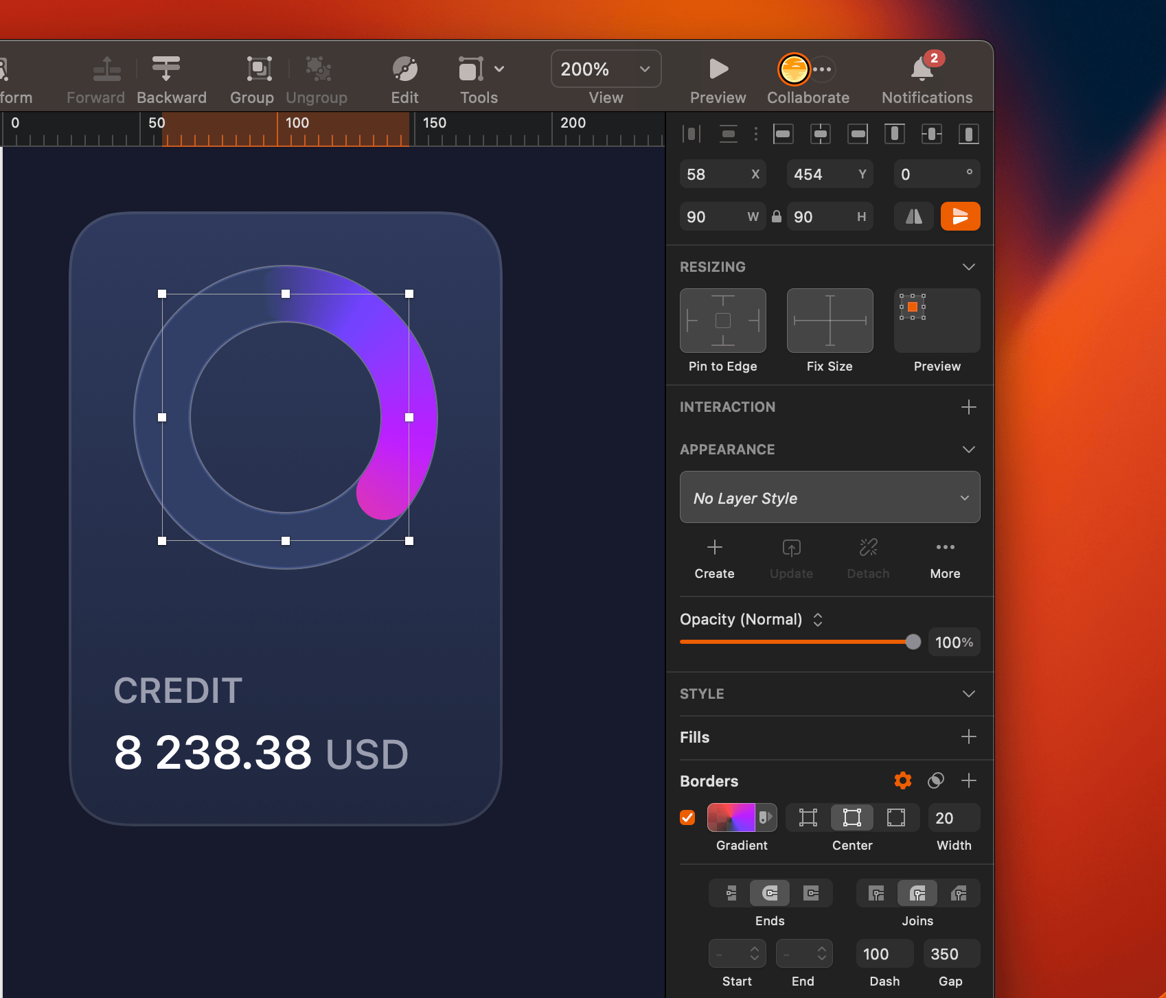
- Add a knob so copy from the previous card
We will add a radar effect.
- Add a first oval of 48x48, border of width 1, inside, color #7461F6, 60% opacity and do not use fill color
- Add a second oval of 68x678 border of width 1, inside, color #7461F6, 20% opacity
- Add a third oval of 81x81, border of width 1, inside, color #7461F6, 10% opacity
- Rename it Credit Card

Chart Progress Ring 2
We will add a second variation for the progress ring. Duplicate the previous card, delete Knob and Ring layers. Move the card to the right, set margin right 24 and Y: 358
- Select the Progress layer and remove Flip Vertical
- Change the angular gradient; color 1 #F239FE and color 2 #8825F4
- Change the dash value to 130
- Add shadow with color #B152E9, 35% opacity, X: 0, Y: 10 and Blur: 20
- Duplicate this layer, remove Dash and Gap by changing to 0, color #343F63 and rename it Ring
- Duplicate the Progress layer and name it Progress 1, ****change the angular gradient; color 1 #0F55E8 and color 2 #6DCFFA
- Change the dash value to 200
- Add shadow with color #195FE8, 15% opacity, X: 0, Y: 10 and Blur: 20
- Change content to SPENDING and number and rename it Spending Card

Chart Progress Horizontal Bar
Let’s create a chart with bar progress. Duplicate the last card and delete the ring inside the Chart layer. For this card, the height will be smaller
- Set the Y: 176 and margin right 24
- Select the rectangle, press on Return key to edit
- Select the top-left and top-right points together and move it down 66px. Same with the invisible rectangle inside Chart folder

- Create a rectangle of 126x12 inside the Chart folder, align center and margin top 44
- Add a corner of 6
- Add fill color #E5F2F6, 50% opacity, border with width 1, inside, color black, overlay and rename it Bar
- Duplicate the layer, change width to 56
- Change the color to linear gradient; color 1 #EE7F7F and color 2 #C44091, border with width 1, inside, color white, 50% opacity and overlay
- Add shadow, color #FF30A3, 30% opacity, X: 0, Y: 4 and Blur: 5 and rename it Progress
- Select Progress and Bar, press on Command+G to group and rename it Pink
- Duplicate Pink then rename it Blue
- Change the width to 126 and change the gradient colors; color 1 #32C2EB and color 2 #7DF1ED
- Add border with width 1, inside, color white, 50% opacity
- Add shadow, color #00F7FF, 20% opacity, X: 0, Y: 4 and Blur: 5
- Rename this card Cashflow Card

Chart Progress Vertical Bar
- Duplicate from the large card and delete the content inside Chart folder except the rectangle
- Move this card below Spending Card with spacing between 24
- Insert a rounded of 10x56, margin left 20 and bottom 22
- Add a linear gradient; color 1 #C44091 and color #EE7F7F
- Add border with width 1, inside, color white, 50% opacity and overlay
- Add shadow, color #FF30A3, 20% opacity, X: 0, Y: 10 and Blur: 10
- Add a shadow, set the colour to # FF30A3 with 20% opacity. Change X axis to 0, Y axis to 10 and Blur to 10
- Duplicate the bar and move it to the right, set height to 100, spacing between 8
- Change the linear gradient; color 1 #32C2EB and color 2 #7DF1ED
- Add shadow, color #00F7FF, 20% opacity, X: 0, Y: 10 and Blur: 10
![Layout and Spacing image 8]()
- Duplicate 5 more times and modify height and alternate the gradient
- Rename this card Income Card


Final Design
We have create all the cards for the statistics. Change the selected tab for Stats . Select folder Selected , set X: 237. Change the text and symbol color to white. Select Tab 3, go to the inspector, click on opacity and select Overlay.

We are done with the second screen!
Templates and source code
Download source files
Download the videos and assets to refer and learn offline without interuption.
Design template
Source code for all sections
Video files, ePub and subtitles
Videos
Subtitles
Assets
1
iOS 16 Design
A complete guide to designing for iOS 16 with videos, examples and design files
2:38
2
Colors and Gradients
Understanding the iOS 16 color system and how to use monochromatic, analogous and complementary colors
31:19
3
Layout and Spacing
Learn how to create a layout for iOS 16 using guides, negative spacing and grids
23:18
4
Material and Dark Mode
Combine background blur, blending modes and mesh gradients to create materials and colors for a dark mode UI
22:59
5
iOS 16 Typography
Design an iOS 16-ready UI from scratch in Sketch using the new SF font width styles, SF Symbols 4 and font pairing
5:33
6
SF Width Styles
Learn how to work and pair it with the new SF width styles: Condensed, Compressed, and Expanded
8:31
7
SF Symbols and Rendering Modes
Learn about the SF Symbols and its rendering modes
13:53
8
Variable Color
Learn how to use variable color to make SF Symbols more expressive
7:39
9
iOS 16 Navigation
Understanding navigation, content structure, action buttons and modals for iOS 16
2:54
10
Content Structure
Set the content navigation and custom tab bar with a floating action button using Sketch
18:58
11
Top Navigation
Learn about Navigation Bar using the back button, action button and segmented control
14:21
12
Modal Presentation
Learn about the Modal Presentation and Push transition
7:16
Meet the instructor
We all try to be consistent with our way of teaching step-by-step, providing source files and prioritizing design in our courses.
Akson Phomhome
UI Designer
Designer at Design+Code.
13 courses - 60 hours
AI Design with Ideogram
Meet Ideogram, an AI-powered image generation tool that takes your ideas and transforms them into stunning visuals. Whether you're a designer, marketer, or just a visual enthusiast, Ideogram simplifies the creative process. In this guide, we’ll walk you through step-by-step instructions to create beautiful logos, social media posts, and more.
1 hrs
Build a SwiftUI app with Claude AI
This comprehensive SwiftUI course combines cutting-edge AI assistance with hands-on development, guiding you through the process of transforming Figma designs into fully functional iOS applications. Leveraging Claude 3.5 Sonnet, you'll learn to efficiently generate and refine SwiftUI code, create reusable components, and implement advanced features like animations and responsive layouts.
9 hrs
Prototype and Code iOS apps in Figma and SwiftUI
Welcome to our course on designing a sleek wallet interface with Figma! You’ll learn to create a visually appealing and functional wallet interface using DesignCode and Apple UI Kits. Master prototyping, swipe gestures, carousel animations, overlays, and reusable components. Plus, explore a Figma plugin to easily transition from design to SwiftUI. By the end, you’ll create dynamic, user-friendly prototypes.
3 hrs
Create 3D UI for iOS and visionOS in Spline
Comprehensive 3D Design Course: From Basics to Advanced Techniques for iOS and visionOS using SwiftUI
3 hrs
3D UI Interactive Web Design with Spline
Learn to create 3D designs and UI interactions such as 3D icons, UI animations, components, variables, screen resize, scrolling interactions, as well as exporting, optimizing, and publishing your 3D assets on websites
3 hrs
Design and Prototype for iOS 17 in Figma
Crafting engaging experiences for iOS 17 and visionOS using the Figma design tool. Learn about Figma's new prototyping features, Dev Mode, variables and auto layout.
6 hrs
Design and Prototype Apps with Midjourney
A comprehensive course on transforming Midjourney concepts into interactive prototypes using essential design techniques and AI tools
8 hrs
Web App Design using Midjourney and Figma
Get UI inspirations from Midjourney and learn UI design, colors, typography as a beginner in Figma
2 hrs
UI Design for iOS 16 in Sketch
A complete guide to designing for iOS 16 with videos, examples and design files
3 hrs
UI Design Android Apps in Figma
Design Android application UIs from scratch using various tricks and techniques in Figma
2 hrs
UI Design Smart Home App in Figma
Design a Smart Home app from scratch using various tricks and techniques in Figma
2 hrs
UI Design Quick Apps in Figma
Design application UIs from scratch using various tricks and techniques in Figma
12 hrs
Figma Handbook
A comprehensive guide to the best tips and tricks in Figma. Not affiliated with or endorsed by Figma, Inc.
6 hrs