
SF Symbols and Rendering Modes
Add to favorites
Learn about the SF Symbols and its rendering modes
Play video
UI Design for iOS 16 in Sketch
SF Symbols 4
If you are unfamiliar with SF Symbols 4, it’s a library of 4,000 icons with weight variants and rendering modes that you can use on all Apple platforms, including macOS , iOS , iPadOS , watchOS and tvOS.

Why Use Symbols?
Symbols are a great way to represent an action or a concept , sometimes without the need of text. They are frequently used for the Tab Bar, Navigation Bar, and button. They are an essential part of interface design.

Rendering Modes
SF Symbols has four rendering modes:
- Automatic sets the recommended mode for each symbol.
- __Monochrome __applies one color to all layers and is the most neutral rendering mode giving a uniform and consistent look.
- Hierarchical applies one color with varying opacity for each layer.
- Palette applies up to three colors across the layers.
- Multicolor may have preset colors combined with one selected color. For example, the delete badge is always red.

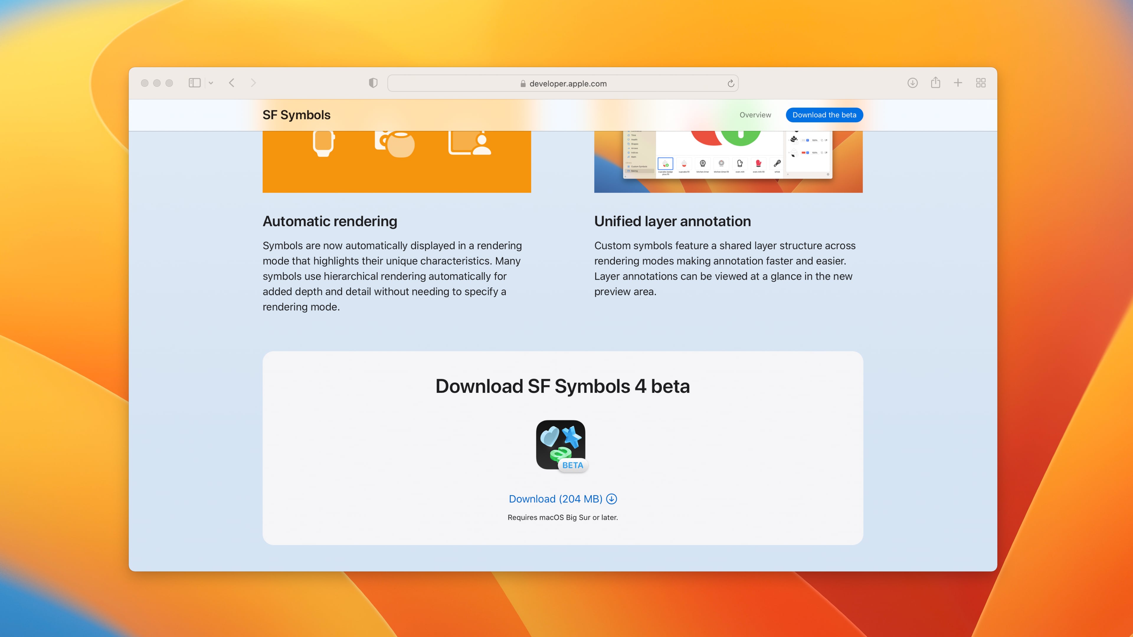
Download SF Symbols 4 beta
You’re going to need the SF Symbols app from Apple for Sketch.
- Download the beta version.
![SF Symbols and Rendering Modes image 5]()
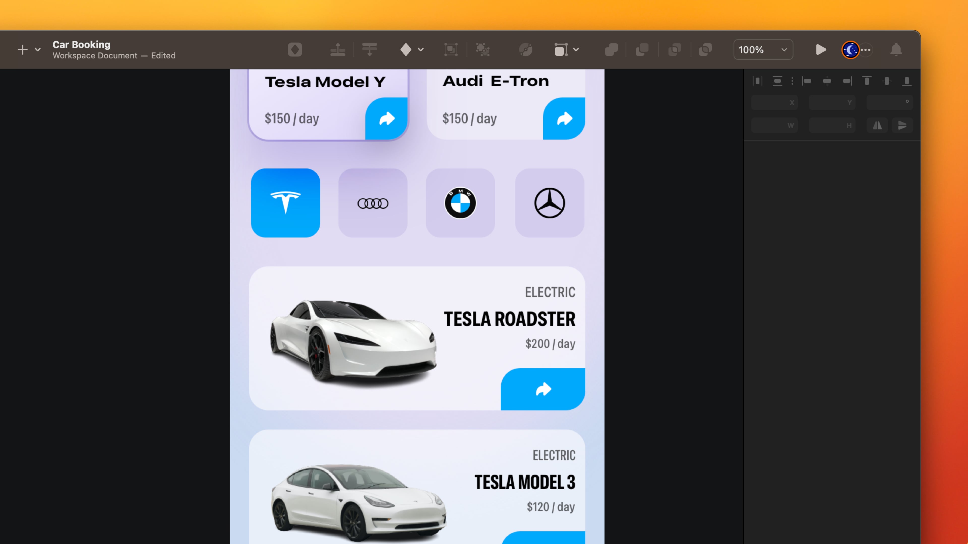
Detail Button
To make it more obvious that the card is tappable, I’m adding a blue button at the bottom right.
- Create a Rectangle of 44 x 44, color #4AA6F4.
- Set the corner radius to 20 on the top left and bottom right.
- Copy the arrowshape.turn.up.right.fill symbol from the SF Symbol 4.
- Group the background and the symbol. Name the layer Detail Button.
- Go to horizontal card, duplicate the detail. Change the width size to 66 and place it on the bottom right corner.
![SF Symbols and Rendering Modes image 6]()
Tab Bar
The Tab Bar is the easiest way to navigate an app’s sections from the bottom of the screen. Let’s take the first screen previously and create a Tab Bar.
- Create a Rectangle of 390 x 85, colour #4AA6F4, opacity to 30%, Blending Mode Overlay.
- Add 20 Background Blur and 30% Saturation.
- Edit the Rectangle to create a curve in the middle.
![SF Symbols and Rendering Modes image 7]()

Home Indicator
Excluding symbols, It is missing something significant, a home indicator.
- Go to the plus button and search for home indicator. Select Light → iPhone.
- Place it at the bottom.
![SF Symbols and Rendering Modes image 8]()

Symbols for the Tab Bar
With SF Symbols, I can find all the symbols that I need for the the tab bar.
- Copy Car, Calendar, Bell __and __Person symbols from the SF Symbols 4.
- Write a title for each symbol, Rent, Bookings, Notifications and __Account __using __Medium 10, __color black. Set auto width and align center.
- Group the Symbol and text. Name the layer.
![SF Symbols and Rendering Modes image 9]()

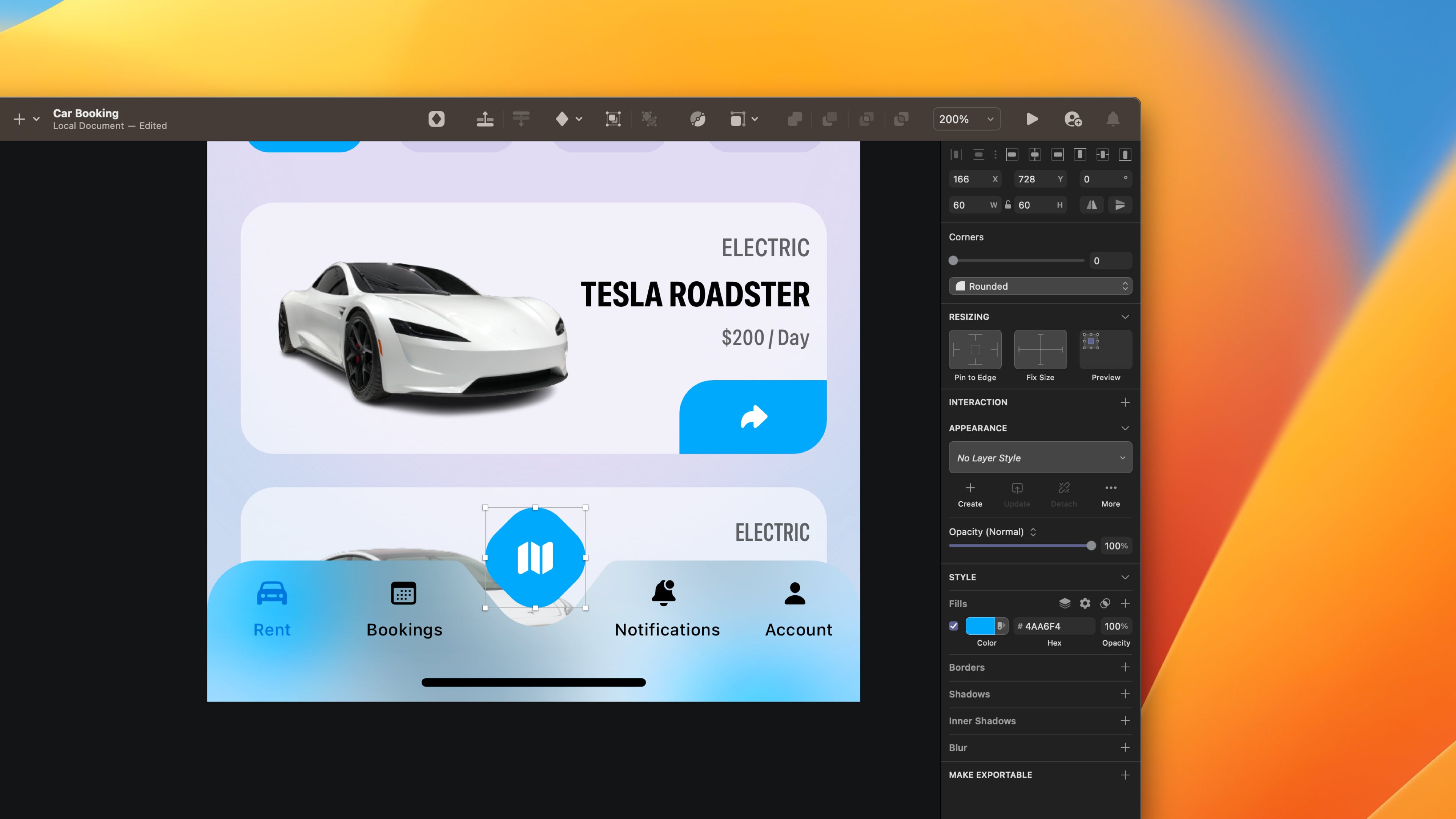
Floating Button
Create a floating button that will serve as a map to make it easier to search and find stores near you.
- Create a Rectangle 60 x 60, colour #4AA6F4. Set 20 on the corner radius.
- Rotate 45 degrees. To set the degree to 0. We must flatten.
- After flattening, the size will change. Change the dimension to 60 x 60.
- You will see decimal on X and Y. Avoid decimal while designing and rounding the number.
- Take the map fill symbol from the SF Symbol 4.
- Group the symbol and the background. Name the layer Map button.
- Group everything: Map button, symbols, home indicator and background.
![SF Symbols and Rendering Modes image 10]()
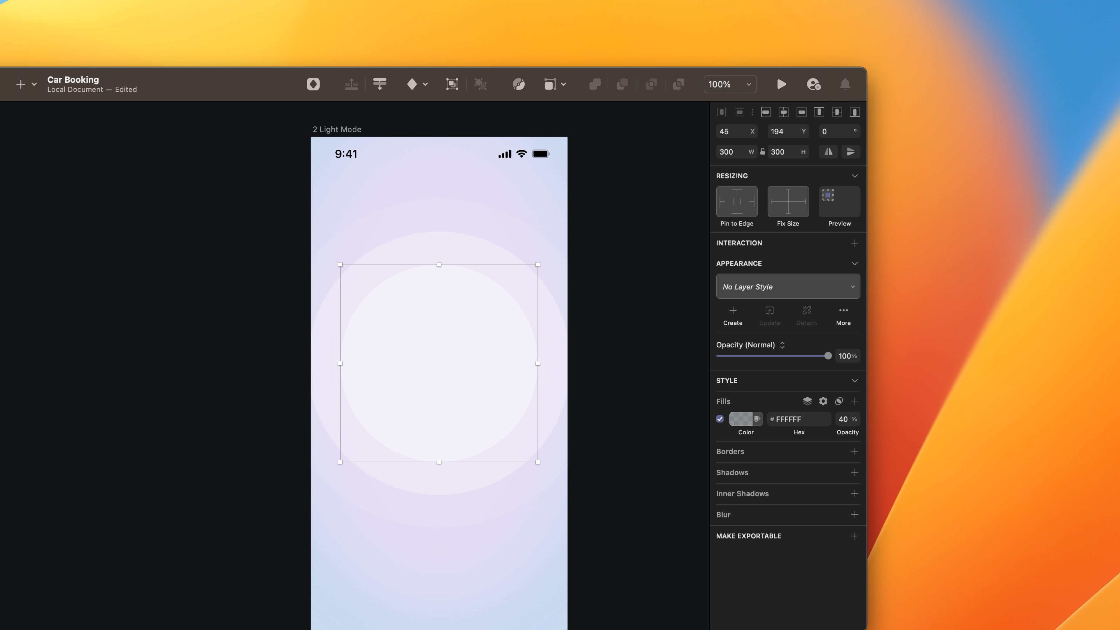
Circular Background
Combine three circles and adjust the opacity to create a beautiful circular background.
- Create an Artboard, choose iPhone 13 Pro and add a background color that is neutral and light #CCD9EF.
- Create three Circles of 500 x 500 , 400 x 400 and 300 x 300, color white.
- Decrease the opacity by 10% of the bigger circle.
- Set 30% to the second circle and 40% to the smaller circle.
- Put them on top of each other, starting from the smaller to the bigger.
![SF Symbols and Rendering Modes image 11]()
Top Navigation and Title
We don’t have a Tab Bar on this screen, so create navigation that allows returning to the previous page. There is no more action for this screen except turning back or booking the car.
- Write the title Car Detail using Expanded bold 17, color black, uppercase.
- Choose auto width and align text left.
- Copy the arrow left symbol from the SF Symbol 4 and put it aside from the title.

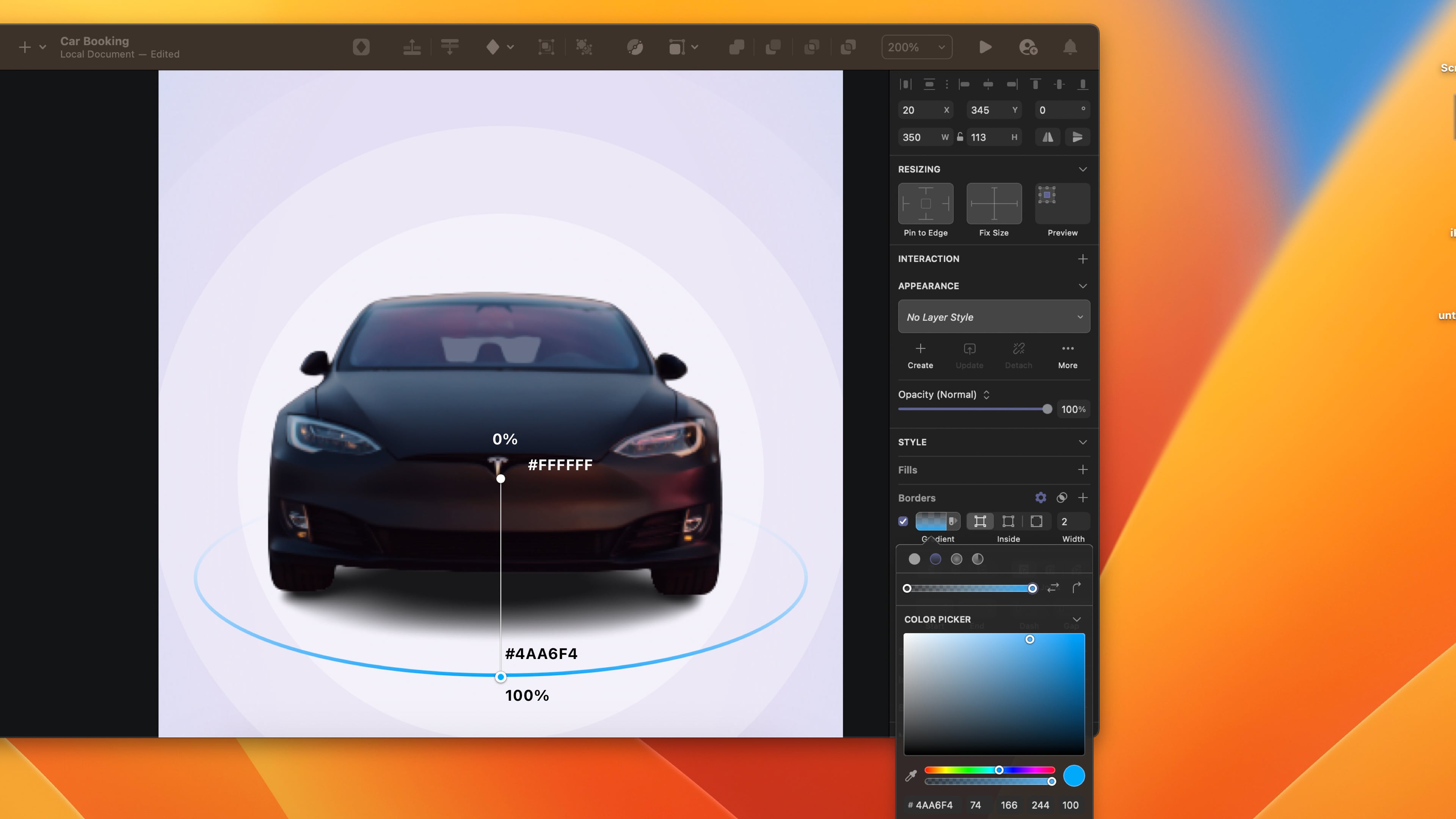
Image and Circular Tool
Create a tool that allows you to rotate the car in a circular motion to see the whole vehicle.
- Add the car image from the asset file.
- Put the image in the middle of the circular background.
- Create an oval 250 x 113 below the car image. Fill with a linear gradient, top 0% ,bottom #4AA6F4.
![SF Symbols and Rendering Modes image 13]()
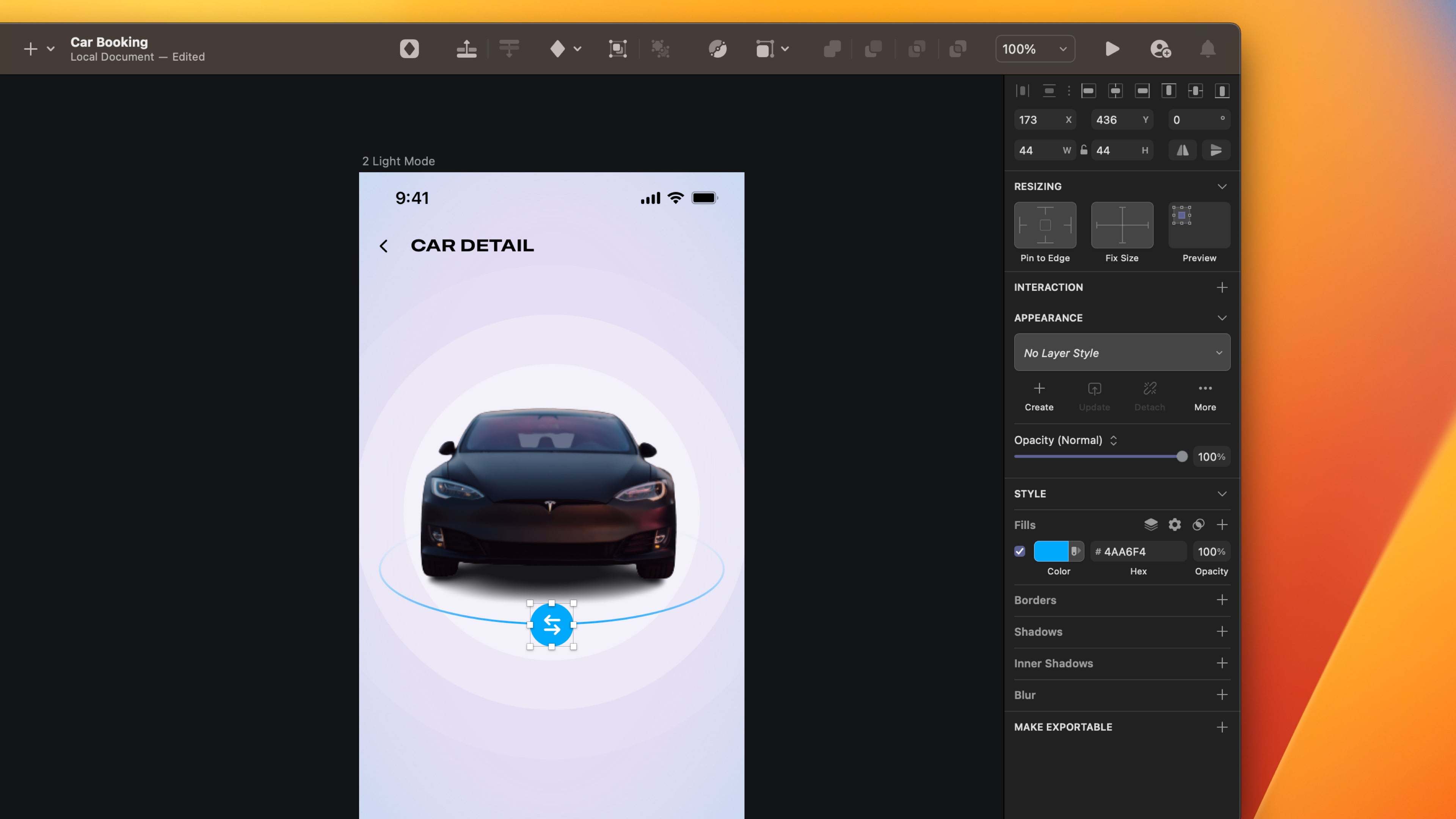
Arrow Left and Right Button
By including an arrow left and right button. Your design is more precise and easier to understand.
- Take the arrow left arrow right symbol from the SF Symbol 4.
- Create a circle of 44 x 44.
- Group the symbol and the base.
![SF Symbols and Rendering Modes image 14]()
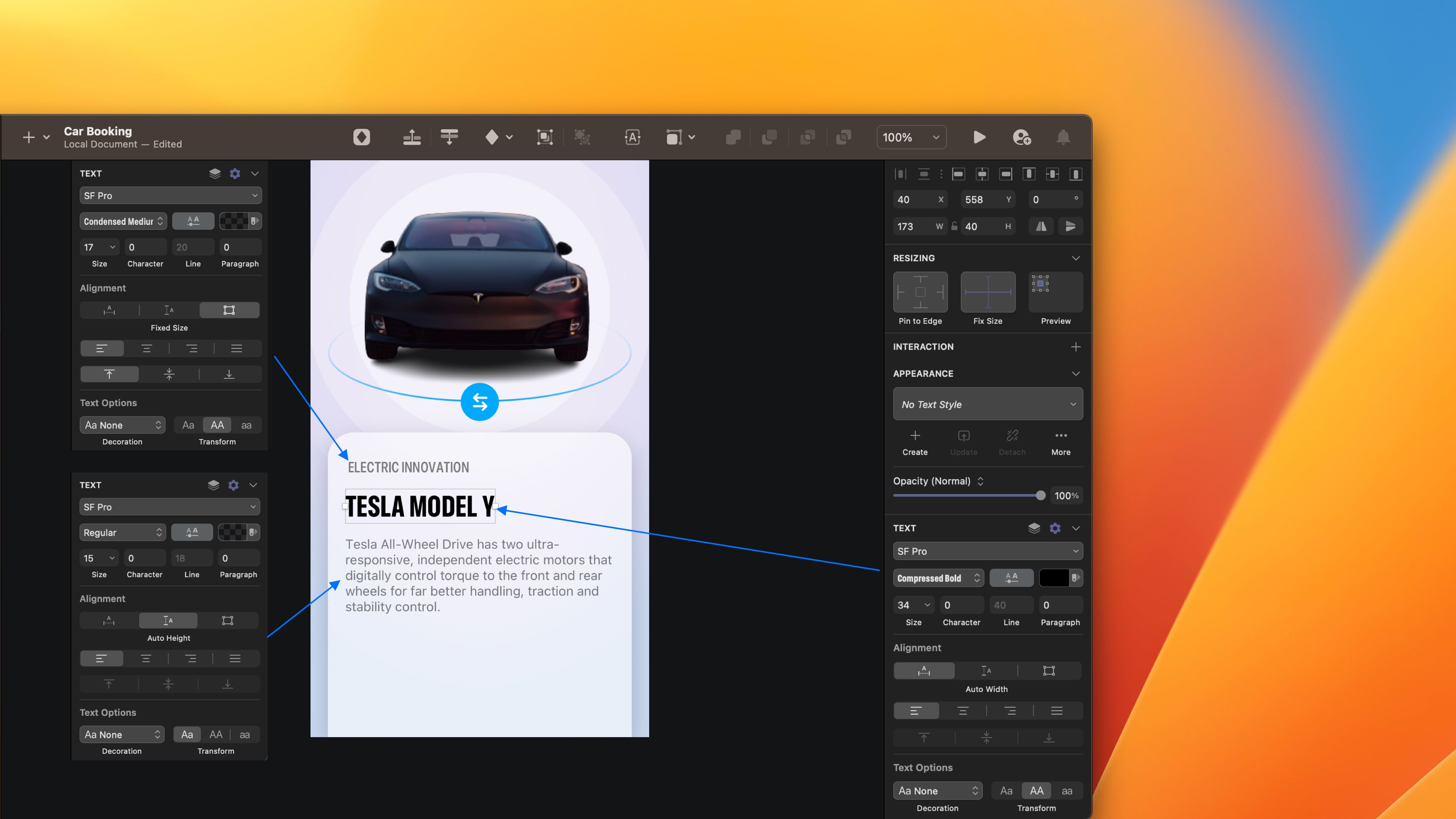
Bottom Sheet
Create a bottom sheet that includes all the detail about the chosen car. Play with the width styles Condensed, Expensed and Regular.
- Write the category of the car Electric Innovation using the condensed medium 17, color black, opacity 60%. Set uppercase. Set auto width and align text left.
- Write the name of the car Tesla Model Y using Compressed Bold 34, color black.
- Add a description about the car using the Regular 15, color black, opacity to 60%. Set auto height and align the text left.
Book Now Button
Create a book now button that goes directly to the third screen to make the reservation.
- Create a rectangle of 175 x 60, color #4AA6F4. Set 30 only in the top left corner.
- Write Book Now using **the **Expanded Bold 17, color white. Set auto width and align text left.
- Group them. Name the layer by Book Now.
- Write the price %150/day using Expanded Bold 17, color black. Set auto width and align text left.

Rendering Mode Palette
The rendering mode works only in SwiftUI, but it doesn't mean we can’t include it in our design. I will show you how to do it manually.
- Go to SF Symbol 4 application and take bold car fill, person 2 fill and snowflake circle fill symbols.
- Select each symbol, right-click and click on Convert to outlines.
- Click on one of the paths and change the colour to #4AA6F4.
- Write a text below: Electric, 7 seater and Air con.

Templates and source code
Download source files
Download the videos and assets to refer and learn offline without interuption.
Design template
Source code for all sections
Video files, ePub and subtitles
Videos
Subtitles
Assets
1
iOS 16 Design
A complete guide to designing for iOS 16 with videos, examples and design files
2:38
2
Colors and Gradients
Understanding the iOS 16 color system and how to use monochromatic, analogous and complementary colors
31:19
3
Layout and Spacing
Learn how to create a layout for iOS 16 using guides, negative spacing and grids
23:18
4
Material and Dark Mode
Combine background blur, blending modes and mesh gradients to create materials and colors for a dark mode UI
22:59
5
iOS 16 Typography
Design an iOS 16-ready UI from scratch in Sketch using the new SF font width styles, SF Symbols 4 and font pairing
5:33
6
SF Width Styles
Learn how to work and pair it with the new SF width styles: Condensed, Compressed, and Expanded
8:31
7
SF Symbols and Rendering Modes
Learn about the SF Symbols and its rendering modes
13:53
8
Variable Color
Learn how to use variable color to make SF Symbols more expressive
7:39
9
iOS 16 Navigation
Understanding navigation, content structure, action buttons and modals for iOS 16
2:54
10
Content Structure
Set the content navigation and custom tab bar with a floating action button using Sketch
18:58
11
Top Navigation
Learn about Navigation Bar using the back button, action button and segmented control
14:21
12
Modal Presentation
Learn about the Modal Presentation and Push transition
7:16
Meet the instructor
We all try to be consistent with our way of teaching step-by-step, providing source files and prioritizing design in our courses.
Sourasith Phomhome
UI Designer
Designer at Design+Code
19 courses - 72 hours
Master AI Prompting for Stunning UI
Learn how to leverage AI tools like Aura for creating beautiful designs, working with templates, and experimenting with advanced prompts. A concise guide for designers and developers to level up their skills.
10 hrs
Design Multiple Apps with Figma and AI
In this course, you’ll learn to design multiple apps using Figma and AI-powered tools, tackling a variety of real-world UI challenges. Each week, a new episode will guide you through a different design, helping you master essential UI/UX principles and workflows
4 hrs
SwiftUI Fundamentals Handbook
A comprehensive guide to mastering Swift programming fundamentals, designed for aspiring iOS developers. This handbook provides a structured approach to learning Swift's core concepts, from basic syntax to advanced programming patterns. Through carefully sequenced chapters, readers will progress from essential programming concepts to object-oriented principles, building a solid foundation for SwiftUI development. Each topic includes practical examples and clear explanations, ensuring a thorough understanding of Swift's capabilities. This handbook serves as both a learning resource and a reference guide, covering fundamental concepts required for modern iOS development. Topics are presented in a logical progression, allowing readers to build their knowledge systematically while gaining practical programming skills.
2 hrs
Design and Code User Interfaces with Galileo and Claude AI
In this course, you’ll learn how to use AI tools to make UI/UX design faster and more efficient. We’ll start with Galileo AI to create basic designs, providing a solid foundation for your ideas. Next, we’ll refine these designs in Figma to match your personal style, and finally, we’ll use Claude AI to turn them into working code—eliminating the need for traditional prototyping.
4 hrs
Design and Prototype for iOS 18
Design and Prototype for iOS 18 is an immersive course that equips you with the skills to create stunning, user-friendly mobile applications. From mastering Figma to understanding iOS 18's latest design principles, you'll learn to craft two real-world apps - a Car Control interface and an AI assistant.
3 hrs
Master Responsive Layouts in Figma
Creating responsive layouts is a must-have skill for any UI/UX designer. With so many different devices and screen sizes, designing interfaces that look great and work well on all platforms is necessary. Mastering this skill will make you stand out in the field. In this course, we'll start from scratch to create this beautiful design using Figma. You'll learn how to make layouts that are easy to use and work well on any device. We'll cover key concepts and tools to help you master responsive design in Figma.
2 hrs
UI UX Design with Mobbin and Figma
Mobbin is a powerful tool for UI/UX designers seeking inspiration and innovative design solutions. This platform offers a vast collection of real-world mobile app designs, providing a treasure trove of UI elements and layouts.
2 hrs
3D UI Interactive Web Design with Spline
Learn to create 3D designs and UI interactions such as 3D icons, UI animations, components, variables, screen resize, scrolling interactions, as well as exporting, optimizing, and publishing your 3D assets on websites
3 hrs
Design and Prototype for iOS 17 in Figma
Crafting engaging experiences for iOS 17 and visionOS using the Figma design tool. Learn about Figma's new prototyping features, Dev Mode, variables and auto layout.
6 hrs
Design and Prototype Apps with Midjourney
A comprehensive course on transforming Midjourney concepts into interactive prototypes using essential design techniques and AI tools
8 hrs
iOS Design with Midjourney and Figma
Learn the fundamentals of App UI design and master the art of creating beautiful and intuitive user interfaces for mobile applications
1 hrs
UI Design for iOS, Android and Web in Sketch
Create a UI design from scratch using Smart Layout, Components, Prototyping in Sketch app
1 hrs
UI Design a Camera App in Figma
Design a dark, vibrant and curvy app design from scratch in Figma. Design glass icons, lens strokes and realistic buttons.
1 hrs
UI Design for iOS 16 in Sketch
A complete guide to designing for iOS 16 with videos, examples and design files
3 hrs
Prototyping in Figma
Learn the basics of prototyping in Figma by creating interactive flows from custom designs
1 hrs
UI Design Quick Websites in Figma
Learn how to design a portfolio web UI from scratch in Figma
1 hrs
UI Design Android Apps in Figma
Design Android application UIs from scratch using various tricks and techniques in Figma
2 hrs
UI Design Quick Apps in Figma
Design application UIs from scratch using various tricks and techniques in Figma
12 hrs
Figma Handbook
A comprehensive guide to the best tips and tricks in Figma. Not affiliated with or endorsed by Figma, Inc.
6 hrs