Content Structure
Add to favorites
Set the content navigation and custom tab bar with a floating action button using Sketch
Play video
UI Design for iOS 16 in Sketch
Your menu should be meaningful, describing your app’s at a glance. For example, Fitness , Training , Sharing . Avoid using Home which tends to make the other tabs repetitive and navigation confusing.

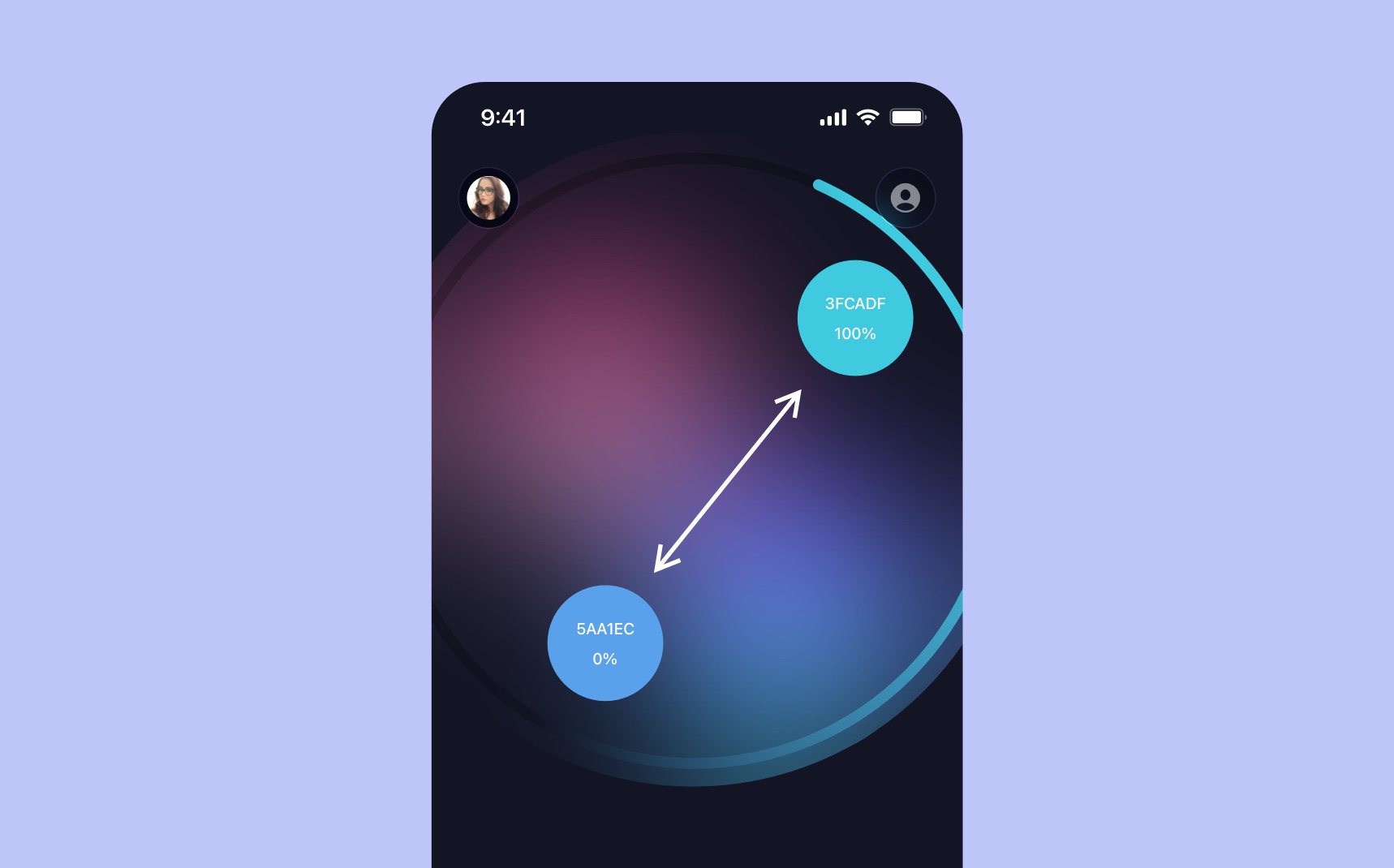
In this section, we’re going to design the first screen with a custom grid layout using a beautiful material sheet. Then, we’ll design a custom tab bar with a floating action button giving a crystal effect.
Workspace Document
When you first start using Sketch, it will bring you to the Workspace window where you’ll find your design files and your team’s files.
- Create a new file by selecting New Document.

Artboard
Artboards are the screens of your app. Since this is in dark mode, we’re going to use a dark purple for the screen background.
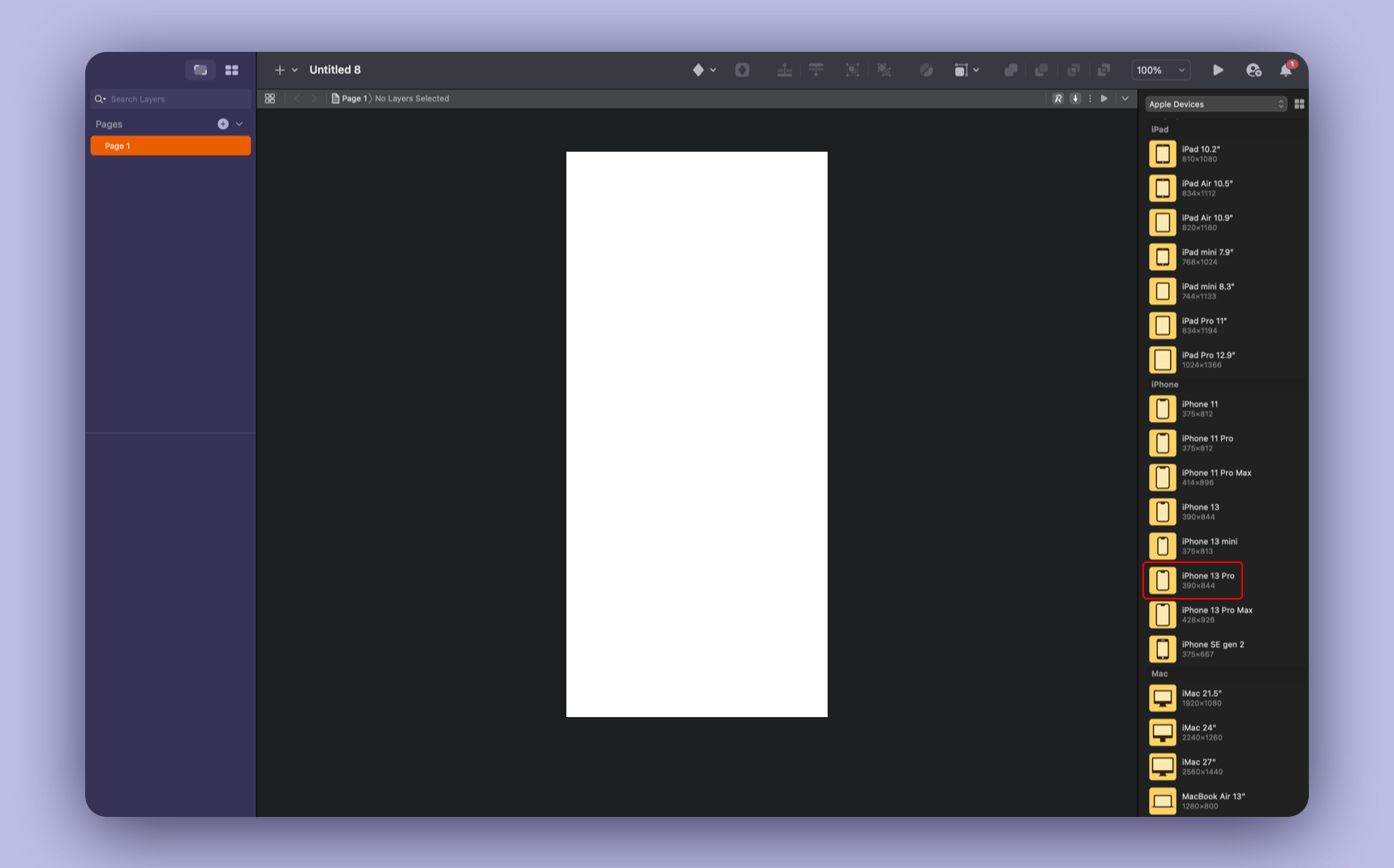
- To create an Artboard, press A and choose iPhone 13 Pro.
- Add a Fill color #131524 for the background.
iOS UI Kit
Apple made a UI Kit for Sketch which is useful for components like the status bar and the home indicator. This saves you time from recreating them from scratch.
- Download the Sketch library file and don’t forget to activate the checkbox.
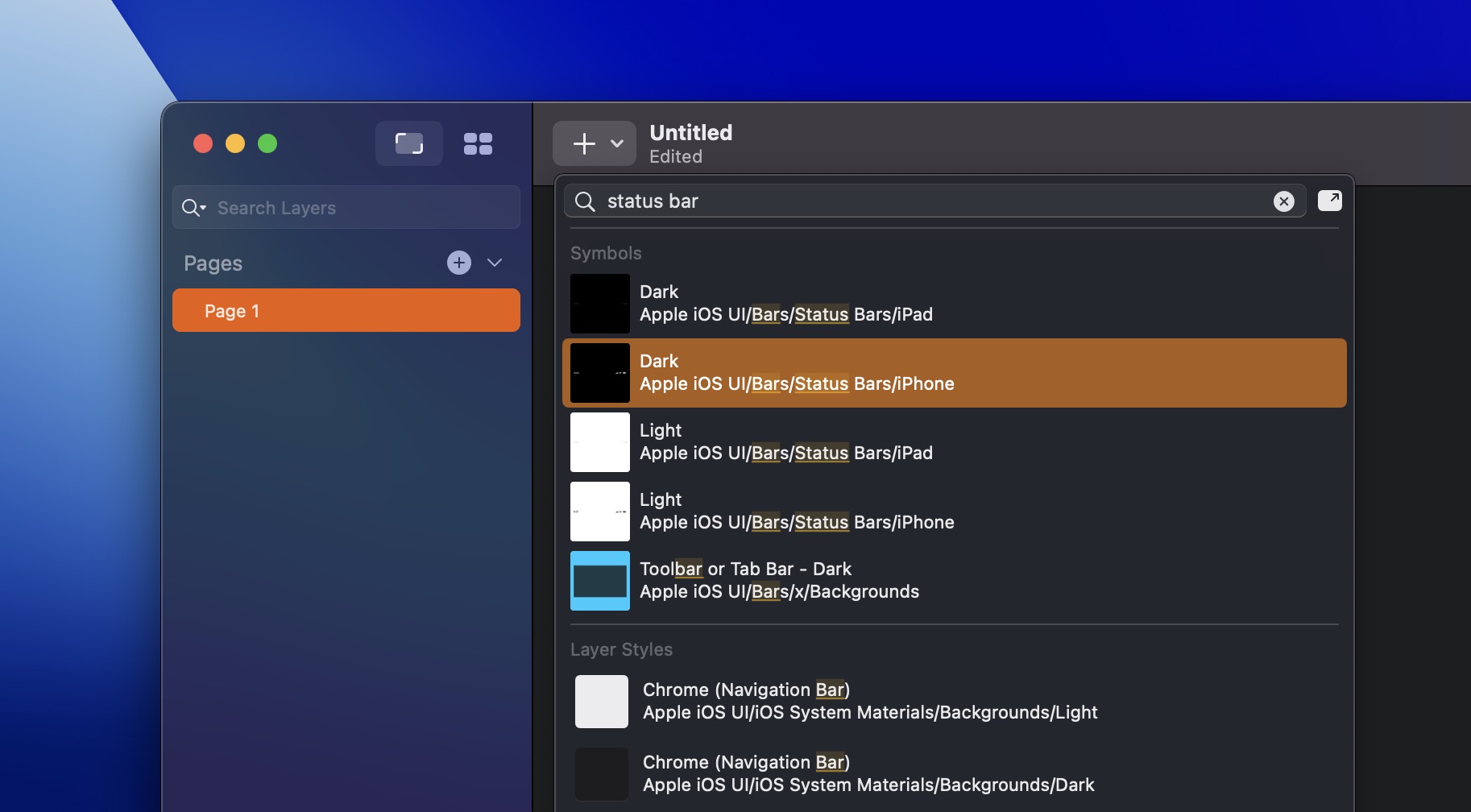
- Go to Insert (Plus icon) and search for status bar. Select Dark → iPhone.
- Do the same thing, search for home indicator. Select Dark → iPhone.
Navigation Bar
Create an avatar and account icon in the top portion of the screen.
Avatar
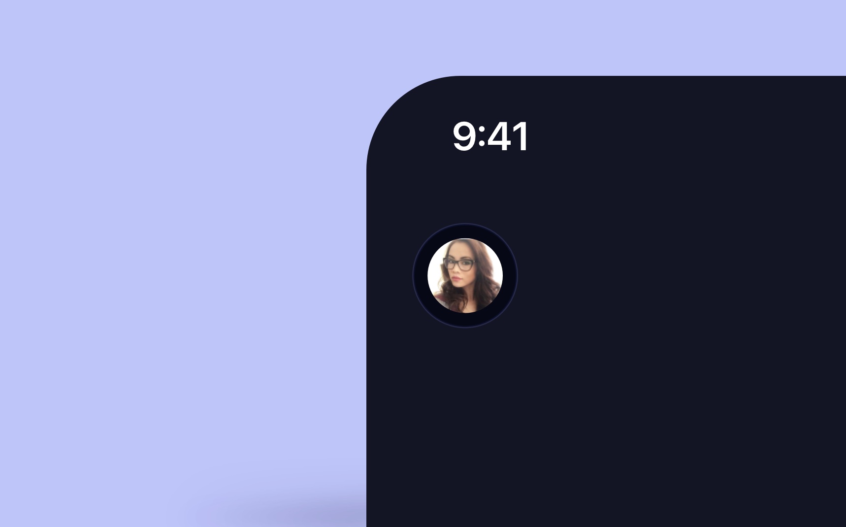
- Draw a Circle of 32 x 32. Change the Fill color to Pattern Fill, then choose the image of your avatar. Remove the border. Rename Avatar. You can download any face photo from Unsplash or use my avatar from the Assets file.
- Draw another Circle 44 x 44 to create a nice border, Fill color #21243E, border color white, add the blending mode to Overlay, width 1.Rename Border. Put the border on the back of your avatar.
- Select the avatar and the border layers and Group by pressing Command + G, X 20, Y 63.
- Rename the group to Avatar.
Account Icon
You’ll need the SF Symbols app for this section. SF Symbols is library of 4,000 icons by Apple.
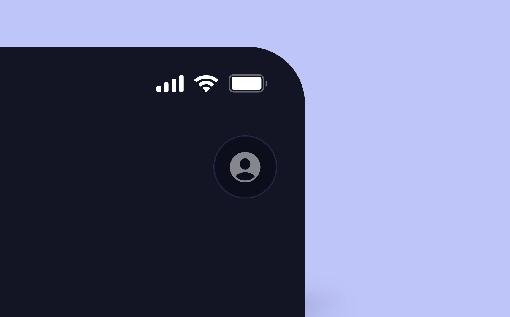
- Duplicate the Avatar group.
- Remove the avatar image. - Search for the person symbol (person.circle.fill) and copy (Command + C).
- Press T to create a Text and paste the person symbol. Use SF Pro Regular 17 with white color, opacity 50%, X 326, Y 63.
- Rename Account.
Blurred Circles
To create a colorful glass effect in the background, we’ll need to blur two circles.
- Create a Circle by pressing O and hold Shift to create a proportional circle of 216 x 216, X 13, Y 121.
- Add a Linear Gradient with 2 colors #FC347F (top color) and #EDD0FF (bottom color), decrease the opacity to 60%. Remove the border.
- Duplicate the Ellipse for the second blob and change the color to #8252FF and #2DAEB3, opacity 100%, X 153 Y 283.

Circular Progress
A progress ring is a visual indicator that shows how far you are in completing a task, such as a workout or filling out a form.
Background Blur
- Create an Ellipse 480 x 480, X -48, Y 37.
- Remove Fill and Border. Add a Background Blur to 40.
- Rename Background Blur, put it on the back of the top navigation.
![Content Structure image 9]()
Progress Ring
- Create a border 444 x 444, remove fill color, border black, 20% opacity, X -29, Y 58, width 8.
- Duplicate the same border and add linear gradient #3FCADF to #5AA1EC (0% opacity), rotate the gradient to top right.
- Set the Stroke to Center.
- Select the border properties (setting icon), set the Dash to 952 and Gap 1400. Select the Ends type to round shape.
- Rotate the ring to 90°, rename Ring.
![Content Structure image 10]()
Stroke Dash
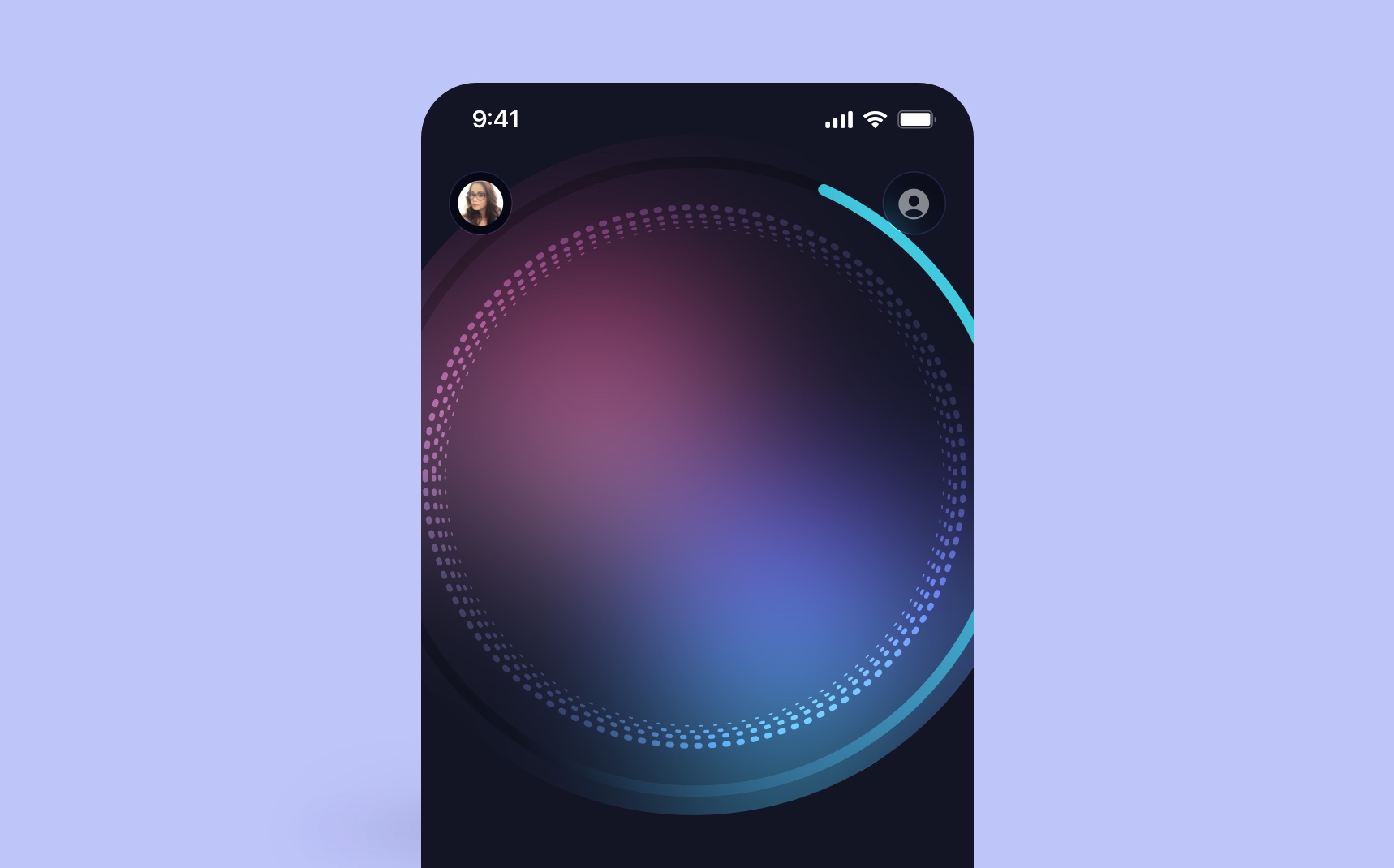
To make the design more interesting, let’s combine 4 dashed strokes.
- Create a stroke 380 x 380, uncheck the fill, border white and width 4.
- Select the Dash 2, Gap 8. Set the Ends type and Joins to round.
- Duplicate the same stroke, resize to 368 x 368, width 3.
- Repeat with a size of 360 x 360, width 2.
- Repeat the last stroke, 352 x 352 and width 1.
- Group the strokes together and Center, X 5, Y 88.
Waves
Let’s create a beautiful wave that shows the heart rate.
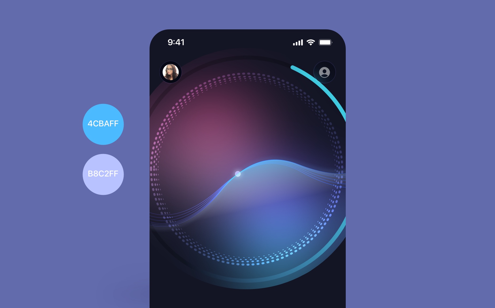
- Using the Vector Tool, click and drag to curve the line to create a wave shape, X -13, Y 266.
- Set the border to 1 and add linear gradient #4CBAFF to #B8C2FF, add blending mode to Overlay.
- Duplicate and rotate by -2 degree and repeat 6 times.
- On the last wave, edit the line by pressing Enter and click on Close Path.
- Set the Fill gradient to #47C3FF to #D8D8D8 (opacity 0%), rotate -9°.
- Duplicate the last stroke and bring on the top of the path layer, blur 5.
- Create a Circle 10 x 10, Fill #C3DFFF, border 1 white 40% opacityX 170, Y 282.
- Duplicate and set a blur of 4.
SF Pro Expanded
Make sure to install the SF Fonts from Apple . For the text, I used Expanded because there is a lot of empty space and it’s expressive and easy to read. I enlarged the text in the middle to give focus on that number.

- The first text and the third text, use SF Pro Expanded Medium 17, white.
- For the second text, use Expanded Bold 64, white.
- Spacing between Heart Rate and 120 is 24, spacing between 120 and bmp is 8.
- Group the text labels together by Command+G, X124, Y 115.
Activity Cards
For the activities, we’re using cards to showcase glanceable information in small, attractive containers about calories, steps, sleep, etc.
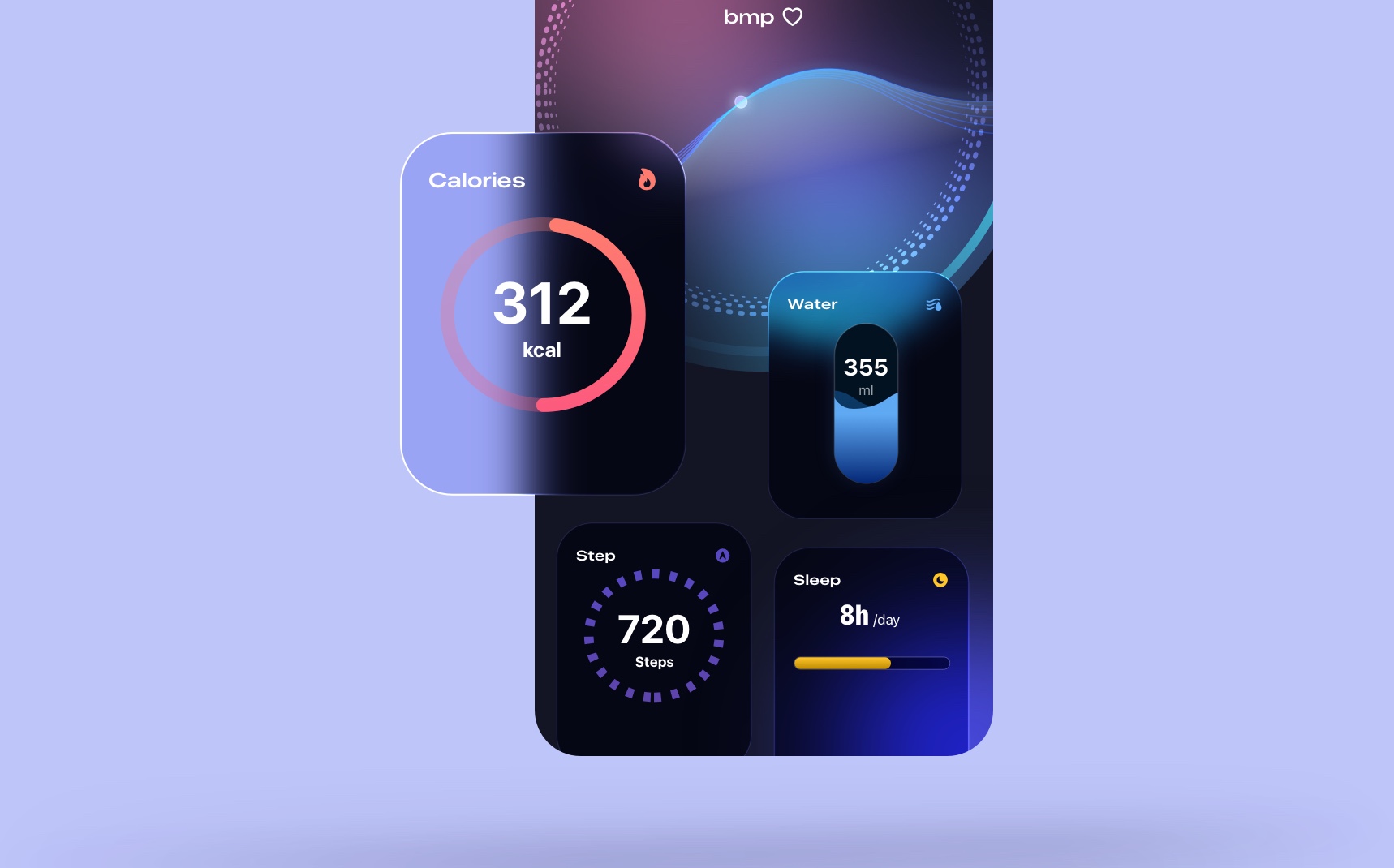
- Create a Rectangle 164 x 210, Fill #21243E, Stroke 1 white, background blur 10, X 10 Y 411.
- Use SF Pro Expanded Semibold, white for the title. Spacing 16 from the left and 16 from the top
- Add the flame.fill SF Symbol, fill #FE7C6F, same spacing as the text (16 left and 16 top).
- Create visuals for Calories, Water, Steps and Sleep. I prepared these components so you can use them. Center in the card.
- Create the other 3 cards with symbols: drop.fill, figure.step.training, sleep.
Tab Bar
The Tab Bar is for navigating the main, top-level sections of your app. It is placed at the bottom of the screen and is useful for quickly switching content types.
Tab bar body
Let’s create a custom shape for the tab bar body with the nice curve.
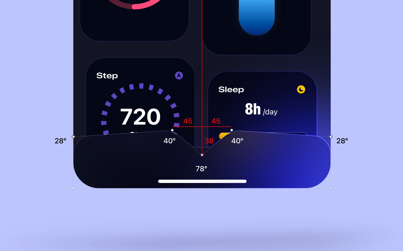
- Create a Rectangle 390 by 88, remove Fill, Stroke 1 white, background blur 24.
- Press Enter to Edit, add a point in the middle, left and right with 45 spacing on each side.
- Select the middle point and drag down to 38 px, corner radius 78°.
- Select the 2 middle points, corner radius 40° each.
- Hold Shift+Command and select the 2 points corner (left and right), drag down to 10 px, corner radius 28° for both.
Tab items
You’ll need the Tab bars from the UI Kit for this section if you want to save time. All you need to do is change the symbols from SF Symbols and the text label.
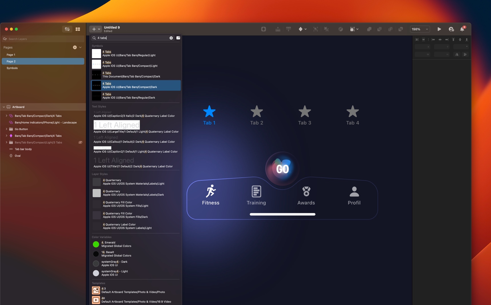
- Go to Insert (Plus icon) and search for 4 tabs (for the shortcut). Select 4 Tabs (Apple iOS UI) → Compack/Dark.
- You’ll need the symbols : figure.run (Fitness), book.fill (Training), trophy.fill (Awards, person.fill (Profil).
- To change the symbols, double click on the tabs, click on Unlink from Library, change the symbol directly on the Symbol section.
- You can change the text label directly on the right panel.
- Select the tabs bars group, select the background on the right panel, select no symbol to remove the background.
- Put the tab bars group in the top of the tab body,select both layer, align center and align middle, X 0, Y 768.
Floating Action Button
The floating action button is generally used to promote the most common action within a user interface screen. Let’s create a custom Floating action button giving a crystal effect. For this section, I’ll show you a quick steps since is repetitive but I have already prepared this so you can use on my asset file.
Button Shape
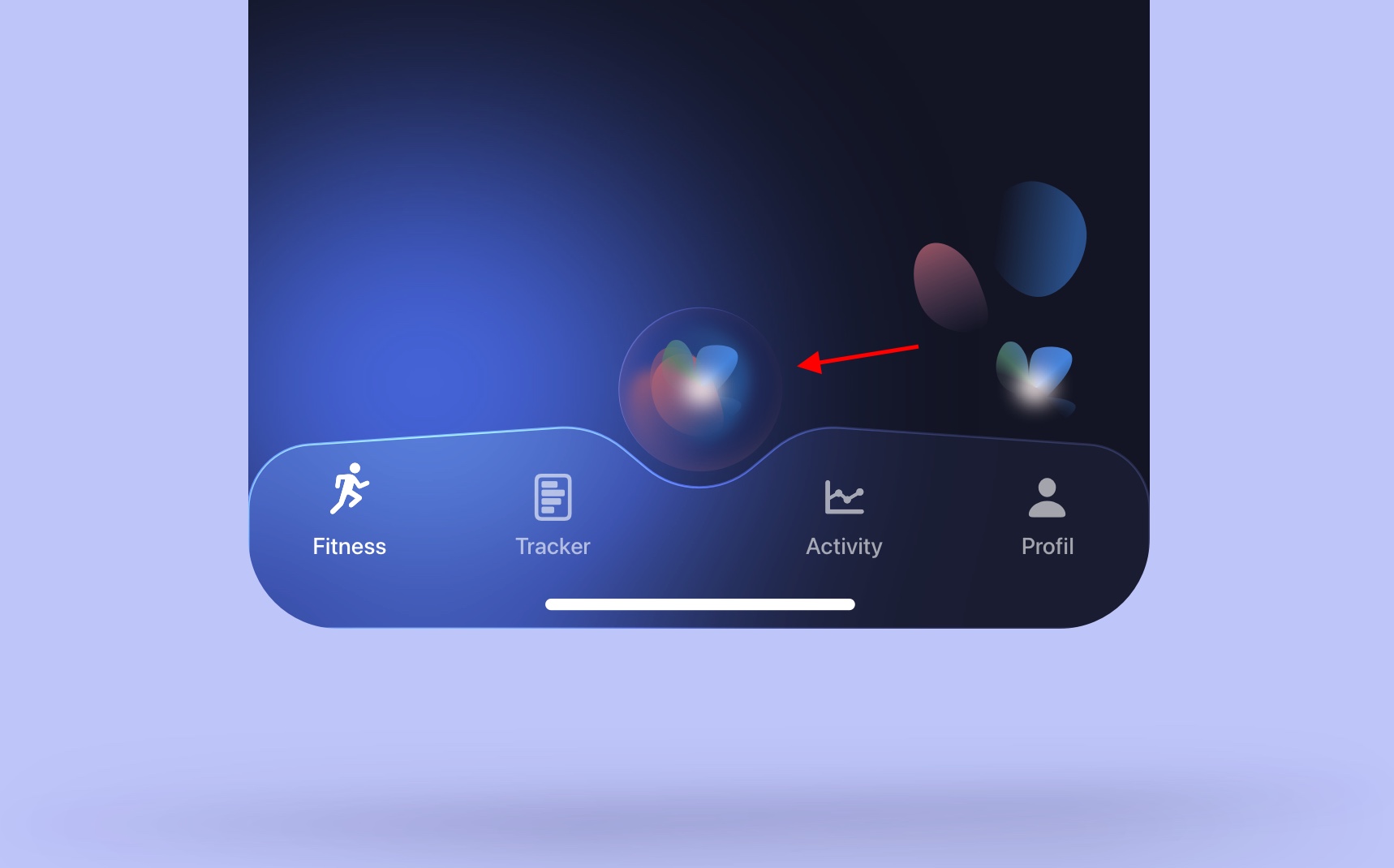
- Create a main Circle 70 x 70, X 160, Y 705, remove fills and borders, Inner Shadow 1: #F28181 (opacity 15%) X 1, Y 1, Blur 1. Inner Shadow 2 white (opacity 50%), X 3, Y -3, Background Blur 2, Saturation 7%.
- Create an Oval 26 x 42, X 159 Y 727.
- Edit the right Point and make a curve., rotate to -22°, set the Fill gradient #B06070 to #7E608A (opacity 0%), Fills opacity 80%.
- Repeat 6X and change the rotation, color, position and create different shapes.
Button Label

- Press T, write GO, use white SF Pro Condensed Bold 24.
- Put the text in top of the Crystal shape and align center.
- Group together by Command+G.
- Name the group Floating Action Button.
- Place the action button on top of the tab body from 20 spacing.
Templates and source code
Download source files
Download the videos and assets to refer and learn offline without interuption.
Design template
Source code for all sections
Video files, ePub and subtitles
Videos
Subtitles
Assets
1
iOS 16 Design
A complete guide to designing for iOS 16 with videos, examples and design files
2:38
2
Colors and Gradients
Understanding the iOS 16 color system and how to use monochromatic, analogous and complementary colors
31:19
3
Layout and Spacing
Learn how to create a layout for iOS 16 using guides, negative spacing and grids
23:18
4
Material and Dark Mode
Combine background blur, blending modes and mesh gradients to create materials and colors for a dark mode UI
22:59
5
iOS 16 Typography
Design an iOS 16-ready UI from scratch in Sketch using the new SF font width styles, SF Symbols 4 and font pairing
5:33
6
SF Width Styles
Learn how to work and pair it with the new SF width styles: Condensed, Compressed, and Expanded
8:31
7
SF Symbols and Rendering Modes
Learn about the SF Symbols and its rendering modes
13:53
8
Variable Color
Learn how to use variable color to make SF Symbols more expressive
7:39
9
iOS 16 Navigation
Understanding navigation, content structure, action buttons and modals for iOS 16
2:54
10
Content Structure
Set the content navigation and custom tab bar with a floating action button using Sketch
18:58
11
Top Navigation
Learn about Navigation Bar using the back button, action button and segmented control
14:21
12
Modal Presentation
Learn about the Modal Presentation and Push transition
7:16
Meet the instructor
We all try to be consistent with our way of teaching step-by-step, providing source files and prioritizing design in our courses.
Sourany Phomhome
UI Designer
Designer at Design+Code.
10 courses - 43 hours

Build an Interactive Site with Wix Studio
Discover Wix Studio: the no-code platform ideal for agencies and enterprises. This beginner-friendly video course guides you through web design basics, using intuitive tools for building responsive, professional websites. Learn to create animations easily—no coding required. Gain the skills to craft your own standout sites confidently.
1 hrs

3D UI Interactive Web Design with Spline
Learn to create 3D designs and UI interactions such as 3D icons, UI animations, components, variables, screen resize, scrolling interactions, as well as exporting, optimizing, and publishing your 3D assets on websites
3 hrs

Design and Prototype for iOS 17 in Figma
Crafting engaging experiences for iOS 17 and visionOS using the Figma design tool. Learn about Figma's new prototyping features, Dev Mode, variables and auto layout.
6 hrs

Design and Prototype Apps with Midjourney
A comprehensive course on transforming Midjourney concepts into interactive prototypes using essential design techniques and AI tools
8 hrs

Learn Figma Prototyping
Master interaction design with Figma Prototyping. Create an animated app experience using after delay, scrolling content, video prototype
1 hrs
UI Design for iOS 16 in Sketch
A complete guide to designing for iOS 16 with videos, examples and design files
3 hrs

Prototyping in Figma
Learn the basics of prototyping in Figma by creating interactive flows from custom designs
1 hrs

UI Design Android Apps in Figma
Design Android application UIs from scratch using various tricks and techniques in Figma
2 hrs

UI Design Quick Apps in Figma
Design application UIs from scratch using various tricks and techniques in Figma
12 hrs

Figma Handbook
A comprehensive guide to the best tips and tricks in Figma. Not affiliated with or endorsed by Figma, Inc.
6 hrs


