
Material and Dark Mode
Add to favorites
Combine background blur, blending modes and mesh gradients to create materials and colors for a dark mode UI
Play video
UI Design for iOS 16 in Sketch
Dark Mode
The system may use more contrast to help foreground material stand out against the darker backgrounds. Dark Mode uses a colorr scheme with darker background and lighter foreground tones.
- Make sure your application looks great and that your content is readable in both appearance modes
- Make every appearance have enough color contrast
- Use SF Symbols wherever possible
- Use the system-provided label colors for labels
- Favour the system's background colors
Material
Material adds transparency and blur to the background, giving the impression that the foreground and background layers are separated visually. To make the interface more visually appealing, materials can be combined with vibrancy to enhance the sense of depth.
Visual Hierarchy
As the name implies, it is the principle of arranging components in ascending order of importance. It makes it easier for users to navigate the menu and find information quickly.
With visual hierarchy, it will inform what the page is about, arranges your data, and helps you navigate. It is convenient because information is delivered in the sequence the user wants it. Through colors, fonts, and images, the design creates an emotional connection with the audience.
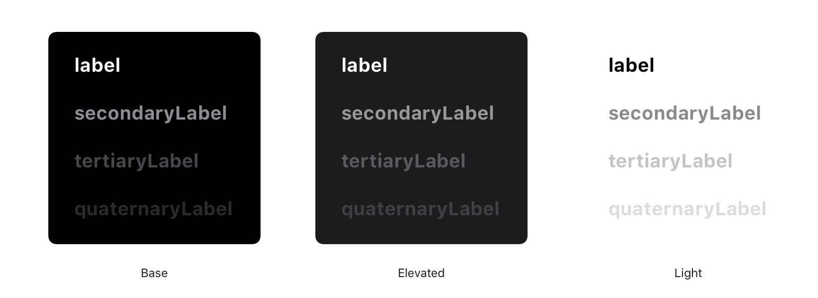
Base and Elevated
The system uses two sets of background colors in dark mode in order to enhance the perception of depth when one dark interface is layered over another. As a result of the base colors being dimmer, background interfaces appear to recede, and the elevated colors being brighter, foreground interfaces appear to advance.
Material Sheets
Keeping context of the background, UI shouldn't compromise the clarity of your content. Blurring the background not only allows you to keep its natural colors, but also brings focus to the foreground. Blurring isn't an invention, it's something that already exists in real life; as you focus on something, everything else become blurry.
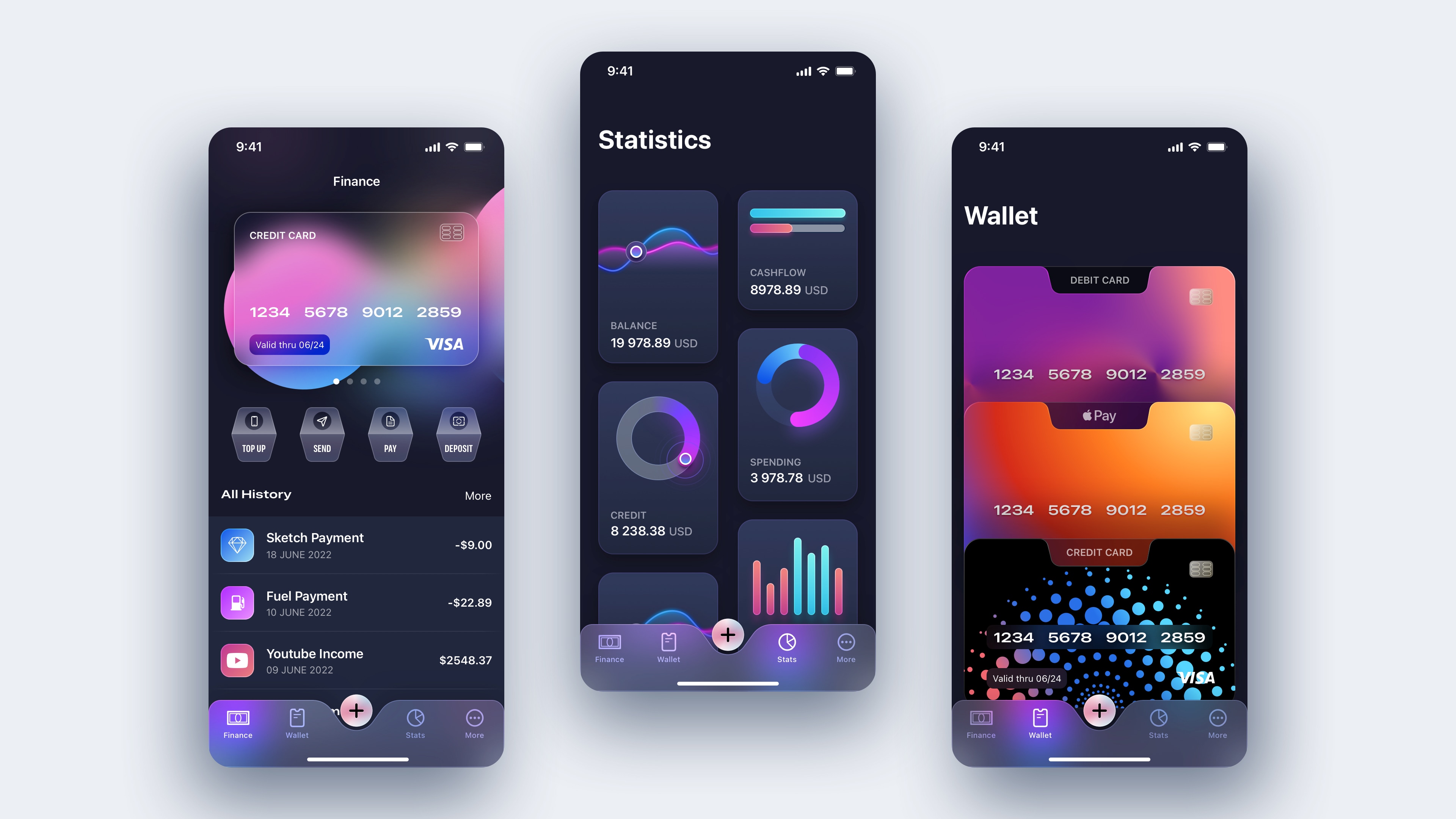
Screen 3
Let’s finish our design with the third and last screen. We will build different beautiful credit cards using radial, mesh and linear gradients. First, let’s duplicate the Statistics screen and delete all the chart cards.
Debit card
- Create a rectangle of 358x224, corners 22 and add smooth corners
- Add shadow, color black,16% opacity, X: 0, Y: 20 and Blur 40
- Align layer to center and margin top 40
- Select the layer, press Command+G to group and rename it Debit card
- Insert an 80X80 polygon with 8 sides, rotate it 22° and flatten the shape (toolbar top center)
- Align layer center, press on Return key to edit
![Material and Dark Mode image 2]()
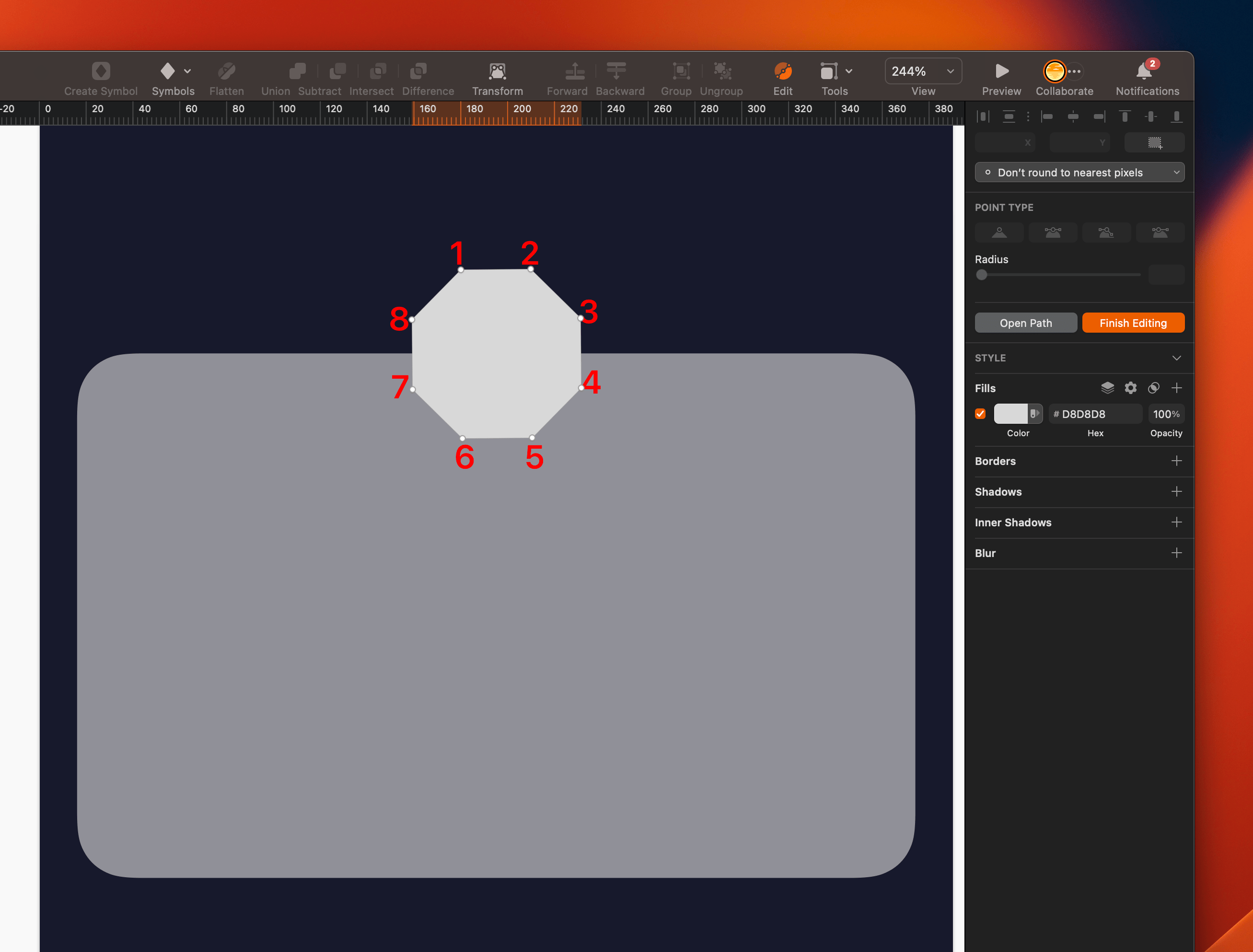
We will transform this polygon into another shape. Change the points as follows:
- First point; X: 99, Y: 170
- Second point; X: 291, Y: 170
- Third point; X: 291, Y: 176
- Fourth point; X: 262, Y: 176 and set corner 12
- Fifth point; X: 256, Y: 212 and set corner 12
- Sixth point; X: 134, Y: 212 and set corner 12
- Seventh point; X: 125, Y: 176 and set corner 12
- Eighth point; X: 99, Y: 176
![Section03-img1]()
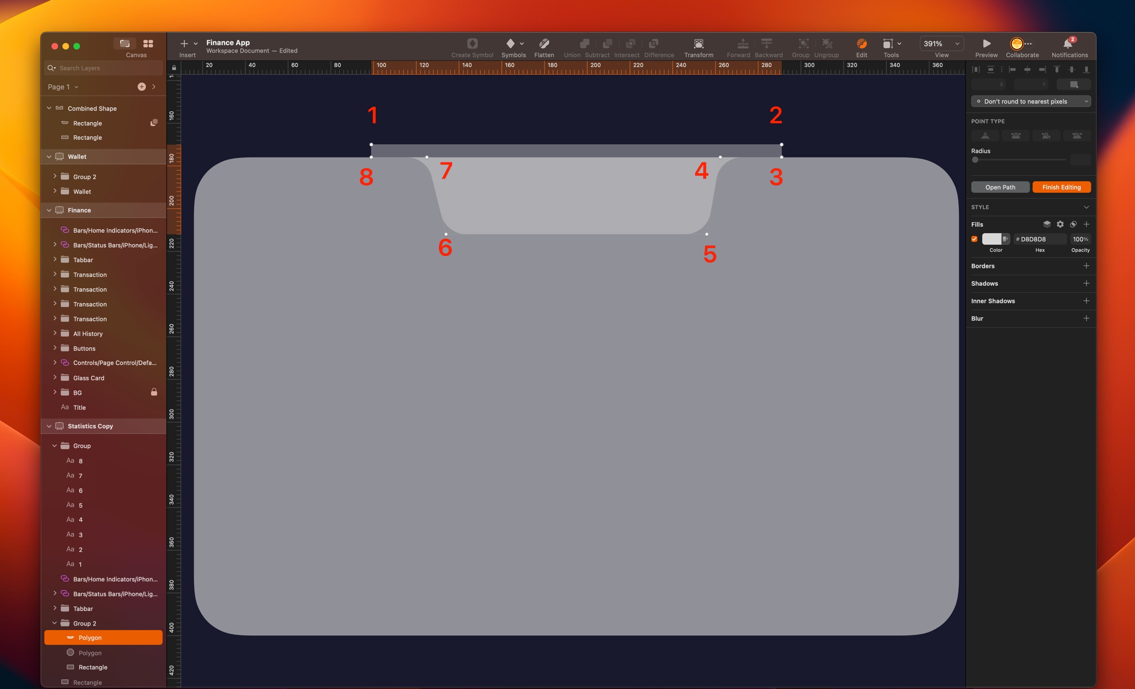
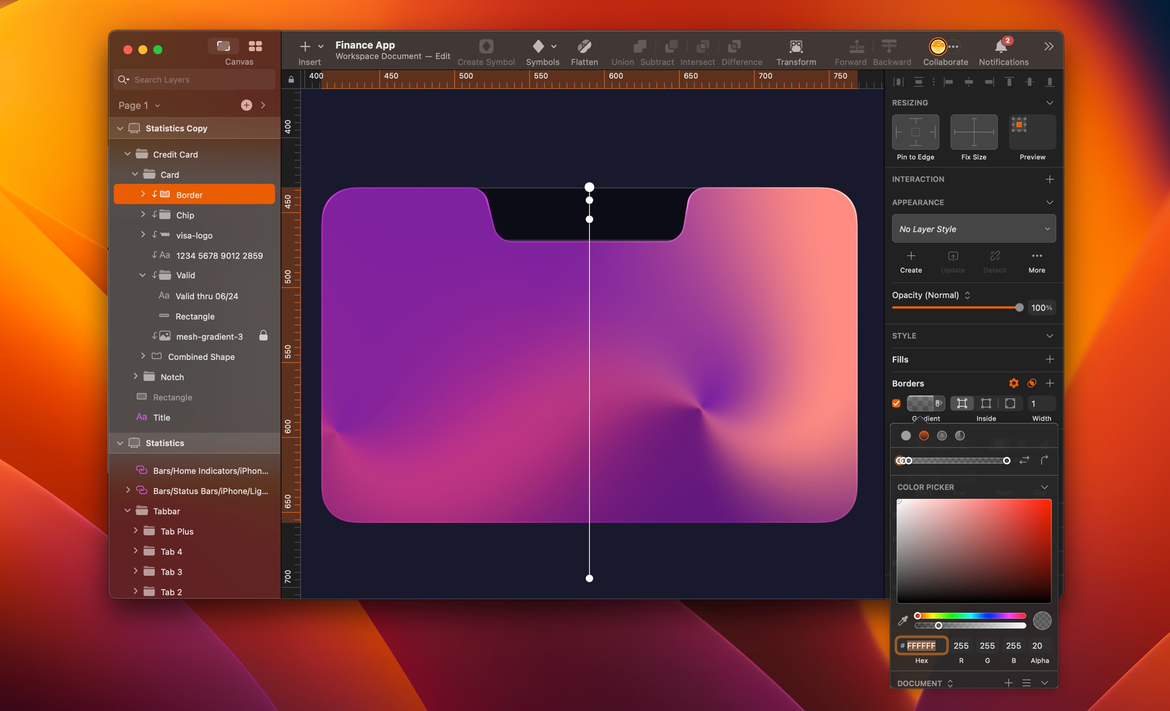
Select the rectangle and the shape layers using a subtract operation. Group the combined shape by pressing on Command+G. Let’s create a rectangle with a background blur
- Insert a rectangle of 164x37, align center and margin top 40 and place it under the combined shape layer
- Add fill color black, 50% opacity, border with width 1, inside, color white, 16% opacity
- Add background blur 20 and rename it Notch
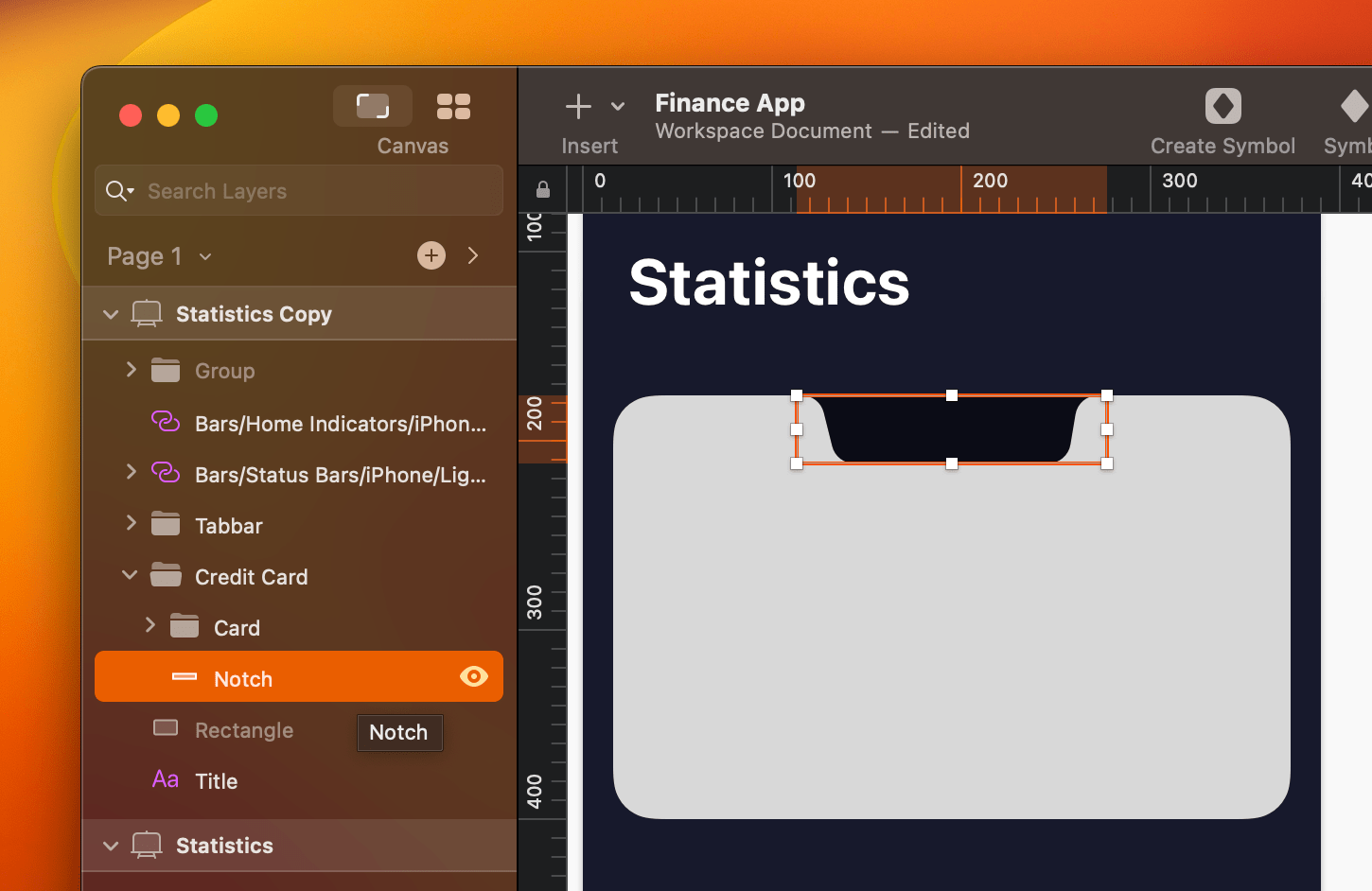
- Select __Combined Shape __layer, duplicate by pressing Command+D, right-click to remove the mask
- Inside__ Card__ folder, move this layer at the top and rename it Border, add border with width 1, inside
- Add a linear gradient, color 1 white, 20% opacity, color 2 white, 80% opacity, color 3 white, 30% opacity, color 4 white, 10% opacity and overlay
![Material and Dark Mode image 4]()
Mesh Gradient
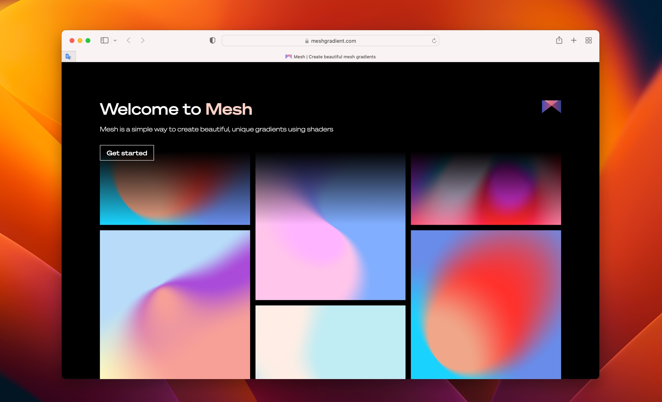
Mesh gradient is a beautiful way to create a background gradient for the hero section on your site or app. We will use it for the colorful card. They also have a plugin for Sketch to free to try and visit their website.
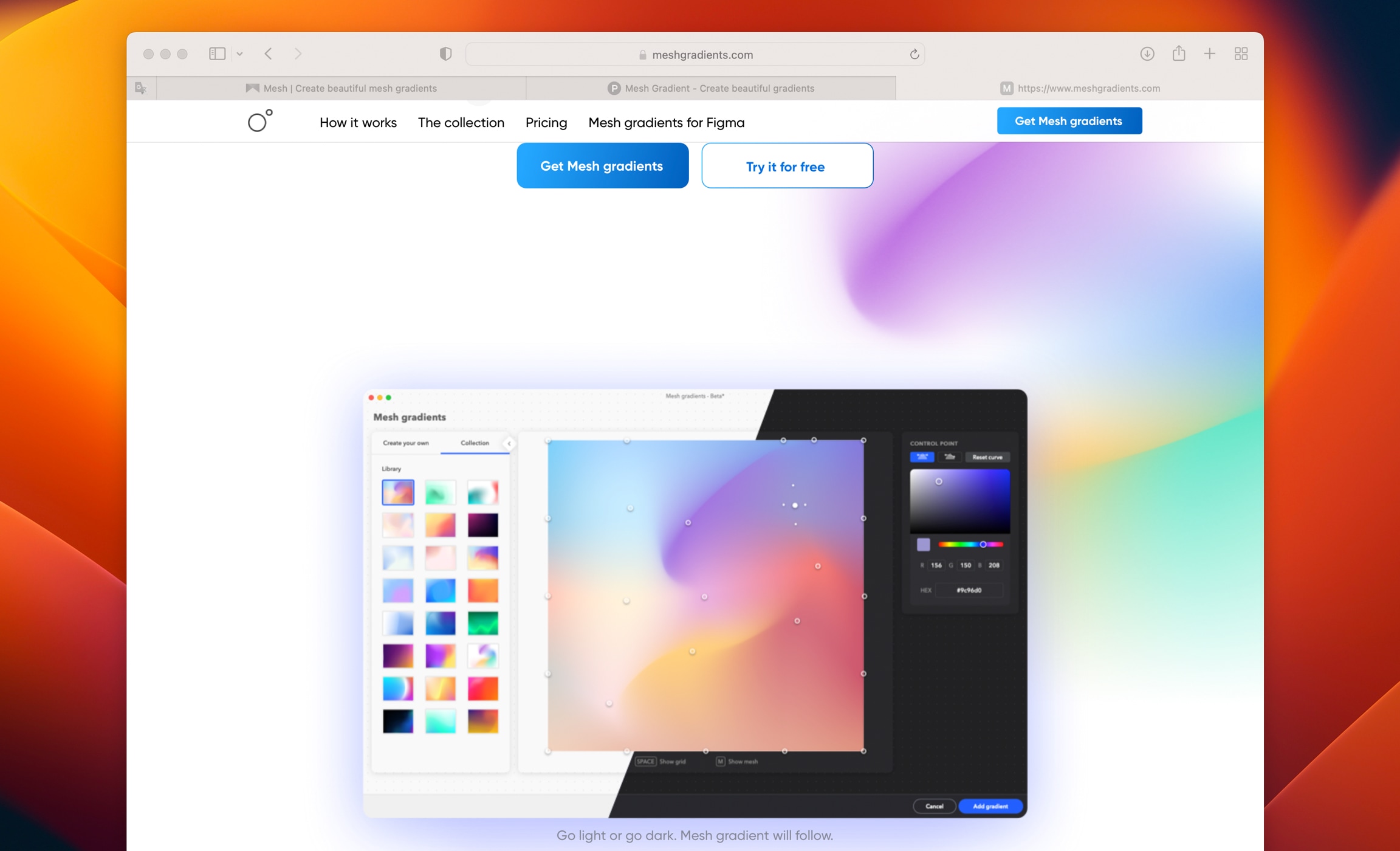
There is another website that I really like. You can use it directly on their website and export in PNG format.
Let’s go to meshgradient.com to explore the tool. Click on the Get started button. You will see 2 frames.
First frame is your colors, you can select up to 4 colors and you can move the dots to play with the colors. You can also use a dropper to clone a color of your choice outside the website.
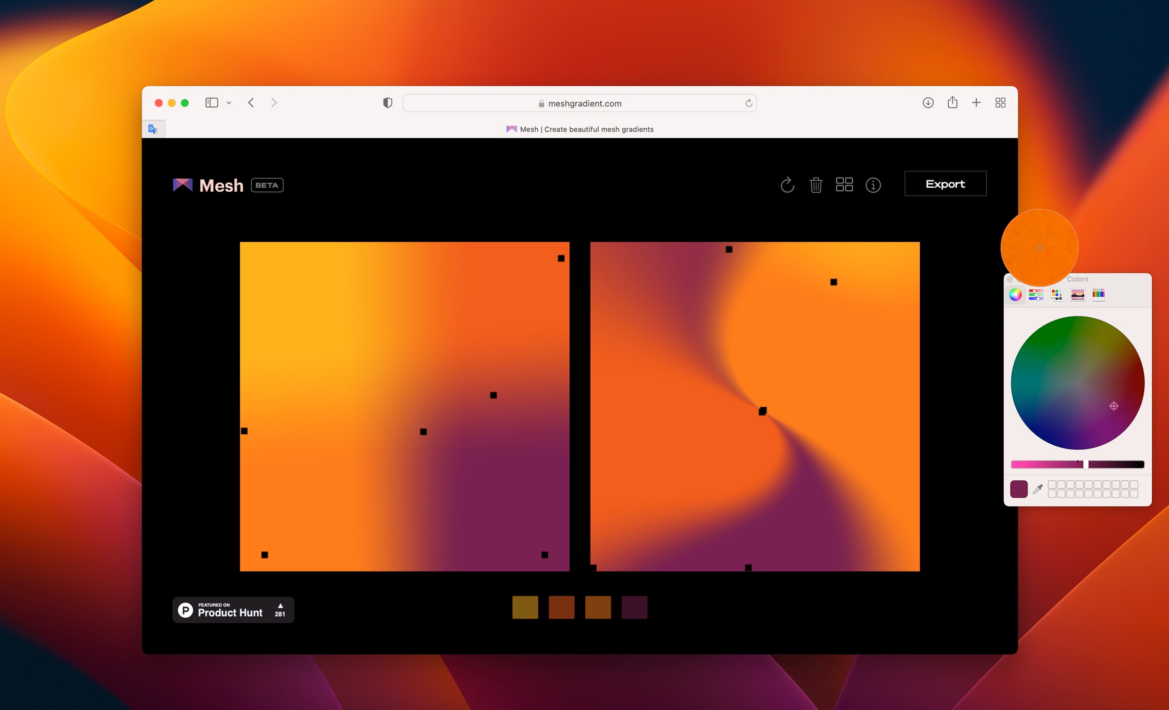
Second frame is where you edit the gradient. When you move 2 points closer, it will create a sharp blur. When you are satisfy with the result, click Export and it will be saved in your Downloads folder.
- Copy the image, go back to Sketch and paste inside the card
- Resize the image to around 600x600
![Material and Dark Mode image 7]()
Let’s fill the card with some content.
Title
- Add title inside the Card layer, write DEBIT CARD in uppercase, SF Pro, semibold, size 13, color #EBEBF5, 60% opacity
- Align layer center and margin top 8
Card number
- Add 16 random digits, SF Pro, expanded semibold, size 18
- Add shadow, color black, 60% opacity, X: 0, Y axis to 1, Blur: 2 and overlay
- Align a layer center and margin top 132
Date
- Create a rectangle of 104x28, corners 8, fill color black, 30% opacity and don’t use border
- Group this layer, press Command+G, write Valid thru 06/24, SF Pro, regular, size 12 and color white
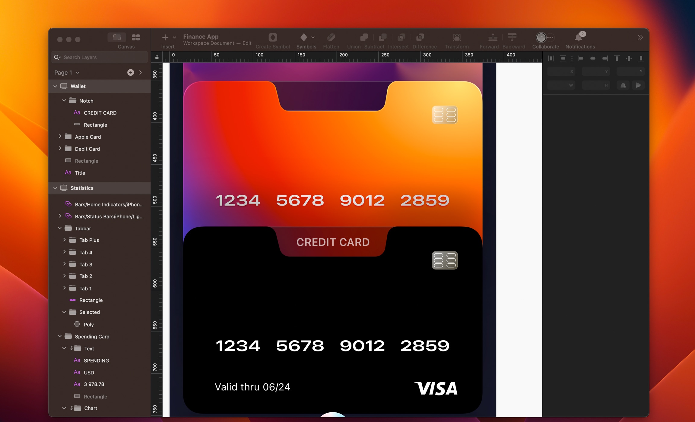
Logo and icon
- Copy and paste the Visa logo from the Finance Screen, margin right 30 and bottom 22
- Copy and paste the chip icon from the Finance Screen margin right 30 and top 30
- Select the rectangle of the chip icon and change the colors white and #8F876D and set 60% opacity
- Add border of witdh 0.5, outside, color #E5E0CA
Rename this card Debit Card and add shadow to the folder, color black, 30% opacity, X: 0, Y: -40 and Blur: 40

Apple Pay Card
For this card, we will use Apple Pay logo. Duplicate the previous card and position it on X: 16 and Y: 361. Delete the mesh gradient as we will replace it by a radial gradient.
Select the Combined Shape layer, Go to the inspector and add a radial gradient. Make a big oval, drag the center point to the top right and 5 colors.
- Color 1 #FFE281, color 2 #FF7D21, color 3 #D52B19, color 4 #5C44D9 and color 5 #5246E9
![Material and Dark Mode image 9]()
- Go to Assets to use Apple Pay logo
- Inside Notch layer, replace text by Apple Pay logo and resize to 44x18
- Align layer center horizontal and vertical
- Change the digits and valid date

Credit Card
For the last card, we will replace the gradients with a pattern. Sketch have an amazing feature that can copy and rotate shapes to create an interesting shape pattern. Copy the previous card, change the content to Credit Card and change the digits.
- Change the gradient to black colour
- Align folder to center, Y: 542
![Material and Dark Mode image 10]()
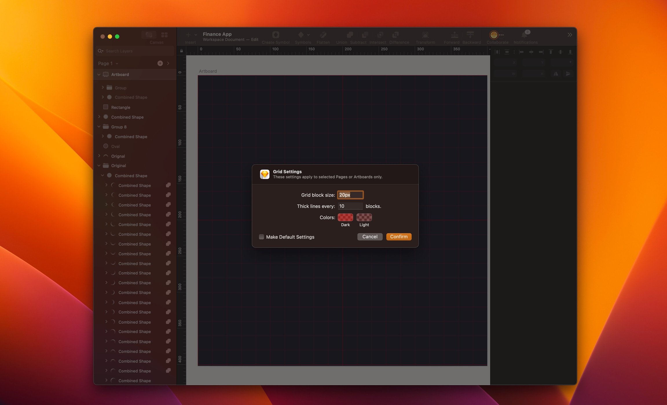
Grid Block
Now let's create an interesting pattern. Go to the Page Patterns, add an artboard with black color of 400x400. Go to the top menu, click on View/Canvas/Grid settings . A pop-up will appear, set Grid block size to 20px, set Thick line every to 10 blocks then Confirm. I will use a grid to guide us through this progression.
Shape Pattern
Let’s create an oval and style it using a linear or angular gradient with colors of your choice. Insert an oval of 224x224 at center of the artboard as guide.
- First oval: 4x4, X: 86, Y: 198, duplicate, X: 310
- Second oval: 5x5, X: 91, Y: 163, duplicate, X: 304
- Third oval: 7x7, X: 103, Y: 135, duplicate, X: 290
- Fourth oval: 11x11, X: 120, Y: 112, duplicate, X: 269
- Fifth oval: 15x15, X: 140, Y: 95, duplicate, X: 245
- Sixth oval: 18x18, X: 162, Y: 85, duplicate, X: 220
- Seventh oval: 24x24, X: 188, Y: 76.
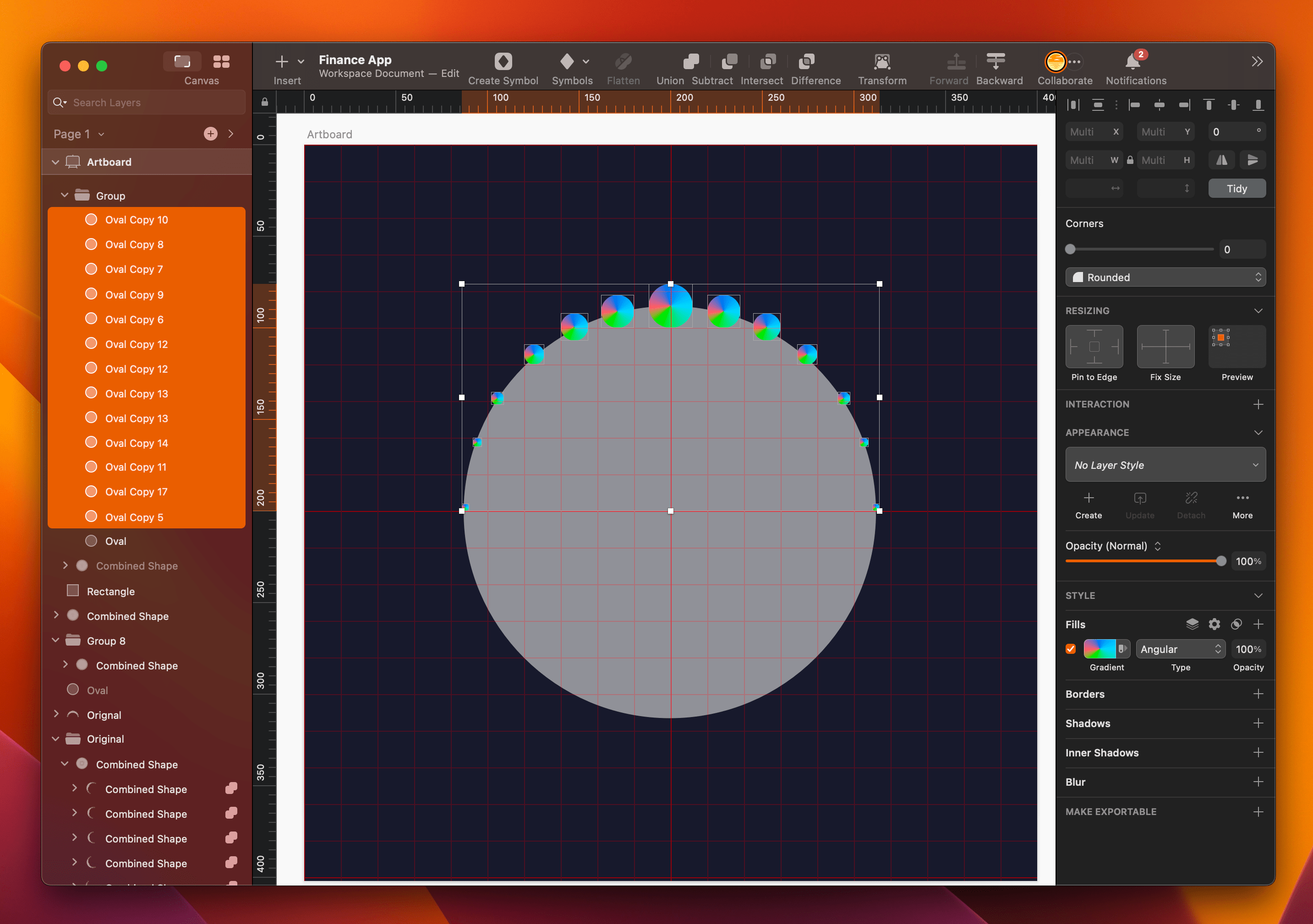
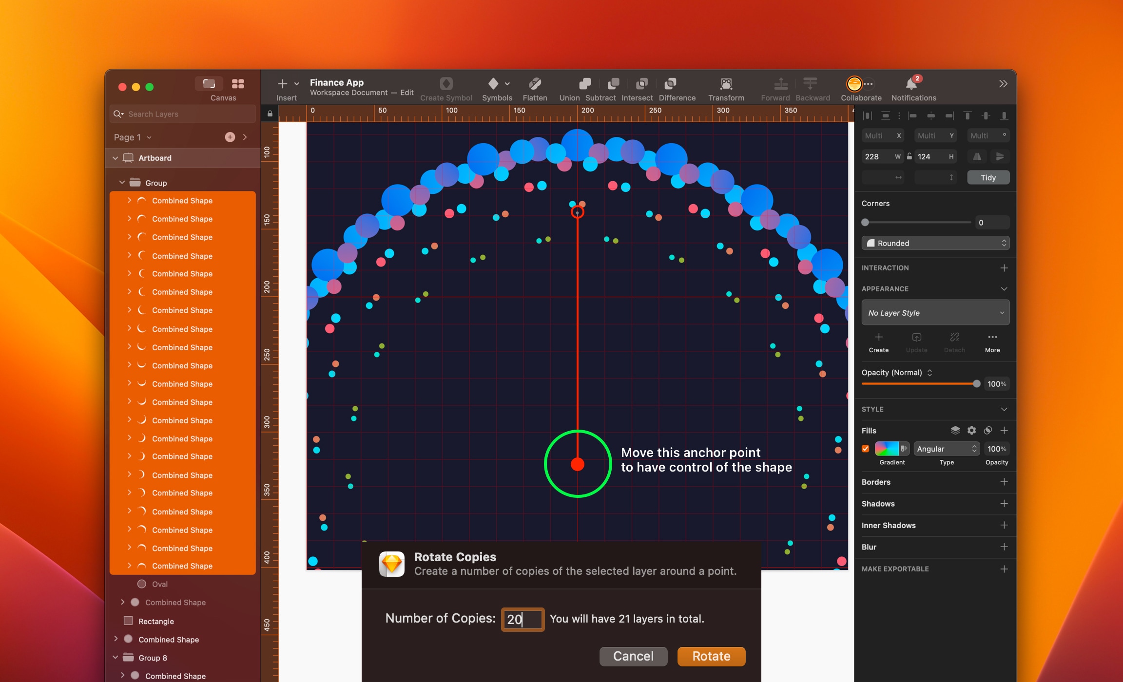
Select all 13 ovals, go to the top center toolbar, click the Union icon and it will combine everything into one shape.
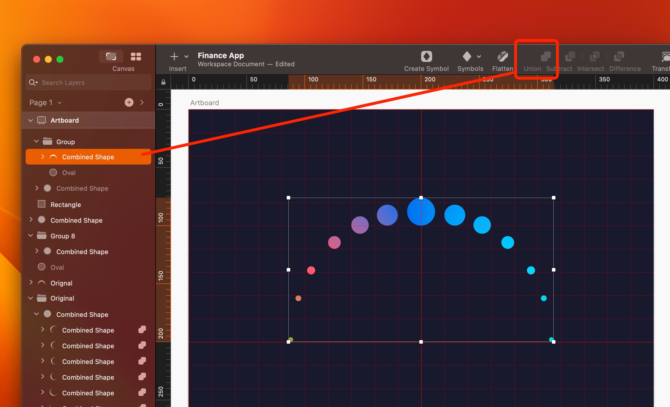
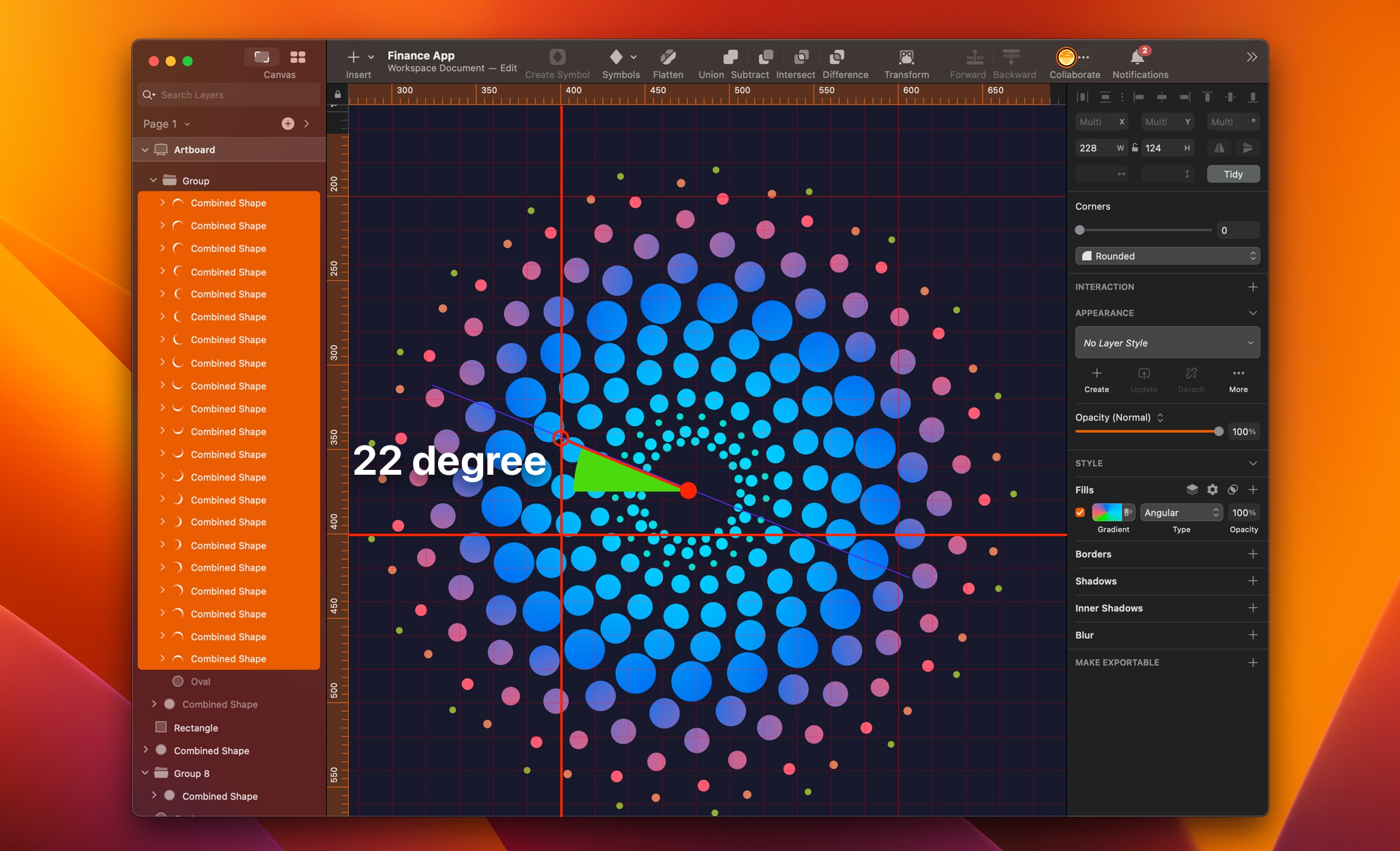
Select the Combined Shape layer, go to the top menu, click Layer/Path/Rotate Copies . A pop-up will appear, use 20 copies and click on Rotate . You will have 21 copies and see an anchor point. Move the anchor point until you are satisfied with the pattern. Click ESC keys when finished.
This is my final pattern. I pulled the anchor point down and to the right. Select all the layers and group them together.
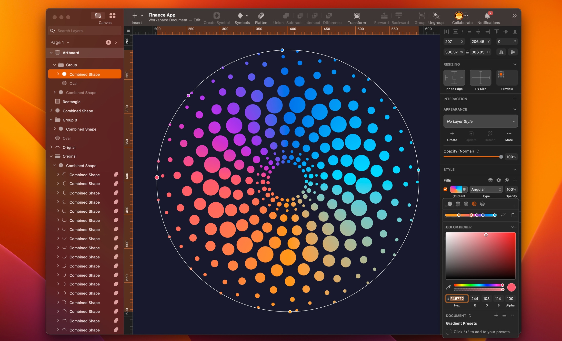
We can also select all the layers, click on Union icon to combine into one shape. We can add gradient and change colors.
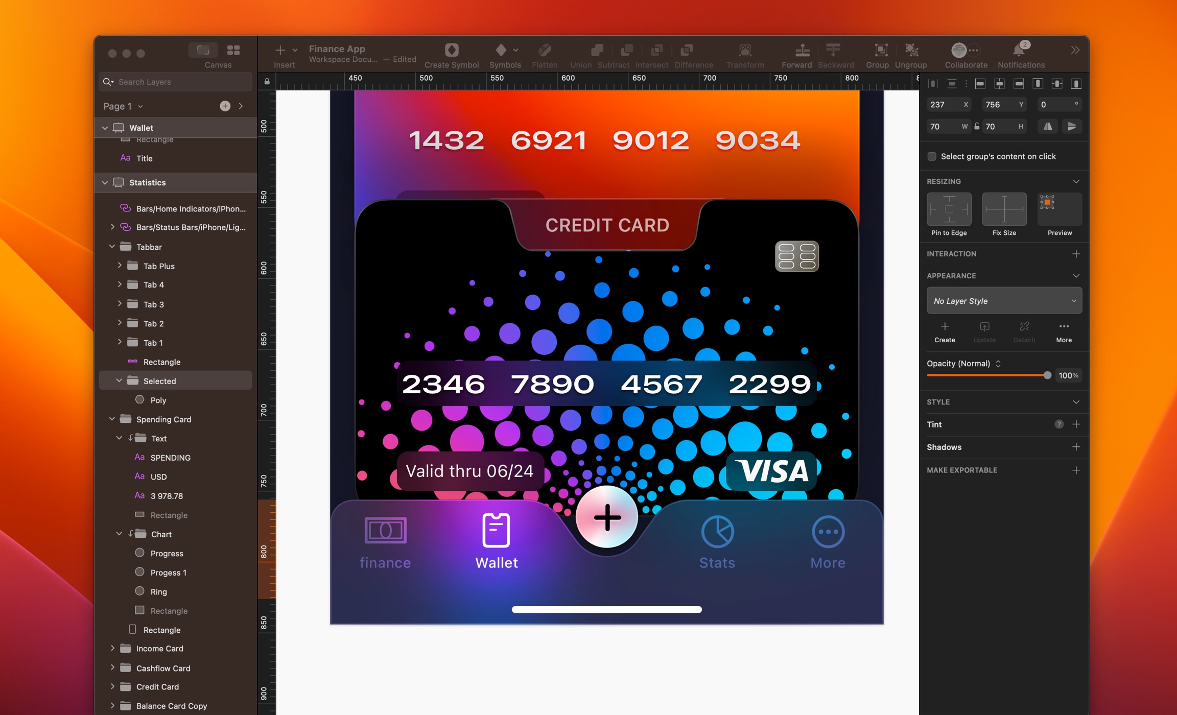
Copy you pattern and paste on the Credit Card folder. Because of the pattern, the digit loses contrast. Let’s fix that.
- Create a rectangle of 298x32, place it behind the digits
- Set corners 9, black color, 30% opacity, add background blur 10, X: 47 and Y: 658
- Align the digits to the center horizontal and vertical
- Select the rectangle in the Valid folder, add background blur 10 to have a better contrast
- Align text center horizontal and vertical
- Create a rectangle of 64x28, add background blur 10, place it behind Visa logo and align logo center horizontal and vertical
Let’s fix the TabBar and move the selected tab to Wallet.
- Select the Selected folder, X: 237 and Y:756
- Change Tab2 to color white and Tab1 to color white with overlay
- Change large title to Wallet
Final Design
Here is our final and colorful design. We have completed our 3 screens from scratch. If you made it to the end, congratulations. I hope you have enjoyed this course and learn new things. See you on the next one!
Templates and source code
Download source files
Download the videos and assets to refer and learn offline without interuption.
Design template
Source code for all sections
Video files, ePub and subtitles
Videos
Subtitles
Assets
1
iOS 16 Design
A complete guide to designing for iOS 16 with videos, examples and design files
2:38
2
Colors and Gradients
Understanding the iOS 16 color system and how to use monochromatic, analogous and complementary colors
31:19
3
Layout and Spacing
Learn how to create a layout for iOS 16 using guides, negative spacing and grids
23:18
4
Material and Dark Mode
Combine background blur, blending modes and mesh gradients to create materials and colors for a dark mode UI
22:59
5
iOS 16 Typography
Design an iOS 16-ready UI from scratch in Sketch using the new SF font width styles, SF Symbols 4 and font pairing
5:33
6
SF Width Styles
Learn how to work and pair it with the new SF width styles: Condensed, Compressed, and Expanded
8:31
7
SF Symbols and Rendering Modes
Learn about the SF Symbols and its rendering modes
13:53
8
Variable Color
Learn how to use variable color to make SF Symbols more expressive
7:39
9
iOS 16 Navigation
Understanding navigation, content structure, action buttons and modals for iOS 16
2:54
10
Content Structure
Set the content navigation and custom tab bar with a floating action button using Sketch
18:58
11
Top Navigation
Learn about Navigation Bar using the back button, action button and segmented control
14:21
12
Modal Presentation
Learn about the Modal Presentation and Push transition
7:16
Meet the instructor
We all try to be consistent with our way of teaching step-by-step, providing source files and prioritizing design in our courses.
Akson Phomhome
UI Designer
Designer at Design+Code.
13 courses - 60 hours
AI Design with Ideogram
Meet Ideogram, an AI-powered image generation tool that takes your ideas and transforms them into stunning visuals. Whether you're a designer, marketer, or just a visual enthusiast, Ideogram simplifies the creative process. In this guide, we’ll walk you through step-by-step instructions to create beautiful logos, social media posts, and more.
1 hrs
Build a SwiftUI app with Claude AI
This comprehensive SwiftUI course combines cutting-edge AI assistance with hands-on development, guiding you through the process of transforming Figma designs into fully functional iOS applications. Leveraging Claude 3.5 Sonnet, you'll learn to efficiently generate and refine SwiftUI code, create reusable components, and implement advanced features like animations and responsive layouts.
9 hrs
Prototype and Code iOS apps in Figma and SwiftUI
Welcome to our course on designing a sleek wallet interface with Figma! You’ll learn to create a visually appealing and functional wallet interface using DesignCode and Apple UI Kits. Master prototyping, swipe gestures, carousel animations, overlays, and reusable components. Plus, explore a Figma plugin to easily transition from design to SwiftUI. By the end, you’ll create dynamic, user-friendly prototypes.
3 hrs
Create 3D UI for iOS and visionOS in Spline
Comprehensive 3D Design Course: From Basics to Advanced Techniques for iOS and visionOS using SwiftUI
3 hrs
3D UI Interactive Web Design with Spline
Learn to create 3D designs and UI interactions such as 3D icons, UI animations, components, variables, screen resize, scrolling interactions, as well as exporting, optimizing, and publishing your 3D assets on websites
3 hrs
Design and Prototype for iOS 17 in Figma
Crafting engaging experiences for iOS 17 and visionOS using the Figma design tool. Learn about Figma's new prototyping features, Dev Mode, variables and auto layout.
6 hrs
Design and Prototype Apps with Midjourney
A comprehensive course on transforming Midjourney concepts into interactive prototypes using essential design techniques and AI tools
8 hrs
Web App Design using Midjourney and Figma
Get UI inspirations from Midjourney and learn UI design, colors, typography as a beginner in Figma
2 hrs
UI Design for iOS 16 in Sketch
A complete guide to designing for iOS 16 with videos, examples and design files
3 hrs
UI Design Android Apps in Figma
Design Android application UIs from scratch using various tricks and techniques in Figma
2 hrs
UI Design Smart Home App in Figma
Design a Smart Home app from scratch using various tricks and techniques in Figma
2 hrs
UI Design Quick Apps in Figma
Design application UIs from scratch using various tricks and techniques in Figma
12 hrs
Figma Handbook
A comprehensive guide to the best tips and tricks in Figma. Not affiliated with or endorsed by Figma, Inc.
6 hrs