iOS 16 Design
Add to favorites
A complete guide to designing for iOS 16 with videos, examples and design files
Play video
UI Design for iOS 16 in Sketch
Sponsored Course
This course is entirely free thanks to Sketch’s sponsorship. In this course, we’ll design three separate designs from scratch as we cover all the essential topics around iOS 16 design. All the assets and design files are provided to help you compare against your own progress.

Downloads
To follow this course, you need to download the Assets file which includes the Sketch projects.
Evolution of iOS
Let’s start from the beginning and look at the image below. On the left, a hyper realistic design, also known as Skeuomorphic. It was effective to introduce strong metaphors because in 2007, few were familiar with having a super computer in your pocket. In the middle, we got rid of all ornaments in favor of flat colors, beautiful typography and high-resolution content. Since most of us got increasingly comfortable with technology, it was no longer necessary to adorn our designs with heavy decorations.
On the right, a screen from iOS 16. Titles are much bolder, and as a result more readable. Because of the taller screens, it is now much more common to see the bottom navigation (known as Tab bar). Designers today have to adapt their layouts against multiple resolutions and pixel densities.

Large Titles
More than ever, iOS is going back to its roots. Bold fonts are everywhere. Titles are big and black. Since screens are now about twice as tall as they were, it only makes sense to have large titles. Another reason for large fonts is accessibility. With billions of people using their phone daily from all age groups, it is important to make the content as clear and readable as possible. Accessibility lets users set very large fonts for apps that support it. In iOS, all of Apple’s stock apps support that option. Because of that reason, you’ll find that users are now expecting it.
Cards
Bigger screens mean more space for content. Before the bigger iPhones, it made sense to rid of any container and give maximum space to content. But with the iPhone X and 8, that is no longer the case. We can make navigation easier by including the status, navigation and tab bars, and use cards as a way to better organize sections. Cards with rounded corners are a good way to make the content seem more tactile and approachable. You can use blurred backgrounds and drop shadows to add depth and context to your design.
Colors
Use a prominent color to show that an element is tappable or that it’s highlighted. Picking the right colors and neutral tones can make or break your design. Blue is a safe choice for buttons and states. Also, a white or extra light gray background against black texts is recommended as a starting point. This provides excellent contrast, which is perfect for readability.

Primary Color
Your user interface should be stripped down to the core aesthetic. Every time you add an element, ask yourself: is this necessary? Unless your app is a game or a specific theme, temper your use of heavy textures, 3D effects and multiple shadows. Instead, focus on functional colors, harmonious gradients, and beautiful typography.

iOS Palette
These are the colors used by Apple in their native apps. In general, blue is used system-wide as the universal color for buttons, icons and actionable items. But other colors can be used to set the brand like yellow for Notes, pink for Apple Music, green for Messages, etc. If you’re in doubt, use blue. When designing, please keep in mind that red is generally used for destructive actions and green for successful actions. Please take a look at the official documentation for more details.
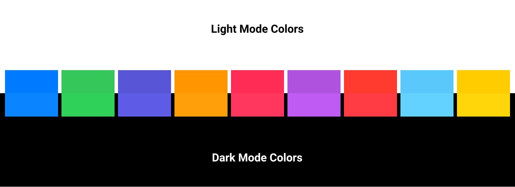
Meaning in colors
Colors have meaning. Use red, green, blue and neutral tones wisely to indicate destructive actions, affirmative actions, links and inactive states, respectively. Avoid confusing your users by using these colors for different purposes. For example, don’t use green on a button that indicates “Delete”.

Gradients
A color gradient is a progressive transition from one colour to another and aren't limited to just two shades. Gradients are also known as color transitions. It can blend between colours that are similar or entirely in opposition. There are different types of gradients: linear , radial , conic.

Material Sheets
Keeping context of the background UI shouldn't compromise the clarity of your content. Blurring the background not only allows you to keep its natural colors, but also brings focus to the foreground. Blurring isn't an invention, it's something that already exists in real life; as you focus on something, everything else become blurry.
Design for Touch
Buttons should be easily tappable. Their sizes should be between 30-60pt wide. The optimal size is 44pt . On rare occasions, set to 22pt for links inside texts, but use cautiously as they become hard to tap. Even text buttons have a tappable zone of at least 30pt.

Layout and Spacing
Use negative space to bring focus to the content. The less you see, the more you can focus on a few things at once. Negative spacing gives breathing room. Don't overwhelm your screen with too much structure or unneeded visual elements. If in doubt, make use of the default margins in Xcode. Apple typically uses between 8 pt to 16 pt for their margins.

Clarity
Make things obvious. Buttons should be self-explanatory and typography should be big and readable at a comfortable distance. Your content should clearly indicate what your app is about. For example, if it's a coffee app, then you should be reminded of the coffee beans, espresso, and brown colors of coffee.
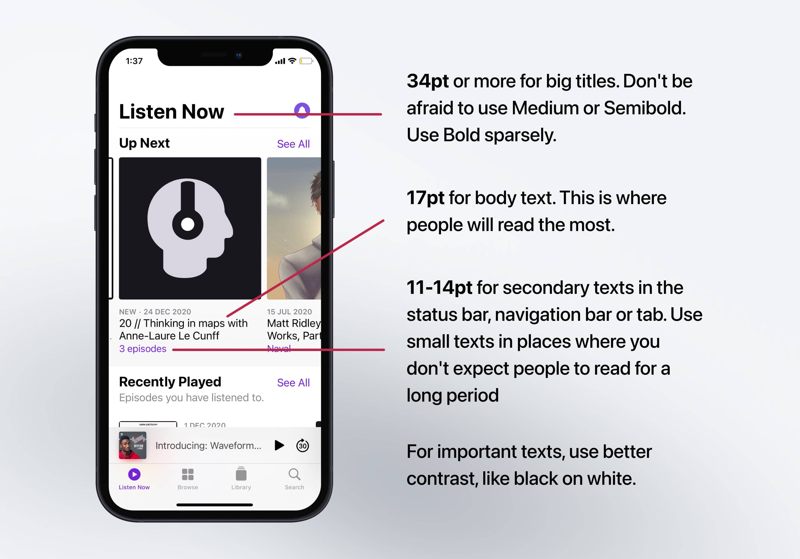
Make the Text Readable
Titles should be big and well-contrasted. Captions should be short and easy to glance. The body texts should be well-spaced and not too long per line to avoid reading fatigue.
Body texts should also have a minimum size of 11pt . The optimal size for reading is 17pt to 20pt . Screen titles should be sized to 34 pt or more while secondary titles should be set at 20 pt to 30 pt.
Align texts with other elements to make them easy to scan. Finally, use black or dark gray against a light background for the best contrast.
Use Obvious Icons
Icons should not be ambiguous; they should clearly indicate what the symbol means. Whenever possible, use text to accompany the icon. Once you use an icon, don't reuse another variation of the same icon elsewhere as that will confuse your users. Likewise, don't use generic texts such as “Back” or “Submit”, instead be specific: “Back to Home” or "Sign up a new account". Design sharp, vectorized icons to make it easy to adapt to different screen densities. Make sure that your assets work for 1x, 2x (retina) and 3x (super retina) screens.

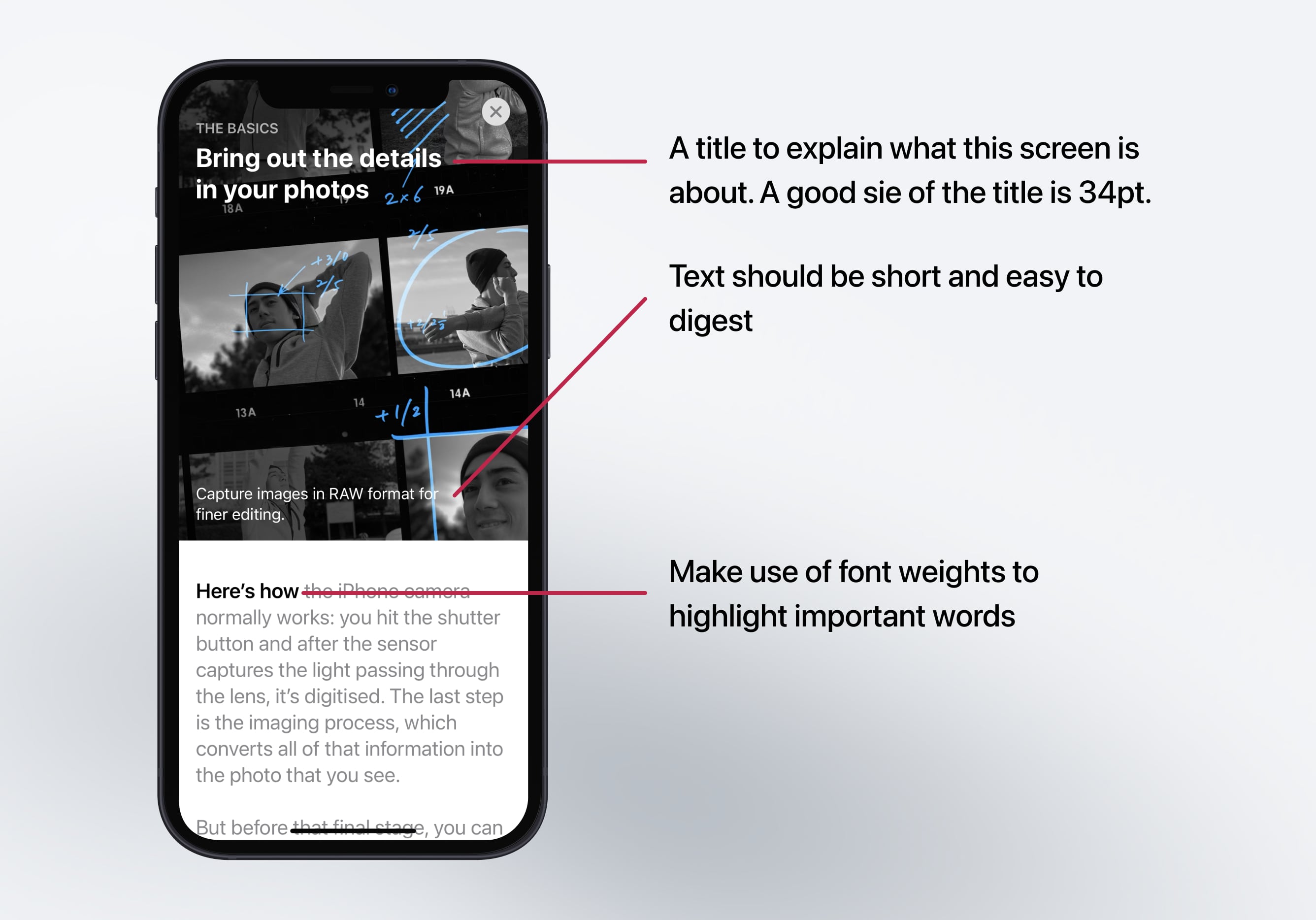
Descriptive Screens
Each page should clearly explain what it does. There should be minimal branding that is replaced by a clear screen title and highlighted state from the tab bar. Be thoughtful with the selection of images to best represent the sections.
Typography
Because of the simplification of the user interface and the focus on the content, your typography will occupy from 50-90% of the screen. Therefore, it is paramount to pick a beautiful font and set its weight, line-height, and color to be visually pleasing and optimal for reading at any size. The default San Francisco font is the recommended option as it was designed for legibility. Apple uses it in all their apps.

Dynamic Type
Accessibility is a prominent theme in iOS design. Apple provides you access to dynamic font presets, as shown in this image. Like this, if you set your text to Body, and enable Dynamic Type, the system will automatically increases the size based on the user’s preferences.

SF Width Styles
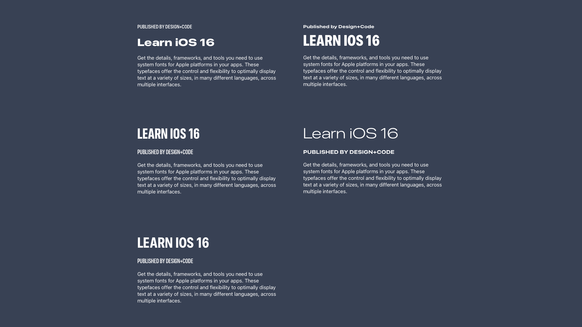
San Francisco, the system font for iOS has three new width styles: Condensed , Compressed , and Expanded to make your design more expressive.

Font Pairing
Every style is functional in its own right, but depending on the context, some will perform better than others. Combined with the regular width, we can pair other styles without using a custom font.
SF Symbols 4
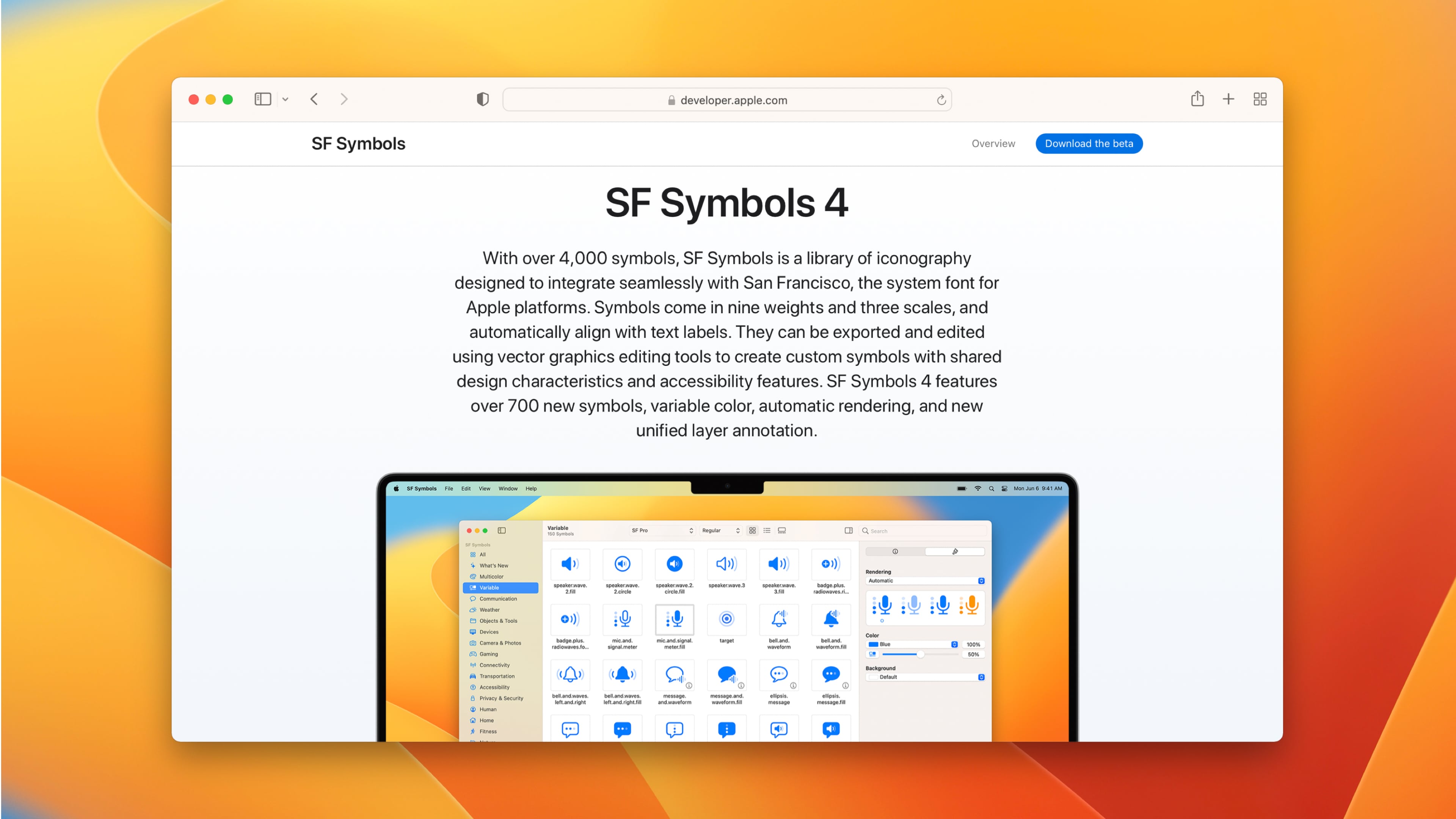
When designing for iOS, we’re provided a library of 4,000 icons with weight variants and rendering modes that you can use on all Apple platforms, including macOS, iOS, iPadOS, watchOS and tvOS.
Navigation
The navigation of your app should be familiar and intuitive. Your content should be structured based on the type, information hierarchy and by using navigation elements like the tab bar, navigation bar and modal presentation.
Tab Bar
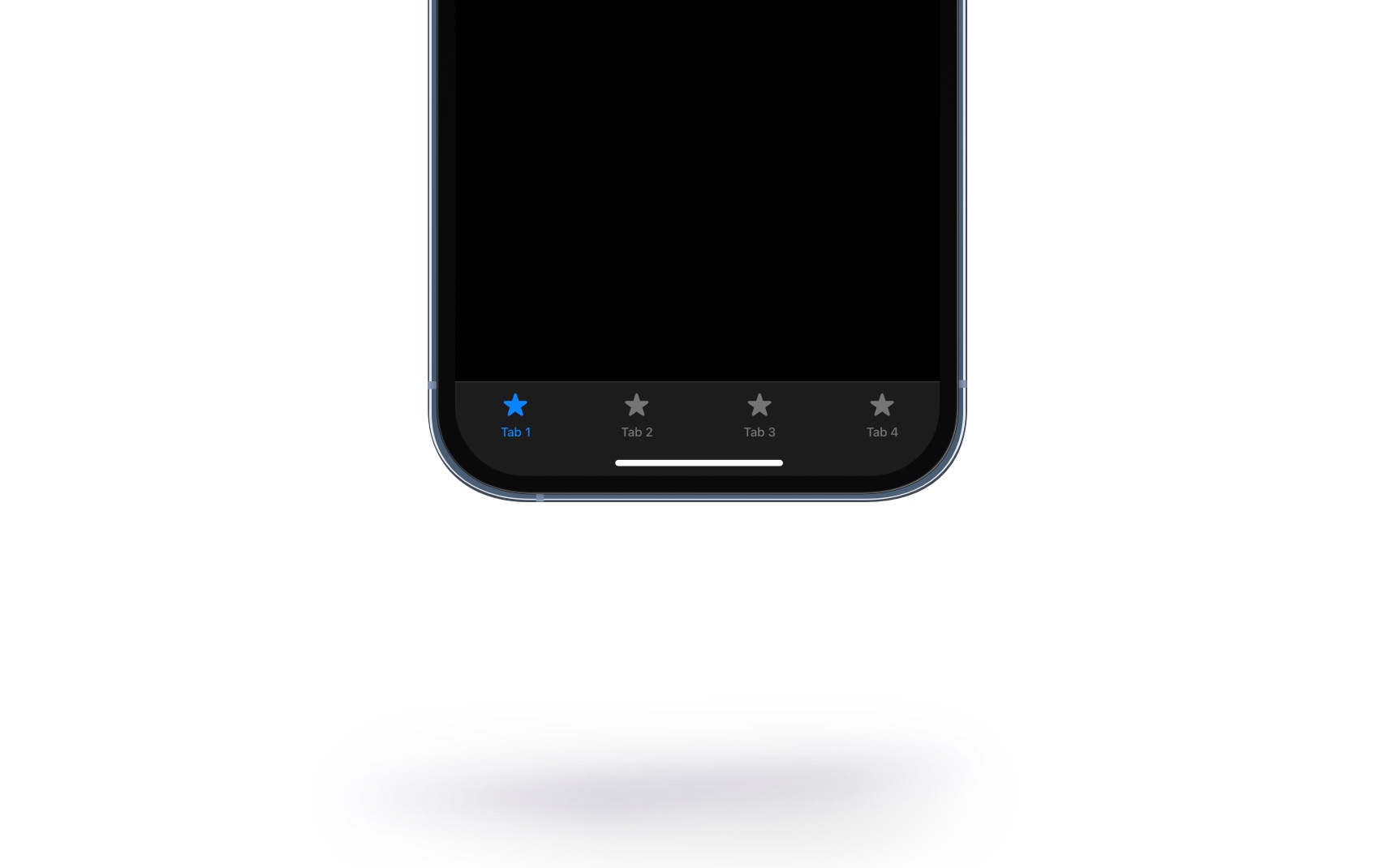
The Tab Bar is the most used menu in iOS. It is placed at the bottom, categorizing an app's content into different sections. It reflects your information hierarchy and help people orient as they interact with your app.
App Hierarchy
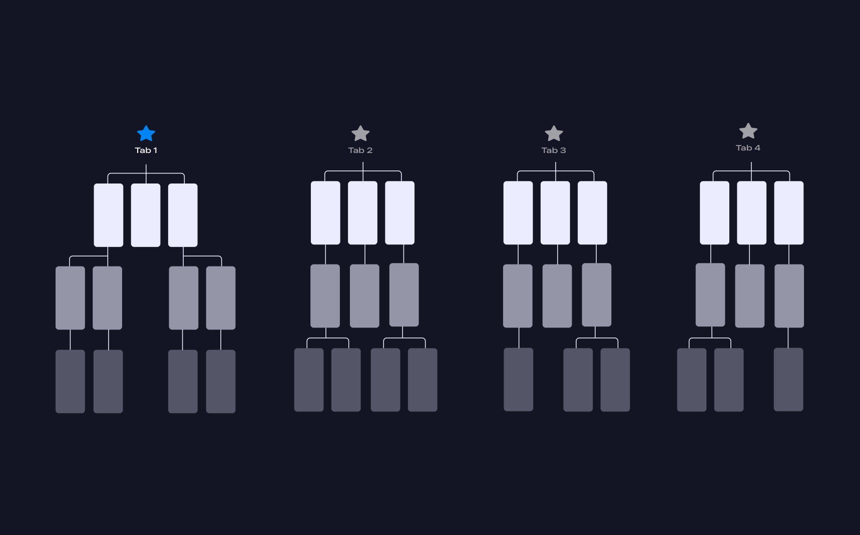
The Tab Bar represents your top-level content that branches out into more specific content. Each tab should be descriptive and communicate your app’s theme. For example, Fitness , Training , Sharing.
Avoid Using Home
Avoid using Home with repetitive functionality because it can lead to confusion. Instead of using Home, you can navigate directly to each content type.

Navigation Bar
A Navigation Bar provides a natural place to display a screen title and action buttons specific to the screen or for navigating to a previous screen.

Push Transition
There are two common forms of transition when navigating between screens. By default, there is a push transition from right to left. Also, you can transition with a modal presentation sliding from the bottom.
Modal Presentation
The modal presentation is used for self-contained tasks. It can take a portion of the screen or the entire screen. It appears from bottom and covers the previous screen.
Sidebar
A sidebar provides app-level navigation for a list of collections based on the content of your app. Having a sidebar makes navigating within the app more convenient for the users. This also offers more customization to the users, meaning they can pick the necessary shortcuts.
Animations
Animation not only serves to transition from one screen to another, it also adds playfulness and delight to your design. It brings importance to an element that would otherwise be ignored. Notifications are more noticeable and the weather is better understood when there is rain pouring in the background.
Although animations are encouraged, they should not be overdone. They should not distract your users from the content or give them motion sickness. Gratuitous, forceful animations can become overwhelming to your users. Instead, make them discoverable when users manipulate the content, or use them to gracefully direct attention to an on boarding process.
Finally, be realistic in the way animations are demonstrated. A modal that slides from the bottom should be dismissed back to the bottom of the screen. That way, users can appreciate the physicality of the elements, even if they’re digital.
Transitional Interface
One of the most exciting and unique aspects of iOS is the animation. Every screen transitions from one to another. The home screen zooms into a folder, then zooms into an app. Animations used to be hard to execute, but thanks to Xcode, they are made more accessible than ever. In fact, you will learn exactly these techniques in the SwiftUI chapter.
Gestures
With the introduction of bigger screens, the back button is now too high for the thumb to easily reach. So, while less obvious than a visible button, a gesture can be an extension to an already visible interaction. It makes it easier for power users. We're all becoming power users, that's why we require less visual cues and more useful functions.
Long Press and Contextual Menu
The contextual menu allows people to quickly access options inside and outside of your app. Think of it like the keyboard shortcuts on your Mac – they enable people to do repeated tasks quicker. You have to design shortcuts that make power users more productive. But just like Keyboard shortcuts, essential features shouldn’t be exclusive to the contextual menu. Your users must be able to operate your app normally without it.
For example, users can long press your App Icon to find frequently used items. Inside an app, mail content can be peeked and links can be peeked before entering full-screen.
Haptic Feedback
Haptics enhances the user experiences as it provides people a sense of touch when interacting with an app. Haptics improves touch gestures and interactions like scrolling through a picker or toggling a switch offering a delightful experience for the user.
Launch Screen
A launch screen is a placeholder screen that appears when your app starts and will be quickly replaced by the app's first screen once it loads completely. Displaying a launch screen creates an illusion that your app is quick to launch by subtlety displaying what to expect.
The launch screen should mimic your app's first screen without any texts, images, or vibrant colors so keep your design as simple as possible.

Widgets
Widgets help the user to have a glance and access key information/content from your app right from their home screen without even having to open the app. This makes the overall experience of your app more accessible.

Sounds
Sounds are minimally used in apps, but when they're played, they can transform a mundane task into a truly rewarding experience. People can recognize your app without even seeing it in meaningful places such as the push notifications. When the sound gives the right impression, you win a lot with a minimal amount of effort. You can download the Sound kit from Meta.

Platforms
Thanks to SwiftUI, we can now design for multiple platforms at once. The OS does a great job at translating the controls and adapting the layout to its respective platform.
iPadOS
iPadOS gives users the best of both worlds by consolidating the key experiences from iOS and macOS. iPadOS is born from iOS to push and utilize the larger screens of the iPad for a better experience while offering distinct experiences. This opens a whole new way to interact with apps, unlike before.
macOS Ventura
Ventura is the latest version of Apple's macOS. Introducing a beautifully redesigned user interface that embraces the use of rounded corners, translucency, and app accent colors. Ventura's design language promotes consistency with all platforms to make it more accessible and friendly when transitioning from iOS or iPad.
Apple Watch
Apple Watch was introduced in 2015. It was highly anticipated by developers, designers and the media. It was indeed the first wearable that broke every expectation, placing Apple as the number one watch manufacturer globally. Now more than ever, there are many resources for designers and developers to create great apps for the Apple Watch.
Apple TV
Apple TV is the perfect platform to connect with users in different ways like gaming, entertainment, home utility and more. And there are different ways you can interact with the TV, by voice or external hardware like the Siri Remote or gaming controllers.
Further Reading
The Human Interface Guidelines by Apple is an essential read. It’s always kept up-to-date and is pretty exhaustive with its list of features. I would suggest to at least skim through it and only read the portions that you need, as it gets very detailed.

Templates and source code
Download source files
Download the videos and assets to refer and learn offline without interuption.
Design template
Source code for all sections
Video files, ePub and subtitles
Videos
Subtitles
Assets
1
iOS 16 Design
A complete guide to designing for iOS 16 with videos, examples and design files
2:38
2
Colors and Gradients
Understanding the iOS 16 color system and how to use monochromatic, analogous and complementary colors
31:19
3
Layout and Spacing
Learn how to create a layout for iOS 16 using guides, negative spacing and grids
23:18
4
Material and Dark Mode
Combine background blur, blending modes and mesh gradients to create materials and colors for a dark mode UI
22:59
5
iOS 16 Typography
Design an iOS 16-ready UI from scratch in Sketch using the new SF font width styles, SF Symbols 4 and font pairing
5:33
6
SF Width Styles
Learn how to work and pair it with the new SF width styles: Condensed, Compressed, and Expanded
8:31
7
SF Symbols and Rendering Modes
Learn about the SF Symbols and its rendering modes
13:53
8
Variable Color
Learn how to use variable color to make SF Symbols more expressive
7:39
9
iOS 16 Navigation
Understanding navigation, content structure, action buttons and modals for iOS 16
2:54
10
Content Structure
Set the content navigation and custom tab bar with a floating action button using Sketch
18:58
11
Top Navigation
Learn about Navigation Bar using the back button, action button and segmented control
14:21
12
Modal Presentation
Learn about the Modal Presentation and Push transition
7:16
Meet the instructor
We all try to be consistent with our way of teaching step-by-step, providing source files and prioritizing design in our courses.
Akson Phomhome
UI Designer
Designer at Design+Code.
13 courses - 60 hours

AI Design with Ideogram
Meet Ideogram, an AI-powered image generation tool that takes your ideas and transforms them into stunning visuals. Whether you're a designer, marketer, or just a visual enthusiast, Ideogram simplifies the creative process. In this guide, we’ll walk you through step-by-step instructions to create beautiful logos, social media posts, and more.
1 hrs

Build a SwiftUI app with Claude AI
This comprehensive SwiftUI course combines cutting-edge AI assistance with hands-on development, guiding you through the process of transforming Figma designs into fully functional iOS applications. Leveraging Claude 3.5 Sonnet, you'll learn to efficiently generate and refine SwiftUI code, create reusable components, and implement advanced features like animations and responsive layouts.
9 hrs

Prototype and Code iOS apps in Figma and SwiftUI
Welcome to our course on designing a sleek wallet interface with Figma! You’ll learn to create a visually appealing and functional wallet interface using DesignCode and Apple UI Kits. Master prototyping, swipe gestures, carousel animations, overlays, and reusable components. Plus, explore a Figma plugin to easily transition from design to SwiftUI. By the end, you’ll create dynamic, user-friendly prototypes.
3 hrs

Create 3D UI for iOS and visionOS in Spline
Comprehensive 3D Design Course: From Basics to Advanced Techniques for iOS and visionOS using SwiftUI
3 hrs

3D UI Interactive Web Design with Spline
Learn to create 3D designs and UI interactions such as 3D icons, UI animations, components, variables, screen resize, scrolling interactions, as well as exporting, optimizing, and publishing your 3D assets on websites
3 hrs

Design and Prototype for iOS 17 in Figma
Crafting engaging experiences for iOS 17 and visionOS using the Figma design tool. Learn about Figma's new prototyping features, Dev Mode, variables and auto layout.
6 hrs

Design and Prototype Apps with Midjourney
A comprehensive course on transforming Midjourney concepts into interactive prototypes using essential design techniques and AI tools
8 hrs

Web App Design using Midjourney and Figma
Get UI inspirations from Midjourney and learn UI design, colors, typography as a beginner in Figma
2 hrs

UI Design for iOS 16 in Sketch
A complete guide to designing for iOS 16 with videos, examples and design files
3 hrs

UI Design Android Apps in Figma
Design Android application UIs from scratch using various tricks and techniques in Figma
2 hrs

UI Design Smart Home App in Figma
Design a Smart Home app from scratch using various tricks and techniques in Figma
2 hrs

UI Design Quick Apps in Figma
Design application UIs from scratch using various tricks and techniques in Figma
12 hrs

Figma Handbook
A comprehensive guide to the best tips and tricks in Figma. Not affiliated with or endorsed by Figma, Inc.
6 hrs
