
Top Navigation
Add to favorites
Learn about Navigation Bar using the back button, action button and segmented control
Play video
UI Design for iOS 16 in Sketch
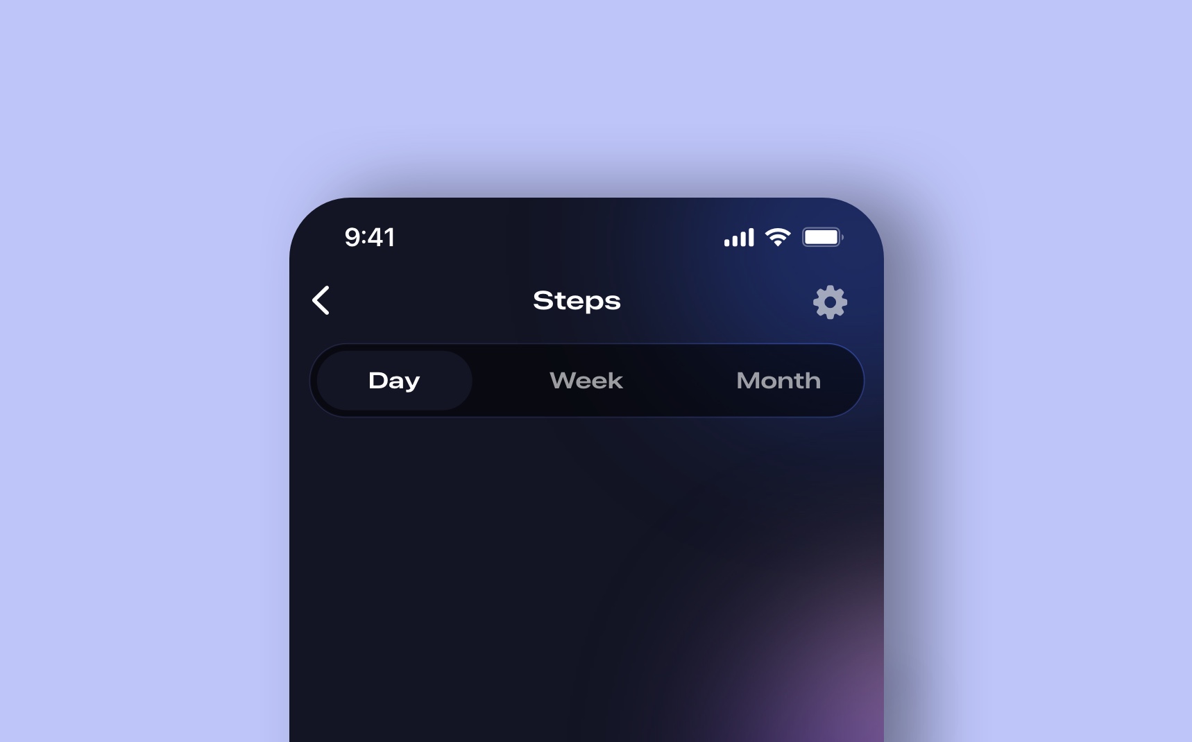
Top Navigation Bar
Let’s create a top navigation using back button, title and action button. In this section, you’ll need the SF Symbol.

- Use SF Symbols for the back button chevron.left and for the setting icon.
- Use SF Pro Medium 22 for the Chevron, Fill white, Position X 20, Y 56
- Repeat for the gearshape.fill symbol, X 350, Y 59.
- Use SF Pro Expanded Semibold 17 for the title, alignment center.
- Group the symbols and title together and name Top navigation.
Segmented Control
A segmented control is a linear set of two or more options, each of which functions as a button.
- Create a Rectangle 350 x 48 and set the corner radius to 24.
- Fill Black, 50% opacity, Center border white with Overlay and width 1.
- Create a Rectangle for the selected button 102 x 40, corner radius 24, color #131524.
- Use SF Pro Expanded Semibold 15 for the text labels Day, Week, Month.
- Use white text for the selected button, use white 60% for the other texts.
![Top Navigation image 2]()
Date Picker
Let’s create the date picker and a selected button with a vibrant gradient.

- Create a rectangle 44 x 70, corner radius 22.
- Add the linear gradient from #FEE7C6F to #FE7C6F.
- Write the day with SF Pro Medium 15 at the top and Regular for the date number at the bottom.
- Duplicate 6X and write the date depending on which day you want to start.
- Hide the rectangle for the unselected dates.
- Keep white for the selected date and put 60% opacity for the rest text labels.
- X 20, Y 160.
Circular Progress
Let’s create another style of circular progress. This time we’re going to make it simpler and play with the opacity using white color to make a gradient circle effect.
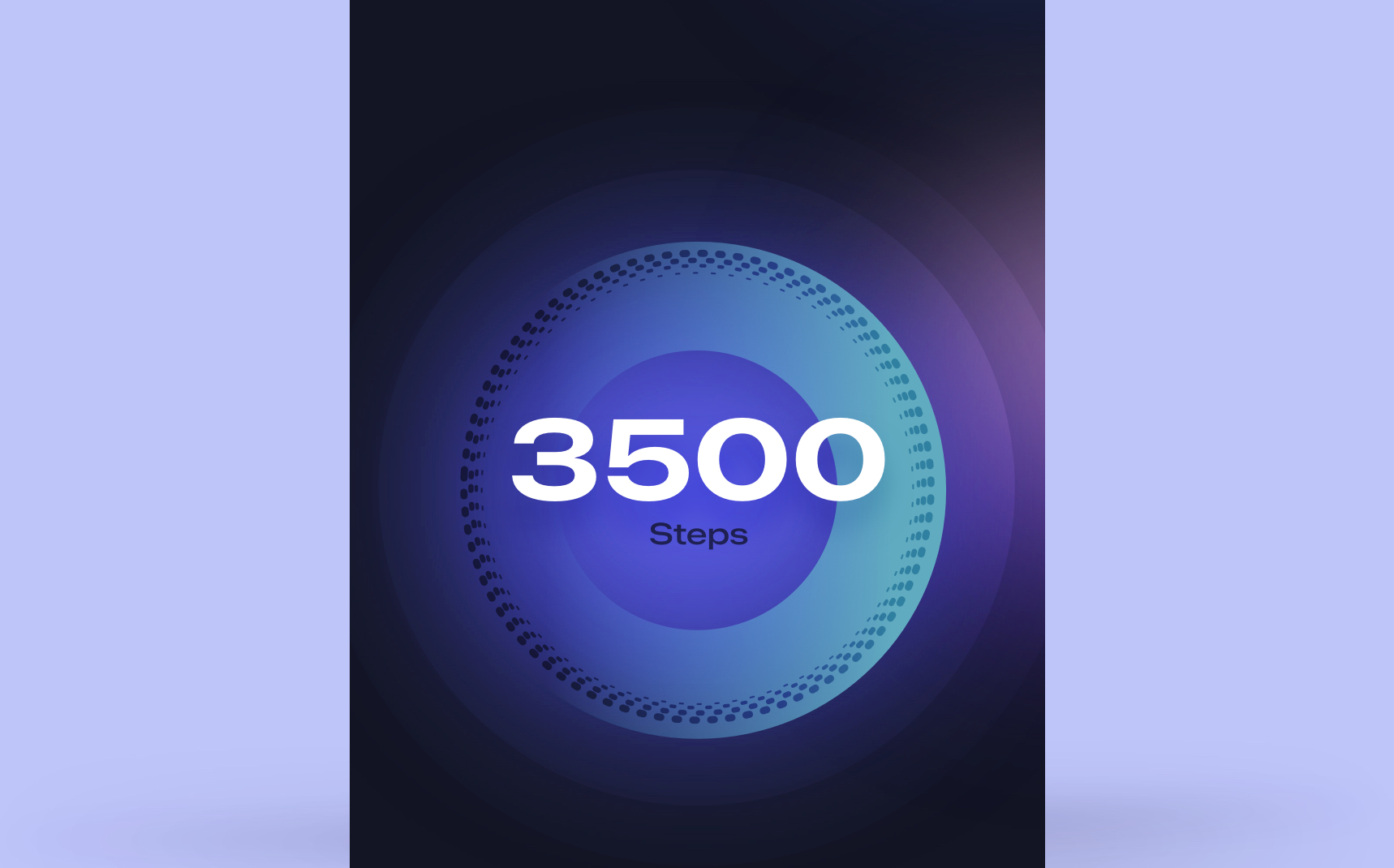
- Circle #1: 240 x 216, Fill #494BE3, blur 50, X 75, Y 325.
- Circle #2: 426 x 426, Fill white, 10% opacity, X -18, Y 219.
- Circle #3: 358 x 358, Fill white, 15% opacity, X 16, Y 254.
- Border 218 by 218, remove fill, Dash 654, Gap 688 with round shape, add horizontal linear gradient #6D61C1 to #5ABDEC (0% opacity), X 86, Y 325.
- Take the Strokes from the progress ring on the first screen, resize to 276 by 276, X 57,Y 294.
- Use white SF Pro Expanded Bold 64 for the number 3500.
- Use black SF Pro Expanded Medium 17, 60% opacity.
- Group the text labels and align center at the top of the progress ring.
- Create a lightning circle 240 by 240, linear gradient #EDB6DC to #160089, Fill opacity 80%, X 300, Y 268, put on the back of the Circular group.## Card for activities status We’re going to create a card for the stats with minutes, calories and distance.

- Create a Rectangle 350 x 102,Corner radius 26, Fill #21243E with Overlay, white Border with Overlay, width 1, Background blur 10, X 20, Y 614.
- Create a symbol clock.fill symbol with SF Pro Condensed Semibold 12.
- Write the values 25 min, 150, 4.8 km with White SF Pro Expanded Bold 20.
- Use SF Pro Expanded Medium 12 for Property, 60% opacity.
- Select all the text labels, align center, spacing 4, group together using Command+G.
- Duplicate the Group 2 times and change the symbols (symbol names) and texts for Calories and Distance. Spacing between each Group is 40.
- Select the Groups and Rectangle, Group them and align center.## Progress Bar Let’s create a simple progress bar for the steps.

-
Create a Rectangle 272 x 20, corner radius 10, X 20, Y 774,
- Fill #21243E, Overlay,
- white border, width 1, Overlay,
- Background Blur 10.
- Duplicate, resize to 160 x 20, linear gradient from #FE7C6F to #FD5B7D.
- Write Progressing using SF Pro Expanded Semibold 17, X 20, Y 741.
- Duplicate the same text and change for Goal, opacity 60%, X 319, Y 741.
- Write 10 Km using SF Pro Expanded Semibold 15, 60% opacity for Km.
- Group everything together and name Progress Bar and Voila
Templates and source code
Download source files
Download the videos and assets to refer and learn offline without interuption.
Design template
Source code for all sections
Video files, ePub and subtitles
Videos
Subtitles
Assets
1
iOS 16 Design
A complete guide to designing for iOS 16 with videos, examples and design files
2:38
2
Colors and Gradients
Understanding the iOS 16 color system and how to use monochromatic, analogous and complementary colors
31:19
3
Layout and Spacing
Learn how to create a layout for iOS 16 using guides, negative spacing and grids
23:18
4
Material and Dark Mode
Combine background blur, blending modes and mesh gradients to create materials and colors for a dark mode UI
22:59
5
iOS 16 Typography
Design an iOS 16-ready UI from scratch in Sketch using the new SF font width styles, SF Symbols 4 and font pairing
5:33
6
SF Width Styles
Learn how to work and pair it with the new SF width styles: Condensed, Compressed, and Expanded
8:31
7
SF Symbols and Rendering Modes
Learn about the SF Symbols and its rendering modes
13:53
8
Variable Color
Learn how to use variable color to make SF Symbols more expressive
7:39
9
iOS 16 Navigation
Understanding navigation, content structure, action buttons and modals for iOS 16
2:54
10
Content Structure
Set the content navigation and custom tab bar with a floating action button using Sketch
18:58
11
Top Navigation
Learn about Navigation Bar using the back button, action button and segmented control
14:21
12
Modal Presentation
Learn about the Modal Presentation and Push transition
7:16
Meet the instructor
We all try to be consistent with our way of teaching step-by-step, providing source files and prioritizing design in our courses.
Sourany Phomhome
UI Designer
Designer at Design+Code.
10 courses - 43 hours
Build an Interactive Site with Wix Studio
Discover Wix Studio: the no-code platform ideal for agencies and enterprises. This beginner-friendly video course guides you through web design basics, using intuitive tools for building responsive, professional websites. Learn to create animations easily—no coding required. Gain the skills to craft your own standout sites confidently.
1 hrs
3D UI Interactive Web Design with Spline
Learn to create 3D designs and UI interactions such as 3D icons, UI animations, components, variables, screen resize, scrolling interactions, as well as exporting, optimizing, and publishing your 3D assets on websites
3 hrs
Design and Prototype for iOS 17 in Figma
Crafting engaging experiences for iOS 17 and visionOS using the Figma design tool. Learn about Figma's new prototyping features, Dev Mode, variables and auto layout.
6 hrs
Design and Prototype Apps with Midjourney
A comprehensive course on transforming Midjourney concepts into interactive prototypes using essential design techniques and AI tools
8 hrs
Learn Figma Prototyping
Master interaction design with Figma Prototyping. Create an animated app experience using after delay, scrolling content, video prototype
1 hrs
UI Design for iOS 16 in Sketch
A complete guide to designing for iOS 16 with videos, examples and design files
3 hrs
Prototyping in Figma
Learn the basics of prototyping in Figma by creating interactive flows from custom designs
1 hrs
UI Design Android Apps in Figma
Design Android application UIs from scratch using various tricks and techniques in Figma
2 hrs
UI Design Quick Apps in Figma
Design application UIs from scratch using various tricks and techniques in Figma
12 hrs
Figma Handbook
A comprehensive guide to the best tips and tricks in Figma. Not affiliated with or endorsed by Figma, Inc.
6 hrs