
Adaptive Layouts
Add to favorites
Working with Multiple Resolutions
Play video
Learn Sketch
1
Learn Sketch
23:28
2
Powerful Start in Sketch
22:49
3
Design for iOS 11
31:30
4
Design for iPhone X
28:23
5
Designing for iPad
11:36
6
Design for Web
25:12
7
Design for Web Part 2
25:11
8
Tricks and Keyboard Shortcuts
20:43
9
Sketch Plugins
12:09
10
Nested Symbols
9:14
11
Sketch Libraries
7:00
12
Version Control
18:53
13
Working with Data
10:29
14
Adaptive Layouts
7:33
15
Working with Vector
20:12
16
Exporting Assets
13:44
17
Styleguide and Handoff
9:11
18
Advanced Techniques
12:40
19
Intro to Framer
27:51
20
Previewing and Sharing
7:22
21
Prototyping in Keynote
3:33
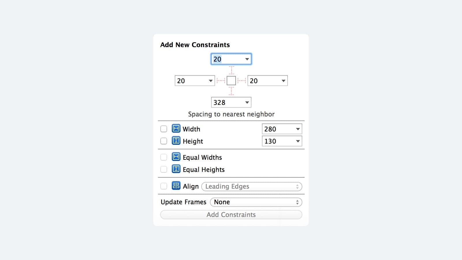
Auto Layout
Looks familiar? If you've used Sketch before you may have noticed a similar feature in the properties panel on the right. It's not as complex as Xcode's Auto Layout but it does a good job at mimicking some of the constraints and acts as an excellent starting point when thinking about adaptive layouts.
Making Your Design Adaptive
This is the screen we're going to make it adaptive. To do this, we're going to design on an iPhone 8 sized Artboard. Then we will set up our constraints, so our design scales up to iPhone 8 Plus and iPhone X, and down to a smaller screen like the iPhone SE, ensuring no matter what device our app is on, it looks great.

Adding Constraints
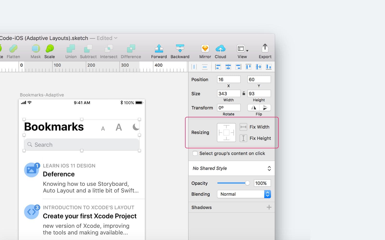
When you select a layer in Sketch, you can modify its properties by changing values in the properties panel on the right panel. This is where the constraints panel lives. The panel is split into two parts, the box on the left is used to set which side of the Artboard of your selected layer will pin to when the artboard is resized. The two buttons on the right set whether the layer will stretch or retain its set width and height. Let me show you some examples of how this works.
No Constraint
This first example shows what happens when we resize the Artboard without setting constraints on the layer.
Pin
In this second example, we've pinned the layer to the top and left edges of our Artboard and locked the height. When we resize, the layer stays pinned in place and resizes horizontally only, as we didn't lock its width.
Content Break
By default with no constraints set, our design won't adapt to different layouts. Let’s try with an iPhone 8, down to an iPhone SE and see what happens.
As you can see, with no constraints set, our design breaks when we change the Artboard size. Let’s fix that and make the design adaptive.
Title Constraints
Starting at the top and working our way down, let’s apply constraints to our Title group which contains our search bar, title, and icons. As you apply the constraints to layers, it’s important to think about how you want the layer to behave when the screen size changes. For example, in the Title group we want the search bar background to stretch, but the icon inside it to retain its position and size. Let’s set up some constraints on our group and its child layers.

Group Constraints
First, we apply constraints to the Group, pinning it to the top left and top right and fixing its height. This ensures that when the device’s height is changed, the Group stays anchored to the top. When the width is changed, it changes with the device width.
Child Constraints
When the Group’s constraints have been set, we can work our way inwards, applying constraints to its child layers. Here, we set constraints on the search bars width and height.
Child Constraints 2
As the search bar also contains its own children, we'll set constraints on these as well. We want the text box to change width with the bar, so let’s pin that to the left and lock its height. The search icon should remain pinned to the left, and shouldn't stretch when the bars width changes, so we'll lock its size to prevent this from happening. In the same way, we need to pin the title Bookmarks, it needs to have a fixed width and height and to be pinned to the left and top.
Constraints Results
Using the same logic, the last thing to do is set the constraints on the 'Bookmarks' title and the group of icons. When finished our title group is ready and adapts to iPhone 8, iPhone 8 Plus and iPhone SE screen sizes.
Adaptive Tab Bar
As you can see our title group is adaptive, but the rest of our layout still breaks when we change the screen size. Next, we're going to set some constraints on our tab bar and its child elements. The tab bar should stay pinned to the bottom edge of the screen but stretch as the screen’s width changes, to do this we activate the bottom pin and lock its height, as we don't want it to stretch vertically when the screen’s height changes. Finally, select the five tab elements which are all symbols and lock the width and height. This ensures they stay nicely spaced when the width changes, and doesn’t stretch.
Pro Tip
Constraints don't just apply to regular layers and groups. More complex shapes can be made adaptive too. Check out this tooltip. We may want its width to be variable, and change when the screen does, but the pin should retain its position, width, and height.
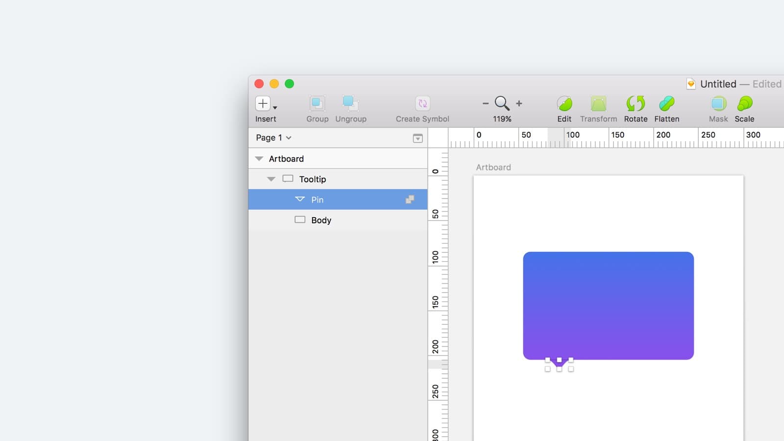
Pin Distorts
Constraints are applied to the overall shape, making sure that it’s pinned to the left and right edges of the Artboard. When we resize the Artboard, the tooltip’s body resizes, but see the pin? It changes position and becomes distorted.
Making the Entire Shape Adaptive
By double-clicking inside the shape and selecting the pin itself, we can pin it to the left and lock its width and height. Now the entire tooltip becomes adaptive, and won't break when the screen size changes.
Templates and source code
Download source files
Download the videos and assets to refer and learn offline without interuption.
Design template
Source code for all sections
Video files, ePub and subtitles
Videos
ePub
Assets
Subtitles
1
Learn Sketch
Introduction to Sketch Basic Tools
23:28
2
Powerful Start in Sketch
Strong Foundations for your Sketch Workflow
22:49
3
Design for iOS 11
Designing an iOS App from scratch in Sketch
31:30
4
Design for iPhone X
Designing and adapting for iPhone X in Sketch
28:23
5
Designing for iPad
Designing an iPad app from Scratch
11:36
6
Design for Web
Designing a Website from Scratch
25:12
7
Design for Web Part 2
Designing a Website from Scratch 2
25:11
8
Tricks and Keyboard Shortcuts
Boost your productivity in Sketch
20:43
9
Sketch Plugins
Essential Sketch Plugins for Designers and Developers
12:09
10
Nested Symbols
Design with More Flexibility by Nesting Symbols
9:14
11
Sketch Libraries
Share Symbols with Other Designers
7:00
12
Version Control
The Github for Designers
18:53
13
Working with Data
Make your design meaningful with real content
10:29
14
Adaptive Layouts
Working with Multiple Resolutions
7:33
15
Working with Vector
Vector Techniques in Sketch
20:12
16
Exporting Assets
Delivering Assets to Multiple Devices in Sketch
13:44
17
Styleguide and Handoff
Consistent design language in your team
9:11
18
Advanced Techniques
Master Sketch with these Tricks
12:40
19
Intro to Framer
Design and Code animations with Framer
27:51
20
Previewing and Sharing
Test drive on your devices
7:22
21
Prototyping in Keynote
Prototyping in Keynote Using Magic Move
3:33
Meet the instructor
We all try to be consistent with our way of teaching step-by-step, providing source files and prioritizing design in our courses.
John Sherwin
Product Designer
null
0 courses - 0 hours