
Complete Beginner-Friendly Framer Course
Add to favorites
4-hour free course to create beautiful, modern interfaces. Dark mode and glass designs, from Figma to Framer, using stack and grid layouts
Play video
Master No-Code Web Design with Framer
1
Complete Beginner-Friendly Framer Course
7:09
2
Create Your First Layout in Framer
13:47
3
Generate Layout with AI in Framer
7:26
4
Basic Layout and Interactive Elements
15:28
5
Text and Vector Animations
18:14
6
UI Design from Figma to Framer
13:16
7
Adaptive Layout with Stacks and Constraints in Framer
12:03
8
Responsive Layout with Breakpoints and Min Max
13:55
9
Button Components, Variables and Variants
11:01
10
Appear, Hover, Press, Loop and Drag Effects
11:17
11
Scroll Speed and Transform in Framer
15:15
12
Scroll Variants and Stick Element
12:13
13
Copy Components, Custom Cursors and 3D Embeds
10:00
14
Grid and Bento Layout
11:26
15
Icon Animation, Menu and Overlay
11:00
16
Code Components with Basic CSS
12:11
17
Property Controls in Framer
9:23
18
Code Overrides in Framer
13:23
19
CMS Collection Page and Detail
14:22
20
Search and Navigation
14:25

Sponsored Free Course
In this 4-hour free course sponsored by Framer, you'll learn to create modern, user-friendly interfaces. Start with dark mode and glass designs, then move from Figma to Framer, using vectors and auto layout for responsive websites. Add animations, interactive buttons, and custom components with code. Finally, you'll craft a design system suitable for teamwork or solo projects, all in a straightforward and practical approach.
Final site: https://significant-nature-656376.framer.app

Downloads
To follow this course, you need to download the Assets file which includes the Figma file. You can also Remix from my template in Framer.
Getting Started with this Course
This course is beginner-friendly. You don't need prior code knowledge or web design experience. Everything is explained step by step from a beginner mindset. It is however recommended that you have some computer knowledge and basic HTML and CSS experience.
- View the final site for reference: https://significant-nature-656376.framer.app
- Create an account on Framer.com
- Get the Remix link to view the Framer design file
- Download the Figma file (you can skip the Figma steps by using the Framer template)
- Download the Framer desktop app or design directly in the browser.
- As you take this course, use the Framer Academy for documentation
- Learn the basics of the Framer UI
Your First Layout in Framer
For beginners in website design, beginning with pre-made templates or pages is advantageous. This method offers a chance to experiment with and alter different components, incorporate images, and fine-tune sizes effortlessly. In Framer, these templates are accessible by pressing 'I' for Insert, followed by exploring the basics section. Here, you'll discover pages featuring diverse styles and layouts. Choosing a page from this collection provides a robust starting point for your design journey.
Generate Layout with AI
The Generate Page with AI feature in Framer, activated by the Command-K shortcut, is a powerful tool for swiftly creating full-page designs. It requires a detailed prompt, which can be crafted manually or generated through ChatGPT for more precision. Once the prompt is provided, Framer takes about 30 seconds to a minute to generate a page.

The output generally includes well-proportioned text, menus, and buttons, though some variations might occur. A standout feature of this tool is its adaptiveness; it automatically incorporates different breakpoints, ensuring that layouts resize effectively across devices. It can produce intriguing layouts, like grids, and integrate elements like maps. This feature significantly speeds up the design process and offers an innovative way to experiment with various colors, fonts, and layouts, seeing firsthand how they adapt to different screen sizes.

- Press Cmd + K and click on Generate Page.
- Use the following prompt or ask ChatGPT to generate one.
Design a smart home product landing page for Stellar inspired by Stripe and Apple macOS landing pages. Aim for a sleek, modern look with a minimalist layout.

The hero should have a compelling headline, text and call to action "Getting Started".

For the features section, create a grid layout, each with a thumbnail and a short description.

Add a section with testimonials in a grid layout.

Add a footer with social media links, styled subtly.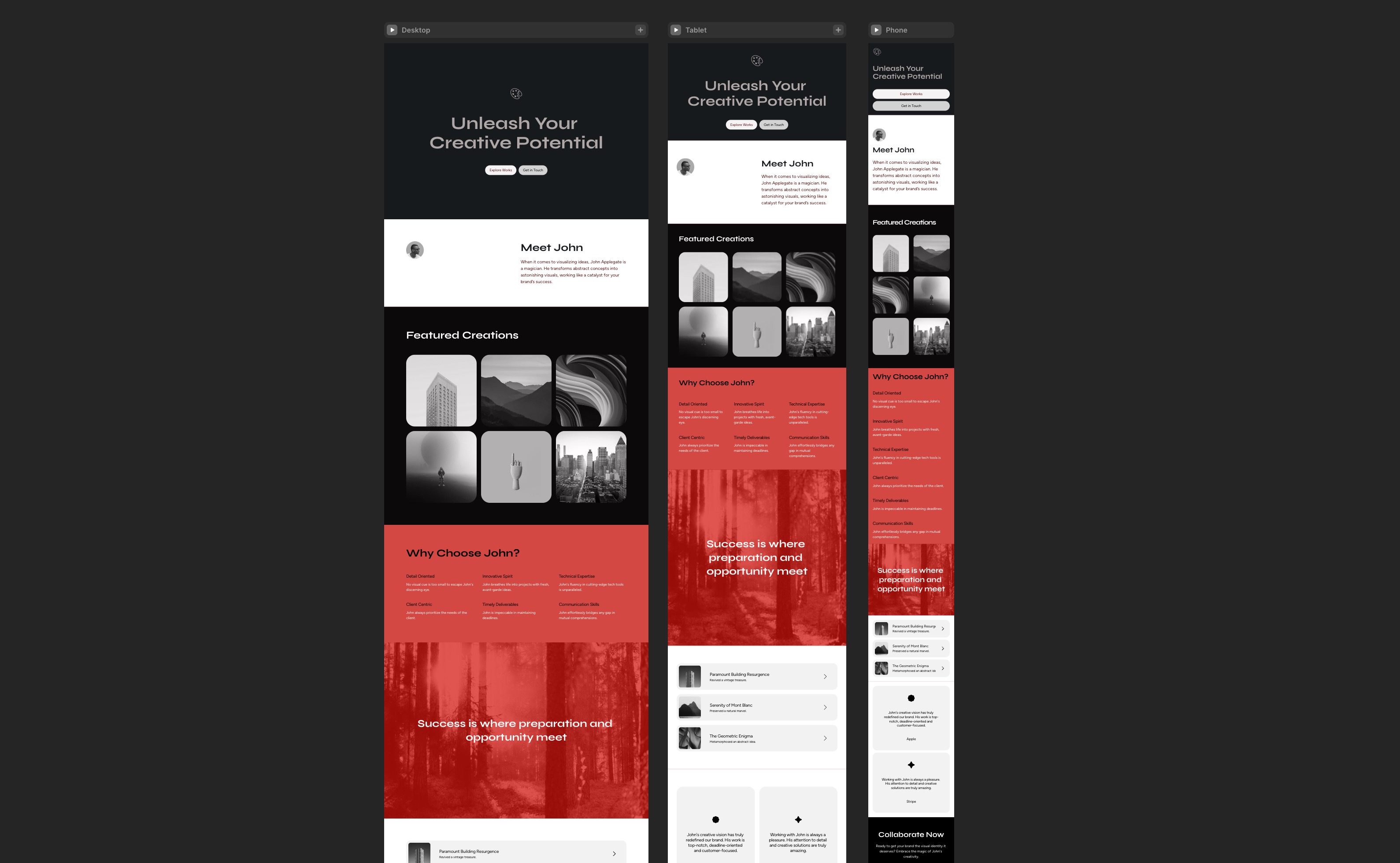
Intro to AI with Framer

- What is AI? AI, or Artificial Intelligence, refers to the simulation of human intelligence in machines. These machines are programmed to think like humans and mimic their actions. AI can be applied in various fields, including web design, where it assists in automating tasks and enhancing creativity.
- Sign up to ChatGPT: ChatGPT is a conversational agent powered by AI, developed by OpenAI. It can understand and generate human-like text based on the input it receives. To use ChatGPT, sign up on the OpenAI platform and gain access to its API, which can be integrated into various applications.
- AI Agents: AI agents are systems capable of autonomous actions to achieve specific objectives. They can range from simple, rule-based algorithms to complex, learning-based systems like ChatGPT. In the context of design, AI agents can help automate repetitive tasks, analyze data, and provide intelligent design suggestions.
- Generate Layout: ChatGPT can be leveraged to generate detailed prompts for designing layouts in Framer. It can process broad objectives, draw inspiration, and handle specific content requirements to aid in layout creation.
- ChatGPT to Code: After finalizing your layout in Framer, ChatGPT can be used to generate code, whether as Code Components or Code Overrides. This AI tool helps in crafting code snippets essential for adding interactions, animations, or embedding AI features in your Framer project. With ChatGPT, the transformation of design ideas into functional prototypes becomes more streamlined.
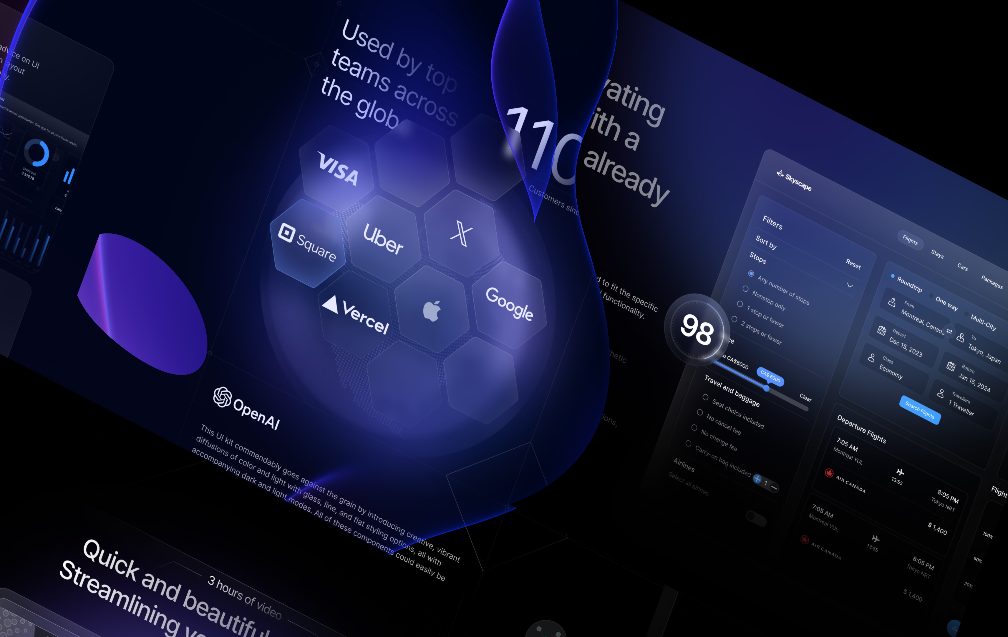
Figma to Framer
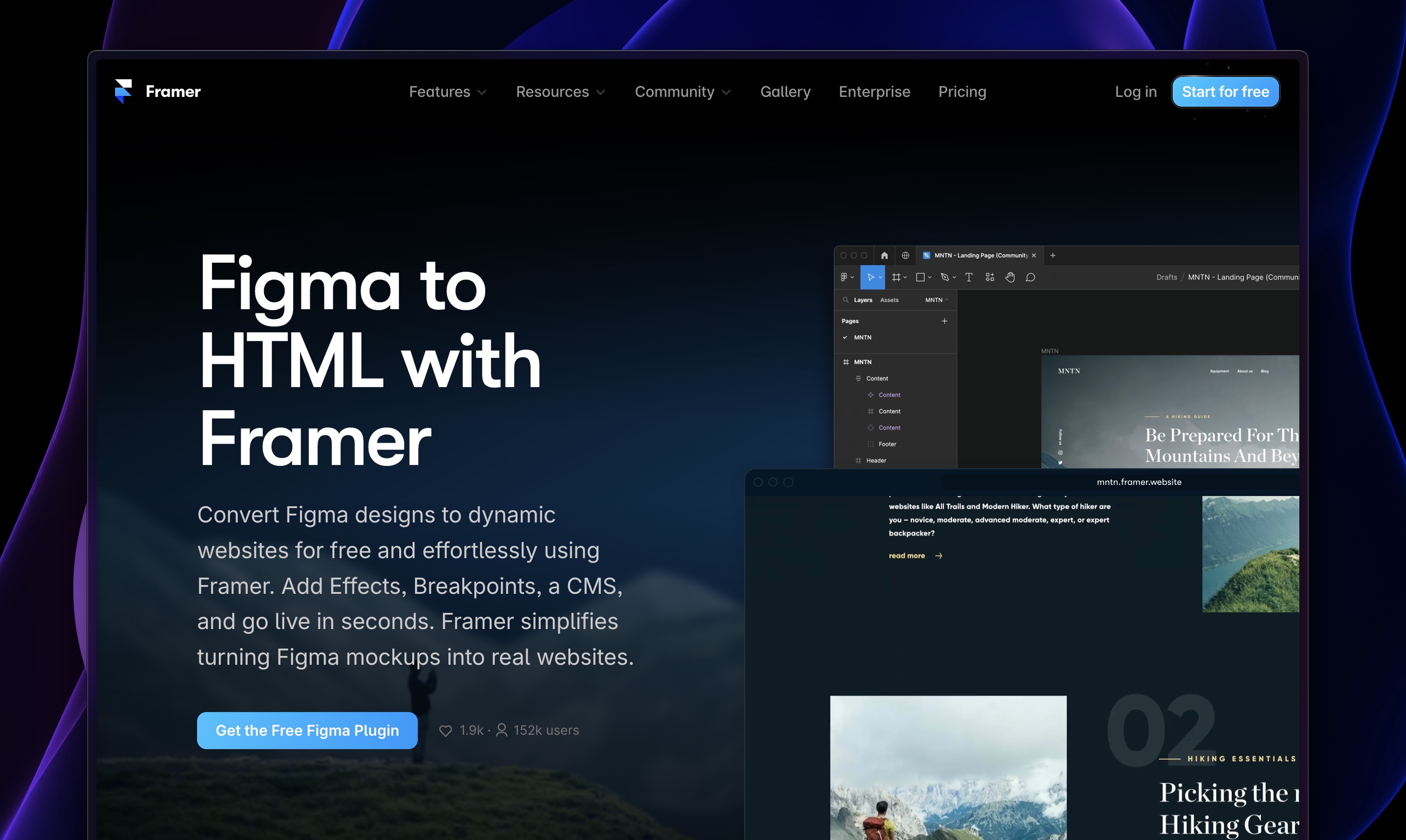
The Figma to HTML plugin is an exceptionally useful tool for designers and developers, bridging the gap between design and code. This plugin seamlessly converts Figma designs into HTML code, ensuring that the intricacies of the design, including colors and layout, are preserved. This process is grounded in sound design principles and guidelines, aiming to produce an exact replica of the Figma design in code form.
Chrome to Framer
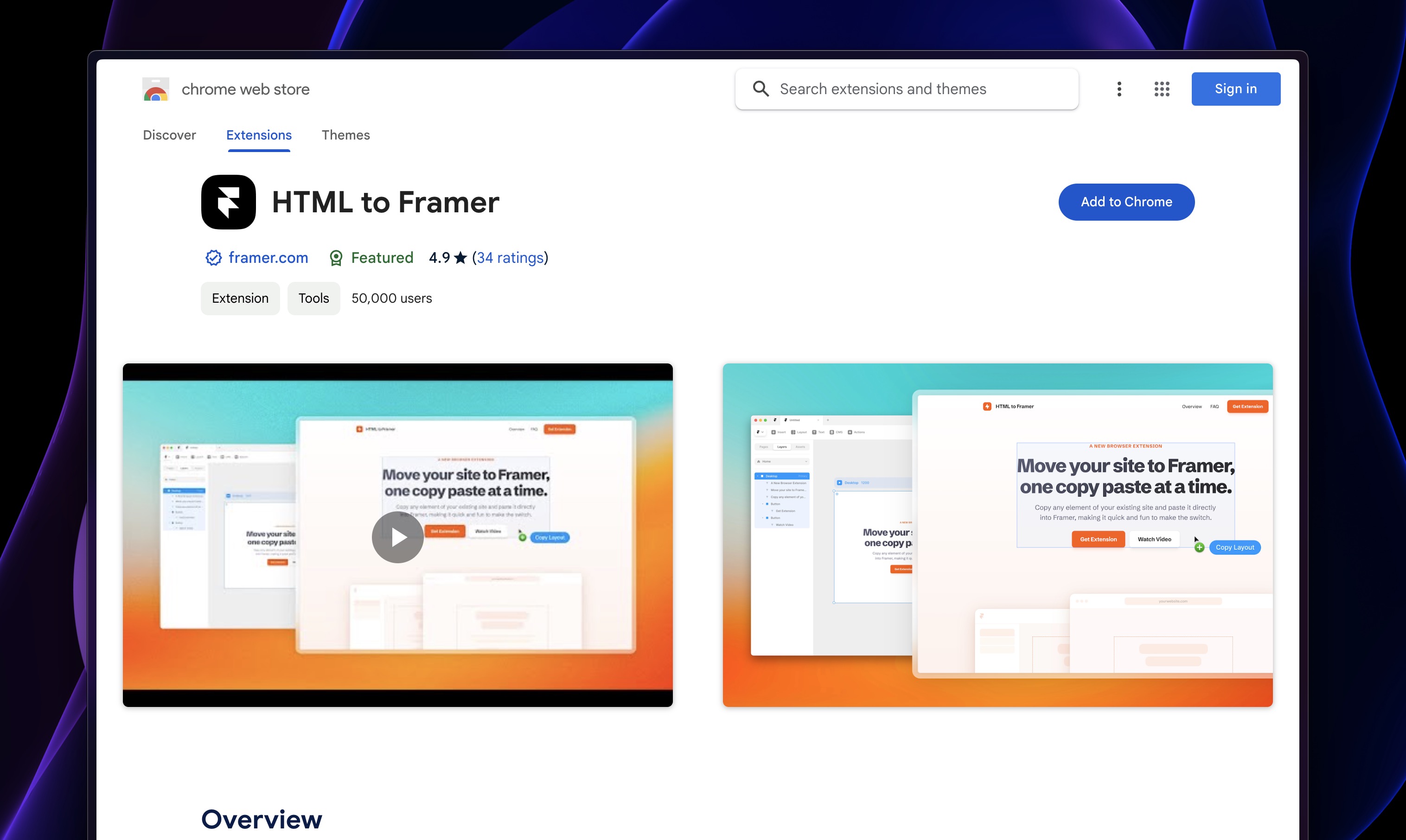
This Chrome extension allows users to easily import HTML structures and styles directly into Framer. This is especially useful for designers who start their process with HTML and CSS but want to leverage Framer's advanced prototyping and animation capabilities.
Best Practices for Figma to Framer Workflow
Transitioning designs from Figma to Framer requires careful attention to detail to ensure that the final prototype accurately reflects the original design intent. Here are some best practices and tips to achieve a perfect transition:
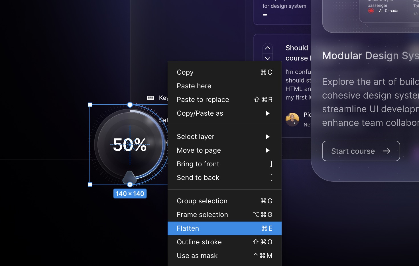
- For Icons and Logos, use Copy as SVG separately. These vectors won't work render properly if copied as HTML. Framer allows you to Paste SVGs from all sources.
- Avoid Stroke Gradient: have a fallback for your stroke gradients or plan to recreate them in CSS using code.
- Flatten Advanced Vectors: For advanced features that are not available in Framer or CSS, such as Advanced Stroke Gaps, make sure to Flatten before.
- Avoid Image as Fill: Using images as fill in Figma might result in them being imported as background images in Framer.
- Avoid Blending Modes: Blending modes with vectors or with effects like Background Blur won't work property. Use simpler alternatives or recreate the effect directly in Framer for better control and consistency.
- Avoid Custom Shapes with Background Blur: custom shapes with background blur in Figma might not be supported in Framer. As an alternative, use CSS clip-path in Framer to create similar effects.
- Absolute Position in Stack: use absolute positioning sparingly inside Auto Layout. This will automatically turn into an extra Layout element. Rely more on alignment and distribution tools for a more adaptable and responsive design when imported into Framer.
- Nested Layouts may cause elements to have fixed sizes. As a result, you should set them to Fit or Fill Content accordingly.
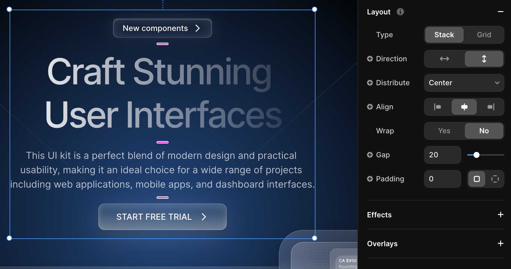
Stacks
In Framer, a stack is a powerful layout tool that allows designers to automatically arrange and space out components in a container. You can think of it as a box that holds other UI elements. The elements inside a stack are automatically arranged in a horizontal or vertical line. This makes it easy to maintain consistent spacing and alignment, crucial for a clean and organized interface. When you add or remove elements, the stack adjusts accordingly, maintaining the layout without manual adjustment.
- Direction: Stacks can be set to arrange elements in either a horizontal or vertical line.
- Distribute: Stacks automatically distribute the elements evenly within the container, creating consistent spacing between components.
- Align: Stacks provide alignment options such as top, center, and bottom alignment, ensuring elements are positioned correctly within the container.
- Wrap: Stacks can wrap elements onto multiple lines if there is not enough space in the container, allowing for flexible layouts.
- Gap: Stacks allow designers to adjust the gap between elements, controlling the spacing between components.
- Padding: Stacks can have padding applied, which adds space around the edges of the container, enhancing the appearance and organization of the interface.
Fixed, Fit and Fill
Making your layout adaptive starts with fine-tuning the small elements. By using a combination of Fixed, Fit, and Fill options within your stacks, you can create adaptive layouts that adjust to different screen sizes and content lengths. This allows your interface to look great on various devices and accommodate different amounts of content without sacrificing design consistency and organization.
- Fit Content: Buttons can grow based on the text.
- Fill: Titles and texts should fill the available space of the container.
- Fixed: Containers can have a Fixed size in Desktop mode and a Fill size in Mobile.
Constraints
Constraints in Framer are rules or limitations that can be applied to elements in order to control their size, position, and behavior within a layout. With constraints, designers can ensure that elements maintain their proportions and alignment when the screen size or device orientation changes. Constraints can be set on the x-axis, y-axis, width, height, and even on the aspect ratio of an element. This helps in creating responsive and adaptable designs that work well on different devices and screen sizes.

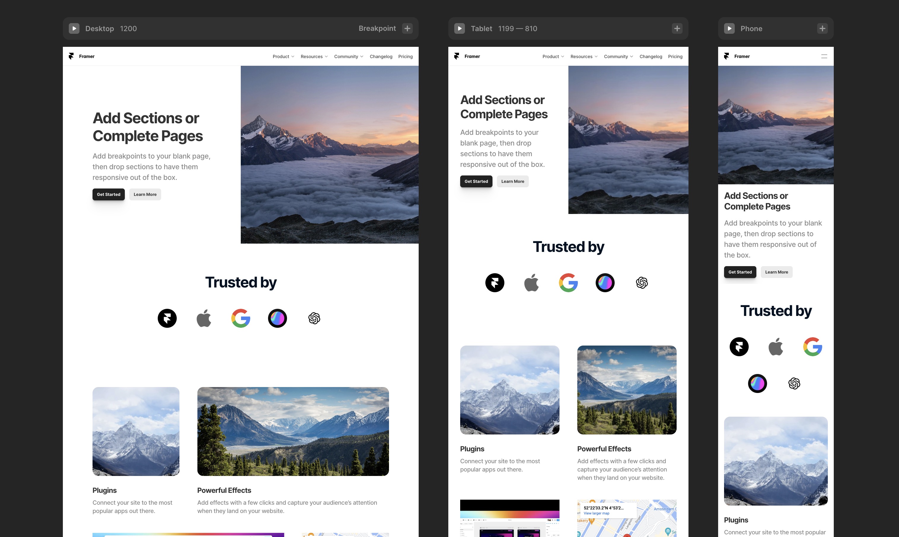
Breakpoints
When designing in Framer, breakpoints can be defined in the form of CSS media queries. These queries allow you to define specific ranges of screen widths and apply different styles or layout rules to elements within those ranges. For example, you can set a breakpoint at 768 pixels and specify that certain elements should have a different font size or positioning when the screen width is below that value.

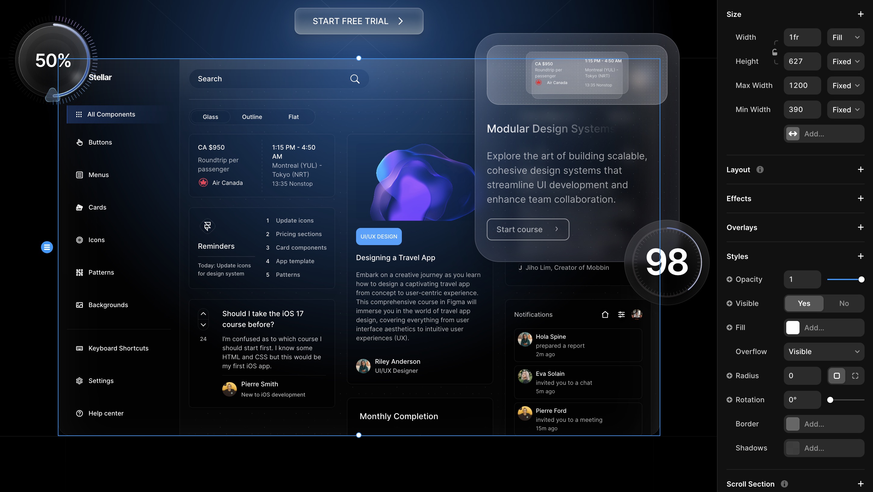
There are three main breakpoints in Framer: 1200, 810, and 390. These breakpoints represent the screen widths at which the design layout will change to accommodate different screen sizes.
- Desktop: 1200 is typically used for large desktop screens. At this width, the design may utilize a wider layout and display more content or larger elements. Elements may be spaced out more and font sizes may be increased for improved readability.
- Tablet: 810 is commonly used for tablets or smaller desktop screens. At this width, the design may adapt to a more compact layout, with elements being rearranged or stacked vertically. Font sizes may be reduced to fit the smaller screen size, and the spacing between elements may also be adjusted.
- Mobile: 390, is typically used for mobile devices. At this width, the design may change significantly to optimize the user experience on smaller screens. Elements may be stacked vertically, and the layout may be simplified to avoid clutter. Font sizes may be further reduced, and the spacing between elements may be increased for better touch interaction.
Min Max
Framer supports min and max values for CSS properties, ensuring consistent size and position across different screen sizes. These values are additional rules that override other Layout growth such as Fill Content.
Button Component

Components in Framer are pre-built UI elements that can be easily customized and reused in your designs. Button components, for example, allow you to quickly create interactive buttons with various effects such as hover, click, and animation. These components help streamline your design process and ensure consistency throughout your project. With Framer's intuitive interface, creating and customizing button components is a breeze.
Component Variables
Component variables in Framer are variables that are associated with a specific component. These variables can be used to customize and manipulate the behavior and appearance of the component. There are several types of variables that can be assigned to a component in Framer:
- Text: Text variables are used to store and manipulate text values. They can be used to display and modify text content within a component, such as labels, titles, descriptions, or user input.
- Color: Color variables are used to store and manipulate color values. They can be used to control the background color, text color, border color, and other visual properties of a component.
- Toggle: Toggle variables are used to store and control the state of a toggle switch or checkbox. They can be used to determine whether a toggle switch or checkbox is selected or deselected, and can be used to trigger certain actions or behaviors based on the toggle's state.
- Link: Link variables are used to store and manipulate URLs or references to other resources. They can be used to create clickable links or buttons that navigate to a different webpage or open a file or document.
- Component Properties: Component properties are variables that store and control various characteristics and behaviors of a component. They can include properties such as size, position, visibility, opacity, and many others.
By assigning values to these component variables, you can easily create dynamic and interactive components that respond to user interactions or change based on certain conditions. Framer provides a powerful and flexible way to define and use component variables, making it easy to create complex and customizable UI elements.

Component Variants
Button variants in Framer allow you to easily create multiple versions of a button with shared elements such as text, icons, sizes, and styles. This can be beneficial in situations where you need to display different variations of a button within your design.
Best practices for using button variants include organizing and labeling your variants in a clear manner, using nested components for more complex buttons, and utilizing Framer's built-in features such as states and interactions to enhance the functionality of your button variants.

3D Embeds with Spline
Another exciting feature of Framer is its ability to integrate 3D embeds with Spline. Spline is a powerful 3D design tool that allows you to create stunning 3D illustrations and animations. By combining Framer's interactive capabilities with Spline's 3D capabilities, you can take your website design to the next level.
Framer Effects
When discussing Framer Effects and its capabilities for prototyping interactions and animations, several key effects come into play, including Appear, Hover, Press, Loop, Drag, Scroll Animation, Scroll Speed, Scroll Transform, and Scroll Variant.

- Appear: This effect is used to define how elements enter the viewport or become visible in the UI. Appear animations can be set to trigger when a component first loads or becomes visible on the screen, allowing for a smooth introduction of content. This can include fading in, sliding from a direction, or scaling up from a certain point.
- Hover: Hover effects are crucial for web and desktop applications, where a mouse pointer is used. It defines the interaction when a user places their cursor over an element without clicking. Hover effects can change the color, size, or appearance of buttons, links, or any interactive element, providing immediate visual feedback that an element is interactive.
- Press: Press effects are triggered when a user clicks or taps on an element. This can be used to simulate the tactile feedback of pressing a button, toggling a switch, or activating an interactive element. Press animations often involve changes in scale, color, or the addition of a ripple effect to signify an action has been taken.
- Loop: Loop effects are continuous animations that repeat indefinitely until stopped. They're useful for drawing attention to specific elements, such as animated icons, loading indicators, or background animations. Loop animations can be subtle, like a pulsing effect, or more complex, involving multiple animated properties.
- Drag: Drag effects allow elements to be moved around the screen through click-and-drag interactions. This is particularly useful for sliders, rearranging items in a list, or interactive elements in a game. The drag effect can include constraints on movement (such as locking to an axis) and feedback animations that respond to the drag action.
- Scroll Animation: Scroll animations are triggered by the user's scroll actions within a page or container. These animations can create parallax effects, reveal content dynamically, or animate properties of elements based on the scroll position. This effect enhances storytelling and engagement on a webpage or application.
- Scroll Speed: This defines how quickly elements respond or animate in relation to the user's scroll speed. Adjusting scroll speed can amplify or dampen the effect of scroll-based animations, allowing designers to fine-tune how interactive elements react to user input for a smoother or more dramatic effect.
- Scroll Transform: Scroll transform applies transformations to elements based on the scroll position. This can include scaling, rotating, skewing, or translating elements. Designers can create immersive, dynamic effects that change as the user scrolls through content.
- Scroll Variant: Scroll variants allow for different animation states based on scroll position. This can be used to switch between different styles, layouts, or visual states of an element as the user scrolls. It's a powerful tool for creating interactive, scroll-driven narratives or guides.
By leveraging these effects, designers can create high-fidelity prototypes that accurately simulate the look, feel, and functionality of the intended design, allowing for effective testing, feedback, and iteration during the design process.
Scroll Interactions
Creating interactive prototypes often requires more than just simple transitions; it involves simulating experiences that are closer to a final product. Framer, a powerful tool for interactive designs, provides advanced features like Scroll Effects, allowing you to adjust scroll speed, transforms, and variants, which can enhance the realism of your prototypes. This tutorial will guide you through utilizing these features in Framer to create more dynamic and engaging designs.

Grid Layout
Grid Layouts feature a structured framework, characterized by a specified arrangement of rows and columns. This structured approach is perfect for organizing complex data, ensuring uniformity and accuracy. Despite their structured nature, designers have the flexibility to modify column widths, row heights, and the spacing between elements, enabling the creation of vibrant and engaging compositions. Grids act more as a supportive guide than a restrictive barrier, empowering designers to innovatively place text, images, and various components, thereby enhancing both the aesthetic quality and the overall user experience.
Navigation Adaptive Menu
In digital design, using animations, menus, and overlays really makes your projects pop. They're not just about looking good; they make websites and apps way more user-friendly. We dive into cool tricks like animating hamburger icons for slick menus, tweaking navigation for all screen sizes, and adding neat overlays without crowding the screen. Plus, there's a bit on crafting footers that fit perfectly on any device. It's all about keeping things engaging and easy for users, with some creative flair.
Overlay
In Framer, the overlay feature allows designers to summon a floating menu over UI elements, like the hamburger menu icon. This interactive layer, appearing with a tap, provides a space-efficient way to display additional navigation options without permanently occupying screen real estate. Perfect for enhancing mobile experiences, it ensures users have access to the full menu in a visually clean, unobtrusive manner, enriching the overall usability and aesthetic of the app.

Code Component with Basic CSS
Diving into code components in Framer, we're learning how to craft cool shapes like hexagons with a smooth background blur—all using just CSS. This isn't something Framer does straight out of the box, but with a bit of CSS magic, we can pull designs straight from Figma or any design tool and bring them to life. It's a great example of how flexible CSS is, opening up endless possibilities for custom designs. Whether you're looking to add some flair with a unique shape or aiming for that subtle background effect, tapping into CSS through Framer gives you the power to create just about anything you can imagine.
import styled from "styled-components"

export default function Hexagon() {
    const Component = styled.div`
        width: 175px;
        height: 151px;
        flex-shrink: 0;
        fill: rgba(255, 255, 255, 0.04);
        stroke-width: 1px;
        stroke: rgba(225, 246, 255, 0.30);
        box-shadow: 0px 30px 30px 0px rgba(255, 255, 255, 0.05) inset;
        backdrop-filter: blur(10px);
        clip-path: path('M171.095 70.4863C172.892 73.5872 172.892 77.4128 171.095 80.5137L133.139 146.014C131.351 149.1 128.054 151 124.487 151H48.5129C44.9459 151 41.649 149.1 39.8606 146.014L1.90532 80.5137C0.108386 77.4128 0.108386 73.5872 1.90532 70.4863L39.8606 4.98625C41.649 1.89999 44.9459 0 48.5129 0H124.487C128.054 0 131.351 1.89999 133.139 4.98625L171.095 70.4863Z')
    `

    return <Component />
}
Code Overrides
Code overrides offer a powerful method to augment existing framework elements with additional functionality through code, without the need to build components from scratch. Here's how to effectively use code overrides in your projects:
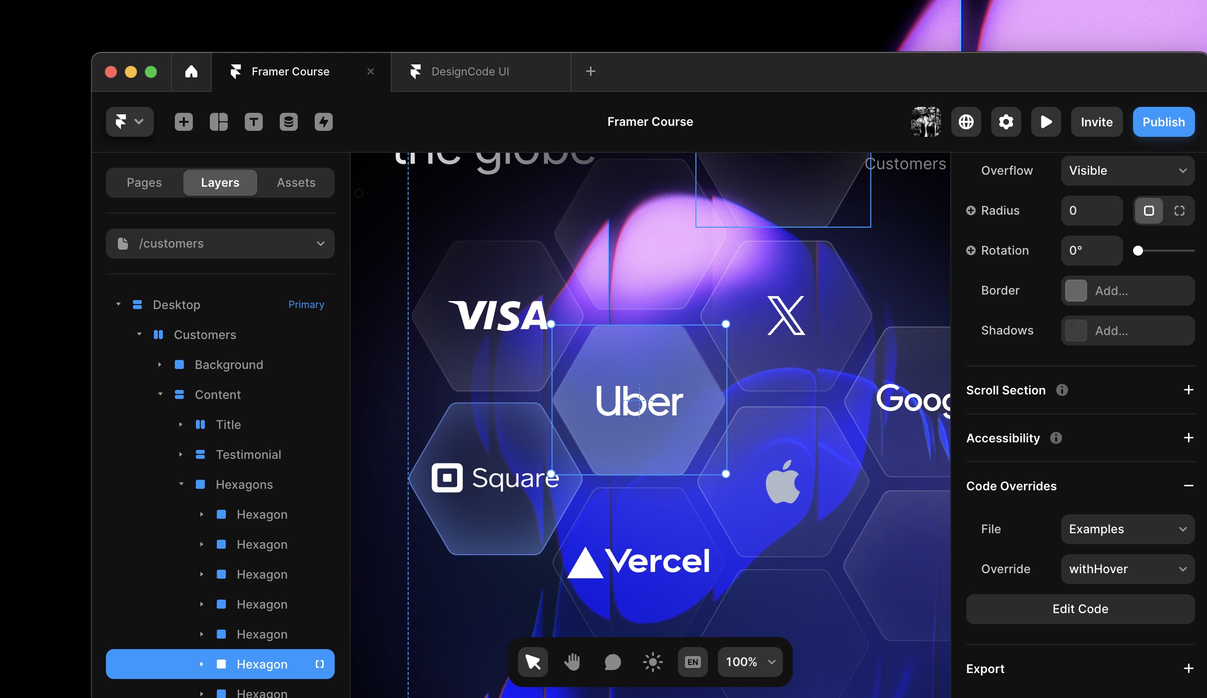
Understanding Code Overrides: They allow you to inject custom behavior or styling into existing elements of your framework. This is particularly useful for adding interactivity or dynamic effects with minimal effort.
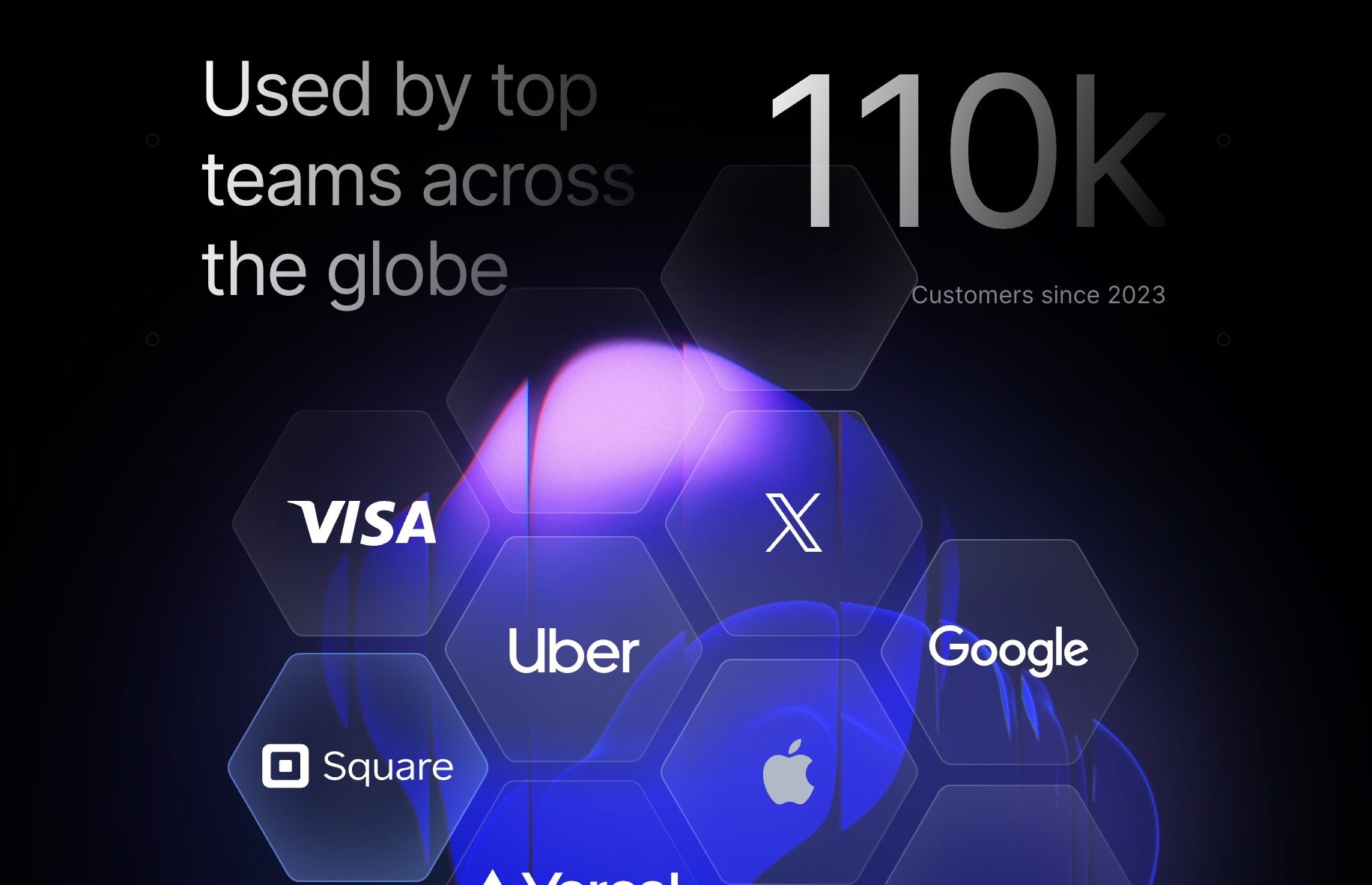
CMS Collection
Integrating a CMS (Content Management System) with your Framer project significantly streamlines content management, especially for projects with extensive content like changelogs. Here's a concise guide on how to effectively utilize CMS for your project:
CMS allows you to manage your content through a dashboard, eliminating the need to manually edit each post within Framer. It's ideal for handling large volumes of content with uniform structure.
Create a CMS Collection
Navigate to your CMS and create a new collection named "ChangeLog". This collection will house all your changelog entries.

Custom Cursors
Users can now design interactive cursors using components, offering infinite customization possibilities. By utilizing Variants, Effects, and Transitions, users can create interactions with a high level of fidelity. To get started, you can add a custom cursor to their Page and switch its Variants on any layer. They have the option to either "Replace" the default cursor with a Component or "Follow" to add to it. To learn more about Custom Cursors, you can watch the video and explore the demo.
Localization

Localization is a crucial step in making your application accessible to a global audience. Here's a concise guide to streamline the process using AI in Framer:
- Access Localization: Click on the earth icon located at the top right of the UI to view all the text elements within your UI.
- Automate Translations: Utilize the sparkle icon next to each text element for quick AI-assisted translations. Note: Bulk edit "Translate All" and context-aware translations "AI Style" will require a pro or enterprise account.
- Manual Translation: Translations can also be done manually, one element at a time.
- CMS Content Translation: Beyond UI elements, CMS content is also translatable. After exiting the localization view, select your primary and secondary languages (e.g., English to French) from the bottom middle of the UI. Use the inspector to translate content for each selected element.
- Monitor Progress: Regularly check the translation progress indicator, which provides a percentage completion. It's essential to continually update and verify translations to ensure accuracy.
Community Components

Framer components, created and shared by the design community, are reusable elements that can be copied into your own Framer templates for efficient design workflow. Here are some resources:
Sites
- Framer Supply: A marketplace for Framer templates and design assets.
- Framer University Resources: A collection of tutorials and resources for mastering Framer.
- Everything Framer: EverythingFramer is a highly vetted, free community for Framer creators.
- Framer Community Resources: This space is for sharing additional resources, like websites with tips and tricks, starter kits, and more.
Interactive Components
- Globe: A customizable 3D globe component for web projects.
- Motion Text: An interactive tool for creating animated text effects.
- Animator: A web-based tool for designing and implementing animations.
- Morpher: Allows for the creation of smooth shape transformations.
- Patterns: A library of design patterns for web and mobile interfaces.
- Arc Text: Enables text to follow a curved path, enhancing visual design.
Icons
- Phosphor: An extensive icon family with 7,488 icons for interfaces, diagrams, and presentations.
- Feather: A collection of simple, open-source icons totaling more than 280.
- Iconoir: One of the largest open-source libraries with over 1,544 SVG icons.
Remixes
Framer Remixes are essentially shared templates. They are distributed using a link, which allows others to duplicate the template directly into their own Framer projects for further customization and use. This feature facilitates easy sharing and collaboration in the design community.
https://www.framer.community/c/remix/
Creative Elements
Creative Elements in Framer enhance web designs with interactive and visual features:
- Patterns and Grids: Organize content neatly, adding depth and structure.
- Noise: Introduces texture, making interfaces feel tactile and dynamic.
- Time Countdown: Adds urgency for events or promotions, keeping users informed.
- Scribbles: Offers a personal touch, breaking digital rigidity with organic flair.
- Circle Text: Draws attention creatively, ideal for logos or standout content.
Explore more with Framer Supply, Framer University, and the Framer community for resources and inspiration. Use these elements wisely to improve user experience without overwhelming your design.
Templates
In 2024, Framer templates are key for UI/UX design. They easily match different design systems, making sure designs stay consistent. They work well on all devices, keeping the look and usability smooth. These templates come with ready-to-use animations that make interfaces more interactive. They also allow designers to tweak the code to suit specific needs. Thanks to input from designers worldwide, these templates cater to various industries, making them a go-to choice for modern UI/UX work.
Framer Academy
Framer Academy offers a structured learning path for individuals starting from scratch, covering a variety of topics in design and prototyping. The courses are meticulously curated by Framer, ensuring that learners receive high-quality, relevant content straight from the source. With lessons ranging from creating basic elements to constructing a complete website, the Academy provides a comprehensive educational experience.
Framer Community

The Framer Community site, located at framer.community, is a hub for designers and developers to find updates, remixes, customer support, give feedback, and access learning materials. It offers various resources, such as tutorials, templates, and community components, to enhance the design and prototyping process. Users can also explore features like Code components and layout generation with AI to take their designs to the next level. Overall, the Framer Community site is a valuable platform for the design community to connect, learn, and collaborate.
Templates and source code
Download source files
Download the videos and assets to refer and learn offline without interuption.
Design template
Source code for all sections
Video files, ePub and subtitles
Assets
Videos
1
Complete Beginner-Friendly Framer Course
4-hour free course to create beautiful, modern interfaces. Dark mode and glass designs, from Figma to Framer, using stack and grid layouts
7:09
2
Create Your First Layout in Framer
Master the basics of layout creation in Framer with this comprehensive step-by-step guide for beginners. Start building your designs today!
13:47
3
Generate Layout with AI in Framer
Create stunning websites with ease using Framer's AI-powered layout generator
7:26
4
Basic Layout and Interactive Elements
Learn how to create a user-friendly layout with interactive elements to enhance the user experience and engagement on your website or app
15:28
5
Text and Vector Animations
Transform your content with captivating text and vector animations
18:14
6
UI Design from Figma to Framer
Mastering the art of transitioning your UI design projects seamlessly from Figma to Framer with expert tips and techniques
13:16
7
Adaptive Layout with Stacks and Constraints in Framer
Create responsive designs easily using stacks and constraints in Framer. Perfect for adaptive layouts for web and mobile projects
12:03
8
Responsive Layout with Breakpoints and Min Max
Create a user-friendly website with responsive design, incorporating breakpoints and min-max values to ensure optimal display on all devices
13:55
9
Button Components, Variables and Variants
Explore different button components, variables, and variants to enhance the functionality and aesthetics of your projects
11:01
10
Appear, Hover, Press, Loop and Drag Effects
Mastering Framer Effects: Create interactive sites with Appear, Hover, Press, Loop, Drag Effects
11:17
11
Scroll Speed and Transform in Framer
Learn how to create dynamic Framer sites with advanced features for interactive designs
15:15
12
Scroll Variants and Stick Element
Enhance User Navigation with Sticky Elements and Scroll Variants in Framer
12:13
13
Copy Components, Custom Cursors and 3D Embeds
Learn how to incorporate Framer's interactive elements into your designs
10:00
14
Grid and Bento Layout
Enhancing Your Designs with Grid and Bento Layouts in Framer
11:26
15
Icon Animation, Menu and Overlay
Web Design User Experience with Icon Animation, Menus, and Overlays in Framer
11:00
16
Code Components with Basic CSS
Create Basic Code Components with CSS in Framer
12:11
17
Property Controls in Framer
Mastering Property Controls for Interactive Framer Components
9:23
18
Code Overrides in Framer
Enhancing Your Framer Elements with Code Overrides
13:23
19
CMS Collection Page and Detail
Integrating Figma Designs with Framer and CMS
14:22
20
Search and Navigation
Enhancing User Experience: Search, Navigation, and Footer Integration
14:25
Meet the instructor
We all try to be consistent with our way of teaching step-by-step, providing source files and prioritizing design in our courses.
Meng To
I design, code and write
Meng To is the author of Design+Code. Meng started off his career as a self-taught designer from Montreal and eventually traveled around the world for 2 years as his US VISA was denied. During his travels, he wrote a book which now has 35,000 readers.
40 courses - 194 hours
Master AI Prompting for Stunning UI
Learn how to leverage AI tools like Aura for creating beautiful designs, working with templates, and experimenting with advanced prompts. A concise guide for designers and developers to level up their skills.
10 hrs
Build SwiftUI apps for iOS 18 with Cursor and Xcode
In this course, we'll explore the exciting new features of SwiftUI 6 and Xcode 16 for building iOS 18 apps. From mesh gradients and text animations to ripple effects, you'll learn how to create polished, highly custom apps using the latest workflows. We'll also dive into using Cursor and Claude AI for AI-driven coding, helping you start strong and customize your apps.
5 hrs
Create your Dream Apps with Cursor and Claude AI
Learn to build your dream web apps from the ground up using Cursor, Claude AI, and a suite of powerful AI tools. This course covers everything you need, including React for frontend development, Firebase for backend integration, and Stripe for handling payments. You’ll also dive into advanced AI tools like Claude Artifacts, Galileo AI, v0.dev for UI, Ideogram for design generation, and Cursor Composer for full-scale development.
6 hrs
Build a React Site from Figma to Codux
In this course, you'll learn to build a website from scratch using Codux, starting with a Figma template. You’ll master responsive design, collaborate with developers on a real React project, export CSS from Figma using Locofy, set up breakpoints with media queries, add CSS animations, improve SEO, create multiple pages with React Router, and publish your site. By following best practices, you’ll bridge design and development, improve your web design skills.
2 hrs
Create 3D UI for iOS and visionOS in Spline
Comprehensive 3D Design Course: From Basics to Advanced Techniques for iOS and visionOS using SwiftUI
3 hrs
Master No-Code Web Design with Framer
In this free Framer course, you'll learn to create modern, user-friendly interfaces. Start with dark mode and glass designs, then move from Figma to Framer, using vectors and auto layout for responsive websites. Add animations, interactive buttons, and custom components with code. Finally, you'll craft a design system suitable for teamwork or solo projects, all in a straightforward and practical approach.
4 hrs
Build SwiftUI Apps for iOS 17
In this course, we’ll be exploring the fresh and exciting features of SwiftUI 5! As we craft a variety of iOS apps from the ground up, we'll delve deep into the treasure trove that is SwiftUI's user interface, interactions, and animations.
4 hrs
Build Beautiful Apps with GPT-4 and Midjourney
Design and develop apps using GPT-4 and Midjourney with prompts for SwiftUI, React, CSS, app concepts, icons, and copywriting
4 hrs
Build SwiftUI apps for iOS 16
Create animated and interactive apps using new iOS 16 techniques using SwiftUI 4 and Xcode 14
5 hrs
Build a 3D Site Without Code with Framer
Design and publish a responsive site with 3D animation without writing a single line of code
3 hrs
Create 3D Site with Spline and React
Design and code a landing page with an interactive 3D asset using Spline and CodeSandbox
1 hrs
Build an Animated App with Rive and SwiftUI
Design and code an iOS app with Rive animated assets, icon animations, custom layouts and interactions
3 hrs
Build a SwiftUI app for iOS 15 Part 3
Design and code a SwiftUI 3 app with custom layouts, animations and gestures using Xcode 13, SF Symbols 3, Canvas, Concurrency, Searchable and a whole lot more
4 hrs
Build a SwiftUI app for iOS 15 Part 2
Design and code a SwiftUI 3 app with custom layouts, animations and gestures using Xcode 13, SF Symbols 3, Canvas, Concurrency, Searchable and a whole lot more
3 hrs
Build a SwiftUI app for iOS 15
Design and code a SwiftUI 3 app with custom layouts, animations and gestures using Xcode 13, SF Symbols 3, Canvas, Concurrency, Searchable and a whole lot more
4 hrs
React Livestreams
Learn how we can use React Hooks to build web apps using libraries, tools, apis and frameworks
4 hrs
Design Founder Livestreams
A journey on how we built DesignCode covering product design, management, analytics, revenue and a good dose of learning from our successes and failures
2 hrs
SwiftUI Advanced Handbook
An extensive series of tutorials covering advanced topics related to SwiftUI, with a main focus on backend and logic to take your SwiftUI skills to the next level
4 hrs
iOS Design Handbook
A complete guide to designing for iOS 14 with videos, examples and design files
2 hrs
SwiftUI Handbook
A comprehensive series of tutorials covering Xcode, SwiftUI and all the layout and development techniques
7 hrs
Build a web app with React Hooks
Learn how we built the new Design+Code site with React Hooks using Gatsby, Netlify, and advanced CSS techniques with Styled Components.
4 hrs
UI Design Handbook
A comprehensive guide to the best tips and tricks for UI design. Free tutorials for learning user interface design.
2 hrs
Figma Handbook
A comprehensive guide to the best tips and tricks in Figma. Not affiliated with or endorsed by Figma, Inc.
6 hrs
SwiftUI for iOS 14
Build a multi-platform app from scratch using the new techniques in iOS 14. We'll use the Sidebar and Lazy Grids to make the layout adaptive for iOS, iPadOS, macOS Big Sur and we'll learn the new Matched Geometry Effect to create beautiful transitions between screens without the complexity. This course is beginner-friendly and is taught step-by-step in a video format.
3 hrs
SwiftUI Livestreams
This is a compilation of the SwiftUI live streams hosted by Meng. Over there he talks and teaches how to use design systems, typography, navigation, iOS 14 Design, prototyping, animation and Developer Handoff.
19 hrs
UI Design Livestreams
This is a compilation of the UI live streams hosted by Meng. Over there he talks and teaches how to use design systems, typography, navigation, iOS 14 Design, prototyping, animation and Developer Handoff.
26 hrs
UI Design for Developers
In this course we'll learn how to use design systems, set up break points, typography, spacing, navigation, size rules for adapting to the iPad, mobile and web versions, and different techniques that translate well from design to code.
3 hrs
Build an app with SwiftUI Part 3
This course was written for designers and developers who are passionate about design and about building real apps for iOS, iPadOS, macOS, tvOS and watchOS. SwiftUI works across all of those platforms. While the code is not a one-size-fits-all, the controls and techniques involved can apply to all platforms. It is beginner-friendly, but it is also packed with design tricks and cool workflows about building the best UIs and interactions.
4 hrs
Build an app with SwiftUI Part 2
This course was written for designers and developers who are passionate about design and about building real apps for iOS, iPadOS, macOS, tvOS and watchOS. SwiftUI works across all of those platforms. While the code is not a one-size-fits-all, the controls and techniques involved can apply to all platforms. It is beginner-friendly, but it is also packed with design tricks and cool workflows about building the best UIs and interactions.
4 hrs
Build a full site in Webflow
Webflow is a design tool that can build production-ready experiences without code. You can implement CSS-driven adaptive layouts, build complex interactions and deploy all in one tool. Webflow also comes with a built-in content management system (CMS) and Ecommerce for creating a purchase experience without the need of third-party tools.
3 hrs
Advanced Prototyping in ProtoPie
ProtoPie is a cross-platform prototyping tool that creates prototypes nearly as powerful as those made with code, with half of the efforts, and zero code. It's perfect for designers who want to quickly experiment with advanced interactions using variables, conditions, sensors and more.
3 hrs
Build an app with SwiftUI Part 1
This course was written for designers and developers who are passionate about design and about building real apps for iOS, iPadOS, macOS, tvOS and watchOS. SwiftUI works across all of those platforms. While the code is not a one-size-fits-all, the controls and techniques involved can apply to all platforms. It is beginner-friendly, but it is also packed with design tricks and cool workflows about building the best UIs and interactions.
4 hrs
React Native for Designers Part 2
React Native is a popular Javascript framework that builds on top of React by using native components to create a real mobile app indistinguishable from one made using Xcode or Android Studio. The main difference with native development is that you get to use CSS, hot-reload, Javascript and other familiar techniques that the Web has grown over the past decades. Most importantly, you're building for both iOS and Android using the same codebase.
3 hrs
React Native for Designers
React Native is a popular Javascript framework that builds on top of React by using native components to create a real mobile app indistinguishable from one made using Xcode or Android Studio. The main difference with native development is that you get to use CSS, hot-reload, Javascript and other familiar techniques that the Web has grown over the past decades. Most importantly, you're building for both iOS and Android using the same codebase.
5 hrs
Design System in Figma
Learn how to use and design a collaborative and powerful design system in Figma. Design Systems provide a shared library of reusable components and guidelines and that will let you build products much faster
3 hrs
React for Designers
Learn how to build a modern site using React and the most efficient libraries to get your site/product online. Get familiar with Grid CSS, animations, interactions, dynamic data with Contentful and deploying your site with Netlify.
3 hrs
Swift Advanced
Learn Swift a robust and intuitive programming language created by Apple for building apps for iOS, Mac, Apple TV and Apple Watch
9 hrs
Learn Swift
Learn Swift a robust and intuitive programming language created by Apple for building apps for iOS, Mac, Apple TV and Apple Watch
4 hrs
Learn Sketch
Learn Sketch a design tool entirely vector-based and focused on user interface design
5 hrs
Learn iOS 11 Design
Learn colors, typography and layout for iOS 8
1 hrs