
Tab Bar Animation
Add to favorites
Crafting Futuristic UI: Designing a Glass Tab Bar with Crystal Floating Button using Spline
Play video
3D UI Interactive Web Design with Spline
1
Introduction to Spline
10:24
2
3D Shapes and Materials
9:45
3
Weather Icon and Sculpting
13:29
4
Icon Animation
9:27
5
Path Animation
9:35
6
Waves Animation
15:33
7
3D Card with Parallax
9:57
8
Button Components
11:41
9
Screen Resize Adaptive Layout
10:43
10
Tab Bar Animation
21:23
11
UI Charts and Variables
16:54
12
Scroll Interaction and Scenes
9:18
13
Export to USDZ and Optimizations
9:28
14
Publish to 3D Site
3:48

This Course
We're going to focus on making the tab bar look lively with animations. We won't be working on the top part of the credit card design, but you'll still have access to the whole design for inspection. We will import the original tab bar design from Figma and animate the icons. After that, we'll create the floating action button from scratch, making it look like a see-through marble that floats above the design.
Designing the Tab Bar Base
You have the flexibility to either create the tab bar base from scratch or streamline the process by exporting a pre-designed tab bar from Figma to Spline. I'll demonstrate how to efficiently export the design, saving us time. However, I'll also briefly guide you through the process of crafting the tab bar base from scratch.
Shape
- Subdivision: 12: Subdivision refers to the number of segments or divisions a 3D shape is divided into. A higher subdivision value results in a smoother and more detailed shape.
- Extrusion: 10: Extrusion determines how far the shape extends in the third dimension. A value of 10 means the shape extends 10 units in the specified direction.
- Bevel Sides: 1: Bevel sides control the number of beveled edges or corners on the shape. A value of 1 indicates a single bevel on each side.
Glass Material
- Set the blur value to 20 would result in a moderately blurred or frosted appearance.
- Thickness determines how thick the material is. In this case, setting the thickness to 20 implies that the glass material has a substantial thickness.
- Set the value of Refracion to 3, this indicates that light passing through this glass material would experience a moderate degree of bending or distortion.
Matcap Material
- Select the first option on the top left: Choose the initial option from the top left corner of the Matcap Material selection, which sets the foundation for the material's appearance.
- Opacity: 30% opacity: Adjust the opacity of the material to 30% to control the transparency level, allowing other elements to show through partially.
- Blending mode: Screen: Set the blending mode to "Screen," which often results in brightening the underlying elements and creating a specific visual effect.
- Color: #070810, 30% opacity with Overlay: Define the color of the material as #070810, which is a dark shade. Apply a 30% opacity to this color and choose the "Overlay" blending mode to achieve a specific blend of the material with the underlying elements.
![Tab Bar Animation11 image 2]()

Create Outline
To enhance the visibility of the tab bar shape and achieve a seamless blend with the background, we'll create an outline stroke following these detailed steps:
- Begin by duplicating the Tab Bar base, and then convert it into a path to create a stroke.
- Set the size to 0.50 for both the X and Y positions. This defines the thickness of the outline stroke.
-
Path Configuration:
-
Set the following path parameters:
- Angle: 360
- Sides: 16
- Depth: 1
-
-
Material Application:
-
To achieve the desired visual effect and blend well with the background, add material to the outline by specifying the following:
- Color: White
- Blending mode: Overlay
-

Creating Tabs
To begin, let's design four tabs, starting with the first one labeled "Home."
Icons
Begin by importing the icons from Figma, ensuring that they have already been converted to outline strokes since the icons are from SF Symbols. This conversion simplifies the design process within Spline.
Path Extrusion:
-
Define the path extrusion with the following settings:
- Size: X: 1, Y: 1
- Angle: 360
- Side: 16
Text:
-
Configure the text for the tabs with the following parameters:
- Size: X: 40.80, Y: 20
- Font size: 6
- Line Height: 120
- Font: Inter
- Weight: Regular
- Horizontal alignment: center
- Vertical alignment: center
Material:
-
Apply the material settings to the tabs, ensuring the following:
- Color: White with 40% opacity
Tab 1
- Select the icon and the text layer, and press command+G from your keyboard shortcut to group the elements together.
- Rename the first tab to Home.
- Set the X position to: 147.17, Y: 16.61, Z: 54.76
Tab 2
- Duplicate the group and position next to the first tab: X: 74.89, Y: 16.61, Z: 54.76.
- Replace the icon for Search icon. You can copy the icon and right click on the current icon and then select Paste in Place. This option will paste the new object on top of the current object on exactly in the same position. You can delete the old icon.
- Rename Search.
- Repeart the same process for the tab 3 and 4.
![Tab Bar Animation11 image 4]()

Creating the First Sphere
Now, let's embark on the journey of crafting the floating action button, resembling a mesmerizing crystal marble that will later be animated. Follow these detailed steps to bring your design to life:
Shape:
- To begin, select the "+" icon on the left of the Toolbar.
- Choose the "Sphere" option, and set the size to 708 for all positions.
- For the X and Y positions, set the sides to 64.
- Configure the slice along the Y-axis to be 180, ensuring the desired shape.
Material:
-
Enhance the visual appeal with specific material configurations:
- For the "Lightning" material, set the blending mode to "Overlay."
-
For the "Glass" material:
- Blur: 50
- Thickness: 60
- Refraction: 1.10
- Blending mode: "Screen"
- For the "Matcap" material, select the white globe and set the blending mode to "Multiply."
- For another "Matcap" material, choose the Black globe and apply a blending mode of "Screen."
-
For the "Fresnel" material:
- Color: BCCCFF
- Bias: 0.10
- Scale: 1
- Intensity: 2
- Factor: 1
- Blending mode: "Overlay."
![Tab Bar Animation11 image 5]()

Creating the Second Sphere
Now, let's move on to crafting the second sphere. To create this distinct design, follow these detailed steps for material adjustments:
- Duplicate the Sphere Layer: Begin by duplicating the existing Sphere layer.
- Lighting: Maintain the same lighting settings.
- Glass Material: Change the Glass Material to "Normal," which will give a different visual effect.
-
Matcap Material:
- Change the Matcap to "Fresnel."
- Set the blending mode to "Multiply."
-
4th Material as Matcap:
- Keep this material as Matcap.
- Change the effect to the third Globe.
- Maintain the same blending mode.
-
Last Material as Depth:
- Configure the last material as "Depth."
-
Adjust the following parameters:
- Origin: Vector
- Blending Mode: Linear
- Add three colors to the Ramp section: #6900FF, #75FFAC, and #75FFD1
- Type: Linear
- Position: Local
- Origin: X: 111.85, Y: 102, Z: 72.16
- Direction: X: 1
- Near: 851.32
- Far: 603.39
- Group the 2 Spheres: Select both spheres and group them together.
- Rename the Group: Rename the group to "Floating Button" for clarity and organization.

Designing the Selected Shape
Let's dive into the creation of the selected shape, which will serve as a captivating glowing light effect. When a tab is selected, this shape will follow, producing a delightful effect behind the glass tab bar, adding a touch of transparency. We'll start with the design, and later, we'll incorporate four states for interactive functionality.
- Select the Sphere tool.
- Drag a circle with dimensions of 708 for all positions (X, Y, Z), creating the foundation of your selected shape.
- Set the Lighting opacity to 100% to ensure a full and vivid lighting effect.
- Switch the Color material to "Normal" for a standard color appearance.
-
Introduce a Fresnel Material with the following settings:
- Color: Black
- Bias: 0.14
- Scale: 1
- Intensity: 2
- Factor: 1
- Blending mode: Overlay
- Add a Matcap material with the third globe effect, providing a crystal-like appearance, and set the blending mode to "Screen."
Depth Material
-
Finally, include a Depth material with these specific settings:
- Ramp: #6900FF, #75FFAC, and #75FFD1.
- Type: Linear.
- Origin: X: 2330.15, Y: 434.82, Z: 513.89.
- Direction: X: 1.
- Near: 2609.54.
- Far: 1692.23.
- Rename the shape to Selected.

Adding States
To enhance interactivity, we will add 4 states to the "Selected" shape. Each state corresponds to the position of the selected shape when a specific tab is chosen.
-
Access the States Panel:
- Click on the "+" icon in the States panel to begin the process of adding states.
-
State 1:
- Select the first state, which represents the initial position.
- Reset the position to X: 36.47, Y: 74.59, and Z: 49.67.
-
State 2:
- Add another state, and it will be automatically named "State 2."
- Configure the new position to X: 190.02, Y: 74.59, Z: 49.67.
-
State 3:
- Add the final state, which will be named "State 3."
- Click on it and change the position to X: 257.96, Y: 74.59, Z: 49.67.

Icon Path Animation
Now, let's delve into the exciting world of animating your object, starting with the captivating icon path animation. This process mirrors the wave animation, offering a dynamic touch to your design.
-
Starting with the Home Tab:
- Begin by selecting the icon within the Home Tab.
- Add a state to initiate the animation sequence.
-
Configuring the Base State:
- In the Base State, we want to make the path gradually appear. To achieve this, hide the path by decreasing the depth to 0.
-
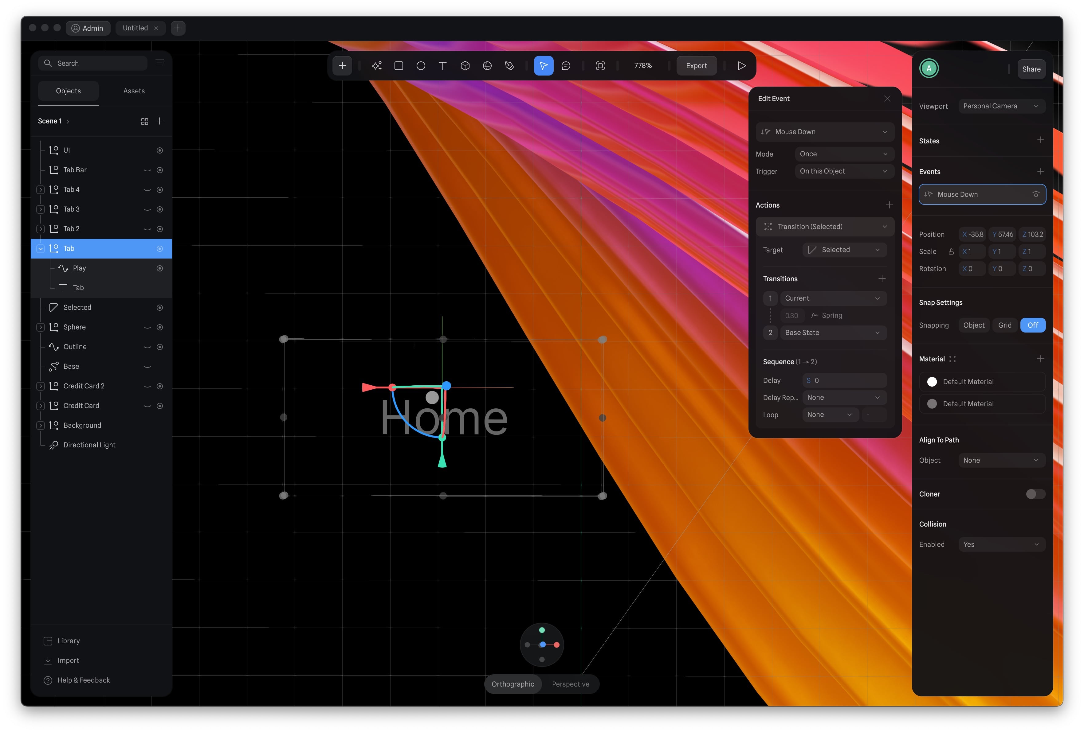
Setting up Events:
- Select the Home Group.
- Add Events, and choose "Mouse Down" as the trigger event.
-
Defining the Action:
- Set the mode to "Once."
- Choose the trigger target as "On this Object."
- Select the action as "Transition."
-
Configuring the Transition:
- Ensure the target for the transition is set to "Selected."
- Set the current transition to the "Base State."
- Adjust the duration to 0.30 milliseconds.
- Choose the transition to be a "Spring" effect.
-
Repeat for the Other Tabs:
- Repeat these steps for the other tabs, ensuring that each tab's icon path animation is set up similarly.

Sphere Animation
Next, let’s animate the 2 spheres as well beginning with the Sphere 1.
- Add a State, make a change on this State.
- The only change is setting the opacity of the Matcap to 0%.
- Add a Event. Keep the event to “Start” option.
- Choose the action to Transition.
- Set the duration to 10, choose the transition action to Ease in Out. Select the loop to Infinite and the Cycle option to Ping Pong.
![Tab Bar Animation11 image 4]()

Conclusion
Congratulations! You've successfully completed the journey of crafting a captivating and dynamic tab bar animation. I hope you've found the experience both rewarding and inspiring. This marks just the beginning of your creative adventure, and we're excited to see the fantastic projects you'll create with your newfound skills.
Templates and source code
Download source files
Download the videos and assets to refer and learn offline without interuption.
Design template
Source code for all sections
Video files, ePub and subtitles
Assets
1
Introduction to Spline
Learn 3D design, UI animations, icons, components, variables, screen resizing, scrolling, and optimize and publish 3D assets online
10:24
2
3D Shapes and Materials
Creating a 3D Icon in Spline: a step-by-step guide
9:45
3
Weather Icon and Sculpting
Master the art of 3D design with Spline's user-friendly interface, and learn how to create a stunning weather icon in a few easy steps.
13:29
4
Icon Animation
Learn to build a 3D animated weather icon using Spline's intuitive interface and powerful features
9:27
5
Path Animation
Learn how to create 3D paths with the path tool and to edit them
9:35
6
Waves Animation
Mastering Wave Animation with the Spline 3D Tool
15:33
7
3D Card with Parallax
Creating a 3D Card with Parallax Effect using a glass layer
9:57
8
Button Components
Simplify Your Design Workflow with Spline Components for Reusable and Dynamic Object Creation
11:41
9
Screen Resize Adaptive Layout
Creating adaptive layouts with Screen Resize Events using Breakpoints and Transitions
10:43
10
Tab Bar Animation
Crafting Futuristic UI: Designing a Glass Tab Bar with Crystal Floating Button using Spline
21:23
11
UI Charts and Variables
Exploring Variables Usage in Interactive UI Design
16:54
12
Scroll Interaction and Scenes
Crafting Scroll-Based Interactions and Scenes for Web Design
9:18
13
Export to USDZ and Optimizations
Creating immersive AR experiences on iOS devices using Spline's 3D models
9:28
14
Publish to 3D Site
Easily embed your 3D creations on web pages using Spline's native HTML component, the Spline Viewer
3:48
Meet the instructor
We all try to be consistent with our way of teaching step-by-step, providing source files and prioritizing design in our courses.
Sourany Phomhome
UI Designer
Designer at Design+Code.
10 courses - 43 hours
Build an Interactive Site with Wix Studio
Discover Wix Studio: the no-code platform ideal for agencies and enterprises. This beginner-friendly video course guides you through web design basics, using intuitive tools for building responsive, professional websites. Learn to create animations easily—no coding required. Gain the skills to craft your own standout sites confidently.
1 hrs
3D UI Interactive Web Design with Spline
Learn to create 3D designs and UI interactions such as 3D icons, UI animations, components, variables, screen resize, scrolling interactions, as well as exporting, optimizing, and publishing your 3D assets on websites
3 hrs
Design and Prototype for iOS 17 in Figma
Crafting engaging experiences for iOS 17 and visionOS using the Figma design tool. Learn about Figma's new prototyping features, Dev Mode, variables and auto layout.
6 hrs
Design and Prototype Apps with Midjourney
A comprehensive course on transforming Midjourney concepts into interactive prototypes using essential design techniques and AI tools
8 hrs
Learn Figma Prototyping
Master interaction design with Figma Prototyping. Create an animated app experience using after delay, scrolling content, video prototype
1 hrs
UI Design for iOS 16 in Sketch
A complete guide to designing for iOS 16 with videos, examples and design files
3 hrs
Prototyping in Figma
Learn the basics of prototyping in Figma by creating interactive flows from custom designs
1 hrs
UI Design Android Apps in Figma
Design Android application UIs from scratch using various tricks and techniques in Figma
2 hrs
UI Design Quick Apps in Figma
Design application UIs from scratch using various tricks and techniques in Figma
12 hrs
Figma Handbook
A comprehensive guide to the best tips and tricks in Figma. Not affiliated with or endorsed by Figma, Inc.
6 hrs