
Screen Resize Adaptive Layout
Add to favorites
Creating adaptive layouts with Screen Resize Events using Breakpoints and Transitions
Play video
3D UI Interactive Web Design with Spline
1
Introduction to Spline
10:24
2
3D Shapes and Materials
9:45
3
Weather Icon and Sculpting
13:29
4
Icon Animation
9:27
5
Path Animation
9:35
6
Waves Animation
15:33
7
3D Card with Parallax
9:57
8
Button Components
11:41
9
Screen Resize Adaptive Layout
10:43
10
Tab Bar Animation
21:23
11
UI Charts and Variables
16:54
12
Scroll Interaction and Scenes
9:18
13
Export to USDZ and Optimizations
9:28
14
Publish to 3D Site
3:48
In today's world, where people use different devices to access content, having a flexible layout is crucial. It ensures that your Spline designs look and work well on desktops and mobile devices, providing a better user experience. This guide will teach you how to make your Spline designs work seamlessly on screens of all sizes, focusing on adaptive layouts for the 3D pricing cards we previously worked on.

Open Project
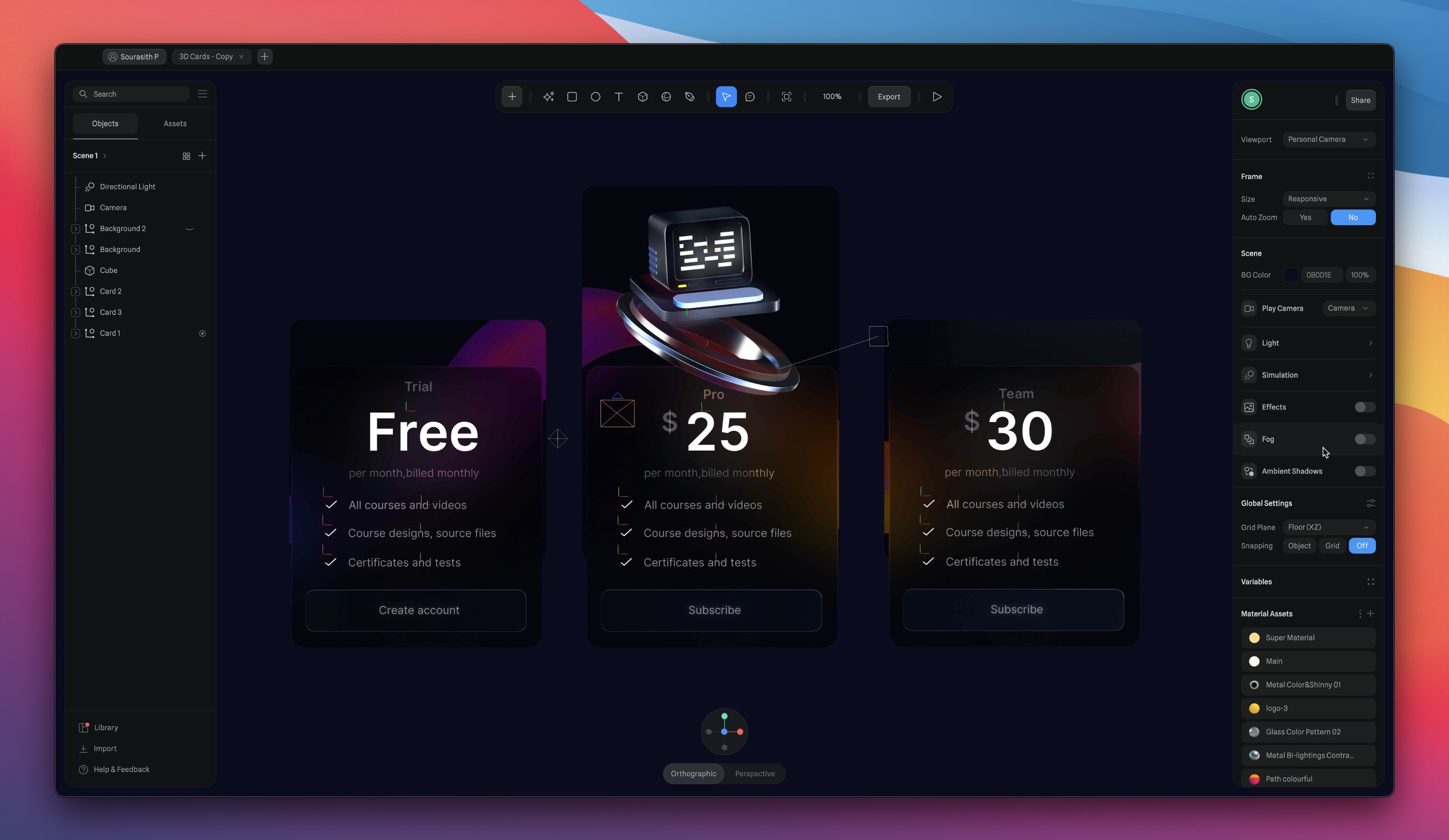
Open your 3D pricing card project to explore the Event settings, and then we will continue working on this document, starting by positioning the three cards and grouping them. This part is optional, and you don't have to do it. It's only for replicating the position I created in my other document. However, I recommend doing it to follow the same steps. If you're new to Spline, positioning your elements may need to be familiar.
- Card 1 (the initial card in the middle): X0, Y-21, Z758
- Card 2 (from the left): X-415, Y-21, Z802.
- Card 3 (from the right): X415, Y-21, Z825.
- Group the three cards, and name by Cards.
![Screen Resize Adaptive Layout image 2]()
Adding Animation and Interactions
When you want to make animations and add interactions to your scene, you need to use States, Events, and Actions. We'll go through all the settings, starting with States. I want the first card to be above the original card, and the last card to be below the original card.
- Choose the first card on the left, which is card 2, and add a state. Then, move it to the top of the original card. When you click on the base state, it will return to its initial position.
- We'll do the same thing with the last card. Select card 3 and position it below the original card.
![Screen Resize Adaptive Layout image 3]()

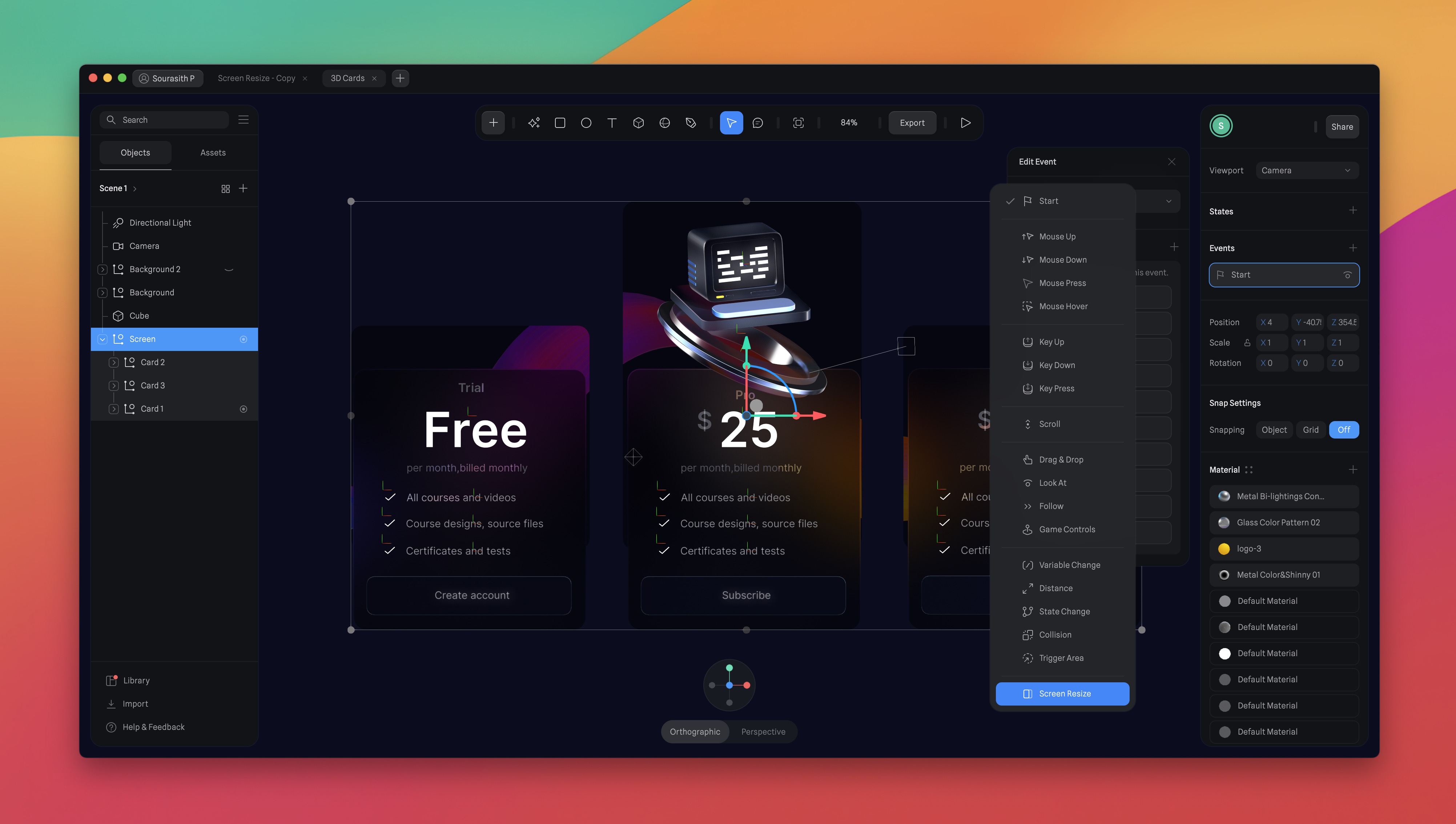
Adding the Screen Resize Event
We will delve into the settings of the screen resize event, which include type, breakpoints, actions, and transitions. After we've acquired an understanding of this feature, we'll proceed to configure it. To add the screen resize event, follow these steps:
- Select the group.
- Click the '+' button next to Events.
- A panel will appear with a flag marked 'start.'
- Click on the flag, and you will find several options.
- Choose 'Screen Resize.'
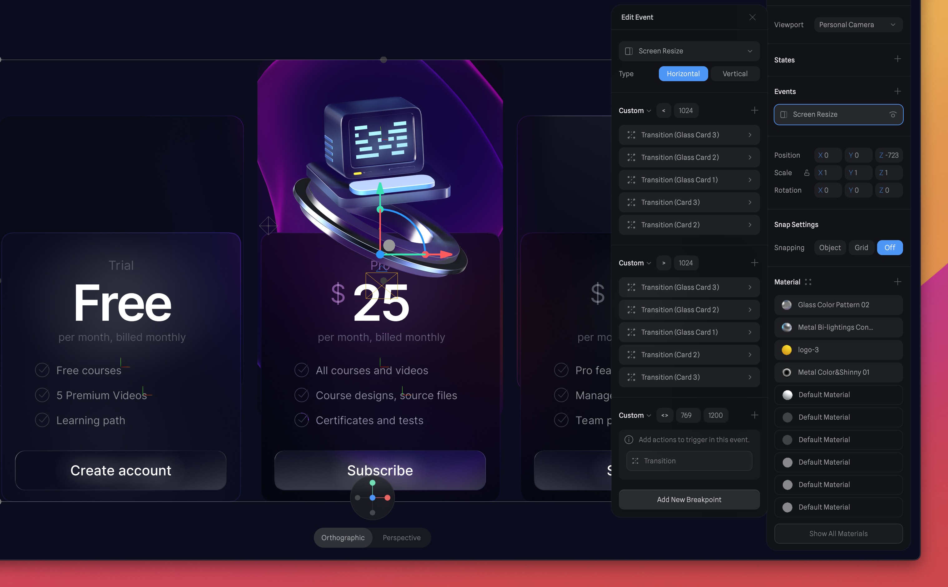
Type
You have the option to specify whether the event's breakpoints will be horizontal or vertical. This choice is significant because it dictates how your actions will activate depending on the canvas size. We will select the "Horizontal" option.
- Horizontal: The event will activate actions based on the canvas's width.
- Vertical: The event will activate actions based on the canvas's height.

Breakpoints
Pixel values and operators define breakpoints. To streamline the process, three presets are available: Mobile, Tablet, and Desktop. These presets come with default breakpoint values corresponding to common screen sizes for each device type. Nevertheless, you can also specify custom values when necessary. You can use three operators to define breakpoints:
- Less Than (<): Actions trigger when the canvas size is less than the defined pixel value.
- More Than (>): Actions trigger when the canvas size exceeds the defined pixel value.
- Between (<>): Actions trigger when the canvas size falls within the specified range.
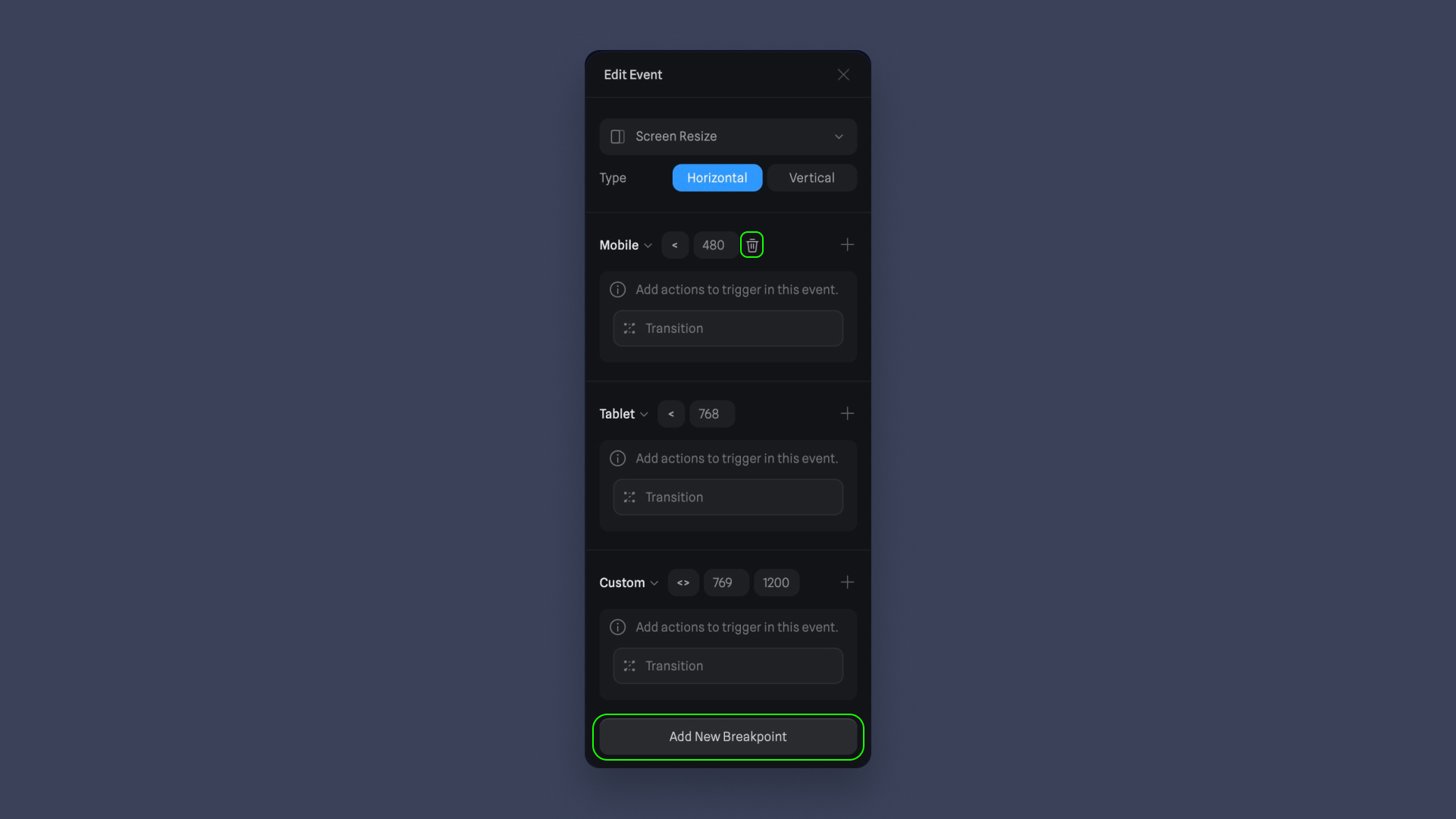
Add Breakpoints
You have the option to select a preset (Mobile, Tablet, or Desktop) or define custom breakpoint values that suit your requirements. In this guide, we will customize the breakpoints as follows:
- Customize the first breakpoint:
- Set the operator to "less than."
- Values: 1024
- Customize the second breakpoint:
- Set the operator to "more than."
- Values: 1024
- Keep the third breakpoint settings as they are:
- Preset: Custom
- Operator: Between
- Values: 769 between 1200
![Screen Resize Adaptive Layout image 7]()
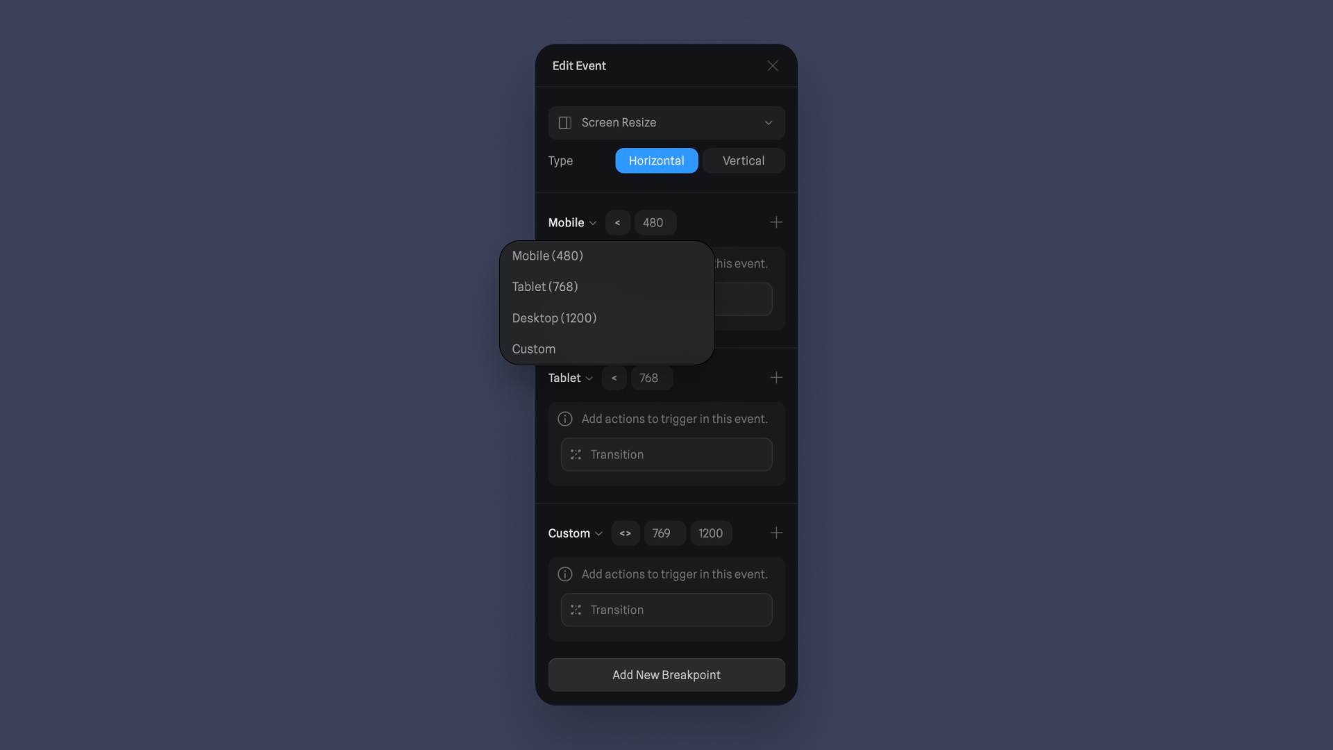
Adding and Deleting Breakpoints
To add a new breakpoint, use the " Add New Breakpoint " button at the bottom of the configuration interface. To delete a breakpoint, look for the delete icon that appears when hovering over the breakpoint.
Actions
A Screen Resize Event can trigger various actions to adapt your canvas content to the new screen size. These actions include:
- Transition Action: Change the content or state of your canvas smoothly.
- Animation Action: Animate elements to provide a dynamic user experience.
- Sound Action: Add audio effects or background music.
- Video Action: Incorporate videos into your canvas.
- Create Object Action: Generate new objects or elements.
- Destroy Object: Remove specific objects from your canvas.
- Switch Camera: Change the viewpoint or focus of the canvas.
- Scene Transition Action: Transition between different scenes or sections.
- Reset Scene Action: Return the canvas to its default state.
- Then, we have the new feature of Spline, Variable, which allows you to create reusable values/parameters. We will learn this feature in another section of our spline course.
![Screen Resize Adaptive Layout image 9]()

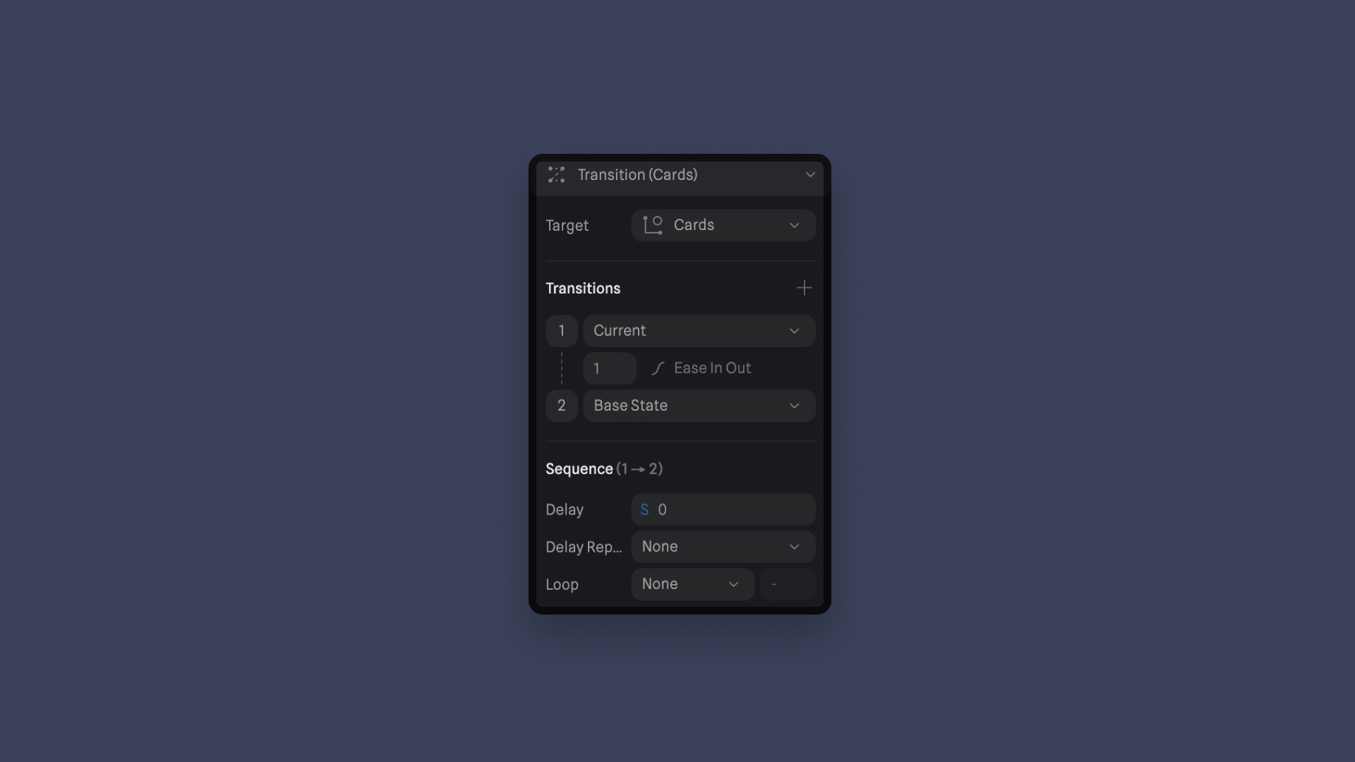
Transition Action
Transitions help objects change between different states and are essential for adding interactivity and animation to your scenes. Think of transitions as actions that make things happen in your project.
- To create a transition action, you need to select the object you want to move from one state to another, as we've already done from the start. In the event settings, add a Transition Action.
![Screen Resize Adaptive Layout image 10]()

Customizing a Transition Action
Once you have your states and events set up, you can customize your transitions in the 'Edit Event' panel. Here's what you can tweak:
Target: This is where the transition will happen, the object you want to change. Choose Card 2.
Transitions: In this section, you decide which states the transition will go through. You can set the duration and other properties for each part of the transition. Select Current to State.
Sequence: These settings impact the entire sequence of transitions. You can set a delay (how long it waits before starting), loop settings (how many times it repeats), and cycle (whether it goes back to the start). Let the setting like this.
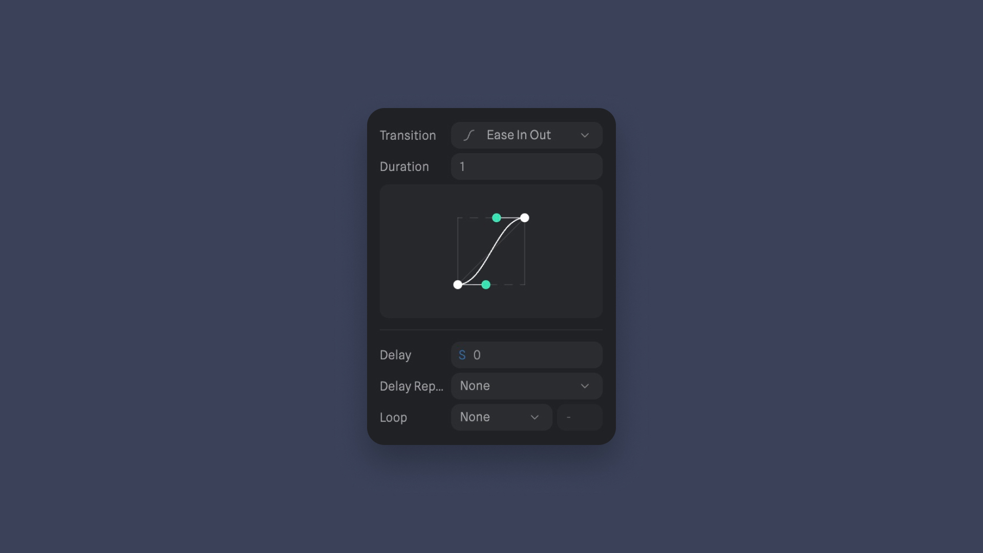
Transition Properties
When you click on the line connecting states, you can change properties for each part of the transition:
- Transition Curve: How the transition looks (like Linear, Ease, Ease In, Ease Out, Ease In Out, Bezier, Spring). We’re going to choose Ease In Out.
- Duration: How long it takes to change from one state to another. Set to 1.
- Delay: How long it waits before starting.
- Cycle: Whether it goes back to the beginning.
- Loop Settings: How many times it repeats.
Adding Transitions
Now that you are familiar with the settings and properties of screen size events, breakpoints, actions, and transitions, we will focus on adding additional transitions. There are a few more transitions that we need to include.
- The first breakpoint, the transitions we're going to add, the target will be: Card 2, Card 3, Glass Card 1, 2, and 3. The transition will be from current to State.
- For the second breakpoint, it's the same target, except that the transition will be based on the base state.
![Screen Resize Adaptive Layout image 13]()

Conclusion
A Screen Resize Event is a valuable feature for canvas-based applications, enabling you to create responsive designs that adapt to various screen sizes. By understanding the types, breakpoints, presets, and actions, you can effectively use this event to enhance the user experience on desktops, tablets, and mobile devices. Experiment with different actions and breakpoints to optimize your canvas-based application for a wide range of users and devices.
Templates and source code
Download source files
Download the videos and assets to refer and learn offline without interuption.
Design template
Source code for all sections
Video files, ePub and subtitles
Assets
1
Introduction to Spline
Learn 3D design, UI animations, icons, components, variables, screen resizing, scrolling, and optimize and publish 3D assets online
10:24
2
3D Shapes and Materials
Creating a 3D Icon in Spline: a step-by-step guide
9:45
3
Weather Icon and Sculpting
Master the art of 3D design with Spline's user-friendly interface, and learn how to create a stunning weather icon in a few easy steps.
13:29
4
Icon Animation
Learn to build a 3D animated weather icon using Spline's intuitive interface and powerful features
9:27
5
Path Animation
Learn how to create 3D paths with the path tool and to edit them
9:35
6
Waves Animation
Mastering Wave Animation with the Spline 3D Tool
15:33
7
3D Card with Parallax
Creating a 3D Card with Parallax Effect using a glass layer
9:57
8
Button Components
Simplify Your Design Workflow with Spline Components for Reusable and Dynamic Object Creation
11:41
9
Screen Resize Adaptive Layout
Creating adaptive layouts with Screen Resize Events using Breakpoints and Transitions
10:43
10
Tab Bar Animation
Crafting Futuristic UI: Designing a Glass Tab Bar with Crystal Floating Button using Spline
21:23
11
UI Charts and Variables
Exploring Variables Usage in Interactive UI Design
16:54
12
Scroll Interaction and Scenes
Crafting Scroll-Based Interactions and Scenes for Web Design
9:18
13
Export to USDZ and Optimizations
Creating immersive AR experiences on iOS devices using Spline's 3D models
9:28
14
Publish to 3D Site
Easily embed your 3D creations on web pages using Spline's native HTML component, the Spline Viewer
3:48
Meet the instructor
We all try to be consistent with our way of teaching step-by-step, providing source files and prioritizing design in our courses.
Sourasith Phomhome
UI Designer
Designer at Design+Code
19 courses - 72 hours
Master AI Prompting for Stunning UI
Learn how to leverage AI tools like Aura for creating beautiful designs, working with templates, and experimenting with advanced prompts. A concise guide for designers and developers to level up their skills.
10 hrs
Design Multiple Apps with Figma and AI
In this course, you’ll learn to design multiple apps using Figma and AI-powered tools, tackling a variety of real-world UI challenges. Each week, a new episode will guide you through a different design, helping you master essential UI/UX principles and workflows
4 hrs
SwiftUI Fundamentals Handbook
A comprehensive guide to mastering Swift programming fundamentals, designed for aspiring iOS developers. This handbook provides a structured approach to learning Swift's core concepts, from basic syntax to advanced programming patterns. Through carefully sequenced chapters, readers will progress from essential programming concepts to object-oriented principles, building a solid foundation for SwiftUI development. Each topic includes practical examples and clear explanations, ensuring a thorough understanding of Swift's capabilities. This handbook serves as both a learning resource and a reference guide, covering fundamental concepts required for modern iOS development. Topics are presented in a logical progression, allowing readers to build their knowledge systematically while gaining practical programming skills.
2 hrs
Design and Code User Interfaces with Galileo and Claude AI
In this course, you’ll learn how to use AI tools to make UI/UX design faster and more efficient. We’ll start with Galileo AI to create basic designs, providing a solid foundation for your ideas. Next, we’ll refine these designs in Figma to match your personal style, and finally, we’ll use Claude AI to turn them into working code—eliminating the need for traditional prototyping.
4 hrs
Design and Prototype for iOS 18
Design and Prototype for iOS 18 is an immersive course that equips you with the skills to create stunning, user-friendly mobile applications. From mastering Figma to understanding iOS 18's latest design principles, you'll learn to craft two real-world apps - a Car Control interface and an AI assistant.
3 hrs
Master Responsive Layouts in Figma
Creating responsive layouts is a must-have skill for any UI/UX designer. With so many different devices and screen sizes, designing interfaces that look great and work well on all platforms is necessary. Mastering this skill will make you stand out in the field. In this course, we'll start from scratch to create this beautiful design using Figma. You'll learn how to make layouts that are easy to use and work well on any device. We'll cover key concepts and tools to help you master responsive design in Figma.
2 hrs
UI UX Design with Mobbin and Figma
Mobbin is a powerful tool for UI/UX designers seeking inspiration and innovative design solutions. This platform offers a vast collection of real-world mobile app designs, providing a treasure trove of UI elements and layouts.
2 hrs
3D UI Interactive Web Design with Spline
Learn to create 3D designs and UI interactions such as 3D icons, UI animations, components, variables, screen resize, scrolling interactions, as well as exporting, optimizing, and publishing your 3D assets on websites
3 hrs
Design and Prototype for iOS 17 in Figma
Crafting engaging experiences for iOS 17 and visionOS using the Figma design tool. Learn about Figma's new prototyping features, Dev Mode, variables and auto layout.
6 hrs
Design and Prototype Apps with Midjourney
A comprehensive course on transforming Midjourney concepts into interactive prototypes using essential design techniques and AI tools
8 hrs
iOS Design with Midjourney and Figma
Learn the fundamentals of App UI design and master the art of creating beautiful and intuitive user interfaces for mobile applications
1 hrs
UI Design for iOS, Android and Web in Sketch
Create a UI design from scratch using Smart Layout, Components, Prototyping in Sketch app
1 hrs
UI Design a Camera App in Figma
Design a dark, vibrant and curvy app design from scratch in Figma. Design glass icons, lens strokes and realistic buttons.
1 hrs
UI Design for iOS 16 in Sketch
A complete guide to designing for iOS 16 with videos, examples and design files
3 hrs
Prototyping in Figma
Learn the basics of prototyping in Figma by creating interactive flows from custom designs
1 hrs
UI Design Quick Websites in Figma
Learn how to design a portfolio web UI from scratch in Figma
1 hrs
UI Design Android Apps in Figma
Design Android application UIs from scratch using various tricks and techniques in Figma
2 hrs
UI Design Quick Apps in Figma
Design application UIs from scratch using various tricks and techniques in Figma
12 hrs
Figma Handbook
A comprehensive guide to the best tips and tricks in Figma. Not affiliated with or endorsed by Figma, Inc.
6 hrs