
3D Card with Parallax
Add to favorites
Creating a 3D Card with Parallax Effect using a glass layer
Play video
3D UI Interactive Web Design with Spline
1
Introduction to Spline
10:24
2
3D Shapes and Materials
9:45
3
Weather Icon and Sculpting
13:29
4
Icon Animation
9:27
5
Path Animation
9:35
6
Waves Animation
15:33
7
3D Card with Parallax
9:57
8
Button Components
11:41
9
Screen Resize Adaptive Layout
10:43
10
Tab Bar Animation
21:23
11
UI Charts and Variables
16:54
12
Scroll Interaction and Scenes
9:18
13
Export to USDZ and Optimizations
9:28
14
Publish to 3D Site
3:48

An Overview of this Section
In this section, our primary focus will be creating the 3D parallax effect and using the glass layer for the portal. Here is an overview of this section. We will incorporate various elements, some in the foreground and others in the background. This arrangement produces a parallax effect, characterized by elements moving at varying speeds. The glass layer and the background hidden in a box create the illusion of a portal effect.
- Bring in Wallpaper Animation: We'll start by adding a background element for our scene, which could be a wallpaper, a blob, or any other suitable image or animation. You can import an existing file or use assets from your Spline library.
- Create the 3D Card Cover: Next, we'll create the base for our 3D card using a rectangle. This rectangle will form the outer shell of our card. To give our card a 3D effect and create the illusion of glass, we'll apply extrusion and materials, including color, glass, and lighting. When you create a glass layer, you'll notice that what you see through it differs from what's behind it. This glass layer works uniquely.
- Create a Front Glass UI: The third step is optional, which is to create the card's front face by using another glass layer to place text content later. You will notice that It doesn't show other glass layers, and its appearance changes based on the material you use. In this case, we will use the Matcap material, which provides a distinct appearance and will be changed in color and reflection. It will create an illusion of a mirror effect, which I really like.
- Create a Box: Hide the background or whatever is inside or behind the glass layer by creating a cube. The cube's purpose is to hide all the elements inside except the card.
- Add Icons: You can enhance your design by adding 3D icons, such as weather icons or 3D assets from your Spline library.
- Add Settings: In the final part of this section, we will explore different settings to enhance user interaction with your 3D card. You'll learn how to implement play settings like orbit, soft orbit, on-hover effects, and orbit limits, allowing you to customize the behaviour of your 3D card and make it even more captivating.
![3D Card with Parallax image 2]()

Opening a File
Now, let's open a new file or any file you've created previously. You'll have access to this final result file for inspection. You'll also have access to the other files in our Spline course and the Spline assets from the Community.

Creating the Background
First, we need an element for the background. This could be any background element, like a shape, wallpaper, or even an animated scene. You can either import an existing file or use assets from your Spline library.
- Let's use the wallpaper from our Spline course library. Copy it from there and paste it into this document.
- You can change the background color of the entire scene to a dark blue, or you can pick your own color. If you want the exact same color, use the hex code #0B0D1E.
![3D Card with Parallax image 4]()

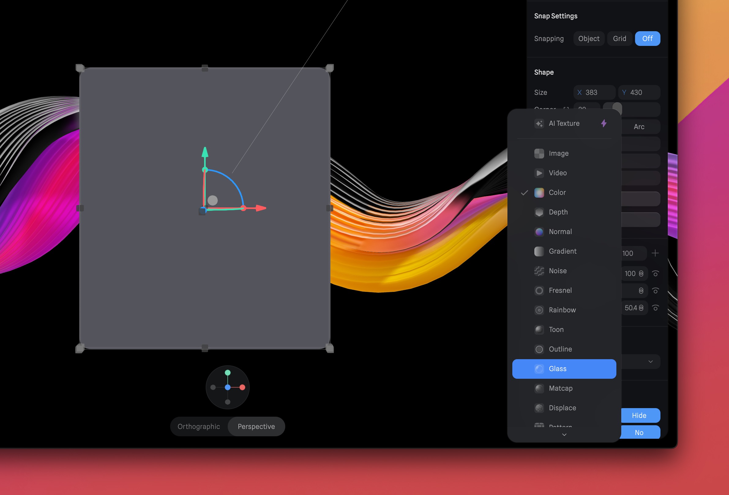
Creating a Rectangle
With our background in place, it's time to design the 3D card cover. We'll start by creating the Front Glass UI, where we'll add the text content later.
- When you create a new document, it will automatically include a directional light and a rectangle. Click on the rectangle and adjust its size to X=383 by Y=430. Also, set the corner radius to 20.
![3D Card with Parallax image 5]()

Applying Extrusion
We'll apply Extrusion to our shape to introduce 3D elements and enhance the depth and realism of your designs. Extrusion is a commonly used technique in 3D modeling and design to give flat shapes depth and volume.
- Choose the rectangle you want to extrude. Locate the "Extrusion" property on the right sidebar. You can either enter the value manually or adjust it by sliding the control until it reaches a value of 10.
![3D Card with Parallax image 6]()

Applying Color Layer
Now, let's apply materials, which include color, an outline, a glass effect, and lighting. To work with materials, stay on the right sidebar. You'll already find options for lighting and color. I'll leave the lighting settings as they are, but for the color, let's opt for a darker shade, such as black, dark blue, or dark purple.
- Choose the rectangle you wish to modify. Click on the color picker to open the color panel. Select your preferred color; I will use the color #04040C and reduce the opacity to 50%.
![3D Card with Parallax image 7]()

Multiply Blend Mode
We'll use the Multiply blending mode, which darkens the colors in the active layer by multiplying the color values of each pixel with the corresponding pixel in the layer below it. This card will be positioned in front of our card cover, producing a darkening effect that is employed to create shadows and enhance depth.
- Click on the icon next to the hex color to access the blending mode options, and then choose "Multiply."
![3D Card with Parallax image 8]()

Adding a Glass Layer
We're going to incorporate a glass layer. This glass layer will serve as a transparent barrier, enabling you to create a portal effect. Elements viewed through the glass layer will have a different appearance compared to what's behind the glass.
- Click the '+' icon found in the Material section. By default, a new color layer will be added. Click the dropdown menu next to "color" and choose 'Glass.'
![3D Card with Parallax image 9]()
Adding Blur Effect
To increase the realism of our glass effect, we'll introduce a blur to our glass layer. This will replicate the natural blurring effect observed when looking through transparent materials.
- Click on the '+' icon to introduce a 'Glass' layer. Subsequently, click on the color, and an options window will emerge. Adjust the blur value to 30 and maintain the other settings as they are.
![3D Card with Parallax image 10]()

Adding Outline Layer
The next step for our glass layer is to add an outline, and then we'll move on to the next step. Follow these steps:
- Click on the '+' icon to add another layer and select 'Outline.' Change the color to white. Next to the color picker, you'll find an icon – this is the blending mode. Choose the 'Overlay' option. Ensure the width size is set to 1.
- It's crucial to organize the layers in the material section. The correct order for the layers is Lighting, Glass, Color and Outline.
![3D Card with Parallax image 11]()

Glass Card
Now, let's design the cover for our 3D card using another rectangle that we'll place behind the front glass we've just created.
- Duplicate the current rectangle and position it at Y25 and Z34. Adjust its dimensions to 393 and 575. Then, click the 'Edit' button and set the subdivision to 15 and the extrusion to 20.
- Rearrange the order of the two rectangles by moving them to the bottom of the list. Name the layers as "Glass UI" for the front glass layer and "Glass Card" for the card's base.
![3D Card with Parallax image 12]()

Matcap Material
Glass layers in Spline do not interact with other glass layers, and their appearance can change based on the applied material. In this case, you're using the Matcap material, which imparts a distinct appearance.
- Modify the color to #070810 and reduce the opacity to 30. Within the material section, hide the outline, glass, and lighting layers.
- Create a new material, select 'Matcap Reflection 5,' reduce the opacity to 30, and set the blend mode to 'Screen.' It's crucial to maintain the layer organization in the material section, with Matcap positioned under the 'color' layer.
![3D Card with Parallax image 13]()

Hiding the Background
Now, let's hide the background, making it visible only through the glass card. To do this, create a block or a 3D cube to encapsulate the wallpaper within it. The cube's color should match the background, effectively concealing everything behind it while leaving the card exposed. Follow these steps:
- Pick the cube from the toolbar; the size doesn't matter as long as it completely covers the entire background.
![3D Card with Parallax image 14]()

Isometric View
In the isometric view, you can effortlessly position the cube to conceal what's behind it. This is essential for achieving the portal effect through the glass layer. Interestingly, the glass layer can still peer through the cube, creating the illusion of a portal into the background. This is what generates the 3D card parallax effect. Follow these steps:
- Eliminate the highlighting layer from the material. Adjust the color to match the background color you selected initially, and then add glass, reducing the opacity to 60.
![3D Card with Parallax image 15]()

Add 3D Icons
Incorporate 3D icons into your design. You can either craft them from the ground up, utilize the Weather icon from section 3, or select from the assortment of 3D icons accessible in Spline. Personalize the 3D icons with materials and contemplate adding supplementary lighting effects to elevate their visual appeal.
- Integrate a 3D icon and position it at the top in front of the card, with coordinates X=-9, Y=16, and Z=1316.
![3D Card with Parallax image 16]()

Create a Camera
In Spline, you have the option to configure two types of cameras: Perspective and Orthographic. The orthographic camera is widely used in design. It presents all objects at the same scale, preserves the parallel lines, and ensures that a unit of length maintains its length consistently throughout the drawing. This simplifies the assessment of relative sizes and model adjustments. On the other hand, the perspective camera provides more depth information, with objects appearing smaller as they move further away, mirroring how the human eye perceives the real world. To set up a camera, follow these steps:
- From the top toolbar, click the '+' icon, and then select 'camera.'
![3D Card with Parallax image 17]()

Set States
Every object in Spline includes a base state, and you can append multiple states to them. The base state encompasses the initial values of your object, while each state holds distinct property values. You have the flexibility to adjust the object's position, shape, visibility, and shadow settings.
- Choose the Glass Card layer, and within the inspector panel, click on the '+' button next to States. Select 'Base State' and configure its initial values.
![3D Card with Parallax image 18]()

Play Settings
Play Settings in Spline let you control how your scene behaves in Play Mode and during export. You can access these settings by clicking 'Export' on the toolbar. These options allow you to tailor the performance and appearance of your project according to your specific needs and preferences, ensuring a seamless and engaging user experience. Here’s an overview of all the settings you can control for your scene:
Main Scene and Camera: Choose the main scene and the camera for your scene. This feature is especially helpful when working with a team, ensuring that everyone views the same end result in both Play Mode and during export.
Logo: For users with a Super or Super Team Subscription, it's possible to eliminate the Spline logo from Public URLs.
BG Color: You have the option to decide whether you want to hide the scene's background color. This feature is valuable for exporting images with a transparent background.
Page Scroll: This setting lets you enable or disable 'Page Scroll' for website scrolling, giving you control over the user experience.
Orbit: You can control the camera's orbiting behavior, allowing users to adjust their perspective by circling around the scene. You have the flexibility to fine-tune parameters like orbit speed and sensitivity.
Pan: With the 'Pan' setting, you can control camera movement, enabling users to shift the view horizontally or vertically within the scene. Adjust pan speed and sensitivity to achieve the desired smoothness.
Zoom: This setting governs the camera's zoom functionality, enabling users to get closer to objects or pull back for a broader view. You can define minimum and maximum zoom levels to restrict the zoom range.
Soft Orbit: 'Soft Orbit' enhances the smoothness of the camera's orbiting motion. You can select from various softening effects like 'Bounce' or 'Ease,' or disable it for a sharper, more abrupt orbiting experience.
 Touch Settings: In the touch settings, you can specify the number of fingers required for orbiting and panning your scene on touch screen devices.
On Hover: You can add a hover effect to your entire scene using the 'On Hover' setting, which can either trigger orbiting or panning when a hover event occurs. Adjust the sensitivity slider to fine-tune the strength of the effect.
Orbit Limits: To further control the experience, 'Orbit Limits' allow you to confine the orbit within a specific area, originating from the position of your main camera. You have the flexibility to restrict orbiting angles horizontally, vertically, or both. Enabling a soft limit ensures smoother movement when reaching the boundary of the constrained area, with options like 'Bounce' or 'Ease,' or you can disable it for a sharper constraint.”
 Pan Limits: Functions similarly to orbit limits but allows you to restrict panning within your scene.
Zoom Limits: You can define minimum and maximum zoom percentages for user interactions.
Animated Turntable: This feature adds automatic rotation to your scene along the Y-axis, and you can customize the speed and direction of rotation.
Events Behavior: Choose between 'Stop At Object' to block triggers when objects obstruct one another or 'Passthrough Object' to trigger regardless of obstructions.
Compression: Opt for higher compression to improve scene performance, or select lower compression for better quality. The initial preload enhances loading times, especially for larger scenes.

Final Arrangement
Arrange the elements as you see fit to achieve the desired parallax effect. Experiment with the positioning of different elements to make your design more appealing.
Conclusion
Congratulations! You've just made an impressive 3D card with a captivating parallax effect in Spline. This effect adds depth and interaction to your design, making it visually engaging and unique. Whether it's a website, app, or any digital project, parallax is a powerful tool to grab your audience's attention and enhance their experience. Keep experimenting and refining your design to make it even more impressive. We hope you found this tutorial helpful and inspiring for your creative endeavors.
Templates and source code
Download source files
Download the videos and assets to refer and learn offline without interuption.
Design template
Source code for all sections
Video files, ePub and subtitles
Assets
1
Introduction to Spline
Learn 3D design, UI animations, icons, components, variables, screen resizing, scrolling, and optimize and publish 3D assets online
10:24
2
3D Shapes and Materials
Creating a 3D Icon in Spline: a step-by-step guide
9:45
3
Weather Icon and Sculpting
Master the art of 3D design with Spline's user-friendly interface, and learn how to create a stunning weather icon in a few easy steps.
13:29
4
Icon Animation
Learn to build a 3D animated weather icon using Spline's intuitive interface and powerful features
9:27
5
Path Animation
Learn how to create 3D paths with the path tool and to edit them
9:35
6
Waves Animation
Mastering Wave Animation with the Spline 3D Tool
15:33
7
3D Card with Parallax
Creating a 3D Card with Parallax Effect using a glass layer
9:57
8
Button Components
Simplify Your Design Workflow with Spline Components for Reusable and Dynamic Object Creation
11:41
9
Screen Resize Adaptive Layout
Creating adaptive layouts with Screen Resize Events using Breakpoints and Transitions
10:43
10
Tab Bar Animation
Crafting Futuristic UI: Designing a Glass Tab Bar with Crystal Floating Button using Spline
21:23
11
UI Charts and Variables
Exploring Variables Usage in Interactive UI Design
16:54
12
Scroll Interaction and Scenes
Crafting Scroll-Based Interactions and Scenes for Web Design
9:18
13
Export to USDZ and Optimizations
Creating immersive AR experiences on iOS devices using Spline's 3D models
9:28
14
Publish to 3D Site
Easily embed your 3D creations on web pages using Spline's native HTML component, the Spline Viewer
3:48
Meet the instructor
We all try to be consistent with our way of teaching step-by-step, providing source files and prioritizing design in our courses.
Akson Phomhome
UI Designer
Designer at Design+Code.
13 courses - 60 hours
AI Design with Ideogram
Meet Ideogram, an AI-powered image generation tool that takes your ideas and transforms them into stunning visuals. Whether you're a designer, marketer, or just a visual enthusiast, Ideogram simplifies the creative process. In this guide, we’ll walk you through step-by-step instructions to create beautiful logos, social media posts, and more.
1 hrs
Build a SwiftUI app with Claude AI
This comprehensive SwiftUI course combines cutting-edge AI assistance with hands-on development, guiding you through the process of transforming Figma designs into fully functional iOS applications. Leveraging Claude 3.5 Sonnet, you'll learn to efficiently generate and refine SwiftUI code, create reusable components, and implement advanced features like animations and responsive layouts.
9 hrs
Prototype and Code iOS apps in Figma and SwiftUI
Welcome to our course on designing a sleek wallet interface with Figma! You’ll learn to create a visually appealing and functional wallet interface using DesignCode and Apple UI Kits. Master prototyping, swipe gestures, carousel animations, overlays, and reusable components. Plus, explore a Figma plugin to easily transition from design to SwiftUI. By the end, you’ll create dynamic, user-friendly prototypes.
3 hrs
Create 3D UI for iOS and visionOS in Spline
Comprehensive 3D Design Course: From Basics to Advanced Techniques for iOS and visionOS using SwiftUI
3 hrs
3D UI Interactive Web Design with Spline
Learn to create 3D designs and UI interactions such as 3D icons, UI animations, components, variables, screen resize, scrolling interactions, as well as exporting, optimizing, and publishing your 3D assets on websites
3 hrs
Design and Prototype for iOS 17 in Figma
Crafting engaging experiences for iOS 17 and visionOS using the Figma design tool. Learn about Figma's new prototyping features, Dev Mode, variables and auto layout.
6 hrs
Design and Prototype Apps with Midjourney
A comprehensive course on transforming Midjourney concepts into interactive prototypes using essential design techniques and AI tools
8 hrs
Web App Design using Midjourney and Figma
Get UI inspirations from Midjourney and learn UI design, colors, typography as a beginner in Figma
2 hrs
UI Design for iOS 16 in Sketch
A complete guide to designing for iOS 16 with videos, examples and design files
3 hrs
UI Design Android Apps in Figma
Design Android application UIs from scratch using various tricks and techniques in Figma
2 hrs
UI Design Smart Home App in Figma
Design a Smart Home app from scratch using various tricks and techniques in Figma
2 hrs
UI Design Quick Apps in Figma
Design application UIs from scratch using various tricks and techniques in Figma
12 hrs
Figma Handbook
A comprehensive guide to the best tips and tricks in Figma. Not affiliated with or endorsed by Figma, Inc.
6 hrs