
Visual Hierarchy and Information Architecture
Add to favorites
Explore the role of visual hierarchy in UI design and learn to structure and organize content to improve a product's usability
Play video
UI UX Design with Mobbin and Figma
1
Introduction to UI/UX Design
5:39
2
UI Kits and Templates
8:18
3
Shapes, Gradients and Strokes
15:15
4
Icons, Typography, and Styles
9:43
5
Auto Layout, Constraints and Pen tool
16:23
6
UX Research and Design Flows
16:19
7
Styles and Plugins
13:09
8
Animation, Sticky Scroll and Overlay
10:13
9
Flat Design and Light Mode
16:57
10
Visual Hierarchy and Information Architecture
11:07
11
Typography and Colors Variable
14:34

Visual Hierarchy
Visual hierarchy is a critical principle in UI design that involves arranging elements in a way that implies importance, guiding the user's attention through a product's interface. It influences how easily users can process information by prioritizing content through size, color, contrast, and placement. For instance, larger, bolder text typically draws attention first and is often used for headings, while less prominent text is used for secondary details. Effective visual hierarchy makes an interface intuitive and reduces cognitive strain, allowing users to navigate and interact with a system more efficiently. Key Aspects of Visual Hierarchy:
- Size: Larger elements capture attention faster than smaller ones.
- Color: Bright and contrasting colors stand out and guide the user’s focus.
- Contrast: High contrast between elements helps differentiate and prioritize content.
- Alignment: Proper alignment creates a clean and organized layout that directs the viewer’s eye smoothly across the screen.
- Spacing: Adequate space around elements helps each one stand out and improves readability.
- Typography: Variation in font size, weight, and style can effectively establish a clear order of importance among text elements.
Information Architecture
information architecture involves organizing and structuring content within an app or website to ensure users can easily find and interact with information. It's about planning how to categorize, label, and link different pieces of content to create a clear, intuitive navigation experience. This helps users quickly locate the information they need and enhances the overall usability of the interface. Key components include:
- Organization: How information is grouped and categorized to ensure users find what they need quickly and intuitively.
- Labeling: Using clear and consistent labels for buttons, menus, and other interactive elements to ensure they are easily understood.
- Navigation: Designing navigation structures that are logical and predictable, helping users find their way through the interface effortlessly.
- Searchability: Incorporating search features and filters to help users locate specific content or functions within the app or website.
- Content Structure: Structuring content in a clear, logical manner that follows user expectations and enhances readability.
- User Flow: Designing a coherent flow that guides users from one task to another in a smooth, natural progression, minimizing confusion and improving user satisfaction.
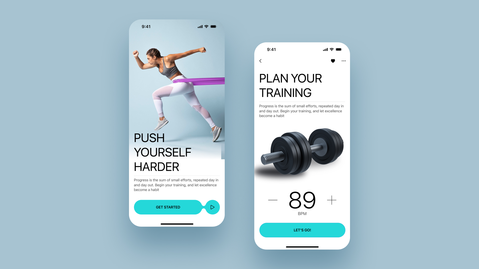
Daily Plan Screen
The second screen we're designing is the Daily Plan screen, which features a streamlined and user-friendly layout. It includes a calendar at the top for easy date navigation, followed by a detailed workout session card titled "Cardio Sessions." This card details the workout intensity, user ratings, and calories burned, complete with a "More" button for additional information. Below, the "Your Plan" section replicates this information to keep daily routines clearly visible. This design ensures users have a comprehensive view of their daily fitness activities, enhancing commitment and ease of use.
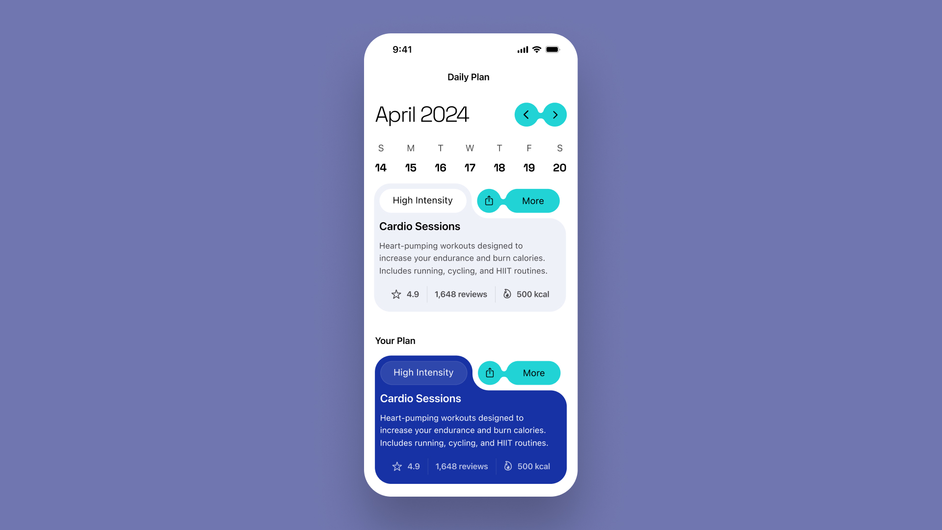
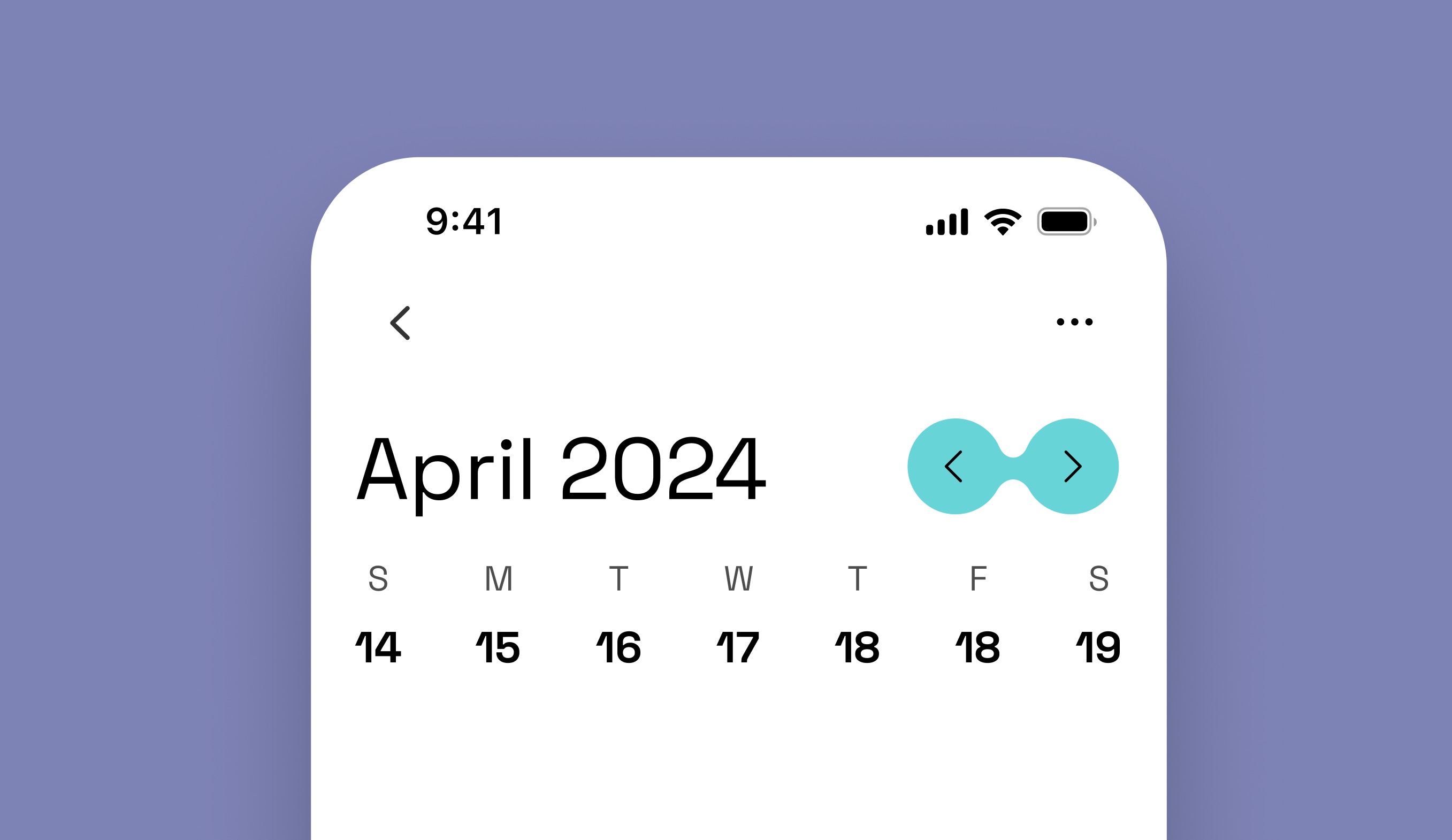
Calendar
Let's design a calendar on the "Daily Plan" screen to better manage users' fitness routines. This calendar enables users to schedule, track, and visualize their workouts, promoting regular exercise and fostering consistent fitness habits. It also offers motivational cues with reminders and visual feedback on their progress.
- Start by duplicating or creating a new screen frame, keeping the status bar, navigation bar, and tab bar.
- Place the text "April 2024" at the top, setting it to auto width, left-aligned, using the Title 2 text style, and color it with the primary foreground.
- For the days of the week, begin with "S" for Sunday using the body style. Below it, add the date, e.g., "14", styled in Space Grotesk, size 20, bold.
- Apply auto layout to these two texts, setting the spacing to 10. Duplicate this pair six times to represent a full week. Apply auto layout to all pairs, adjust the width to 353, and set the spacing to auto. Update the days and dates accordingly.
- For the navigation, create a liquid button effect. Use two circles, each 44 in diameter, and a small rectangle (20x10).
- Combine these shapes with the Union tool, space the circles 8 apart, and fill with the accent color.
- Add chevron icons for left and right within a 44x44 container, aligning it with the circle to enable easy weekly navigation.
- Name the layer and compile all elements into a frame. Apply auto layout to the month, year, and navigation frame, set the frame's resizing to 353 and the gap to auto.
- Group everything using auto layout and adjust the spacing between them to 20.
![Visual image 5]()
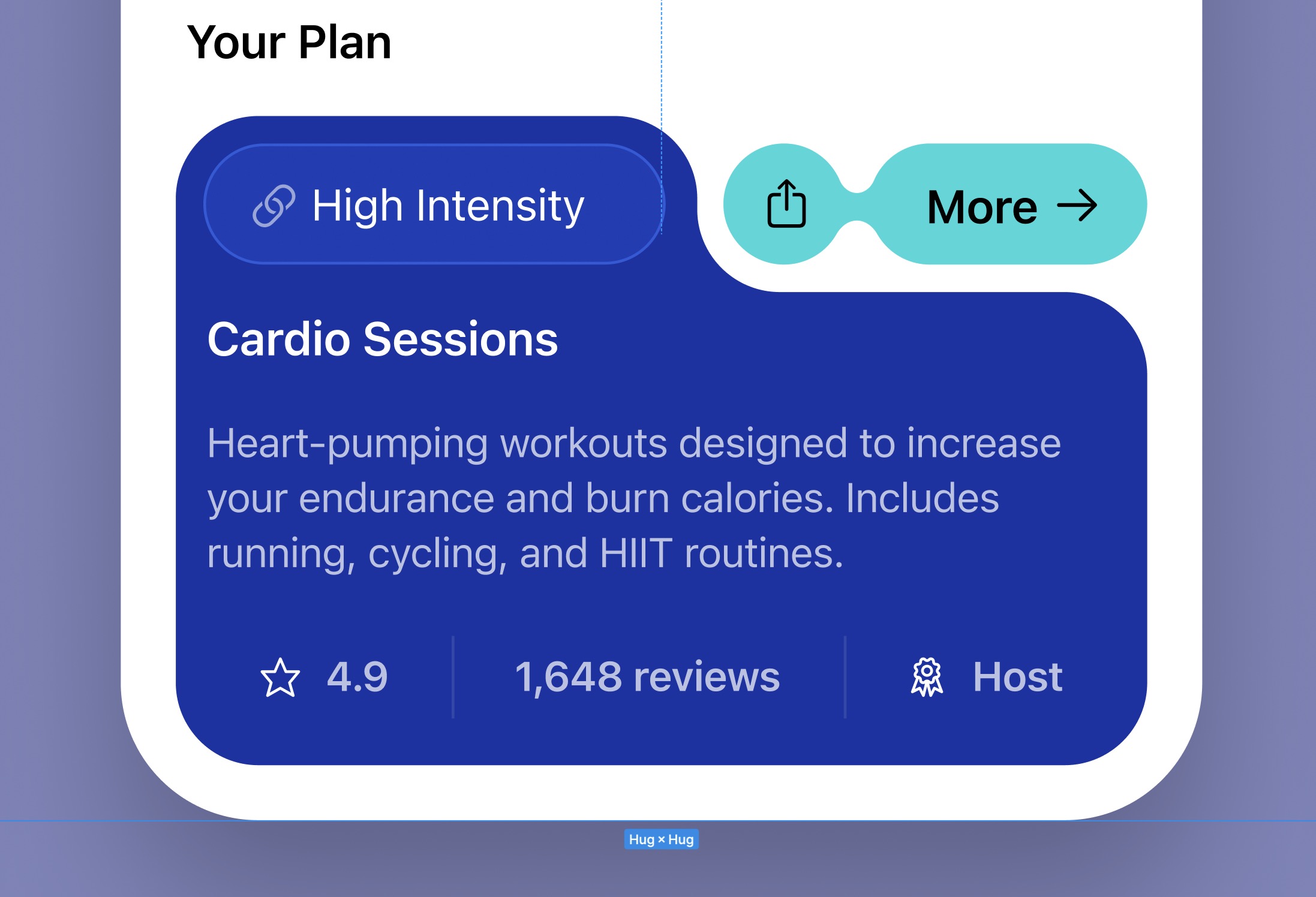
Exercise Folder Card
We're going to design the Exercise Folder Card to complement the shape of the liquid button. This card will provide a concise overview of a fitness activity, detailing essential information such as session type, intensity, user ratings, and the session host. Here’s how to start creating the structure and make necessary adjustments:
- Create a base rectangle of 353 by 236 pixels.
- Mimic the calendar's navigation style, make a rectangle of 100 by 44 pixels, and replace the right circle.
- Change the icon to “Share” and the text to “More.”
- Shape the rectangle to look like a folder and place the liquid button at the top right with a 10-pixel spacing.
- Color the card with the accent color for consistency.
- Label the exercise intensity, such as "High Intensity," in Body style.
- Apply auto layout, set padding to 10 on all sides, and adjust the width accordingly.
- Set the card's fill to white with 10% opacity and add a white stroke at 10% opacity.
- Add the session name in headline style.
- Include a brief session description in SF Pro Regular, size 15.
![Visual image 6]()
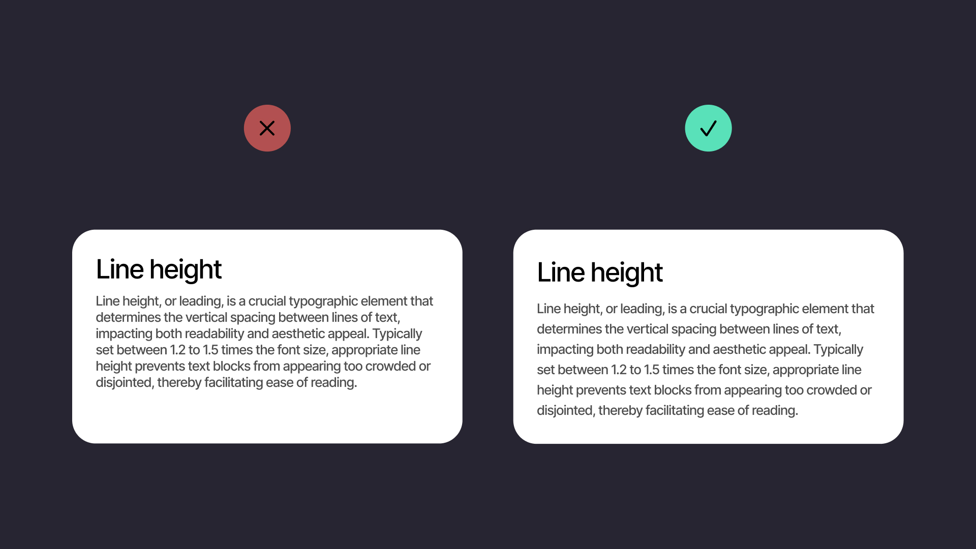
Line Heights
Line height, or the spacing between lines of text, is crucial for improving readability and minimizing eye strain. A general rule is to set the line height at 1.5 times the font size, although adjustments might be needed based on the font and layout specifics. For our design, let's also incorporate additional content below the description to offer deeper insights into the session. We'll use a component from the assets page to include information about the session's rating to reflect its popularity, as well as reviews to assist users in deciding if the cardio session fits their needs. Furthermore, we'll provide an estimate of the calories that can be burned. Place this information block at the top of the shape, ensuring a spacing of 10 pixels from the right, left, and bottom edges, and set the text color to white.
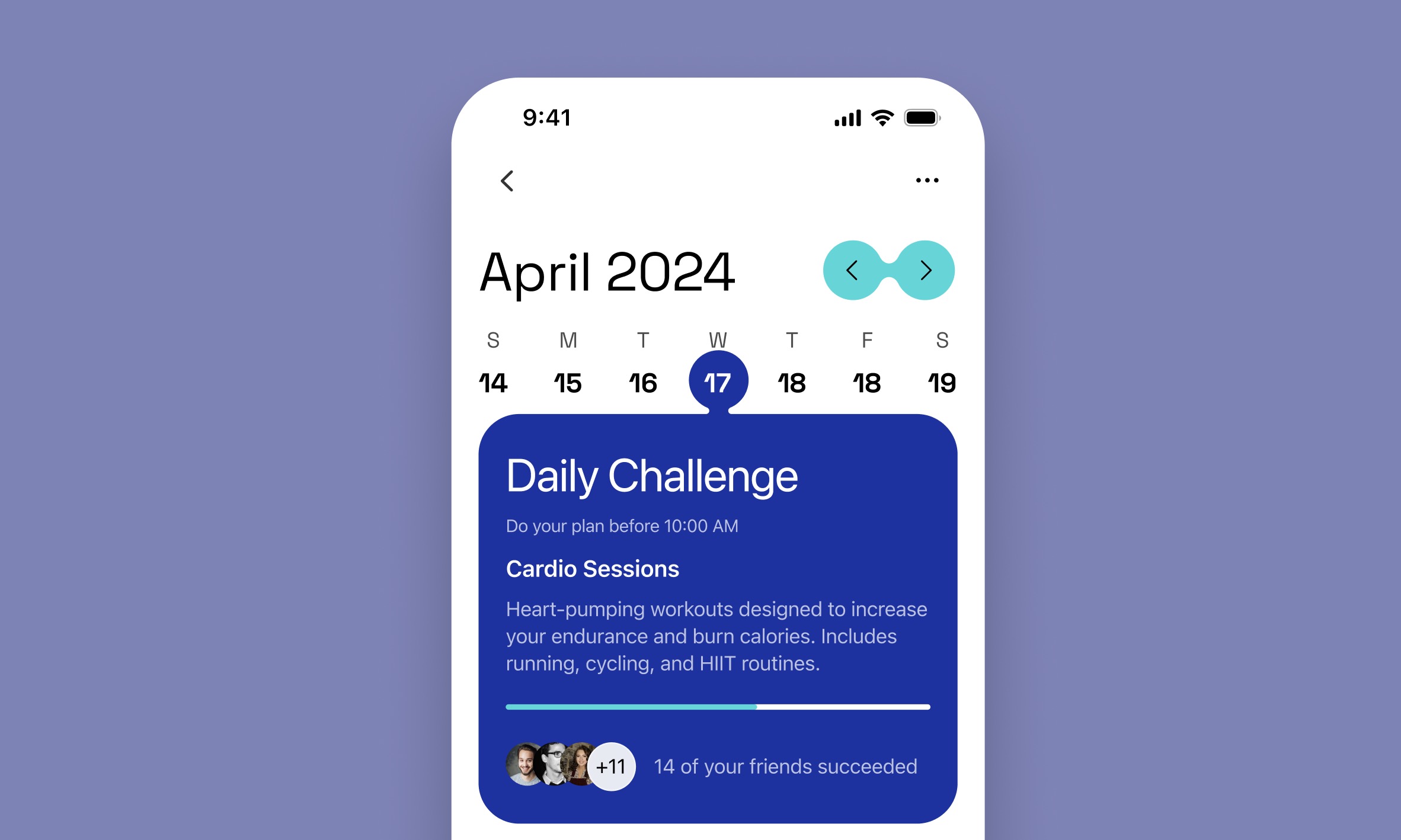
Tooltip
Let's create a tooltip that appears when you hover over a date to display details about that date. A tooltip is a contextual overlay that provides additional information about elements when hovered over, clicked, or tapped, depending on the interaction design. They are useful for providing quick insights without cluttering the main UI, thereby enhancing the user experience by delivering necessary data at just the right moment.
- First, I'll hide the card layer to focus on designing the tooltip. Let's start with a rectangle; the height can be adjusted later, but set the width to 353, similar to the liquid button method.
- Type "Daily Challenge" using the Title 3 style.
- Type "Do your plan before 10:00 AM" in SF Pro Regular, size 13.
- Type "Cardio Sessions" in SF Pro SemiBold, size 17.
- Add a description: "Heart-pumping workouts designed to increase your endurance and burn calories. Includes running, cycling, and HIIT routines" in SF Pro Regular, size 15.
- Create a progress bar: Begin with a line using Line 313, width 4, and color white. Duplicate this line, change its color to an accent color, and adjust its width for visual emphasis.
- The final steps are to name the layers and organize them by grouping. Ensure each element is well-aligned with 20 pixels of padding on each side. The spacing between elements should be 20 pixels, except for the text box, which should have a spacing of 4. Finally, assemble all the elements within a frame.
![Visual image 8]()
Conclusion
Visual hierarchy and information architecture are crucial in UI design, working together to create effective interfaces. Visual hierarchy uses elements like size, color, and placement to direct the viewer’s attention to important information. Information architecture organizes content so it’s easy for users to navigate. Together, these principles enhance the user experience, making digital environments not only functional but also enjoyable. By mastering these, designers ensure their applications are accessible, logical, and visually appealing.
Templates and source code
Download source files
Download the videos and assets to refer and learn offline without interuption.
Design template
Source code for all sections
Video files, ePub and subtitles
Videos
1
Introduction to UI/UX Design
Finding inspiration with Mobbin and transforming ideas into unique designs using Figma
5:39
2
UI Kits and Templates
Accelerating design efficiency by using UI kits and templates
8:18
3
Shapes, Gradients and Strokes
Design a smart home iOS App and learn to use shapes, gradients, and strokes to create a thermostat interface
15:15
4
Icons, Typography, and Styles
Improve the design of our smart home application with icons, typography, and effects
9:43
5
Auto Layout, Constraints and Pen tool
Adding finishing touches on our design with Auto Layout, constraints. Use the Pen Tool to create intuitive controls
16:23
6
UX Research and Design Flows
Diving Deeper into UX Research and the Importance of Designing User Flows
16:19
7
Styles and Plugins
Exploring Figma Tools and Plugins to Enhance Creativity and Efficiency
13:09
8
Animation, Sticky Scroll and Overlay
Bridging Design and Interaction with a Step-by-Step Guide to Prototyping
10:13
9
Flat Design and Light Mode
Exploring the Essentials of Flat Design and Light Mode for a Cleaner and More Intuitive User Experience
16:57
10
Visual Hierarchy and Information Architecture
Explore the role of visual hierarchy in UI design and learn to structure and organize content to improve a product's usability
11:07
11
Typography and Colors Variable
Learn How to Streamline Your Designs with Typography and Color Variables
14:34
Meet the instructor
We all try to be consistent with our way of teaching step-by-step, providing source files and prioritizing design in our courses.
Sourasith Phomhome
UI Designer
Designer at Design+Code
19 courses - 72 hours
Master AI Prompting for Stunning UI
Learn how to leverage AI tools like Aura for creating beautiful designs, working with templates, and experimenting with advanced prompts. A concise guide for designers and developers to level up their skills.
10 hrs
Design Multiple Apps with Figma and AI
In this course, you’ll learn to design multiple apps using Figma and AI-powered tools, tackling a variety of real-world UI challenges. Each week, a new episode will guide you through a different design, helping you master essential UI/UX principles and workflows
4 hrs
SwiftUI Fundamentals Handbook
A comprehensive guide to mastering Swift programming fundamentals, designed for aspiring iOS developers. This handbook provides a structured approach to learning Swift's core concepts, from basic syntax to advanced programming patterns. Through carefully sequenced chapters, readers will progress from essential programming concepts to object-oriented principles, building a solid foundation for SwiftUI development. Each topic includes practical examples and clear explanations, ensuring a thorough understanding of Swift's capabilities. This handbook serves as both a learning resource and a reference guide, covering fundamental concepts required for modern iOS development. Topics are presented in a logical progression, allowing readers to build their knowledge systematically while gaining practical programming skills.
2 hrs
Design and Code User Interfaces with Galileo and Claude AI
In this course, you’ll learn how to use AI tools to make UI/UX design faster and more efficient. We’ll start with Galileo AI to create basic designs, providing a solid foundation for your ideas. Next, we’ll refine these designs in Figma to match your personal style, and finally, we’ll use Claude AI to turn them into working code—eliminating the need for traditional prototyping.
4 hrs
Design and Prototype for iOS 18
Design and Prototype for iOS 18 is an immersive course that equips you with the skills to create stunning, user-friendly mobile applications. From mastering Figma to understanding iOS 18's latest design principles, you'll learn to craft two real-world apps - a Car Control interface and an AI assistant.
3 hrs
Master Responsive Layouts in Figma
Creating responsive layouts is a must-have skill for any UI/UX designer. With so many different devices and screen sizes, designing interfaces that look great and work well on all platforms is necessary. Mastering this skill will make you stand out in the field. In this course, we'll start from scratch to create this beautiful design using Figma. You'll learn how to make layouts that are easy to use and work well on any device. We'll cover key concepts and tools to help you master responsive design in Figma.
2 hrs
UI UX Design with Mobbin and Figma
Mobbin is a powerful tool for UI/UX designers seeking inspiration and innovative design solutions. This platform offers a vast collection of real-world mobile app designs, providing a treasure trove of UI elements and layouts.
2 hrs
3D UI Interactive Web Design with Spline
Learn to create 3D designs and UI interactions such as 3D icons, UI animations, components, variables, screen resize, scrolling interactions, as well as exporting, optimizing, and publishing your 3D assets on websites
3 hrs
Design and Prototype for iOS 17 in Figma
Crafting engaging experiences for iOS 17 and visionOS using the Figma design tool. Learn about Figma's new prototyping features, Dev Mode, variables and auto layout.
6 hrs
Design and Prototype Apps with Midjourney
A comprehensive course on transforming Midjourney concepts into interactive prototypes using essential design techniques and AI tools
8 hrs
iOS Design with Midjourney and Figma
Learn the fundamentals of App UI design and master the art of creating beautiful and intuitive user interfaces for mobile applications
1 hrs
UI Design for iOS, Android and Web in Sketch
Create a UI design from scratch using Smart Layout, Components, Prototyping in Sketch app
1 hrs
UI Design a Camera App in Figma
Design a dark, vibrant and curvy app design from scratch in Figma. Design glass icons, lens strokes and realistic buttons.
1 hrs
UI Design for iOS 16 in Sketch
A complete guide to designing for iOS 16 with videos, examples and design files
3 hrs
Prototyping in Figma
Learn the basics of prototyping in Figma by creating interactive flows from custom designs
1 hrs
UI Design Quick Websites in Figma
Learn how to design a portfolio web UI from scratch in Figma
1 hrs
UI Design Android Apps in Figma
Design Android application UIs from scratch using various tricks and techniques in Figma
2 hrs
UI Design Quick Apps in Figma
Design application UIs from scratch using various tricks and techniques in Figma
12 hrs
Figma Handbook
A comprehensive guide to the best tips and tricks in Figma. Not affiliated with or endorsed by Figma, Inc.
6 hrs