
Auto Layout, Constraints and Pen tool
Add to favorites
Adding finishing touches on our design with Auto Layout, constraints. Use the Pen Tool to create intuitive controls
Play video
UI UX Design with Mobbin and Figma
1
Introduction to UI/UX Design
5:39
2
UI Kits and Templates
8:18
3
Shapes, Gradients and Strokes
15:15
4
Icons, Typography, and Styles
9:43
5
Auto Layout, Constraints and Pen tool
16:23
6
UX Research and Design Flows
16:19
7
Styles and Plugins
13:09
8
Animation, Sticky Scroll and Overlay
10:13
9
Flat Design and Light Mode
16:57
10
Visual Hierarchy and Information Architecture
11:07
11
Typography and Colors Variable
14:34

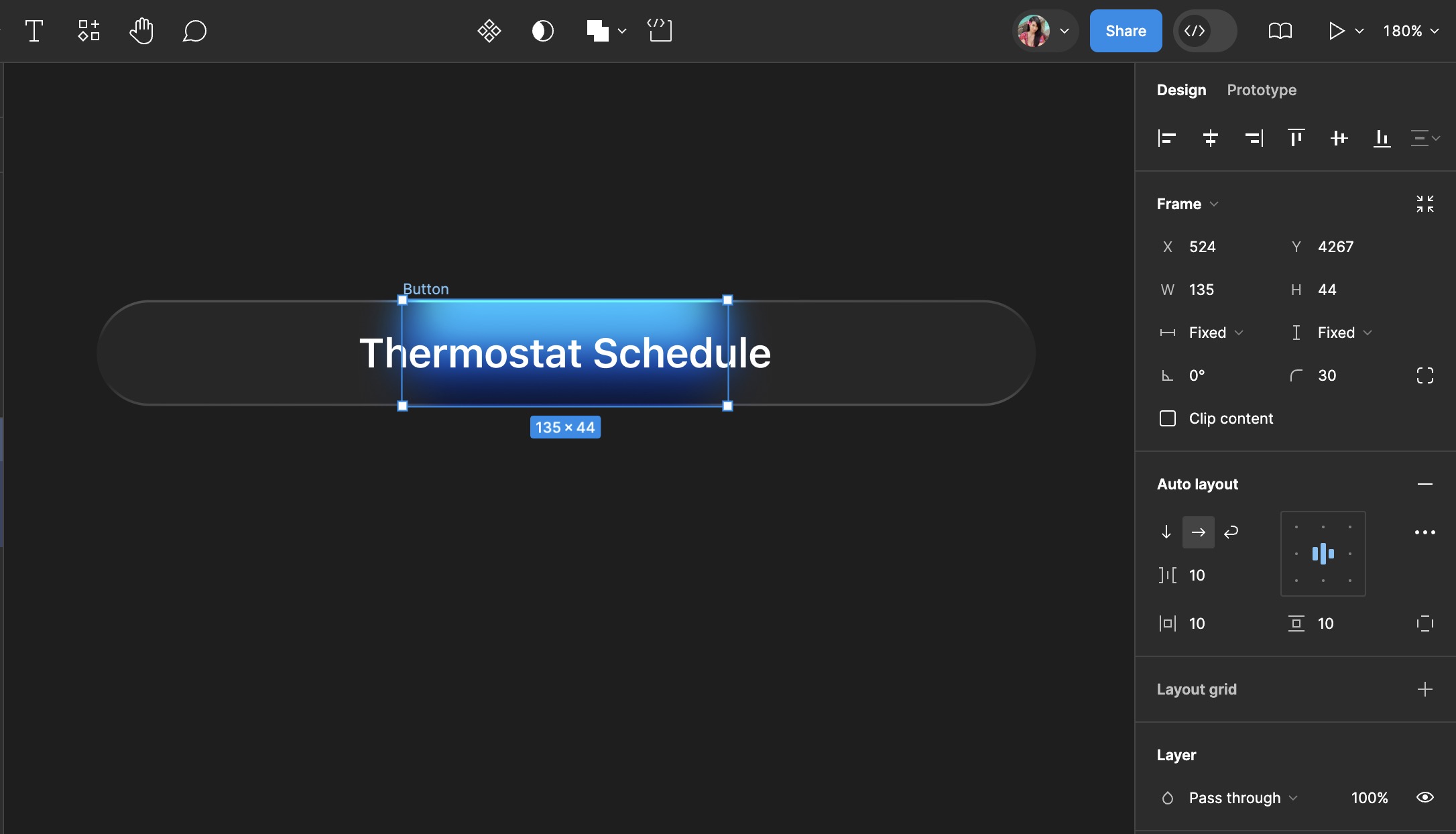
Segmented Control
We're going to create a segmented control that lets users choose between multiple options. For the smart home, the options will be "Devices" and "Rooms," displayed in a horizontal row. Each segment functions as a button, and selecting one will deselect any others, clearly indicating the active option. This type of control is often used to switch views or filter content within the same context, without navigating away from the current page or screen.
- Copy a button from the thermostat design, replacing its rectangle with one of width 135.

Constraints
After changing the width, the rectangle inside the button doesn't adjust. You need to use constraints to fix this. Constraints are settings that determine how elements within a frame behave when the frame's size changes. With constraints, you pin the rectangle to a side of the frame, top, right, bottom, left, so it stays in place when the frame size changes. They help maintain the positioning and scaling of elements relative to their parent frame, ensuring designs adapt smoothly across different screen sizes and layouts.
- Adjust the rectangle within the button using constraints to ensure it resizes correctly. Pin it to the left, right, and top sides of the frame.
- Change the button text to "Devices".
![Auto Layout, Constraints and Pen tool image 3]()
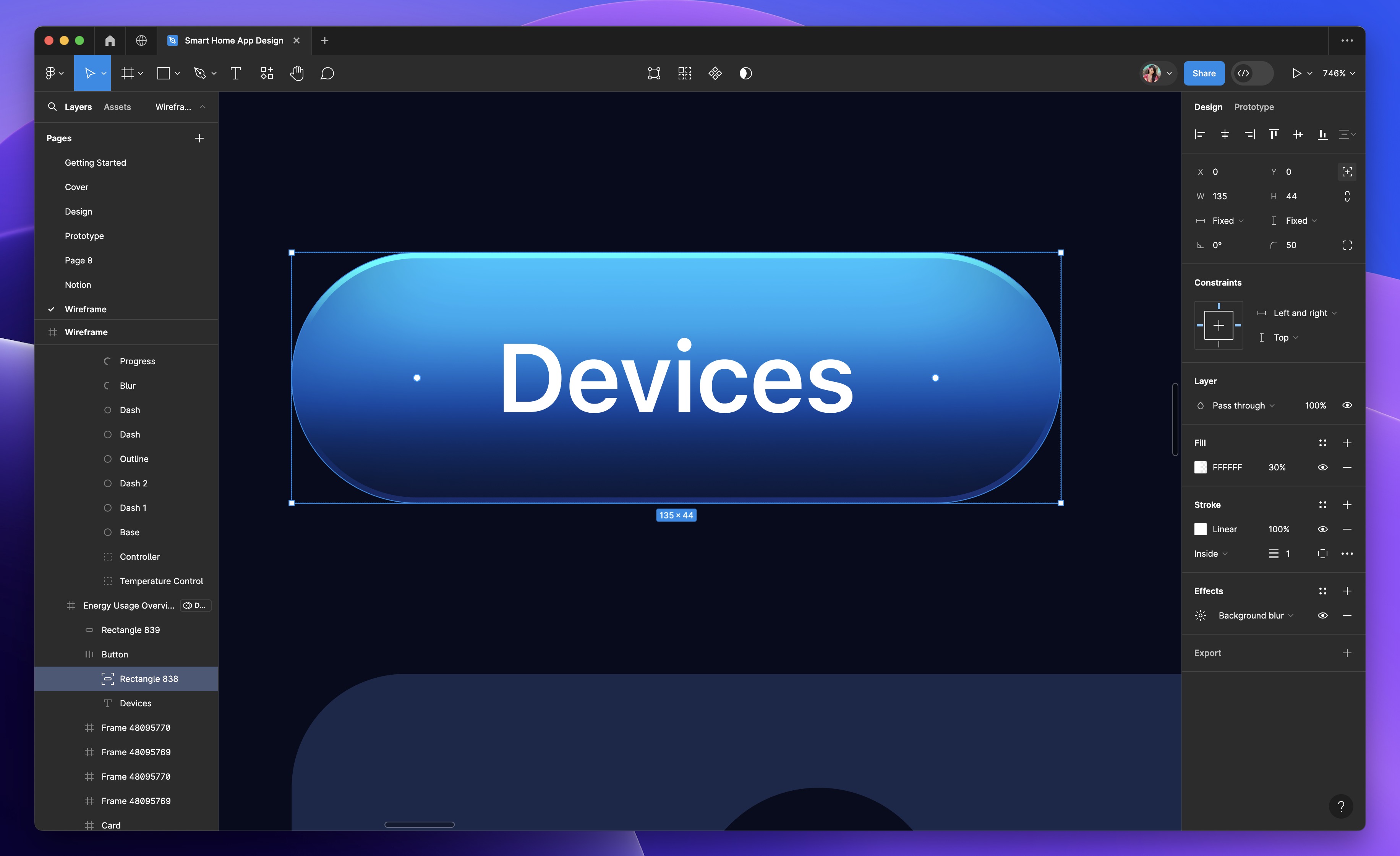
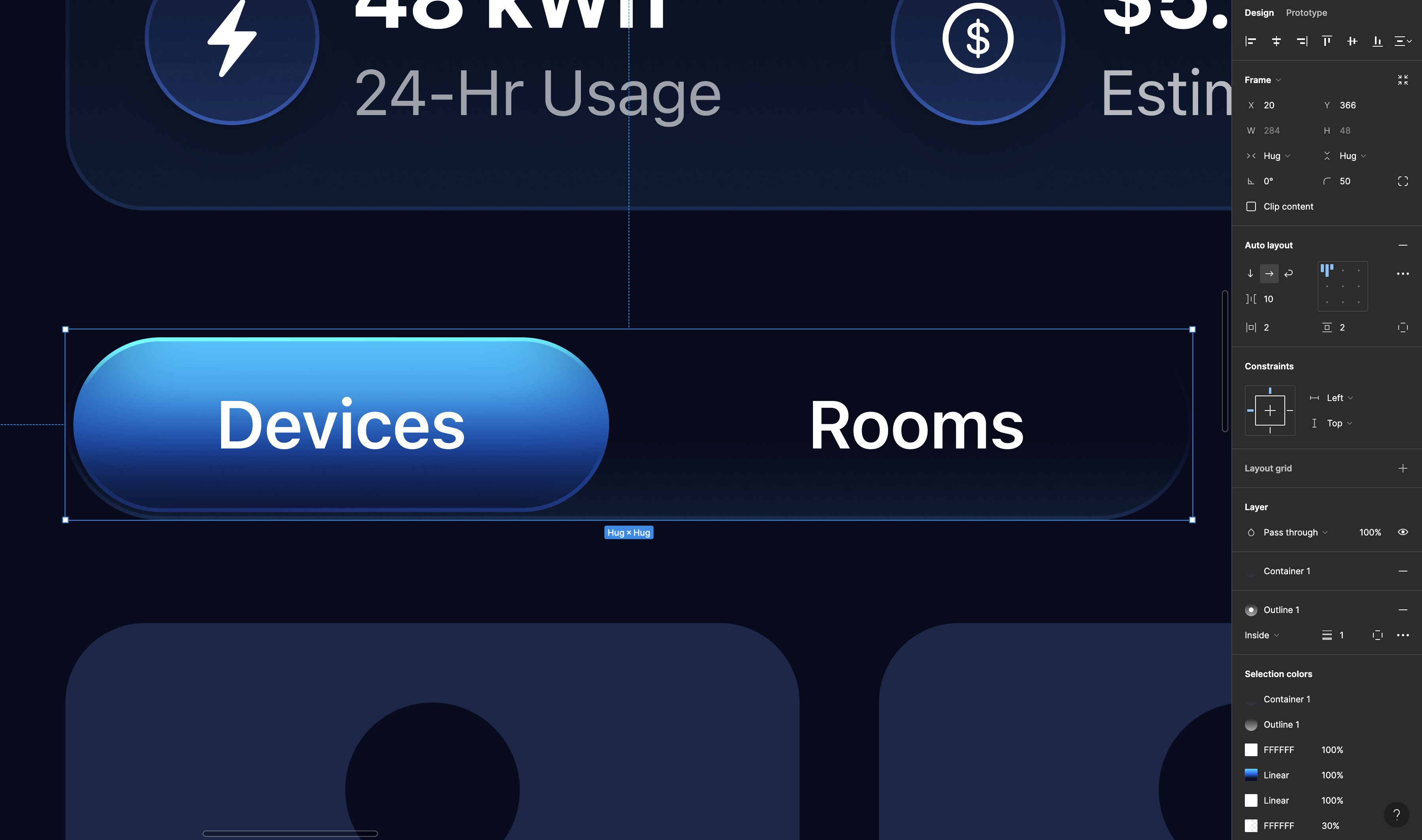
Duplicating Buttons and Applying Auto Layout
- Duplicate the button, changing the second button's text to "Rooms" and removing the fill and background blur.
- Select the two buttons, add auto layout, set the gap between items to 10, and adjust the horizontal and vertical padding to 2.
- Fill the parent container with 'container 1', add 'outline 1' as the stroke, and set the corner radius to 50.
![Auto Layout, Constraints and Pen tool image 4]()
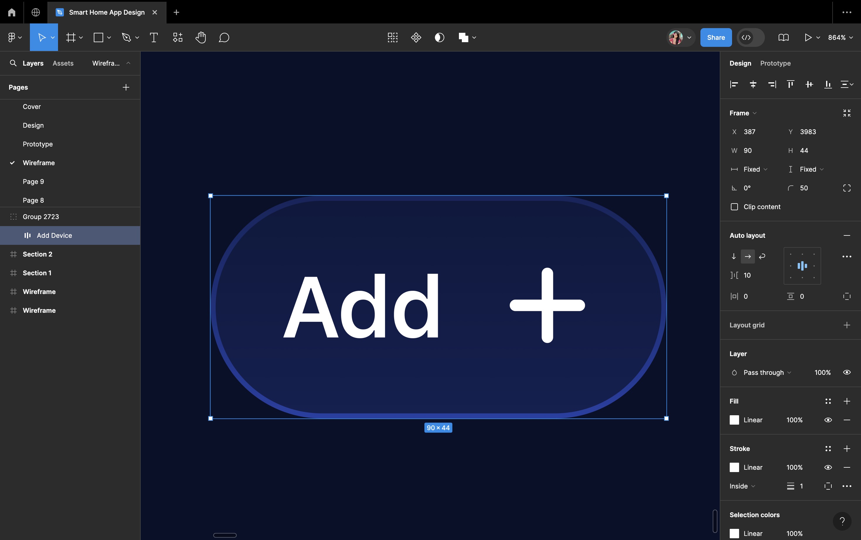
Add Action Button
Now, we're going to create an action button for adding devices. An action button is a clickable element in a user interface that executes a particular action when clicked or tapped. This action could involve submitting a form, navigating to another page, or triggering a function within an application. Essentially, it provides users with a simple and efficient way to interact with a digital interface and accomplish their intended tasks.
- You will need a plus icon, and then copy the text from the segmented control and change it to "Add.”
- Select both the text and the icon, then add auto layout. Resize the frame to 90x44 and set the alignment to center within the auto layout properties.
![Auto Layout, Constraints and Pen tool image 5]()
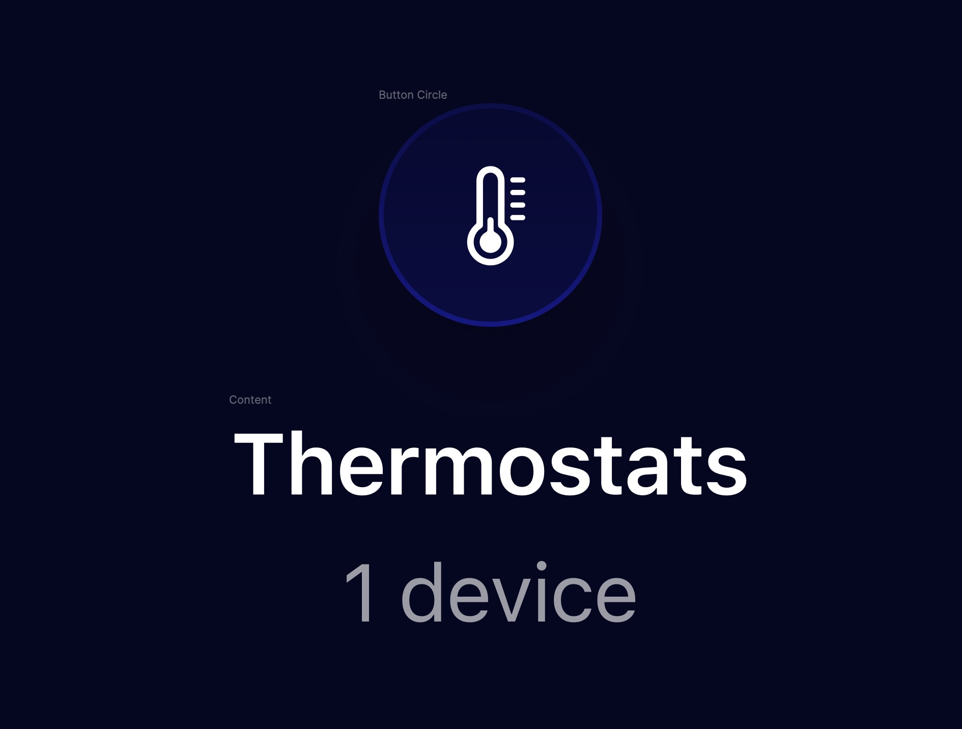
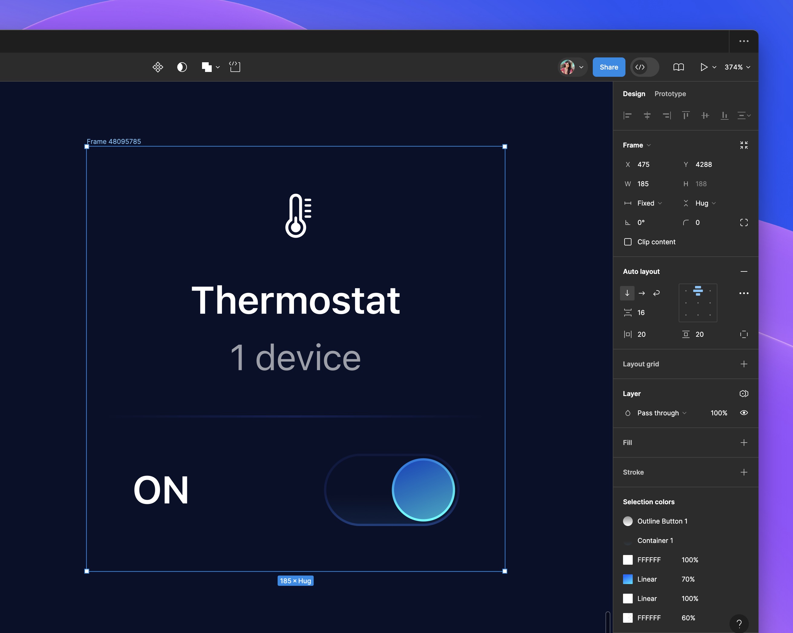
Device Control Card
Now, let's create the Device Control Card. A Device Control Card is a small interface element that lets users manage and interact with individual devices. It usually shows the device's name, status, and options to control it, like turning it on or off, adjusting settings, or viewing details.
- First, we need icon, take the thermostat from the asset page.
- I'll do the first one with you and then you'll duplicate, change the icon and text.
- Press on "T", and type Thermostats using the Body Emphasized style, using the color white.
- Duplicate the text, change it to '1 device', apply the 'Callout Regular' style, and reduce the opacity to 60%. Select the two texts, add auto layout, and set the gap between them to 4.
![Auto Layout, Constraints and Pen tool image 6]()
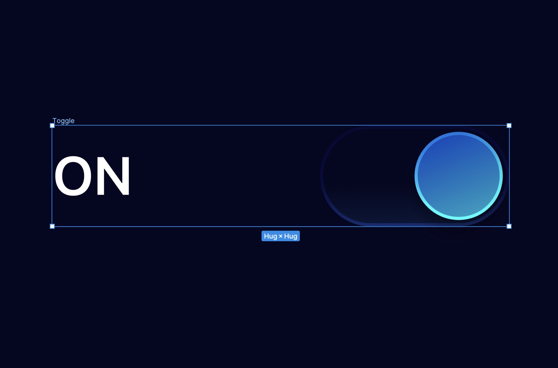
Toogle
A toggle is a graphical element used to switch between two states, like on/off or enabled/disabled. Users interact by clicking or tapping, changing the state visually. It's commonly used for controlling settings or features in an interface.
- Fill the circle with the 'Gradient 1' color style, using a linear gradient of two shades of blue placed diagonally
- Select the other rectangle which is the base of the toggle. Fill with container 1 style, and add stroke using outline button 1.
- Press on T, and type ON in uppercase. Use the body emphasized text style with the color white.
- Name the layer. Then, add auto layout to both the text and the toggle.
![Auto Layout, Constraints and Pen tool image 7]()
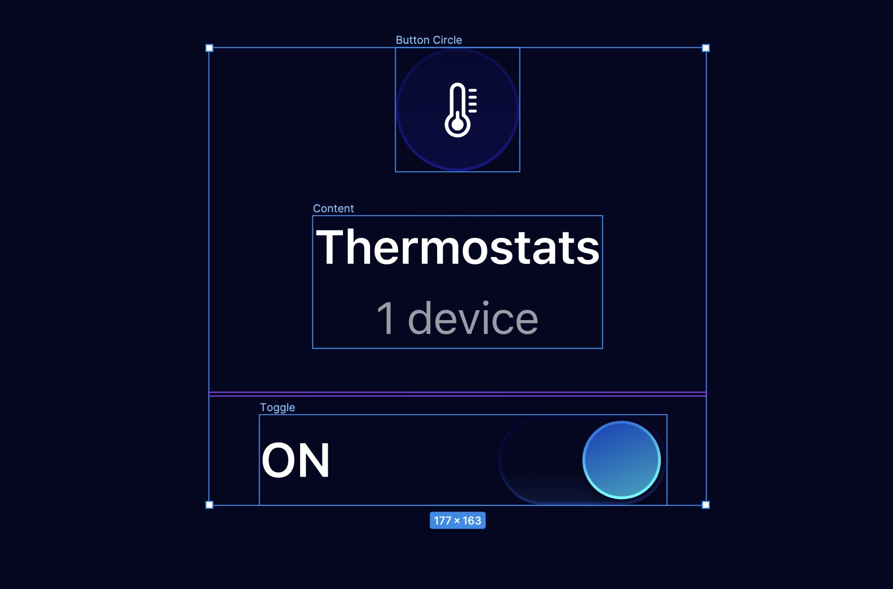
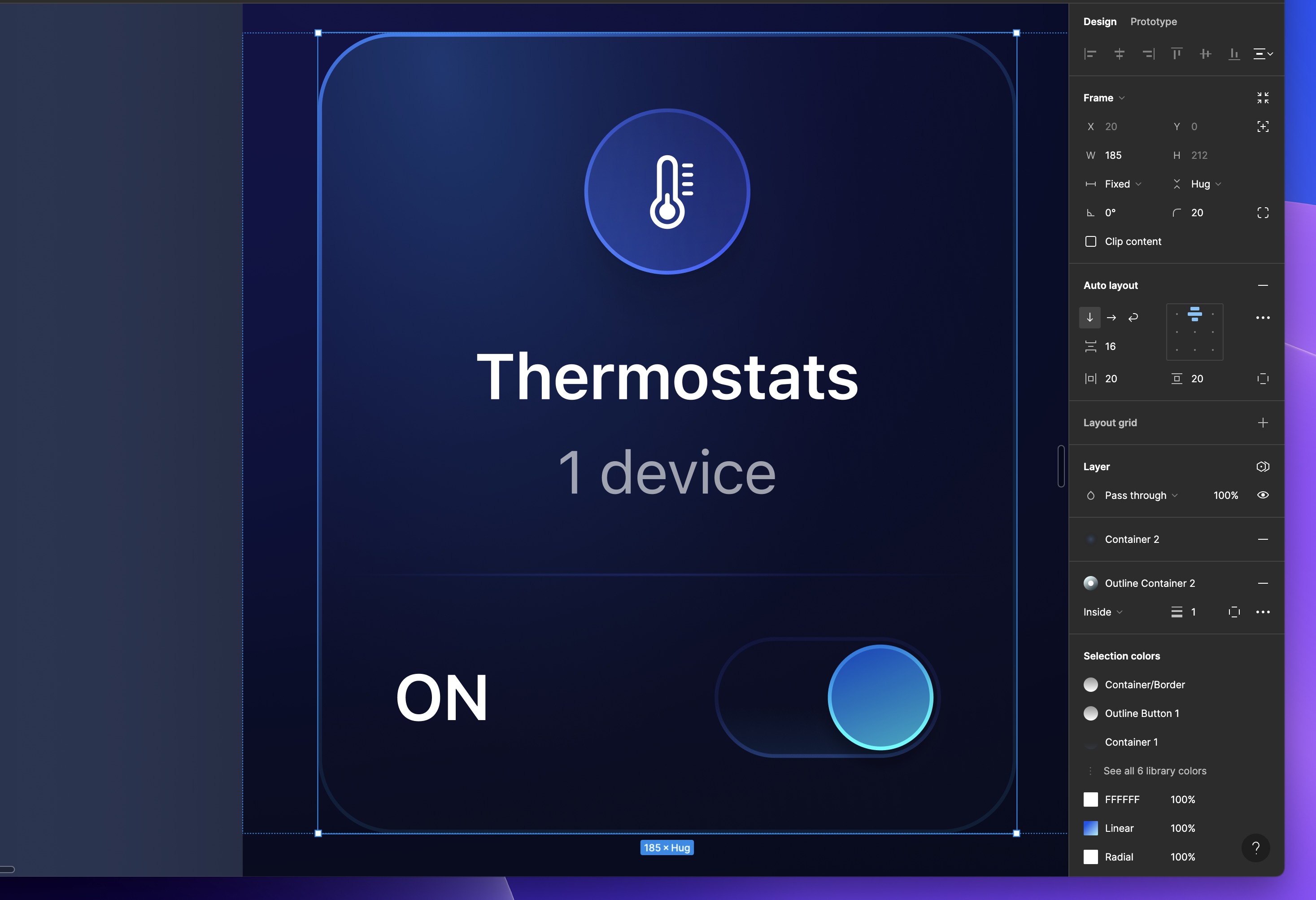
Assembling the Elements
- To avoid redundancy and maintain consistency, duplicate an existing separator instead of creating a new one. Adjust the width of the separator to 170.
- Select the icon, text box, and toggle, then press Shift+A to apply Auto Layout.
![Auto Layout, Constraints and Pen tool image 8]()
Auto Layout
Auto layout is a feature that automatically arranges and adjusts elements within a user interface to maintain a consistent and visually pleasing layout across different screen sizes and orientations. It ensures that elements resize, reposition, or stack appropriately based on available space, making the interface responsive and adaptable to various devices.
Gap Between Items: This setting determines the space between adjacent elements in a layout. By adjusting the gap, designers can control the spacing between buttons, text fields, or other UI components, ensuring an even and visually appealing distribution. Set the gap between items to 16
Padding: Padding refers to the space between the edge of a container (such as a frame or group) and its contents. Designers can specify padding to create breathing room around elements, preventing them from appearing cramped or too close to the container's edges. Set the horizontal and vertical padding to 20.
Alignment: Alignment settings dictate how elements are positioned within their container. Horizontal alignment options include left, center, and right alignment, while vertical alignment options include top, center, and bottom alignment. These settings ensure that elements are neatly aligned relative to each other and to the container's boundaries. Set the alignment to center.
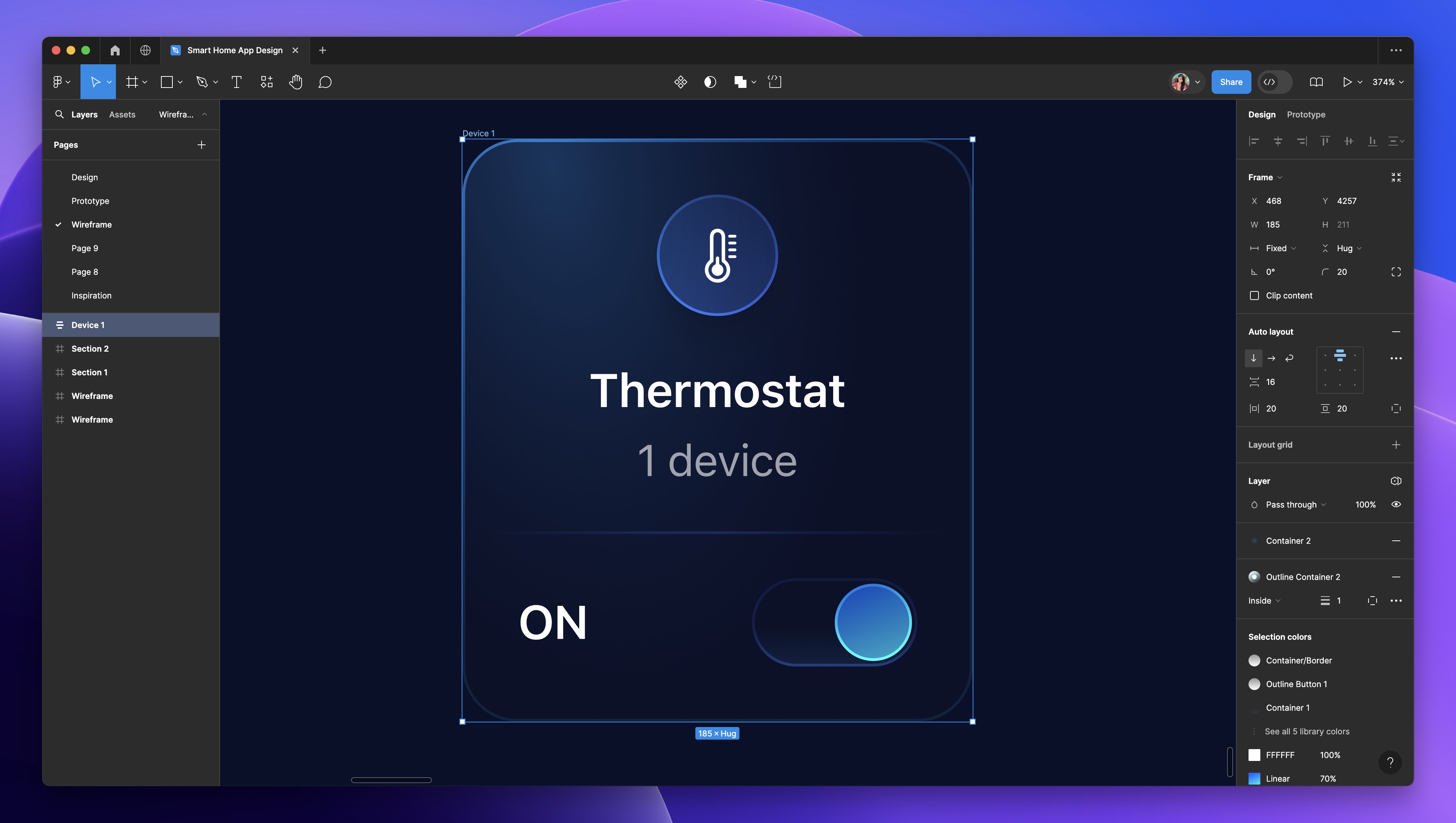
Flexible Width and Height
Elements can expand or contract horizontally and vertically based on the available space. This ensures that the interface remains visually balanced and fully utilizes the screen real estate.
- Adjust the width to 185.
![Auto Layout, Constraints and Pen tool image 10]()
Fill container
Parent containers hold and organize elements, defining their boundaries and allowing for auto layout. Child containers, grouped within parent containers, inherit their properties and can contain further elements, enabling nested organization in designs. we’re going to select the child containers and set them to fill container, it will expand to match the width and/or height of its parent frame.
- Select the child containers “the toggle” and set them to fill the parent container.
- Change the gap between to Auto, allowing it to adjust based on the available space.
![Auto Layout, Constraints and Pen tool image 11]()

Add Colors and Icons
- Fill the layout with the 'Container 2' color style and add a stroke using 'Outline Container 2'. Set the corner radius to 20.
- Copy and replace the three other empty layouts.
- During this pause, change the icon and text to correspond with the device you wish to add, such as a Wi-Fi system, appliances, lighting, etc.
![Auto Layout, Constraints and Pen tool image 12]()
Setting Direction in Auto Layout
Select the four containers and apply Auto Layout. Within the Auto Layout settings, the "Direction" option determines the alignment of items within a container. Choose "Horizontal" to align items side by side, "Vertical" to stack them from top to bottom, or "Wrap" to allow items to flow to a new line or column when there's insufficient space.
- Configure the direction to "Wrap" and establish a 20-pixel gap both horizontally and vertically between the items.

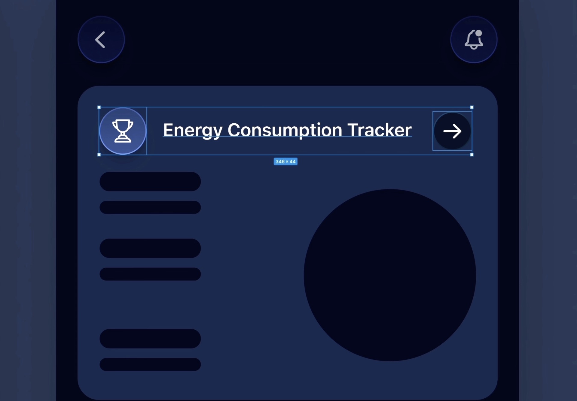
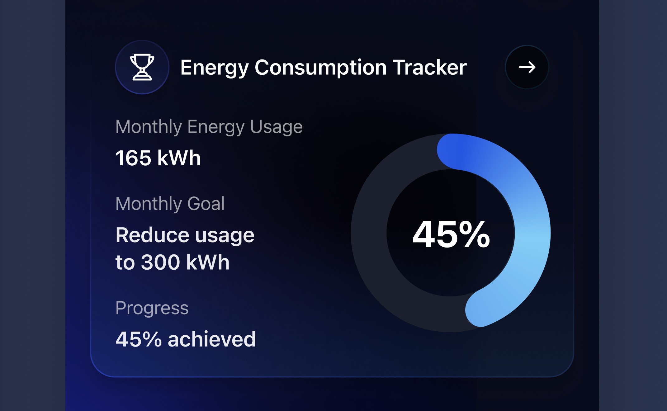
Energy Consumption Tracker
In this section, we'll focus on creating the Energy Consumption Tracker for the third screen of our smart home app. This feature consists of a layout with three main child containers, each serving a specific function in displaying energy usage information.
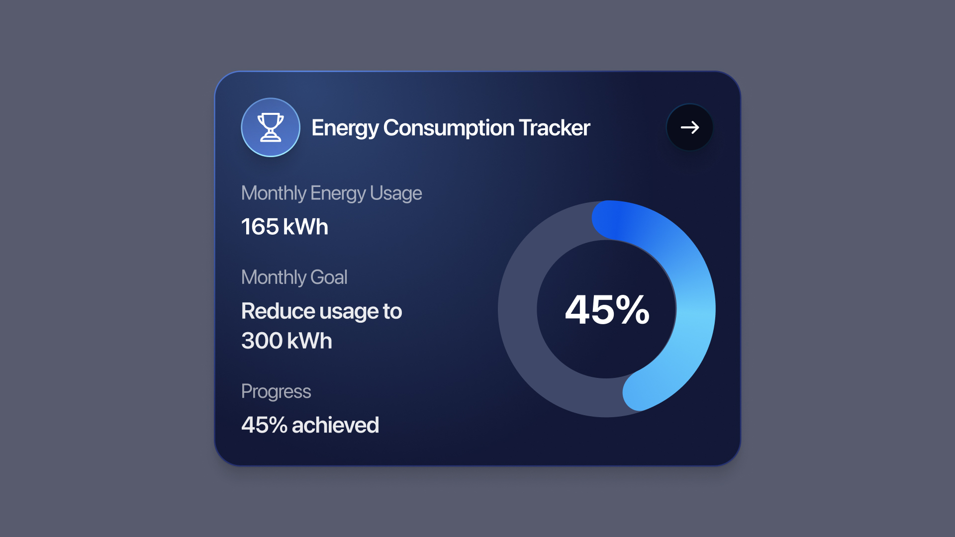
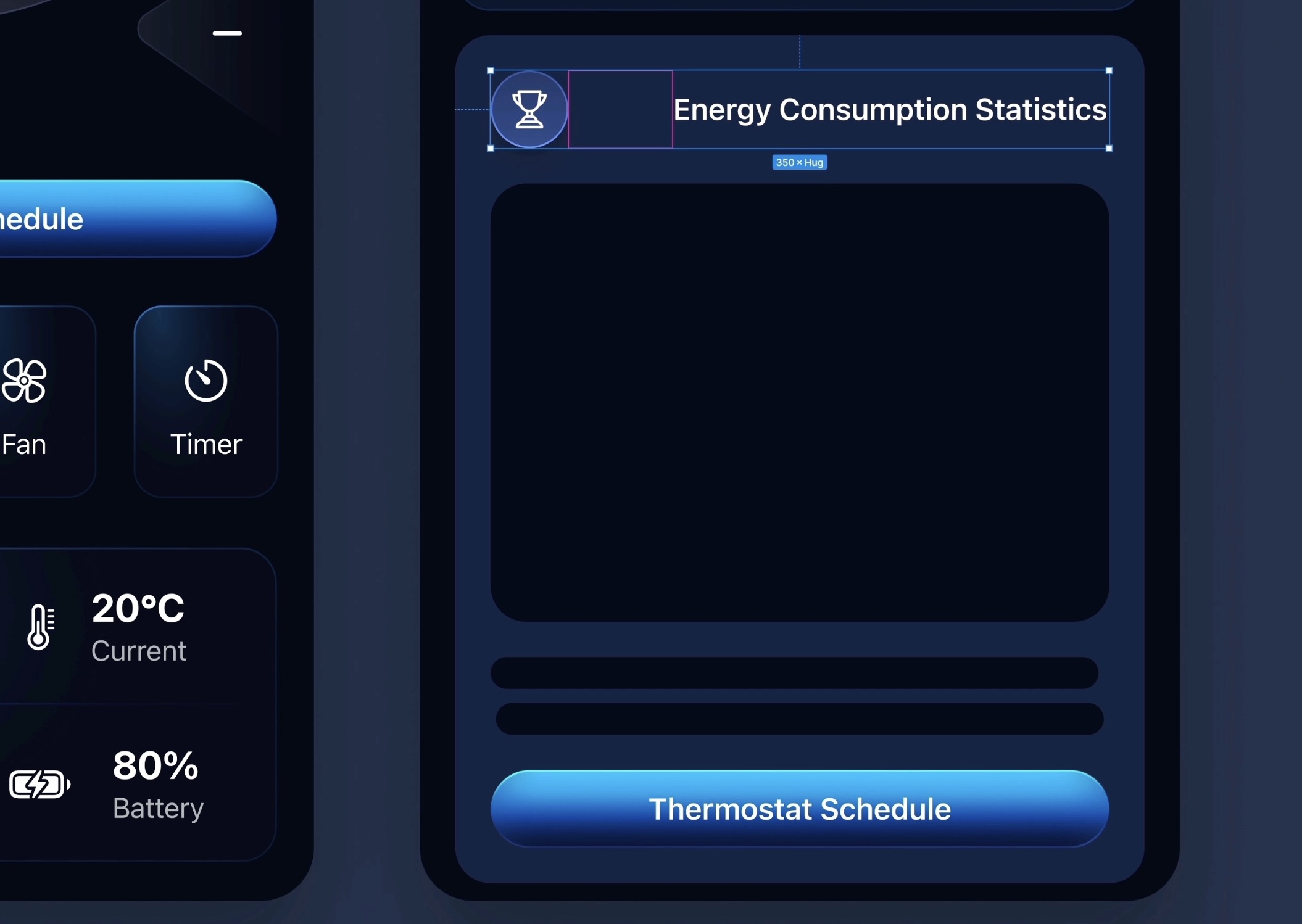
Title and Navigation
- Icons and Layout: Begin by incorporating an arrow icon for navigation and a trophy icon to symbolize achievements or milestones. Position the arrow icon on the right and the trophy icon on the left.
- Auto Layout and Sizing: Apply Auto Layout to the arrow icon and adjust its frame to 36x36. Remove any existing circle shape from this layout.
- Styling: Change the fill of the removed circle to black, reduce the opacity to 50%, and round the corners to achieve a circular shape. Apply a stroke with the 'Outline Container 2' style for added definition.
- Adding the Title: Type "Energy Consumption Tracker" using the Body Emphasized text style in white. Group the icon and the title together and apply Auto Layout for alignment.
Monthly Energy Usage
- Text Details: Utilize the Text tool (T) to add "Monthly energy usage" with the Subheadline Regular style. Duplicate this text, changing it to "165 kWh" with the Body Emphasized style, and reduce the opacity to 60%.
- Inner Containers: This container will also include child containers to neatly organize information. Add three text boxes for detailing energy usage, applying similar styling as above.
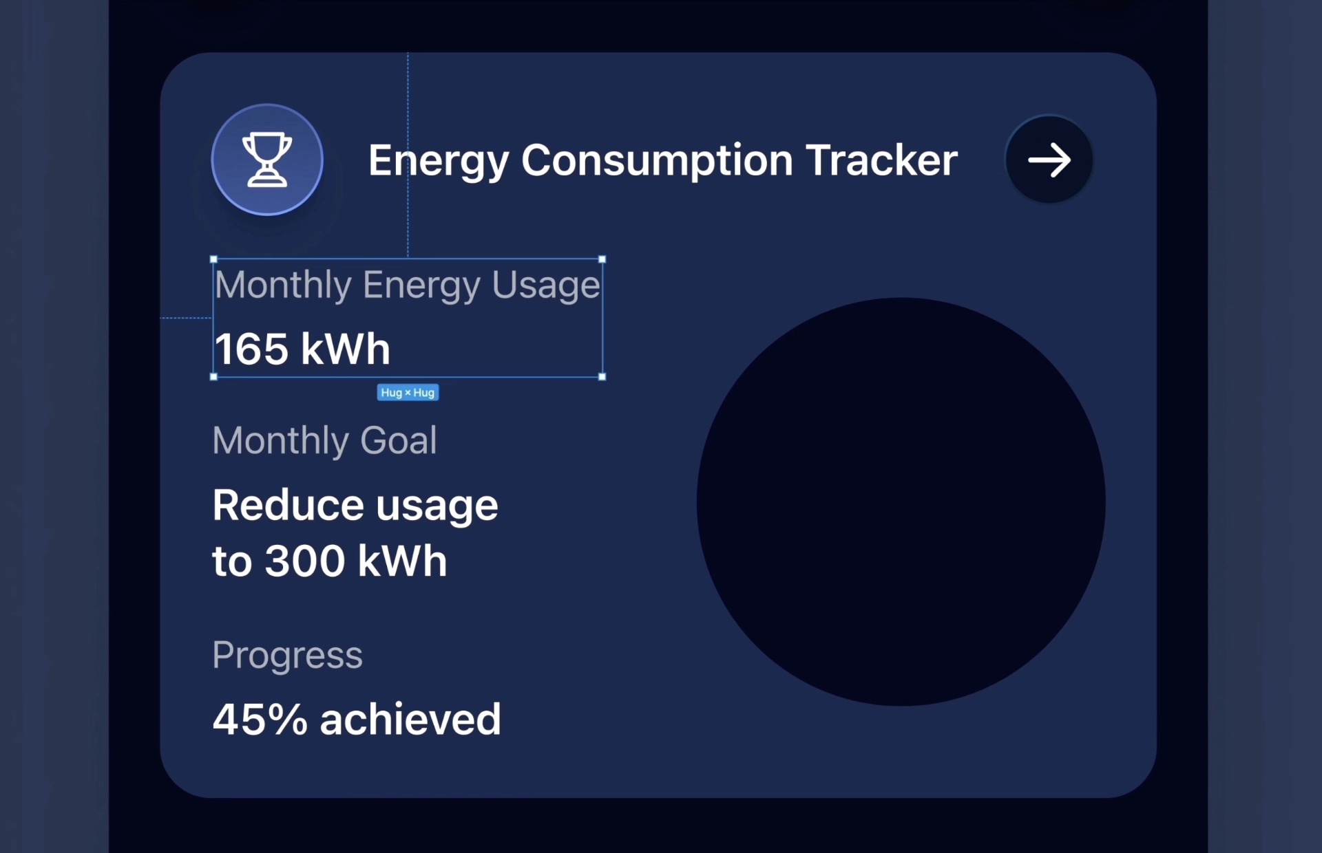
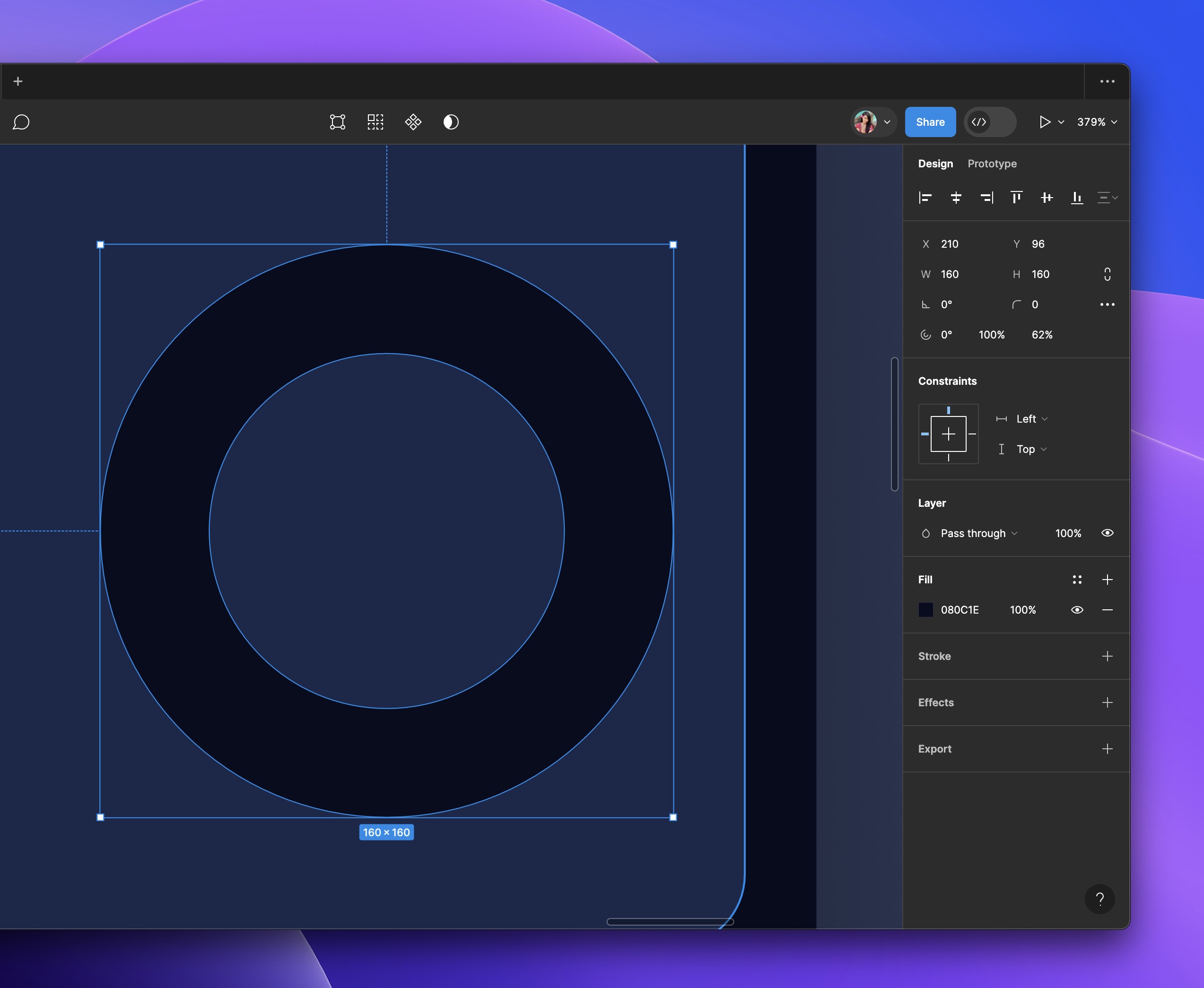
Progress Ring
- Creation and Duplication: Hover over the circle to initiate the progress ring creation. Set the completion ratio to 62% and the sweep value to 100%. Duplicate this progress ring, adjusting the second ring's sweep value to 50% and the start angle to -80 degrees.
- Percentage Display: Add a percentage indicator, such as “45%,” using the Title 1 Emphasized style in white.
- Grouping and Layout: Group these elements under "Progress Ring" and apply Auto Layout to organize them alongside the textual content. Ensure the entire layout is cohesive by adjusting gaps and padding accordingly.
Final Adjustments
- Container Adjustments: Select the containers involved in displaying the progress rings and textual content, applying Auto Layout to ensure a uniform and responsive design. Adjust the width to 390, set a 16-pixel gap between items, and add 20 pixels of padding horizontally and vertically.
- Fill and Stroke: To finalize, remove any unnecessary shapes, set the container to fill with the 'Container 1' color style, and apply a stroke using the 'Outline 1' style. Adjust the corner radius to 20 for a polished look.
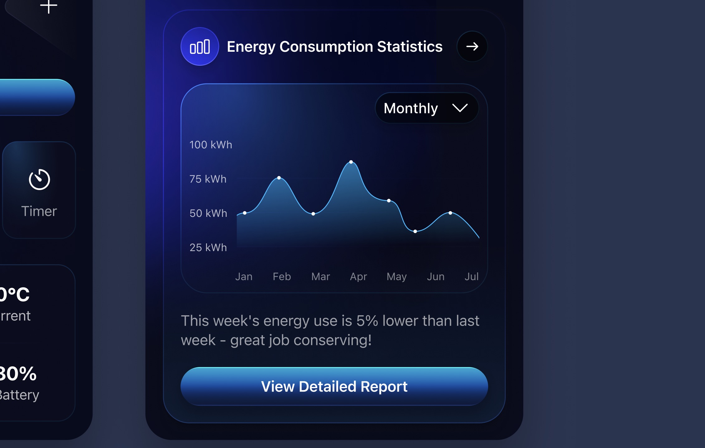
Energy Consumption Statistics
We're creating an Energy Consumption Statistics card. This card shows users how much energy they use in a way that's easy to understand. It displays things like how much energy you've used, how close you are to your energy-saving goals, and how your current use compares to before. You'll see charts like progress bars on this card, and it might give you tips on saving energy. The goal is to make it easier for you to keep an eye on your energy use and encourage you to use less energy at home or work.
Duplicating Navigation and Button
To begin, we replicate existing elements from the energy consumption tracker and thermostat controller page to maintain consistency in navigation and functionality.
- Duplicate Navigation: Copy the navigation element from the energy consumption tracker to reuse in the current design.
- Modify Button: Duplicate the button from the thermostat controller page, then update its text to "View Detailed Report."
- Energy Use Message: Type "This week's energy use is 5% lower than last week - great job conserving!" using the Body/Regular style.
Creating Statistics Visualization
Focus on illustrating statistics through visual elements, specifically opting for a line graph to represent energy consumption over time.
- Select Visualization Type: Decide to create a line graph among various statistical representation options.
- Line Group Creation: Draw a line of 296 pixels in white color at 10% opacity, duplicate it three times, set 40 pixels spacing between each, group them, and name the group "lines."
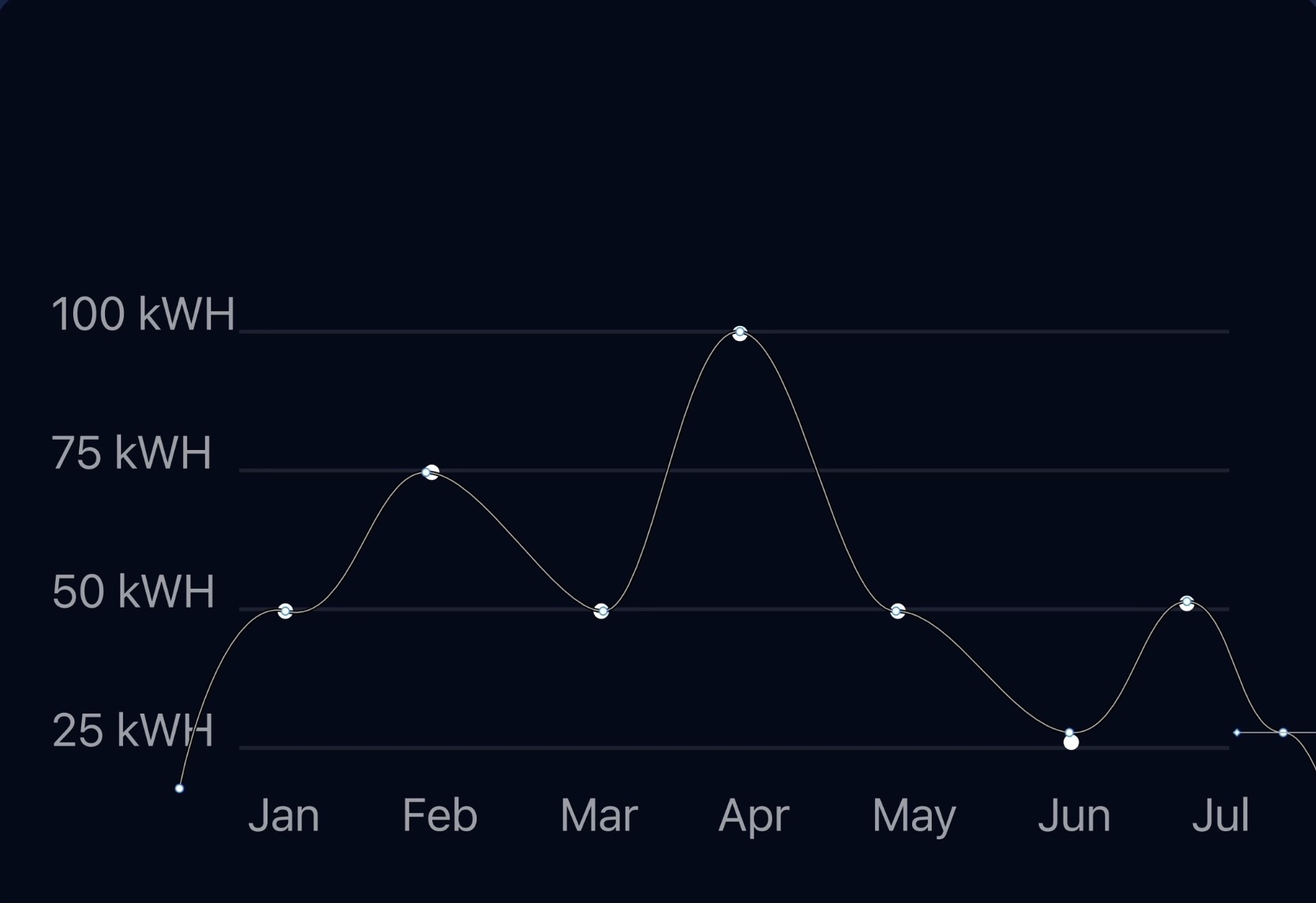
Utilizing the Pen Tool
Learn how to use the Pen tool to create custom wave shapes that can represent fluctuating data or simply add a dynamic visual element to the design.
- Activate Pen Tool: Choose the Pen tool from the toolbar or press P to start drawing on the canvas.
- Wave Creation: Click to create anchor points and drag to form curves for a zigzag pattern, indicating peaks and troughs.
- Adjust Curves: Use the Move tool (V) to select and adjust curves by manipulating anchor point handles.
- Curve Adjustments: Refine the shape of your wave or zigzag pattern using the bend tool for smoother curves.
Finalizing the Graph
Conclude the design process by arranging the graphical elements properly and applying auto layout to ensure a cohesive and responsive design.
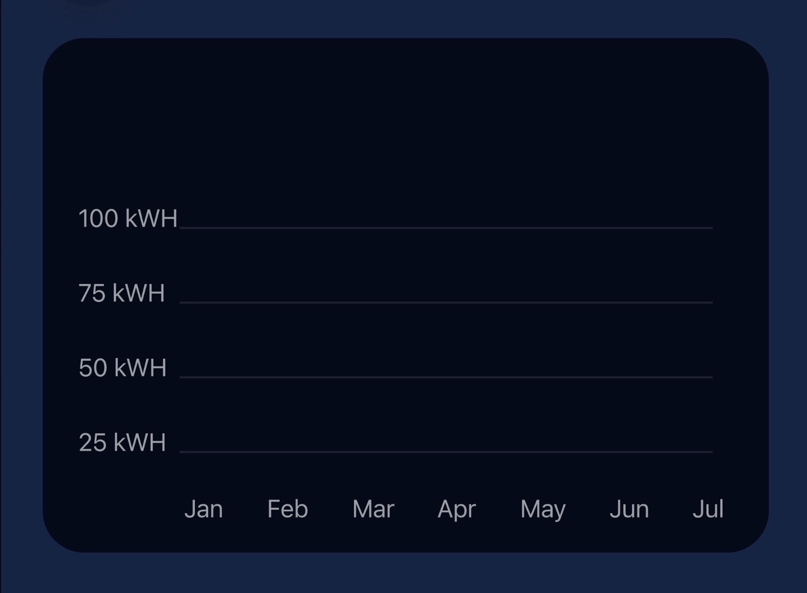
- Y-Axis and Wave Setup: Create labels for the y-axis with the "Caption Regular" style, adjust the opacity, and group them after setting appropriate spacing.
- X-Axis Preparation: Duplicate and adjust labels for the x-axis to represent different time periods, such as months.
- Graph Line Frame: Use the line tool ('L') to draw baseline lines for the graph, adjust their opacity, and align them with the text.
- Apply Auto Layout: Combine the y-axis labels and wave into one container, then merge this container with the x-axis labels, applying auto layout for organization and scalability
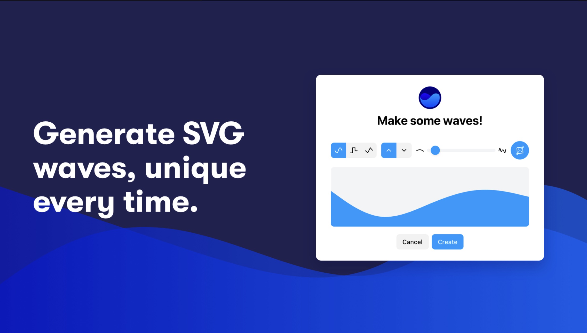
Get Wave Plugin
Also, you can use “Get wave plugin”. The Get Wave plugin for Figma helps users easily create customizable wave patterns within their design projects. It automates the process, allowing for quick adjustments of wave characteristics like amplitude, frequency, and complexity. Users can install the plugin through Figma's Community section and then access it within their Figma workspace to generate and customize wave designs. This tool is especially useful for adding dynamic, fluid shapes to backgrounds, separators, or branding elements in web, app, or graphic designs.
Conclusion
Congratulations on designing a sleek Energy Consumption Statistics card that beautifully marries functionality with design aesthetics for the smart homes of the future. By mastering layout adjustments, text styling, and data visualization with a custom line graph, you’ve crafted an intuitive interface that not only tracks energy usage but also encourages conservation. This card stands as a testament to your growing skill in creating engaging, user-friendly digital experiences. Well done!
Templates and source code
Download source files
Download the videos and assets to refer and learn offline without interuption.
Design template
Source code for all sections
Video files, ePub and subtitles
Videos
1
Introduction to UI/UX Design
Finding inspiration with Mobbin and transforming ideas into unique designs using Figma
5:39
2
UI Kits and Templates
Accelerating design efficiency by using UI kits and templates
8:18
3
Shapes, Gradients and Strokes
Design a smart home iOS App and learn to use shapes, gradients, and strokes to create a thermostat interface
15:15
4
Icons, Typography, and Styles
Improve the design of our smart home application with icons, typography, and effects
9:43
5
Auto Layout, Constraints and Pen tool
Adding finishing touches on our design with Auto Layout, constraints. Use the Pen Tool to create intuitive controls
16:23
6
UX Research and Design Flows
Diving Deeper into UX Research and the Importance of Designing User Flows
16:19
7
Styles and Plugins
Exploring Figma Tools and Plugins to Enhance Creativity and Efficiency
13:09
8
Animation, Sticky Scroll and Overlay
Bridging Design and Interaction with a Step-by-Step Guide to Prototyping
10:13
9
Flat Design and Light Mode
Exploring the Essentials of Flat Design and Light Mode for a Cleaner and More Intuitive User Experience
16:57
10
Visual Hierarchy and Information Architecture
Explore the role of visual hierarchy in UI design and learn to structure and organize content to improve a product's usability
11:07
11
Typography and Colors Variable
Learn How to Streamline Your Designs with Typography and Color Variables
14:34
Meet the instructor
We all try to be consistent with our way of teaching step-by-step, providing source files and prioritizing design in our courses.
Sourasith Phomhome
UI Designer
Designer at Design+Code
19 courses - 72 hours
Master AI Prompting for Stunning UI
Learn how to leverage AI tools like Aura for creating beautiful designs, working with templates, and experimenting with advanced prompts. A concise guide for designers and developers to level up their skills.
10 hrs
Design Multiple Apps with Figma and AI
In this course, you’ll learn to design multiple apps using Figma and AI-powered tools, tackling a variety of real-world UI challenges. Each week, a new episode will guide you through a different design, helping you master essential UI/UX principles and workflows
4 hrs
SwiftUI Fundamentals Handbook
A comprehensive guide to mastering Swift programming fundamentals, designed for aspiring iOS developers. This handbook provides a structured approach to learning Swift's core concepts, from basic syntax to advanced programming patterns. Through carefully sequenced chapters, readers will progress from essential programming concepts to object-oriented principles, building a solid foundation for SwiftUI development. Each topic includes practical examples and clear explanations, ensuring a thorough understanding of Swift's capabilities. This handbook serves as both a learning resource and a reference guide, covering fundamental concepts required for modern iOS development. Topics are presented in a logical progression, allowing readers to build their knowledge systematically while gaining practical programming skills.
2 hrs
Design and Code User Interfaces with Galileo and Claude AI
In this course, you’ll learn how to use AI tools to make UI/UX design faster and more efficient. We’ll start with Galileo AI to create basic designs, providing a solid foundation for your ideas. Next, we’ll refine these designs in Figma to match your personal style, and finally, we’ll use Claude AI to turn them into working code—eliminating the need for traditional prototyping.
4 hrs
Design and Prototype for iOS 18
Design and Prototype for iOS 18 is an immersive course that equips you with the skills to create stunning, user-friendly mobile applications. From mastering Figma to understanding iOS 18's latest design principles, you'll learn to craft two real-world apps - a Car Control interface and an AI assistant.
3 hrs
Master Responsive Layouts in Figma
Creating responsive layouts is a must-have skill for any UI/UX designer. With so many different devices and screen sizes, designing interfaces that look great and work well on all platforms is necessary. Mastering this skill will make you stand out in the field. In this course, we'll start from scratch to create this beautiful design using Figma. You'll learn how to make layouts that are easy to use and work well on any device. We'll cover key concepts and tools to help you master responsive design in Figma.
2 hrs
UI UX Design with Mobbin and Figma
Mobbin is a powerful tool for UI/UX designers seeking inspiration and innovative design solutions. This platform offers a vast collection of real-world mobile app designs, providing a treasure trove of UI elements and layouts.
2 hrs
3D UI Interactive Web Design with Spline
Learn to create 3D designs and UI interactions such as 3D icons, UI animations, components, variables, screen resize, scrolling interactions, as well as exporting, optimizing, and publishing your 3D assets on websites
3 hrs
Design and Prototype for iOS 17 in Figma
Crafting engaging experiences for iOS 17 and visionOS using the Figma design tool. Learn about Figma's new prototyping features, Dev Mode, variables and auto layout.
6 hrs
Design and Prototype Apps with Midjourney
A comprehensive course on transforming Midjourney concepts into interactive prototypes using essential design techniques and AI tools
8 hrs
iOS Design with Midjourney and Figma
Learn the fundamentals of App UI design and master the art of creating beautiful and intuitive user interfaces for mobile applications
1 hrs
UI Design for iOS, Android and Web in Sketch
Create a UI design from scratch using Smart Layout, Components, Prototyping in Sketch app
1 hrs
UI Design a Camera App in Figma
Design a dark, vibrant and curvy app design from scratch in Figma. Design glass icons, lens strokes and realistic buttons.
1 hrs
UI Design for iOS 16 in Sketch
A complete guide to designing for iOS 16 with videos, examples and design files
3 hrs
Prototyping in Figma
Learn the basics of prototyping in Figma by creating interactive flows from custom designs
1 hrs
UI Design Quick Websites in Figma
Learn how to design a portfolio web UI from scratch in Figma
1 hrs
UI Design Android Apps in Figma
Design Android application UIs from scratch using various tricks and techniques in Figma
2 hrs
UI Design Quick Apps in Figma
Design application UIs from scratch using various tricks and techniques in Figma
12 hrs
Figma Handbook
A comprehensive guide to the best tips and tricks in Figma. Not affiliated with or endorsed by Figma, Inc.
6 hrs