Animation, Sticky Scroll and Overlay
Add to favorites
Bridging Design and Interaction with a Step-by-Step Guide to Prototyping
Play video
UI UX Design with Mobbin and Figma
1
Introduction to UI/UX Design
5:39
2
UI Kits and Templates
8:18
3
Shapes, Gradients and Strokes
15:15
4
Icons, Typography, and Styles
9:43
5
Auto Layout, Constraints and Pen tool
16:23
6
UX Research and Design Flows
16:19
7
Styles and Plugins
13:09
8
Animation, Sticky Scroll and Overlay
10:13
9
Flat Design and Light Mode
16:57
10
Visual Hierarchy and Information Architecture
11:07
11
Typography and Colors Variable
14:34

Setting Up Your Prototype
When you create a prototype, it's important to duplicate your design and work on a separate page. This allows you to make necessary modifications to the design based on the prototype without affecting the original design. You’ll find additional screens and modals in the assets for the prototype. Bring them onto the prototype page.

Onboarding Screen
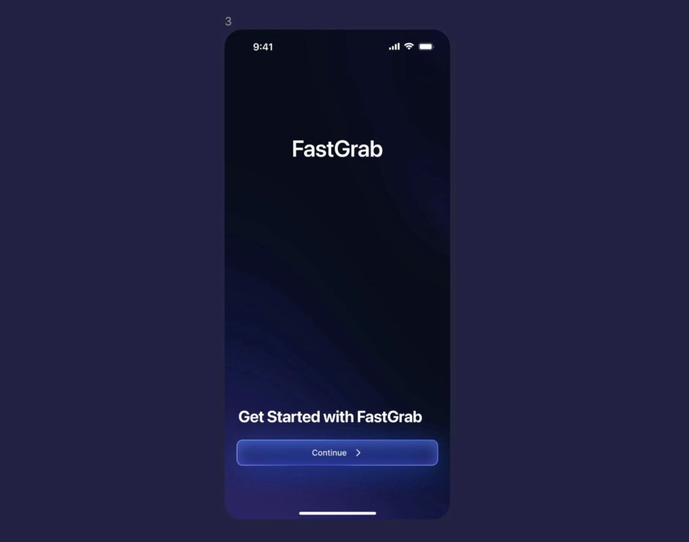
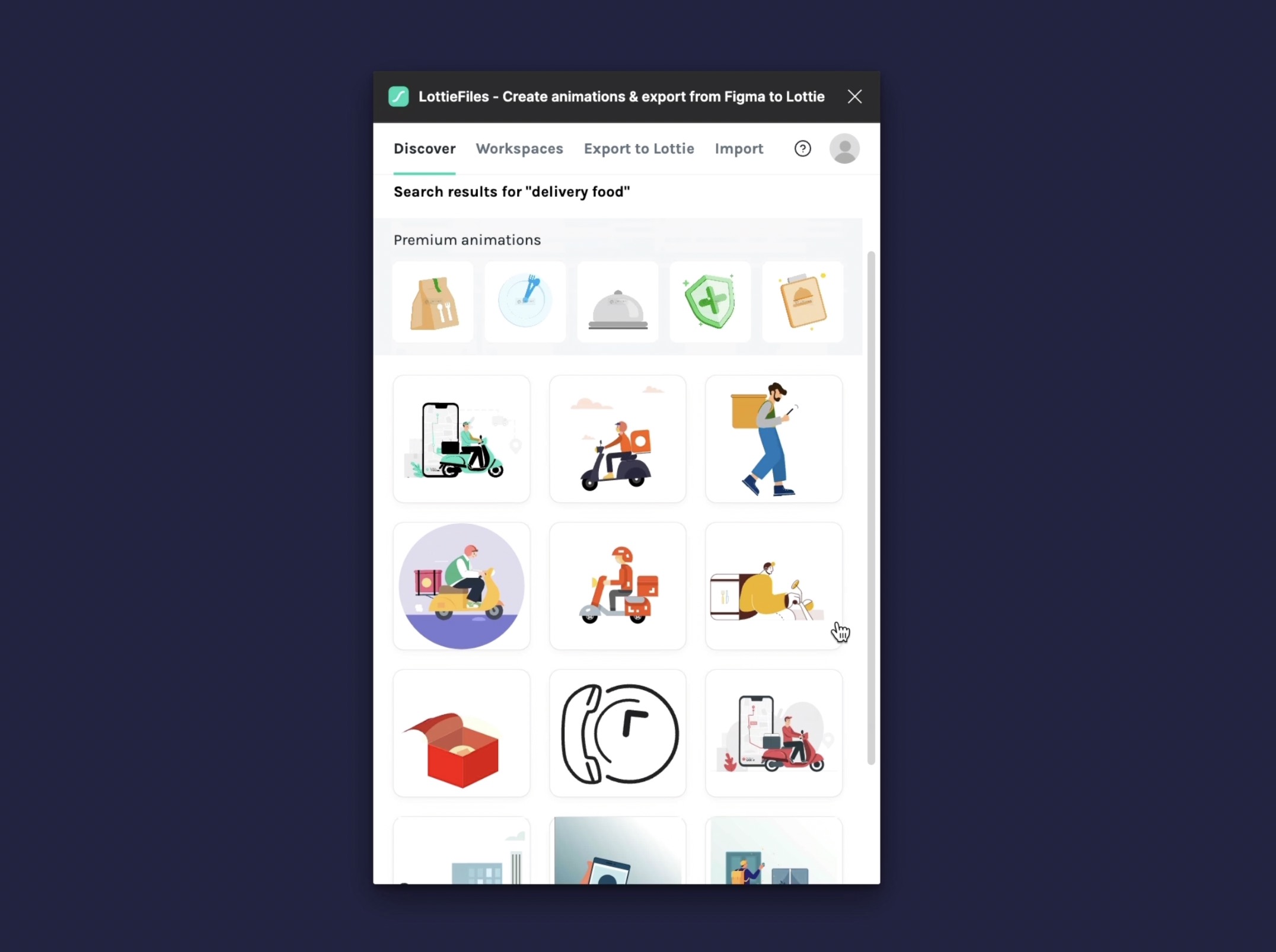
We will start with the onboarding screen, the first series presented to users when they open an application. These screens are designed to introduce the main features and functionalities of the app, guiding users through initial setup processes or providing critical information to help them get started. The goal is to enhance user understanding and engagement right from the start, making the app more accessible and more intuitive to use. Take Uber, for example; their onboarding is effortless and primarily features their brand name. However, I will show you how to add GIFs using Lottie animations easily, and you can even create your own.
Lottie Animation
The LottieFiles plugin offers a wide range of free animations that are smaller and clearer than GIFs and videos. Note that Lottie animations cannot have transparent backgrounds. You can preview animations live to see how they'll look in your design. When inserting an animation as a GIF, you can choose different sizes. For higher quality, opt for medium or large sizes, which require a paid subscription. Keep exploring the library to find animations that fit your design needs. Customization options like changing the color palette are also available with a subscription.
Link Your Screens
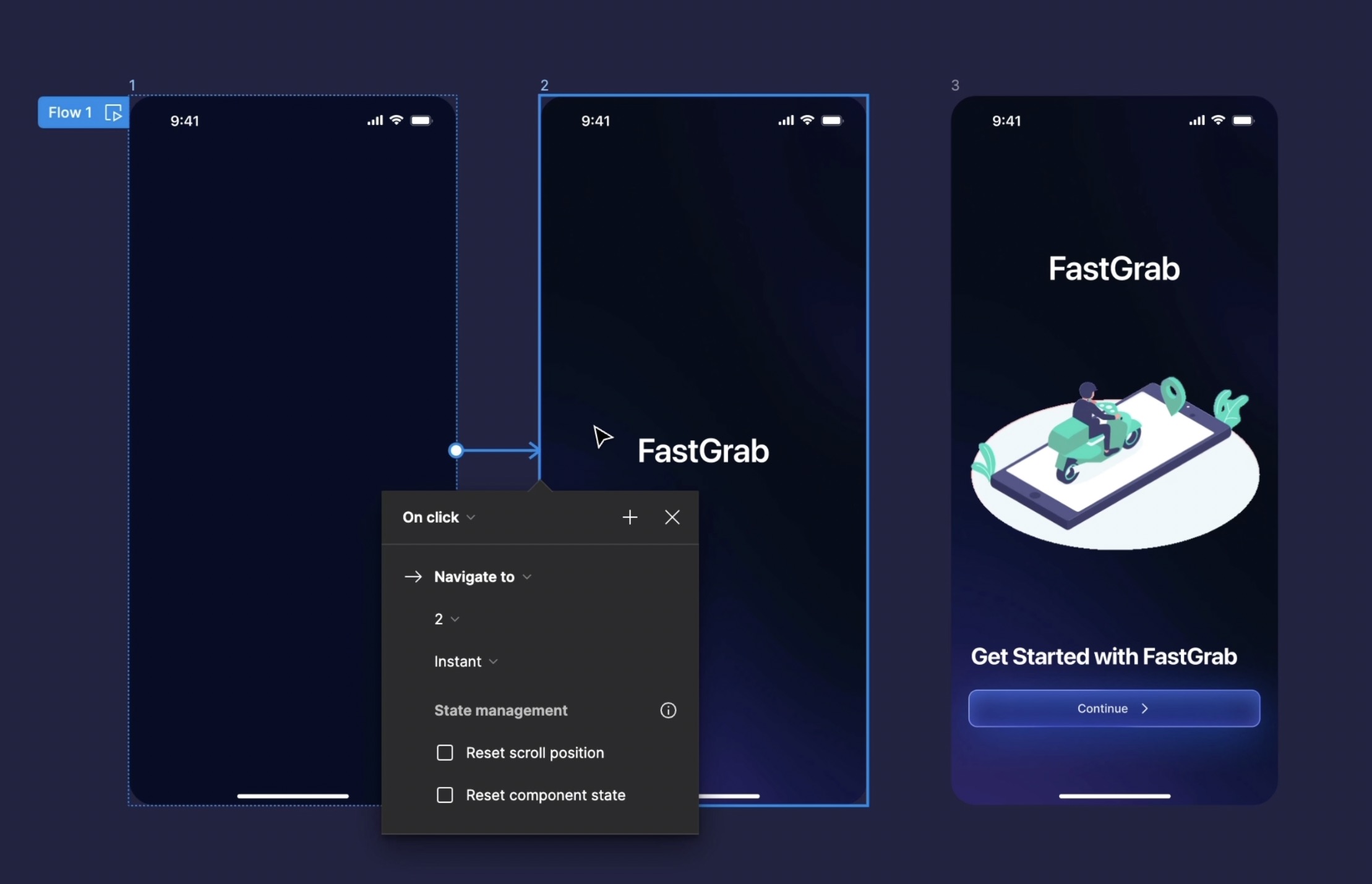
Put the lottie animation in the onboarding frame, and duplicate the onboarding frame. Select the first frame and move the elements inside the frame to the outside, except for the text, which we'll place in the center. then, we're going to duplicate this frame, and remove the animation inside and also the button, and move the text outside the frame.
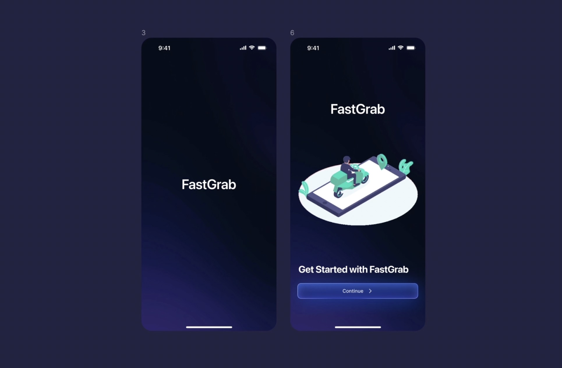
Add Interaction
- Drag a connection from the first frame to frame 2. This sets up a linkage between the two frames.
- set the interaction type to ‘After Delay’ to trigger the animation after a specified delay.
- Choose 'Smart Animate' as the animation type. This option enables Figma to automatically calculate and create smooth transitions based on differences between the connected frames.
- Select ‘Ease In and Out’ for the easing option. This will make the transition between frames appear more natural and fluid.
- Apply the same steps to connect frame 2 to frame 3, ensuring continuity in your animation flow.
![Animation, Sticky Scroll and Overlay image 6]()
On Tap and Instant
Now, let's take the sign-up and subscription screen. The interaction we will create occurs when the user presses the 'continue' button, which will lead us to the sign-up page. Of course, we would need more screens to create the actual design flow, but we will work with what we have.
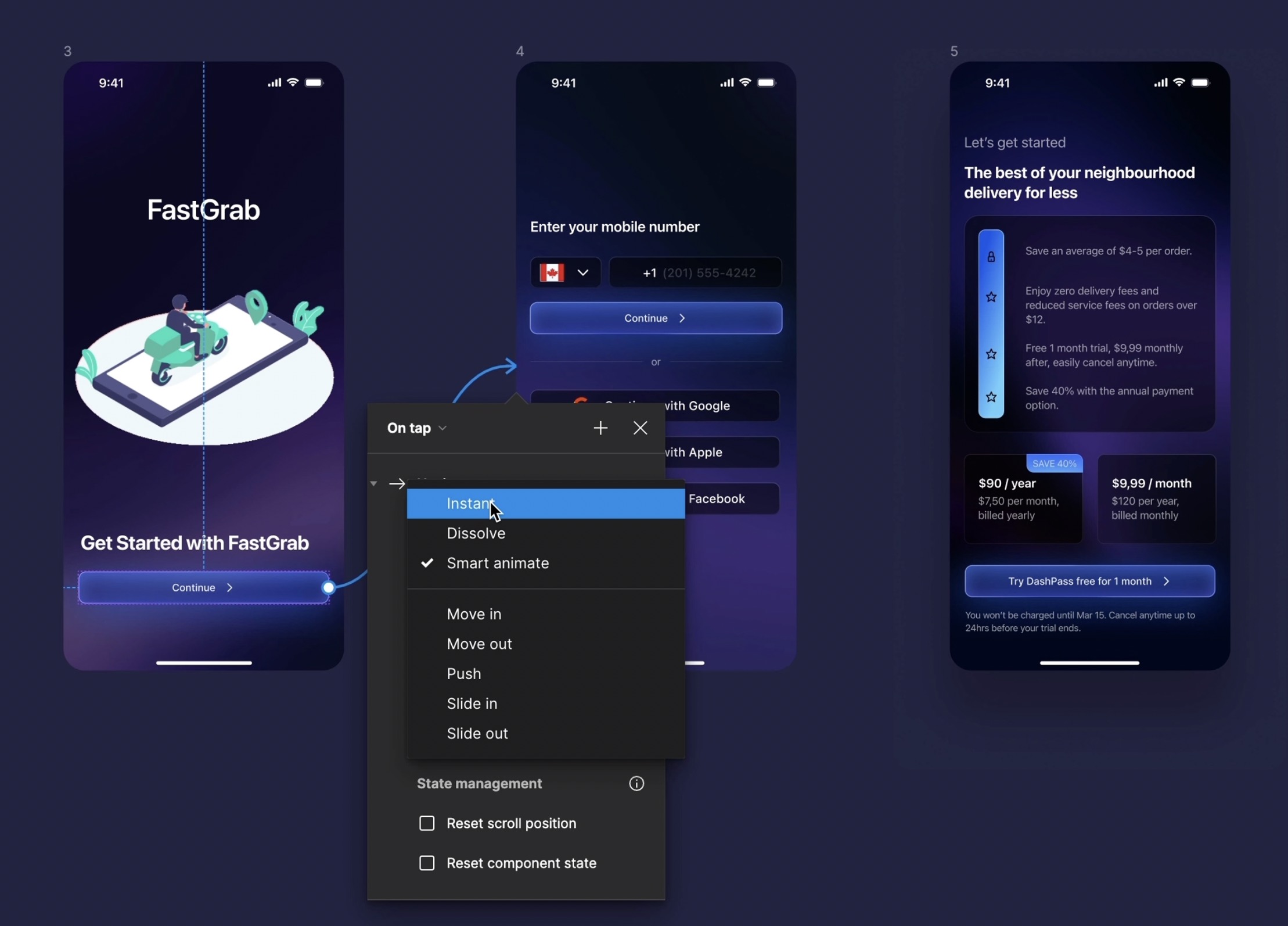
Create Lottie Animation
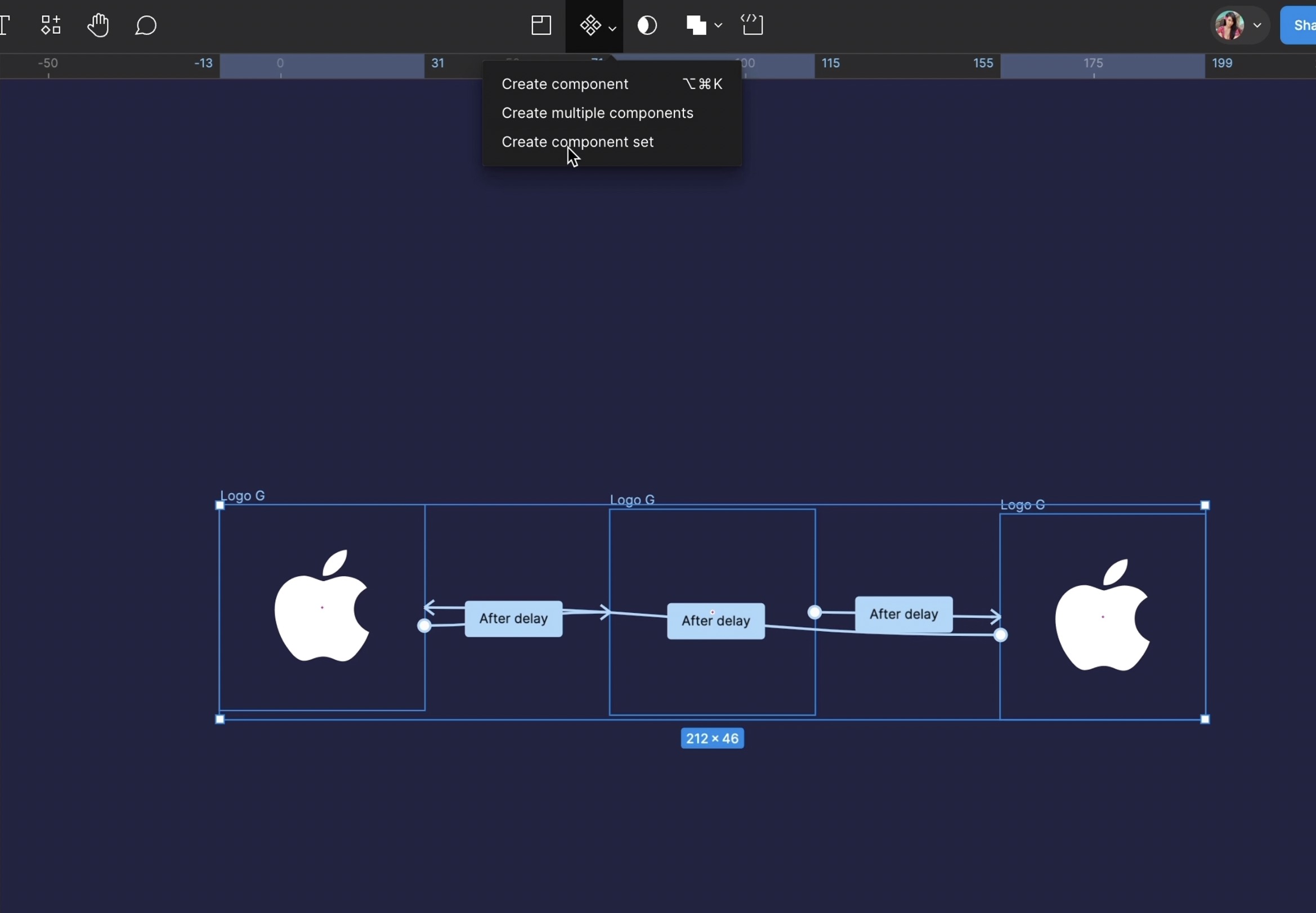
The animation is simple, just like in a real app. We can always add a bit more animation, such as with icons. Let's take the Apple logo as an example. I will show you two ways to create an animation, the first by creating your own Lottie.
- Select the apple logo, duplicate two more, we will set the first logo to rotate to 50, and the third to rotate to -50. Then, we'll add an interaction 'after layer' and 'smart animate' with a 1 millisecond delay.
- After that, open the Lottie plugin, go to the 'export to Lottie' section, choose 'select prototype flow,' and select flow
- You can view your animation and then click 'Insert as GIF.' Feel free to continue experimenting; this is just a simple example.
-
Next, scale it down and replace the logo on the sign-up screen
Interactive Components
We will use interactive components to create a dynamic animation effect where a component appears to 'bounce'. Interactive components in Figma are elements within your designs that exhibit specific behaviors based on user interactions, such as clicks or mouse-overs, without requiring additional prototyping. They help simulate real-world interactions directly in your mockups.
- Create Three Frames: Begin by designing three separate frames for the component. The first frame will be the starting position. The second frame will move upward and temporarily out of view, creating the illusion of a bounce. The third frame will bring the component back down to its original position. Alternatively, you can simplify the animation with just two frames, with the second frame serving as both the peak and return of the bounce.
- Apply Interactions: Assign interactions to these frames. Set the transition between the first and second frames, then from the second to the third frame (or back to the first if using two frames). This creates the bouncing effect.
- Create Component Set: Convert these frames into a component set. This enables you to manage and replicate the interaction more easily across different parts of your design.
- Replace and Preview: Replace any placeholder elements with your actual design elements, such as logos or icons, and use the preview mode to test the interaction.
- Apply to Other UI Elements: Use the same principle to create interactive components for other UI elements like steppers, buttons, and checkboxes. For instance, in a stepper, when a user clicks to add an item, increase the displayed number and highlight the '+' button.
- Link Interactions: For elements like buttons, add an on-click event that triggers an immediate response or links to another frame or page in your design.
![Animation, Sticky Scroll and Overlay image 8]()
Scrolling
Creating a scrolling prototype allows users to interact with your design as they would with a webpage or mobile app by scrolling through content. This feature is particularly useful for designing long or overflow pages where all content can't be viewed at once.
- Set Up Your Home Screen: Start by ensuring you have a home screen frame designed. This frame should represent the main view where you want to implement scrolling.
- Create Interaction: Design an interaction where a button leads to the home screen. For this transition, select 'Move in' from the right as the type of animation, giving the appearance that the home screen slides into view.
- Prepare the Scrollable Frame: Inside your home screen frame, place a larger frame that extends beyond the boundaries of the home screen. This larger frame should contain all the content you want to be scrollable.
- Enable Scrolling: Select your larger frame and go to the 'Overflow Behavior' settings. Choose 'Vertical Scrolling' to make the content within this frame scroll vertically. This setting allows users to scroll up and down through the content within the boundaries of the home screen frame.

Sticky Scroll
A sticky scroll feature in design allows certain elements, like a navigation bar or menu, to remain visible at a specific position on the screen while other parts of the page continue to scroll. This is useful for keeping important controls or information readily accessible to users as they navigate through your content.
- Create Initial Interaction: Begin by setting up an interaction where clicking on a restaurant option takes the user to a detailed page of that restaurant. Ensure this transition is smooth and intuitive.
- Fix Elements: Make sure elements like the status bar, navigation bar, and home indicator remain fixed and do not scroll with the rest of the content. This can be done by setting their position to 'Fixed' in the properties.
- Prepare Scrollable Content: Create a frame for the scrollable content. Place all the elements you want to scroll (excluding the menu and fixed elements) inside this frame.
- Set Up Sticky Menu: To make the menu sticky, first create a new frame for the menu that is slightly larger than the menu itself. Align the menu at the bottom of this new frame. This frame will act as the parent frame.
- Adjust Sticky Behavior: Select the parent frame and set its scrolling behavior to 'Sticky on Top'. Then, ensure the menu scrolls with the parent. This setup prevents the menu from hiding behind any top elements like the status bar.
- Add Design Details: Add some padding around the menu for aesthetics. Fill the menu background with black, and apply a background blur for a sleek look.
- Preview the Prototype: Finally, preview your prototype to see how the sticky menu behaves as you scroll. Make adjustments as necessary to ensure a smooth user experience.

Menu and Checkout Interactions
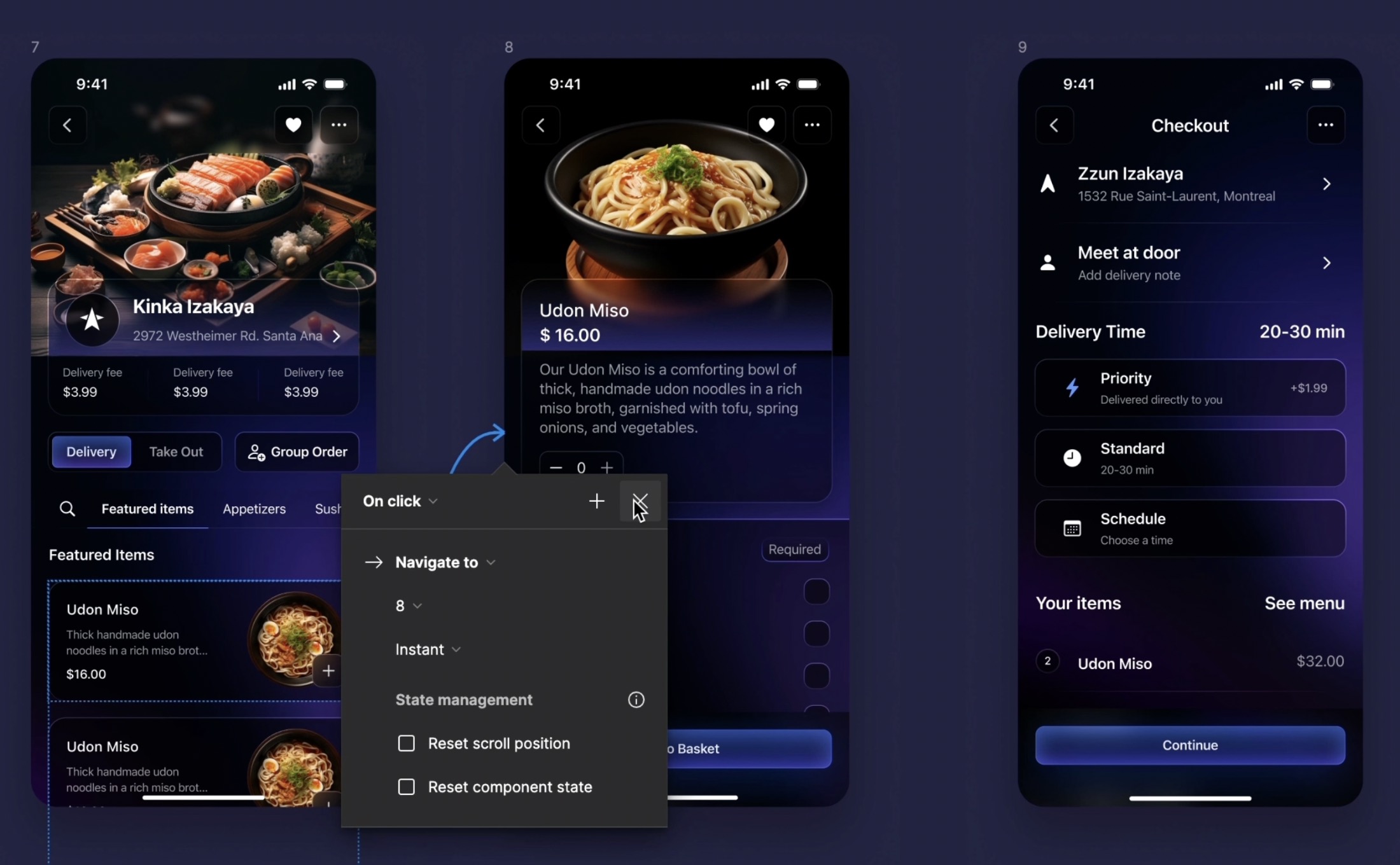
Learn how to link meal selections to the checkout screen and manage item quantities directly within your design.
- Create Screen Connections: Ensure you have both the menu selection screen and the checkout screen designed. Establish a connection from a selected meal on the menu screen to the meal selection screen.
- Adjust Quantities: For removing an item, set up an interaction where clicking a minus button decreases the number of that item. Ensure that the minus button visually responds to being selected, indicating that it's active.
Overlay
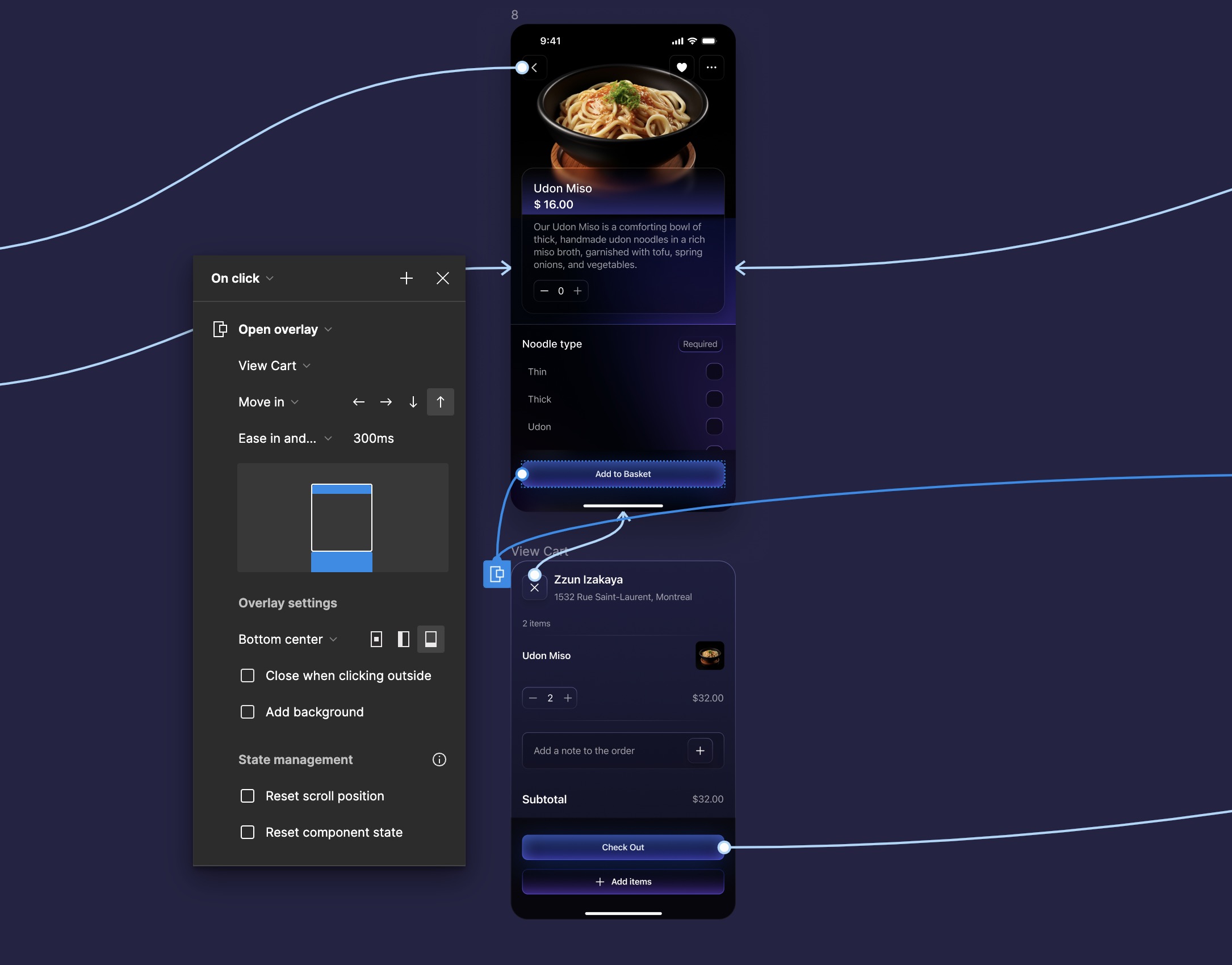
An overlay is a design element that appears on top of the current screen to display additional content like menus, modals, or dialogues without navigating away from the current view. This feature is crucial for enhancing user interaction without losing the context of the existing screen.
- Prepare Overlay Elements: Ensure you have designed elements like a side menu and a view cart modal, which you want to display as overlays.
- Set Trigger for Overlay: Select the button or element that will trigger the overlay. This could be a 'View Cart' button for the cart modal or a 'Menu' icon for the side menu.
- Link to Overlay Frame: Drag the prototyping node from the trigger button to the overlay frame. This connects the button to the overlay.
- Configure Overlay Settings: In the interaction details pane, choose 'Open Overlay.' Set the overlay to move in from the bottom and align to the bottom center for the cart modal. For the side menu, set it to slide in from the right and position it at the top left.
- Manage Overlay Behavior: Disable the option that allows users to close the modal by clicking outside. Instead, add an interaction to the close button specifically to remove the modal when clicked.
Conclusion
This guide has shown you the essential steps to create a functional and straightforward prototype. By following these steps, you can build prototypes that are both impressive and practical, showing how users will interact with the final product. Remember, successful prototyping involves constant refinement based on feedback and testing to improve user experience. Congratulations on creating your delivery food app prototype and learning how to bring it to life!
Templates and source code
Download source files
Download the videos and assets to refer and learn offline without interuption.
Design template
Source code for all sections
Video files, ePub and subtitles
Videos
1
Introduction to UI/UX Design
Finding inspiration with Mobbin and transforming ideas into unique designs using Figma
5:39
2
UI Kits and Templates
Accelerating design efficiency by using UI kits and templates
8:18
3
Shapes, Gradients and Strokes
Design a smart home iOS App and learn to use shapes, gradients, and strokes to create a thermostat interface
15:15
4
Icons, Typography, and Styles
Improve the design of our smart home application with icons, typography, and effects
9:43
5
Auto Layout, Constraints and Pen tool
Adding finishing touches on our design with Auto Layout, constraints. Use the Pen Tool to create intuitive controls
16:23
6
UX Research and Design Flows
Diving Deeper into UX Research and the Importance of Designing User Flows
16:19
7
Styles and Plugins
Exploring Figma Tools and Plugins to Enhance Creativity and Efficiency
13:09
8
Animation, Sticky Scroll and Overlay
Bridging Design and Interaction with a Step-by-Step Guide to Prototyping
10:13
9
Flat Design and Light Mode
Exploring the Essentials of Flat Design and Light Mode for a Cleaner and More Intuitive User Experience
16:57
10
Visual Hierarchy and Information Architecture
Explore the role of visual hierarchy in UI design and learn to structure and organize content to improve a product's usability
11:07
11
Typography and Colors Variable
Learn How to Streamline Your Designs with Typography and Color Variables
14:34
Meet the instructor
We all try to be consistent with our way of teaching step-by-step, providing source files and prioritizing design in our courses.
Sourasith Phomhome
UI Designer
Designer at Design+Code
19 courses - 72 hours

Master AI Prompting for Stunning UI
Learn how to leverage AI tools like Aura for creating beautiful designs, working with templates, and experimenting with advanced prompts. A concise guide for designers and developers to level up their skills.
10 hrs

Design Multiple Apps with Figma and AI
In this course, you’ll learn to design multiple apps using Figma and AI-powered tools, tackling a variety of real-world UI challenges. Each week, a new episode will guide you through a different design, helping you master essential UI/UX principles and workflows
4 hrs

SwiftUI Fundamentals Handbook
A comprehensive guide to mastering Swift programming fundamentals, designed for aspiring iOS developers. This handbook provides a structured approach to learning Swift's core concepts, from basic syntax to advanced programming patterns. Through carefully sequenced chapters, readers will progress from essential programming concepts to object-oriented principles, building a solid foundation for SwiftUI development. Each topic includes practical examples and clear explanations, ensuring a thorough understanding of Swift's capabilities. This handbook serves as both a learning resource and a reference guide, covering fundamental concepts required for modern iOS development. Topics are presented in a logical progression, allowing readers to build their knowledge systematically while gaining practical programming skills.
2 hrs

Design and Code User Interfaces with Galileo and Claude AI
In this course, you’ll learn how to use AI tools to make UI/UX design faster and more efficient. We’ll start with Galileo AI to create basic designs, providing a solid foundation for your ideas. Next, we’ll refine these designs in Figma to match your personal style, and finally, we’ll use Claude AI to turn them into working code—eliminating the need for traditional prototyping.
4 hrs

Design and Prototype for iOS 18
Design and Prototype for iOS 18 is an immersive course that equips you with the skills to create stunning, user-friendly mobile applications. From mastering Figma to understanding iOS 18's latest design principles, you'll learn to craft two real-world apps - a Car Control interface and an AI assistant.
3 hrs

Master Responsive Layouts in Figma
Creating responsive layouts is a must-have skill for any UI/UX designer. With so many different devices and screen sizes, designing interfaces that look great and work well on all platforms is necessary. Mastering this skill will make you stand out in the field. In this course, we'll start from scratch to create this beautiful design using Figma. You'll learn how to make layouts that are easy to use and work well on any device. We'll cover key concepts and tools to help you master responsive design in Figma.
2 hrs

UI UX Design with Mobbin and Figma
Mobbin is a powerful tool for UI/UX designers seeking inspiration and innovative design solutions. This platform offers a vast collection of real-world mobile app designs, providing a treasure trove of UI elements and layouts.
2 hrs

3D UI Interactive Web Design with Spline
Learn to create 3D designs and UI interactions such as 3D icons, UI animations, components, variables, screen resize, scrolling interactions, as well as exporting, optimizing, and publishing your 3D assets on websites
3 hrs

Design and Prototype for iOS 17 in Figma
Crafting engaging experiences for iOS 17 and visionOS using the Figma design tool. Learn about Figma's new prototyping features, Dev Mode, variables and auto layout.
6 hrs

Design and Prototype Apps with Midjourney
A comprehensive course on transforming Midjourney concepts into interactive prototypes using essential design techniques and AI tools
8 hrs

iOS Design with Midjourney and Figma
Learn the fundamentals of App UI design and master the art of creating beautiful and intuitive user interfaces for mobile applications
1 hrs

UI Design for iOS, Android and Web in Sketch
Create a UI design from scratch using Smart Layout, Components, Prototyping in Sketch app
1 hrs

UI Design a Camera App in Figma
Design a dark, vibrant and curvy app design from scratch in Figma. Design glass icons, lens strokes and realistic buttons.
1 hrs

UI Design for iOS 16 in Sketch
A complete guide to designing for iOS 16 with videos, examples and design files
3 hrs

Prototyping in Figma
Learn the basics of prototyping in Figma by creating interactive flows from custom designs
1 hrs

UI Design Quick Websites in Figma
Learn how to design a portfolio web UI from scratch in Figma
1 hrs

UI Design Android Apps in Figma
Design Android application UIs from scratch using various tricks and techniques in Figma
2 hrs

UI Design Quick Apps in Figma
Design application UIs from scratch using various tricks and techniques in Figma
12 hrs

Figma Handbook
A comprehensive guide to the best tips and tricks in Figma. Not affiliated with or endorsed by Figma, Inc.
6 hrs

