
UI Kits and Templates
Add to favorites
Accelerating design efficiency by using UI kits and templates
Play video
UI UX Design with Mobbin and Figma
1
Introduction to UI/UX Design
5:39
2
UI Kits and Templates
8:18
3
Shapes, Gradients and Strokes
15:15
4
Icons, Typography, and Styles
9:43
5
Auto Layout, Constraints and Pen tool
16:23
6
UX Research and Design Flows
16:19
7
Styles and Plugins
13:09
8
Animation, Sticky Scroll and Overlay
10:13
9
Flat Design and Light Mode
16:57
10
Visual Hierarchy and Information Architecture
11:07
11
Typography and Colors Variable
14:34

UI Kits
UI kits are a treasure chest for designers. They contain premade design elements that can be used to kick-start projects, maintain consistency and inspire creativity. They are comprehensive collections of design elements, including icons, buttons, typography, color schemes, and navigation menus, all designed to adapt to your design needs efficiently without starting from scratch for each project.

Templates
Templates provide pre-designed page or app layouts, including common UI elements. They're a starting point for creating page layouts, helping visualize and refine ideas early in the design process. They're particularly useful for beginners, offering insights into effective design practices.

Top Resources for Designers
Here are my top UI kits and template resources, which are very useful for beginners in this field. You can analyze and work with professionally designed UI kits, which can be a great learning experience. They help you understand the best design practices and discover new design approaches.
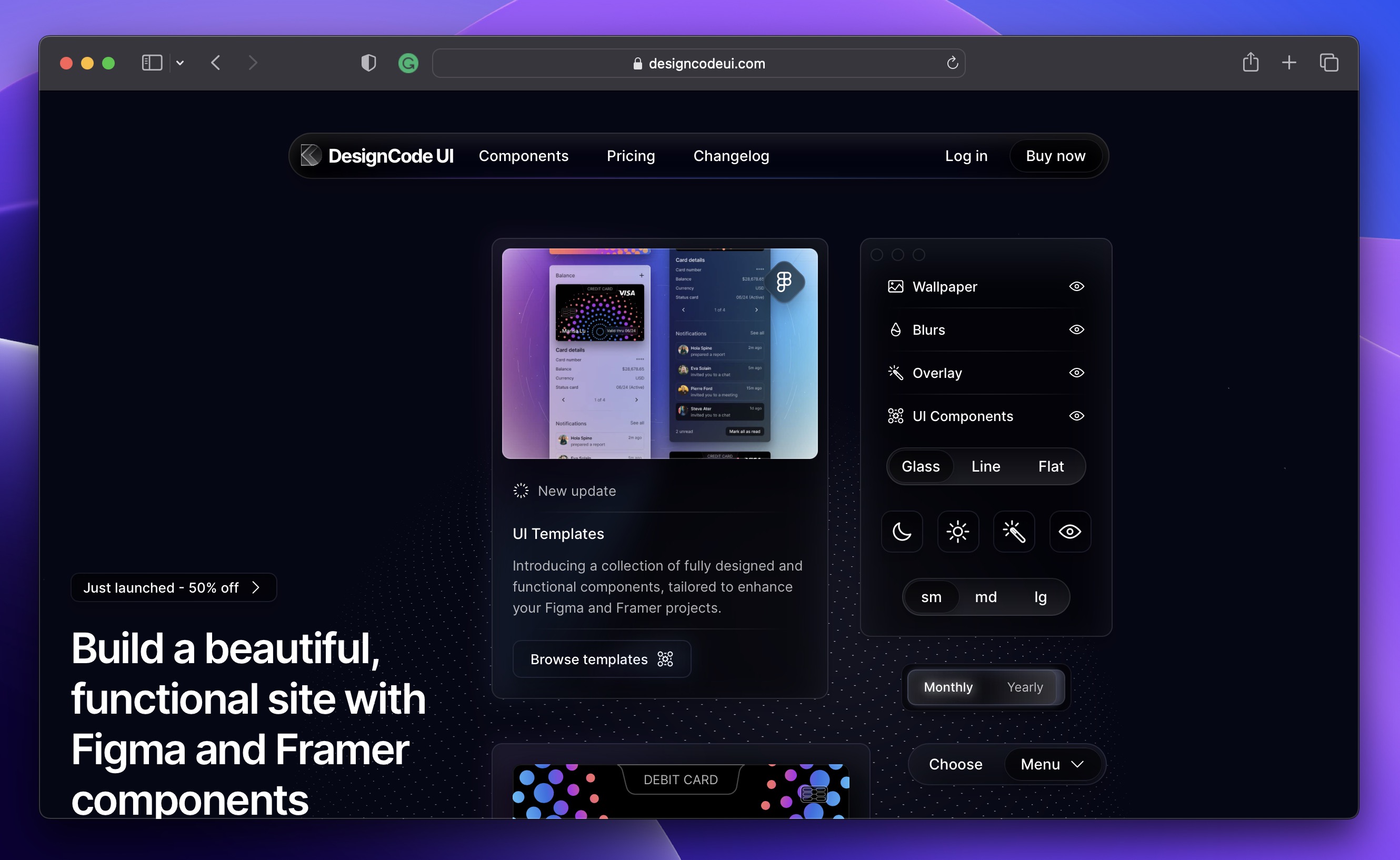
DesignCode UI Kit
DesignCode UI is our expansive design system with hundreds of Figma UI components and templates, ready for Framer integration. Meticulously organized with variables, variants, and adaptive layouts, our extensive UI kit is made from decades of UI/UX design expertise. Of course, for those who don't have access to the full library, we will use the free version of DesignCode UI . However, you may not have access to everything, you may not be able to add the library to your Figma file, and you'll have to copy and paste the original file into your page.
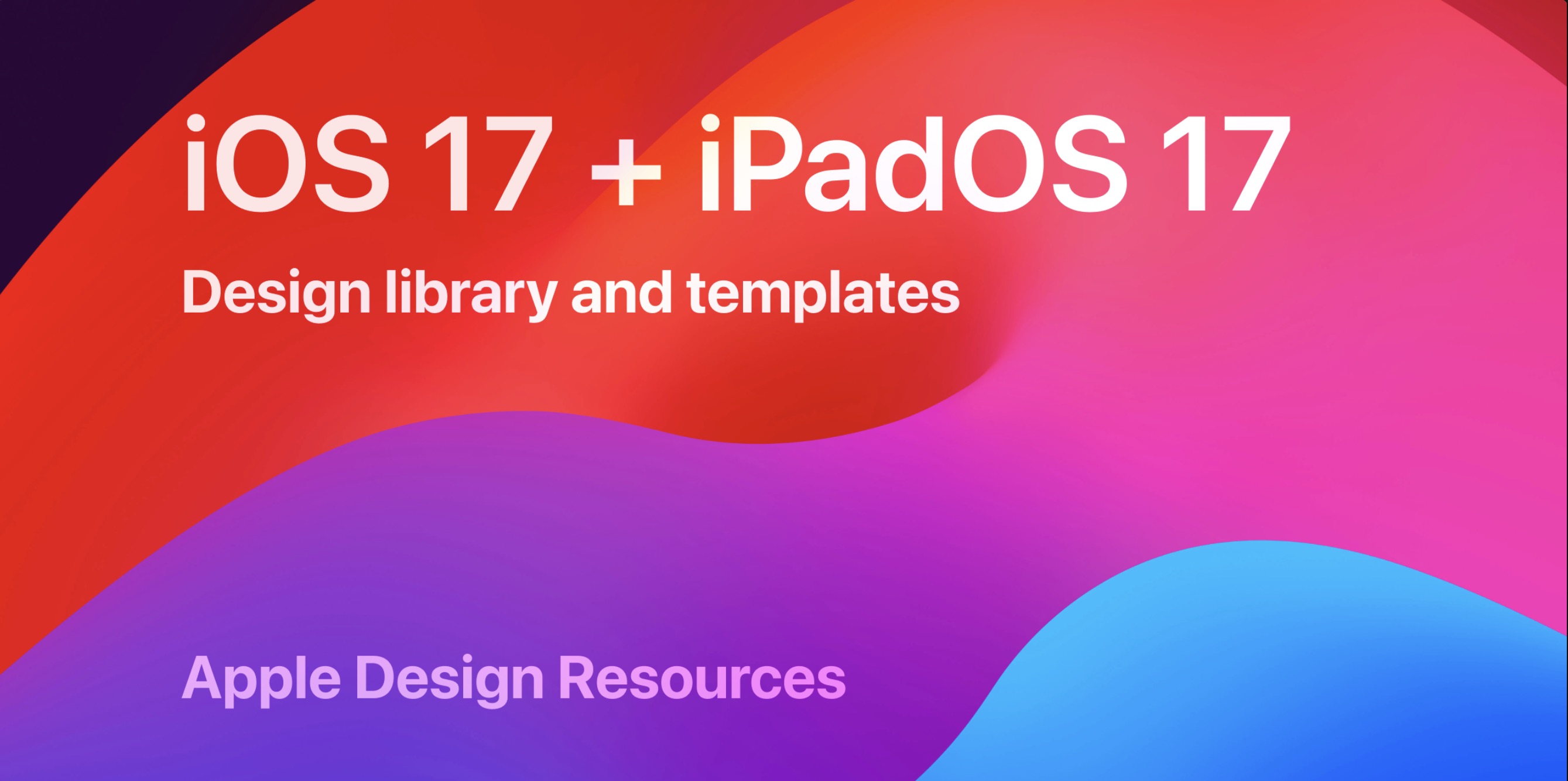
Apple Design Resources
Apple Design Resources provide a comprehensive collection of materials and tools to help designers and developers create applications that adhere to Apple's design principles. These resources include user interface (UI) elements, templates, and guidelines for various Apple platforms like iOS, macOS, watchOS, and tvOS.
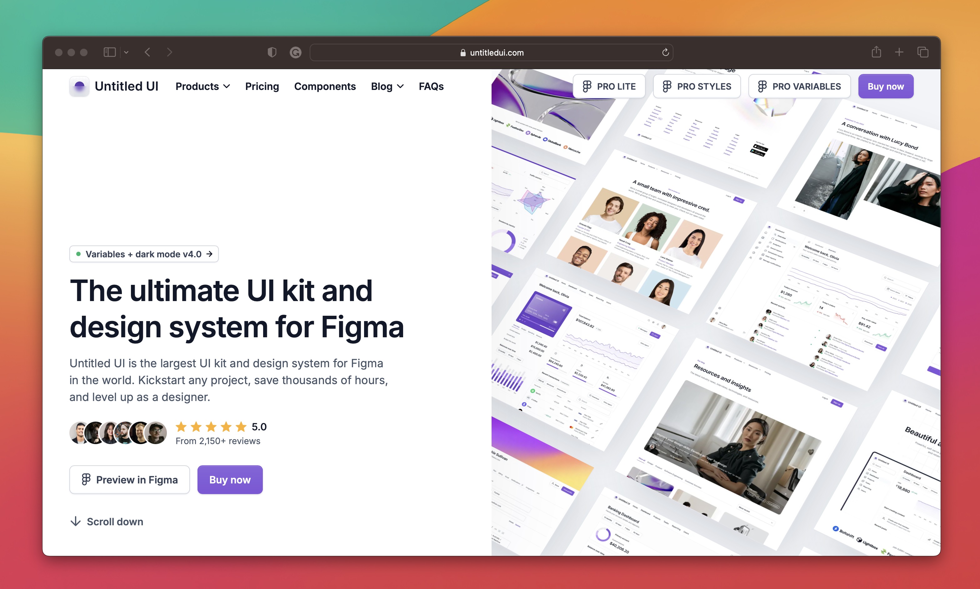
Untitled UI
Untitled UI is a versatile and comprehensive UI kit designed to accelerate the design process for digital products. It offers a vast collection of pre-designed components, layouts, and templates that can be easily customized to fit various projects.
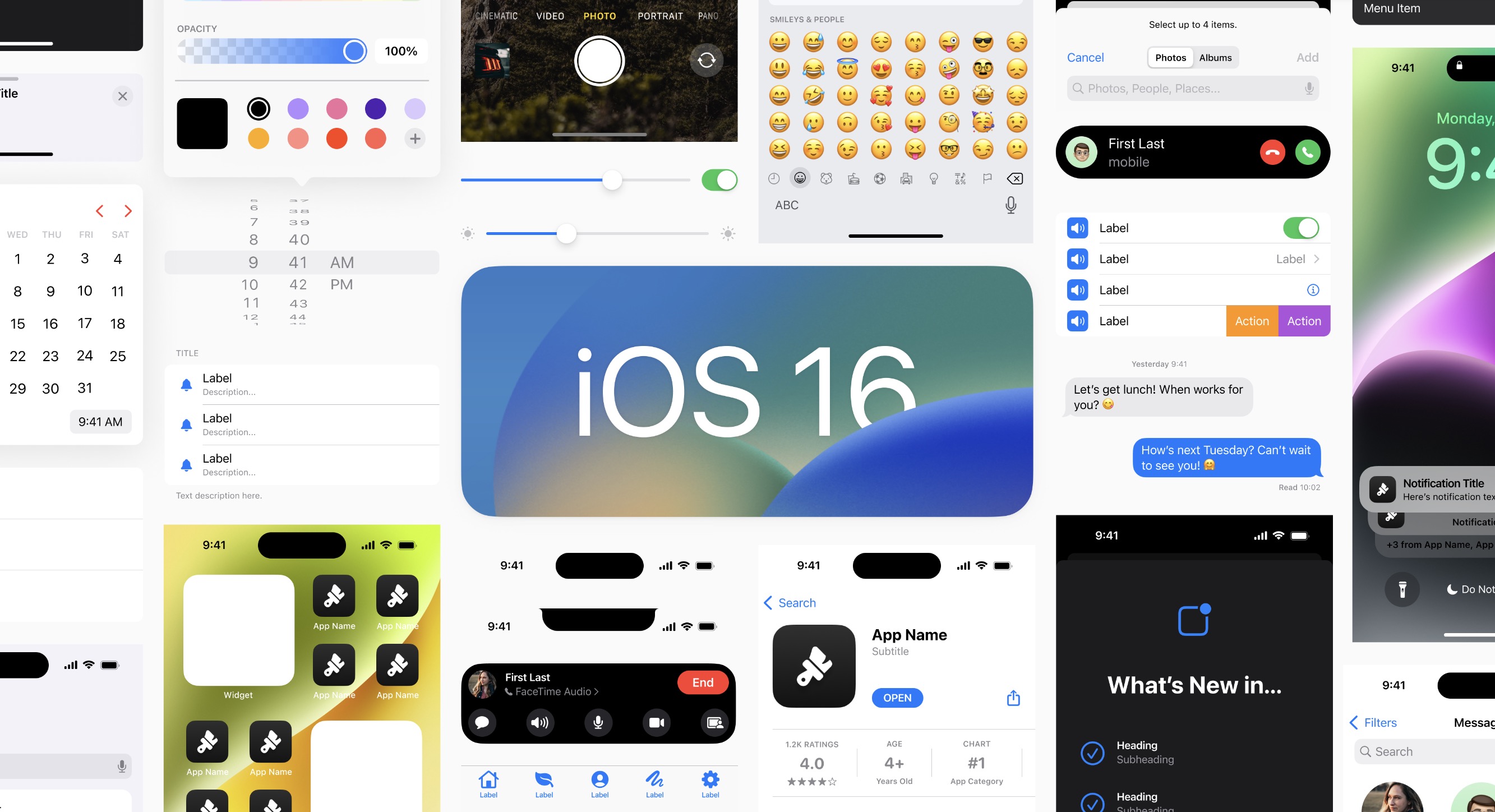
iOS 16 UI Kit for Figma
The iOS 16 UI Kit for Figma is a specific toolkit designed to help designers create interfaces for iOS 16 applications using the Figma design tool. It includes a wide array of UI elements, icons, templates, and components that are consistent with the design language introduced in iOS 16.
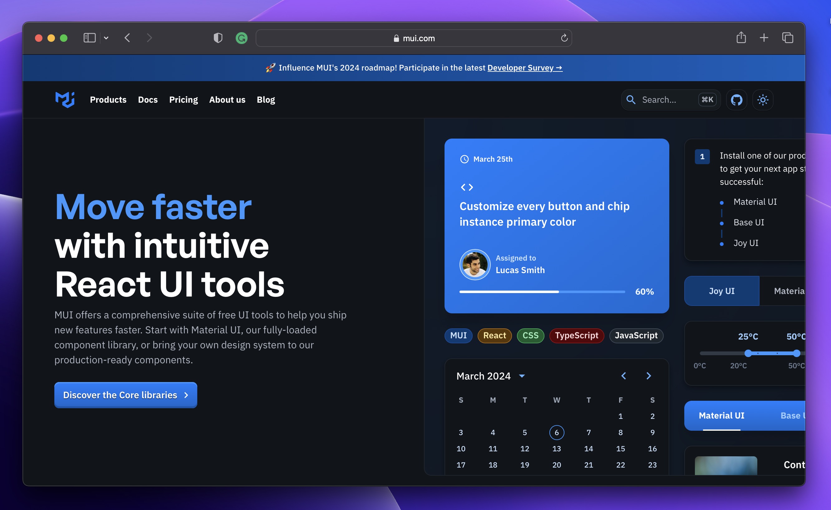
Material UI
Material UI is a popular open-source framework that implements Google's Material Design guidelines through a set of React components. It provides a robust and customizable set of UI tools that help developers build engaging and consistent user interfaces for web applications quickly.
UI8
UI8 offers a wide range of ready-made components, templates, and icons, making it a go-to resource for designers. It not only ensures a consistent look but also speeds up the design process, helping designers create user-friendly interfaces efficiently.

Getting Started
Before we begin, ensure you have both my Figma file and the DesignCode UI kit ready. Once you're all set, let's dive into the design process.
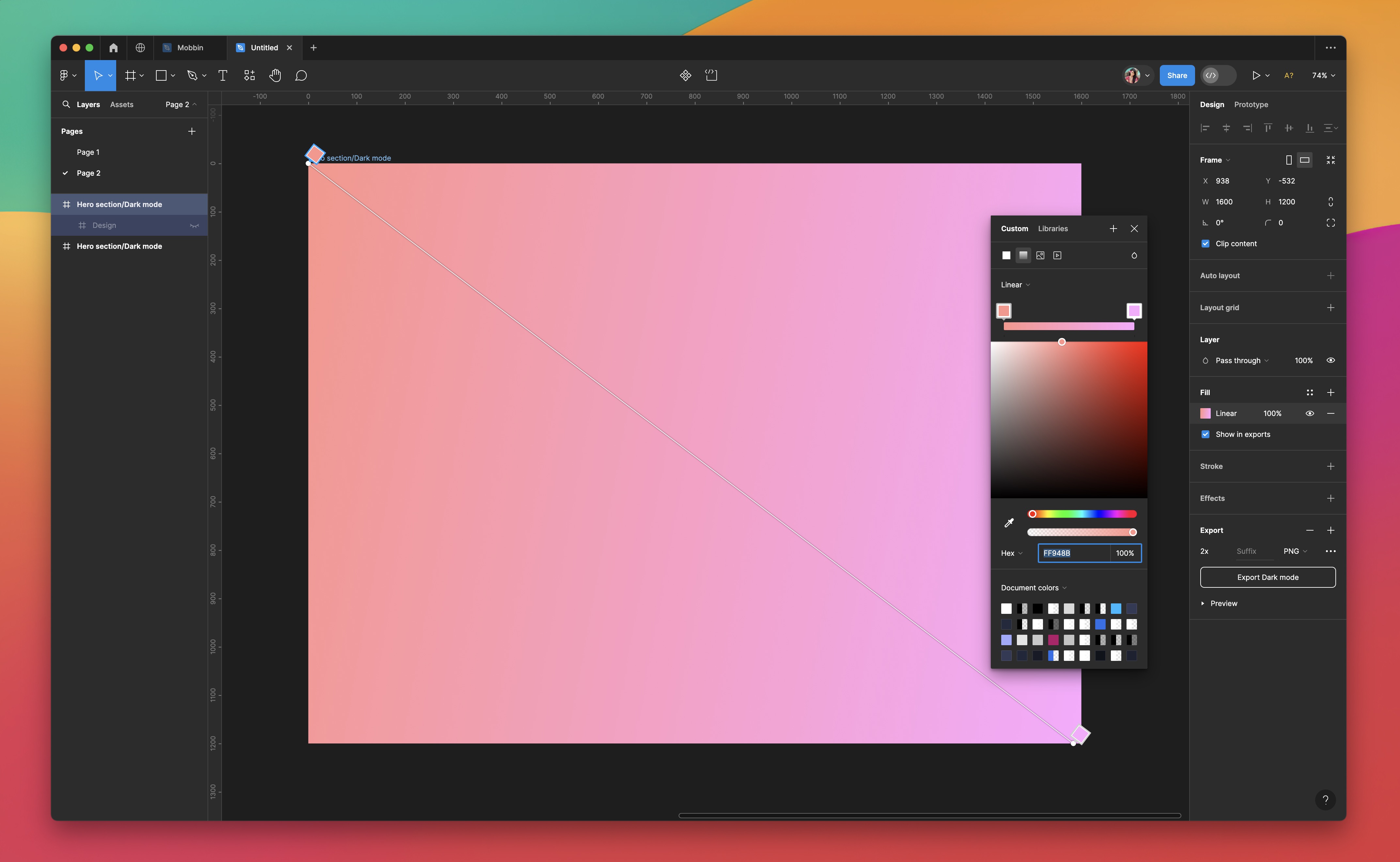
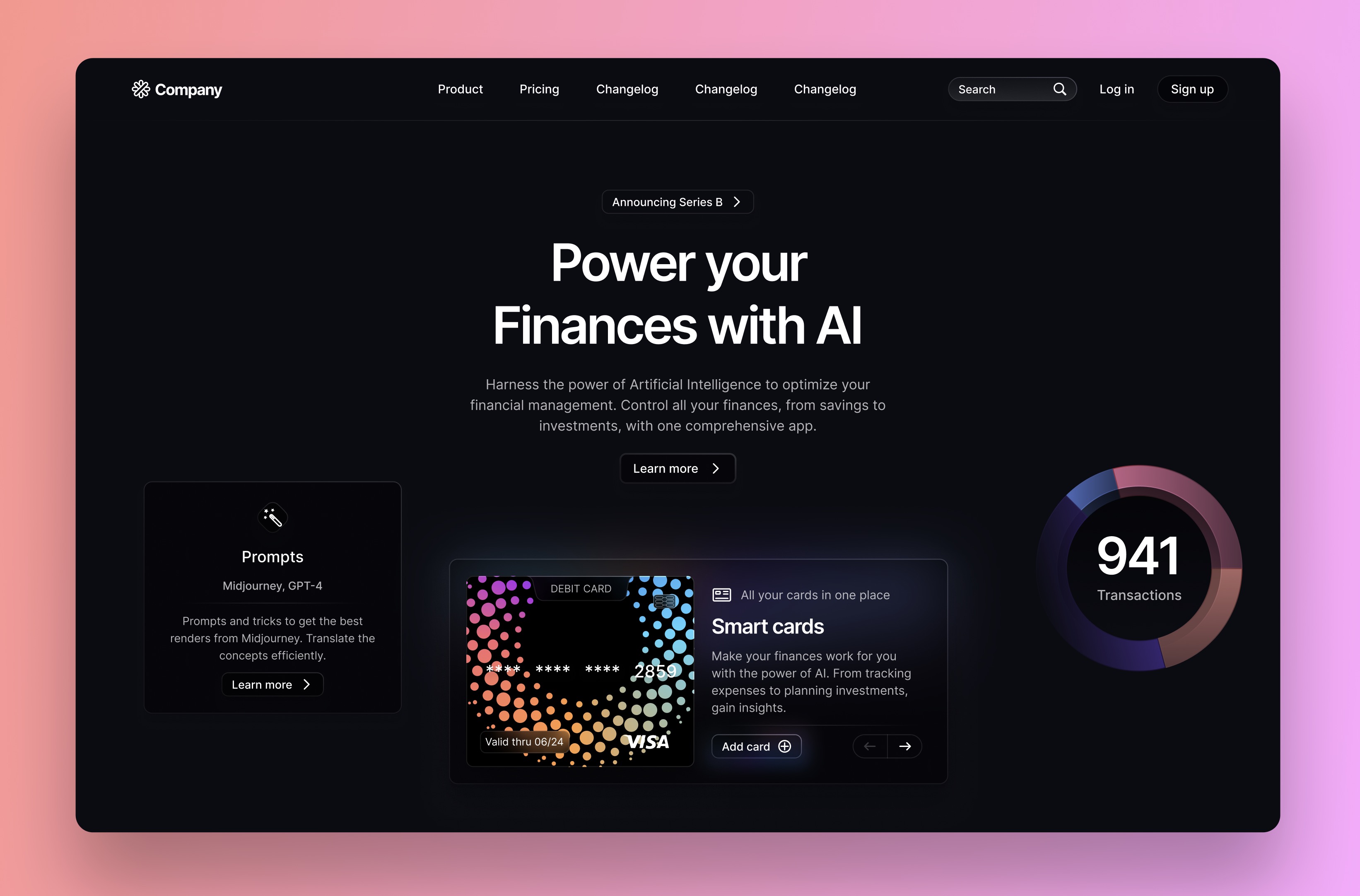
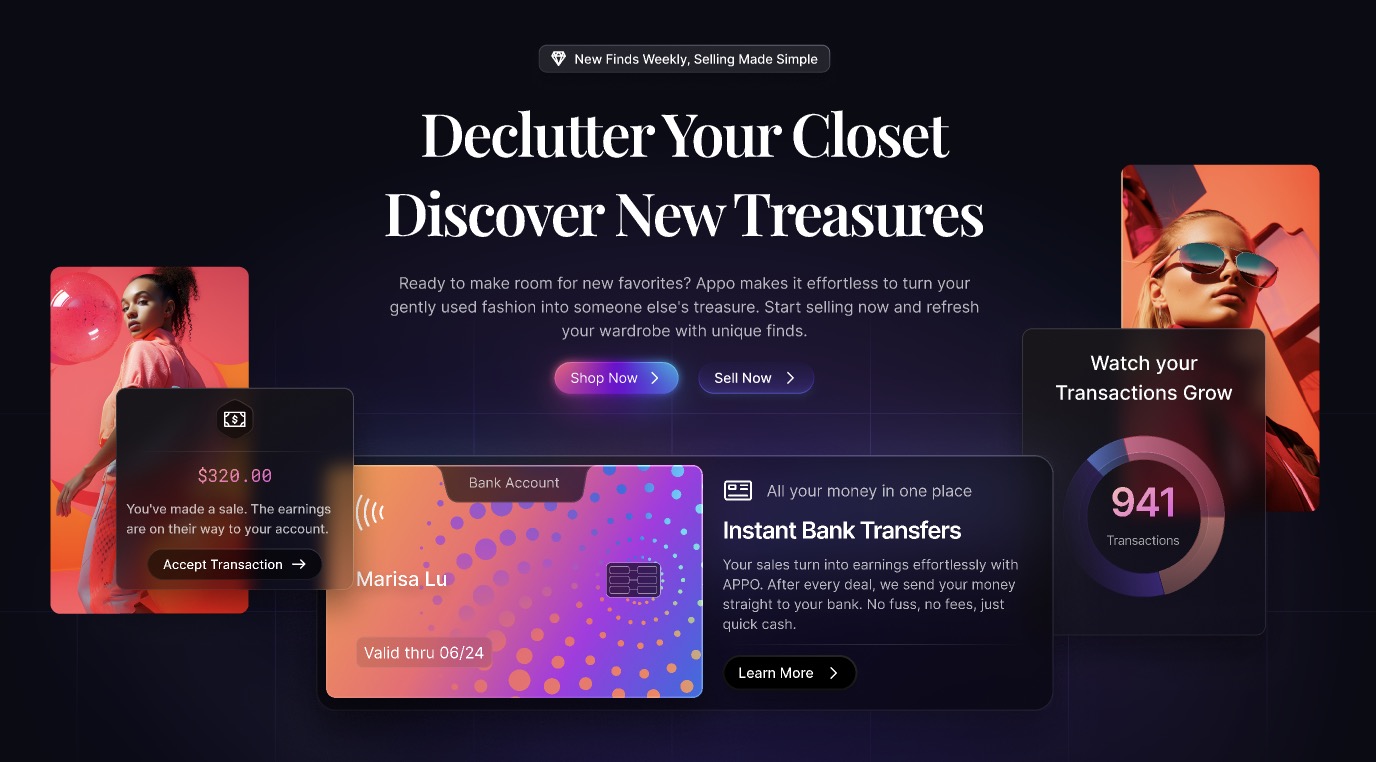
Setting Up the Presentation Frame
- Create Frame: Press F to create a new frame.
- Adjust Size: Set the frame size to 1600x1200 for presentation purposes.
- Apply Gradient: Use the color picker to set a gradient background. Start with the first color #FF948B and end with the second color #FDA8FF. Align the gradient diagonally for a dynamic look.
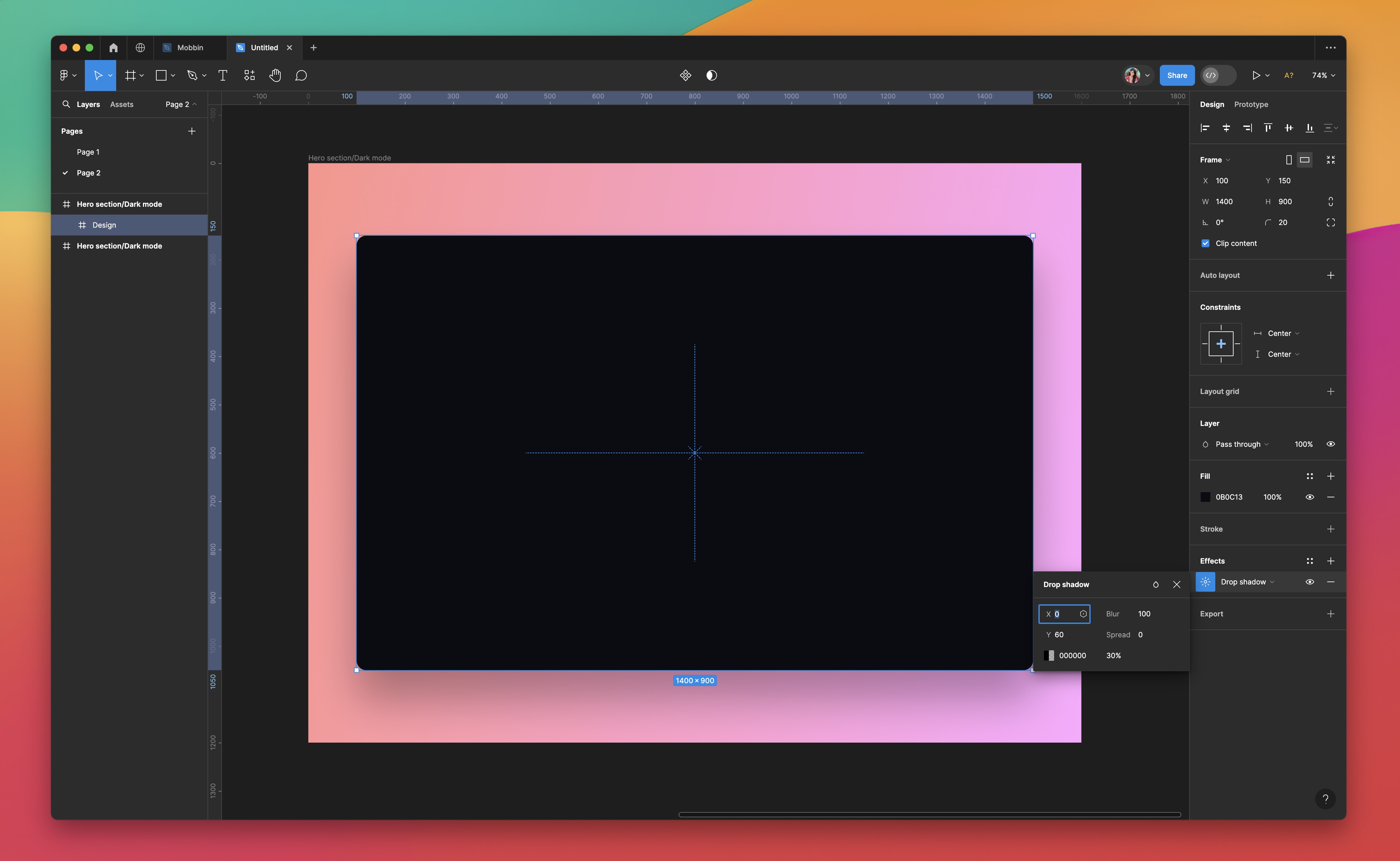
Adding the Content Frame
- Insert Inner Frame: Create another frame within the main one for your content, with dimensions 1400x900.
- Background Color: Fill this frame with a dark shade #0B0C13 to contrast the bright outer frame.
- Styling: Round the corners to 20px for a softer look, and add a drop shadow with Y=60, Blur=100, and 30% opacity in black for depth.
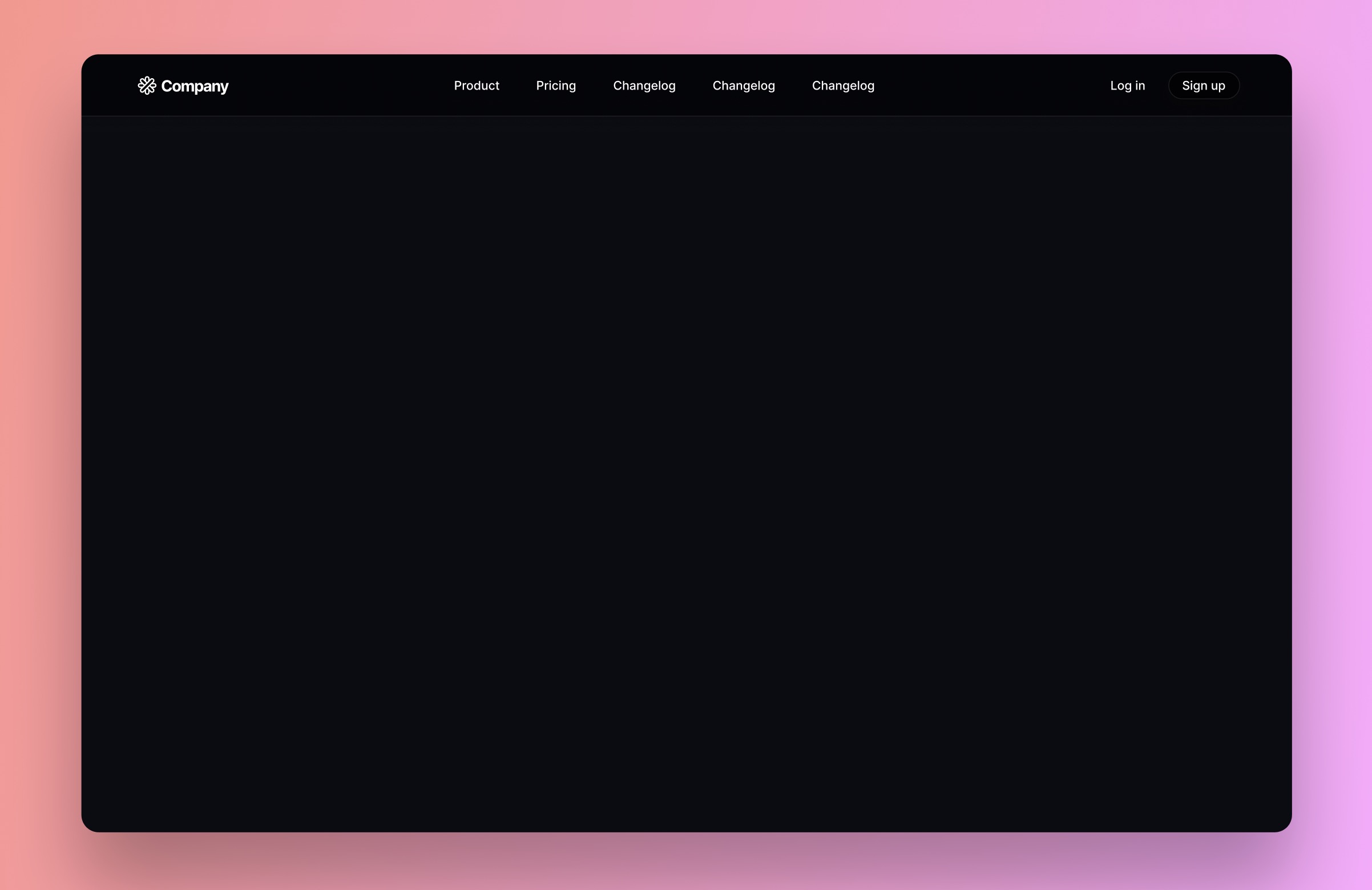
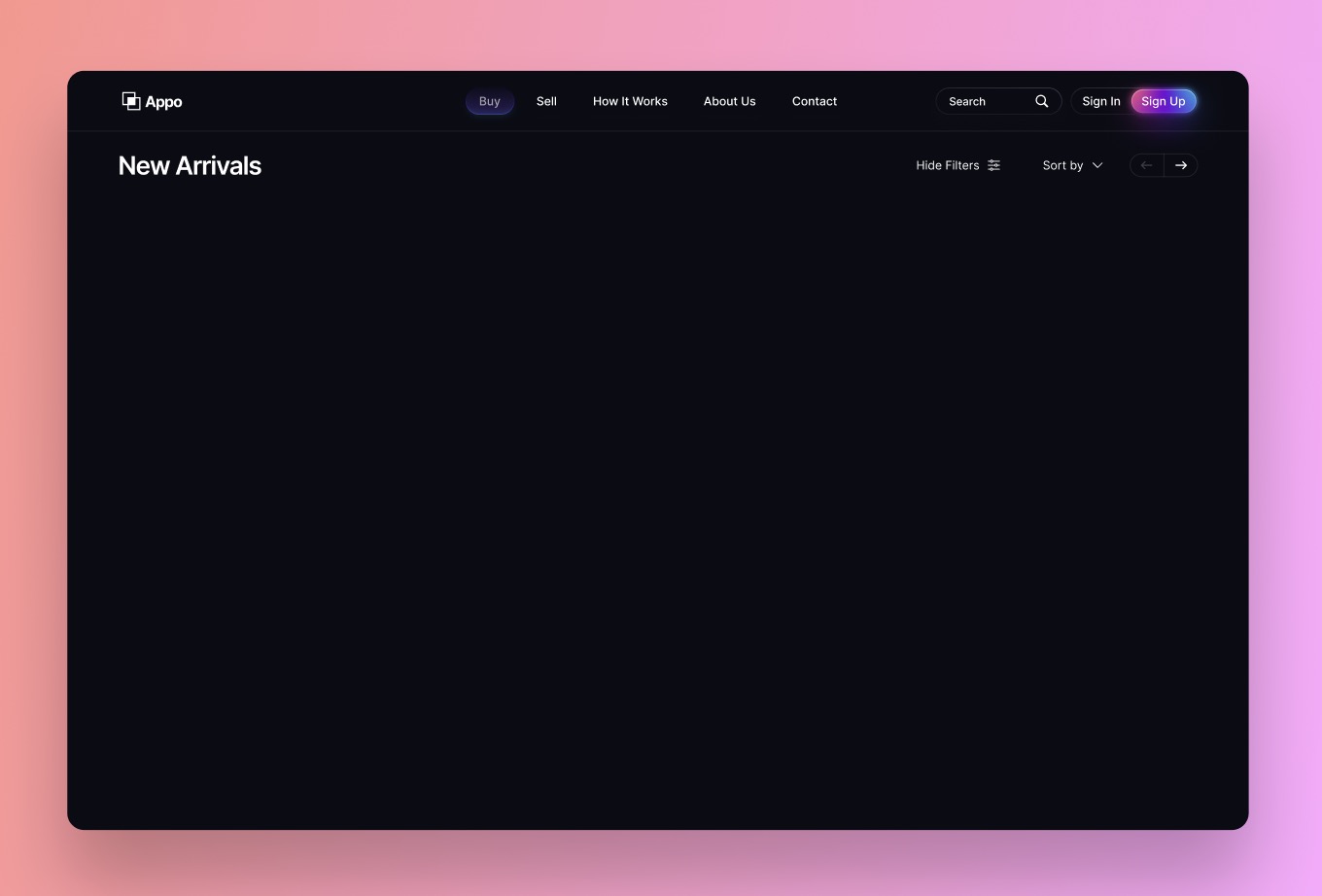
Navigation Bar
- Select Components: Choose the navigation bar component from the UI kit.
- Detach Instance: To customize, right-click the component and select Detach Instance.
- Resize and Layout: Adjust the width to 1400px to span the entire content frame. Organize the layout to have the logo on the left, menu in the center, and login/signup on the right.
- Ungroup for Customization: Ungroup the left content within the navigation bar for individual element adjustments.
Adding a Searchfield
- Insert Search: Place the Search in the left content.
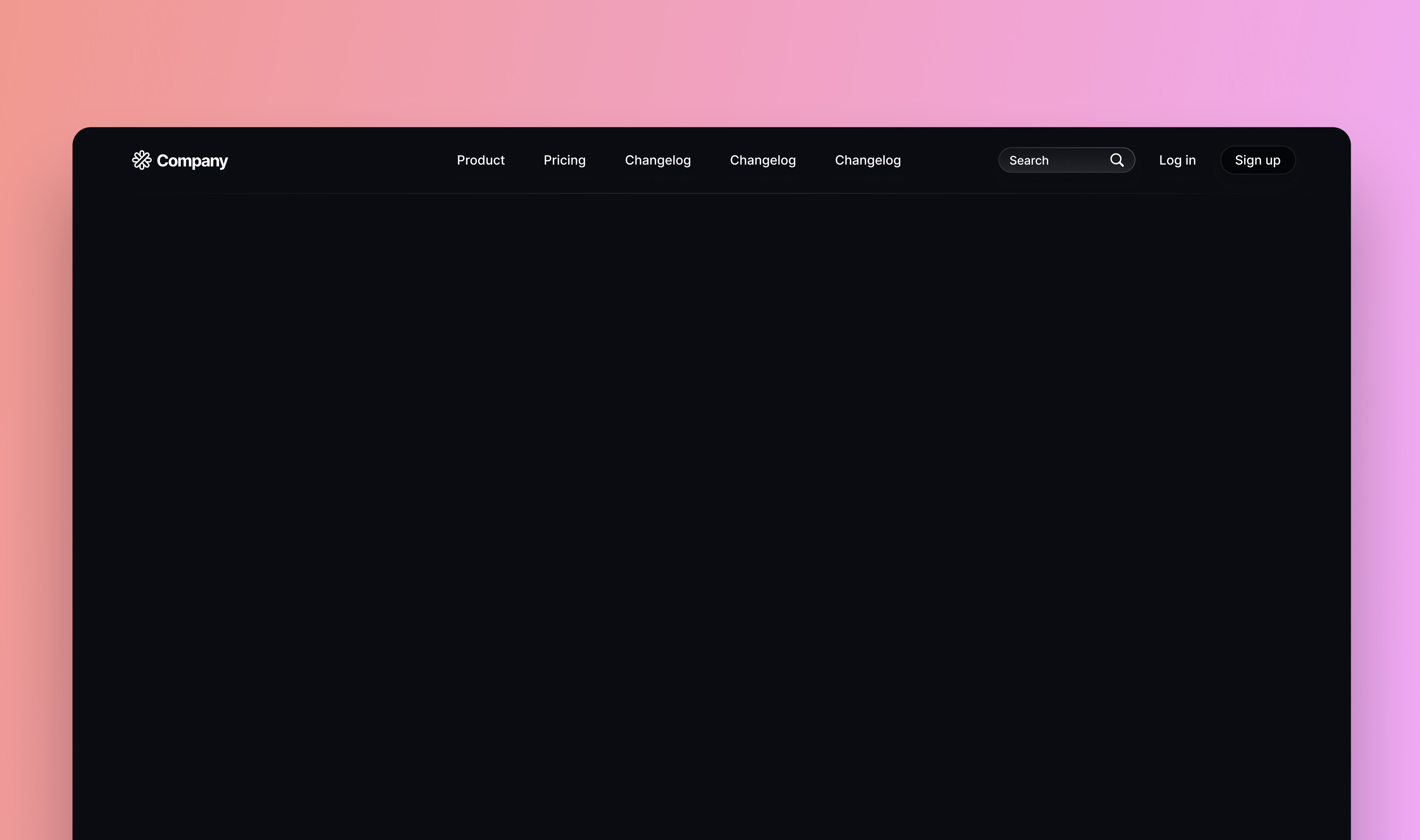
Adding a Divider
- Insert Divider: Place a 1400px wide divider at the bottom of the navigation bar.
- Auto Layout: Enable auto layout for this element and name the layer appropriately for easy identification.

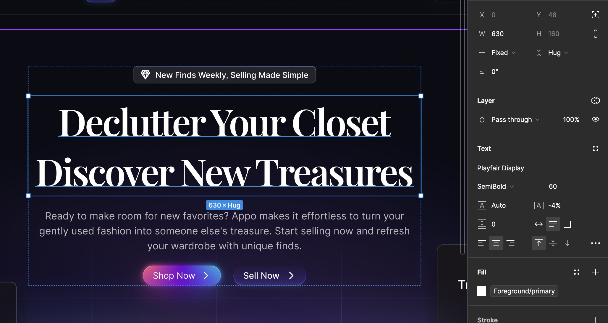
Inserting Hero Text
- Find Component: Look for the "Text Block Large" component in the Typography page.
- Placement: Position this component prominently to serve as the main headline or hero text of your design.
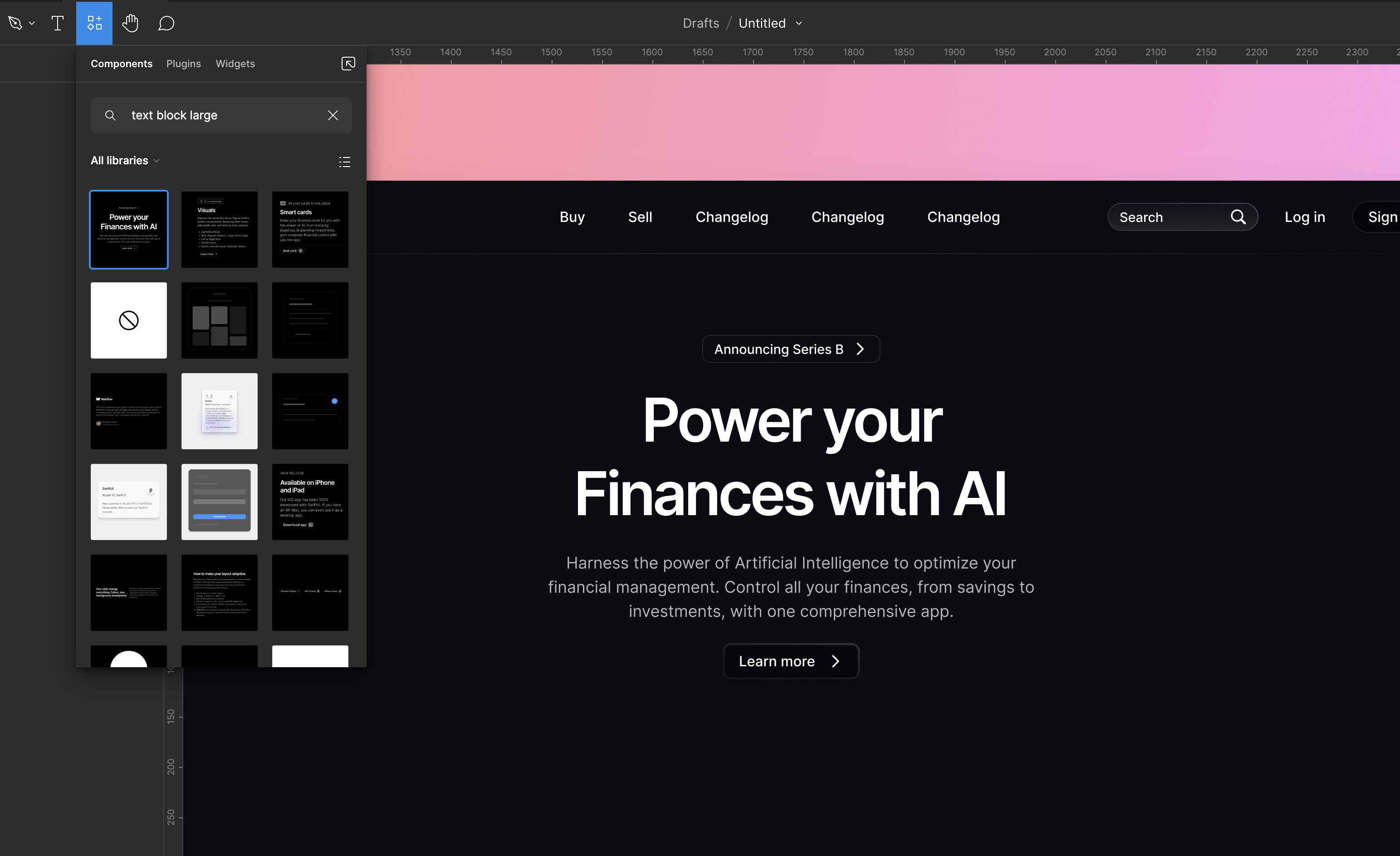
Changing Title Font
- Select Title: Choose the title element.
- Change Font: Set the font to
Playfair Display. - Adjust Size: Maintain the size at 60.
- Font Weight: Set the font weight to Semibold.
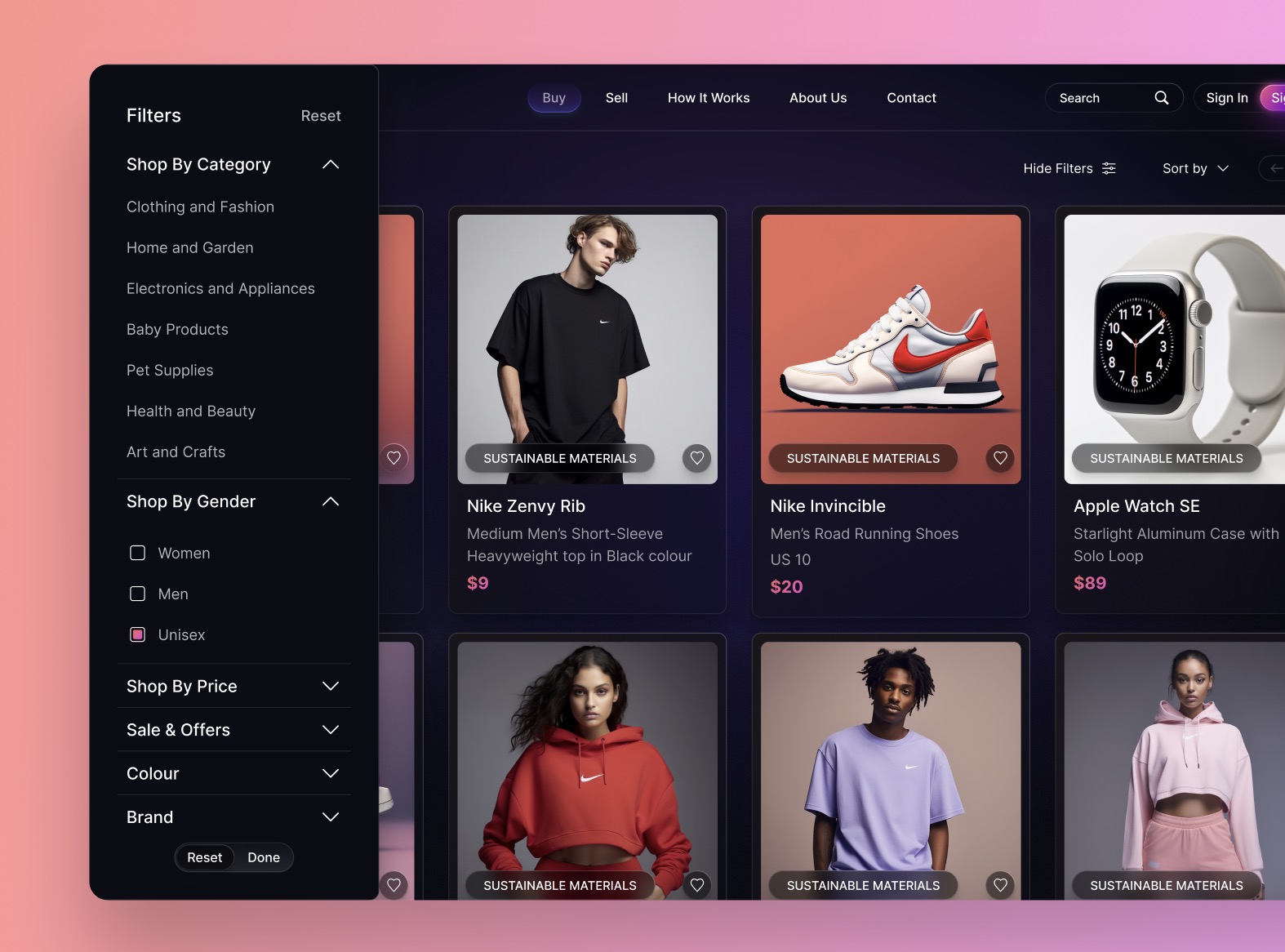
Adding Cards
- Selection: Choose three cards from my Figma file in the assets page -
Finance Card,Sale Card, andTransaction Card. - Adapt to Theme: Adjust these components to fit a dark theme if necessary, modifying colors and elements to ensure visual harmony.v
Adding Images
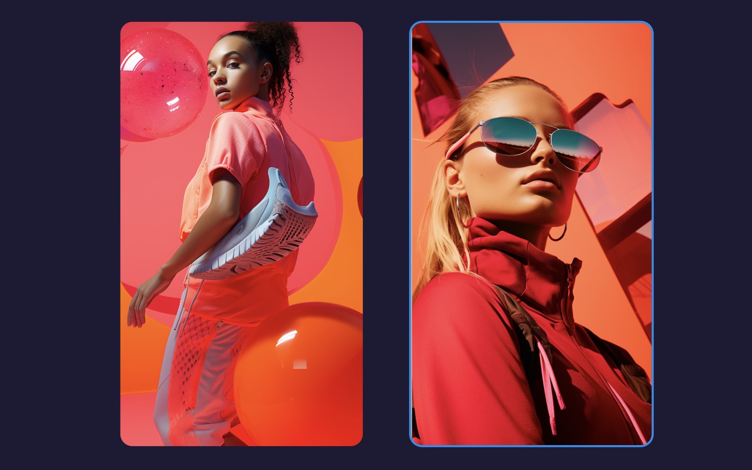
- Selection: Choose the two images from my Figma file in the assets page, or feel free to use your own images.
- Midjourney: These images were generated using Midjourney.
- Prompt: editorial photography, trendy, moodboard, nike, sports, lifestyle, fashion --ar 4:7 --v 5.2
Adding Background
- Selection: Choose the the background from my Figma file in the assets page.
Filter and Sort by
A little bonus for you! We're going to create another page together, the search items page. It's going to be very quick because everything is already prepared for you.
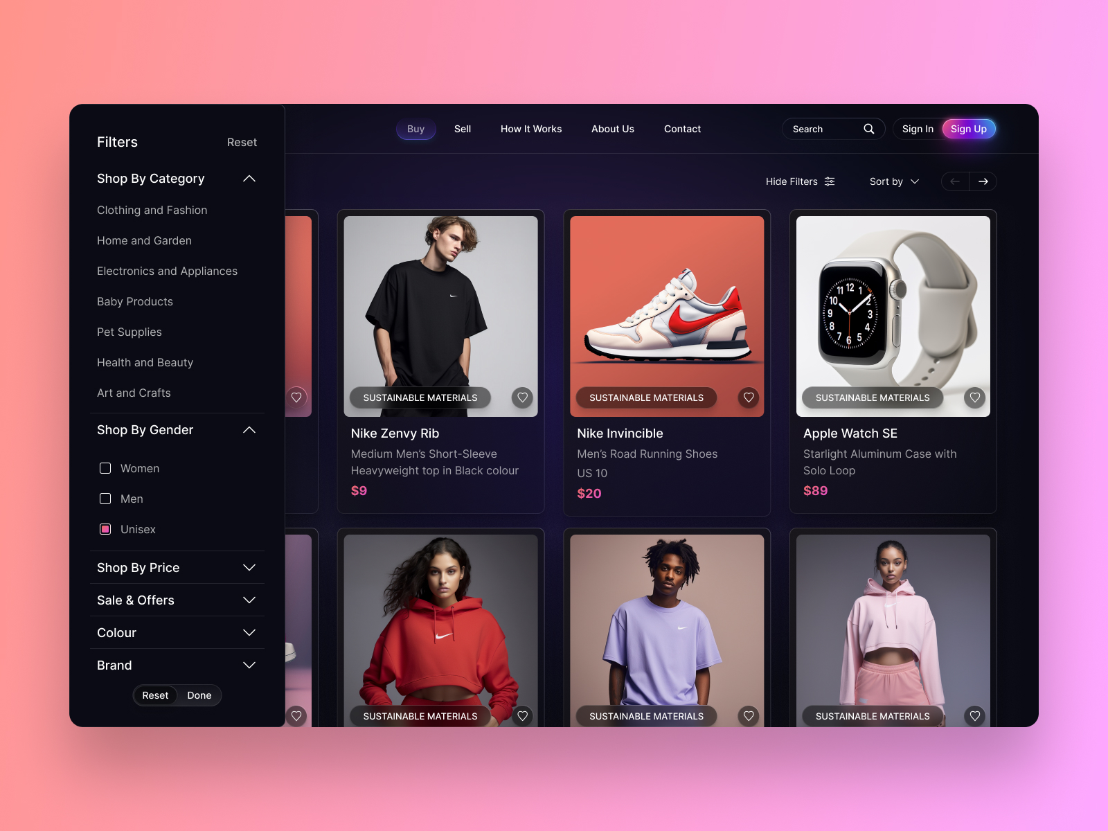
Duplicating the Design
- Make a Copy: Create a duplicate of the existing design.
- Clear Main Frame: Remove all elements from the main frame.
Adding Top Navigation
- Insert Top Navigation: Place a top navigation bar in the layout.
- Navigation Creation: Include the page title and navigation for filtering and sorting. Utilize auto layout with a gap of 0 between items.
- Positioning: Ensure the navigation is placed at the top of the layout.
Creating Multiple Item Cards
- Insert and Duplicate: Insert an item card and duplicate it three more times.
- Arrange with Auto Layout: Arrange the cards using auto layout with a spacing of 20.
- Duplicate Container: Make a copy of the new container.
- Reapply Auto Layout: Add the copied container to auto layout again.
- Set Horizontal Padding: Select the parent container and set 60 for horizontal padding.
- Adjust Gap: Ensure the gap between items is set to auto.
- Fill Container: Fill each child container within the parent container.
Adding Filter and Sort Card
- Select Filter and Sort Cards: Choose the filter and sort card component from the Assets page.
- Positioning: Place the filter and sort card on the left side of the layout.
- Adjustment: Customize the card as needed for filter and sorting options.
- Align: Ensure proper alignment with other elements on the page.
Final Touches
With the two web designs completed, it's time to add your personal touch. Customize them by incorporating colors of your choice, switching fonts, adjusting the content within the cards, and making slight modifications to enhance the design's appeal. As an exercise, I challenge you to transform these two designs into light mode. Share your work and don't forget to tag me; I'll be delighted to provide feedback.
Conclusion
We learned how to easily search for new ideas simply by exploring Mobbin, without the need to visit multiple websites for design inspiration. Additionally, we discovered that incorporating UI kits and templates into your design workflow can significantly enhance project efficiency and consistency. By thoughtfully selecting and customizing these resources, you could streamline your design process and allocate more time to creating unique, user-centered experiences.
Templates and source code
Download source files
Download the videos and assets to refer and learn offline without interuption.
Design template
Source code for all sections
Video files, ePub and subtitles
Videos
1
Introduction to UI/UX Design
Finding inspiration with Mobbin and transforming ideas into unique designs using Figma
5:39
2
UI Kits and Templates
Accelerating design efficiency by using UI kits and templates
8:18
3
Shapes, Gradients and Strokes
Design a smart home iOS App and learn to use shapes, gradients, and strokes to create a thermostat interface
15:15
4
Icons, Typography, and Styles
Improve the design of our smart home application with icons, typography, and effects
9:43
5
Auto Layout, Constraints and Pen tool
Adding finishing touches on our design with Auto Layout, constraints. Use the Pen Tool to create intuitive controls
16:23
6
UX Research and Design Flows
Diving Deeper into UX Research and the Importance of Designing User Flows
16:19
7
Styles and Plugins
Exploring Figma Tools and Plugins to Enhance Creativity and Efficiency
13:09
8
Animation, Sticky Scroll and Overlay
Bridging Design and Interaction with a Step-by-Step Guide to Prototyping
10:13
9
Flat Design and Light Mode
Exploring the Essentials of Flat Design and Light Mode for a Cleaner and More Intuitive User Experience
16:57
10
Visual Hierarchy and Information Architecture
Explore the role of visual hierarchy in UI design and learn to structure and organize content to improve a product's usability
11:07
11
Typography and Colors Variable
Learn How to Streamline Your Designs with Typography and Color Variables
14:34
Meet the instructor
We all try to be consistent with our way of teaching step-by-step, providing source files and prioritizing design in our courses.
Sourasith Phomhome
UI Designer
Designer at Design+Code
19 courses - 72 hours
Master AI Prompting for Stunning UI
Learn how to leverage AI tools like Aura for creating beautiful designs, working with templates, and experimenting with advanced prompts. A concise guide for designers and developers to level up their skills.
10 hrs
Design Multiple Apps with Figma and AI
In this course, you’ll learn to design multiple apps using Figma and AI-powered tools, tackling a variety of real-world UI challenges. Each week, a new episode will guide you through a different design, helping you master essential UI/UX principles and workflows
4 hrs
SwiftUI Fundamentals Handbook
A comprehensive guide to mastering Swift programming fundamentals, designed for aspiring iOS developers. This handbook provides a structured approach to learning Swift's core concepts, from basic syntax to advanced programming patterns. Through carefully sequenced chapters, readers will progress from essential programming concepts to object-oriented principles, building a solid foundation for SwiftUI development. Each topic includes practical examples and clear explanations, ensuring a thorough understanding of Swift's capabilities. This handbook serves as both a learning resource and a reference guide, covering fundamental concepts required for modern iOS development. Topics are presented in a logical progression, allowing readers to build their knowledge systematically while gaining practical programming skills.
2 hrs
Design and Code User Interfaces with Galileo and Claude AI
In this course, you’ll learn how to use AI tools to make UI/UX design faster and more efficient. We’ll start with Galileo AI to create basic designs, providing a solid foundation for your ideas. Next, we’ll refine these designs in Figma to match your personal style, and finally, we’ll use Claude AI to turn them into working code—eliminating the need for traditional prototyping.
4 hrs
Design and Prototype for iOS 18
Design and Prototype for iOS 18 is an immersive course that equips you with the skills to create stunning, user-friendly mobile applications. From mastering Figma to understanding iOS 18's latest design principles, you'll learn to craft two real-world apps - a Car Control interface and an AI assistant.
3 hrs
Master Responsive Layouts in Figma
Creating responsive layouts is a must-have skill for any UI/UX designer. With so many different devices and screen sizes, designing interfaces that look great and work well on all platforms is necessary. Mastering this skill will make you stand out in the field. In this course, we'll start from scratch to create this beautiful design using Figma. You'll learn how to make layouts that are easy to use and work well on any device. We'll cover key concepts and tools to help you master responsive design in Figma.
2 hrs
UI UX Design with Mobbin and Figma
Mobbin is a powerful tool for UI/UX designers seeking inspiration and innovative design solutions. This platform offers a vast collection of real-world mobile app designs, providing a treasure trove of UI elements and layouts.
2 hrs
3D UI Interactive Web Design with Spline
Learn to create 3D designs and UI interactions such as 3D icons, UI animations, components, variables, screen resize, scrolling interactions, as well as exporting, optimizing, and publishing your 3D assets on websites
3 hrs
Design and Prototype for iOS 17 in Figma
Crafting engaging experiences for iOS 17 and visionOS using the Figma design tool. Learn about Figma's new prototyping features, Dev Mode, variables and auto layout.
6 hrs
Design and Prototype Apps with Midjourney
A comprehensive course on transforming Midjourney concepts into interactive prototypes using essential design techniques and AI tools
8 hrs
iOS Design with Midjourney and Figma
Learn the fundamentals of App UI design and master the art of creating beautiful and intuitive user interfaces for mobile applications
1 hrs
UI Design for iOS, Android and Web in Sketch
Create a UI design from scratch using Smart Layout, Components, Prototyping in Sketch app
1 hrs
UI Design a Camera App in Figma
Design a dark, vibrant and curvy app design from scratch in Figma. Design glass icons, lens strokes and realistic buttons.
1 hrs
UI Design for iOS 16 in Sketch
A complete guide to designing for iOS 16 with videos, examples and design files
3 hrs
Prototyping in Figma
Learn the basics of prototyping in Figma by creating interactive flows from custom designs
1 hrs
UI Design Quick Websites in Figma
Learn how to design a portfolio web UI from scratch in Figma
1 hrs
UI Design Android Apps in Figma
Design Android application UIs from scratch using various tricks and techniques in Figma
2 hrs
UI Design Quick Apps in Figma
Design application UIs from scratch using various tricks and techniques in Figma
12 hrs
Figma Handbook
A comprehensive guide to the best tips and tricks in Figma. Not affiliated with or endorsed by Figma, Inc.
6 hrs