
Flat Design and Light Mode
Add to favorites
Exploring the Essentials of Flat Design and Light Mode for a Cleaner and More Intuitive User Experience
Play video
UI UX Design with Mobbin and Figma
1
Introduction to UI/UX Design
5:39
2
UI Kits and Templates
8:18
3
Shapes, Gradients and Strokes
15:15
4
Icons, Typography, and Styles
9:43
5
Auto Layout, Constraints and Pen tool
16:23
6
UX Research and Design Flows
16:19
7
Styles and Plugins
13:09
8
Animation, Sticky Scroll and Overlay
10:13
9
Flat Design and Light Mode
16:57
10
Visual Hierarchy and Information Architecture
11:07
11
Typography and Colors Variable
14:34
 https://www.figma.com/community/file/1370464528540868526
Flat Design
Flat design is a minimalist interface style that emphasizes functionality, using solid colors and clear typography with minimal texture, shading, and gradients. It compensates for the lack of depth—such as embossing and shadows—by employing vivid, bold colors that help distinguish elements and enhance user focus. Typography in flat design is particularly clear and legible, maintaining the overall simplicity. Additionally, flat design commonly incorporates basic geometric shapes in icons and elements, such as rectangles, circles, and squares, maintaining everything on a single visual plane to reinforce the clean and straightforward aesthetic.

Light Mode
Light mode design uses a light background, often white or light gray, with dark text and colorful accents. It focuses on a clean and bright look to enhance readability and reduce eye strain. Subtle shadows and highlights add depth, while plenty of whitespace improves usability. This style works well with minimalist and flat designs, using simple graphics and clear typography to keep the interface user-friendly.
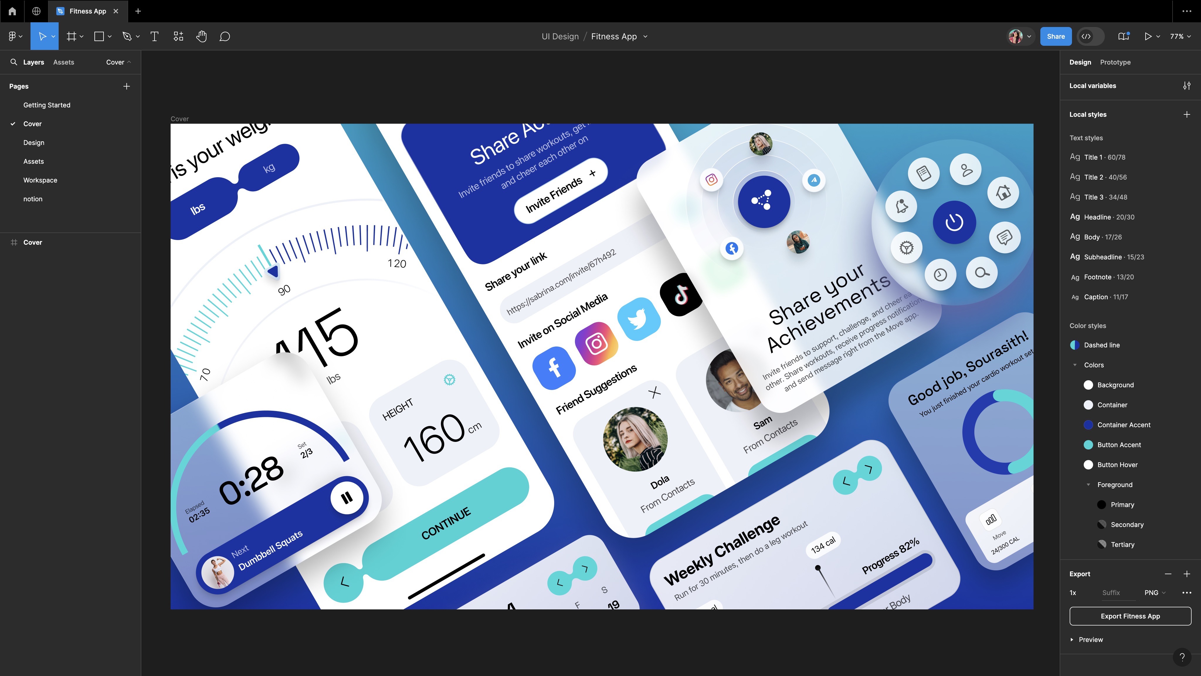
Fitness App Design
For our fitness app, we're going to incorporate bold shapes, vibrant solid colors, and clear, large typography to achieve a minimalist look. By including plenty of white space, we maintain a clean and user-friendly interface, allowing the elements to stand out without the need for shadows. We're focusing on unique and engaging elements that captivate attention while adhering to the principles of flat design—no gradients, strokes, or shadows.
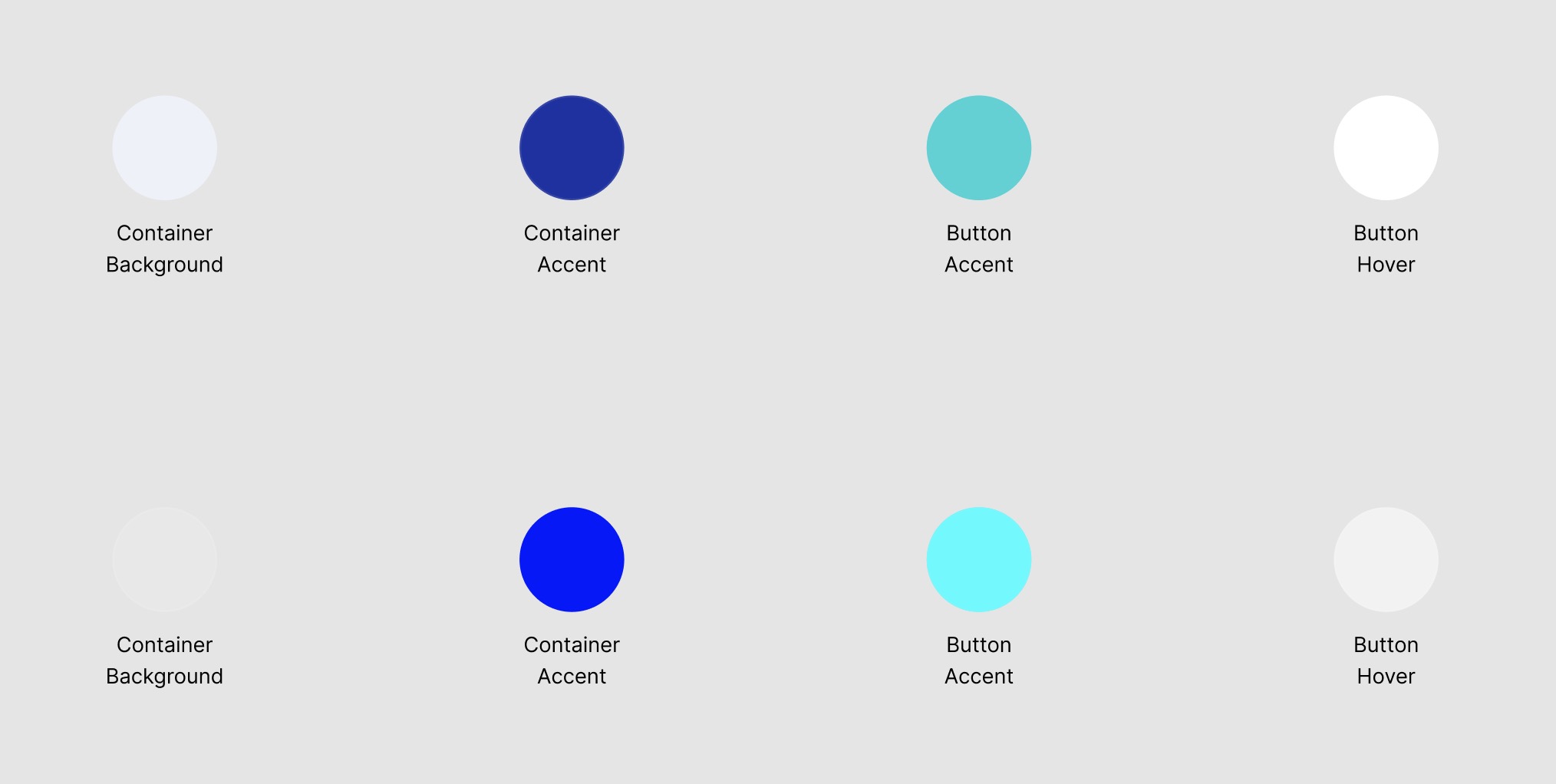
Vibrant Color Palette
We'll use a consistent and vibrant color scheme to enhance brand identity and engage users, focusing on solid colors that pop without gradients. We're going to use accent colors to highlight key elements like buttons or links, and softer shades for secondary information. Colors will establish a visual hierarchy on the page, guiding the user's eye from the most important elements to less prominent ones. This approach helps create a user-friendly interface that communicates information effectively.
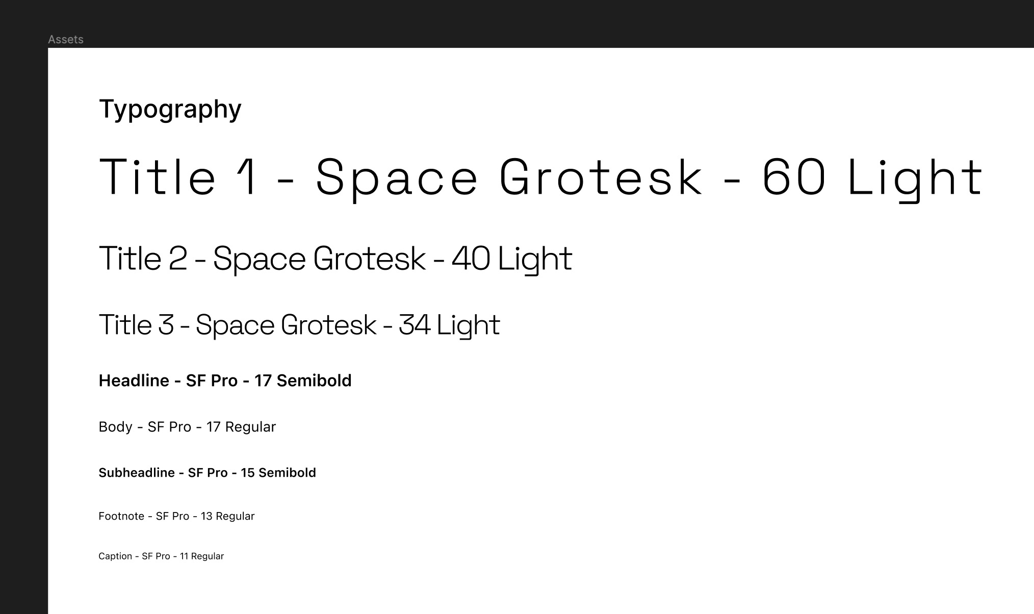
Typography
We'll be using two fonts, SF Pro and Space Grotesk , in various weights including Light, Regular, and Semibold. Our choice of bold, readable fonts, combined with large text sizes for key information, ensures that the text is easy to navigate and draws attention to important details. Most excitingly, we'll explore how to effectively use typography variables, which allow you to set up font family, size, and spacing once and apply them across your designs with just a few clicks.
Variables
If you haven’t tried them yet, variables allow you to create reusable values for design properties like colors, text styles, and spacing. These variables help maintain consistency across your designs, making it easier to update elements globally. For example, if you define a color variable for your brand’s primary color, you can apply it to various components. If the brand color changes, updating the variable will automatically update all instances where it's used, saving time and reducing errors. This feature streamlines the design process and enhances collaboration within teams.
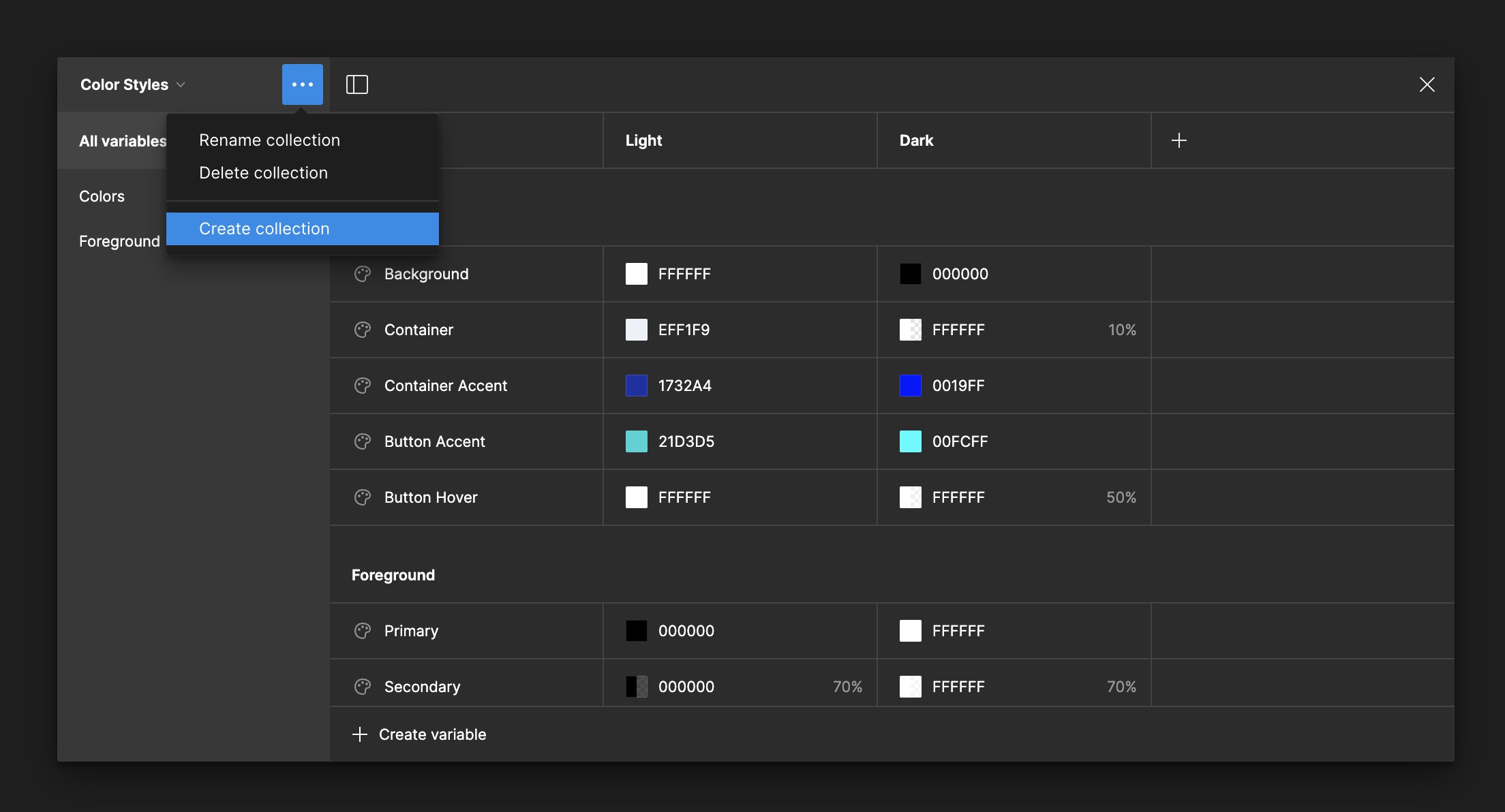
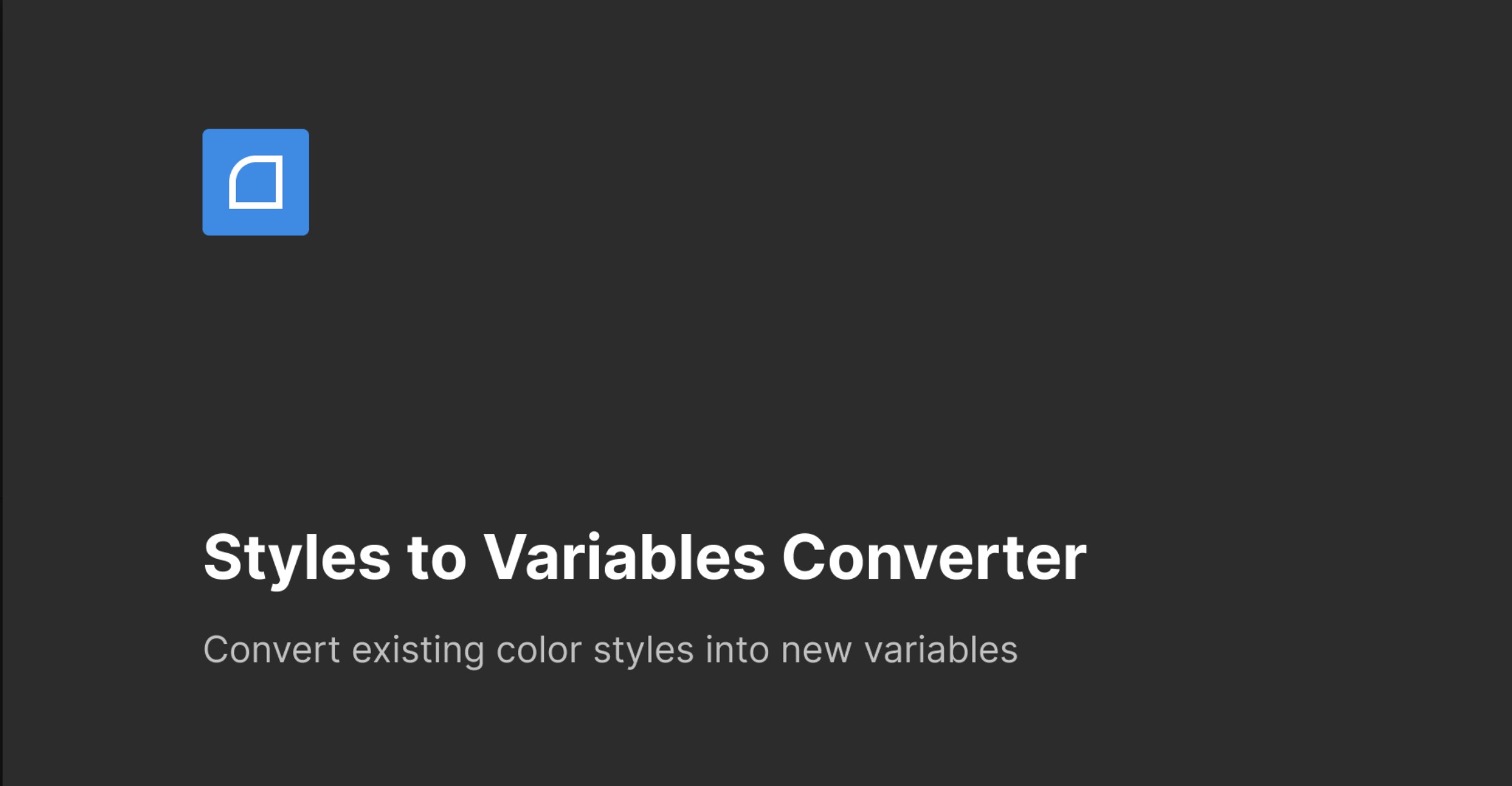
Styles to Variables
You'll also learn about Styles in Figma, which are predefined properties such as colors, text styles, and effects that ensure consistency and efficiency in your designs. We'll cover how to convert our color styles into variables, streamlining color management across the project. Instead of doing this manually, we'll use a plugin called ' Styles to Variables Converter .'This tool automates the conversion, seamlessly updating each color style into a variable.
Sponsored by Mobbin
Before we start, I want to thank Mobbin for sponsoring this course. Their support provides me with excellent design resources and insights. Mobbin is a fantastic source for real-world design inspiration based on research. I appreciate their contribution to the design community and recommend checking out their tools if you're interested in great design.
Explore Mobbin: https://mobbin.com/browse/ios/flows Get 20% off: https://mobbin.com/?referrerworkspaceid=d37f6325-3235-4c87-953f-c89b357f7634
Figma File
To follow this course, you'll need my Figma file. I was using the new DesignCode UI kit for iOS, but it hasn't been released yet. Since you don't have access to it, I'll include it on my assets page. You'll have access to my initial design, components, and text and color styles, including variables for both light and dark modes and typography.
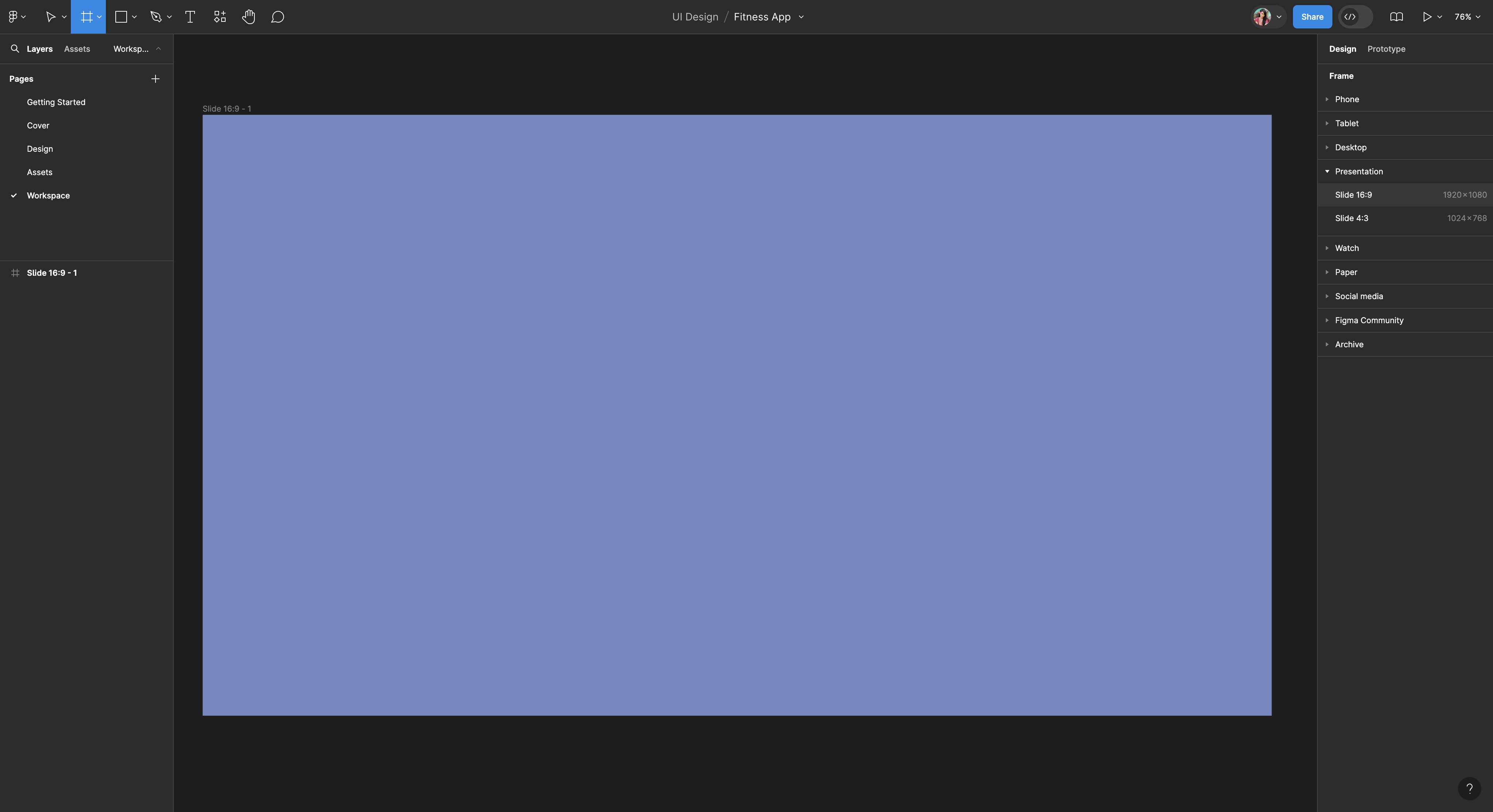
Presentation Frame
We'll begin by creating a presentation frame, which is essential for setting the context of our UI design. A well-defined presentation frame enhances the visibility of your design by providing a contrasting backdrop that makes light mode UI elements stand out. This is crucial for emphasizing details and ensuring that viewers can appreciate the nuances of your design.
- Fill the presentation frame with a color that provides good contrast with the light mode UI design. Choosing the right background color enhances the visibility and readability of your UI components. We can adjust the color later if needed to better suit the design as it evolves.
![Flat Design and Light Mode image 11]()
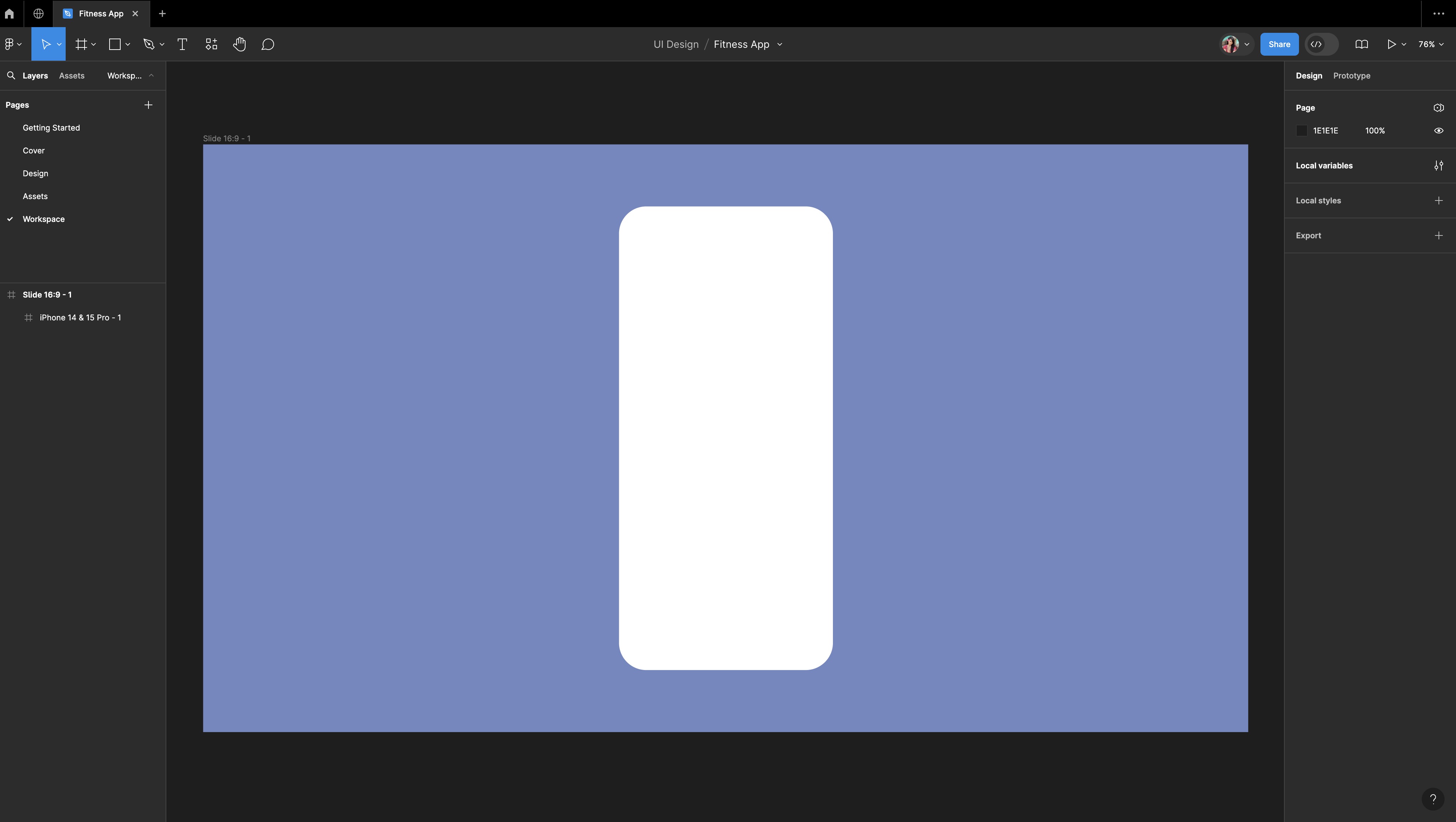
Screen Frame
Next, we will create a screen frame within the presentation frame. This frame will be specific to the device for which you are designing, which in this case is the iPhone 14 & 15 Pro. Using a device-specific frame is critical for ensuring that your design adheres to the correct dimensions and layout constraints of the target device.
- Choose the device you want to design for. For this tutorial, we'll focus on the iPhone 14 & 15 Pro.
- Since we are doing a light mode design, choose a light color for the screen frame to maintain consistency with the overall theme.
- Round the corners of the screen frame to 50 to give it a modern look and feel that aligns with contemporary iOS design standards.
![Flat Design and Light Mode image 12]()
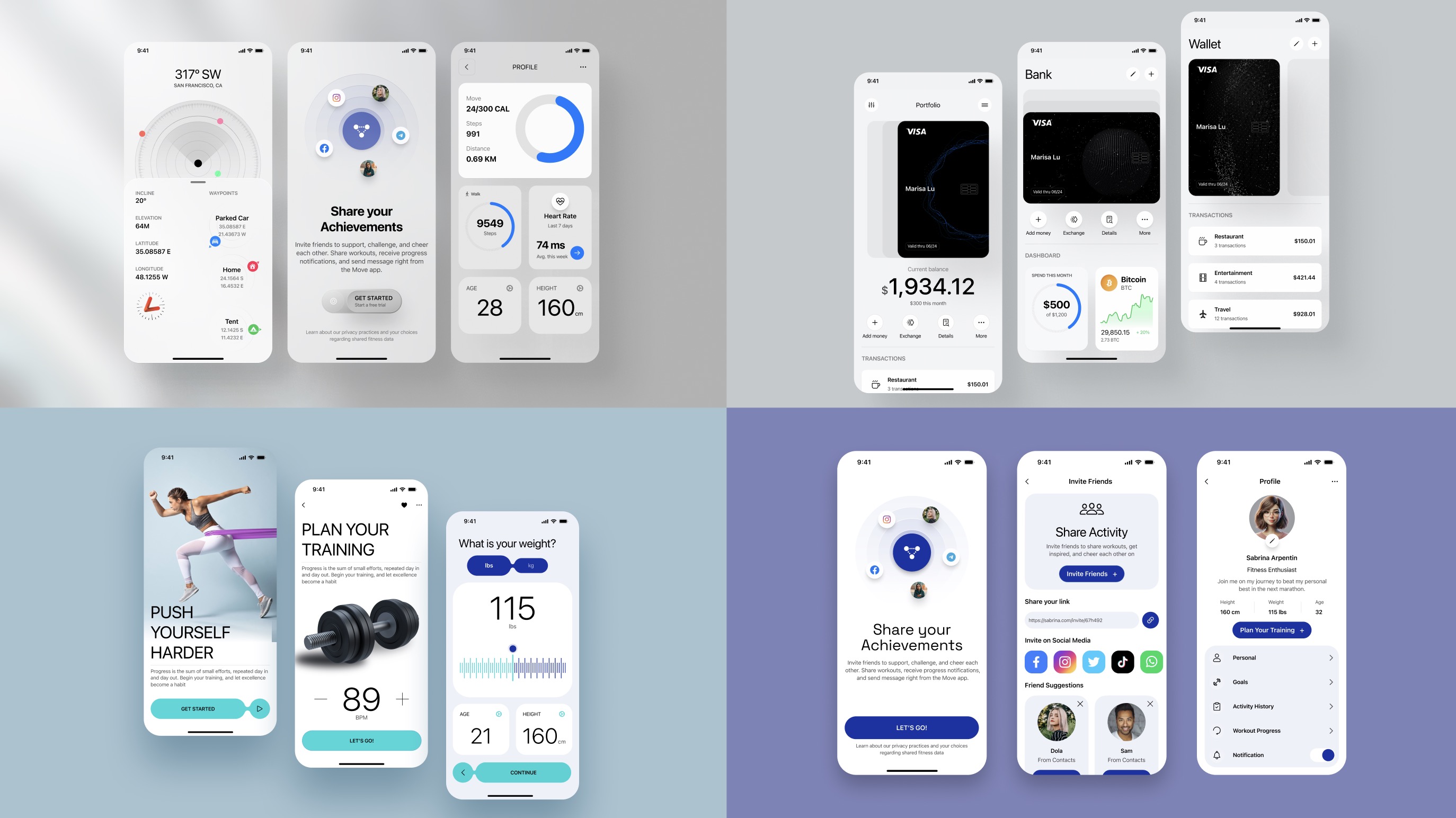
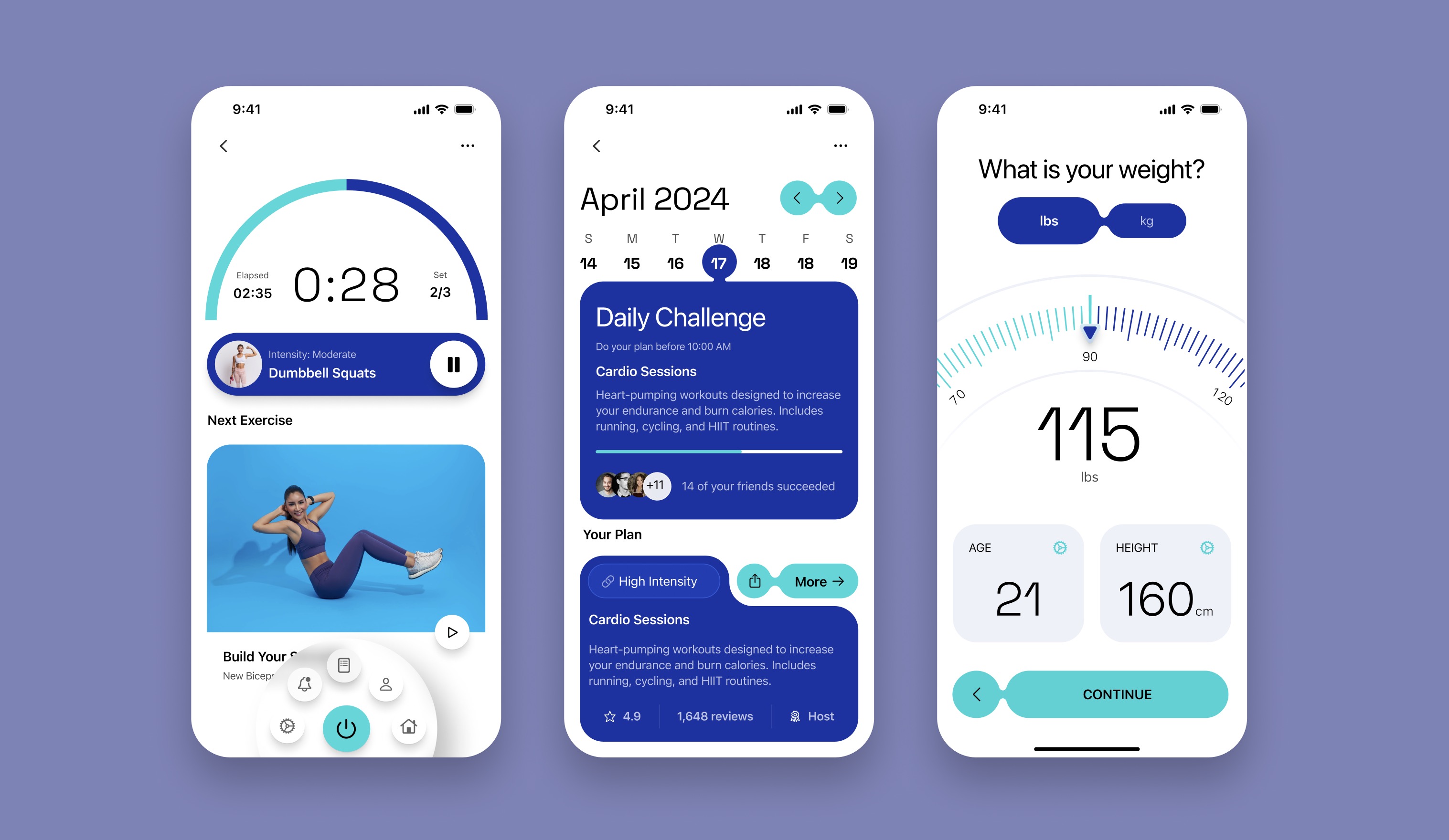
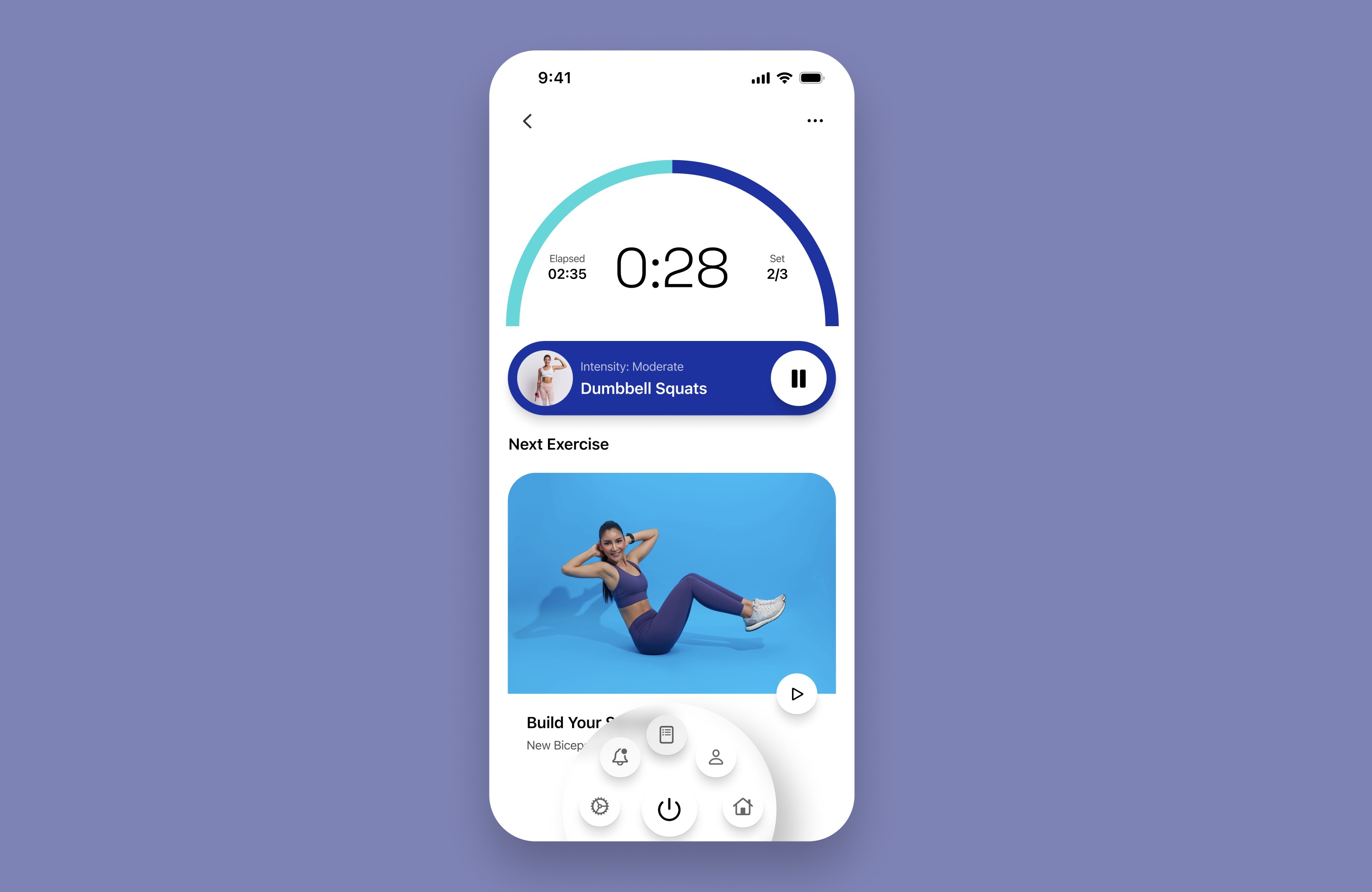
Active Workout Screen
The first screen we're going to design is the Active Workout Screen. It's designed to keep the user informed and engaged throughout their exercise routine and includes workout progress, workout control, and a preview of the next exercise.
Status Bar and Navigation Bar
We're going to add a status bar and navigation to the top of the screen. You can use components from any UI kit you prefer, or choose from my assets page. I've used a UI kit from our new Design+Code UI kit for iOS, which hasn't been released yet, so feel free to take it directly from my assets page.
Workout Progress
Let's create a semi-circular progress arc that indicates the elapsed time, showing the user how much time they've spent on the current exercise set versus the total planned time. This visual indicator will help users quickly see their progress during a workout.
- Press on “O” to activate the Ellipse tool, and create a circle with a diameter of 353. For a perfect circle, hold the 'Shift' key while dragging.
![Flat Design and Light Mode image 15]()
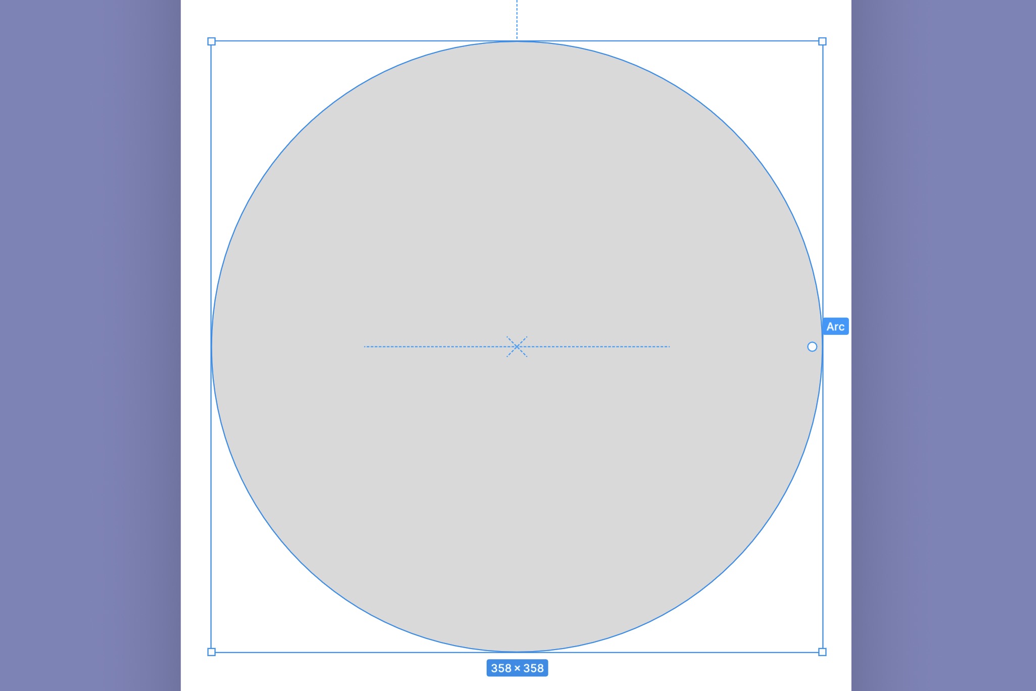
Convert to Arc
By dragging this handle slightly, you will start converting the circle into an arc and create a semi-circular arc, rather than a full circle.
- Start: Set the 'Start' angle to 0%. This will start the arc from the top center of the circle.
- Sweep: Set the 'End' angle to -50%. This configures the arc to cover half of the circle, visually representing a 50% completion.
- Ratio: Change the 'Ratio' to 92%. This adjusts the inner radius, making the arc thicker.

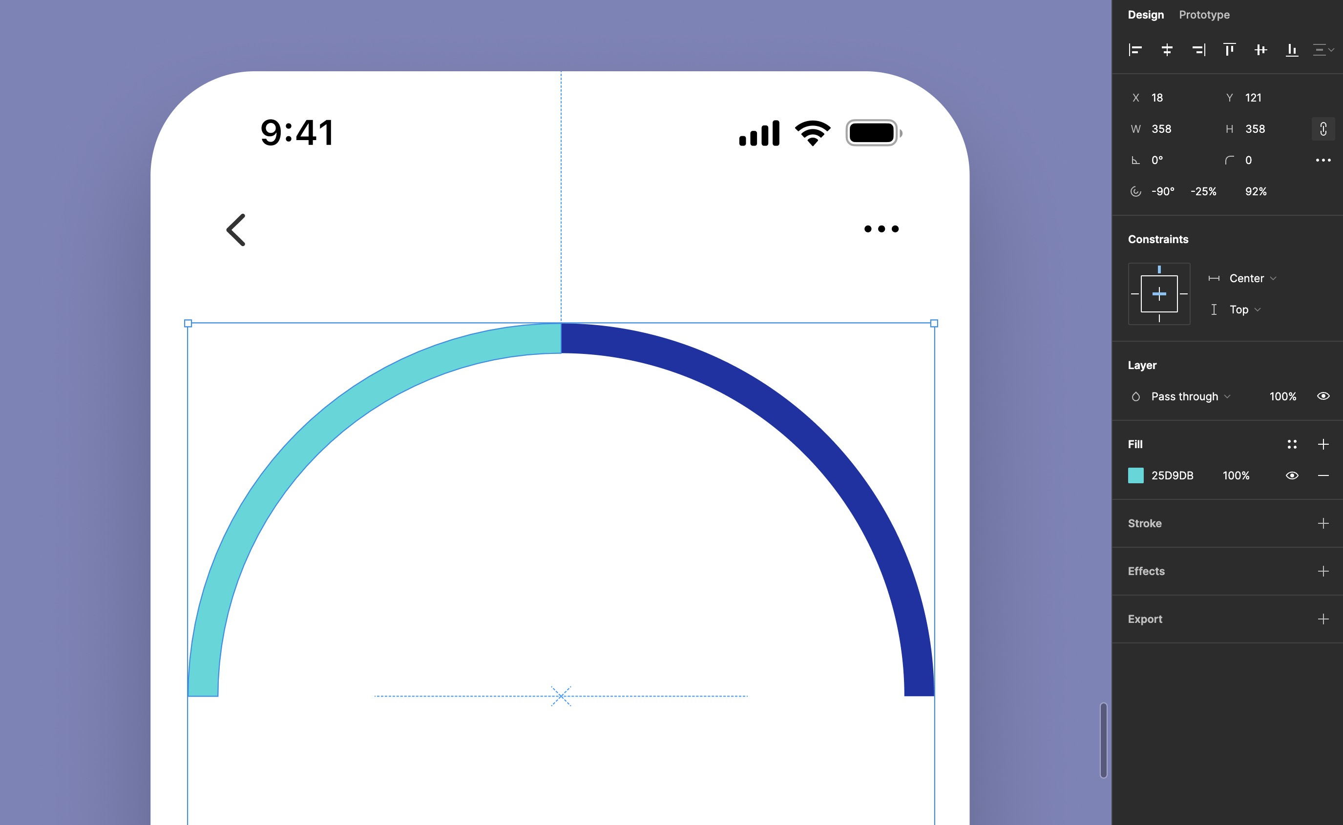
Progress Arc
To create a progress arc that fills as time progresses, duplicate the arc layer. Use one as the background (unfilled) and the other as the progress (filled). Adjust the 'End' angle of the filled arc according to the progress you wish to display. Select the duplicated arc layer. This will be your progress arc, which will fill up as time progresses.
- Start Angle: Set the 'Start' angle to -90° to orient the starting point of the arc to the left.
- Sweep Angle: Set the 'End' angle to -25% for the progress arc. This establishes a starting point for the progression. You can adjust this angle dynamically in your application as the progress increases.
- Ratio: Ensure the 'Ratio' is set to 92% to maintain consistency in thickness with the background arc.
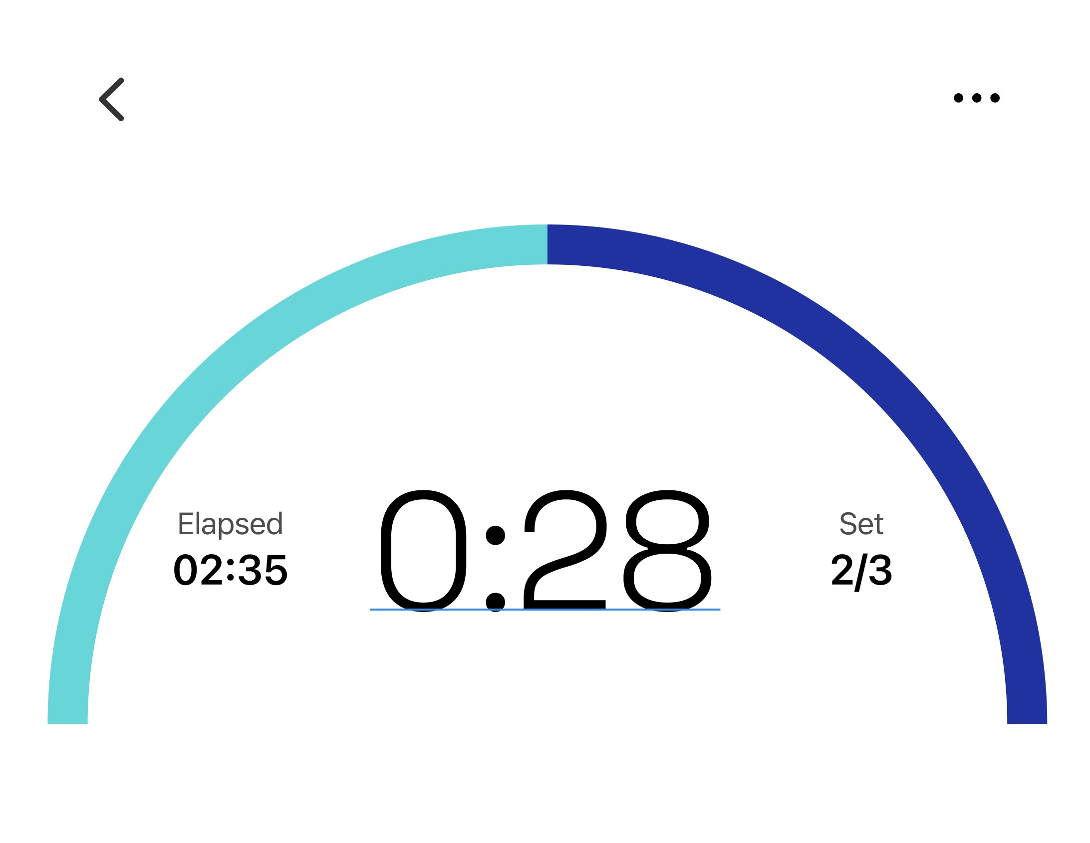
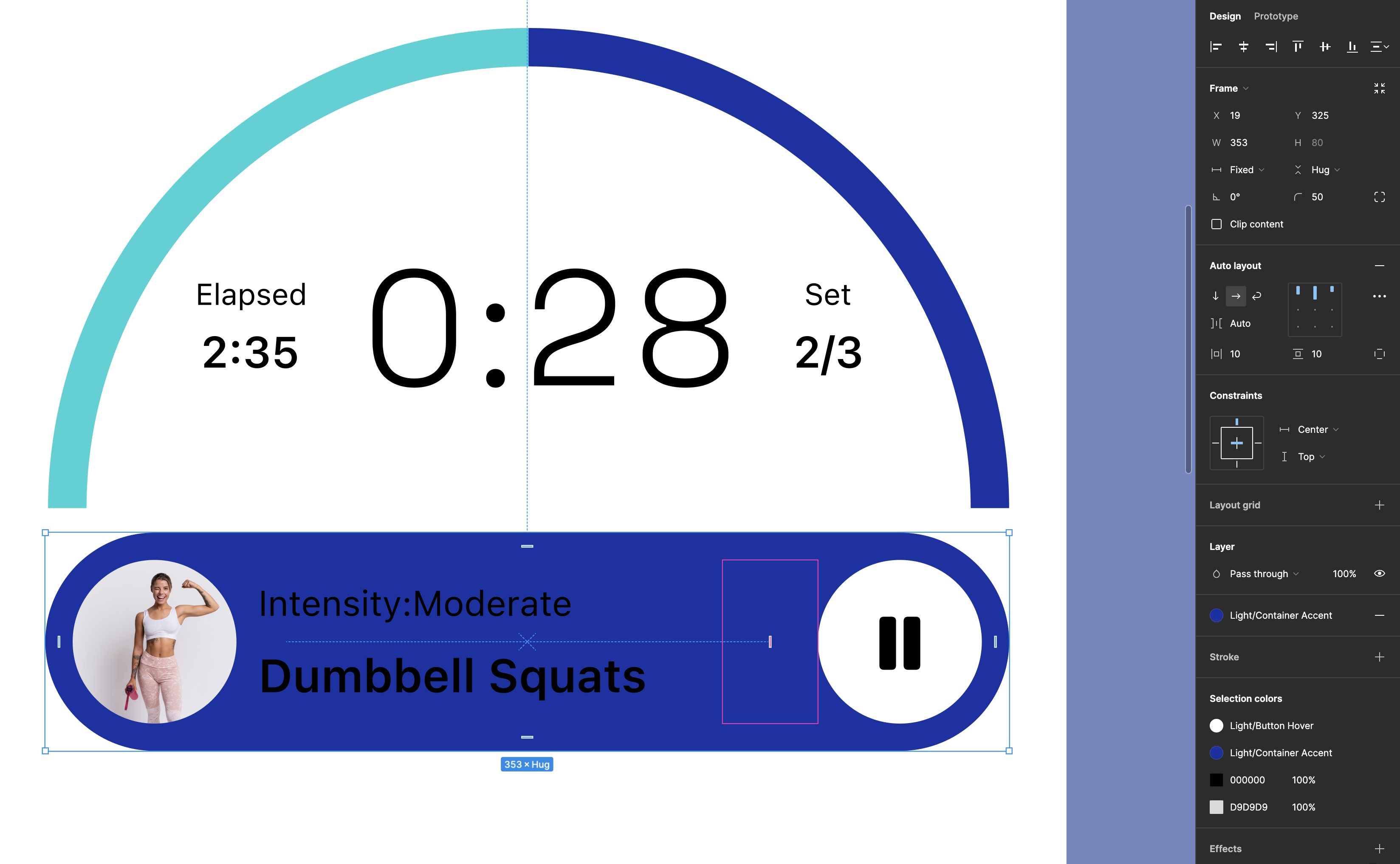
Timer and Set Indicator
To provide essential workout details, we'll include the "Timer & Set Indicator" on the screen. This feature displays the elapsed time and the current set number, helping users track their progress during their session. We'll use clear typography styles to maintain readability and hierarchy.
- Subheadings: Use 'T' to type "Elapsed" in 'Caption' style or manually apply 'SF Pro Regular' at 11pt. Ensure alignment is set to auto width and aligned left.
- Headings: Below the subheading, input "02:35" using 'Subheadline' style with 'SF Pro Semibold' at 15pt to emphasize it as primary information.
- Add Container: After selecting both texts, group them into a container with auto layout by pressing 'Shift + A'. Duplicate this container for "Set" and "2/3".
- Central Time Display ("0:28"): Highlight this time using 'Title 1' style to draw attention to the active timer, making it prominent and engaging. Then, group the texts into a container with auto layout, and set 20 on the gap value.
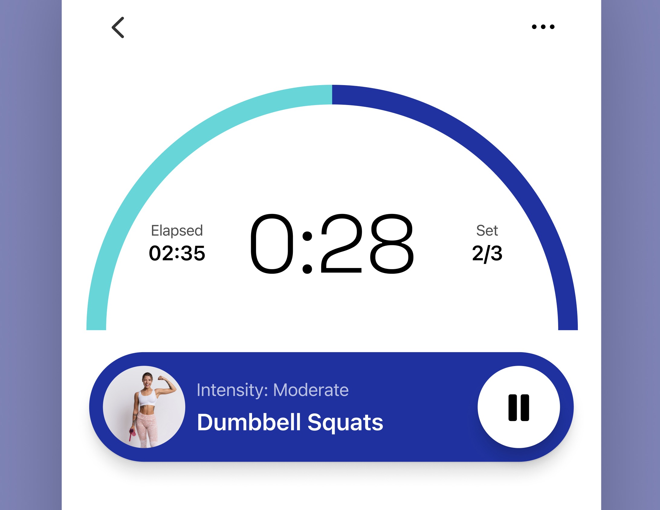
Workout Control
We're going to design the Workout Control that displays the current exercise, "Dumbbell Squats," along with its intensity level, "Moderate," and includes a play/pause button. This keeps users informed and in command of their workout routine.
- Exercise Image Container: First, create a circle with a 60-pixel diameter and fill it with an exercise image from a stock plugin such as Freepik or Unsplash.
- Exercise Information: Now, type the intensity level using the 'Footnote' style. Then, add another text below and type the name of the exercise using the 'Headline' style.
- Group the texts: Select the two text elements, then apply auto layout with a spacing of 4 between them.
- Play/Pause Button: Add a play/pause icon inside a 60x60 pixel circular container for workout control.
- Group everything: Name the layers, add the three elements to an auto layout, and fill the container with the accent color style. Resize the frame to a fixed width of 353. Set the padding to 10 horizontally and vertically in the auto layout properties.
Auto Layout Settings
For the spacing between the three elements, we'll set it to "Auto." This setting automatically adjusts the space between elements to distribute them evenly within the container. However, if you prefer the text to be closer to the image, rather than centered, you should group the image and the text box into a single container.
- Create a New Container: First, select the image and the text box.
- Apply Auto Layout: With both elements selected, apply auto layout to this new group. This action groups them into a single auto layout container.
- Set Spacing: Set the spacing between the image and the text box to 8. This ensures they are closely spaced according to your specific design needs.
- Adjust Alignment: Ensure the alignment settings are centered.
- Finally, apply the 'Button Hover' color style to the button container and set its corner radius to 50. Repeat this step for the parent container to round its corners as well.
![Flat Design and Light Mode image 1]()
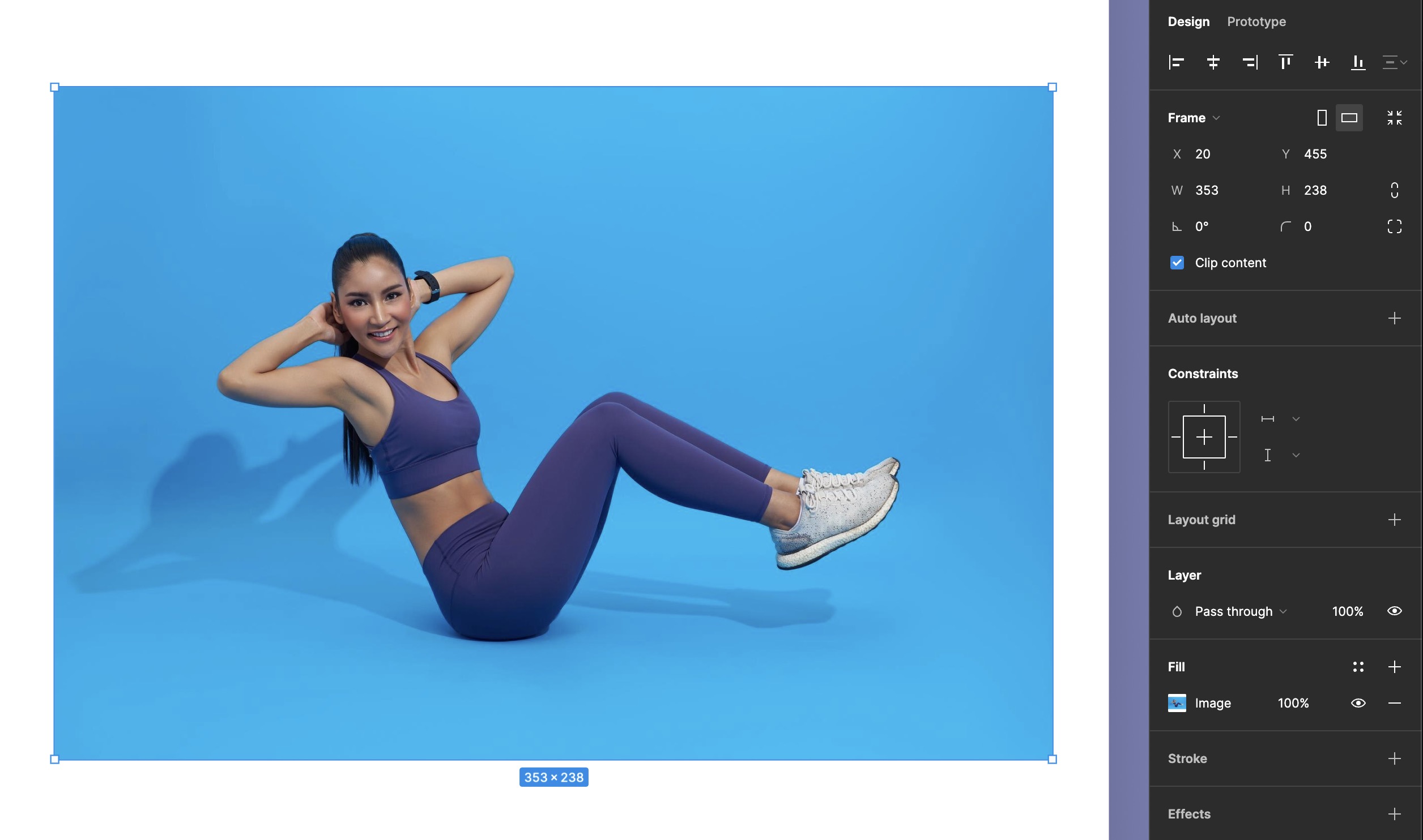
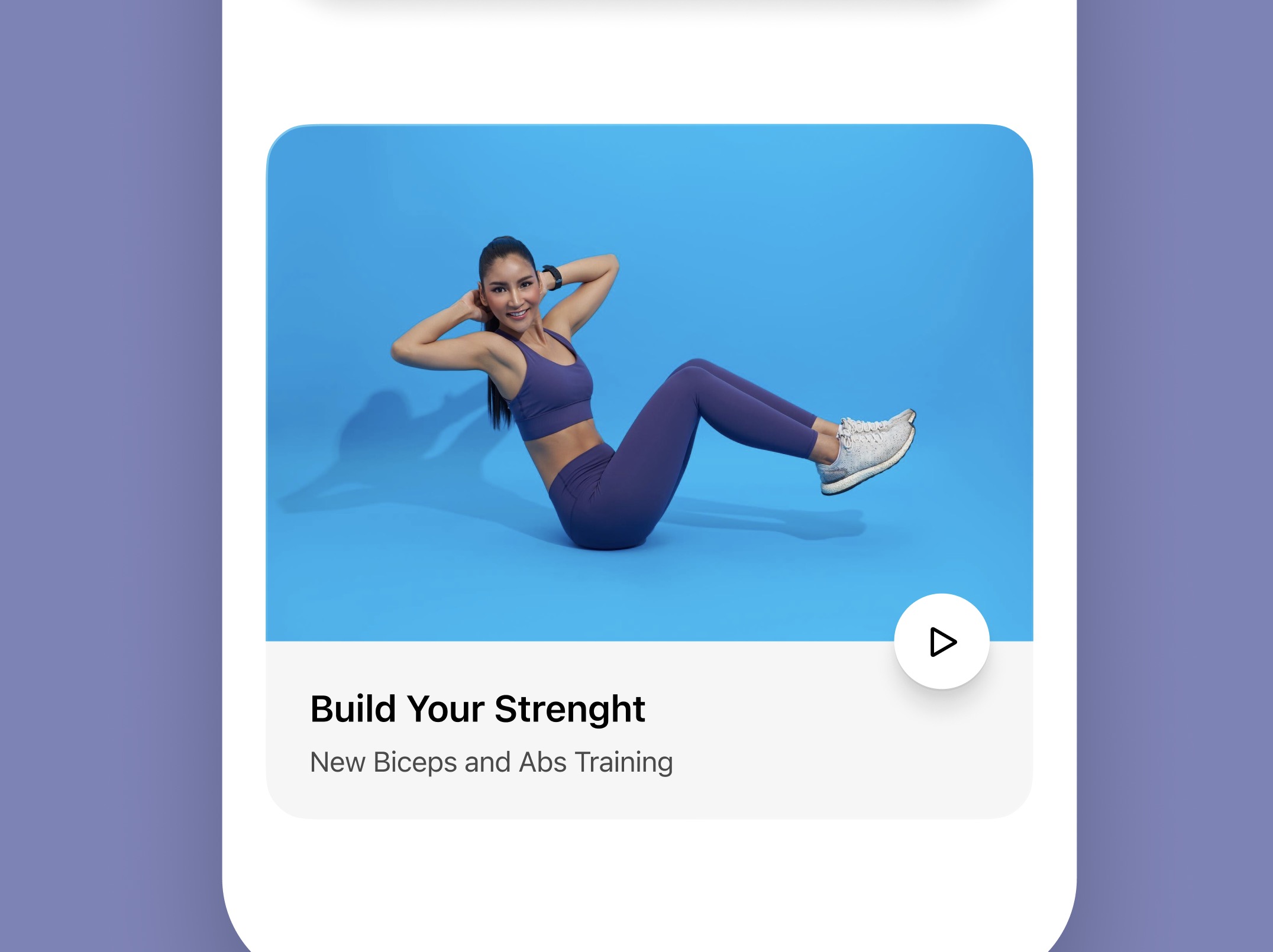
Exercise Preview
Next, we’re going to design the exercise preview component which showcases an upcoming or suggested workout, offering a visual and descriptive teaser of what the user can expect next. With the engaging image, title, and additional details about the benefits of the exercise, it effectively entices the user to continue their fitness journey. The play button prompts action, suggesting this exercise is ready to start whenever the user is.
- Start by creating a frame with the dimensions 353x238 pixels.
- Fill this frame with an image that visually represents the exercise.
![Flat Design and Light Mode image 2]()
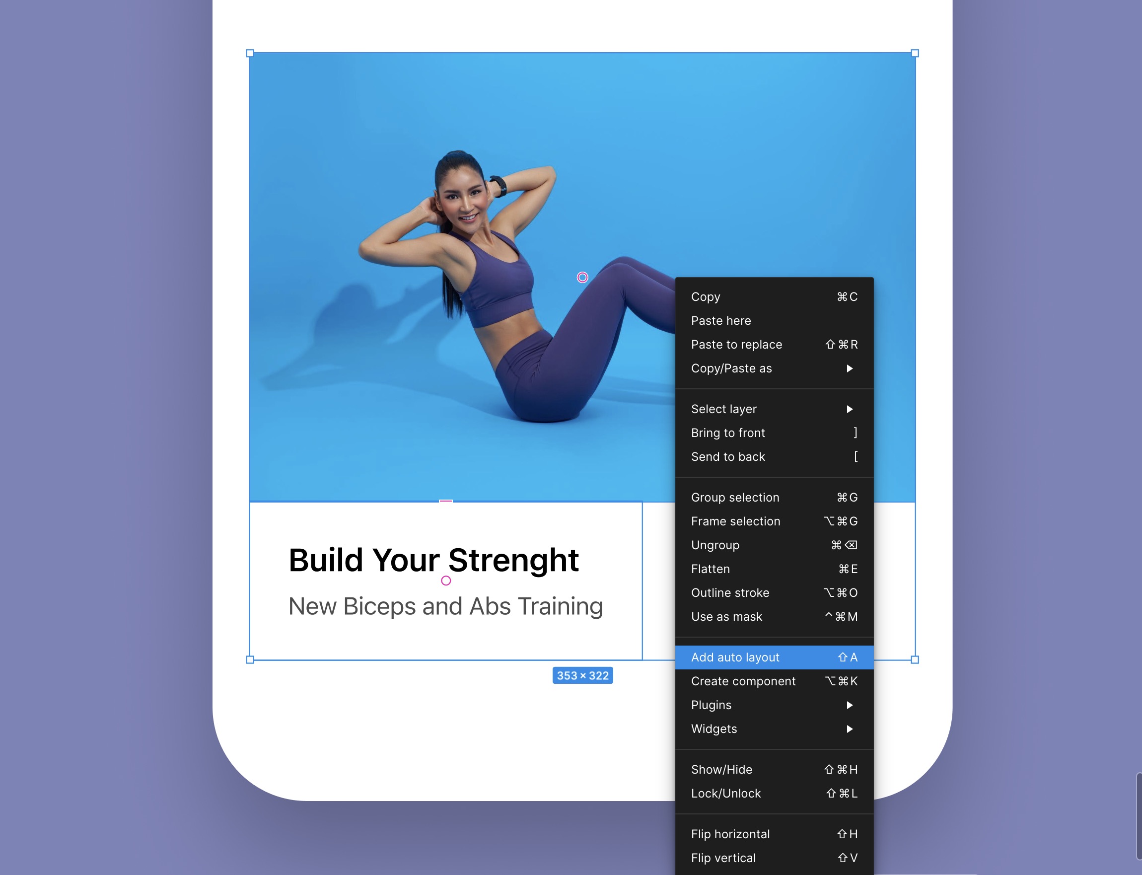
Add Heading and Subheading
- For the heading, type out the main title of the exercise using Headline style. This will likely be the name of the exercise or the main benefit it provides.
- Below the heading, add the subheading with additional details or benefits using Footnote style.
- Select both the heading and the subheading and apply auto layout. Set the gap between the two text elements to 4 pixels. Apply horizontal and vertical padding of 20 pixels to the text box to ensure the content is well-spaced within the component.
- Finally, select both the frame with the image and the auto layout text box, and group them together in another auto layout frame.
- Ensure that the spacing between the image and the text box is set to 0 to maintain visual cohesion.
![Flat Design and Light Mode image 3]()
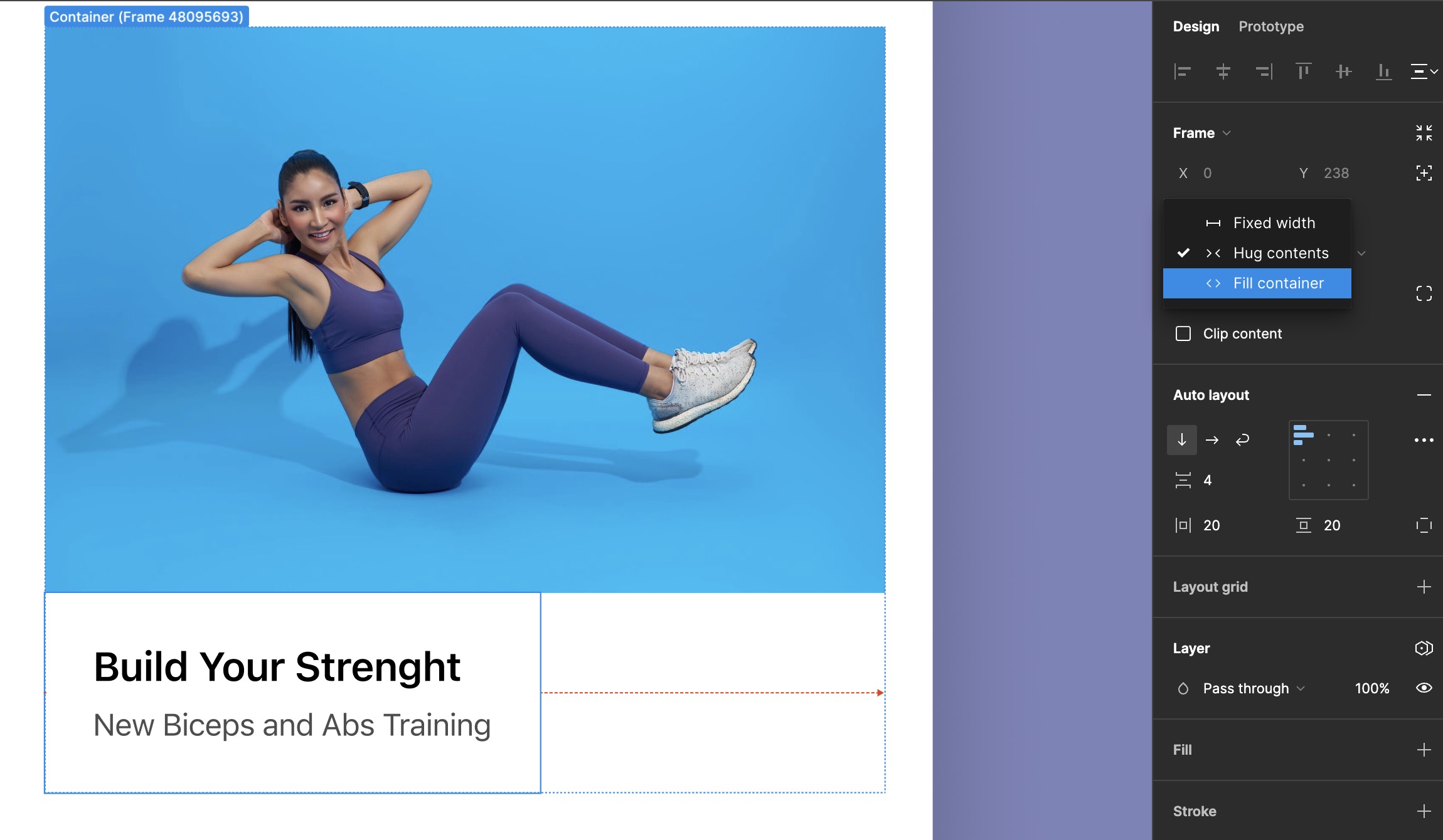
Fill Container
- Select the text layout that includes both your heading and subheading.
- Go to the properties panel, where you will find options for resizing the text frame.
- Choose the 'Fill container' option for the width. This will make the text layout expand to use the full width of its parent container.
- Once this setting is applied, the text will adjust automatically, spanning the entire width of the frame, ensuring a clean and responsive design.
![Flat Design and Light Mode image 4]()
Absolute Position
- Create a play button using a circular shape. Design it with a recognizable play icon in the center.
- With the play button selected, switch its position to 'Absolute' within the properties panel.
- This allows you to freely move the play button over other elements without disrupting the auto layout flow.
- Drag the play button to the desired position within the frame.
- Place it towards the right, ensuring it doesn’t overlap the text box but still appears integrated with the overall design.
- Set a consistent spacing of 20 pixels from the right edge of the parent container to maintain visual balance and ensure the button is easily accessible.
![Flat Design and Light Mode image 5]()
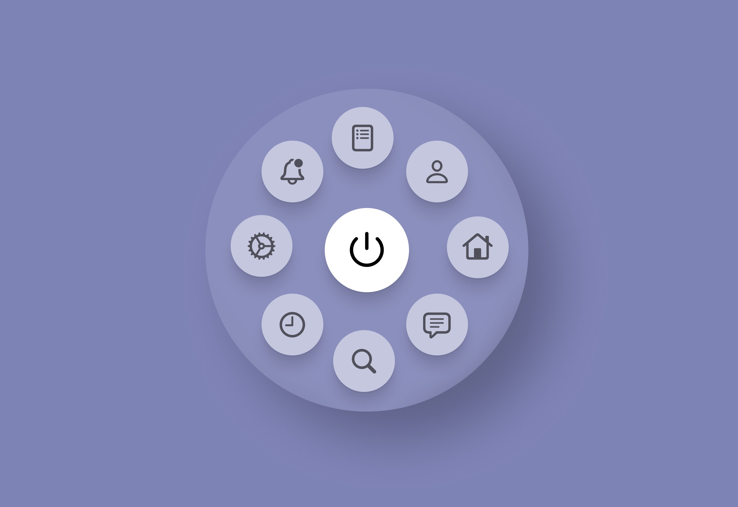
Circular Tab Bar
Now, let's design a circular tab bar that floats above the main content at the bottom of the screen. Although this design is uncommon, it is crucial from a UX standpoint that it is intuitive and the icons are easily recognizable. Additionally, we must ensure that all the tabs are easy to tap with one finger. You will need nine icons that represent key functionalities of your app. You can source these icons from SF Symbols or any preferred icon library:
- Create the base of the tab bar using a frame that measures 230 by 230. Change the shape into a circle by rounding the corners to 120. The color will be white, but we'll reduce the opacity to 10%.
- Place a Power Icon in the center of the circular tab bar. This will serve as the Session Activation button. When a user taps this icon, it should start a new workout session, beginning the tracking of workout duration, calories burned, and other relevant metrics.
- Bring two tabs and place them in the middle horizontally, ensuring a spacing of 16 from the edge of the frame. Do the same with two more tabs, placing them in the middle, but this time vertically.
- We still have four tabs to place; this time, place them diagonally. Take two more tabs and align them together, ensuring they are positioned correctly.
- Bring the tab bar inside the main frame and position it at the bottom. Then, select the base; we're going to add a background blur because it's transparent and allows us to see the content behind. After that, select all the tabs and reduce the opacity of their color to 60%.
- Next, fill the power button with the accent color and add a shadow. Then, slightly lower the tab bar without obscuring it too much, allowing users to rotate the tab bar to view the options underneath.
![Flat Design and Light Mode image 6]()
Conclusion
We've explored creating distinctive flat designs in light mode, focusing on simplicity and functionality. This ensures our designs are visually appealing, user-friendly, and efficient. Next, we'll learn how to organize our designs using visual hierarchy and information architecture, enhancing usability and aesthetics by structuring content to guide users through the interface naturally.
Templates and source code
Download source files
Download the videos and assets to refer and learn offline without interuption.
Design template
Source code for all sections
Video files, ePub and subtitles
Videos
1
Introduction to UI/UX Design
Finding inspiration with Mobbin and transforming ideas into unique designs using Figma
5:39
2
UI Kits and Templates
Accelerating design efficiency by using UI kits and templates
8:18
3
Shapes, Gradients and Strokes
Design a smart home iOS App and learn to use shapes, gradients, and strokes to create a thermostat interface
15:15
4
Icons, Typography, and Styles
Improve the design of our smart home application with icons, typography, and effects
9:43
5
Auto Layout, Constraints and Pen tool
Adding finishing touches on our design with Auto Layout, constraints. Use the Pen Tool to create intuitive controls
16:23
6
UX Research and Design Flows
Diving Deeper into UX Research and the Importance of Designing User Flows
16:19
7
Styles and Plugins
Exploring Figma Tools and Plugins to Enhance Creativity and Efficiency
13:09
8
Animation, Sticky Scroll and Overlay
Bridging Design and Interaction with a Step-by-Step Guide to Prototyping
10:13
9
Flat Design and Light Mode
Exploring the Essentials of Flat Design and Light Mode for a Cleaner and More Intuitive User Experience
16:57
10
Visual Hierarchy and Information Architecture
Explore the role of visual hierarchy in UI design and learn to structure and organize content to improve a product's usability
11:07
11
Typography and Colors Variable
Learn How to Streamline Your Designs with Typography and Color Variables
14:34
Meet the instructor
We all try to be consistent with our way of teaching step-by-step, providing source files and prioritizing design in our courses.
Sourasith Phomhome
UI Designer
Designer at Design+Code
19 courses - 72 hours
Master AI Prompting for Stunning UI
Learn how to leverage AI tools like Aura for creating beautiful designs, working with templates, and experimenting with advanced prompts. A concise guide for designers and developers to level up their skills.
10 hrs
Design Multiple Apps with Figma and AI
In this course, you’ll learn to design multiple apps using Figma and AI-powered tools, tackling a variety of real-world UI challenges. Each week, a new episode will guide you through a different design, helping you master essential UI/UX principles and workflows
4 hrs
SwiftUI Fundamentals Handbook
A comprehensive guide to mastering Swift programming fundamentals, designed for aspiring iOS developers. This handbook provides a structured approach to learning Swift's core concepts, from basic syntax to advanced programming patterns. Through carefully sequenced chapters, readers will progress from essential programming concepts to object-oriented principles, building a solid foundation for SwiftUI development. Each topic includes practical examples and clear explanations, ensuring a thorough understanding of Swift's capabilities. This handbook serves as both a learning resource and a reference guide, covering fundamental concepts required for modern iOS development. Topics are presented in a logical progression, allowing readers to build their knowledge systematically while gaining practical programming skills.
2 hrs
Design and Code User Interfaces with Galileo and Claude AI
In this course, you’ll learn how to use AI tools to make UI/UX design faster and more efficient. We’ll start with Galileo AI to create basic designs, providing a solid foundation for your ideas. Next, we’ll refine these designs in Figma to match your personal style, and finally, we’ll use Claude AI to turn them into working code—eliminating the need for traditional prototyping.
4 hrs
Design and Prototype for iOS 18
Design and Prototype for iOS 18 is an immersive course that equips you with the skills to create stunning, user-friendly mobile applications. From mastering Figma to understanding iOS 18's latest design principles, you'll learn to craft two real-world apps - a Car Control interface and an AI assistant.
3 hrs
Master Responsive Layouts in Figma
Creating responsive layouts is a must-have skill for any UI/UX designer. With so many different devices and screen sizes, designing interfaces that look great and work well on all platforms is necessary. Mastering this skill will make you stand out in the field. In this course, we'll start from scratch to create this beautiful design using Figma. You'll learn how to make layouts that are easy to use and work well on any device. We'll cover key concepts and tools to help you master responsive design in Figma.
2 hrs
UI UX Design with Mobbin and Figma
Mobbin is a powerful tool for UI/UX designers seeking inspiration and innovative design solutions. This platform offers a vast collection of real-world mobile app designs, providing a treasure trove of UI elements and layouts.
2 hrs
3D UI Interactive Web Design with Spline
Learn to create 3D designs and UI interactions such as 3D icons, UI animations, components, variables, screen resize, scrolling interactions, as well as exporting, optimizing, and publishing your 3D assets on websites
3 hrs
Design and Prototype for iOS 17 in Figma
Crafting engaging experiences for iOS 17 and visionOS using the Figma design tool. Learn about Figma's new prototyping features, Dev Mode, variables and auto layout.
6 hrs
Design and Prototype Apps with Midjourney
A comprehensive course on transforming Midjourney concepts into interactive prototypes using essential design techniques and AI tools
8 hrs
iOS Design with Midjourney and Figma
Learn the fundamentals of App UI design and master the art of creating beautiful and intuitive user interfaces for mobile applications
1 hrs
UI Design for iOS, Android and Web in Sketch
Create a UI design from scratch using Smart Layout, Components, Prototyping in Sketch app
1 hrs
UI Design a Camera App in Figma
Design a dark, vibrant and curvy app design from scratch in Figma. Design glass icons, lens strokes and realistic buttons.
1 hrs
UI Design for iOS 16 in Sketch
A complete guide to designing for iOS 16 with videos, examples and design files
3 hrs
Prototyping in Figma
Learn the basics of prototyping in Figma by creating interactive flows from custom designs
1 hrs
UI Design Quick Websites in Figma
Learn how to design a portfolio web UI from scratch in Figma
1 hrs
UI Design Android Apps in Figma
Design Android application UIs from scratch using various tricks and techniques in Figma
2 hrs
UI Design Quick Apps in Figma
Design application UIs from scratch using various tricks and techniques in Figma
12 hrs
Figma Handbook
A comprehensive guide to the best tips and tricks in Figma. Not affiliated with or endorsed by Figma, Inc.
6 hrs