Styles and Plugins
Add to favorites
Exploring Figma Tools and Plugins to Enhance Creativity and Efficiency
Play video
UI UX Design with Mobbin and Figma
1
Introduction to UI/UX Design
5:39
2
UI Kits and Templates
8:18
3
Shapes, Gradients and Strokes
15:15
4
Icons, Typography, and Styles
9:43
5
Auto Layout, Constraints and Pen tool
16:23
6
UX Research and Design Flows
16:19
7
Styles and Plugins
13:09
8
Animation, Sticky Scroll and Overlay
10:13
9
Flat Design and Light Mode
16:57
10
Visual Hierarchy and Information Architecture
11:07
11
Typography and Colors Variable
14:34

Mobbin
The Mobbin plugin provides designers with access to a vast library of mobile design patterns and screenshots from popular apps. It's a great tool for finding fresh inspiration and understanding current UI/UX trends right within your design environment. Ideal for UX/UI designers, this plugin helps speed up the design process by showing how leading apps tackle common design challenges.

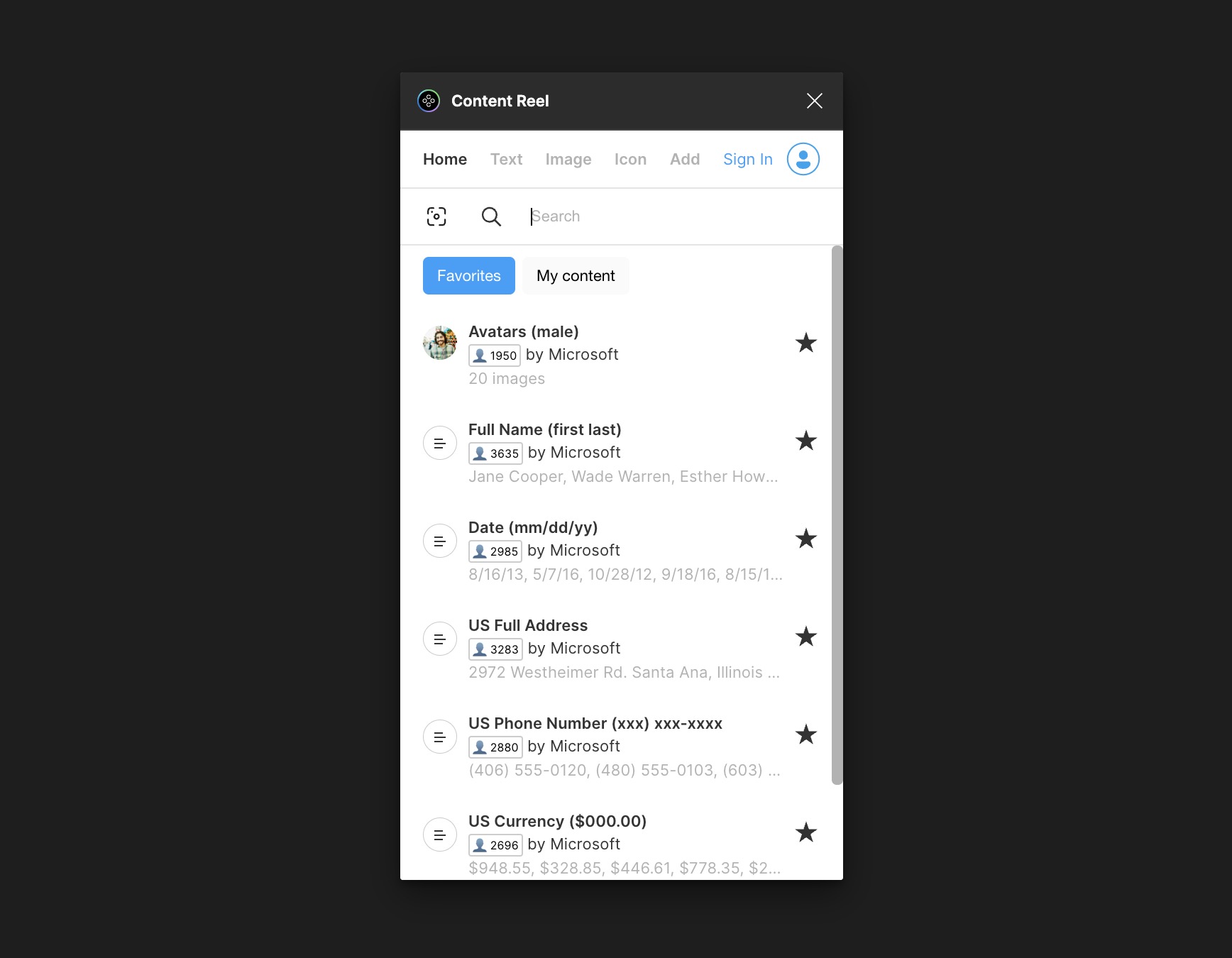
Content Reel
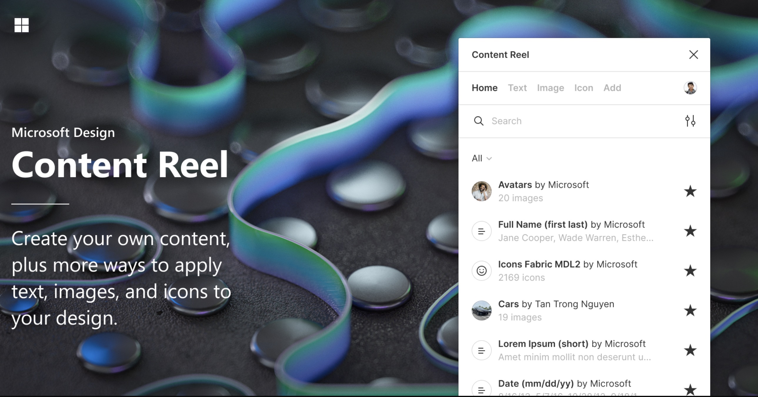
You can find literally everything with Content Reel from images and text strings to icons and avatars. I use this plugin frequently, and it's been developed by Microsoft. For me, it's the most crucial and time-saving tool in my design arsenal
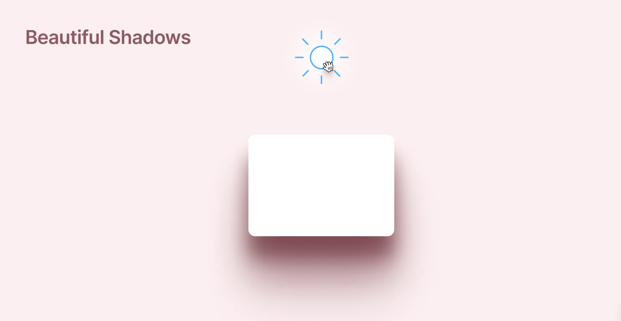
Beautiful Shadow
The Beautiful Shadow plugin makes it easy to create realistic, smooth shadows in your designs. Simply drag a "light source" over elements to produce natural-looking shadows that enhance visual appeal. This tool is great for designers looking to improve the visual impact and consistency of their projects
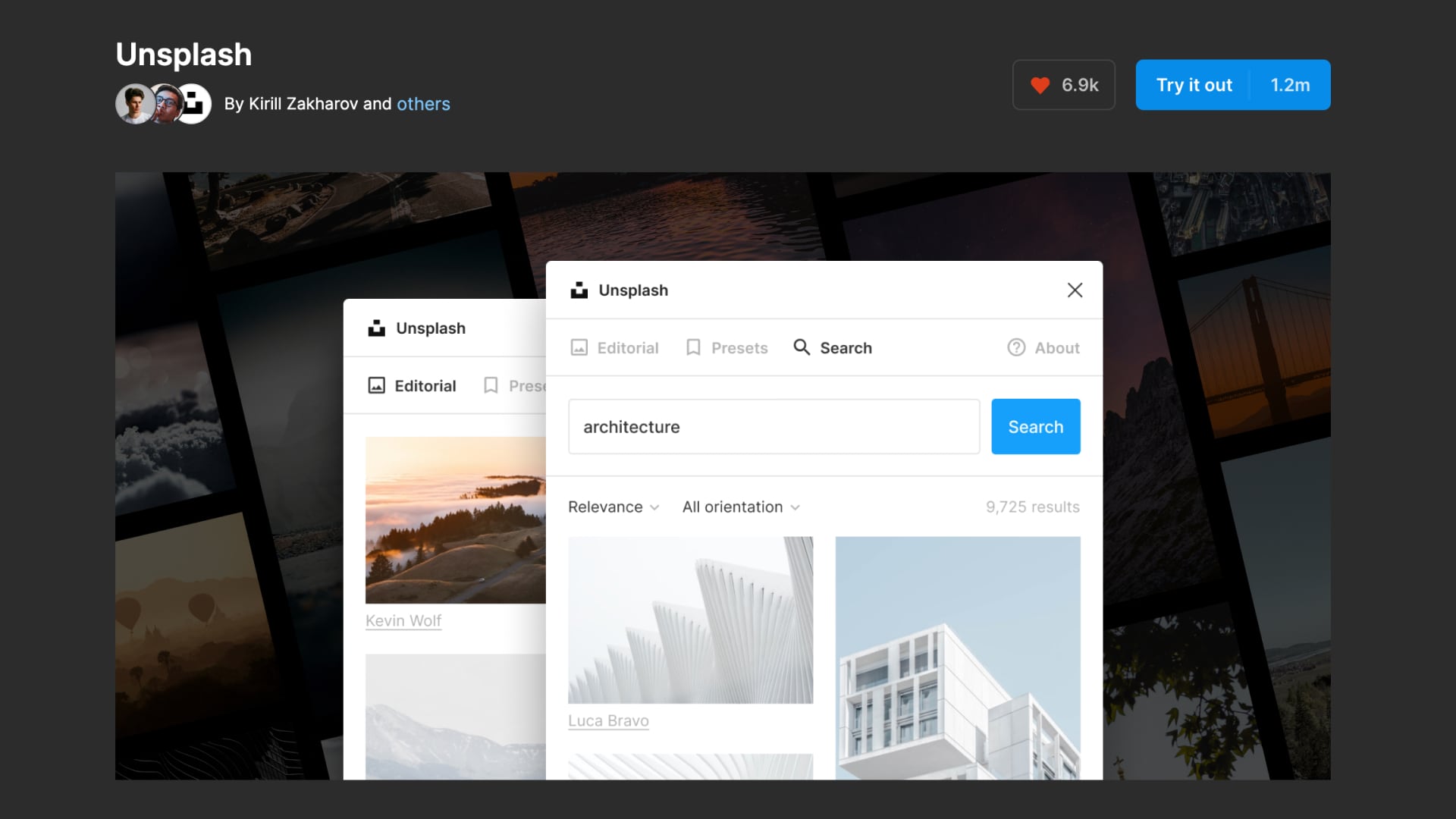
Unsplash
The Unsplash Plugin for Figma offers easy access to a wide collection of free, high-quality images directly within your design projects. Ideal for designers, photographers, and companies, this plugin lets you quickly find and use beautiful photos for various purposes like marketing or backgrounds. It simplifies adding images to your designs, enhancing creativity and efficiency without licensing concerns.
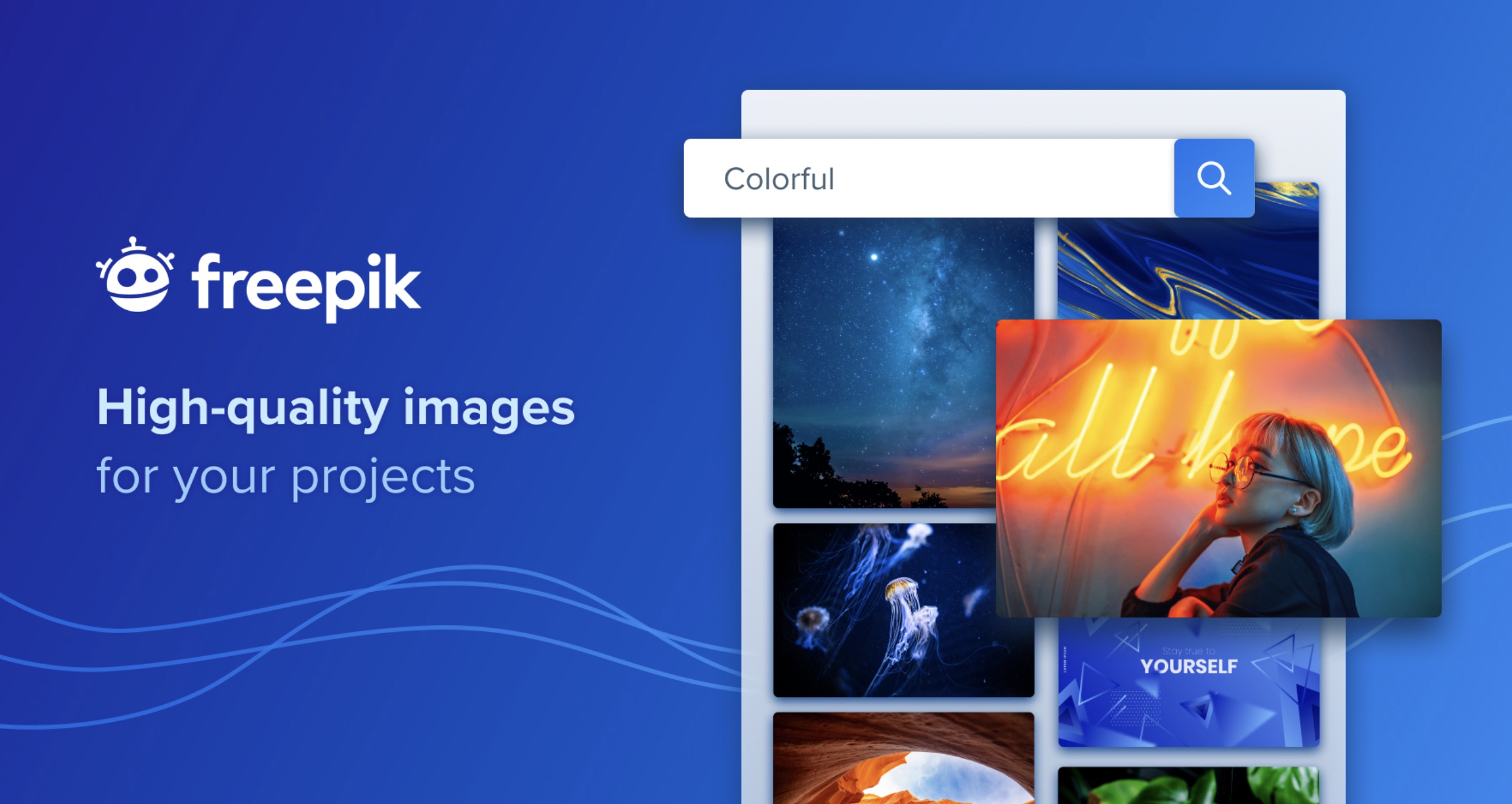
Freepik
The Freepik plugin gives designers quick access to a huge collection of graphic resources like photos, vectors, illustrations, and PSD files. Easily integrated into your design software, it lets you browse and add these assets directly to your projects. This plugin helps boost your productivity and allows you to bring creative ideas to life efficiently.
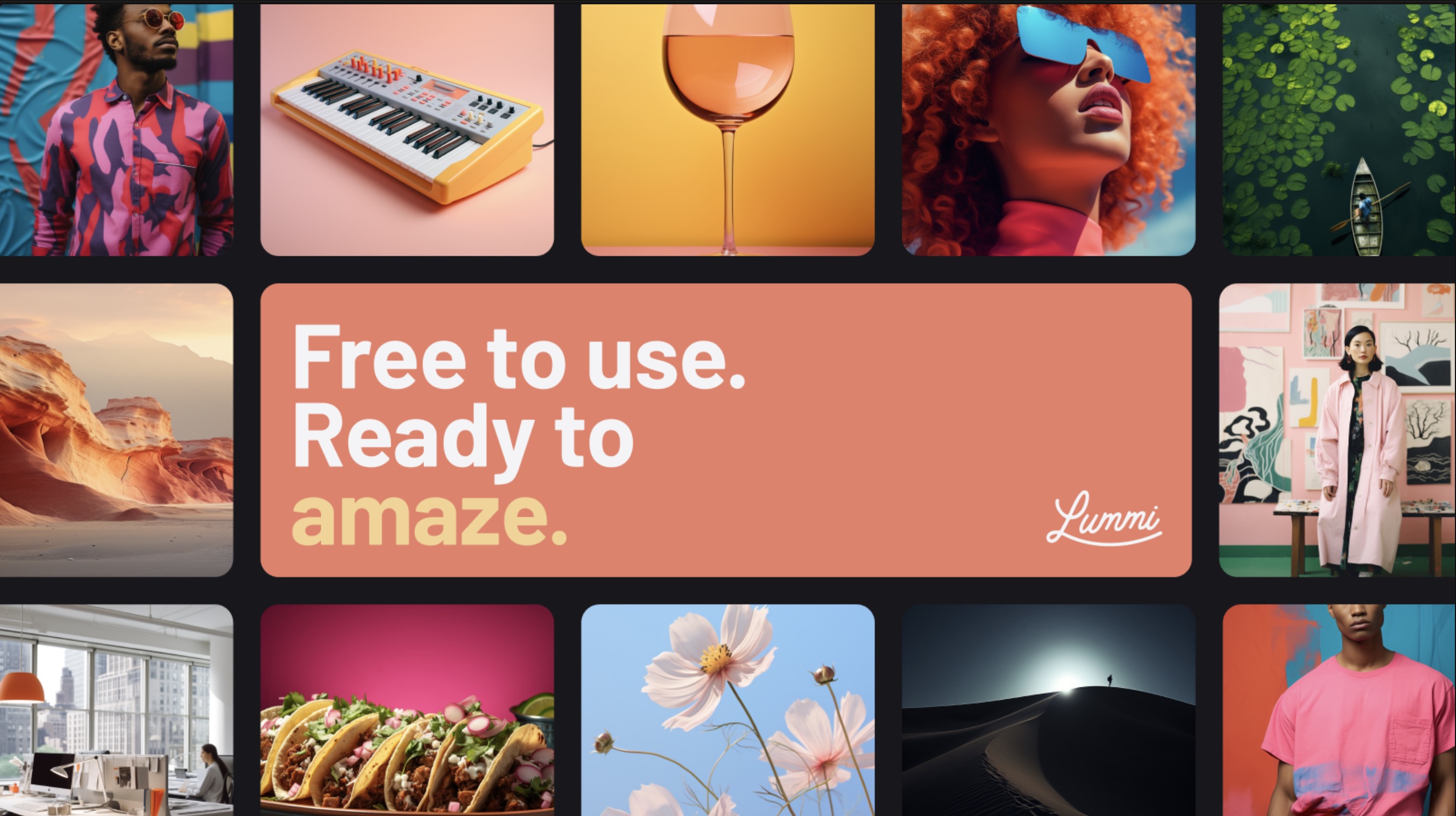
Lummi
Enhance your designs with Lummi ’s Figma Plugin. This tool brings you beautiful, AI-generated images by talented digital artists. Find everything from vibrant landscapes to captivating portraits, all ready to elevate your projects. With easy integration into Figma, the Lummi Plugin lets you quickly find and use the perfect images for your design needs.
RemoveBG
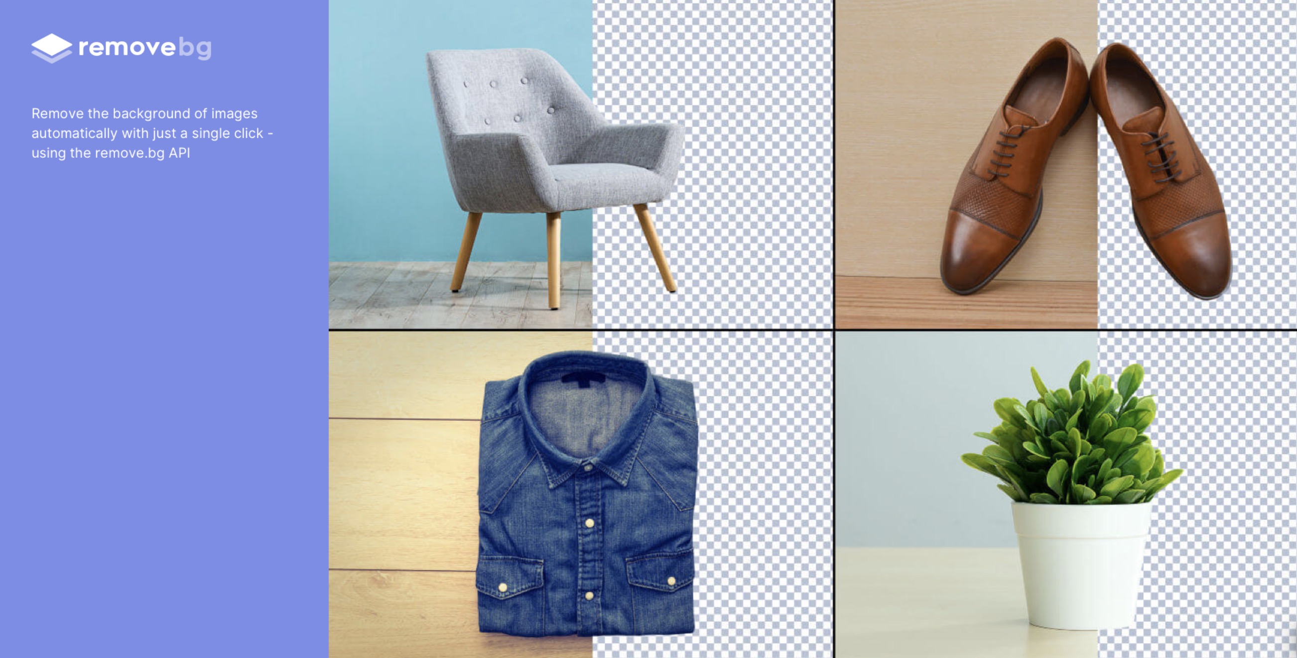
Quickly remove backgrounds from your images with just one click using the Remove BG plugin. This tool simplifies the background removal process, letting you concentrate on the creative parts of your projects. Ideal for designers, photographers, and businesses aiming to improve their workflow, Remove BG offers easy integration. Note: You need a remove.bg account to use this plugin.
LottieFiles
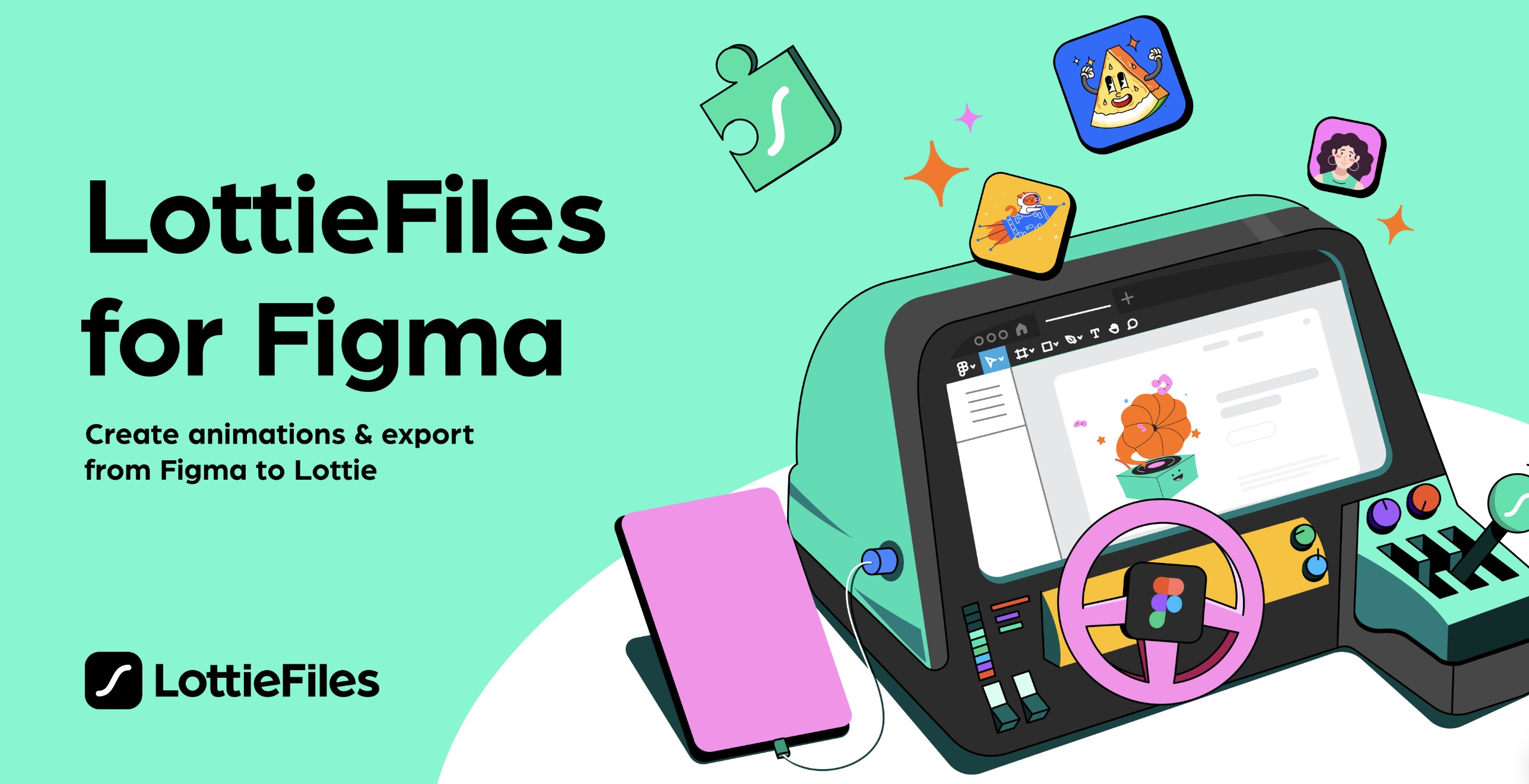
The LottieFiles plugin makes it easy to add and create animations for your designs. You can access a wide range of ready-to-use, lightweight animations, or make your own right within the tool. This plugin allows you to search, preview, and apply animations directly from your design software, streamlining your workflow and enhancing your projects.
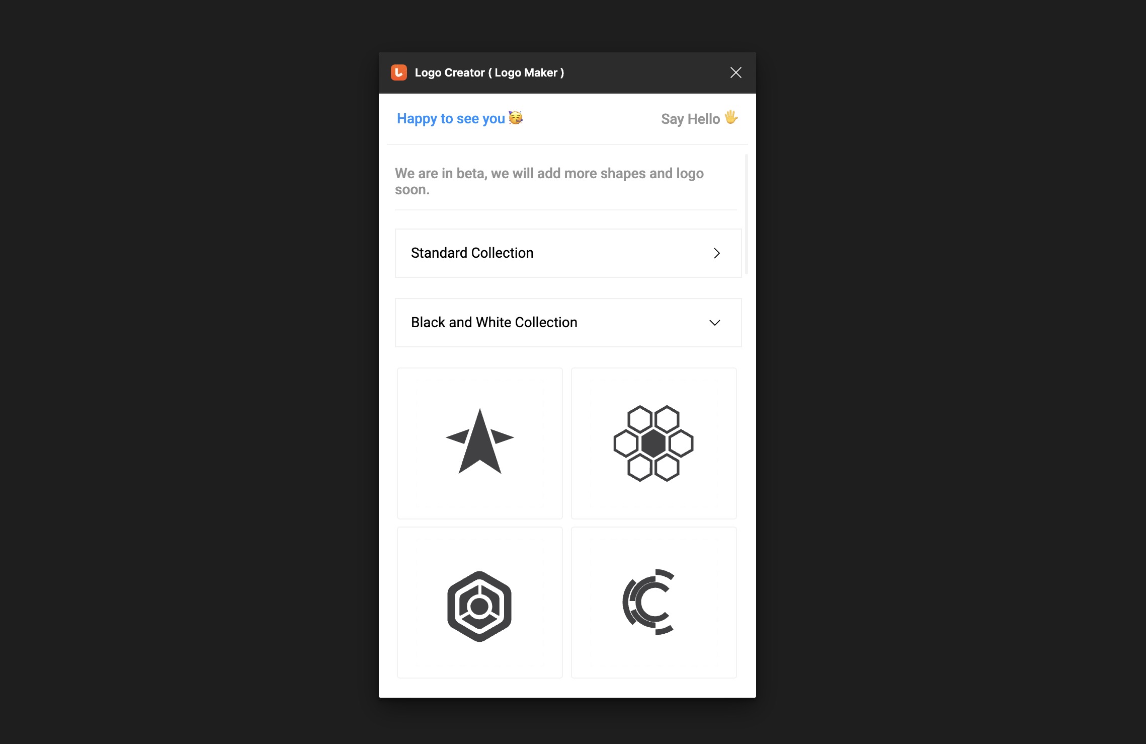
Logo Creator
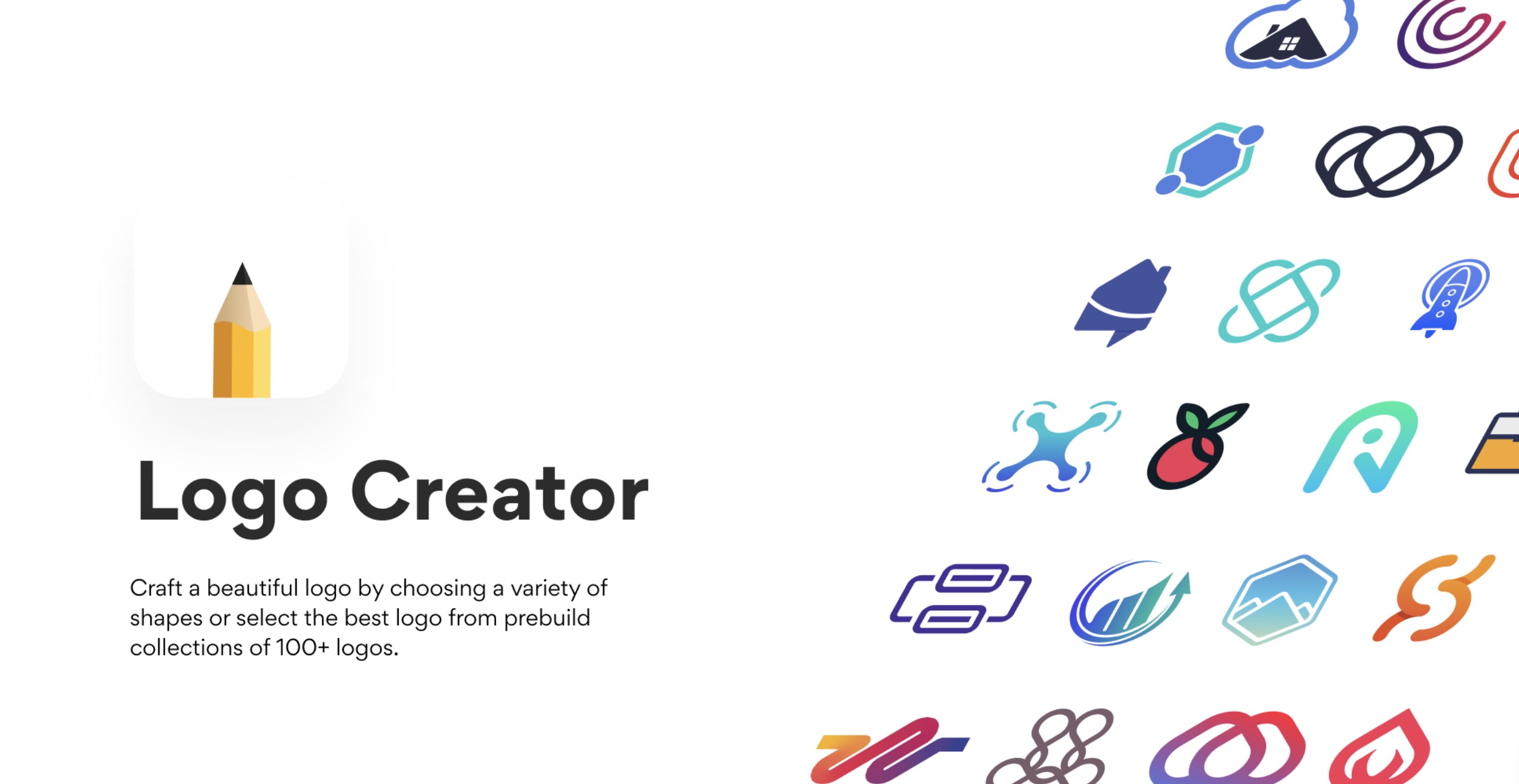
Find your perfect logo inspiration directly in Figma with the Logo Creator plugin. Choose from over 300 prebuilt logos or customize your own using a variety of shapes and components—all within a single, convenient tool.
Styles
To fill the container, instead of repeating the entire process, you have the option to copy the properties. However, a more efficient approach is to create styles. Styles in Figma are predefined sets of properties that can be applied to objects in your designs, ensuring consistency and efficiency. These styles can be applied to text, colors, effects, and more, making it easier to maintain a unified appearance across your project.
Text Styles
Text styles in Figma save specific attributes of text such as font family, weight, size, line height, letter spacing, and paragraph spacing. By defining text styles, you can easily apply the same typographic properties to different text elements across your design, ensuring textual consistency. For instance, you might have text styles for headings, subheadings, body text, captions, etc.
Color Styles
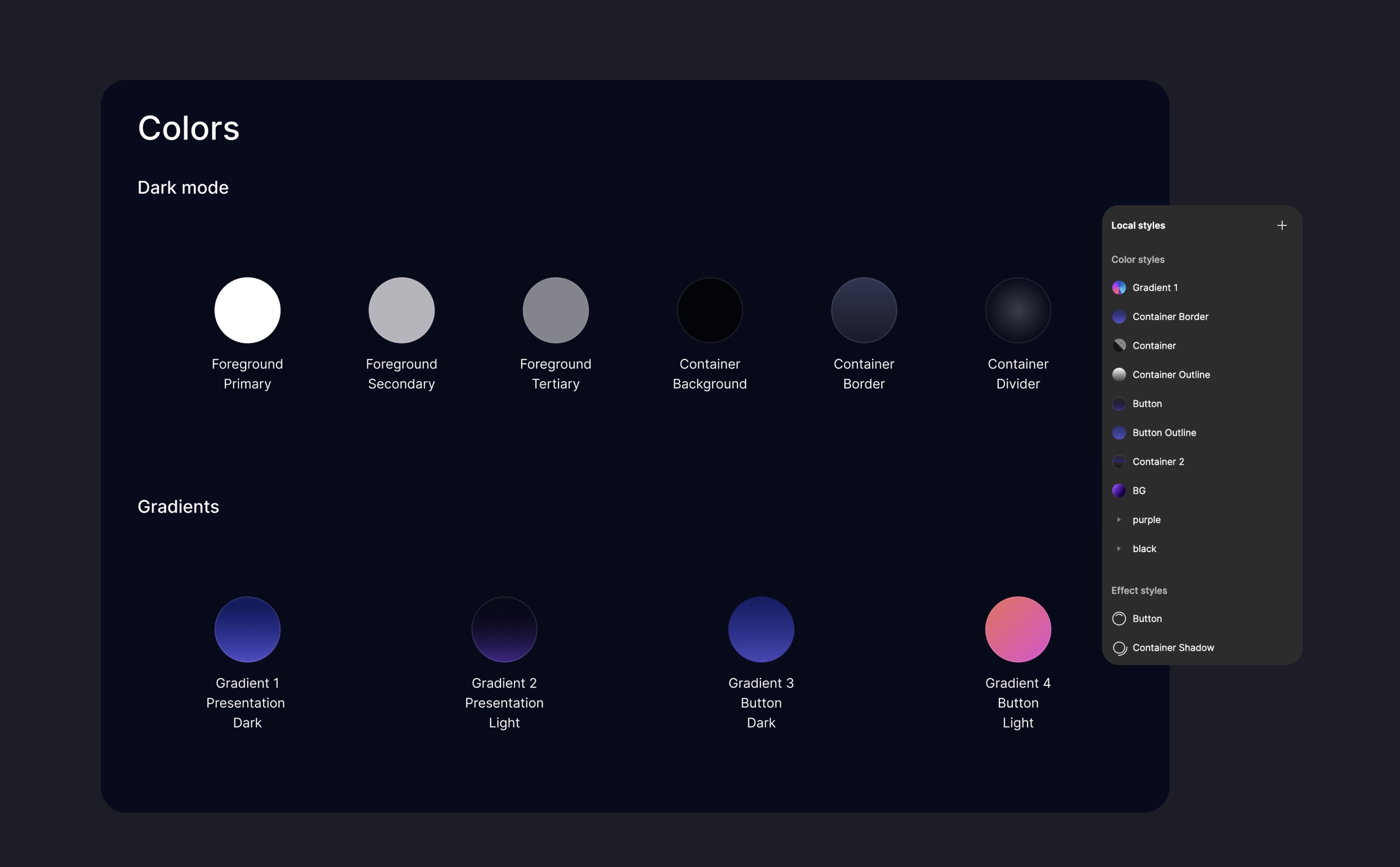
Color styles store specific color values (and sometimes gradients or images) that you can apply to fills, strokes, and backgrounds. Using color styles helps in maintaining a consistent color scheme throughout your design. If you need to change a color universally, updating the color style will automatically apply the change to all instances where the style is used, saving you time and effort.
- Color styles in Figma store specific color values that can be applied to fills and strokes. To create a color style, click on the 'Create style' icon, then add and name your style to clarify its purpose.
- Now, we're going to fill the delivery button with the button style. And add stroke using the button outline too.
- There's something missing from the button, I forgot to add the effects. We'll also create a style for the effects, and then, apply to the delivery button.
Effect Styles
Effect styles allow you to save and reuse settings for various effects like drop shadows, inner shadows, layer blurs, and background blurs. By creating effect styles, you can ensure that elements like buttons, cards, and modal windows have consistent shadowing or blurring effects across your design. This is especially useful for maintaining a consistent visual depth and focus across different UI elements.
Corner Radius
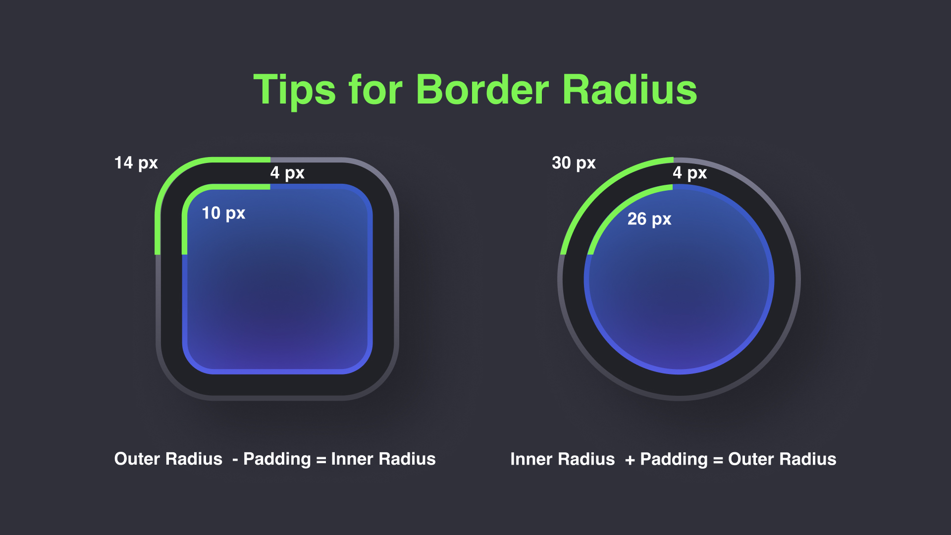
When designing user interfaces, it’s essential to pay attention to details that enhance both aesthetics and usability. One such detail is the use of border radii. Adjusting the corner radius of elements can dramatically affect the perception of your design, making interfaces feel more friendly and accessible. Here's a step-by-step guide on creating and managing border radius in your design to ensure consistency and visual appeal. Here's a little trick that's easy to remember: If you're looking for the inner radius, you should follow this formula: inner radius = outer radius - padding. It's the same when searching for the outer radius, but in reverse, you would add instead. For example, outer radius = inner radius + padding.
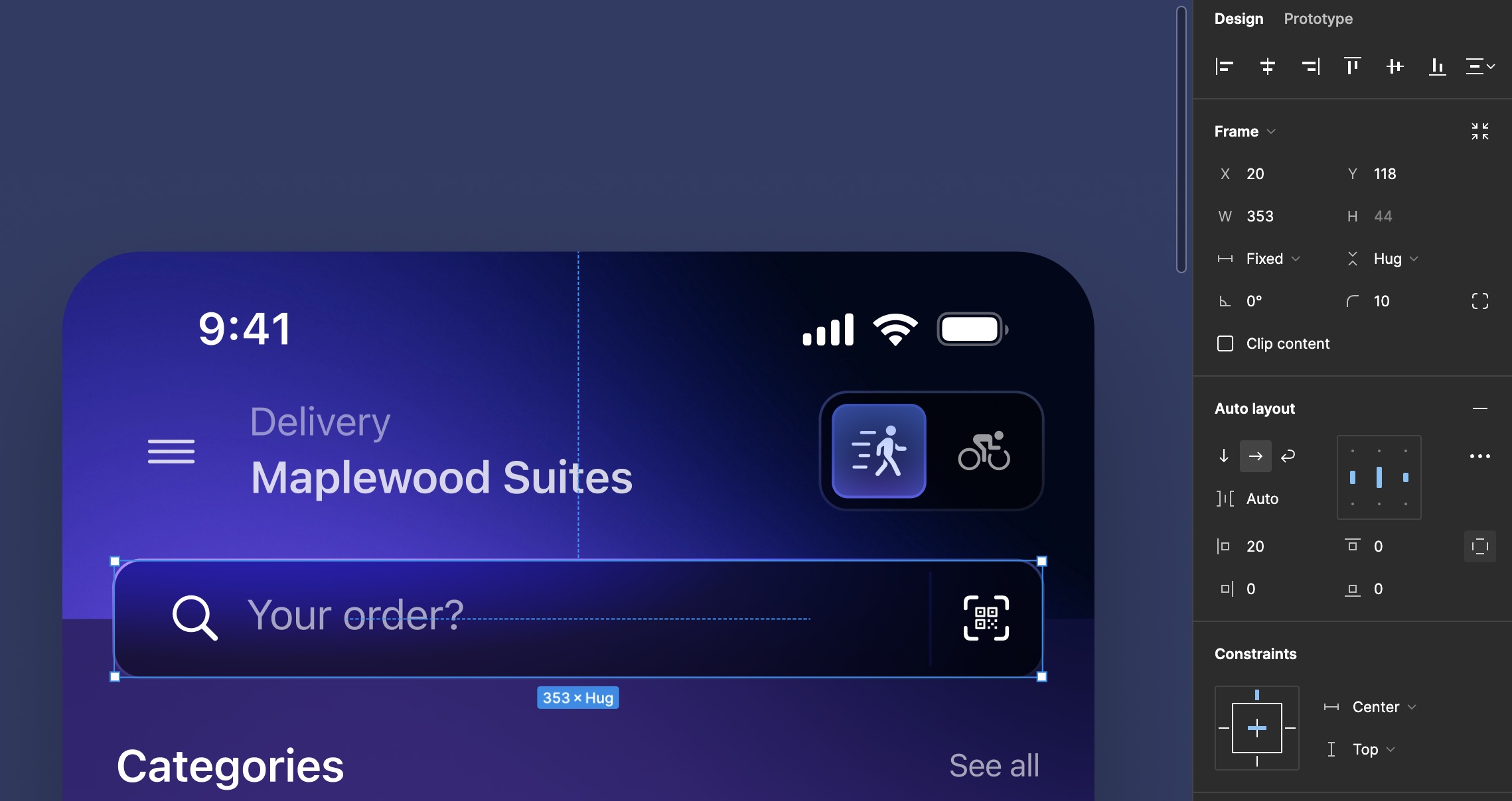
- Set the outer corner radius to 10. Calculate the inner corner radius by subtracting the padding (4) from the outer radius: 10 - 4 = 6. The inner corner radius should be 6.
- Name the layer accordingly. Select both the left container and the segmented control container. Add auto layout and set the width to 393.
- Apply 20 for horizontal padding and set the gap between items to auto. Position the containers below the status bar.
![Styles and Plugins image 12]()
Search Bar
Now, let’s create the search bar. You will need the magnifying glass and qrcode icons. Then, type “Your order?” using the Callout/Regular style. Group the magnifying glass and the text inside a container using auto layout. Set the spacing between them to 8.
- Start by adding the magnifying glass and QR code icons to your layout. Next to the icons, type “Your order?” using the Callout/Regular style for the font.
- Group the magnifying glass icon and the text inside a container. Use auto layout and set the spacing between them to 8.
- Press 'L' to create a line. Set the line length to 36 and orient it vertically. Color the line white and apply an overlay fill.
- Group the newly created separator with the QR code icon and set auto layout with no spacing (0).
- Select all components and set the overall width to 353. Adjust the horizontal padding to 20. Set the gap between items to "Auto" to allow for automatic adjustment based on item sizes and space.
- Apply a fill using the container style and add an external stroke to define the boundaries more clearly. Round the corners to a radius of 10.
- Type "Categories" using the "Body/Emphasized" style for the font.
- Duplicate this text and change it to "See all" using the "Caption 1" style.
- Group these texts in a container using auto layout, set the width to 353, and choose auto for the gap between them. Ensure the texts are centered. Name all the layers for clarity and easy management.
- Group the header ("Categories" and "See all") and the categories section together. Set the spacing between these groups to 16.
![Styles and Plugins image 13]()
Cards
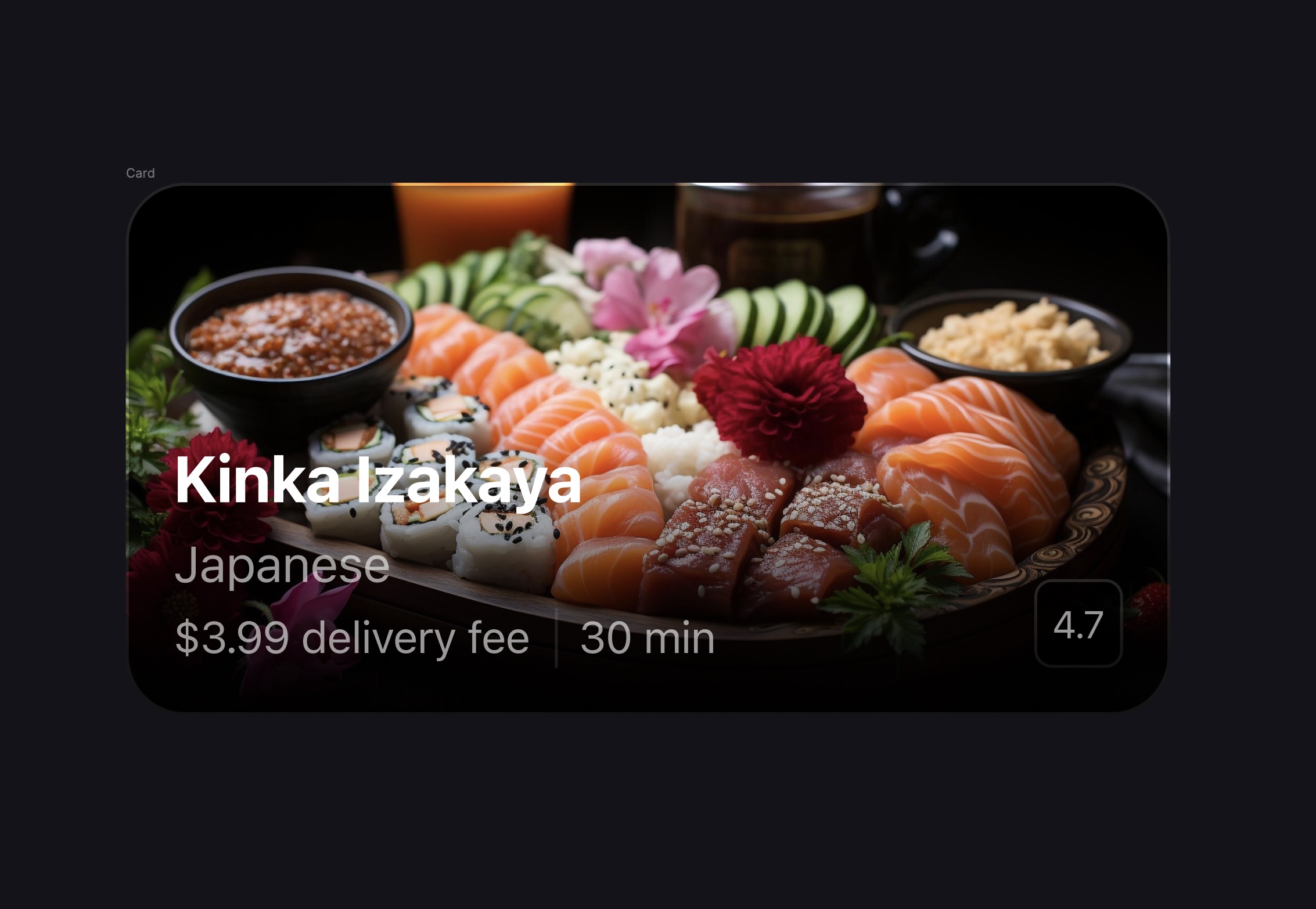
- Set up a new frame with dimensions of 353x180 pixels.
- Fill the frame with an image sourced from Unsplash, Freepik, or Lummi.
- Apply a container outline style for the frame.
- Set up another frame over the background for the gradient effect. Use black color, apply it vertically with 0% opacity at the top and 100% opacity at the bottom.
- Insert the restaurant name using the "Title2" style.
- List the food categories using the "Body/Regular" style.
- Include details like delivery fees and times using the "Subheadline Regular" style. Set the text color opacity to 60% and add the restaurant rating.
- Place a separator between the delivery fee and time information.
- Enclose the delivery details and separator in a container. Set the spacing in this container to 8.
- Select all elements and add them to another auto layout with a spacing of 4. Ensure the new container has a spacing of 16 from both the left and bottom edges of the main frame.
![Styles and Plugins image 14]()
Add Wallpaper
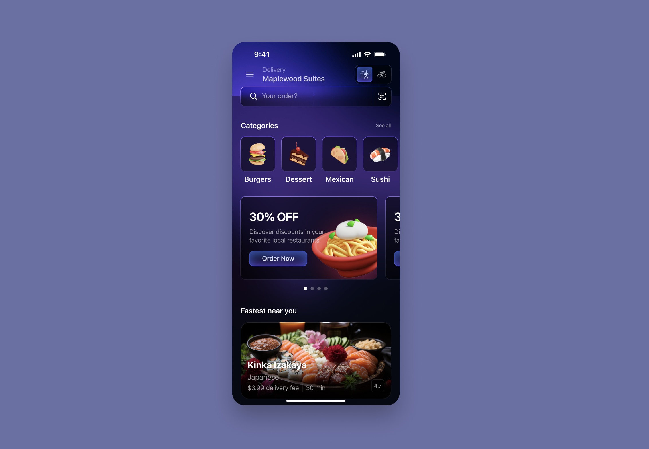
- Put the card under the 'Fastest Near You' title in a container spaced by 16px. Remove 'See All'.
- Duplicate the cards and change their images and text.
- For a more striking design with minimal effort, use a wallpaper. You can use the wallpaper in my asset; place it behind all the layers.
- Place a glass effect frame in front of the wallpaper to hide it. Fill the frame with black, reduce the opacity, and add background blur.
- Move the search field up to the navigation bar, maintaining a spacing of 8.
- Adjust the frame to align it to the middle of the search field.
![Styles and Plugins image 15]()
Selecting Restaurant Screen
In this step, we'll focus on designing the second screen for our app, which will serve as the selected restaurant interface. We'll begin by duplicating the main frame and customizing it to fit the requirements of this screen. And proceed with adding a food image to enhance the visual appeal of the screen with the Unsplash, Freepik or Lummi plugins.
- Duplicate the main frame. Delete all elements except the status bar, home indicator, navigation bar, wallpaper, and glass background.
- Replace the icons in the navigation bar with a chevron for "Go Back," a heart for "Favorite," and the "More" option.
- Group the "Favorite" button and "More" option together using Auto Layout.
- Remove the auto gap and set the spacing between the buttons to 8.
- Resize the group to fill the container adequately.
- Create a frame for the image size 393 by 340. Insert a food image into the frame.
- Position the frame on top of the mainframe to integrate the food image seamlessly into the design.
![Styles and Plugins image 1]()
Content Reel
In this step, we'll enrich our design by incorporating essential information about the restaurant using the Content Reel plugin.
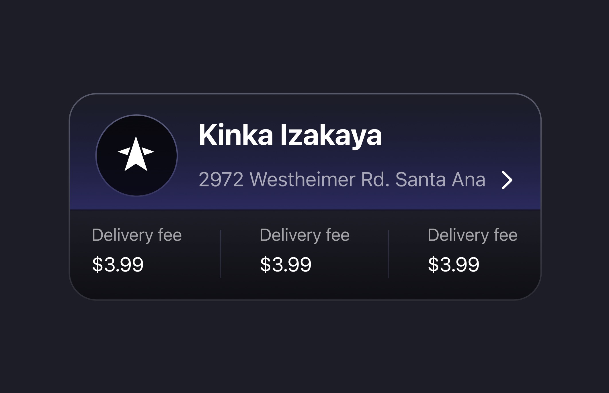
- Type "Kinka Izakaya" in Title 2 style. Then, I'll duplicate the text, switch to the Subheadline style, and change the text to a random address.
- Add a chevron icon on the right to allow users to click and see all the information about the restaurant, such as the complete address, opening times, etc.
- Select the address and chevron icon, and group them in an auto layout with a spacing of 8.
- Group this new address container with the restaurant's name in another auto layout, with an spacing 8.
![Styles and Plugins image 2]()
Add Logo Creator
- Create a circle that is 60 by 60. We'll add a logo to it later.
- Create an auto layout with the text box, setting a spacing of 16 between them.
- Create a frame for the logo. Then, open the logo creator where you will find unique and interesting logos. I will choose one at random.
- Resize our logo using the scale tool and remove the background.
- Select the frame, round the corner to 60, delete the circle. Fill with the same color styles.
![Styles and Plugins image 3]()
Delivery Details and Ratings
Now, let's add some information about delivery fee, delivery time and also, rating and review.
- Type "Delivery fee" using the footnote style. Duplicate it and change the text to a random amount using the subheadline style.
- Duplicate two more, and add a separator between them, to avoid repeating the same process, im going to copy form the search field or recreate on using line.
- select the three text boxes and the two separators and group them together in another layout. Set the spacing between items to 8.
- Group this new container with the first container in the same auto layout. Add 16 for both horizontal and vertical padding.
![Styles and Plugins image 4]()
Linear Gradient
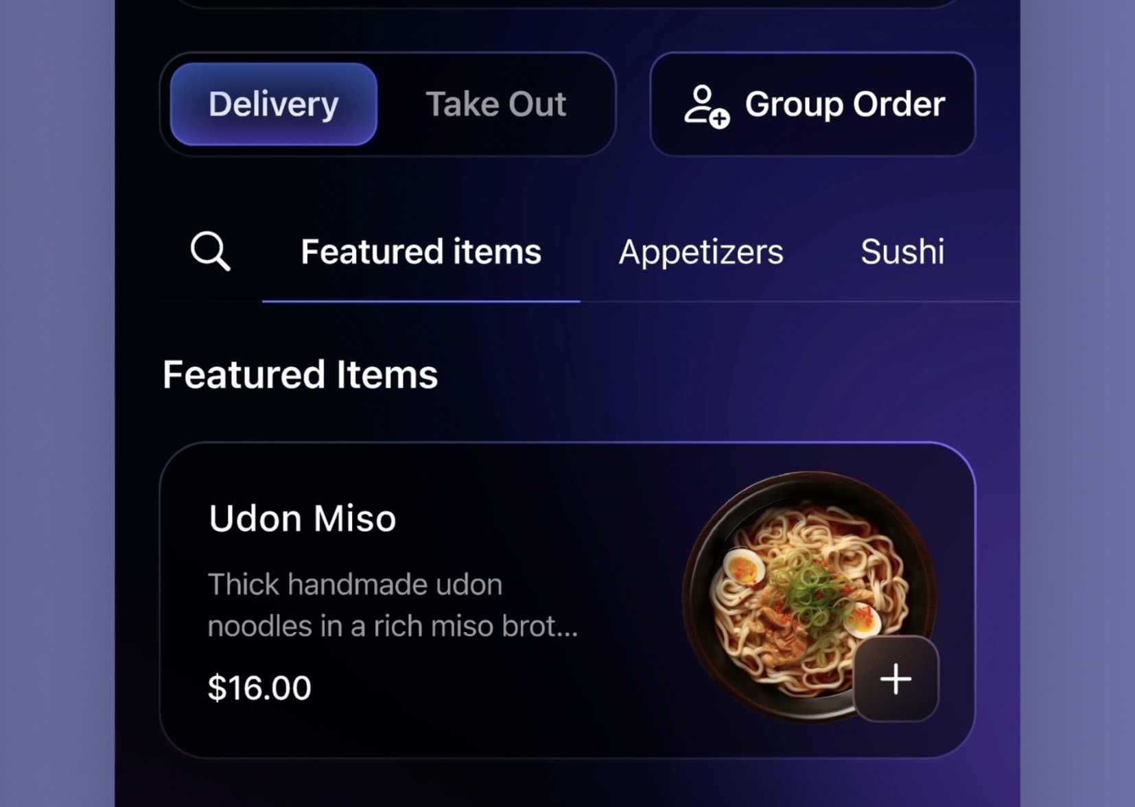
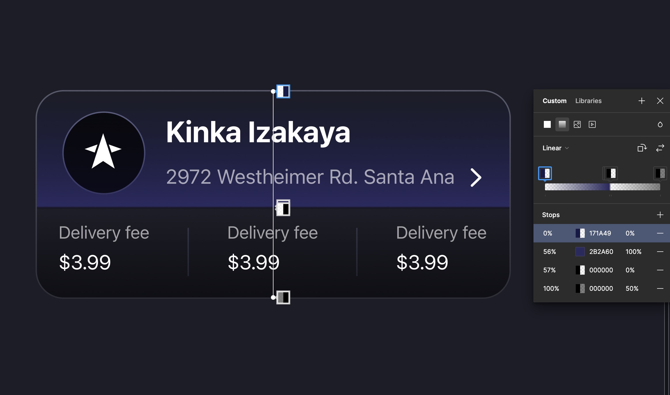
We're going to fill the card using a vertical gradient, starting with dark blue at the top, at 0%, and transitioning to black at 50%. This gradient should allow the background image to be visible. For the separator, we will create a linear gradient between the two child containers, featuring two color stops: the first color will be mauve, followed by black with 0% opacity positioned slightly below the first. The separator should align with the top edge of the image. Now, we're going to add stroke using the same color style. Also, I'm going to darken the logo container.
Segmented Control
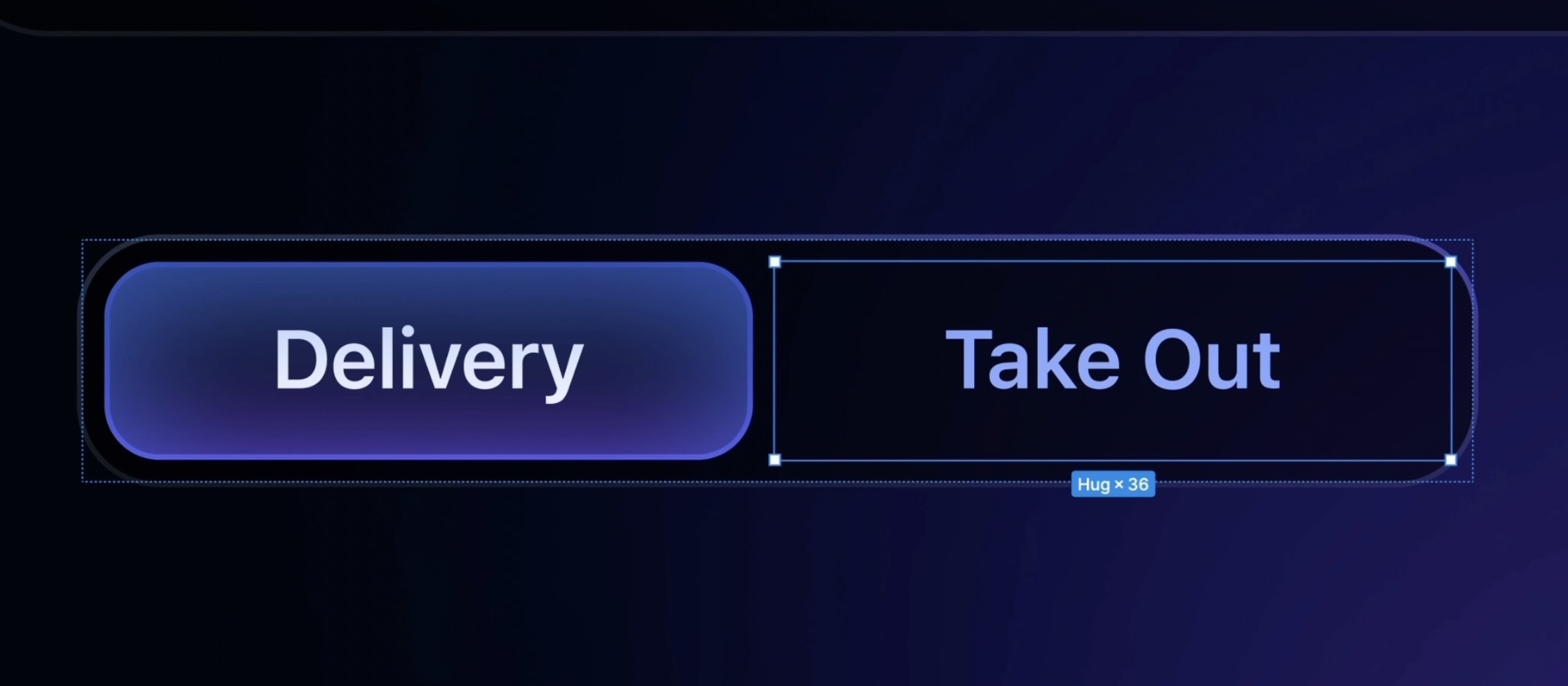
A segmented control is a user interface element used to select one option from a set of mutually exclusive choices. It typically appears as a row of segments, allowing users to toggle between options with a single selection.
- Copy the button, duplicate another button, place both buttons in a new layout with a spacing of 4, and add padding of 4 on all sides. We're going to desectioned the take out button by removing the colors.
![Styles and Plugins image 6]()
Group Order Button
Why do I use a segmented control for delivery and takeout, and keep group order separate? This is an important UX consideration. Delivery and takeout are similar—they both simply involve how the user gets their food, so they fit well together in a segmented control. Group orders, however, include more complex features like inviting friends, splitting the bill, or choosing different delivery spots. We need to ensure that the design differentiates between the regular order button and the group order button. We can do this by choosing different colors or adding icons.
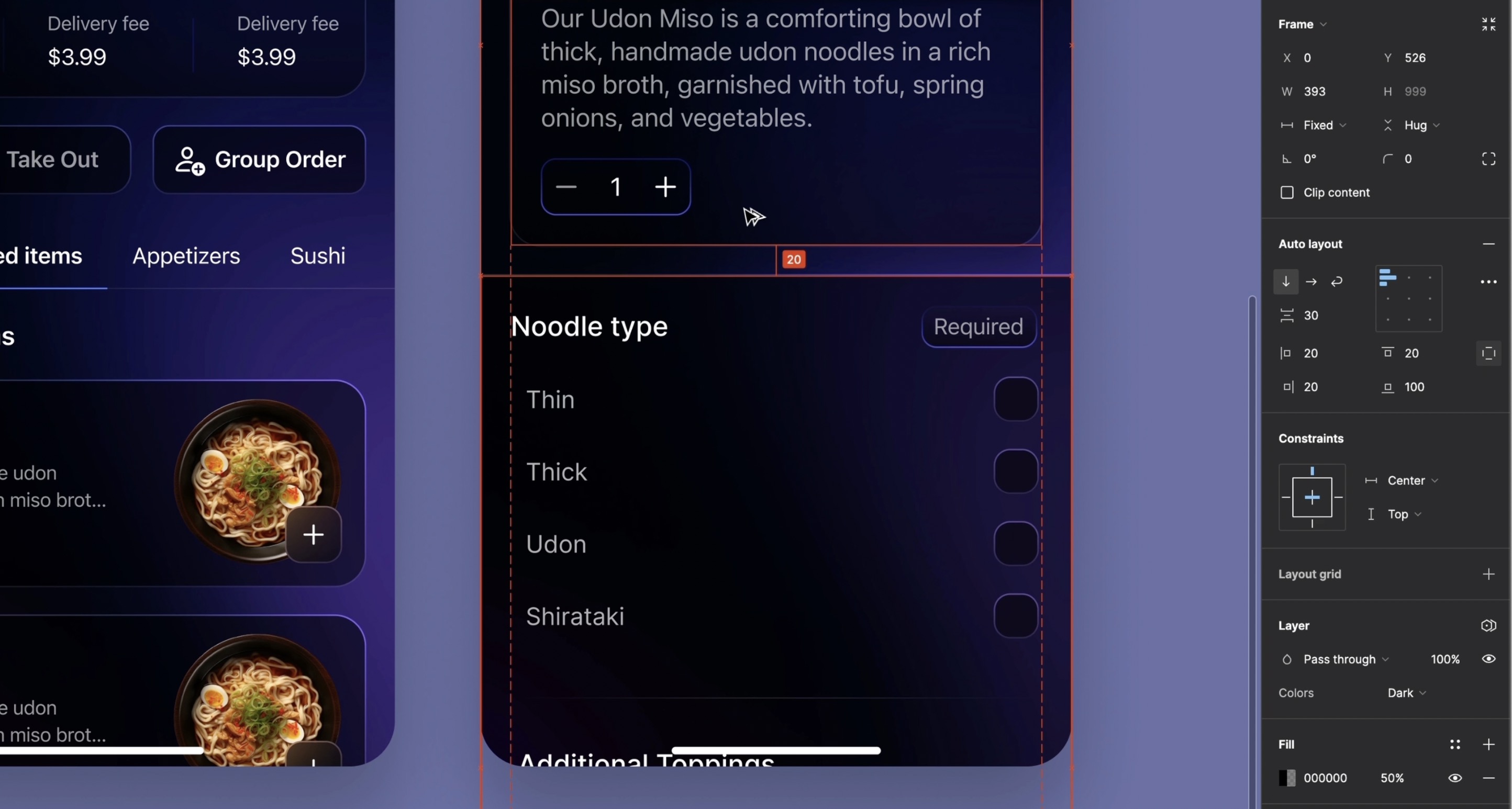
- First, we'll adjust the padding to 16 instead of 30, as there's now less room. Next, we'll duplicate the button and set its height to 44 to match the segmented control. Finally, update the button text.
- We'll put the segmented control and the button together in an auto layout. I want the width to be 353, so I need to set the fill container to the child containers. Then, set the spacing to "16". Align in the center, and the spacing between the two elements should be 20.
- Add the tab, which serves as the menu for users to select their food. You can either keep the glow or just use a line to indicate category selection.
![Styles and Plugins image 7]()
Remove BG
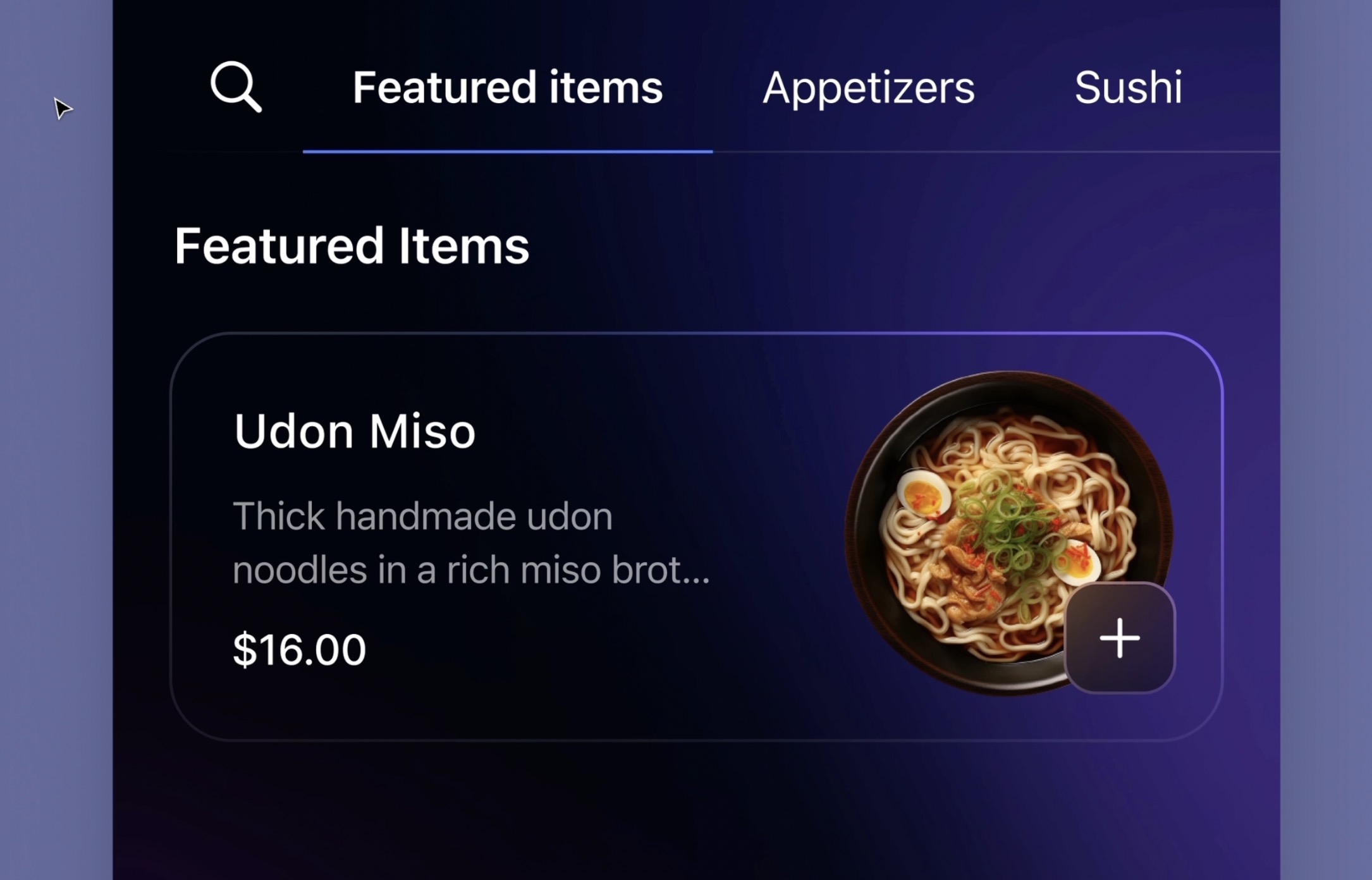
We'll now take a look at the item card. You'll notice that I haven't used the same color style as the other cards. For consistency, I recommend choosing a maximum of two styles. I designed it this way because my photo has a black background, which doesn't work well when I remove the black gradient. One solution is to use the removeBG plugin to eliminate the background. With a single click, our image will no longer have a background, allowing us to use the same color style.” Duplicate another card and change the image and text. Then we'll make another page.
The last screen
We've reached the final stage; we're going to create our third screen, which is for selecting food.
- Duplicate the main frame and delete everything except the status bar, navigation, background and image et the info card. We're going to replace the image with the selected food image, and replace the info card with another one in the asset page.
- now we'll take the customize food card already prepared for you.
- Next, we'll set up the 'Add to Basket' button area to remain fixed, while the other elements scroll during the prototype. Duplicate the button, create a frame measuring 393 by 108, and paste the button inside it. Include the home indicator and adjust the button size to 393 by 44.
![Styles and Plugins image 9]()
Glow Button
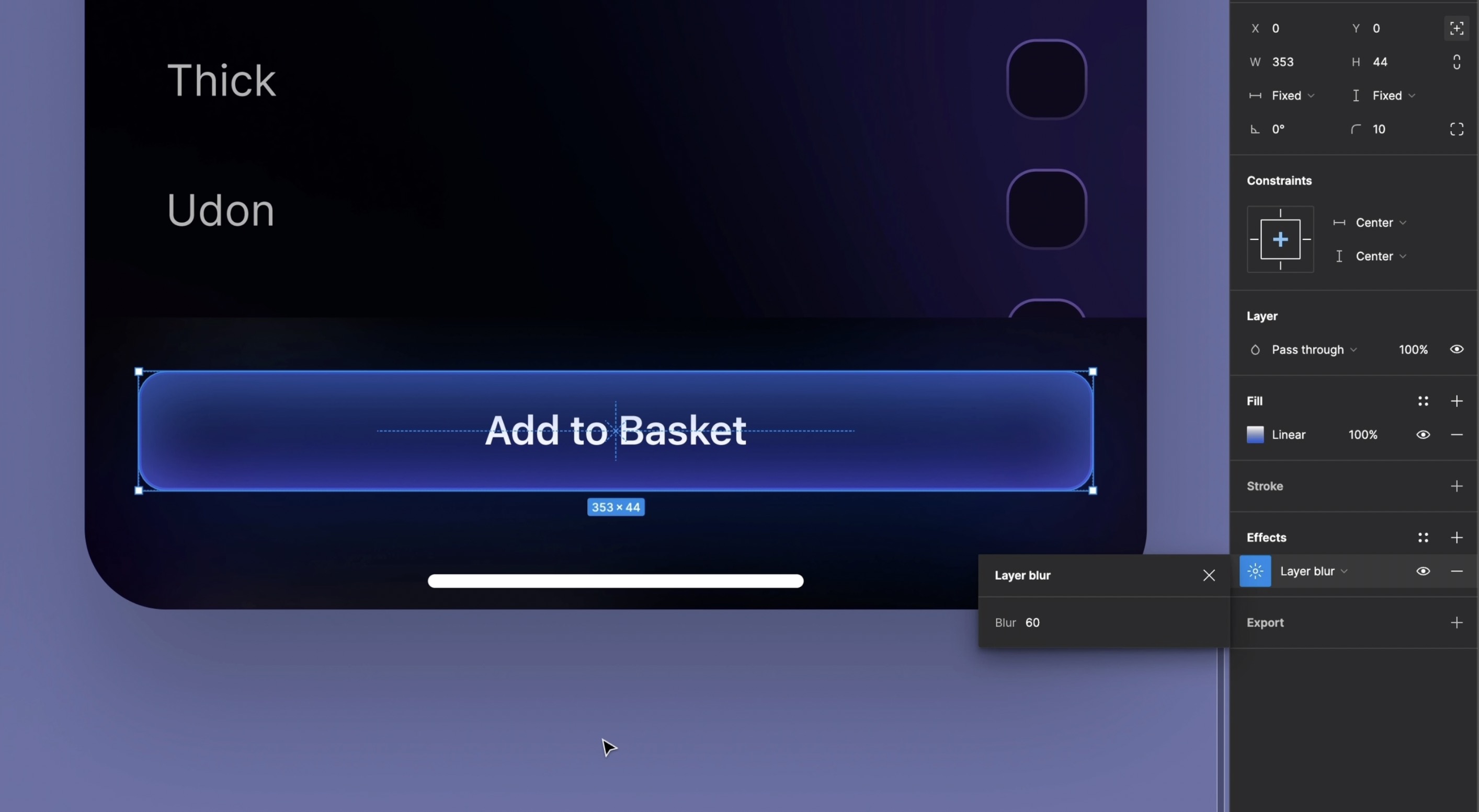
For a distinctive touch, I'm adding a subtle glow effect to one of our buttons, which we haven't applied to the others. We'll start by creating a rectangle that matches the size of the button. This rectangle will be filled with a linear gradient, transitioning from dark blue at the top to a lighter blue at the bottom. After filling, we'll enhance it with a layer blur to achieve the glow effect. Next, we'll incorporate this glowing rectangle into the auto layout to maintain flow consistency. To ensure it blends perfectly without disrupting the layout, we'll set its position to 'absolute' and center it.
Create the Glow Rectangle
- Begin by creating a rectangle that matches the dimensions of the button.
- Fill this rectangle with a linear gradient starting with dark blue at the top and fading to lighter blue at the bottom.
- Add a layer blur to the rectangle to create the glow effect.
- Insert the glowing rectangle into the auto layout to maintain design consistency.
- Set the position of the rectangle to 'absolute' and center it within the layout to ensure it does not disrupt other elements.
- Move the glowing rectangle layer above the text layer to make the glow visible.
- Locate the tab bar in the asset page. Place it at the bottom of the Home Screen to complete the setup.
![Styles and Plugins image 10]()
Conclusion
Congratulations on completing the design part! We've explored Figma plugins that enhance your design workflow, allowing you to create more efficiently and innovatively. Use these tools to keep pushing the boundaries of your creativity and to refine your digital experiences. Next section, we’re going to learn about prototype.
Templates and source code
Download source files
Download the videos and assets to refer and learn offline without interuption.
Design template
Source code for all sections
Video files, ePub and subtitles
Videos
1
Introduction to UI/UX Design
Finding inspiration with Mobbin and transforming ideas into unique designs using Figma
5:39
2
UI Kits and Templates
Accelerating design efficiency by using UI kits and templates
8:18
3
Shapes, Gradients and Strokes
Design a smart home iOS App and learn to use shapes, gradients, and strokes to create a thermostat interface
15:15
4
Icons, Typography, and Styles
Improve the design of our smart home application with icons, typography, and effects
9:43
5
Auto Layout, Constraints and Pen tool
Adding finishing touches on our design with Auto Layout, constraints. Use the Pen Tool to create intuitive controls
16:23
6
UX Research and Design Flows
Diving Deeper into UX Research and the Importance of Designing User Flows
16:19
7
Styles and Plugins
Exploring Figma Tools and Plugins to Enhance Creativity and Efficiency
13:09
8
Animation, Sticky Scroll and Overlay
Bridging Design and Interaction with a Step-by-Step Guide to Prototyping
10:13
9
Flat Design and Light Mode
Exploring the Essentials of Flat Design and Light Mode for a Cleaner and More Intuitive User Experience
16:57
10
Visual Hierarchy and Information Architecture
Explore the role of visual hierarchy in UI design and learn to structure and organize content to improve a product's usability
11:07
11
Typography and Colors Variable
Learn How to Streamline Your Designs with Typography and Color Variables
14:34
Meet the instructor
We all try to be consistent with our way of teaching step-by-step, providing source files and prioritizing design in our courses.
Sourasith Phomhome
UI Designer
Designer at Design+Code
19 courses - 72 hours

Master AI Prompting for Stunning UI
Learn how to leverage AI tools like Aura for creating beautiful designs, working with templates, and experimenting with advanced prompts. A concise guide for designers and developers to level up their skills.
10 hrs

Design Multiple Apps with Figma and AI
In this course, you’ll learn to design multiple apps using Figma and AI-powered tools, tackling a variety of real-world UI challenges. Each week, a new episode will guide you through a different design, helping you master essential UI/UX principles and workflows
4 hrs

SwiftUI Fundamentals Handbook
A comprehensive guide to mastering Swift programming fundamentals, designed for aspiring iOS developers. This handbook provides a structured approach to learning Swift's core concepts, from basic syntax to advanced programming patterns. Through carefully sequenced chapters, readers will progress from essential programming concepts to object-oriented principles, building a solid foundation for SwiftUI development. Each topic includes practical examples and clear explanations, ensuring a thorough understanding of Swift's capabilities. This handbook serves as both a learning resource and a reference guide, covering fundamental concepts required for modern iOS development. Topics are presented in a logical progression, allowing readers to build their knowledge systematically while gaining practical programming skills.
2 hrs

Design and Code User Interfaces with Galileo and Claude AI
In this course, you’ll learn how to use AI tools to make UI/UX design faster and more efficient. We’ll start with Galileo AI to create basic designs, providing a solid foundation for your ideas. Next, we’ll refine these designs in Figma to match your personal style, and finally, we’ll use Claude AI to turn them into working code—eliminating the need for traditional prototyping.
4 hrs

Design and Prototype for iOS 18
Design and Prototype for iOS 18 is an immersive course that equips you with the skills to create stunning, user-friendly mobile applications. From mastering Figma to understanding iOS 18's latest design principles, you'll learn to craft two real-world apps - a Car Control interface and an AI assistant.
3 hrs

Master Responsive Layouts in Figma
Creating responsive layouts is a must-have skill for any UI/UX designer. With so many different devices and screen sizes, designing interfaces that look great and work well on all platforms is necessary. Mastering this skill will make you stand out in the field. In this course, we'll start from scratch to create this beautiful design using Figma. You'll learn how to make layouts that are easy to use and work well on any device. We'll cover key concepts and tools to help you master responsive design in Figma.
2 hrs

UI UX Design with Mobbin and Figma
Mobbin is a powerful tool for UI/UX designers seeking inspiration and innovative design solutions. This platform offers a vast collection of real-world mobile app designs, providing a treasure trove of UI elements and layouts.
2 hrs

3D UI Interactive Web Design with Spline
Learn to create 3D designs and UI interactions such as 3D icons, UI animations, components, variables, screen resize, scrolling interactions, as well as exporting, optimizing, and publishing your 3D assets on websites
3 hrs

Design and Prototype for iOS 17 in Figma
Crafting engaging experiences for iOS 17 and visionOS using the Figma design tool. Learn about Figma's new prototyping features, Dev Mode, variables and auto layout.
6 hrs

Design and Prototype Apps with Midjourney
A comprehensive course on transforming Midjourney concepts into interactive prototypes using essential design techniques and AI tools
8 hrs

iOS Design with Midjourney and Figma
Learn the fundamentals of App UI design and master the art of creating beautiful and intuitive user interfaces for mobile applications
1 hrs

UI Design for iOS, Android and Web in Sketch
Create a UI design from scratch using Smart Layout, Components, Prototyping in Sketch app
1 hrs

UI Design a Camera App in Figma
Design a dark, vibrant and curvy app design from scratch in Figma. Design glass icons, lens strokes and realistic buttons.
1 hrs

UI Design for iOS 16 in Sketch
A complete guide to designing for iOS 16 with videos, examples and design files
3 hrs

Prototyping in Figma
Learn the basics of prototyping in Figma by creating interactive flows from custom designs
1 hrs

UI Design Quick Websites in Figma
Learn how to design a portfolio web UI from scratch in Figma
1 hrs

UI Design Android Apps in Figma
Design Android application UIs from scratch using various tricks and techniques in Figma
2 hrs

UI Design Quick Apps in Figma
Design application UIs from scratch using various tricks and techniques in Figma
12 hrs

Figma Handbook
A comprehensive guide to the best tips and tricks in Figma. Not affiliated with or endorsed by Figma, Inc.
6 hrs

