
Typography and Colors Variable
Add to favorites
Learn How to Streamline Your Designs with Typography and Color Variables
Play video
UI UX Design with Mobbin and Figma
1
Introduction to UI/UX Design
5:39
2
UI Kits and Templates
8:18
3
Shapes, Gradients and Strokes
15:15
4
Icons, Typography, and Styles
9:43
5
Auto Layout, Constraints and Pen tool
16:23
6
UX Research and Design Flows
16:19
7
Styles and Plugins
13:09
8
Animation, Sticky Scroll and Overlay
10:13
9
Flat Design and Light Mode
16:57
10
Visual Hierarchy and Information Architecture
11:07
11
Typography and Colors Variable
14:34

Variables
Variables in Figma, often referred to as "design tokens," are reusable values that can be applied across various properties of a design system, such as colors, typography, spacings, and more. They allow designers to maintain consistency and scalability within their projects by enabling quick updates and ensuring uniformity across all components and layouts. For example, you can define a color variable for your brand’s primary color and use that variable across all your designs. If you decide to change the primary color, you can simply update the variable, and all instances where it is used will automatically change, saving time and reducing the potential for errors. This makes managing and iterating on designs more efficient and cohesive.

Variables for Solo Projects
For solo projects, variables are still very useful, though the benefits might not be as immediately apparent as in team settings. Even when working alone, using variables can greatly enhance your workflow efficiency. They allow you to quickly experiment with different design choices and make broad changes easily. For instance, if you're working on a personal project and decide to change the color scheme or adjust the typography, having these properties tied to variables means you can make those changes globally in just a few clicks, rather than manually adjusting each element. This saves time and ensures that your design remains consistent, which can be particularly helpful as projects grow in complexity or evolve over time.
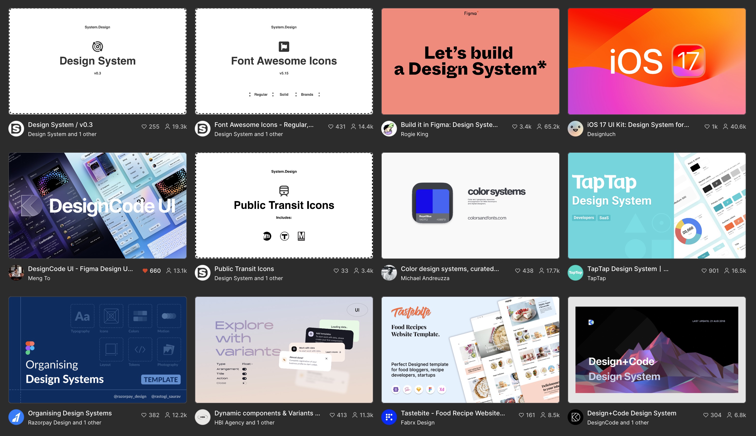
Explore Design Systems in Figma Community
You can explore design systems in the Figma Community that utilize variables, such as the "Ant Design System," "iOS 17 UI Kit," or the "DesignCode UI," and many more. These systems benefit beginners who want to jump straight into designing without setting up everything from scratch. By adopting these established systems, beginners can observe how professionals structure their design systems and employ variables effectively. This access is an invaluable learning tool, providing insights into best practices in UI design and showcasing the practical application of design principles in real-world projects.
Types of Variables
Figma uses four main types of variables: color, number, string, and boolean. Each serves specific functions to enhance design flexibility and control. Today, we'll be focusing on color and number, and string variables.
- Color Variables: These are used to define and apply consistent colors to elements like fills and strokes. Changing a color variable updates the color across all linked elements.
- Number Variables: Number variables assign numerical values to properties such as width, height, padding, and spacing. This helps maintain consistent dimensions across different design elements.
- String Variables: These variables control text content within designs, useful for localization and dynamic text updates. String variables ensure text consistency across multiple instances and components.
- Boolean Variables: Boolean variables manage visibility states with true or false values. They are currently limited to component instances, allowing for the toggling of element visibility on different device layouts.

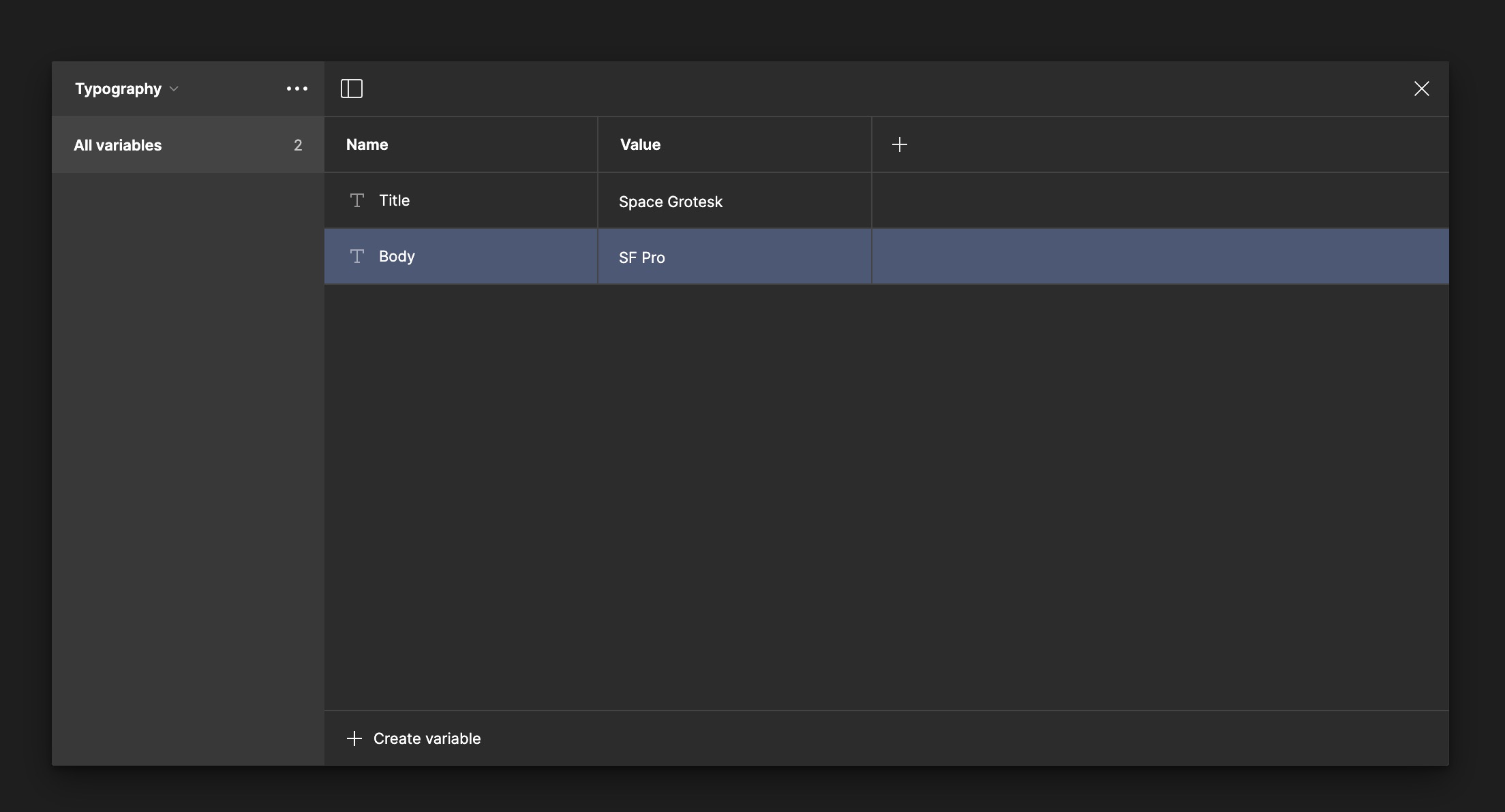
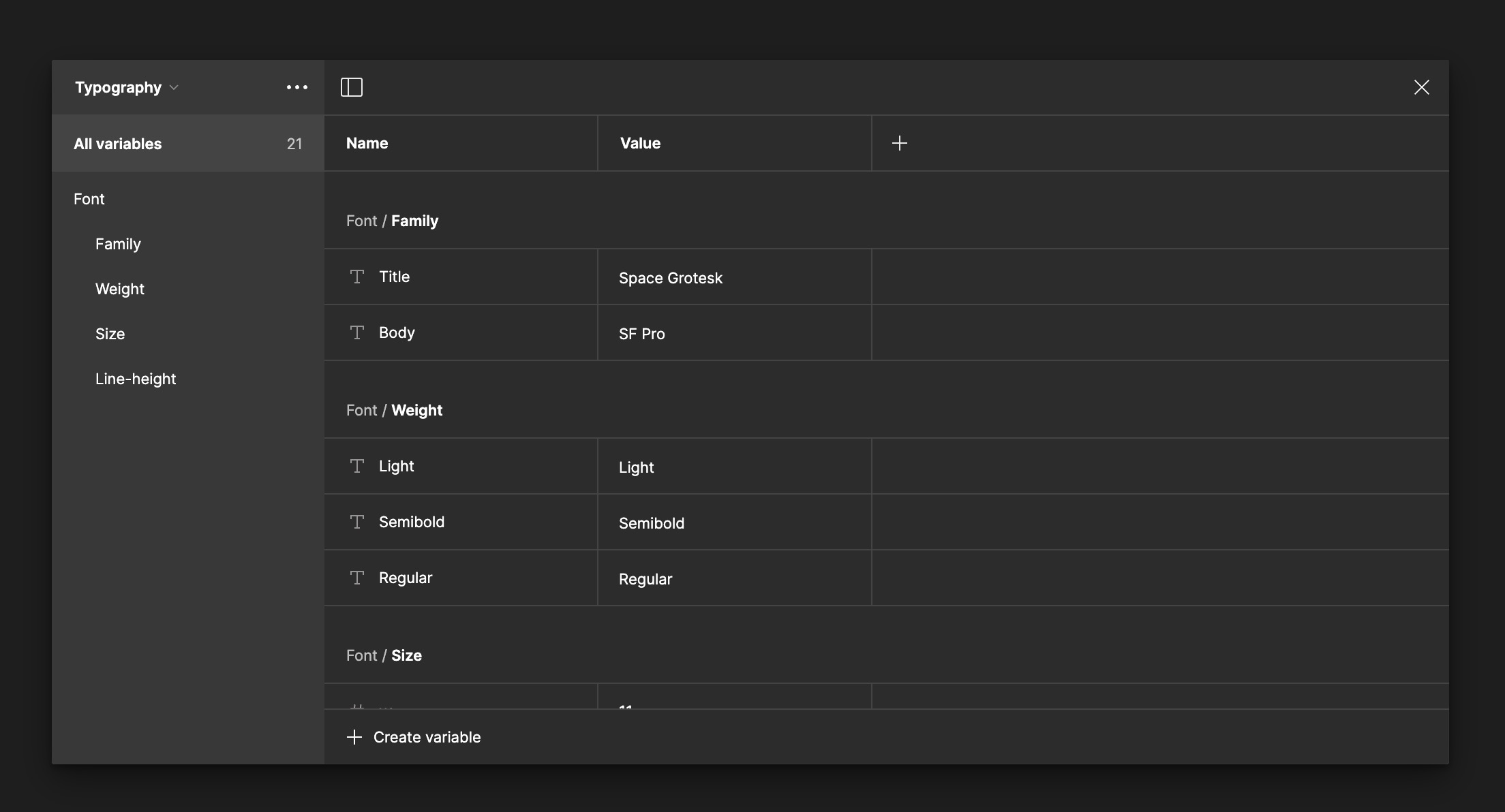
Typography Variables
Typography variables in Figma come in two types: string and number variables. String variables are used for text attributes that require specific names, such as font family, style, and named weights (e.g., "Bold" or "Regular"). Number variables are utilized for numerical attributes like font size, line height, and numeric font weights (e.g., 400, 700).
- Navigate to the Variables panel in Figma.
- Click on Create New Collection and name it ‘Typography’.
- This collection will house all your typography-related variables.
![Typography and Colors Variable image 6]()
Add Font Family Variables
For this design, I'm using two fonts: Space Grotesk and SF Pro. I will create two groups: one for the font families and another for title and body text. Using a slash separates these into groups.
- Within the Typography collection, create a new string variable.
- Name it according to the font family it represents, such as
Font/Family/Titlefor title. - Assign the actual font name as the value, “Space Grotesque”.
- Duplicate the variable, and change the name to Body and the value to SF Pro.
Add Weight Variables
Let's create variables for font weight. You can use either number or string variables. For numeric values, you might use 300 for 'Light' and 800 for 'Extra Bold.' However, I prefer using string variables, which use descriptive names like 'Regular' and 'Bold.' Remember, lower numeric values result in thinner text, while higher values produce thicker text.
- Create a new string variable.
- Name them clearly and systematically, for example,
Font/Weight/Lightand set the value to 'Light'. - Duplicate the variable, change it to
Font/Weight/Semibold, and add another forFont/Weight/Regular.
Add Font Size
Next, we're going to create variables for font size, using number variables this time. Follow these steps to set up each font size:
- Create a number variable for each size.
- Name them clearly and systematically, such as
Font/Size/xs. - Assign the values accordingly: XS for 11, SM for 13, MD for 15, LG for 17, XL for 20, 2XL for 34, 3XL for 40, and the largest, 4XL for 60.
![Typography and Colors Variable image 9]()

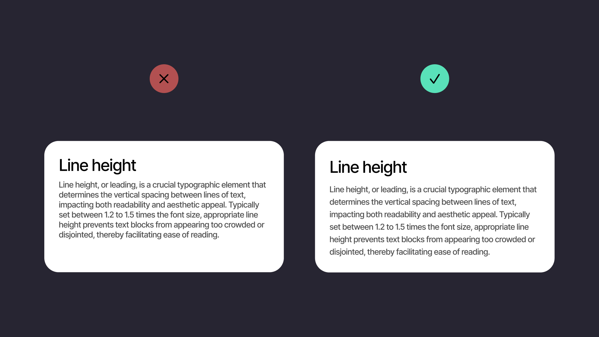
Line Height
We're going to add number variables for line height, a crucial element of typography. Typically, line height is set at 1.2 to 1.5 times the font size to enhance both readability and aesthetic appeal. This ratio varies depending on the font and its application; for body text, a multiplier of 1.4 to 1.5 is common, while headings might benefit from a tighter spacing of 1.2 to 1.3, ensuring legibility and a visually pleasing layout.
Add Line Height
Next, we're going to create variables for line height, using number variables. Assign each font size a line height using the following multipliers and round to the nearest whole number:
- For a font size of 11, a line height of 1.5 results in 16.5, so round it to 17.
- For a font size of 13, a 1.5 multiplier gives a line height of 19.5, rounded to 20.
- For a font size of 15, a 1.5 multiplier results in 22.5, rounded to 23.
- For a font size of 17, a 1.5 multiplier results in 25.5, rounded to 26.
- For a font size of 20, a 1.5 multiplier results in 30.
- For a font size of 34, a 1.4 multiplier gives a line height of 47.6, rounded to 48.
- For a font size of 40, a 1.4 multiplier results in 56.
- For a font size of 60, a 1.3 multiplier for a tighter fit as a heading results in 78.
![Typography and Colors Variable image 11]()

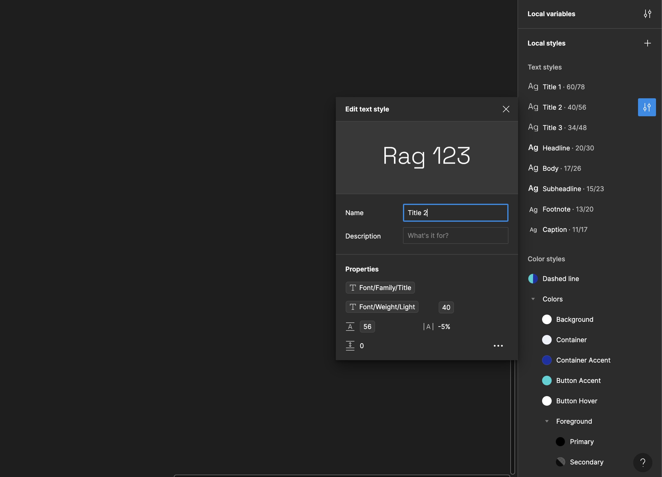
Applying Typography Variables to Text Styles
Let's integrate these new variables into our existing text styles. Hover over the style and click on 'Edit Style'. From the font family dropdown, click on the variable icon. A panel will appear displaying the available string variables for selection. Choose 'Title', and you will see its name appear below the properties.”
- Select a Text Style to Edit: Go to your
Text Styleslibrary. Choose a style where you want to apply the variable, like a heading or body text. - Apply the Font Family Variable: Click on the ‘Edit Style’ button. In the font family dropdown, select
Apply Variable. Choose the appropriate font family variable from your collection. - Apply Font Size and Weight Variables: For font size and weight, follow the same steps. Ensure each text style is linked to the correct variable for consistency and ease of management.
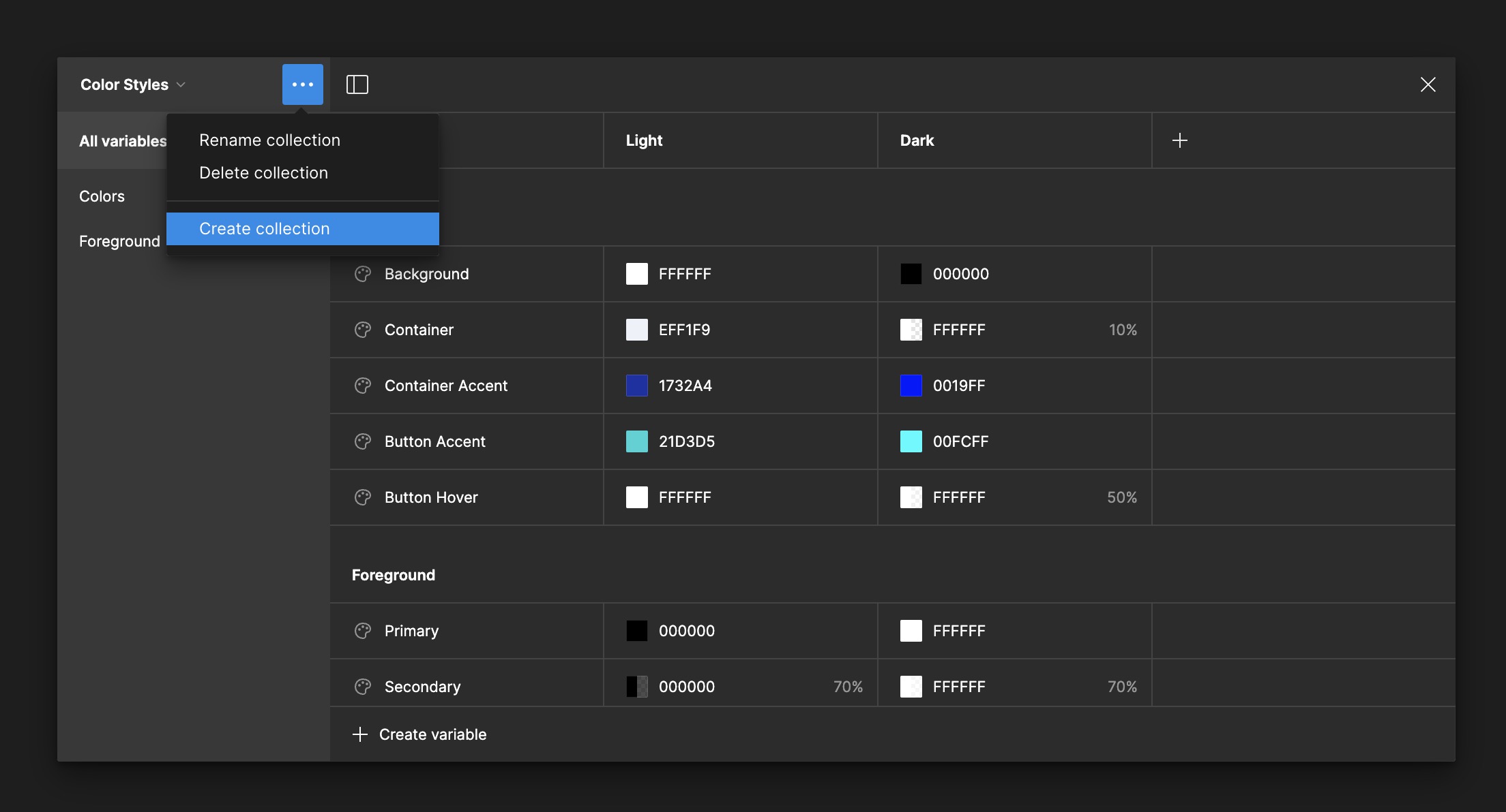
Color Variables
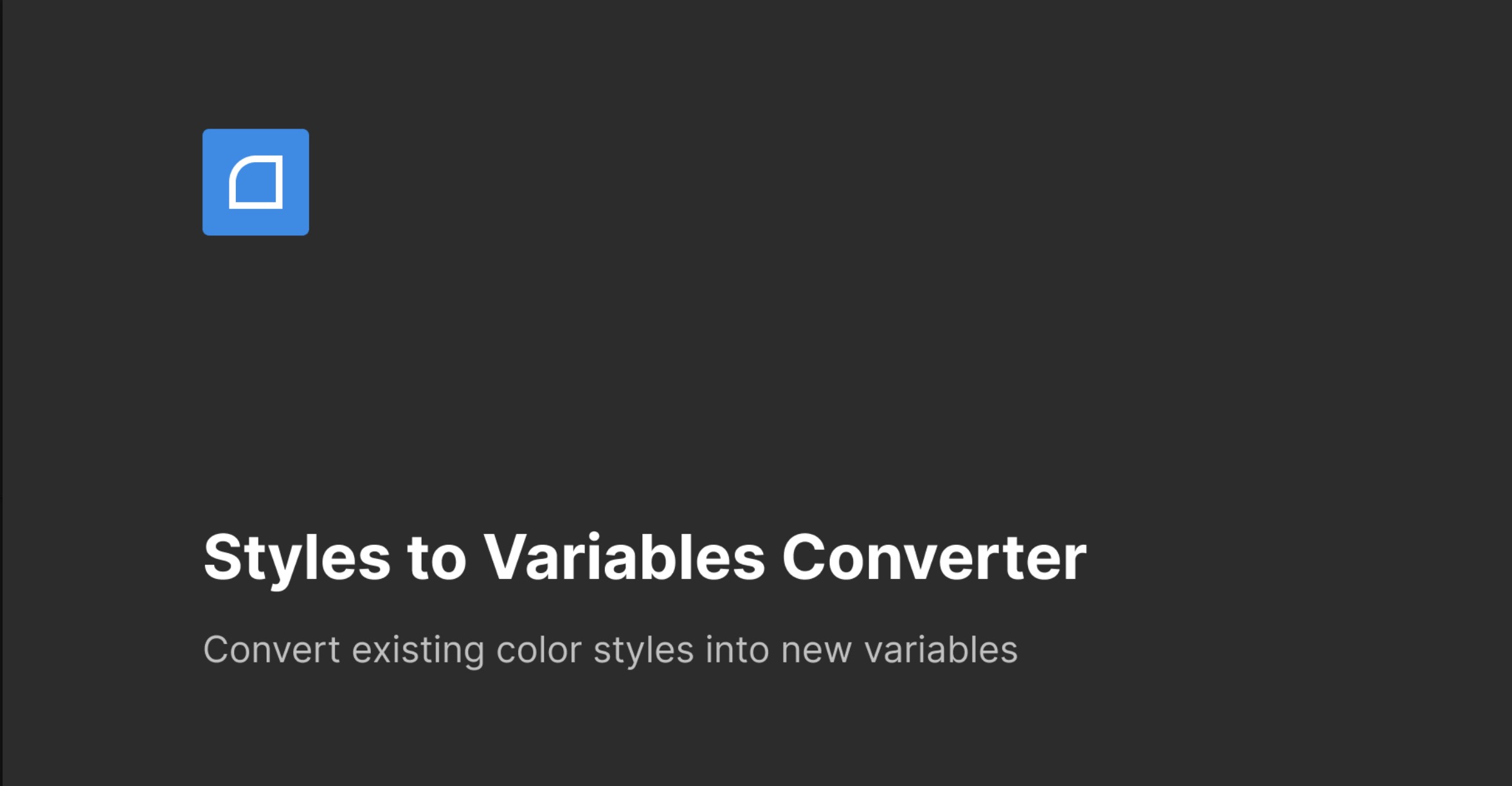
We're now going to convert our color styles into variables, which can streamline the process of applying and managing colors across our design project. Instead of converting these manually, we'll use a plugin called 'Styles to Variables Converter.' This tool automates the conversion of your color styles into variables and updates the properties of each color style accordingly.
- Install and Use the Plugin: First, ensure that the 'Styles to Variables Converter' plugin is installed in your design tool. Once installed, run the plugin with your color styles open.
- Check the Conversion: After running the plugin, go to your collection of styles. You should see your newly created variables listed. The group or label 'Colors' should appear at the top of the list, indicating that your color styles have been successfully converted into variables.
Modes
I've initially created color styles for light mode. Now, I'd like to expand the palette by adding colors for dark mode. This involves defining new values specifically tailored for dark mode visibility and contrast.
- Create Dark Mode Colors: Begin by defining a new set of color styles intended for dark mode. These should complement or contrast effectively with the dark backgrounds for optimal readability and aesthetic balance.
- Testing Light and Dark Modes: After setting up the dark mode colors, test the full layout to ensure both light and dark modes switch seamlessly. Select the full layout and toggle between light and dark modes. If you've applied the color styles correctly, all elements should adapt without issues.
- Organize Color Styles: To keep the design system organized, group the text color styles under the name 'Foreground.' Place the other color styles in a separate group called 'Colors.' This categorization helps maintain clarity and ease of use in your design project.
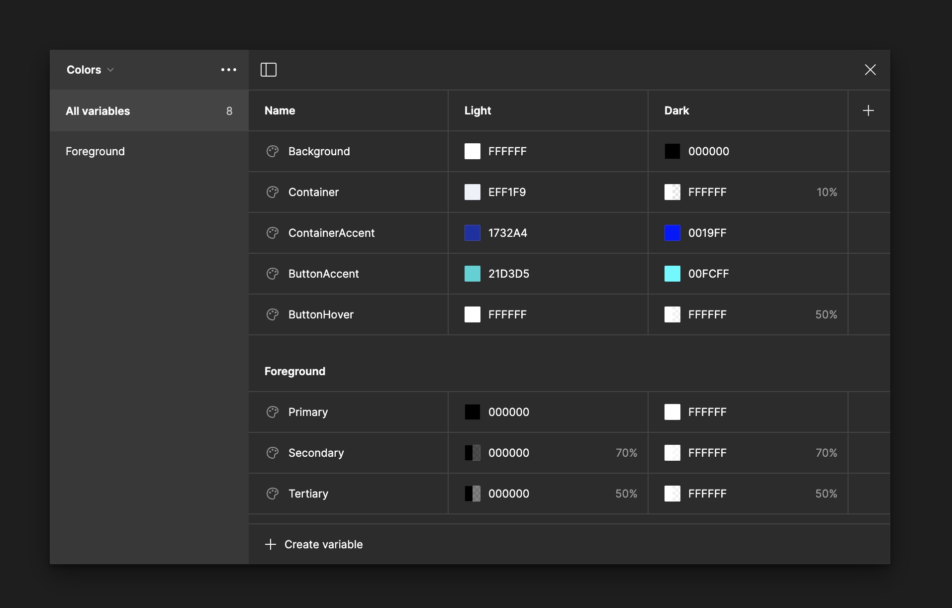
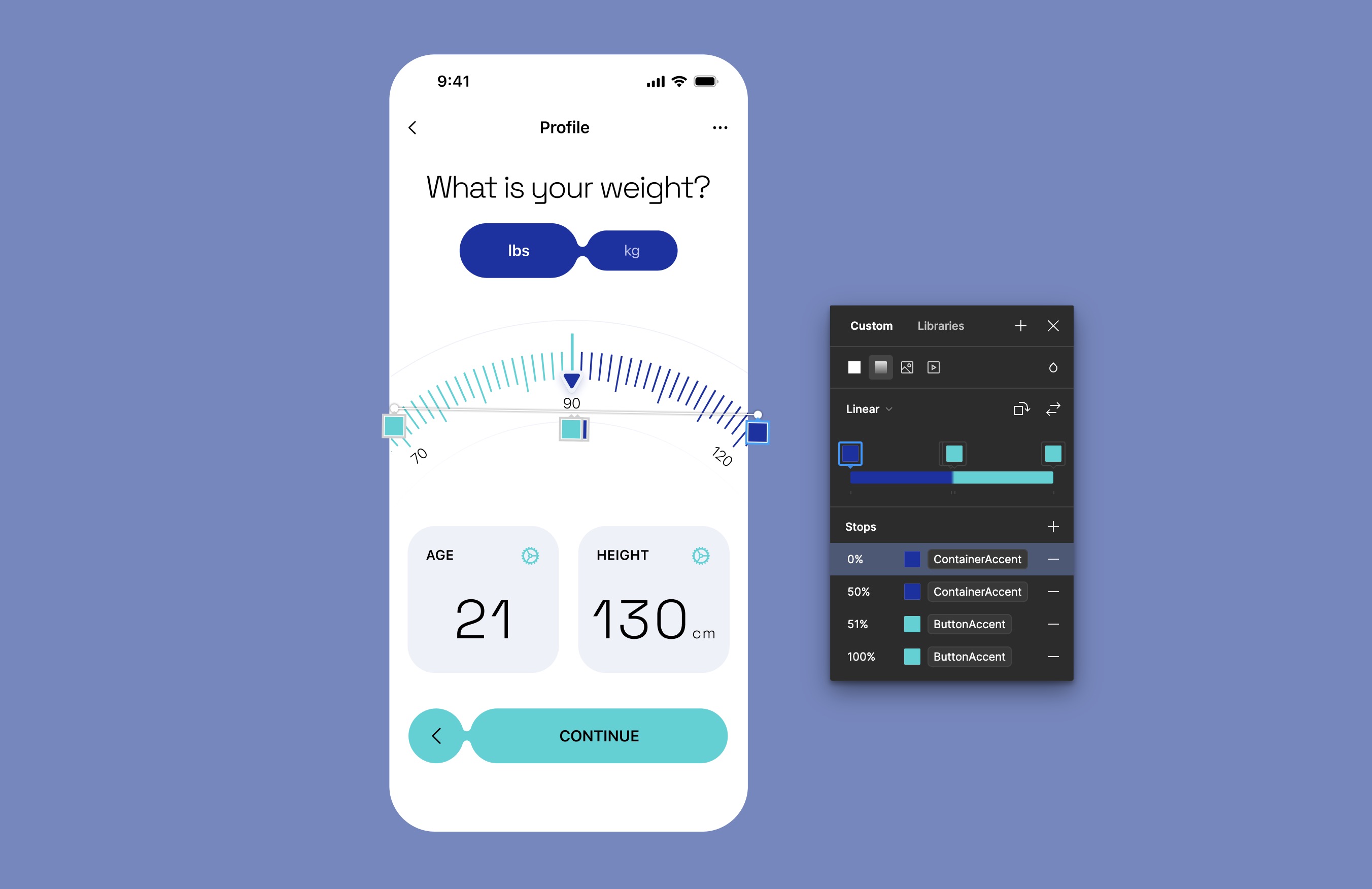
Weight Entry Screen
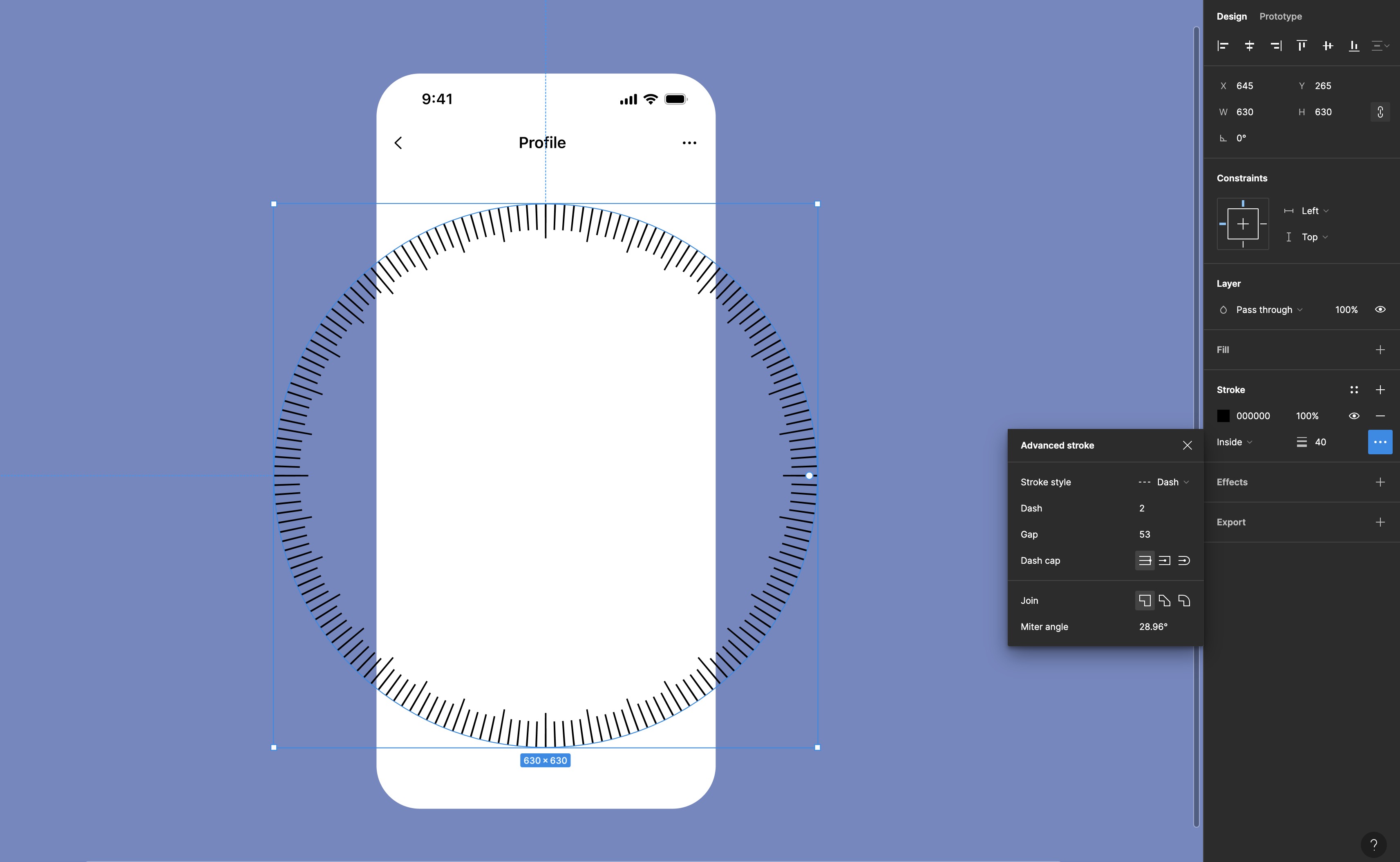
We'll continue from where we left off, creating the weight entry screen that allows users to input their weight. This feature is essential for setting up profiles or tracking fitness progress. The screen includes toggles for weight measurement in pounds (lbs) and kilograms (kg), and a visual gauge to indicate the weight range.
- Create the Outer Gauge: Start by drawing an ellipse with a diameter of 630 pixels. Add a stroke with a width of 30 pixels, set the dash to 2, and the gap to 9. This will create the first dashed line of the gauge.
- Duplicate and Modify the Dashed Line: Duplicate the first dashed line. Change the stroke width to 40 pixels, but keep the dash at 2 and increase the gap to 53. This alteration helps differentiate the gauge's layers.
- Create Central Circles: Draw a large circle with a diameter of 700 pixels and align it with the dashed lines. Then, create another, smaller circle with a diameter of 500 pixels and center it within the larger circle. These circles will serve as the base for the visual gauge.
- Mask Excess Elements: To clean up the design, create a frame around the circles and use it to mask and hide any portions of the circles that extend beyond the desired gauge area.
Color Variables to Gradients
While you cannot create variables specifically for color gradients, you can incorporate color variables at various stops within a gradient. This approach maintains flexibility in your design, allowing for easy updates across your project. When you change a color variable, it automatically updates every instance where that variable is used within the gradients.
- Setting Color Stops: If you want a color to appear prominently at a certain point in your gradient, place two color stops close to each other using the same color variable. This technique is useful for emphasizing a color in the middle of a gradient.
- Create and Use Gradient Styles: To maintain consistency across similar elements without repeating the gradient setup, create a style for your gradient. Once the style is created, apply it to other elements like the second dashed line.
- Apply Color Variables to Other Elements: Select the two other ellipses and apply the 'Container Color' variable to them. This ensures that they match the broader design theme and adapt to any future changes in the container color.
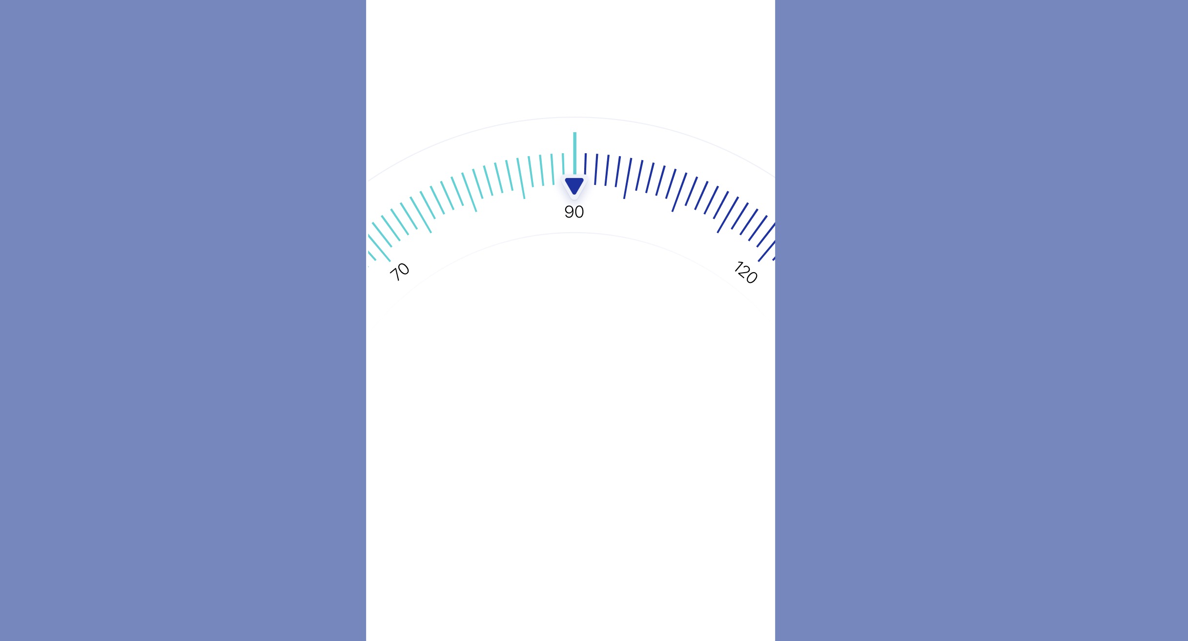
Cursor Indicator
We will create a cursor indicator which will include a central cursor line, two polygons, and text labels.
- Draw the Cursor Line: Use the 'Line' tool to draw a vertical line 60 pixels long. Color it bright green (#00FF00) and slightly elevate it for visibility.
- Create the Cursor Polygon: Select the 'Polygon' tool and draw a 38x38 polygon. Round the corners with a 2px radius inside and a 4px radius on the bottom.
- Duplicate and Modify Polygon: Duplicate the first polygon and resize it to 24x24. Fill it with blue (#0000FF) and ensure the background color matches the container.
- Group the Elements: Select the line and both polygons. Group them into a frame to maintain layout integrity.
- Add and Style Text: Use the 'Text' tool to add text '90', set in 'SF Pro' light, size 16. If the text feels cramped, adjust the background size to 500 pixels to fit the text better. Duplicate the text, rotate it to 40°, and update to '70'. For additional information, duplicate the text again, rotate it to -40°, and change the text to '120'.
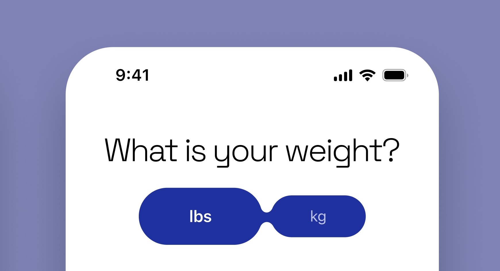
Segmented Control
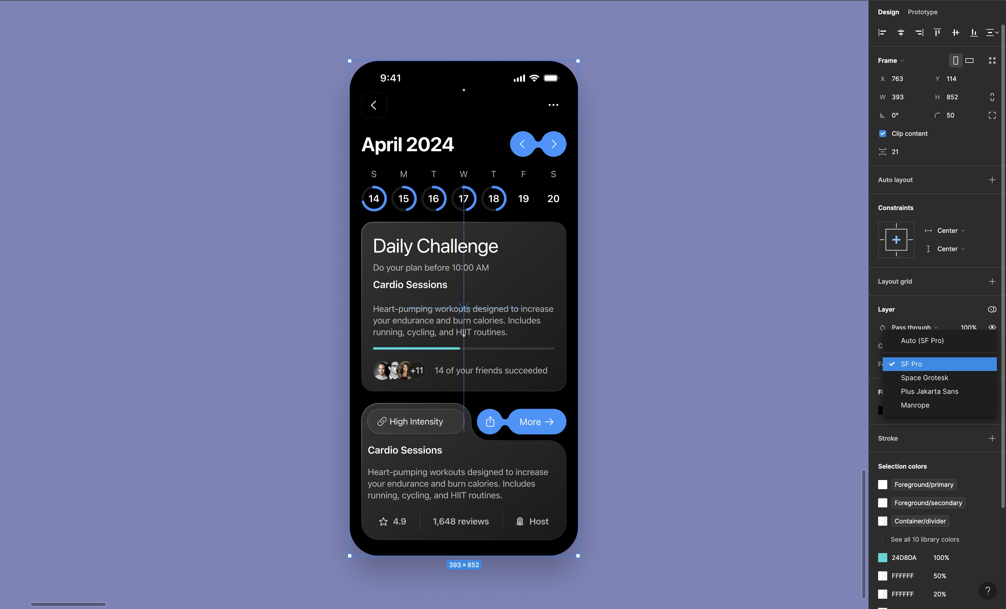
This design features a segmented control where each segment corresponds to a different unit of measurement for weight — pounds (lbs) and kilograms (kg). The segments are visually connected, emphasizing that they are part of the same control but can be selected independently. When a user taps on one of the segments, the system recognizes it as a separate action, allowing the user to toggle between units. This approach not only provides a clear visual distinction between choices but also supports a quick and efficient interaction.
- Add the segmented control and the liquid button from the asset page.
![Typography and Colors Variable image 2]()
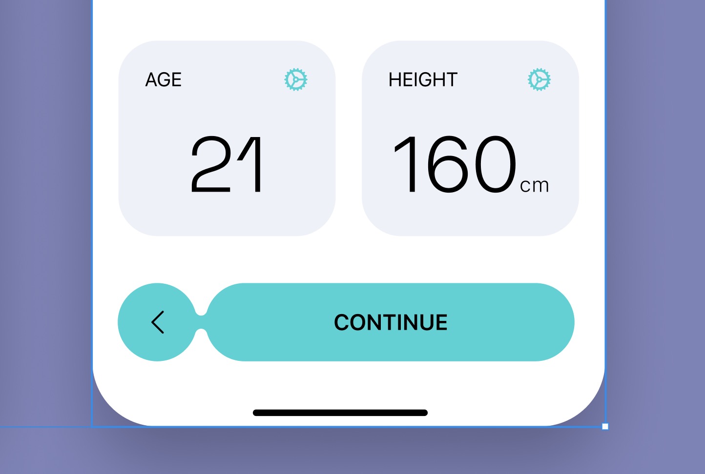
Data Cards
The last step is to create data cards, each displaying a specific type of user information—one for age and the other for height—in a clear and minimalistic design.
- Type "AGE" in uppercase using the Subheadline style and add the gear icon. Implement auto layout for these elements.
- Type "21" using the Title 1 style. Apply auto layout to both containers. Fill the containers with the designated color style and set the width to 166. Ensure the fill extends across all child containers.
![Typography and Colors Variable image 3]()
Conclusion
Congratulations on completing the course! You've learned key skills in flat design and light mode, including how to use visual hierarchy, information architecture, variable typography, and colors. These tools will help you maintain consistency and enhance your design projects. Keep applying what you've learned and continue to innovate in your designs!
Templates and source code
Download source files
Download the videos and assets to refer and learn offline without interuption.
Design template
Source code for all sections
Video files, ePub and subtitles
Videos
1
Introduction to UI/UX Design
Finding inspiration with Mobbin and transforming ideas into unique designs using Figma
5:39
2
UI Kits and Templates
Accelerating design efficiency by using UI kits and templates
8:18
3
Shapes, Gradients and Strokes
Design a smart home iOS App and learn to use shapes, gradients, and strokes to create a thermostat interface
15:15
4
Icons, Typography, and Styles
Improve the design of our smart home application with icons, typography, and effects
9:43
5
Auto Layout, Constraints and Pen tool
Adding finishing touches on our design with Auto Layout, constraints. Use the Pen Tool to create intuitive controls
16:23
6
UX Research and Design Flows
Diving Deeper into UX Research and the Importance of Designing User Flows
16:19
7
Styles and Plugins
Exploring Figma Tools and Plugins to Enhance Creativity and Efficiency
13:09
8
Animation, Sticky Scroll and Overlay
Bridging Design and Interaction with a Step-by-Step Guide to Prototyping
10:13
9
Flat Design and Light Mode
Exploring the Essentials of Flat Design and Light Mode for a Cleaner and More Intuitive User Experience
16:57
10
Visual Hierarchy and Information Architecture
Explore the role of visual hierarchy in UI design and learn to structure and organize content to improve a product's usability
11:07
11
Typography and Colors Variable
Learn How to Streamline Your Designs with Typography and Color Variables
14:34
Meet the instructor
We all try to be consistent with our way of teaching step-by-step, providing source files and prioritizing design in our courses.
Sourasith Phomhome
UI Designer
Designer at Design+Code
19 courses - 72 hours
Master AI Prompting for Stunning UI
Learn how to leverage AI tools like Aura for creating beautiful designs, working with templates, and experimenting with advanced prompts. A concise guide for designers and developers to level up their skills.
10 hrs
Design Multiple Apps with Figma and AI
In this course, you’ll learn to design multiple apps using Figma and AI-powered tools, tackling a variety of real-world UI challenges. Each week, a new episode will guide you through a different design, helping you master essential UI/UX principles and workflows
4 hrs
SwiftUI Fundamentals Handbook
A comprehensive guide to mastering Swift programming fundamentals, designed for aspiring iOS developers. This handbook provides a structured approach to learning Swift's core concepts, from basic syntax to advanced programming patterns. Through carefully sequenced chapters, readers will progress from essential programming concepts to object-oriented principles, building a solid foundation for SwiftUI development. Each topic includes practical examples and clear explanations, ensuring a thorough understanding of Swift's capabilities. This handbook serves as both a learning resource and a reference guide, covering fundamental concepts required for modern iOS development. Topics are presented in a logical progression, allowing readers to build their knowledge systematically while gaining practical programming skills.
2 hrs
Design and Code User Interfaces with Galileo and Claude AI
In this course, you’ll learn how to use AI tools to make UI/UX design faster and more efficient. We’ll start with Galileo AI to create basic designs, providing a solid foundation for your ideas. Next, we’ll refine these designs in Figma to match your personal style, and finally, we’ll use Claude AI to turn them into working code—eliminating the need for traditional prototyping.
4 hrs
Design and Prototype for iOS 18
Design and Prototype for iOS 18 is an immersive course that equips you with the skills to create stunning, user-friendly mobile applications. From mastering Figma to understanding iOS 18's latest design principles, you'll learn to craft two real-world apps - a Car Control interface and an AI assistant.
3 hrs
Master Responsive Layouts in Figma
Creating responsive layouts is a must-have skill for any UI/UX designer. With so many different devices and screen sizes, designing interfaces that look great and work well on all platforms is necessary. Mastering this skill will make you stand out in the field. In this course, we'll start from scratch to create this beautiful design using Figma. You'll learn how to make layouts that are easy to use and work well on any device. We'll cover key concepts and tools to help you master responsive design in Figma.
2 hrs
UI UX Design with Mobbin and Figma
Mobbin is a powerful tool for UI/UX designers seeking inspiration and innovative design solutions. This platform offers a vast collection of real-world mobile app designs, providing a treasure trove of UI elements and layouts.
2 hrs
3D UI Interactive Web Design with Spline
Learn to create 3D designs and UI interactions such as 3D icons, UI animations, components, variables, screen resize, scrolling interactions, as well as exporting, optimizing, and publishing your 3D assets on websites
3 hrs
Design and Prototype for iOS 17 in Figma
Crafting engaging experiences for iOS 17 and visionOS using the Figma design tool. Learn about Figma's new prototyping features, Dev Mode, variables and auto layout.
6 hrs
Design and Prototype Apps with Midjourney
A comprehensive course on transforming Midjourney concepts into interactive prototypes using essential design techniques and AI tools
8 hrs
iOS Design with Midjourney and Figma
Learn the fundamentals of App UI design and master the art of creating beautiful and intuitive user interfaces for mobile applications
1 hrs
UI Design for iOS, Android and Web in Sketch
Create a UI design from scratch using Smart Layout, Components, Prototyping in Sketch app
1 hrs
UI Design a Camera App in Figma
Design a dark, vibrant and curvy app design from scratch in Figma. Design glass icons, lens strokes and realistic buttons.
1 hrs
UI Design for iOS 16 in Sketch
A complete guide to designing for iOS 16 with videos, examples and design files
3 hrs
Prototyping in Figma
Learn the basics of prototyping in Figma by creating interactive flows from custom designs
1 hrs
UI Design Quick Websites in Figma
Learn how to design a portfolio web UI from scratch in Figma
1 hrs
UI Design Android Apps in Figma
Design Android application UIs from scratch using various tricks and techniques in Figma
2 hrs
UI Design Quick Apps in Figma
Design application UIs from scratch using various tricks and techniques in Figma
12 hrs
Figma Handbook
A comprehensive guide to the best tips and tricks in Figma. Not affiliated with or endorsed by Figma, Inc.
6 hrs