Sidebar menu animation
Add to favorites
Implement a smooth and exciting menu transition
Play video
Design and Prototype an App with Play
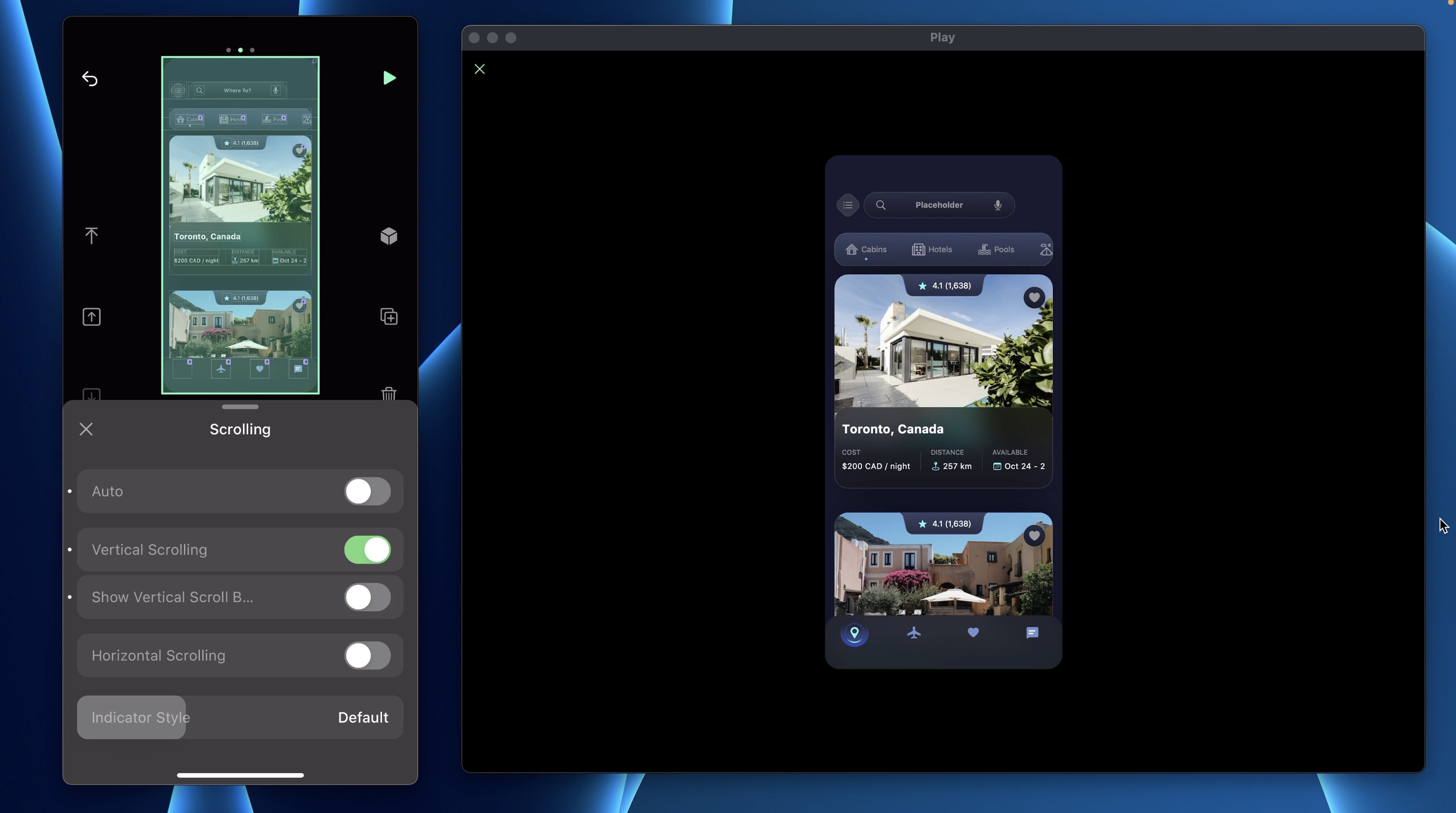
Home Container
Let’s add a container that will hold all the current elements on this screen.
- Add a Stack V, rename it: Home Container and set the alignment to Center
- Set the Width and Height to 100%
- Set the paddings (32, 0, 180, 0) and Pin To Top Center
- In Appearance, set the BG Color to #17182B and the Corner Radius to 24.
- Then, drag in the Mask, Search Bar Container, Segmented Controls Container and the Card Container in that same order

- To remove the scroll indicator, set Scrolling to Vertical and remove show indicator. As you can see, nothing really changed.
Diamond button background
Let’s update the BG Color of the Diamond button first, add a new gradient #0F54E8 - #9DDEF3 at 10% from left to right.
Show Menu
Let’s add a new state on the Page and name it: Show Menu. In that state, we will apply some transformations on the Home Container.
- Set the transform: Perspective 130deg, Move X 265PT, Move Y -150PT, Move Z -150PT and Rotation Y -30deg
- Set the Height to 130% and Pin To none
- Set the Mask to hidden
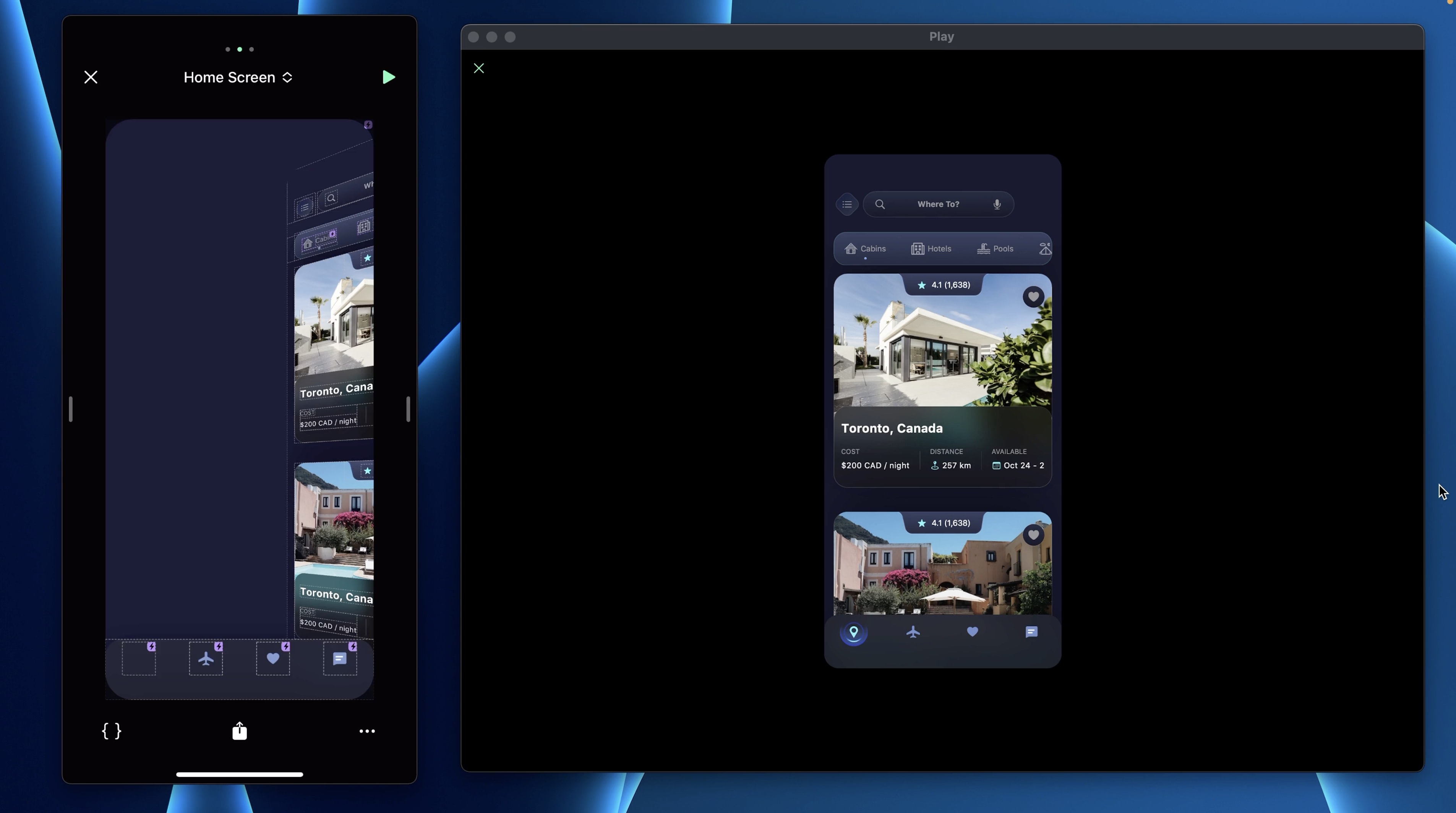
For the Search Container and the Segmented Controls Container, disable Pin To Page. We will also hide the Diamond Button.
Background Color
As you can see, the BG Color of both layers are the same so let’s change the Page’s one. Add a new Color gradient #16203A - #394156.
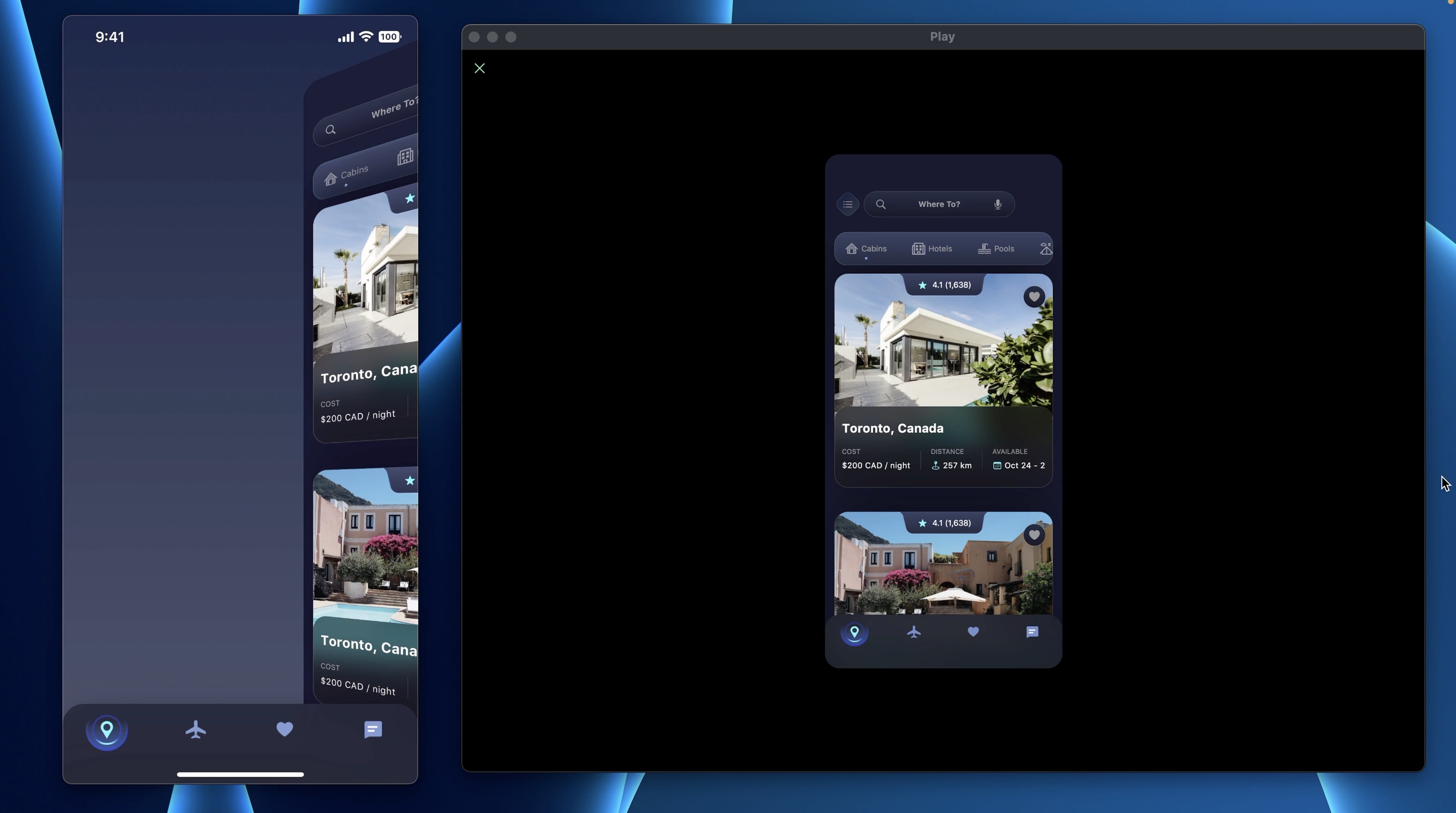
Tab bar
To remove the Tab bar from the screen, we will push it down instead of hiding it. That way, it will create a smoother transition between the Default and Show Menu state. Set the Offset Y to 100PT.
Remove Scrolls
When the Sidebar Menu appears, we also want to disable the scrolls. Disable the Scrolling of the Page and the Home Container.
Side Menu
Now, let’s design the side menu.
- Add a Stack V and name it: Side Menu
- Set the Width to 260PT and Height to Auto
- Add a padding top of 48 and Pin To Top Left
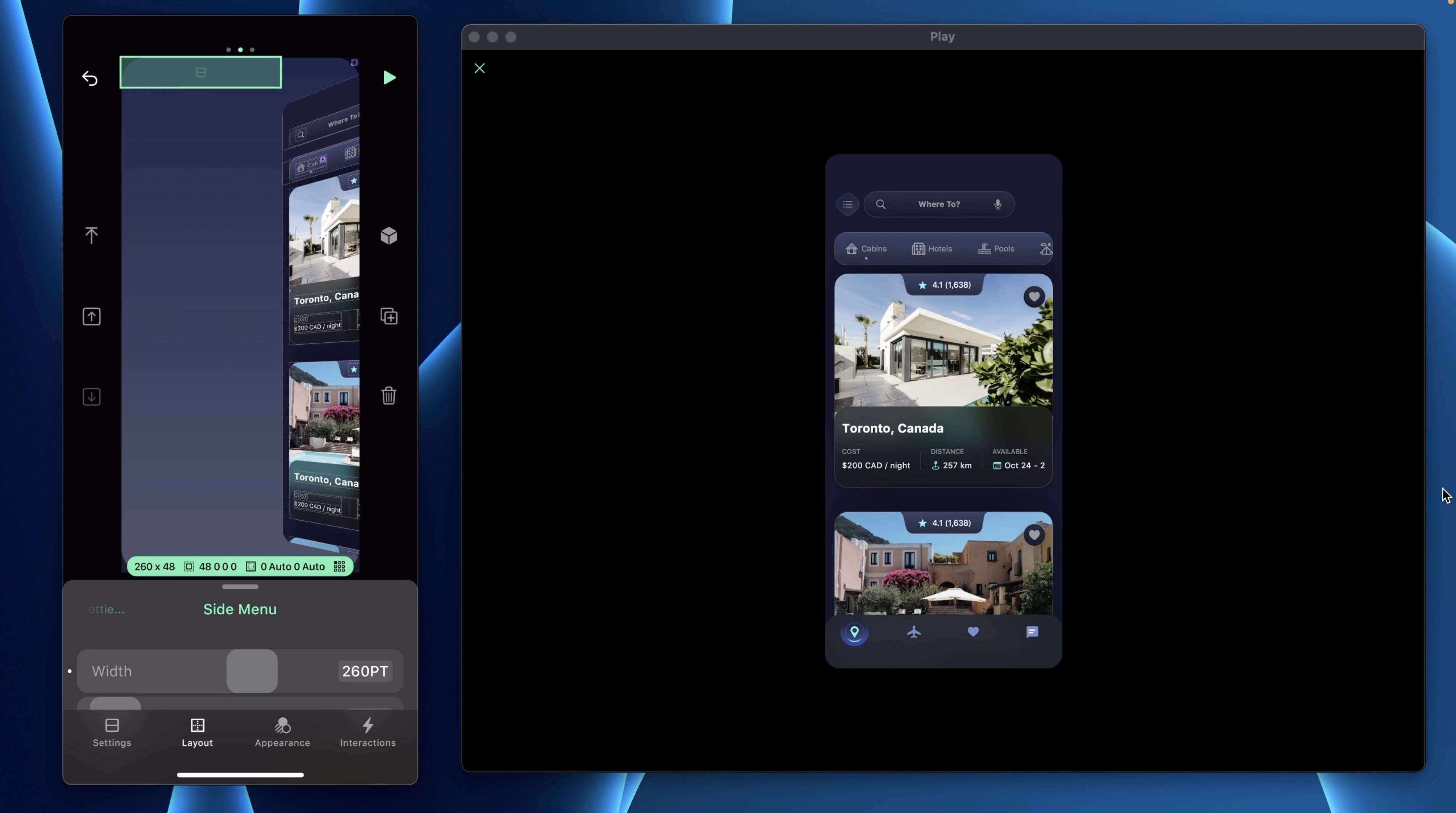
Avatar Container
The first element in that stack is the avatar. Add a Stack H and name it: Avatar - Close Button
- Set the Alignment Center and Distribution to Space Between
- In Layout, add paddings (0, 16, 0, 16)
- Set the Width to 100% and the Height to Auto
Add another Stack H and name it: Avatar Container
- Set the Gap to 8 and Alignment Center
- Set the Width and the Height to Auto
Then, add another stack for the background, name it: Avatar Icon.
- Set the Alignment and Distribution to Center
- Set the Width and Height to 36PT
- For the BG Color, set it to #22283E - #171827
- Set the Corner Radius to 40
- Add a Border 1PT, white at 10%
- Add Drop Shadow, Offset X 4PT, Offset Y 4PT, Blur 10 and the color is black at 20%
- Add a SF Symbol “person.fill” with a size of 24 and the Container Size of 24x24. Set the Color to White
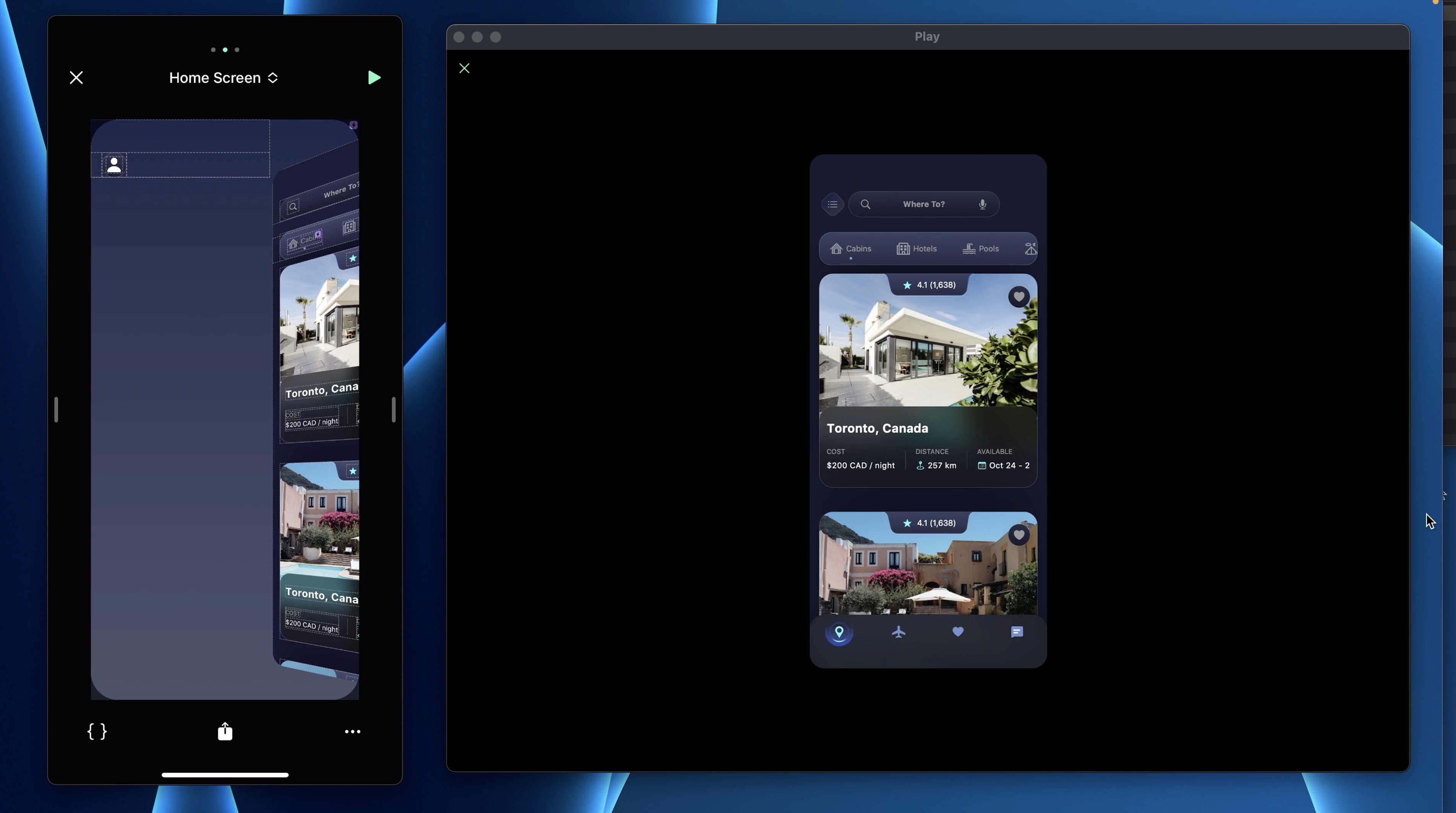
Name Container
In the Avatar Container, let’s insert a name and title. Add a Stack V and name it: Name - Title.
- Set the Width and Height to Auto
- Add a Text “Your Name”, the Type is Headline, the color is white and the Width and Height to Auto
- Add a second Text “Show Profile”, the Type is Footnote, the color is System Gray and the Width and Height to Auto
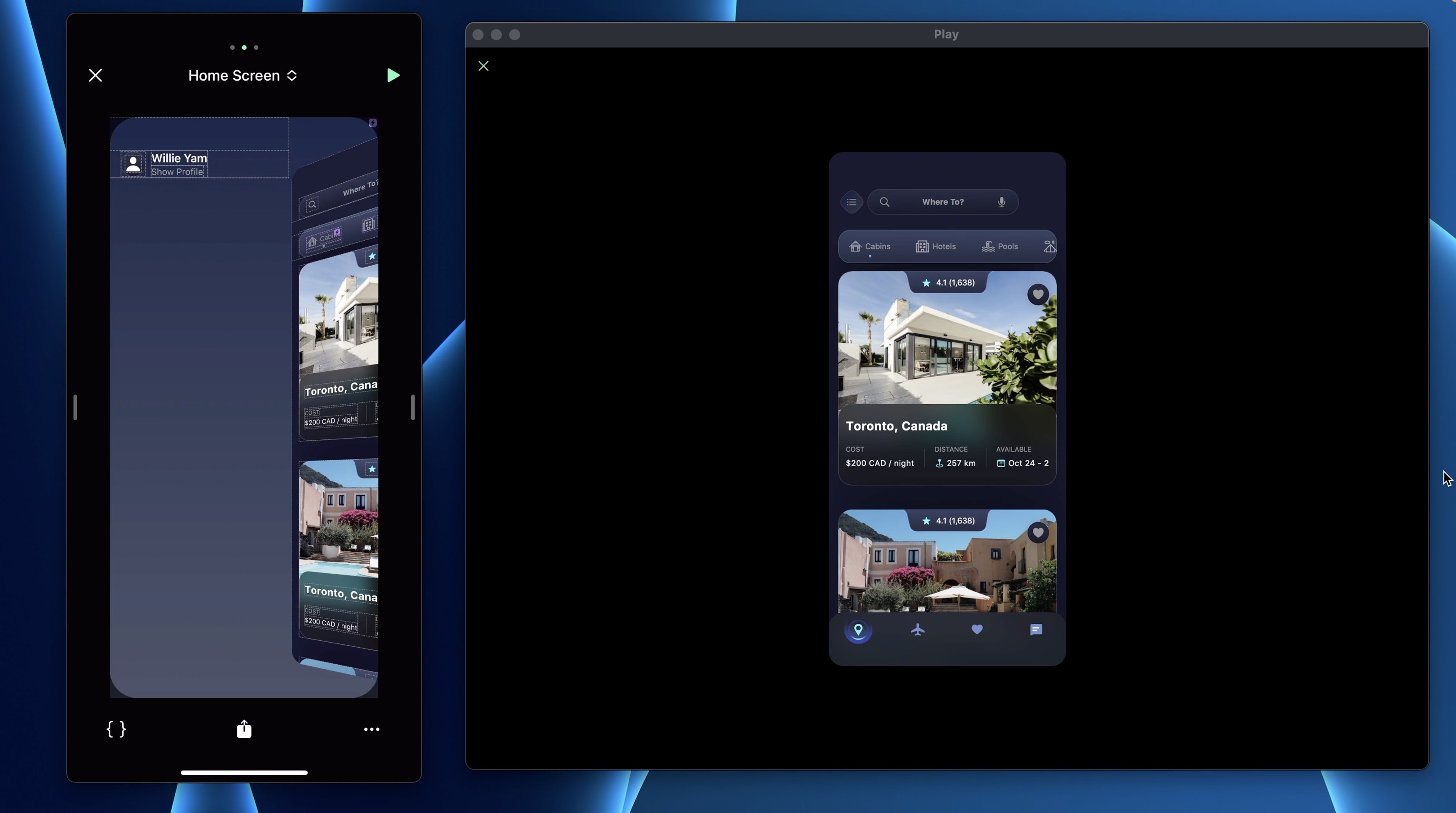
Close Button
Now let’s add a Close Button so we can switch between the Default and Show Menu states. Select the Avatar - Close button and aadd a stack and name it: Close Button.
- Set the Distribution to Center
- Setthe Width and the Height to 36PT
- Set the Corner Radius to 24
Add a SF Symbol and search for “xmark”.
- Set the Size to 16PT and the Container Size to 36PT
- Set the Color to System Gray
- Set the Corner Radius to 24
- Add a Borders 1PT white at 10%
- Add Drop Shadow, Offset X 4PT, Offset Y 4PT, Blur 10 and color Black at 20%
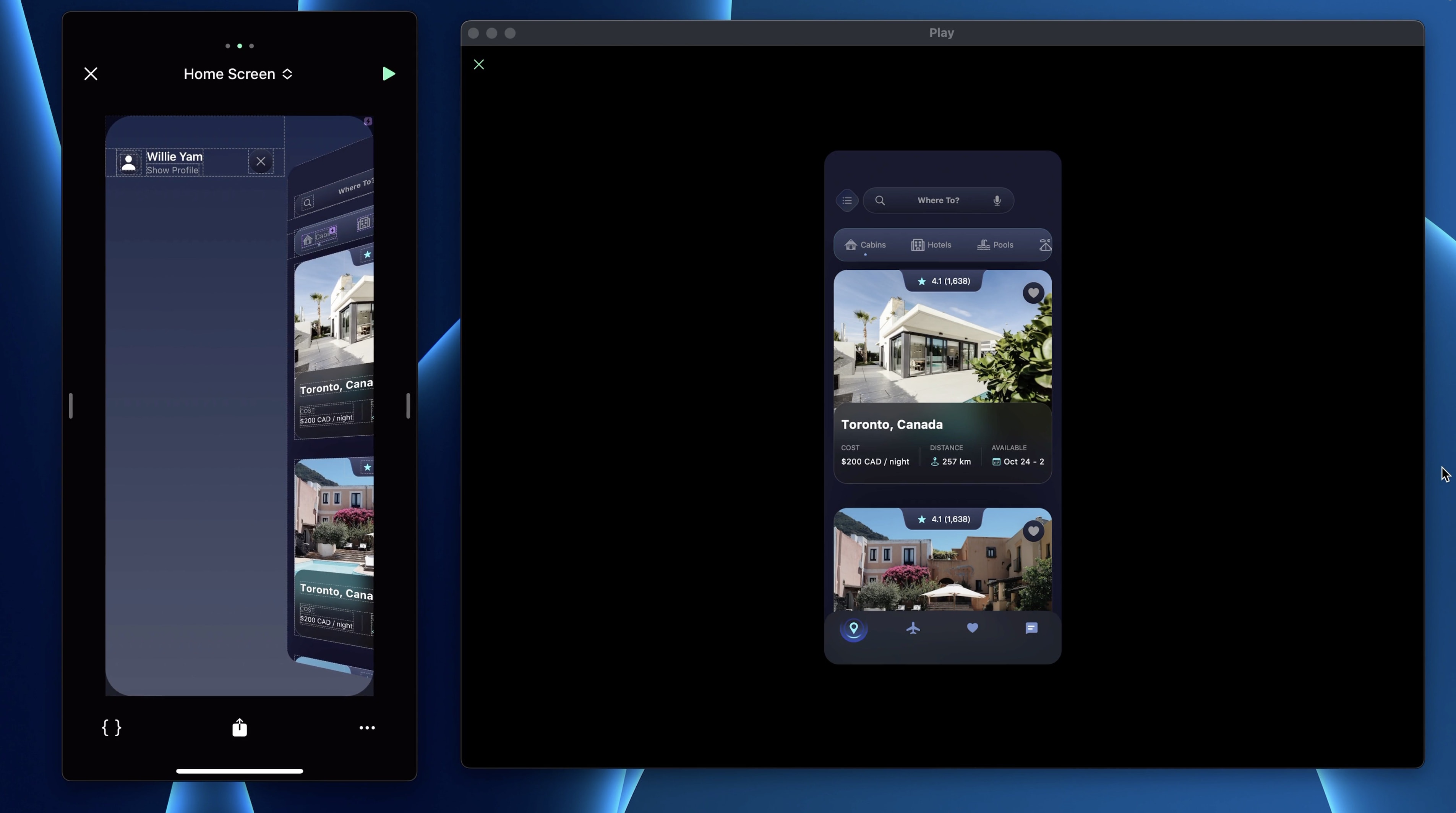
Make the Side Menu into a component.
Screen Transition
Let’s add an interaction on the Close Button. Add a Tap trigger with a Set State action.
- Set the Start State to Show Menu and the End State to Default
- On the animation, set the Duration to 0.7s and Easing to Ease In & Out
Then, go to Default state and add a Tap trigger on the Diamond Button. Add a Set State action and set the Start State to Default and the End State to Show Menu. On the animation, set the Duration to 0.7s and Easing to Ease In & Out.
For a smooth transition, select the Side Menu and set the Offset X to -260PT. That way, during the transition, you will see a slight movement from the left side.
List
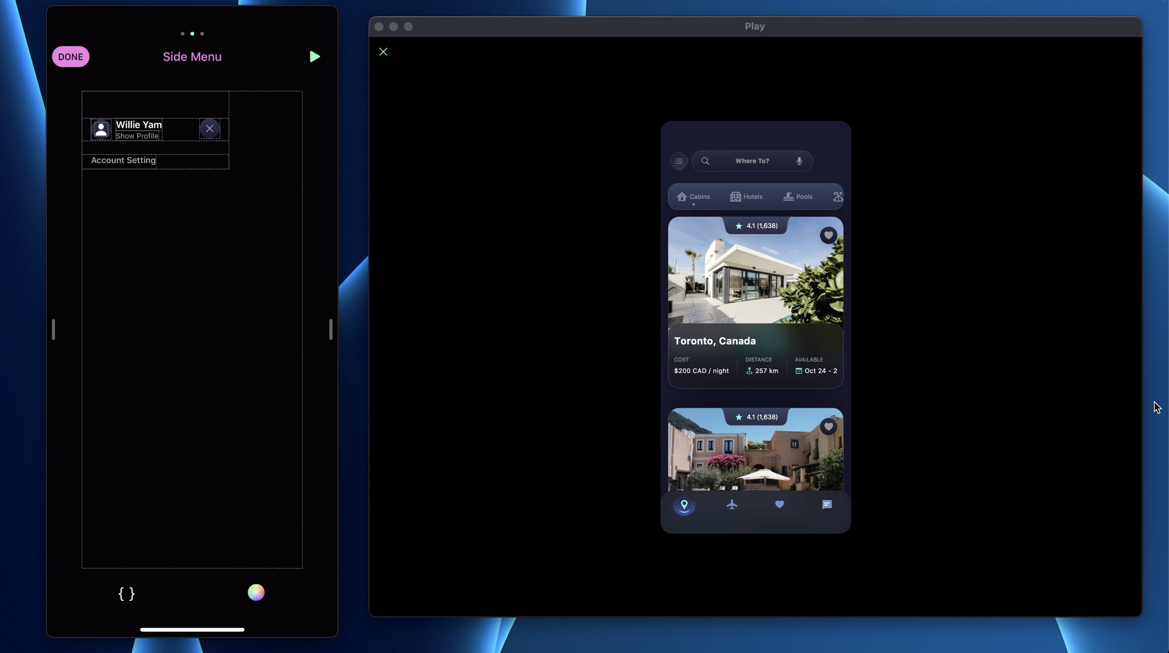
Next, let’s go to the Side Menu component screen and design the list with the buttons. Add a Stack V and name it: List. Set its Height to Auto and the margin top to 24.
Then, add a Text “Account Setting”, set the Type to Subhead 2 and the Color to System Gray. For the paddings, add a padding left of 16 and bottom of 6.
Menu Button
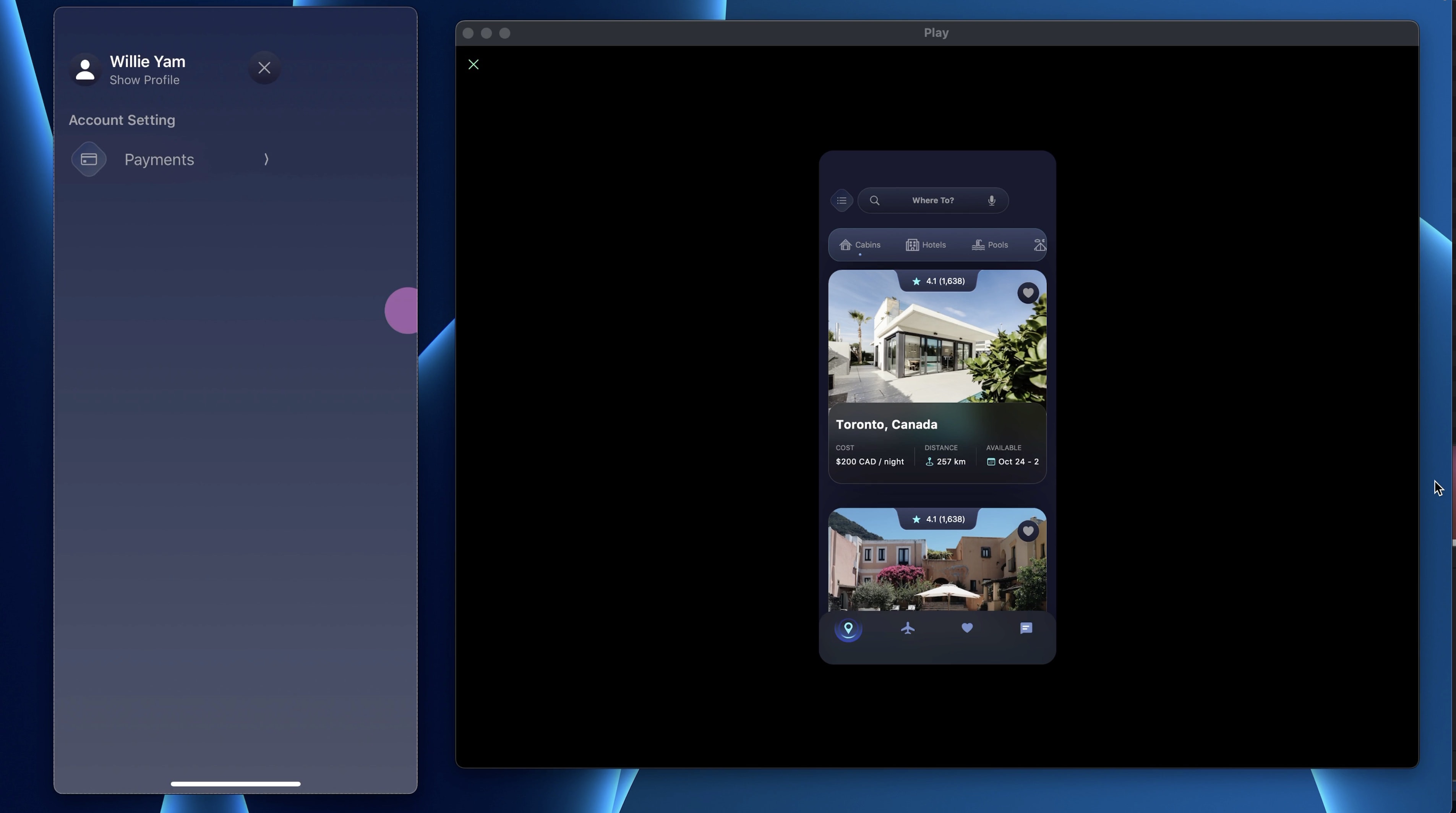
Let’s add a button so add a Stack H and name it: Menu Button.
- Set the Gap to 16PT
- Set the Width 100% and the Height to 52PT
- Add paddings (9, 16, 9, 16)
- Set the BG Color to a new gradient #21263D 100% - #21263D 0% from left to right.
Add a Diamond Button, set the Background to #0F54E8 - #9DDFF3 and the icon to “credit card”. Add a Text “Payments”, set the Type to Body and the Color to System Gray. Make sure the Width and the Height are set to Auto.
Next, add a Spacer element. This element will basically push everything and take the most space possible. Finally, add a SF Symbol “chevron.compact.right”, set the Size to 15PT, Container Size to 32x32 and Color to System Gray.
Button State
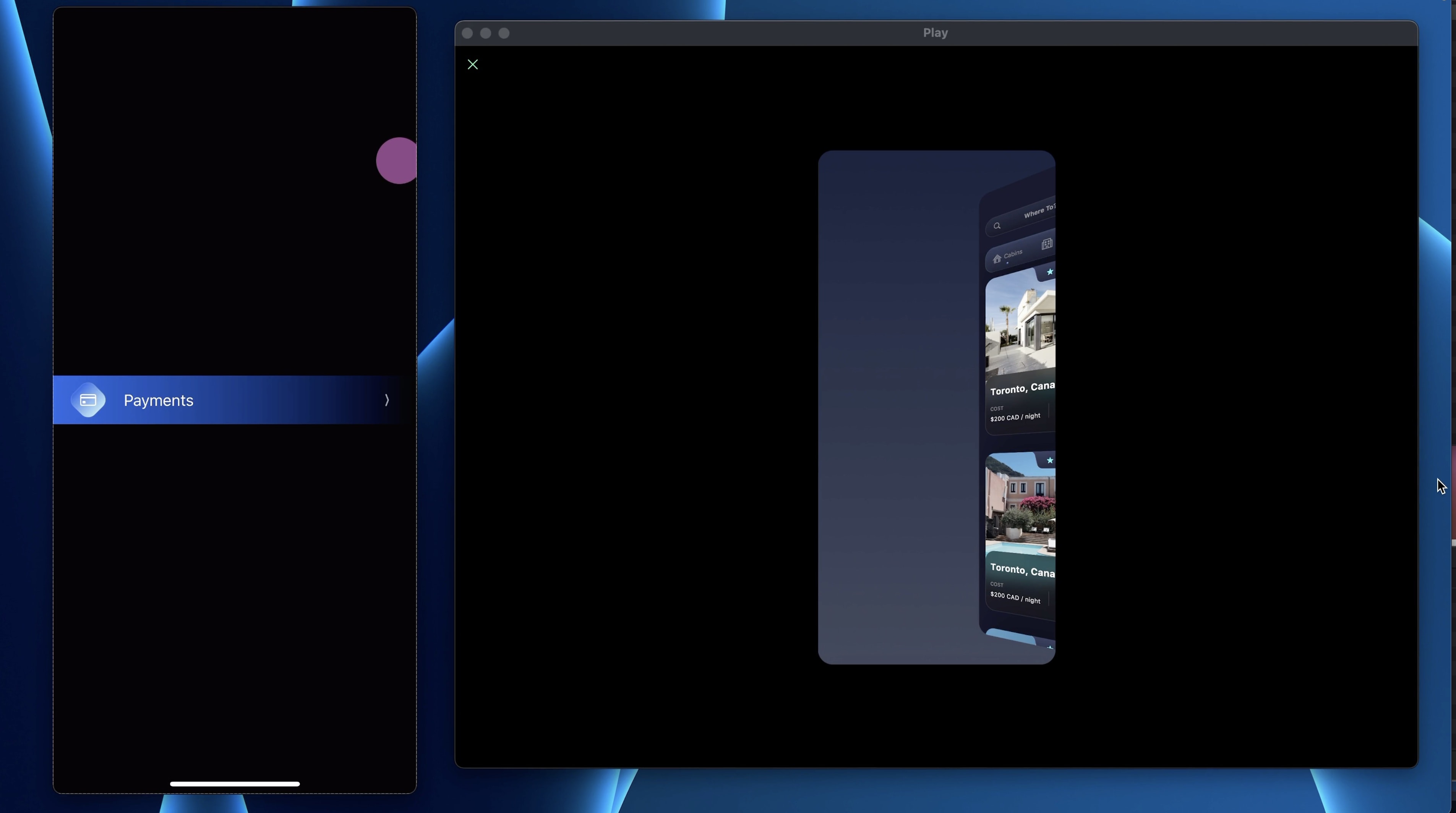
Let’s work on the button state. Selec the Menu Button and make it in a component, access the component’s screen and add a custom state “Tapped”. In that state, we want to change a few things.
- Change the Color of the Diamond Icon to #0F54E8 - #9DDFF3 from left to right
- Set the Color of the Icon to white and the text as well
- On the Menu Button, set the BG Color to #0F54E8 100% - #0F54E8 0%.
Button Interaction
Add a Tap trigger with a Set State action. Target is Self, Start State is Default and the End State is Tapped. Make sure to toggle “Invert Other Instances”. This option allows you to reset all the other same components to its default state that are in the same stack. We don’t want to have 2 Menu buttons that are in the Tapped state at the same time. Set the duration to 0.5 and easing to Ease In and Out.
Separator
Between each Menu Button, there's a Separator. For this component, we will use 2 stacks with opposite gradient. Select the List and add a Stack H and name it: Separator Menu.
- Set the Width to 100% and the Height to Auto
- In it, add another Stack, set the Width to 50% and the Height to 1PT
- For the BG Color, set a gradient #D6D2EA 0% - #D6D2EA 100%.
- Reduce opacity to 20%
- Duplicate the stack and add a 3D transform Rotation Y 180deg
- Make it into a component
Button List
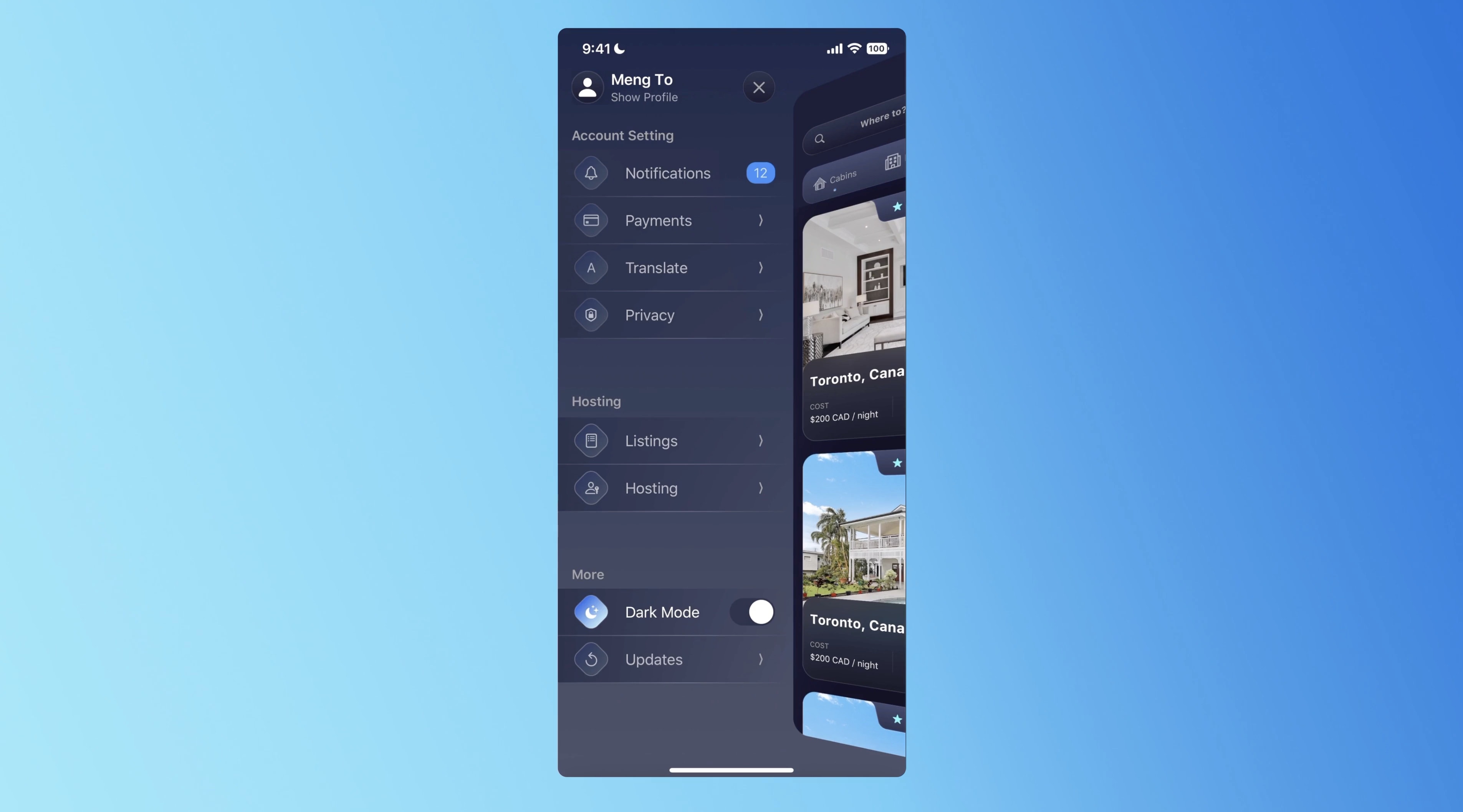
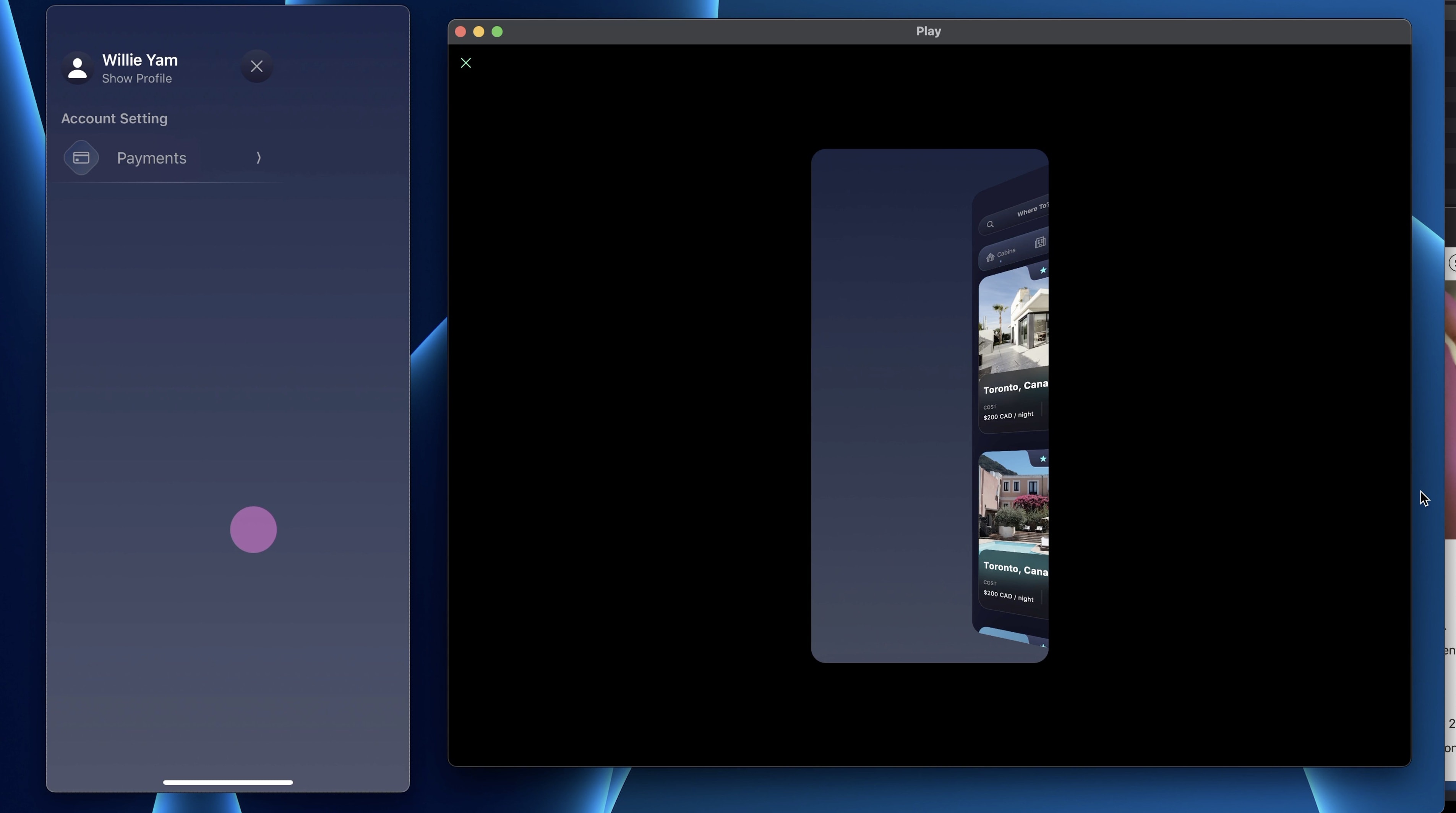
With that done, let’s continue with the layout. Duplicate the titles, buttons and the separators until you have a layout that resembles this:
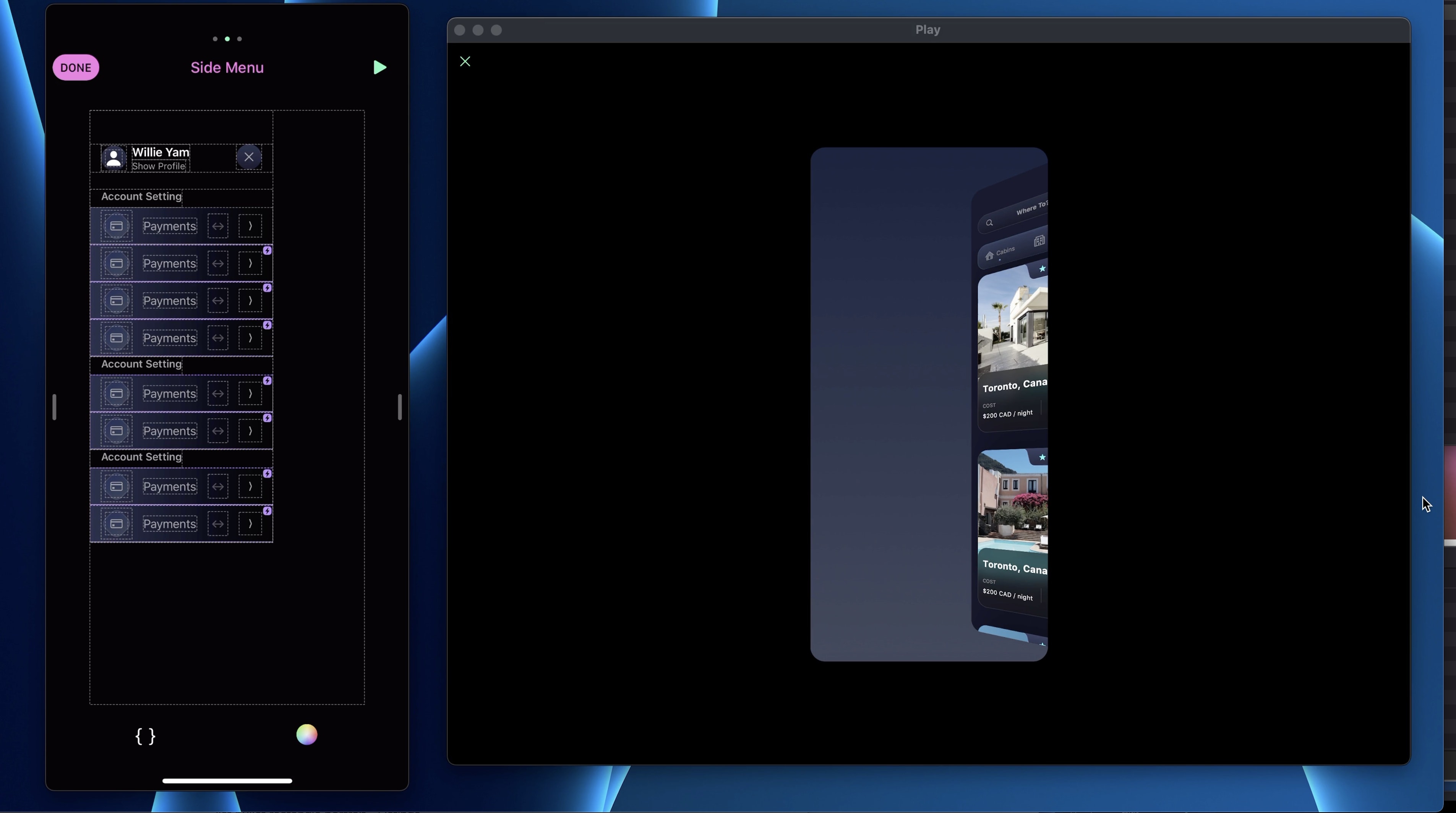
Now change the icon and the title as follows. Make sure to also change the icon and the title in Tapped state.
1 - Account Setting
- bell - Notifications
- creditcard - Payments
- A - Translate
- lock.shield - Privacy
2 - Hosting
- list.bullet.rectangle.portrait - Listings
- person.badge.key - Hosting
3 - More
- moon.stars.fill - Dark Mode
- arrow.counterclockwise - Updates
Select the second and third titles, add a padding top of 60PT.

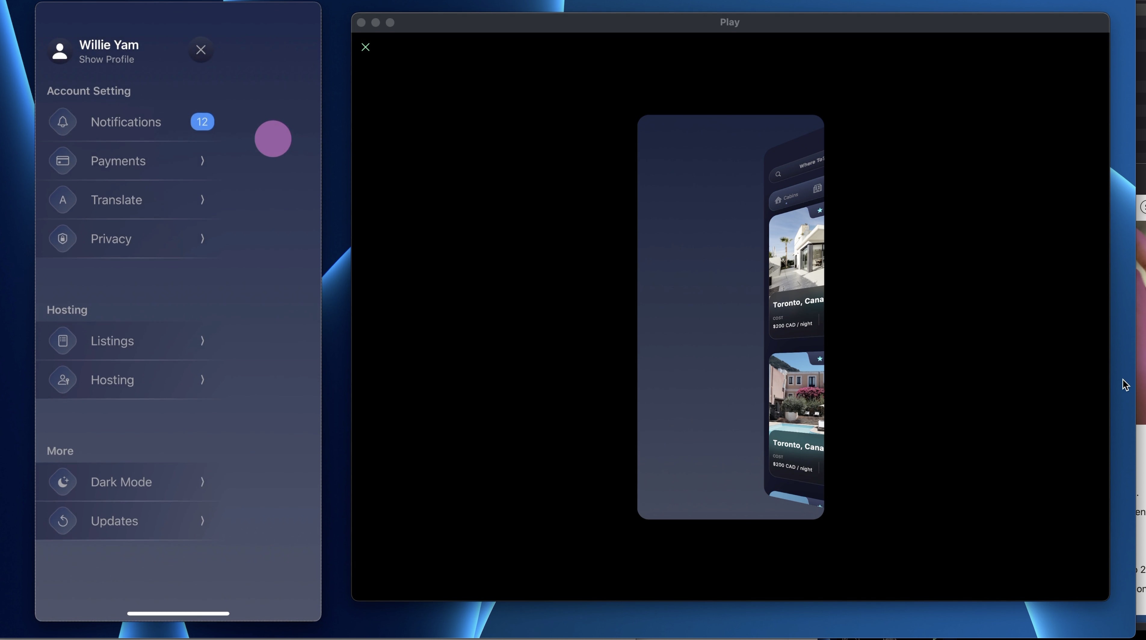
Notification
In the design, you can see that the notification button doesn't have the arrow but a notification bubble instead. You can select the Menu Button of the Notification one and Detach Instance. By doing that, you will keep the default design and can change elements in it.Delete the SF Symbol and let’s add a Stack.
- Set the Alignment and Distribution to Center
- Set the Width and the Height to Auto
- Add paddings (2, 8, 2, 8)
- Set the BG Color to Blue and Corner Radius to 10
- Add a Text “12” with Type Subhead 1 and the Color to white, opacity 70%
Switch
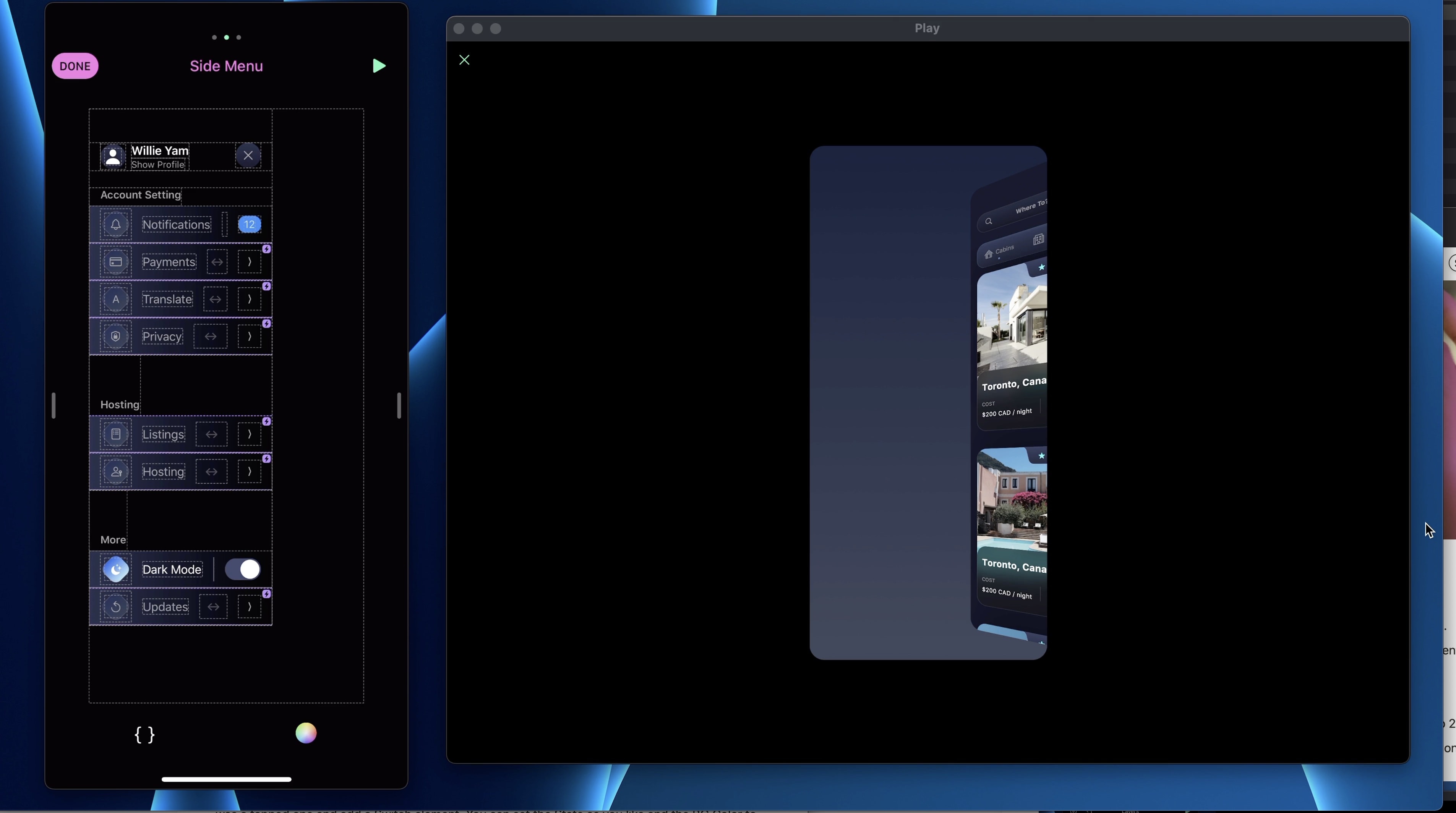
Similar to the Notification Button, the Dark mode one doesn’t have an arrow. Instead, we will add a switch. Detach from instance the Dark mode button and delete the SF Symbol. Set the button as if it was a tapped one and add a Switch element. You can set the State as you like and the BG Color to #22283E - #171827.
Sequence Animation
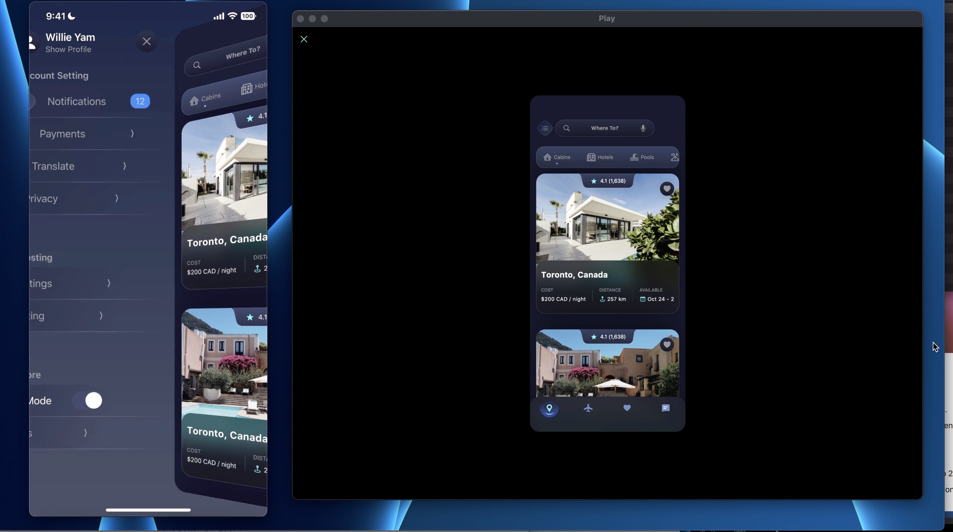
One fun way to animate a Sidebar menu is by using a sequence animation. Which means that each button will come in view one after the other. To do that, go to the Home Screen in Default state, on the Side Menu, we will set the Offset X of each Menu button to -100PT multiplied by its order.
- Menu Button 1 : -100PT
- Menu Button 2 : -200PT
- Menu Button 3 : -300PT
- Menu Button 4 : -400PT
- Menu Button 5 : -500PT
- Menu Button 6 : -600PT
- Menu Button 7 : -700PT
- Menu Button 8 : -800PT
Templates and source code
Download source files
Download the videos and assets to refer and learn offline without interuption.
Design template
Source code for all sections
Video files, ePub and subtitles
Assets
Videos
Subtitles
1
Intro to Play
Build a completely functional prototype without writing a single line of code from your phone
4:29
2
Layout and Components
Learn how to make and re-use custom elements
20:23
3
States and Interactions
Make your app more engaging with state-based animations
6:52
4
Custom Search Bar and Segmented Control
Use Textfield to make a custom component
8:03
5
Custom Segmented Controls
Alternative UI to radio buttons and dropdown menus
10:35
6
Tab bar Lottie animation
Create a beautiful animation for Tab Bar using Lottie
17:44
7
Sidebar menu animation
Implement a smooth and exciting menu transition
38:07
8
Map and Drawer animation
Use native elements to create a beautiful map screen
16:32
9
Navigation and Detail screen
Transition to another screen
56:38
10
Native Date Picker
Design a beautiful interactive calendar
9:14
Meet the instructor
We all try to be consistent with our way of teaching step-by-step, providing source files and prioritizing design in our courses.
Willie Yam
Front-end/UI developer at Design+Code
I do UI coding. HTML/CSS/JS/SWIFTUI dev.
10 courses - 37 hours

Design and Prototype an App with Play
Build a completely functional prototype without writing a single line of code from your phone
3 hrs

Create a 3D site with game controls in Spline
Build an interactive 3D scene implemented on a ReactJS site using Figma and Spline
2 hrs

Build a Movie Booking App in SwiftUI
Learn how to create an iOS app based on a beautiful UI design from Figma with interesting animations and interactions, create a custom tab bar and use navigation views to build a whole flow
1 hrs

Build Quick Apps with SwiftUI
Apply your Swift and SwiftUI knowledge by building real, quick and various applications from scratch
11 hrs

CSS Handbook
A comprehensive series of tutorials that encompass styled-components, CSS, and all layout and UI developments
1 hrs

Advanced React Hooks
Learn how to build a website with Typescript, Hooks, Contentful and Gatsby Cloud
5 hrs

Unity for Designers
If you want to make a game and don't know where to start, you are in the right place. I will teach you how to use Unity, code in C# and share essential tips and tricks to make your first game.
5 hrs

Create a Javascript Game
Learn how to create a web game using Phaser 3, a popular javascript game engine. Draw a map using an editor, implement the player, make the player move, apply physics, collisions, and implement the enemies.
2 hrs

Build an ARKit 2 App
Introduction to ARKit and learn how to make your own playground. You will be able to add models or even your own designs into the app and play with them
4 hrs

Create a SpriteKit Game
Overview of SpriteKit a powerful 2D sprite-based framework for games development from Apple and learn how to create your very own platform
3 hrs
