
Layout and Components
Add to favorites
Learn how to make and re-use custom elements
Play video
Design and Prototype an App with Play
New project
Click on the + icon on the top right and create a new project.

Pages
You'll be presented with the Pages screen. This is where you create new screens. Tap on the + icon and you will see a bunch of templates. These templates make it easy to create a new screen. For us, we will start from scratch so choose the Blank one.
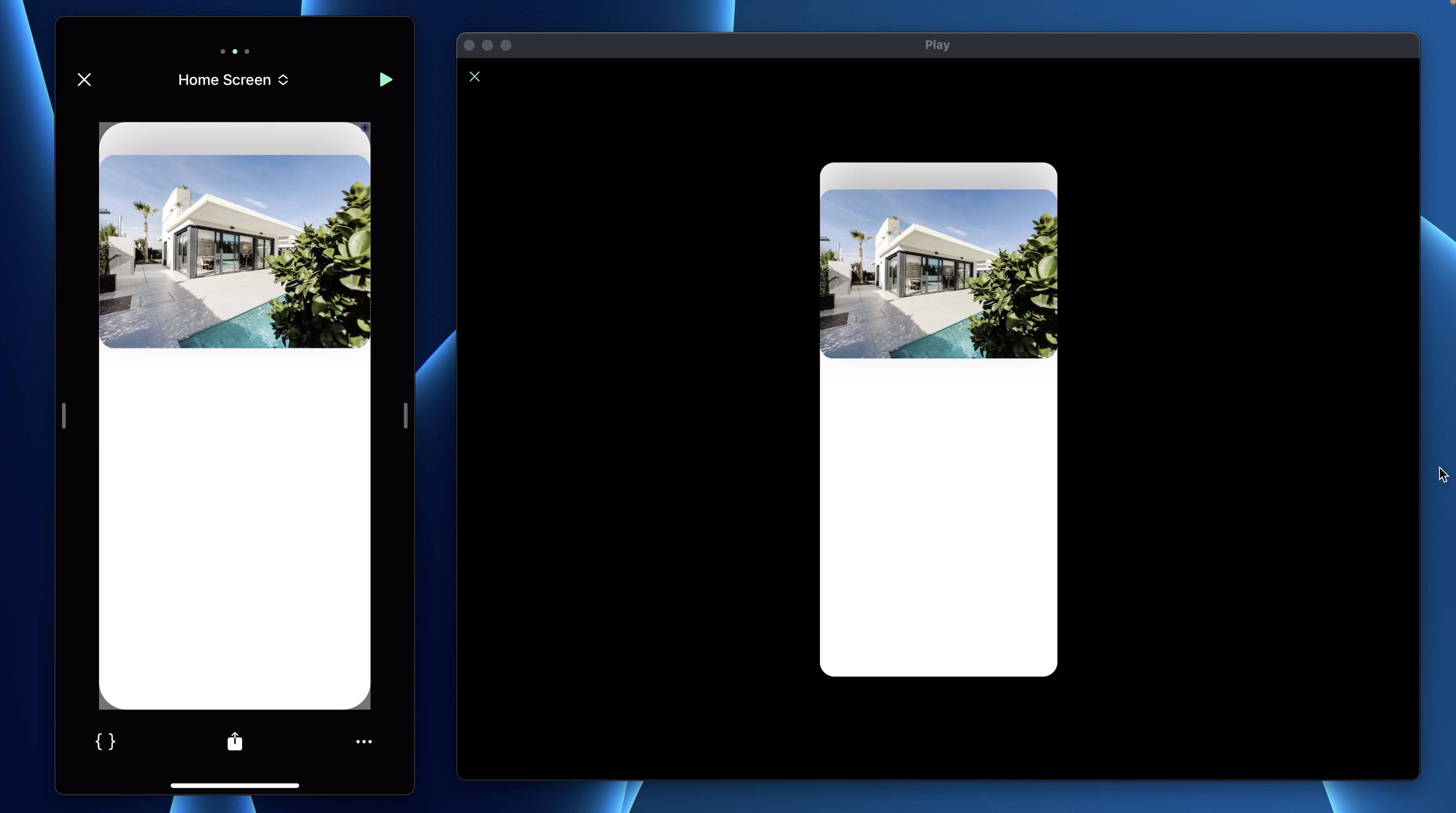
At the bottom right, click on the 3 dots icon. Rename the page to Home screen.

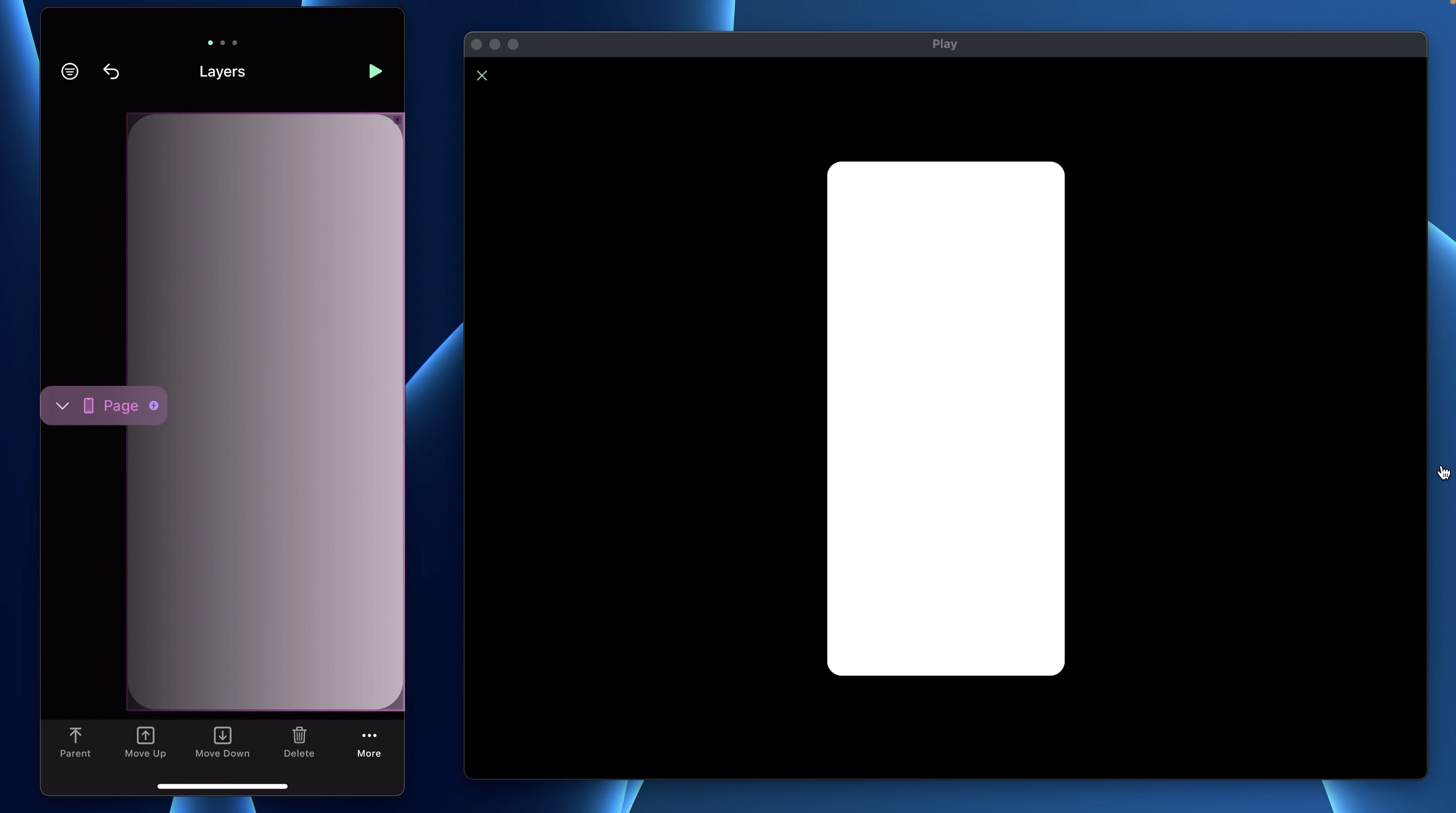
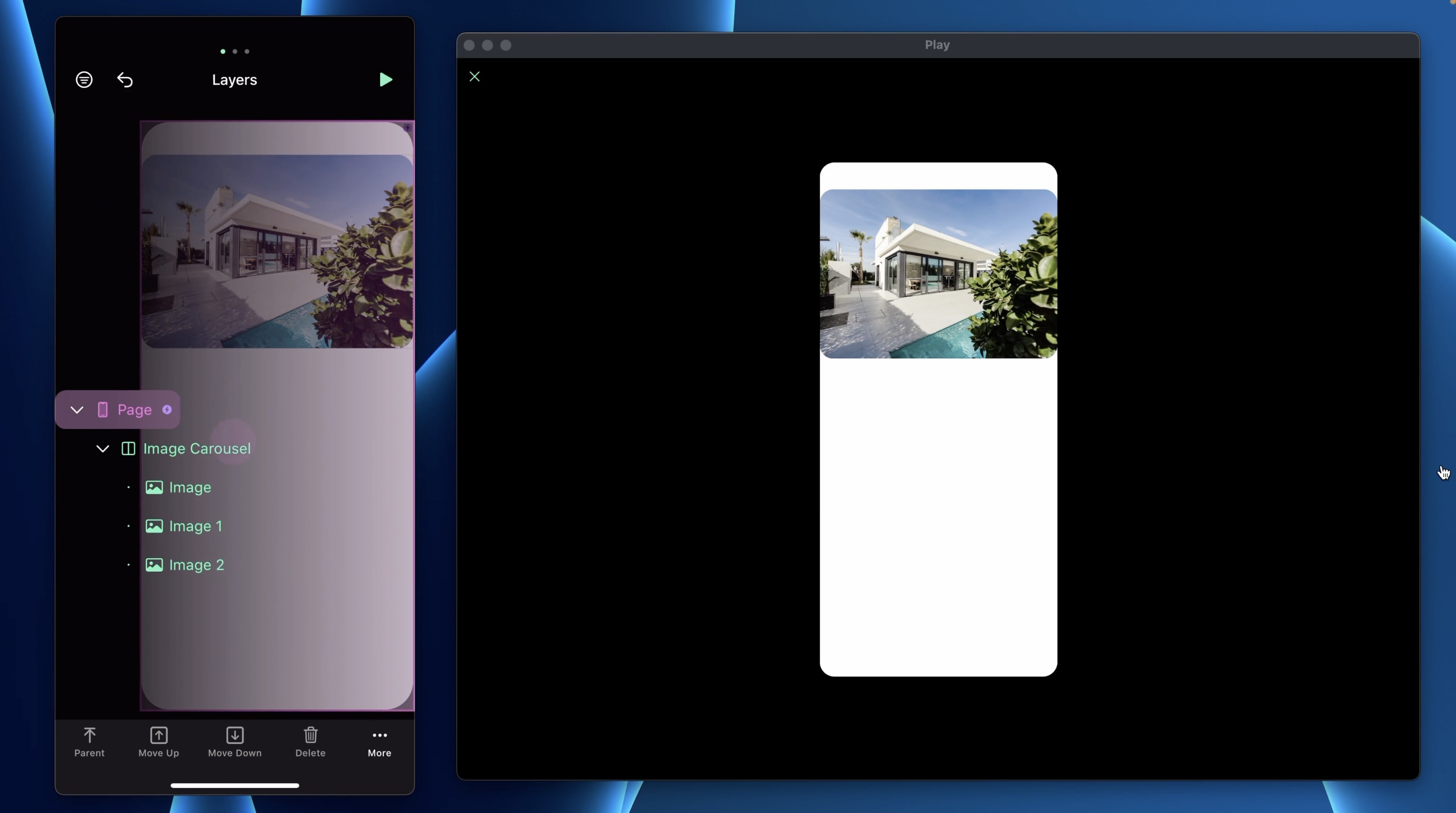
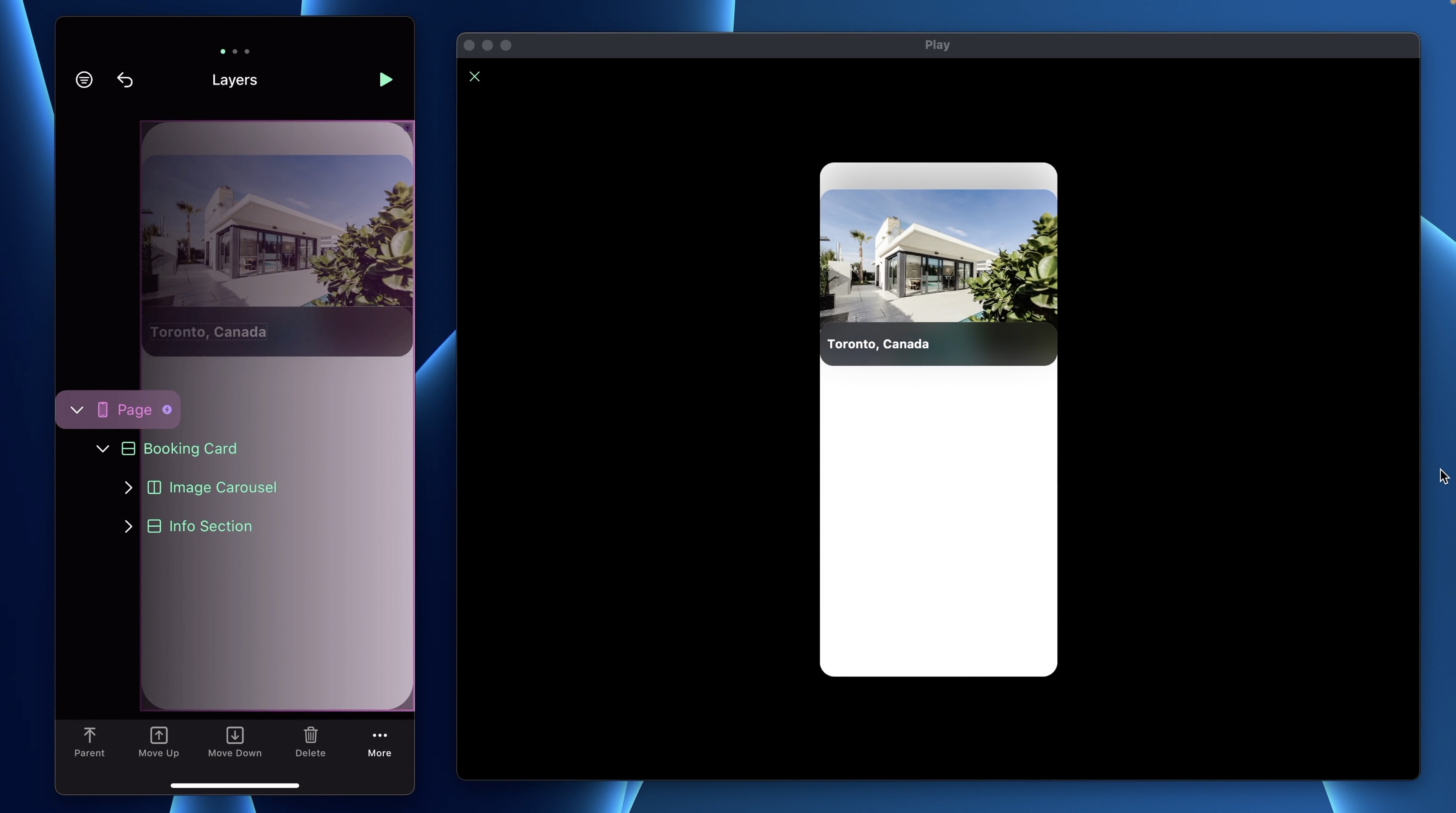
Layers
The editor has three main sections. Tap the left indicator to display Layers. This is where you will find all the layers and elements, very similar to Figma. At the bottom, you also have the option to move layers around.
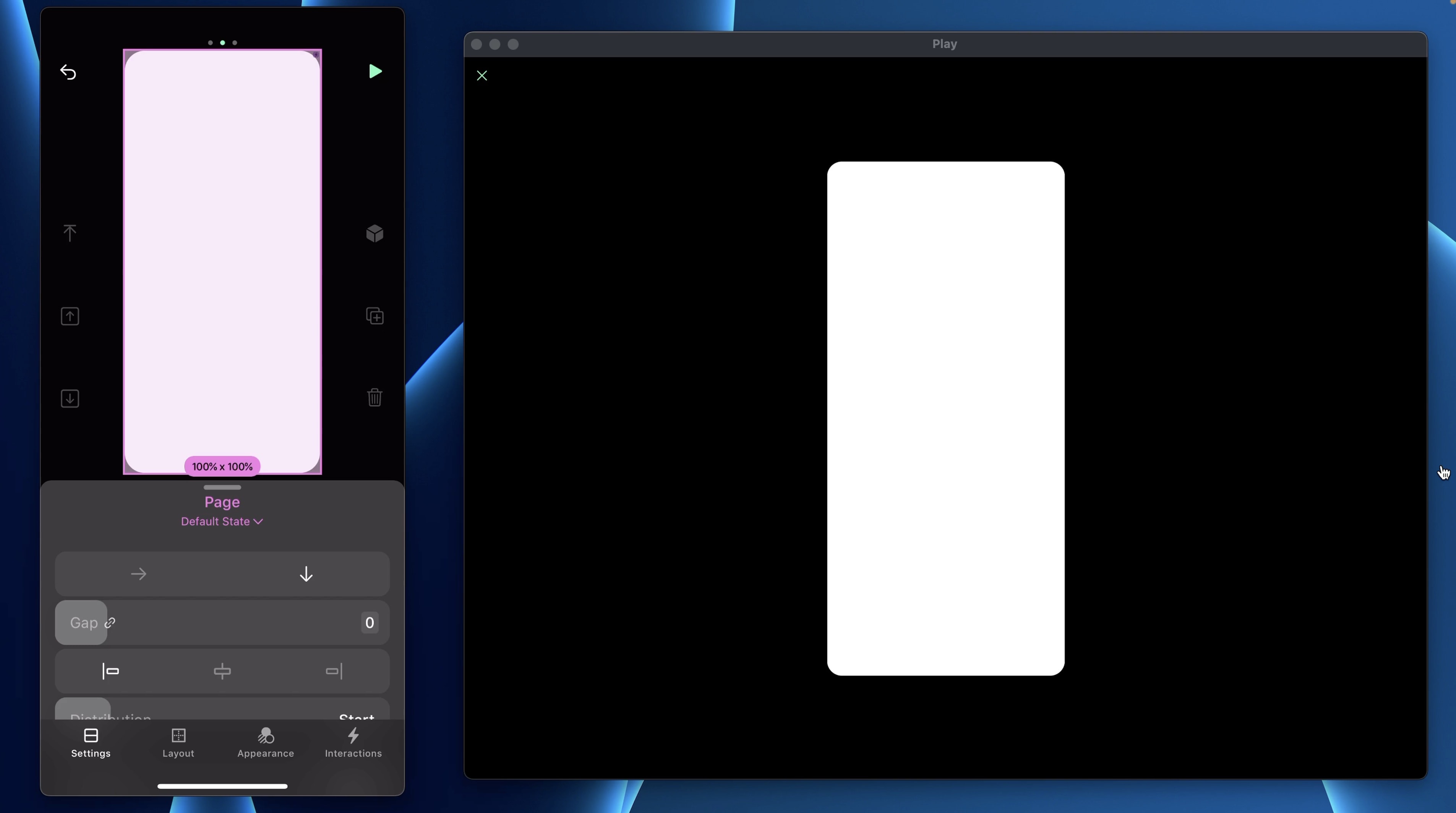
Inspector Panel
After you’ve selected a layer, the Inspector panel will slide into view from the bottom of your screen. It has 4 main sections: Settings, Layout, Appearance, and Interactions.
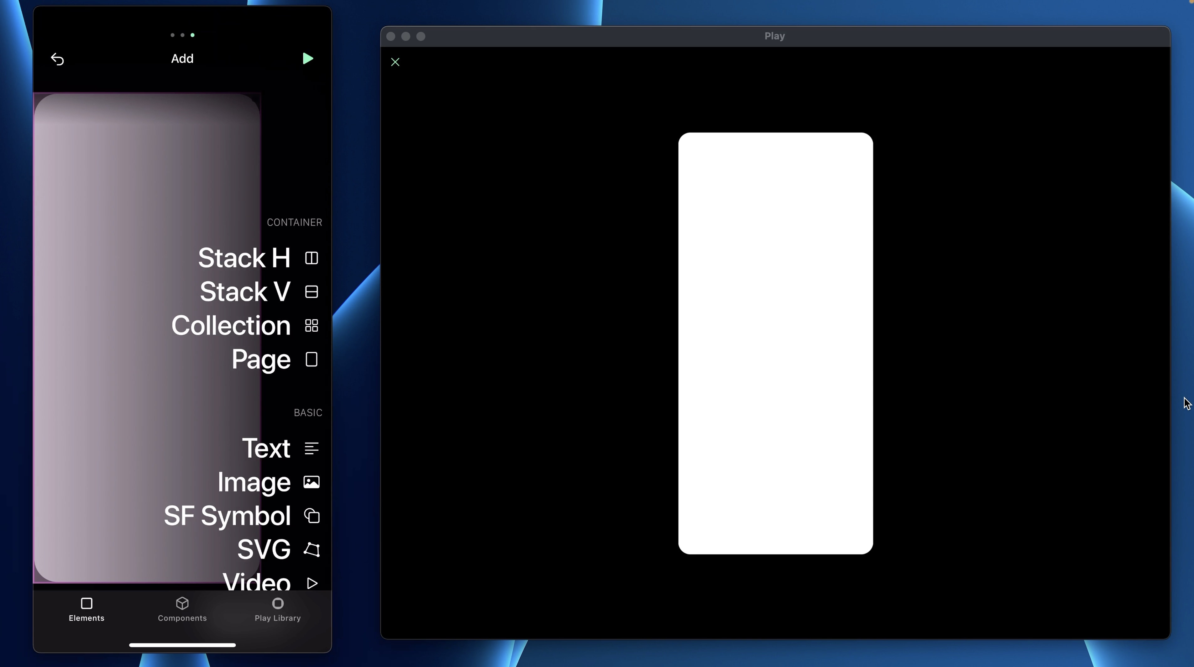
Elements, Components & Library
Finally, tap the right indicator to add a new element. You'll see 3 different tabs: Elements are your views in SwiftUI, Components is where you'll find custom components, and Library is where you can find pre-made components or native iOS elements.
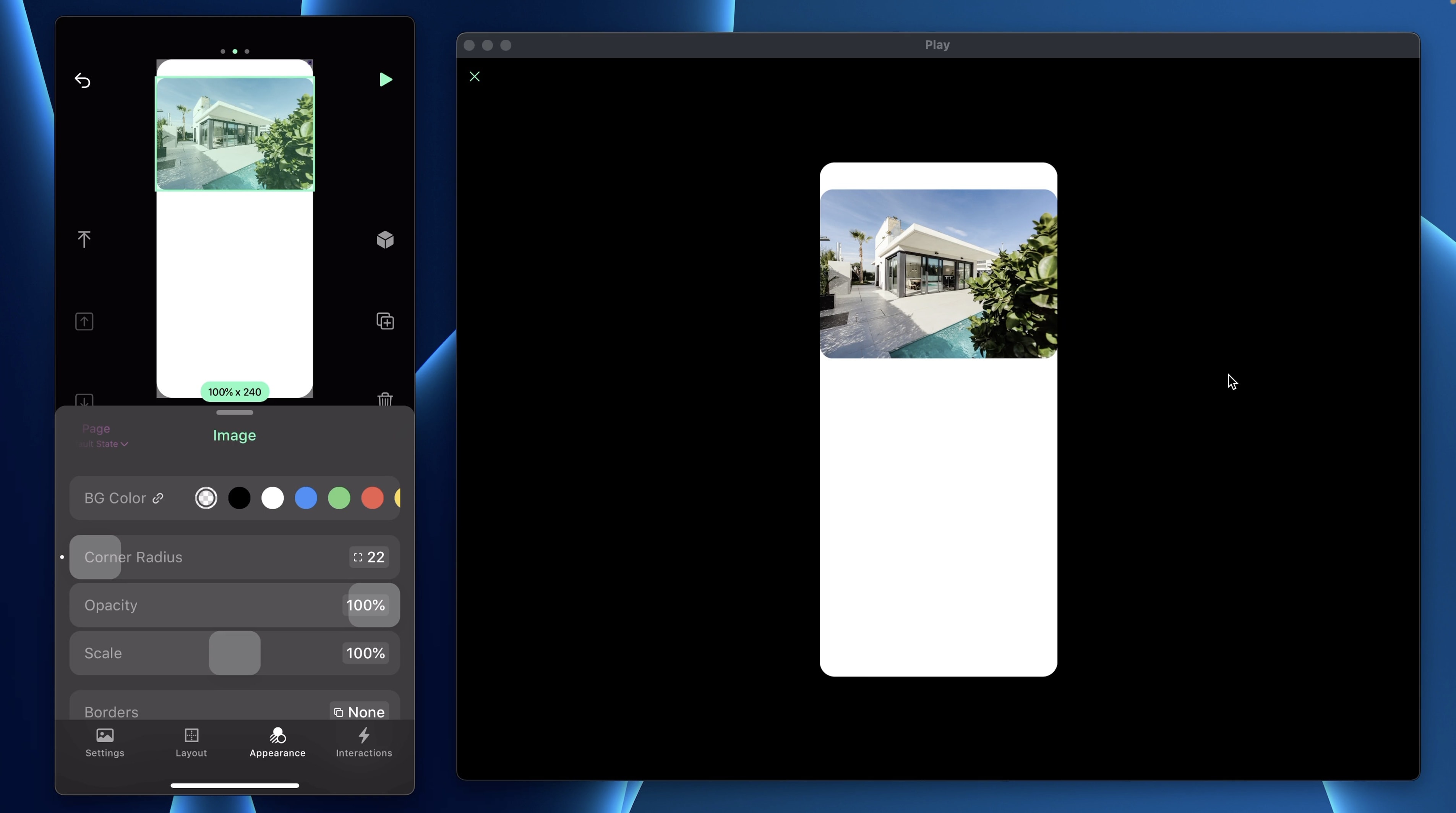
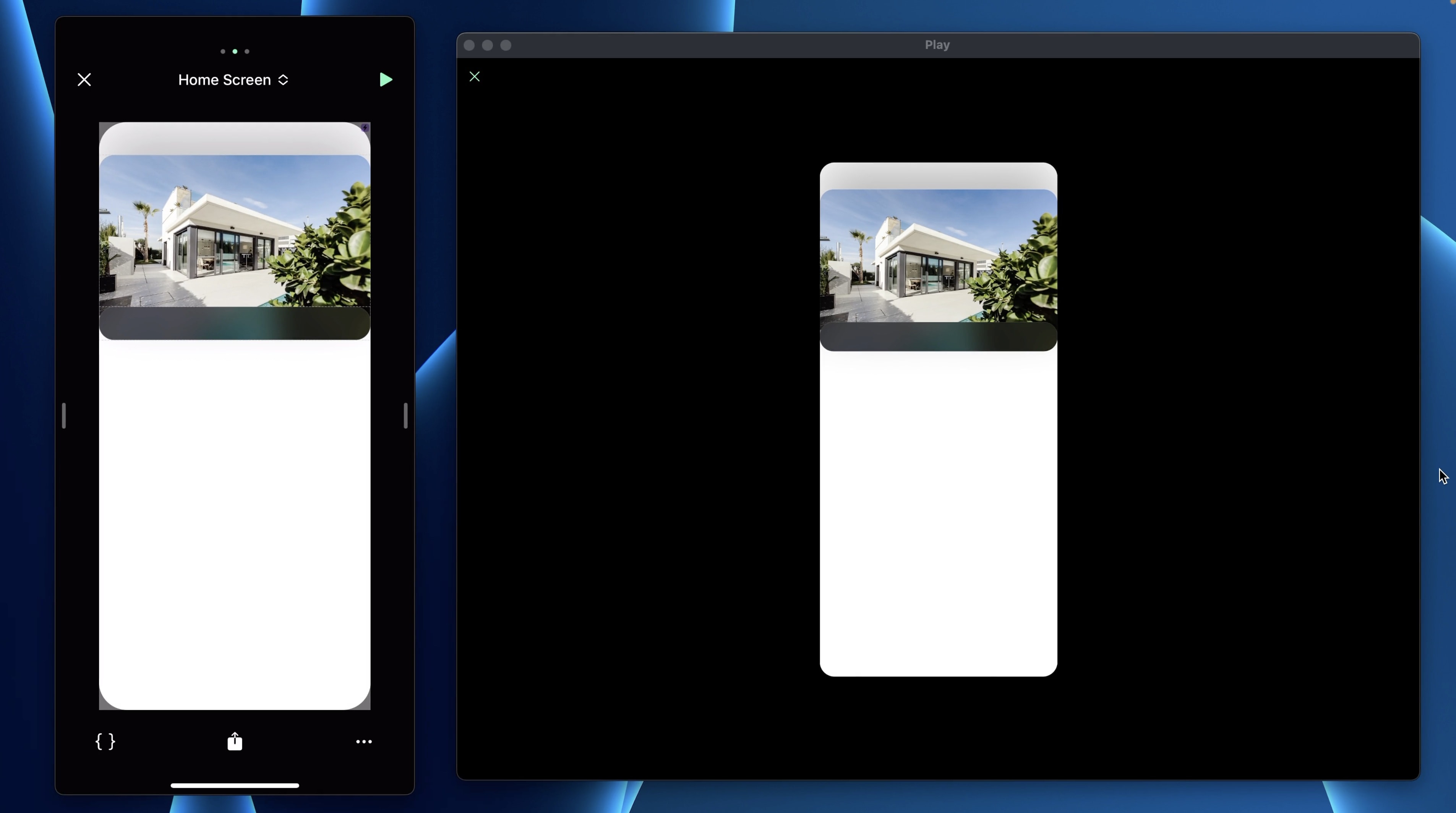
Image
- Add an Image element and rename it Image
- In Settings, upload your own image or use Unsplash
- Set the Width to 100% and Height to 278pt
- In Appearance, set the Corner Radius to 22
Quick Preview
In Play you can use quick preview feature by holding your finger on the screen. This will show you how your app will look like on your device.
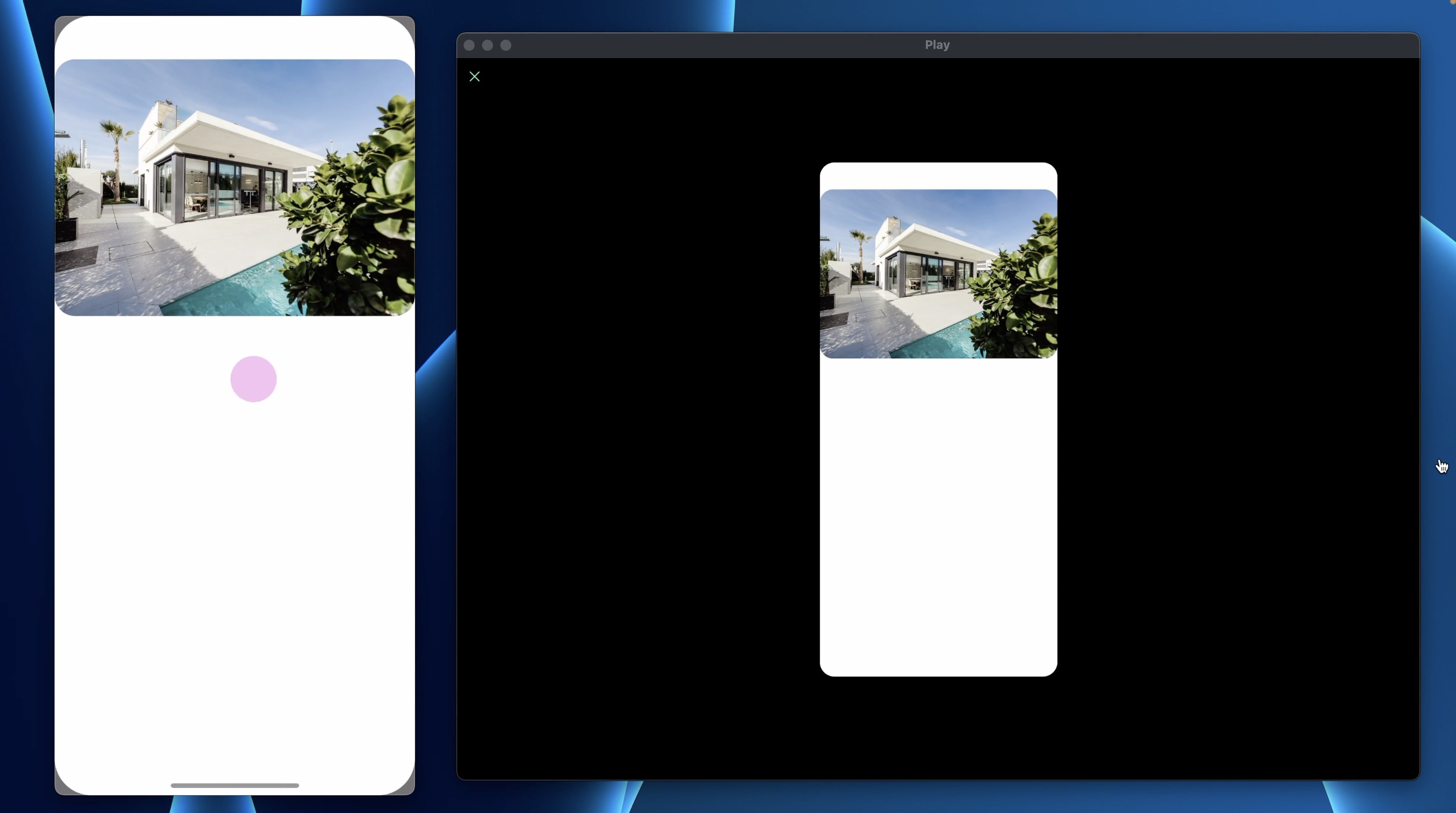
Image Carousel
The image carousel is a popular user interface (UI) that you will find in almost any app. You can easily recreate this UI in Play. We want the carousel to be horizontal.
- Add a Stack H
- In Layers, place an image inside the Stack
- Tap on the duplicate icon 2 times
Only with these settings, you can already swipe and preview the interaction. Let’s change the 2 other images. From Settings, you can choose the different effects you want. I will select Fade & Scale.
- In Layout, set the Height to 278pt
- In Appearance, set the Corner Radius of both top sides to 22
Booking Card
For the Booking card, very similar to SwiftUI, add a Stack V from the elements.
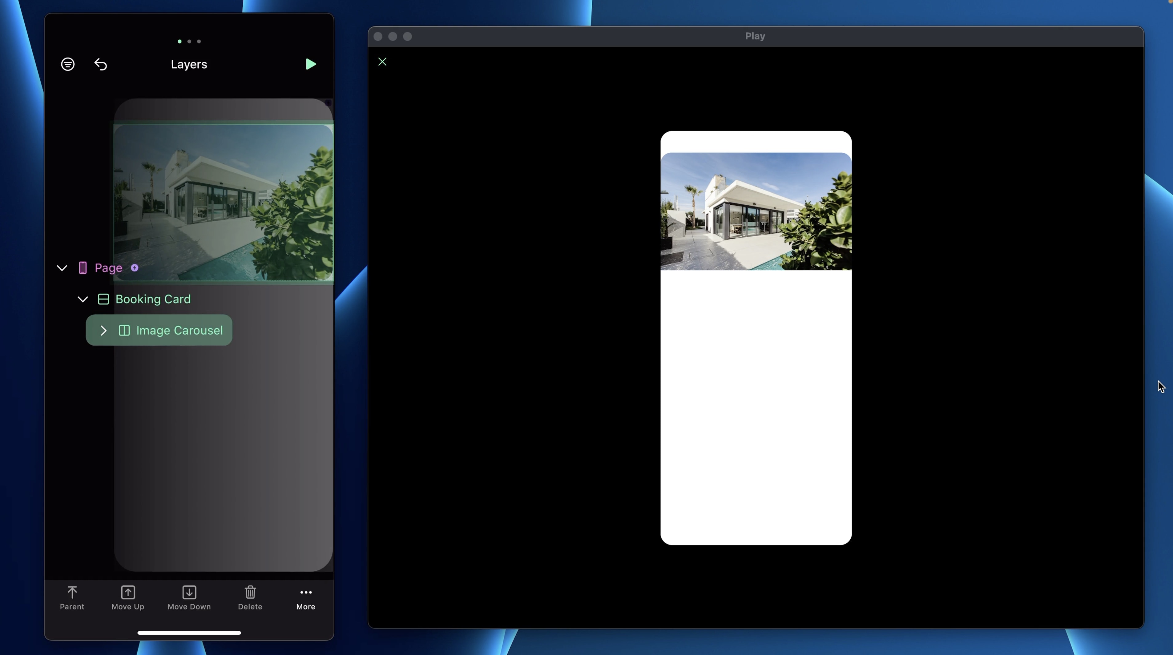
- Rename it: Booking Card and drag the Image Carousel in the stack
- In Layout, set the Height to Auto because we want the height to be dynamic to the content
- In Appearance, set the BG Color to clear and Corner Radius to 22
- Add Borders of 1px, color white, opacity 10%
- Add Drop Shadow, Outer with Offset X to 0, Offset Y to -40pt, Blur 40 and Color black at 30% opacity
Info Section
- Add a Stack V and rename it Info Section
- In Settings, set the Gap to 20pt
- In Layout, set paddings to 24, 12, 24, 12 and set the margin top to -60
- In Appearance, set the Corner Radius to 22 and
- Add Borders 1pt, color white, opacity 7%
- For the Effects, add a BG Blur Dark
Text Type
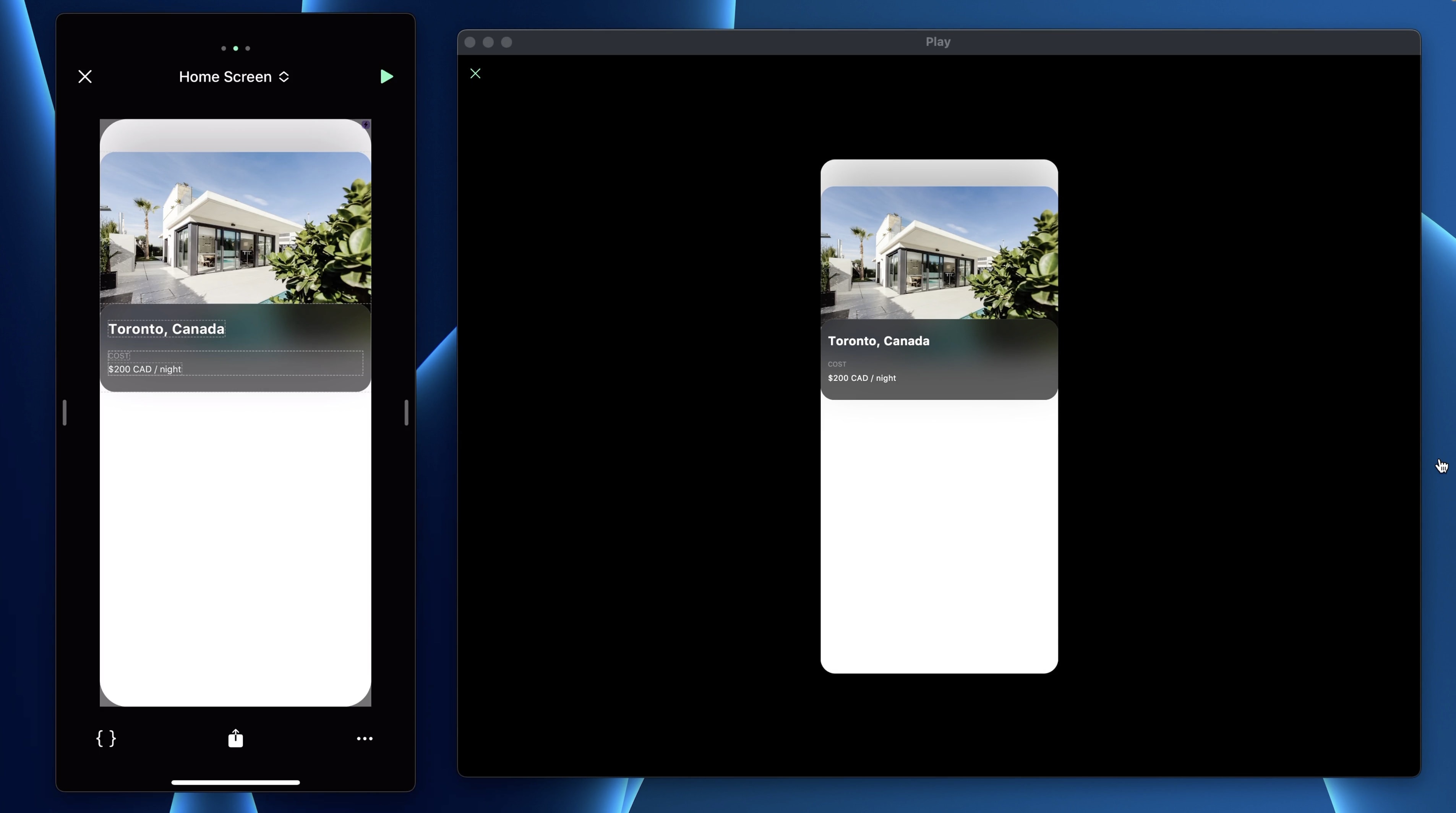
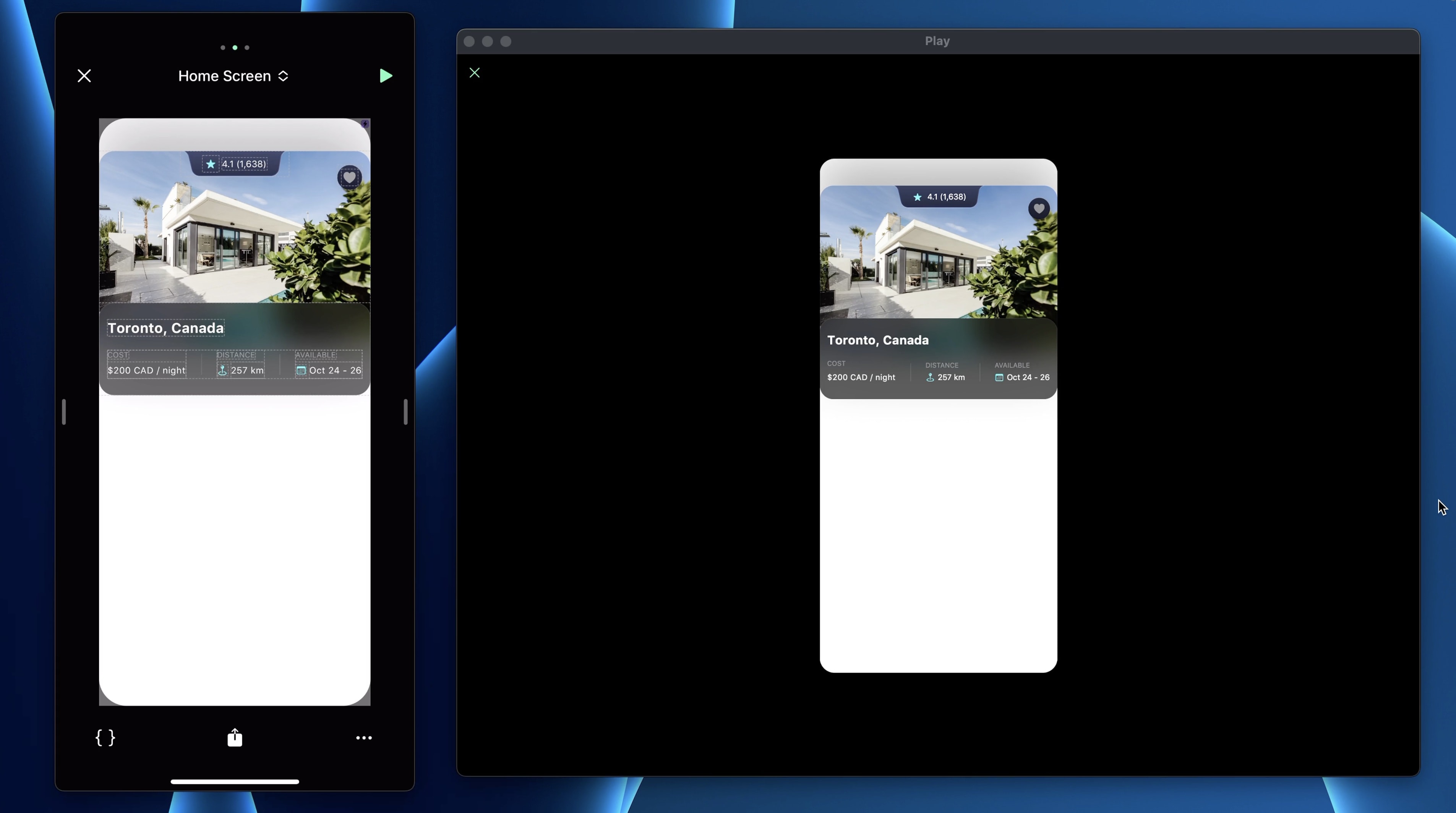
Next, we have the Country title. Add a Text element. Play makes it easy to customize your own design system even for text. Set the text to "Toronto, Canada". The type is preset, but we can still change the style.
- Set Styles to Bold, Size to 20pt and the name to “Title 3 - Bold”, Color to white
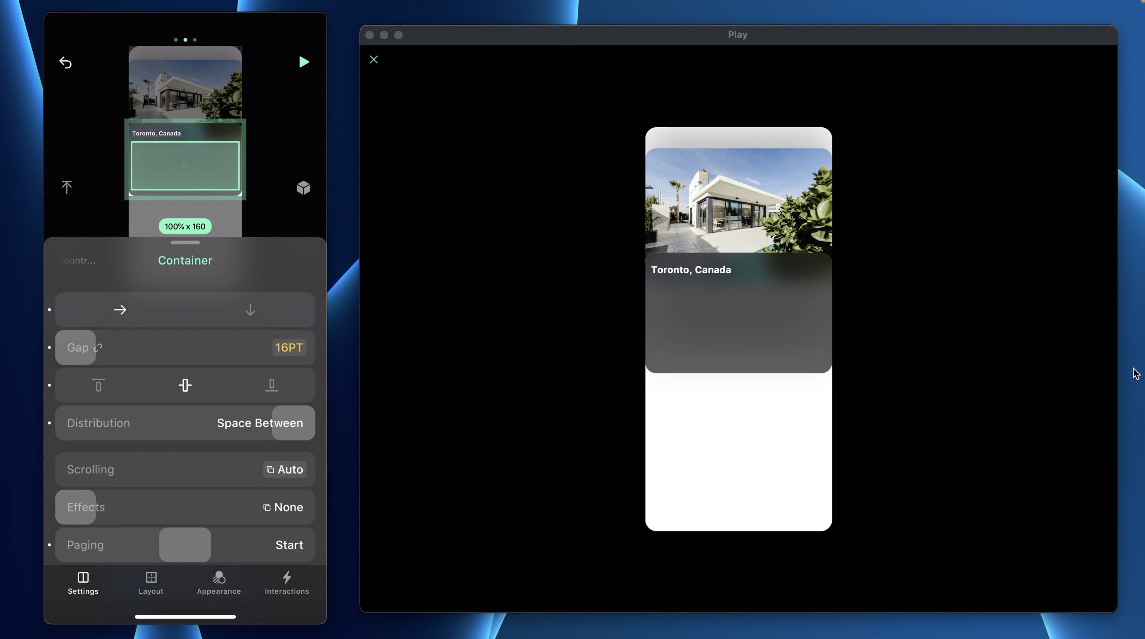
Cost, Distance, Available Container
Let's use Stack H to set the content horizontal. We'll name this Stack “Container”.
- In Settings, set the Gap to 16 and Distribution to Space Between
- In Layout, make sure Height is set to Auto
Info Container
Add a Stack V, set the Gap to 4 and the Distribution to Start. Set the Width to Auto.
Texts
In the Info Container, add 2 text elements.
- First is called Subtitle, set the text to “COST”, the type to Caption 2 and the color to System Gray
- Second is called Description, set the text to “$200 CAD / night”, the type to Footnote and the color to white
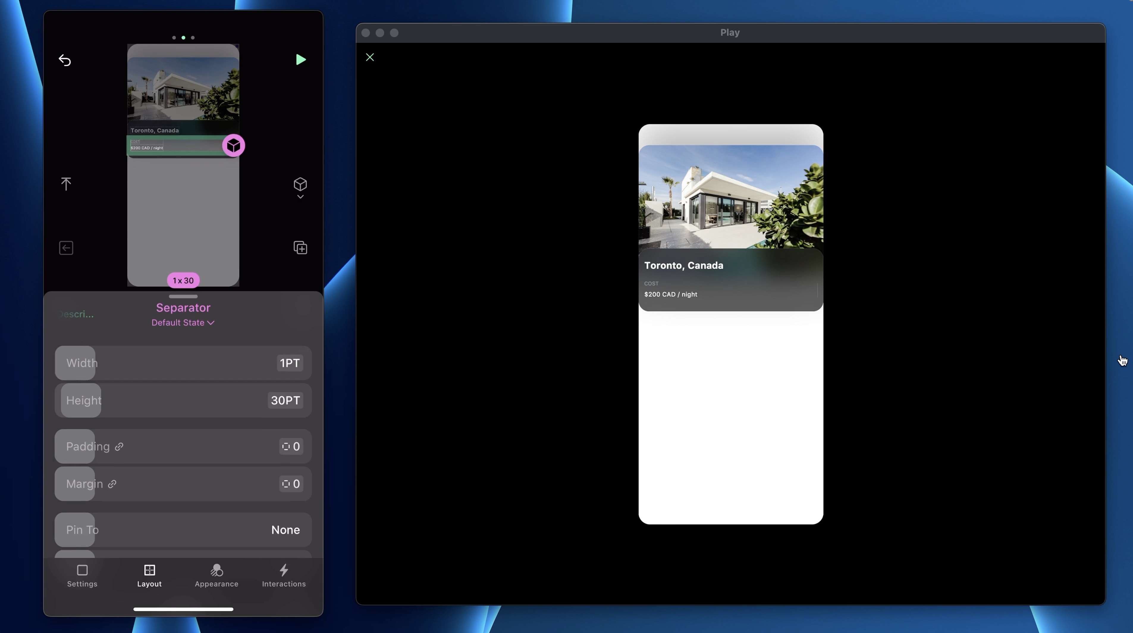
Separator
Between each Info Container, there’s a separator. To make one, add any Stack.
- In Layout, set the Width to 1pt and Height to 30pt
- In Appearance, set the BG Color to white, opacity 10%

Components
We are going to reuse the Separator multiple times during this project. To make it re-usable, we will make it into a component. Select the separator and tap on the cube icon. You will know your layer is a component when the title is pink. To modify a component, tap the pink cube to open the component’s screen. The changes you make will apply to all instances.
SF Symbols
Duplicate the Info Container, the UI is very similar but the second row has an extra icon so add a Stack H.
- On that Container, set the Gap to 4
- Drag the Description in it and add an SF Symbol
- In Settings, search for the “mappin.and.ellipse” icon, set the Size to 13, Container Size to 16x16
- Add new color #37FAFA to the design system

Duplicate
Next, duplicate the Separator and the second Info Container. Change the text accordingly.

Notch
For the notch, we will add a Stack H.
- In Settings, set the Gap to 4 and the Distribution to Center
- In Layout, set the Width to 156pt, Height to 37
To place another element on top of the current one, you need to enable “Pin To” top center.
- In Appearance, set the BG Image to the Notch image in the Assets file
- In that Stack, add a SF Symbols, set the icon to “star.fill”, Size to 12pt, Container Size 24x24 and color to #37FAFA
- Add a text “4.1 (1,648)”. The type is Footnote and the color is white

Favorite Button
Next, we will add the favorite button. Add a Stack.
- In Settings, set the Distribution to Center
- In Layout, set the Width and the Height to 36pt
- Slide Pin To Top Right, set the margin top to 20 and margin right to 12
- For the Background Color, add a new Gradient for #22283E - #171827
- Set the Corner Radius to 40
- In Borders, set 1pt, color white, opacity 10%
- In Effect, add a Drop Shadow with Offset X 4pt, Offset Y 4pt, Blur 10, color black, 20% opacity
- Add a SF Symbol “heart.fill” with Size 18pt, Container Size 24x24 and set the color to System Gray
Templates and source code
Download source files
Download the videos and assets to refer and learn offline without interuption.
Design template
Source code for all sections
Video files, ePub and subtitles
Assets
Videos
Subtitles
1
Intro to Play
Build a completely functional prototype without writing a single line of code from your phone
4:29
2
Layout and Components
Learn how to make and re-use custom elements
20:23
3
States and Interactions
Make your app more engaging with state-based animations
6:52
4
Custom Search Bar and Segmented Control
Use Textfield to make a custom component
8:03
5
Custom Segmented Controls
Alternative UI to radio buttons and dropdown menus
10:35
6
Tab bar Lottie animation
Create a beautiful animation for Tab Bar using Lottie
17:44
7
Sidebar menu animation
Implement a smooth and exciting menu transition
38:07
8
Map and Drawer animation
Use native elements to create a beautiful map screen
16:32
9
Navigation and Detail screen
Transition to another screen
56:38
10
Native Date Picker
Design a beautiful interactive calendar
9:14
Meet the instructor
We all try to be consistent with our way of teaching step-by-step, providing source files and prioritizing design in our courses.
Willie Yam
Front-end/UI developer at Design+Code
I do UI coding. HTML/CSS/JS/SWIFTUI dev.
10 courses - 37 hours
Design and Prototype an App with Play
Build a completely functional prototype without writing a single line of code from your phone
3 hrs
Create a 3D site with game controls in Spline
Build an interactive 3D scene implemented on a ReactJS site using Figma and Spline
2 hrs
Build a Movie Booking App in SwiftUI
Learn how to create an iOS app based on a beautiful UI design from Figma with interesting animations and interactions, create a custom tab bar and use navigation views to build a whole flow
1 hrs
Build Quick Apps with SwiftUI
Apply your Swift and SwiftUI knowledge by building real, quick and various applications from scratch
11 hrs
CSS Handbook
A comprehensive series of tutorials that encompass styled-components, CSS, and all layout and UI developments
1 hrs
Advanced React Hooks
Learn how to build a website with Typescript, Hooks, Contentful and Gatsby Cloud
5 hrs
Unity for Designers
If you want to make a game and don't know where to start, you are in the right place. I will teach you how to use Unity, code in C# and share essential tips and tricks to make your first game.
5 hrs
Create a Javascript Game
Learn how to create a web game using Phaser 3, a popular javascript game engine. Draw a map using an editor, implement the player, make the player move, apply physics, collisions, and implement the enemies.
2 hrs
Build an ARKit 2 App
Introduction to ARKit and learn how to make your own playground. You will be able to add models or even your own designs into the app and play with them
4 hrs
Create a SpriteKit Game
Overview of SpriteKit a powerful 2D sprite-based framework for games development from Apple and learn how to create your very own platform
3 hrs