
Styles and Team Library
Add to favorites
Rules for typography, colors and gradients in Figma
Play video
Design System in Figma
1
Design System in Figma
10:14
2
Basic Layout and Techniques
19:49
3
Constraints and Adaptive Layout
15:13
4
Styles and Team Library
22:02
5
Components and Nesting
18:44
6
Booleans and Shapes
13:40
7
Icons and Vector Network
30:29
8
Export, Inspect and Code in Figma
26:03
9
Multiplayer and Commenting in Figma
8:36
10
Prototyping and Interaction
11:42
Create the Design System File
Let’s create a new Figma file and call it Design System. We’ll create super quick styles to help with the consistency in our main design.
Colors
Create a new MacBook Pro Frame. Rename it to Colors.
Grid Styles
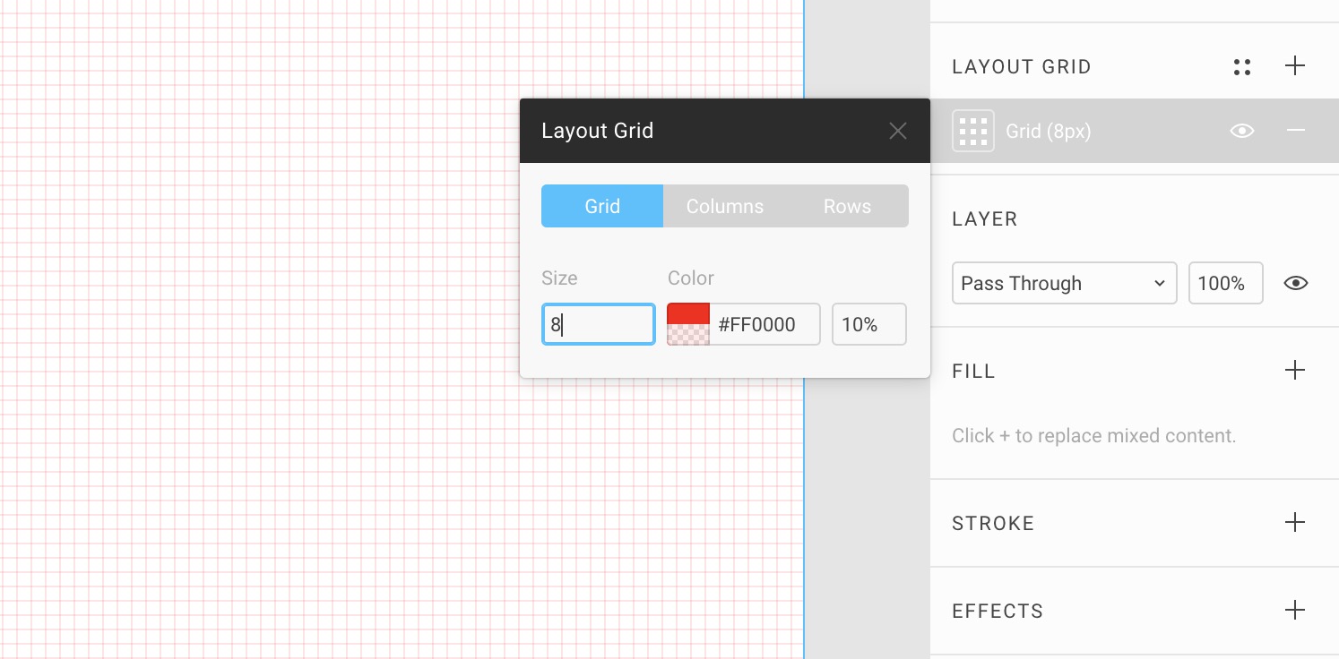
The first thing to add to our Styles is the Grids. Let’s select the Colors frame and click on the Plus icon next to the Layout Grid. To save this as a new Style, click on the 4-dot icon and click on Create Style. Name it Grid 10pt. That’s it! We just created our first Style, which can be reused elsewhere.

Second Grid Style
Let’s do the same for an 8pt grid. First, remove the newly created Grid 10pt by clicking on the Minus icon. Click on the Plus icon, then the Grid icon to change the size to 8. Finally, create another Style and name it Grid 8pt.
Now you can switch between the two grids on the fly! Additionally, this can be reused on any other Frame.
Color Styles
Let’s create a bunch of Rectangles (280x200) and fill them with multiple colors to use for your project. Most designs will need 4 different types of colors: Background, Text, Buttons and Gradients.
Just like Grids, Colors and Gradients can be saved as styles. You first need to create a Fill of your choice and click on the 4-dot icon. In that window, click on the Plus sign to enter a name for your Color style. Please note that colors shown in the Fill menu are different from the Styles menu.
Background Colors
Good design needs good contrast to be legible and to command attention. To achieve this, you’d use two opposite colors, like black versus white, dark gray versus off-white, dark blue versus light blue. In our case, we used Dark Blue \#212C4F and Light Gray \#F0F3F5.
Text Colors
Text colors can be used to structure your typographic content. For the body text, you’d start with black on white, and white on black. For extra texts such as captions and titles, you’d need a couple of other colors. In this case, we’ll have Black, White, Dark Green \#205284 and Light Blue \#C6D0EB.
Button Colors
These colors need to draw attention. They’re used for actionable items, such as buttons, links and clickable areas. They can also be used to express your branding. The color that we use are: Purple \#7B42F6, Violet \#B01EFF, Pink \#E1467C, Blue \#3672F8
Gradient Styles
For those who are used to Sketch, you need to know that Figma has a different way to store Gradients. It’s not in the Fill menu but in the Styles menu. Unlike colors, there are no general presets. They’re Library-specific.
Gradients are used for buttons and backgrounds. You can even use them for text layers since Figma has this unique capability. To create a Gradient, go to Fill, and select the dropdown next to Solid. Move the endpoints from Top Left **to **Bottom Right. Make sure to set both ends to 100% opacity.
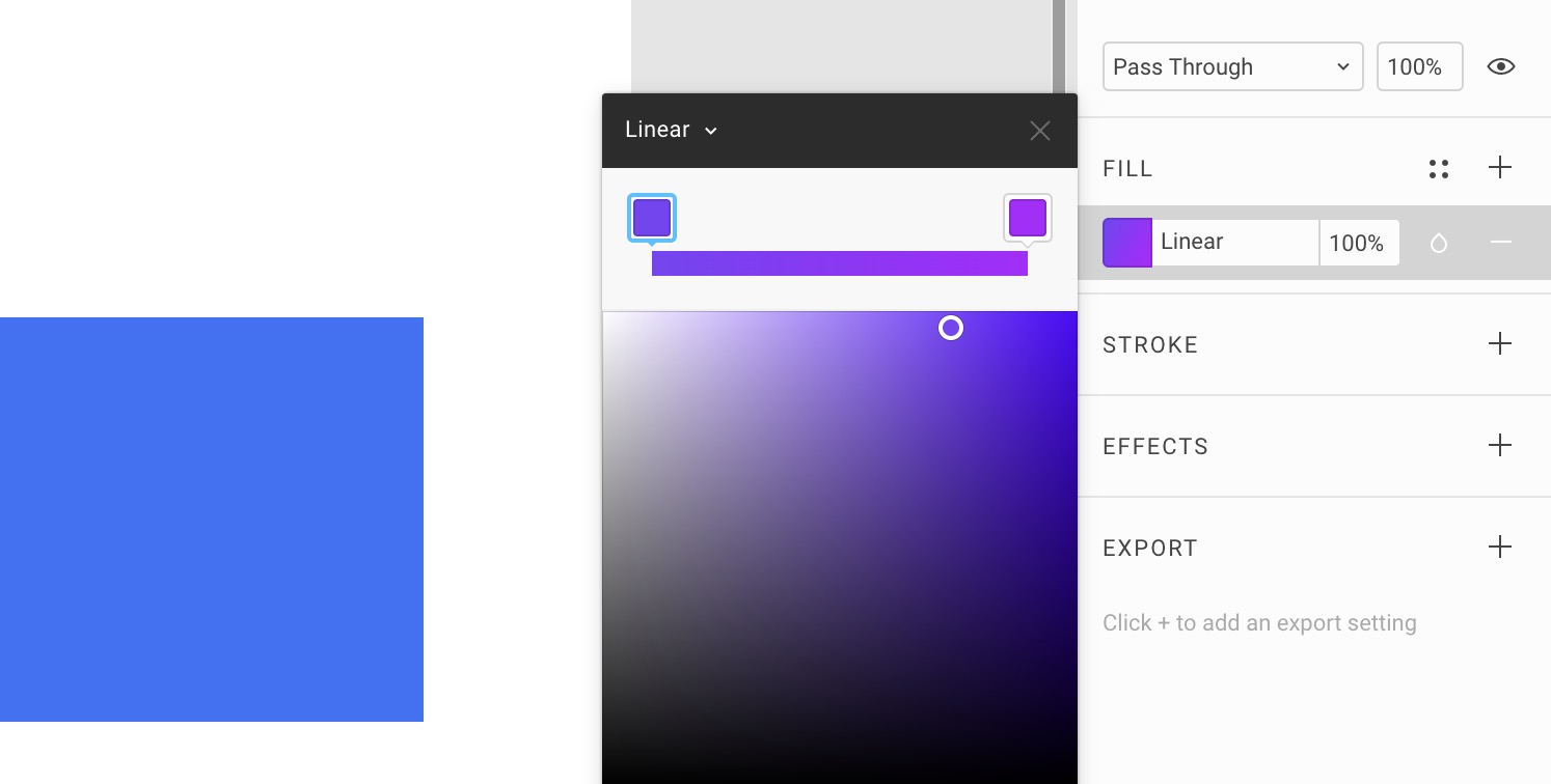
For our design system, we’ll use Purple Violet \#7B42F6 to \#B01EFF, Violet Pink \#B01EFF to \#E1467C, Blue Violet \#3672F8 to \#B01EFF, Blue Marine \#14F1D9 to \#3672F8.
Saving Color Styles
Now that we have all our colors, we can select each one and click on the Styles icon next to Fill to create a new Style. This will be added to your Local Styles. Do the same for Gradients. Figma will treat them the same.
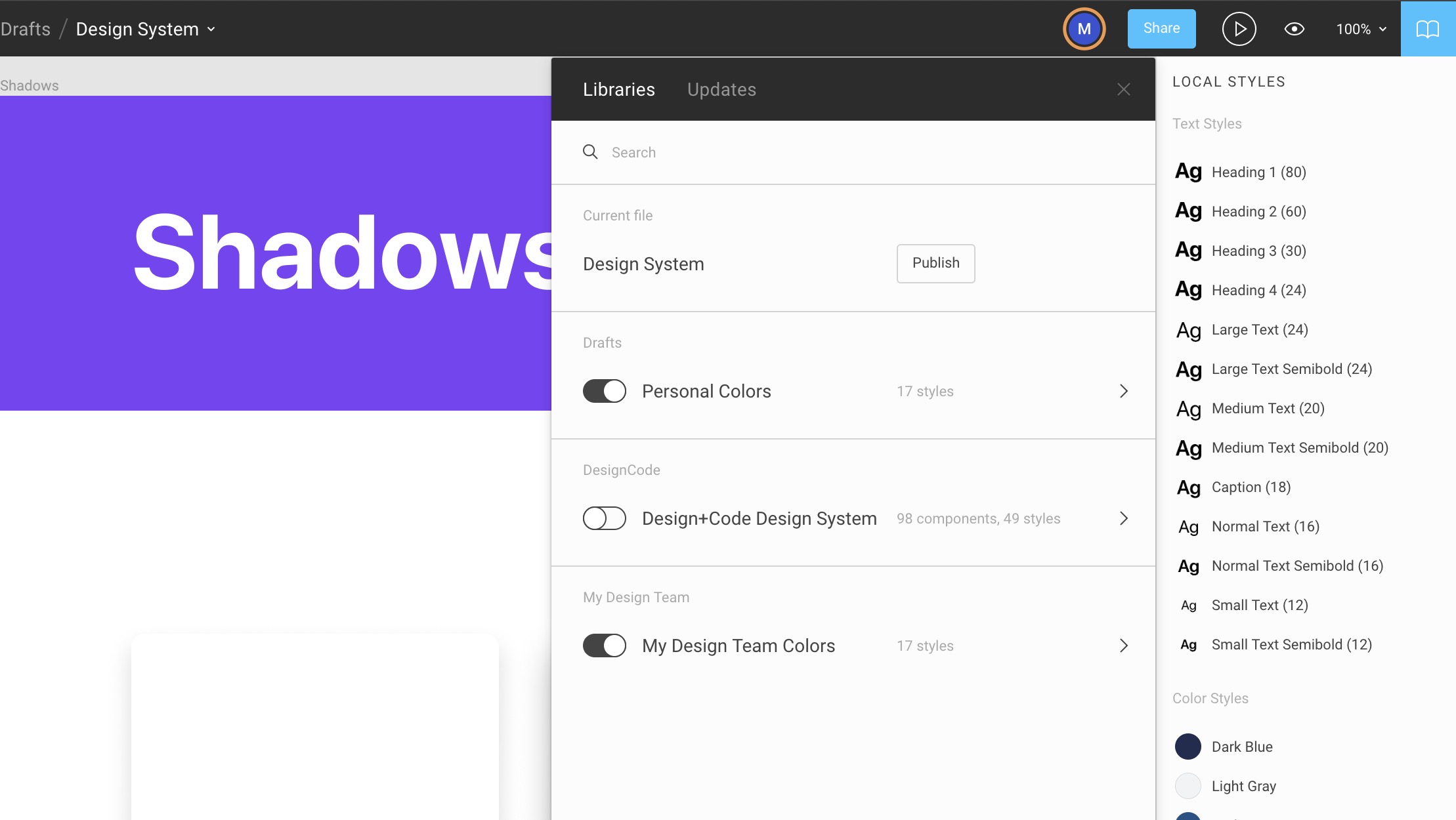
Your Styles
If you have nothing selected, you’ll see your global settings, which includes your local styles. You’ll see that you have saved the Color Styles and Grid Styles. Nice!
Header
We can already start using our new Color styles on the Header! Create a Rectangle at 1440 x 240px. As a Fill, click on the 4-dot icon and select Purple.
Title
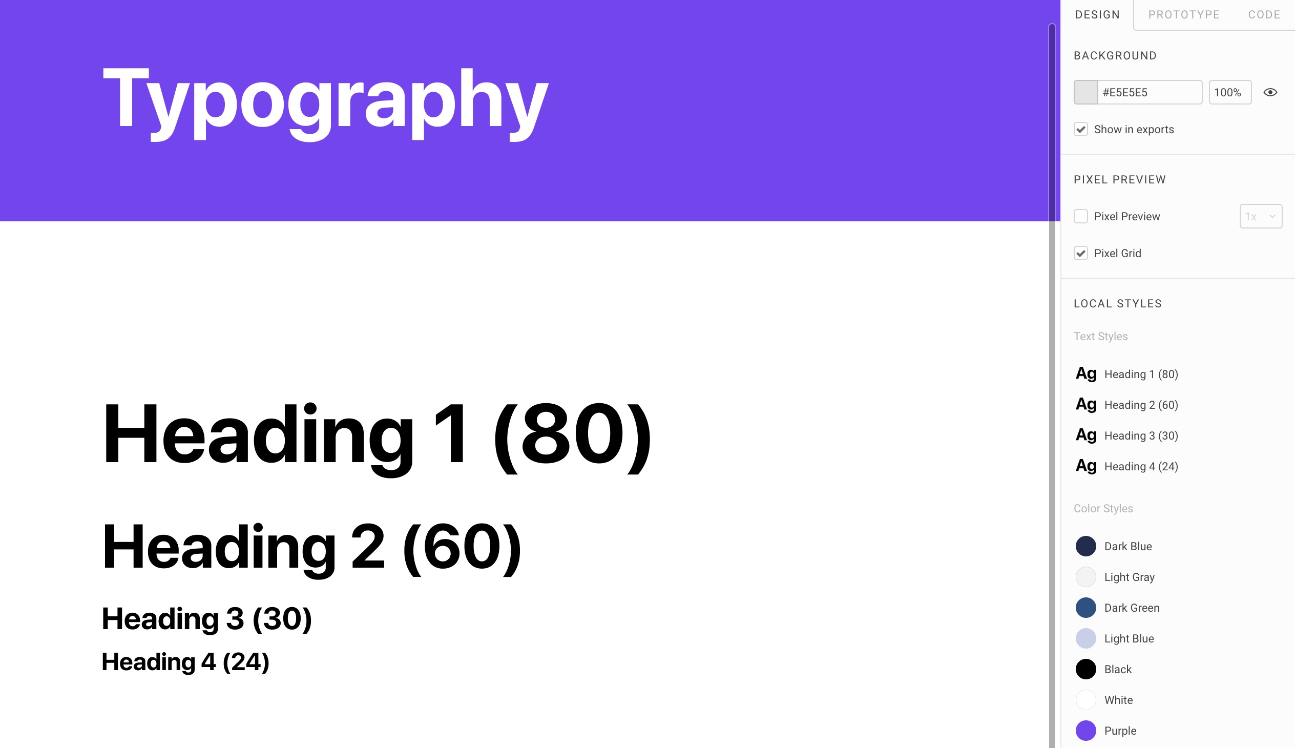
Make a Text layer with a font size of 80px, bold, white, 100px from left and centered vertically. We’ll use SF Pro Display and write Colors.
Typography
Let’s duplicate the Colors frame and change the Title to Typography. You can delete the color layers.
We’ll create roughly 13 different text layers divided into 2 types: Headings and Body Texts.
Headings
Headings are for large titles and will use SF Pro Display, which has the letter less spaced out. The font is bold and as a result, extremely easy to scan as you scroll the screen. As recommended by Apple, when the font size is more 20pt or more, SF Pro Display should be used. For the line-height, set to 120%.
Headings Text Styles
Create 4 text layers at 80px, 60px, 30px and 24px respectively. Set them all to Bold. For each, create a new Text Style based on their names.
Body Texts
Body texts are for reading a large amount of text content, typically for more than one line of text. We’ll have Large, Medium, Normal and Small. For each, we’ll need the Regular weight and Semibold. For Design+Code, we’ll have a special one called Caption set in Semibold.
Create the text layers at 24px, 20px, 18px, 16px and 12px. Line-height should be set to 130%. For each, except for Caption, duplicate to create the Semibold version.
Advanced Type
You can have access to more options for your text layers if you click on the triple dots icon. You can change the Resizing, Transform, and some advanced features.
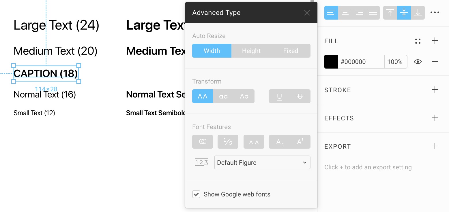 For the Caption, set it to Transform: Uppercase.
Body Text Styles
Again, for each text layer, create a Text Style.
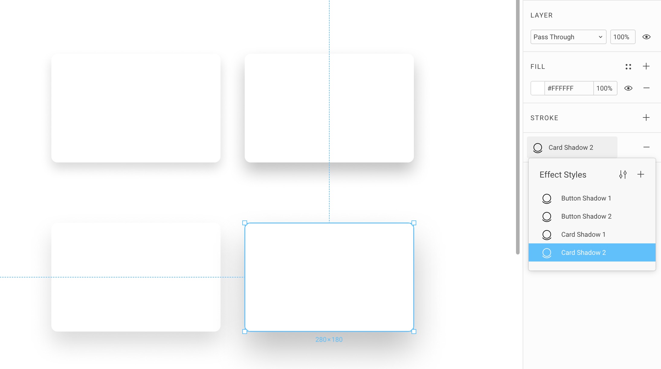
Shadows
Duplicate the Typography frame to create the Shadows frame. Delete the content.
Effects
A feature unique to Figma is the ability to store Effects, like drop shadows, stroke, blur and even images as Styles. This is insanely useful for creating button shadows, blur settings and even preset content like avatars and backgrounds. You can store UI faces, images for others to use as long as they have this Library enabled.
Button Drop Shadow
Create a white Rectangle with 10px corner radius. Click on the + next to Effects. Set the drop shadows to 20px Blur, 10px Y, 15% black. Typically, I set the Blur to be 2x the Y position. The X position is almost always at 0. We’ll use this for the Button.
Drop Shadow State
We’ll create a drop shadow that seems to be floating away further from the ground. This will serve as the end state for our drop shadow animation from the first state. Duplicate the first Rectangle and set the drop shadow to 30px Blur, 15px Y.
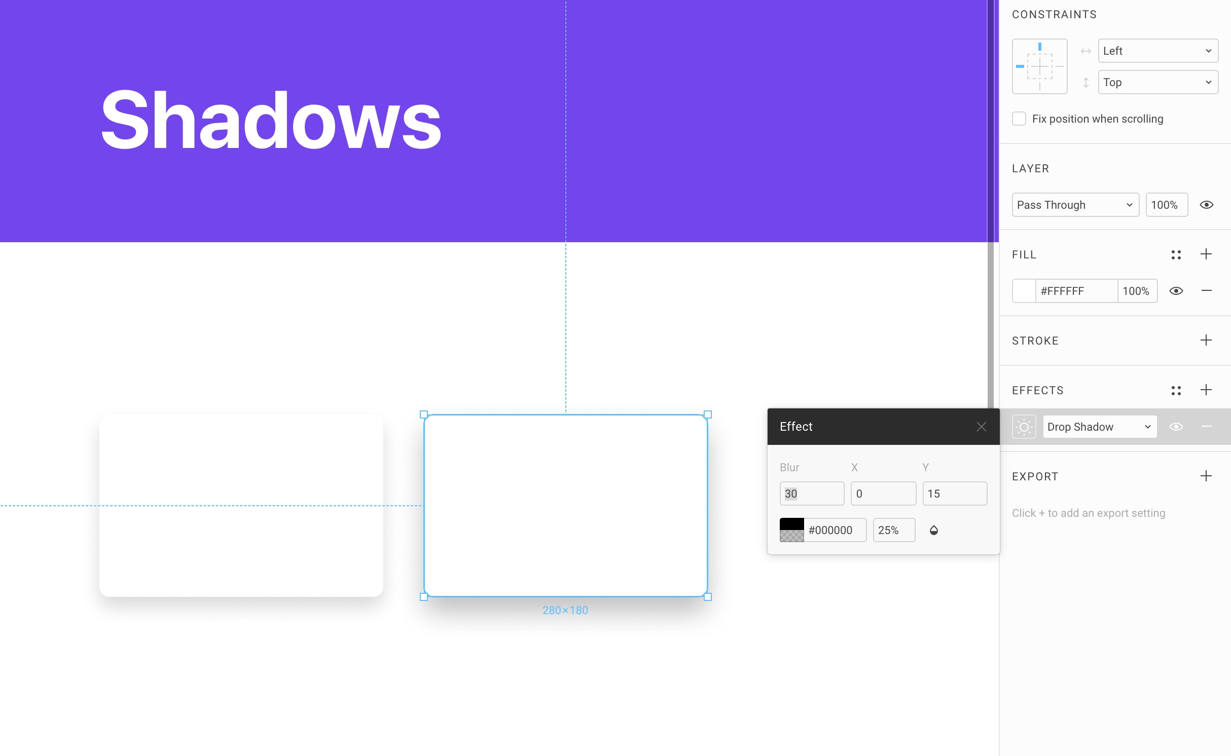
Card Drop Shadow
Let’s duplicate the Rectangles to create one at 40px Blur, 20px Y and another one at 60px Blur, 30px Y.
Save Effects
Let’s save all 4 drop shadow effects.
Assets
Let’s duplicate again a Frame to rename to Assets. Divide the content into 2 sections: Avatar and Background. Create text layers for both titles. We can already use our Styles.
Set the Text Style to Heading 2 (60) and the Fill to Dark Green.
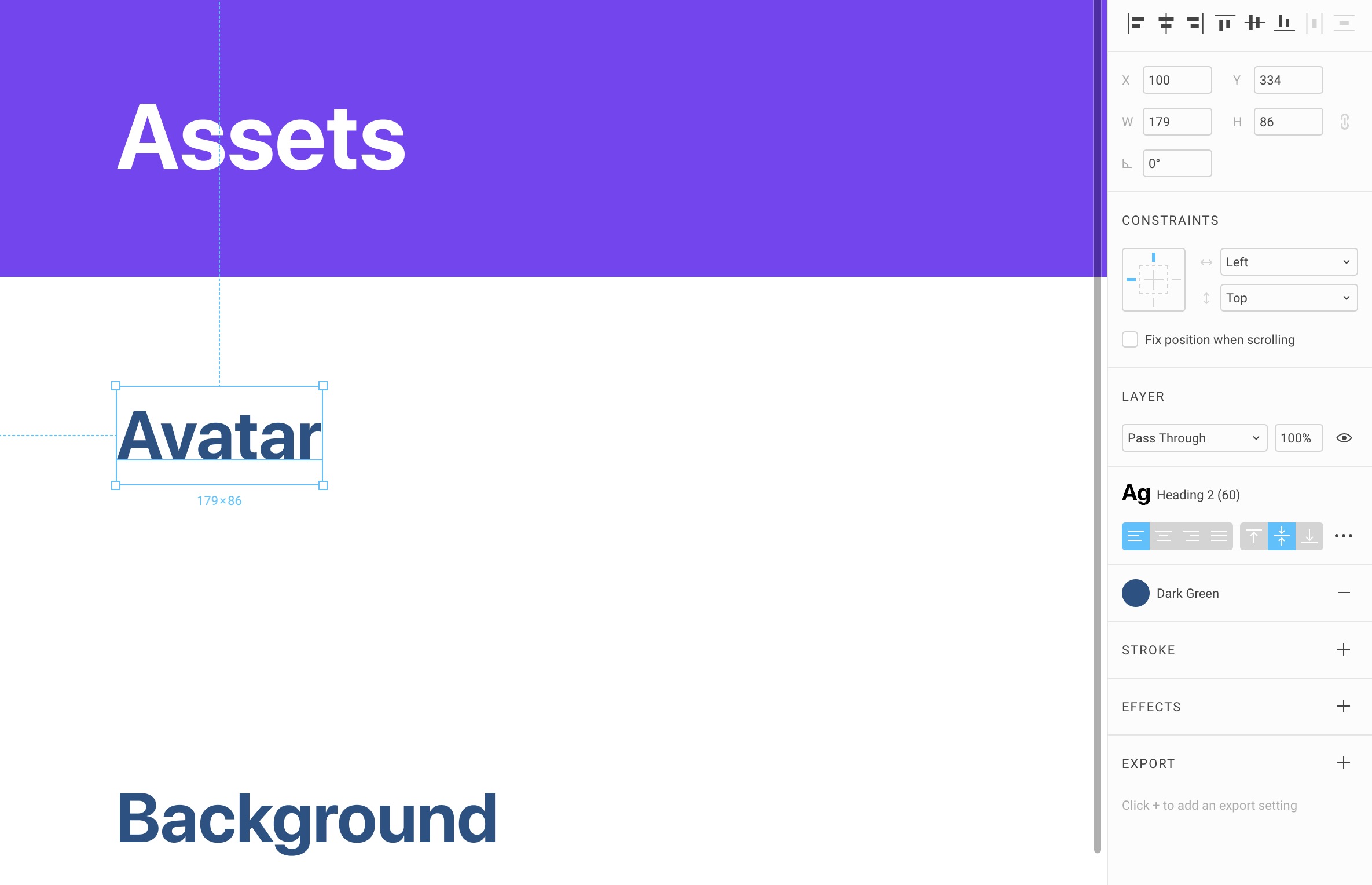
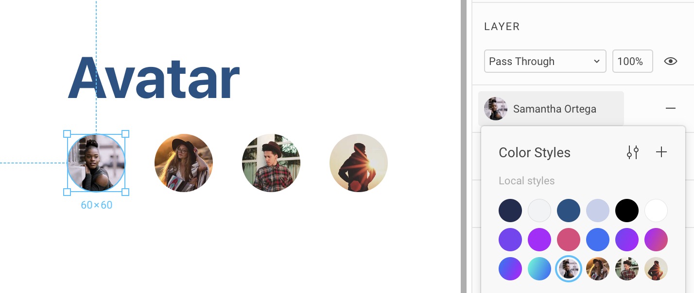
Avatars
Press O to create an Oval at 60x60. Change the image to any avatar provided in the assets. You can find more avatars on UINames.
Option-Drag to the right with a distance of 30px and press Command + D to do it multiple times. Make about 4. Then, change the images for the rest of the avatars.
Create a Style for each and simply title them by their full names. This will be useful when you design.
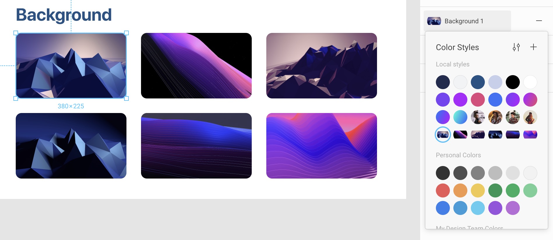
Backgrounds
Press R to create a Rectangle 380x225 with a corner radius of 20. Change the image to any of the backgrounds provided. More can be found on the downloads page. Option-Drag to duplicate to the right with a distance of 50px. Command + D to make another copy. Duplicate for a second row. Change to the other backgrounds provided.
Create a Style for each background and simply name them Background 1, Background 2, etc. Of course, you can decide to create more of these for your own Design System.
Team Library
Now that you have your Styles saved, you can Publish them for your team to use. Click on the Library icon in the top right and click on Publish. Voila! Anyone in your team can use turn on and off the Library and have access to all the styles you’ve just created!
Enabling a Library
You can enable the Design+Code icons library in order to use its Components. This will be useful for later.
Templates and source code
Download source files
Download the videos and assets to refer and learn offline without interuption.
Design template
Source code for all sections
Video files, ePub and subtitles
Videos
ePub
Subtitles
Assets
1
Design System in Figma
Complete guide to designing a site using a collaborative and powerful design system
10:14
2
Basic Layout and Techniques
Start with the styles and design system foundation in Figma
19:49
3
Constraints and Adaptive Layout
Make your design adapt to any screen
15:13
4
Styles and Team Library
Rules for typography, colors and gradients in Figma
22:02
5
Components and Nesting
Design powerful and reusable elements for your site
18:44
6
Booleans and Shapes
Collaborate with your team with shared components
13:40
7
Icons and Vector Network
Create your own vector illustrations from scratch in Figma
30:29
8
Export, Inspect and Code in Figma
Communicating the design system to your developers
26:03
9
Multiplayer and Commenting in Figma
Iterate designs and explore new ideas in a multiplayer environment
8:36
10
Prototyping and Interaction
Quickly create an entire flow for your app design in Figma
11:42
Meet the instructor
We all try to be consistent with our way of teaching step-by-step, providing source files and prioritizing design in our courses.
Meng To
I design, code and write
Meng To is the author of Design+Code. Meng started off his career as a self-taught designer from Montreal and eventually traveled around the world for 2 years as his US VISA was denied. During his travels, he wrote a book which now has 35,000 readers.
40 courses - 187 hours
Master AI Prompting for Stunning UI
Learn how to leverage AI tools like Aura for creating beautiful designs, working with templates, and experimenting with advanced prompts. A concise guide for designers and developers to level up their skills.
3 hrs
Build SwiftUI apps for iOS 18 with Cursor and Xcode
In this course, we'll explore the exciting new features of SwiftUI 6 and Xcode 16 for building iOS 18 apps. From mesh gradients and text animations to ripple effects, you'll learn how to create polished, highly custom apps using the latest workflows. We'll also dive into using Cursor and Claude AI for AI-driven coding, helping you start strong and customize your apps.
5 hrs
Create your Dream Apps with Cursor and Claude AI
Learn to build your dream web apps from the ground up using Cursor, Claude AI, and a suite of powerful AI tools. This course covers everything you need, including React for frontend development, Firebase for backend integration, and Stripe for handling payments. You’ll also dive into advanced AI tools like Claude Artifacts, Galileo AI, v0.dev for UI, Ideogram for design generation, and Cursor Composer for full-scale development.
6 hrs
Build a React Site from Figma to Codux
In this course, you'll learn to build a website from scratch using Codux, starting with a Figma template. You’ll master responsive design, collaborate with developers on a real React project, export CSS from Figma using Locofy, set up breakpoints with media queries, add CSS animations, improve SEO, create multiple pages with React Router, and publish your site. By following best practices, you’ll bridge design and development, improve your web design skills.
2 hrs
Create 3D UI for iOS and visionOS in Spline
Comprehensive 3D Design Course: From Basics to Advanced Techniques for iOS and visionOS using SwiftUI
3 hrs
Master No-Code Web Design with Framer
In this free Framer course, you'll learn to create modern, user-friendly interfaces. Start with dark mode and glass designs, then move from Figma to Framer, using vectors and auto layout for responsive websites. Add animations, interactive buttons, and custom components with code. Finally, you'll craft a design system suitable for teamwork or solo projects, all in a straightforward and practical approach.
4 hrs
Build SwiftUI Apps for iOS 17
In this course, we’ll be exploring the fresh and exciting features of SwiftUI 5! As we craft a variety of iOS apps from the ground up, we'll delve deep into the treasure trove that is SwiftUI's user interface, interactions, and animations.
4 hrs
Build Beautiful Apps with GPT-4 and Midjourney
Design and develop apps using GPT-4 and Midjourney with prompts for SwiftUI, React, CSS, app concepts, icons, and copywriting
4 hrs
Build SwiftUI apps for iOS 16
Create animated and interactive apps using new iOS 16 techniques using SwiftUI 4 and Xcode 14
5 hrs
Build a 3D Site Without Code with Framer
Design and publish a responsive site with 3D animation without writing a single line of code
3 hrs
Create 3D Site with Spline and React
Design and code a landing page with an interactive 3D asset using Spline and CodeSandbox
1 hrs
Build an Animated App with Rive and SwiftUI
Design and code an iOS app with Rive animated assets, icon animations, custom layouts and interactions
3 hrs
Build a SwiftUI app for iOS 15 Part 3
Design and code a SwiftUI 3 app with custom layouts, animations and gestures using Xcode 13, SF Symbols 3, Canvas, Concurrency, Searchable and a whole lot more
4 hrs
Build a SwiftUI app for iOS 15 Part 2
Design and code a SwiftUI 3 app with custom layouts, animations and gestures using Xcode 13, SF Symbols 3, Canvas, Concurrency, Searchable and a whole lot more
3 hrs
Build a SwiftUI app for iOS 15
Design and code a SwiftUI 3 app with custom layouts, animations and gestures using Xcode 13, SF Symbols 3, Canvas, Concurrency, Searchable and a whole lot more
4 hrs
React Livestreams
Learn how we can use React Hooks to build web apps using libraries, tools, apis and frameworks
4 hrs
Design Founder Livestreams
A journey on how we built DesignCode covering product design, management, analytics, revenue and a good dose of learning from our successes and failures
2 hrs
SwiftUI Advanced Handbook
An extensive series of tutorials covering advanced topics related to SwiftUI, with a main focus on backend and logic to take your SwiftUI skills to the next level
4 hrs
iOS Design Handbook
A complete guide to designing for iOS 14 with videos, examples and design files
2 hrs
SwiftUI Handbook
A comprehensive series of tutorials covering Xcode, SwiftUI and all the layout and development techniques
7 hrs
Build a web app with React Hooks
Learn how we built the new Design+Code site with React Hooks using Gatsby, Netlify, and advanced CSS techniques with Styled Components.
4 hrs
UI Design Handbook
A comprehensive guide to the best tips and tricks for UI design. Free tutorials for learning user interface design.
2 hrs
Figma Handbook
A comprehensive guide to the best tips and tricks in Figma
6 hrs
SwiftUI for iOS 14
Build a multi-platform app from scratch using the new techniques in iOS 14. We'll use the Sidebar and Lazy Grids to make the layout adaptive for iOS, iPadOS, macOS Big Sur and we'll learn the new Matched Geometry Effect to create beautiful transitions between screens without the complexity. This course is beginner-friendly and is taught step-by-step in a video format.
3 hrs
SwiftUI Livestreams
This is a compilation of the SwiftUI live streams hosted by Meng. Over there he talks and teaches how to use design systems, typography, navigation, iOS 14 Design, prototyping, animation and Developer Handoff.
19 hrs
UI Design Livestreams
This is a compilation of the UI live streams hosted by Meng. Over there he talks and teaches how to use design systems, typography, navigation, iOS 14 Design, prototyping, animation and Developer Handoff.
26 hrs
UI Design for Developers
In this course we'll learn how to use design systems, set up break points, typography, spacing, navigation, size rules for adapting to the iPad, mobile and web versions, and different techniques that translate well from design to code.
3 hrs
Build an app with SwiftUI Part 3
This course was written for designers and developers who are passionate about design and about building real apps for iOS, iPadOS, macOS, tvOS and watchOS. SwiftUI works across all of those platforms. While the code is not a one-size-fits-all, the controls and techniques involved can apply to all platforms. It is beginner-friendly, but it is also packed with design tricks and cool workflows about building the best UIs and interactions.
4 hrs
Build an app with SwiftUI Part 2
This course was written for designers and developers who are passionate about design and about building real apps for iOS, iPadOS, macOS, tvOS and watchOS. SwiftUI works across all of those platforms. While the code is not a one-size-fits-all, the controls and techniques involved can apply to all platforms. It is beginner-friendly, but it is also packed with design tricks and cool workflows about building the best UIs and interactions.
4 hrs
Build a full site in Webflow
Webflow is a design tool that can build production-ready experiences without code. You can implement CSS-driven adaptive layouts, build complex interactions and deploy all in one tool. Webflow also comes with a built-in content management system (CMS) and Ecommerce for creating a purchase experience without the need of third-party tools.
3 hrs
Advanced Prototyping in ProtoPie
ProtoPie is a cross-platform prototyping tool that creates prototypes nearly as powerful as those made with code, with half of the efforts, and zero code. It's perfect for designers who want to quickly experiment with advanced interactions using variables, conditions, sensors and more.
3 hrs
Build an app with SwiftUI Part 1
This course was written for designers and developers who are passionate about design and about building real apps for iOS, iPadOS, macOS, tvOS and watchOS. SwiftUI works across all of those platforms. While the code is not a one-size-fits-all, the controls and techniques involved can apply to all platforms. It is beginner-friendly, but it is also packed with design tricks and cool workflows about building the best UIs and interactions.
4 hrs
React Native for Designers Part 2
React Native is a popular Javascript framework that builds on top of React by using native components to create a real mobile app indistinguishable from one made using Xcode or Android Studio. The main difference with native development is that you get to use CSS, hot-reload, Javascript and other familiar techniques that the Web has grown over the past decades. Most importantly, you're building for both iOS and Android using the same codebase.
3 hrs
React Native for Designers
React Native is a popular Javascript framework that builds on top of React by using native components to create a real mobile app indistinguishable from one made using Xcode or Android Studio. The main difference with native development is that you get to use CSS, hot-reload, Javascript and other familiar techniques that the Web has grown over the past decades. Most importantly, you're building for both iOS and Android using the same codebase.
5 hrs
Design System in Figma
Learn how to use and design a collaborative and powerful design system in Figma. Design Systems provide a shared library of reusable components and guidelines and that will let you build products much faster
3 hrs
React for Designers
Learn how to build a modern site using React and the most efficient libraries to get your site/product online. Get familiar with Grid CSS, animations, interactions, dynamic data with Contentful and deploying your site with Netlify.
3 hrs
Swift Advanced
Learn Swift a robust and intuitive programming language created by Apple for building apps for iOS, Mac, Apple TV and Apple Watch
9 hrs
Learn Swift
Learn Swift a robust and intuitive programming language created by Apple for building apps for iOS, Mac, Apple TV and Apple Watch
4 hrs
Learn Sketch
Learn Sketch a design tool entirely vector-based and focused on user interface design
5 hrs
Learn iOS 11 Design
Learn colors, typography and layout for iOS 8
1 hrs