
Interactive Components
Add to favorites
Creating reusable interactions using interactive components
Figma Handbook
1
The Figma Design Tool
0:54
2
The Editor in Figma
1:17
3
Basic Tools
2:14
4
Position, Size, Rotation, & Corner Radius properties
1:27
5
Color Styles
1:13
6
Masks
1:47
7
Dark Mode with Selection Colors
1:17
8
Gradients
1:36
9
Creating Backgrounds
2:37
10
Blending Modes
2:02
11
Alignment, Distribution, & Tidy up Properties
1:24
12
Union and Corner Radius
2:53
13
Shadow and Blur Effects
1:48
14
Using Images
2:00
15
Fill, Stroke, & Advanced Stroke
3:21
16
Text Properties and Styles
1:37
17
Google Fonts and Custom Fonts
1:13
18
Accessibility
19
Responsive Design
3:07
20
Constraints
1:11
21
Layout Grid
2:00
22
Auto Layout in Figma
8:17
23
Vector Mode
0:55
24
Vector Network
1:19
25
Perspective Mockups
2:00
26
3D Mockups
1:20
27
Using Illustrations in Design
2:03
28
Booleans
2:24
29
Icon Design
1:48
30
Components
1:50
31
Team Library
2:14
32
Creating Confetti
1:59
33
Looper Shape Duplication
1:41
34
Apple Watch Ring
2:23
35
Exporting Assets in Figma
1:39
36
Exporting CSS Code
1:04
37
Designing with Data
1:57
38
Prototyping
2:25
39
Version History
1:25
40
Multiplayer, Commenting, & Previews
1:36
41
Variants
5:39
42
Interactive Components
5:40
43
UIKits
4:47
44
Plugins
5:47
45
Blob Background
4:45
46
Wave Background
6:46
47
3D Shapes
12:27
48
Parallax Prototyping in Figma
7:52
49
3D UI Perspective Design
7:16
50
Glass Icon
9:16
51
Crystal Ball with Water Effect Animation
12:54
52
Design and code a line animation with letters
29:38
53
Futuristic line animation
19:30
54
Import from Adobe Illustrator to Figma
3:16
55
Create an Illustration in Figma
4:07
56
Remove BG plugin
2:27
57
Circular Lines Advanced Stroke
3:27
58
Publish Design to Community
4:49
59
Turn Image into Vector
3:11
60
Prototype with Scrolling Content
3:42
61
Hug Content and Resizing
2:04
62
Advanced Auto Layout
4:13
63
Circular Text on Path
5:57
64
Mirror Prototype
2:39
65
Sticky Nav and Tab Bar Prototyping
4:37
66
Video in Figma Prototype
5:04
67
Mesh Gradients
3:03
68
Figma Sections
3:53
69
Unsplash Stock Photos
2:07
70
Angular Gradient
4:17
71
Radial Gradient
5:11
72
After Delay Animation Prototyping
3:14
73
UI Wireframe
2:53
74
Lottie Animations
3:55
75
Design Sign Up Screen
6:42
76
Content Generator
2:53
77
Design Lint Missing Style
2:36
78
Slice Tool
2:04
79
Adaptive Layout with Breakpoints
6:25
80
Chart Designs
4:51
81
Design Modals
4:08
82
Batch Rename
2:35
83
Design Onboarding Screen
2:28
84
Animated Button Prototype
3:06
85
Smart Selection
2:15
86
Component Properties
4:37
87
RedLines
2:54
88
Interactive Calendar
7:46
89
Measure Distance
3:33
90
Variable Fonts
2:51
91
AI Plugins
6:16
92
Text Animation
3:11
93
Resize Layers
2:36
94
View Layer Outlines
2:23
95
Prototype Connections
2:38
96
Export SVG Files and Code
2:47
97
3D Illustrations
4:14
98
UI Placeholder
2:38
99
Dark Mode Switch
4:23
100
Dev Mode
6:26
101
Dark Mode Variables
10:04
102
Figma to HTML
10:51
Understanding Interactive Components
Interactive components in Figma refer to elements that can change states based on user interactions. These could be buttons, toggle switches, checkboxes, and more. They are crucial in designing intuitive user interfaces, as they allow designers to create elements that react just like they would in the finished product.
Collaboration With the Team
We can publish and reuse the variants in our designs and their instances inherit those interactions by default without our need to recreate new interactions. Another designer can use this asset in a separate file, modifying certain attributes such as icon replacement and text modification. Remarkably, the original interactions are preserved. So, rather than creating multiple frames to encompass each potential interaction variant as our design evolves, a single frame is enough. This makes building and changing prototypes more efficient in the future. So if interactions change we can publish the updates to the library to keep our designs consistent across the company.
Highlight
In this tutorial, we’ll guide you through the essentials of crafting and implementing interactive components in both simple and complex designs.
Design Process
Let’s start with interactive buttons. You have the option to create a simple button or a more complex one with multiple states, adding a touch of originality. To make an interactive component, we need to prototype our variants within the component set.
- First, create a component for our button. A "component" in Figma is a reusable design element that can be utilized in various projects or repeatedly within the same project.
- Next, add a variant to the button component and change its color to represent the hover state. In Figma, a "variant" is a functionality in the component system that enables designers to organize related components under a single parent component. This feature allows the creation of different versions of a component, each with distinct properties or states. If you want to learn more about variants, use the resources linked in the description. Understanding these basics is crucial for mastering the art of interactive components.
- First, change the color of our button to dark blue. Rename the properties to "states," with the first variant labeled as "default" and the second variant renamed to "hover.”
- Next, we'll make the buttons interactive so that they switch between the default and hover variants when hovered over.

Make the Button Interactive
- Go to the Prototype panel. The Prototype panel is a feature used for creating interactive prototypes from your design files. It's an essential tool for designers who want to simulate how a user might interact with a website, app, or digital product.
- Select the default variant and drag the connection node to the hover variant. We've now created prototyping connections!
- The default action is set to "Change to" in the interaction details panel. This action signals that the object should switch to a different variant within the same component set based on a specific trigger. Note that "Change to" is an action exclusive to variants for creating interactive components and is disabled for frames and regular components.
- Set the trigger to "While Hovering," and select "Smart Animate" for a smooth transition, keeping the default "Ease Out" animation with a duration of 300 milliseconds.
- To revert to the original state when the mouse leaves the button, drag the connection node from the hover variant back to the default variant, this time using the "Mouse Leave" trigger with the same transition and duration.
- Place the instance into a frame for testing or directly incorporate it into your design. Now, let’s open up the presentation view to see how our interactive components are working.
 Here, we observe that when hovering over the button, its color changes to dark blue, and when the mouse moves to an empty space, the button color reverts to its default state. To enhance engagement, why not add a clickable state with an appealing interaction to make the button even more dynamic?
Clickable Interaction
Alright, let's create a unique click interaction. Upon clicking, a second color will slide to the right, and a check icon will appear from the bottom.
- Note that the design has already been prepared, and you can download the Figma file from the link in the description to follow along. In the file, you'll notice everything is arranged inside a frame with the second color of the rectangle positioned on the left, and the icon hidden at the bottom. Ensure that the button is in a frame with "Clip Content" enabled to hide elements outside the frame's boundaries.
- "Clip Content" is used to control the visibility of frame contents that extend beyond its boundaries. When enabled, elements partially or completely outside the frame are cropped to fit within the frame's size.
- Select the variant 2 and add another variant. Then, move the hidden rectangle to the right and position the icon at the top right of the button, ensuring it's vertically centered.
- Go back to the Prototype panel, and drag the connection node from variant 2 to variant 3. Set the trigger to “On Click” or “On Tap,” and select the “Slow” transition with a duration of 600 milliseconds. Preview it again to see the button's new behavior.

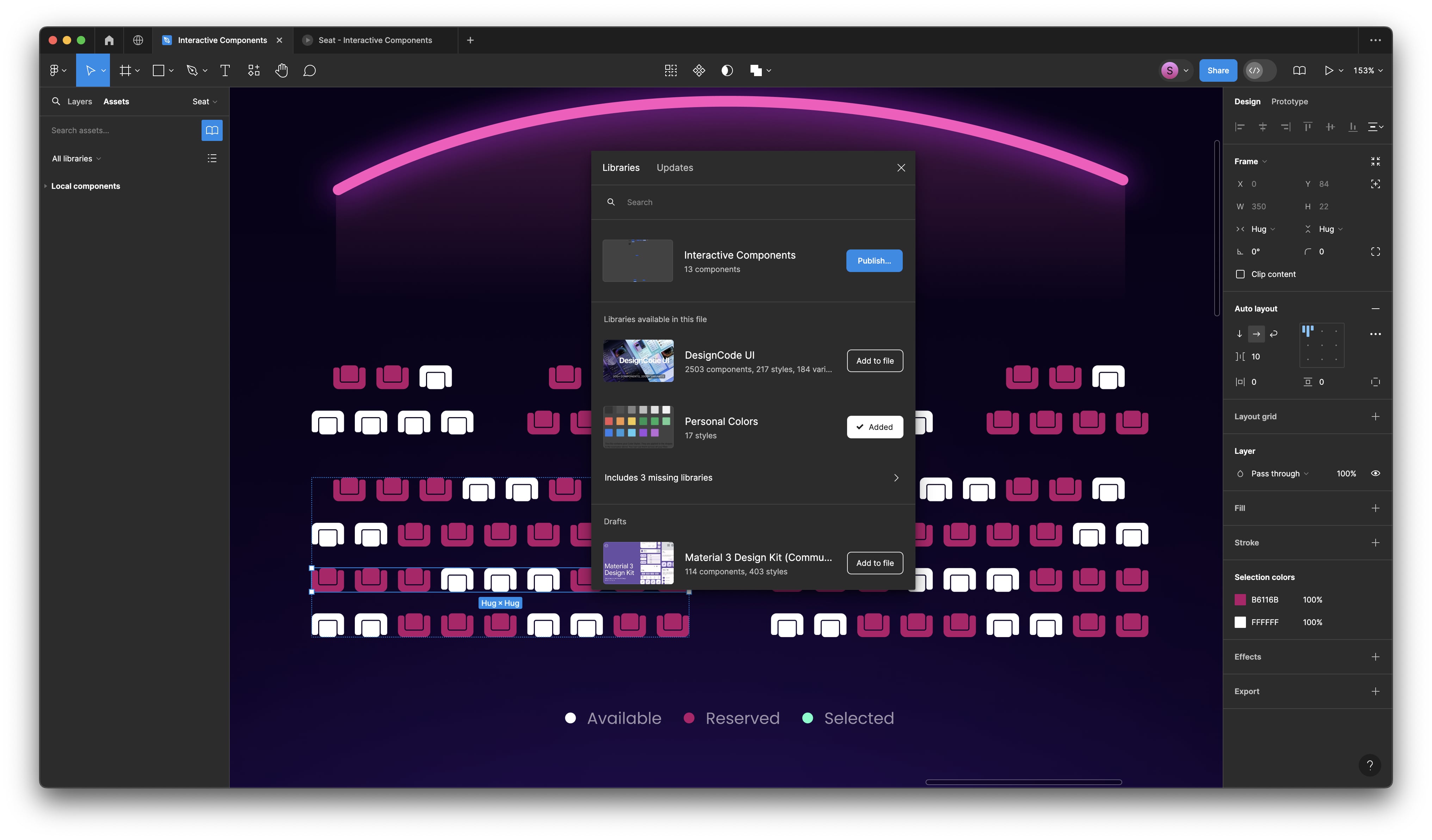
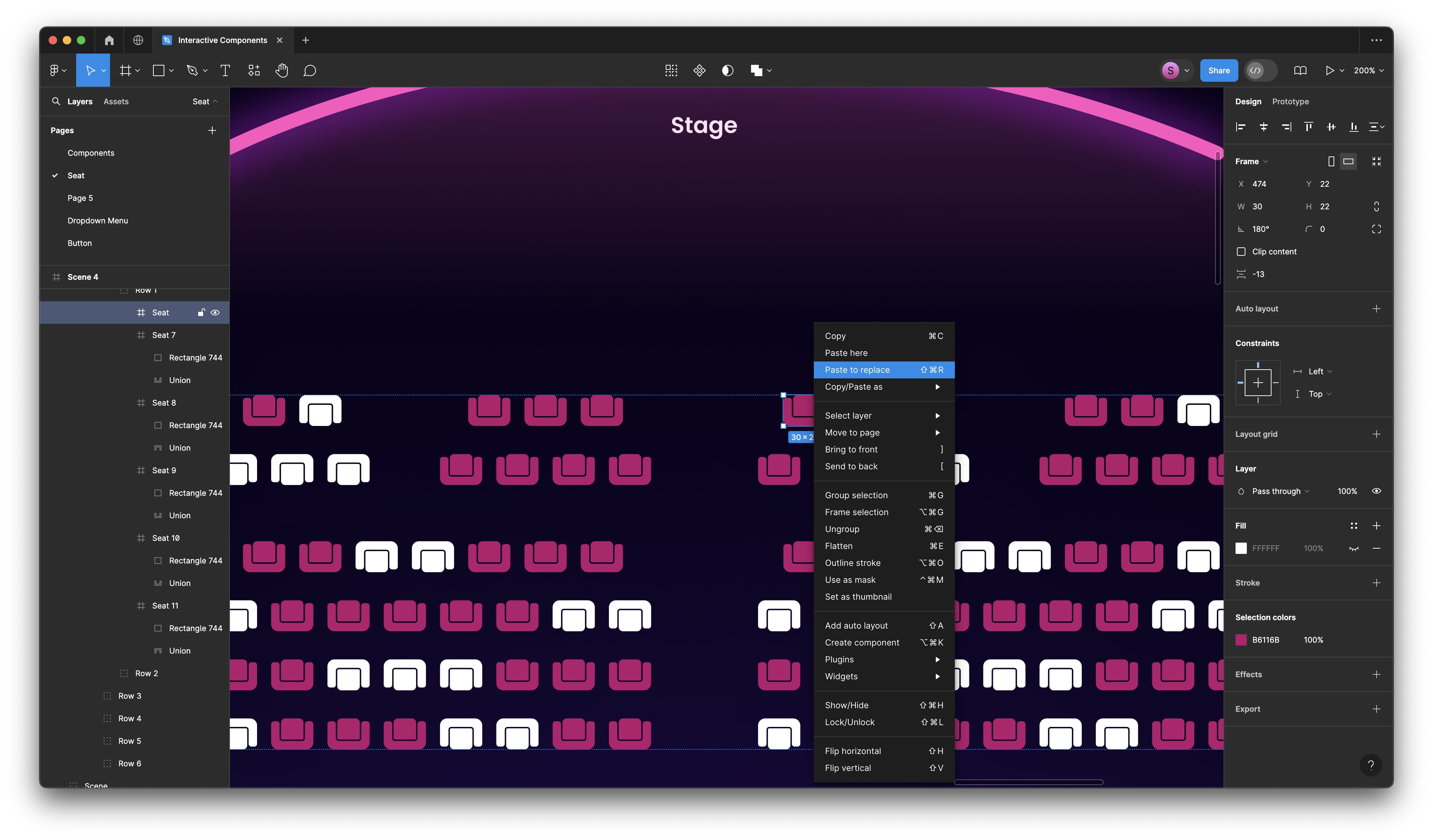
Create a Seat Interactive Components
Let's move on to another example of interactive components, this time with a slightly more complex design. In this scenario, we're designing for a movie or show booking app, where users select available seats. This design includes both an 'hover' state and a 'click' state. Upon clicking, the selected seat changes color and rotates towards the stage. The red chairs represent unavailable seats. All these interactions are encompassed within a single design.
- Alright, let’s quickly create the interactive icons using the same process as the button, but we'll experiment with the rotation and color. We'll designate this white chair as the available seat. First, let's create a component and then add a variant.
- For the second variant, change the color to blue to indicate the hover state. Add another variant, select the icons, and rotate them vertically.
- Add a final variant and change its color to pink. Rename the property to 'States' and update the variant names accordingly: the first variant to 'Available', the second to 'Hover', the third to 'Click', and the last one to 'Unavailable'.

Add Interaction
- From variant 1 to variant 2, set the trigger to 'While Hovering' with an 'Ease Out' transition, keeping the duration at the default setting. Then, from variant 2 to variant 3, set the trigger to 'Gentle' with a duration of 600 ms, and link back from variant 3 to variant 1 using the 'On Click' trigger. For the 'Unavailable' state, no connection is needed since it represents a disabled state.
- Now, apply the instance directly in our design. Copy the default and paste it to replace the old icons, then randomly assign states to the other seats.
- Alright, let’s test it out! Which seat will I choose? All the white chairs are available, and the pink chairs are reserved, so I can't select them. Let's choose from the second row — I'll select both the first and the second seats. If I change my mind, I can deselect a seat and choose another one, observing the price appear at the bottom.
Conclusion
Great! This is a simple method for creating interactive components with more than two states within a single frame. Now, you have a better understanding of how interactive components work. With this knowledge, you can animate the tab bar, you can even create swiping interactive cards, and much more, all while keeping the prototypes within one frame.
Interactive components in Figma are a game-changer for UI/UX designers. They not only help in creating more realistic and dynamic prototypes but also streamline the design process by enabling reuse and consistency across projects. Thanks to this feature, we can work more efficiently and achieve a better-organized and cleaner design.
Learn with videos and source files. Available to Pro subscribers only.
Purchase includes access to 50+ courses, 320+ premium tutorials, 300+ hours of videos, source files and certificates.
Templates and source code
Download source files
Download the videos and assets to refer and learn offline without interuption.
Design template
Source code for all sections
Video files, ePub and subtitles
Videos
Assets
ePub
Subtitles
1
The Figma Design Tool
Getting started with Figma as your design tool
0:54
2
The Editor in Figma
Getting familiar with the Figma interface
1:17
3
Basic Tools
Getting to know the tool panel in Figma
2:14
4
Position, Size, Rotation, & Corner Radius properties
Working with Position, Size, Rotation, & Corner Radius properties
1:27
5
Color Styles
Working with color styles on Figma
1:13
6
Masks
Using masks to clip content and compose your design in Figma
1:47
7
Dark Mode with Selection Colors
Learn to design and adapt for designs for Dark Mode with Selection Colors
1:17
8
Gradients
We'll walk through all the different ways to use gradients in your work, as well as techniques when creating them
1:36
9
Creating Backgrounds
Design backgrounds in Figma
2:37
10
Blending Modes
Learn to interesting techniques with Blending Modes
2:02
11
Alignment, Distribution, & Tidy up Properties
Exploring Alignment and Tidy up in Figma
1:24
12
Union and Corner Radius
Working on union and corner radius
2:53
13
Shadow and Blur Effects
Exploring ways to incorporate shadows and blur to your design
1:48
14
Using Images
Steps on how to use images in Figma
2:00
15
Fill, Stroke, & Advanced Stroke
Get to know more about the Fill and various Stroke options in Figma
3:21
16
Text Properties and Styles
Explore and learn about Figma's type properties
1:37
17
Google Fonts and Custom Fonts
Explore the differences between Google Fonts and custom fonts for your website
1:13
18
Accessibility
Exploring a11y in design
19
Responsive Design
Designing responsive layouts in Figma using Constraints and Auto Layout
3:07
20
Constraints
Working with Constraints in Figma
1:11
21
Layout Grid
Learn to design using grids, columns, rows and margins.
2:00
22
Auto Layout in Figma
Working with Auto Layout for responsive design
8:17
23
Vector Mode
Exploring vector mode to edit and customize vector shapes
0:55
24
Vector Network
Learn to use vector networks and design icons
1:19
25
Perspective Mockups
Use realistic mockups to present your designs
2:00
26
3D Mockups
Adding 3D mockups to design
1:20
27
Using Illustrations in Design
Incorporate illustrations into your design
2:03
28
Booleans
Using booleans to design icons
2:24
29
Icon Design
Learn how to design icons using the tools provided by Figma
1:48
30
Components
Make your design more reusable by using components.
1:50
31
Team Library
Publishing your design styles and components
2:14
32
Creating Confetti
Working with Confetti plugin
1:59
33
Looper Shape Duplication
Working with Looper Figma plugin
1:41
34
Apple Watch Ring
Creating apple watch ring in Figma
2:23
35
Exporting Assets in Figma
Learn about exporting assets in Figma for implementation
1:39
36
Exporting CSS Code
Working with CSS code on Figma
1:04
37
Designing with Data
Plugins to help you design with real content
1:57
38
Prototyping
Quickly create an entire flow for your app design in Figma
2:25
39
Version History
Working with version history on Figma
1:25
40
Multiplayer, Commenting, & Previews
Learn about collaboration & sharing with Figma
1:36
41
Variants
Combining similar components into variants
5:39
42
Interactive Components
Creating reusable interactions using interactive components
5:40
43
UIKits
Designing using UIKits in Figma
4:47
44
Plugins
Exploring and Designing using Plugins in Figma
5:47
45
Blob Background
Create a simple blob background in Figma
4:45
46
Wave Background
Create a wave design in Figma using the Bend tool and the Wave plugin
6:46
47
3D Shapes
Create 3D-looking shapes using vector tools in Figma
12:27
48
Parallax Prototyping in Figma
Learn how to create a parallax scrolling animation technique where the background and the foreground layers move at different speed
7:52
49
3D UI Perspective Design
Transforming your user interface with the power of three-dimensional perspective
7:16
50
Glass Icon
Learn how to design a creative icon using background blur
9:16
51
Crystal Ball with Water Effect Animation
Animate waves in a crystal ball using the prototyping tool
12:54
52
Design and code a line animation with letters
Learn how to animate lines using CSS in CodeSandbox
29:38
53
Futuristic line animation
Learn how to create a futuristic background with lines using the pen tool in Figma
19:30
54
Import from Adobe Illustrator to Figma
Best practices for importing an Illustrator file to Figma
3:16
55
Create an Illustration in Figma
Use the vector tool in Figma to create an illustration from scratch
4:07
56
Remove BG plugin
Remove an image background with the RemoveBG plugin in Figma
2:27
57
Circular Lines Advanced Stroke
Design a camera controller with clock lines in Figma
3:27
58
Publish Design to Community
Publishing design files in the Figma Community
4:49
59
Turn Image into Vector
Convert an image into vector in Figma
3:11
60
Prototype with Scrolling Content
Add vertical and horizontal scrolling on your Figma Prototype
3:42
61
Hug Content and Resizing
Learn how to choose the right resizing options including hug content, fixed width or height, fill container and text truncation
2:04
62
Advanced Auto Layout
Learn how to use spacing mode, canvas stacking, text baseline alignment, stroke values in advanced layout
4:13
63
Circular Text on Path
Make a circular text on path using ARC plugin in Figma
5:57
64
Mirror Prototype
View your prototypes on your mobile device using the Figma mobile app
2:39
65
Sticky Nav and Tab Bar Prototyping
How to fix the position with sticky Nav Bar and Tab Bar
4:37
66
Video in Figma Prototype
Apply a video as a fill using any vector network on your prototype
5:04
67
Mesh Gradients
Create beautiful and wave shaped gradients using shapes or the mesh gradient plugin in Figma
3:03
68
Figma Sections
Use sections in Figma to organize designs better and make it easier for collaboration
3:53
69
Unsplash Stock Photos
Insert beautiful images from Unsplash straight into your designs
2:07
70
Angular Gradient
Step-by-step guide to creating and customizing an angular gradient in Figma
4:17
71
Radial Gradient
Creating vibrant radial gradients in Figma for a professional design look
5:11
72
After Delay Animation Prototyping
The easiest way to animate anything on the web using simple after delay interaction in Figma
3:14
73
UI Wireframe
Use various tools and plugins to create a wireframe that helps you easily plan and design your user interface
2:53
74
Lottie Animations
Step-by-step guide to using Lottie animations in Figma to improve collaboration and enhance your designs
3:55
75
Design Sign Up Screen
Easily design a sign up screen in Figma for your app or website
6:42
76
Content Generator
Useful plugins that can help designers design with real content and save time
2:53
77
Design Lint Missing Style
Save time finding and fixing errors in your Figma designs with Design Lint
2:36
78
Slice Tool
Export your designs using the slice tool in Figma
2:04
79
Adaptive Layout with Breakpoints
Creating flexible and responsive web designs with adaptive layout and breakpoints
6:25
80
Chart Designs
Exploring the endless possibilities of chart designs for data visualization
4:51
81
Design Modals
How to design modals that enhance user interfaces
4:08
82
Batch Rename
Quickly and easily rename multiple files in Figma using the Batch Rename plugin
2:35
83
Design Onboarding Screen
Creating an engaging experience to drive user retention with onboarding design
2:28
84
Animated Button Prototype
How to create a dynamic interactive button
3:06
85
Smart Selection
Arrange layers more efficiently with smart selection
2:15
86
Component Properties
Reduce the number of variants in your design system by using component properties and editing them directly in the properties panel
4:37
87
RedLines
Measure distances and annotate your Figma designs before handoff with Redlines Figma plugin
2:54
88
Interactive Calendar
Learn how to use interactive components in Figma to create an interactive calendar with hover and clicked-on states
7:46
89
Measure Distance
Place your design elements in the right place with measure distance in Figma
3:33
90
Variable Fonts
Learn how to replace static fonts with the variable font version
2:51
91
AI Plugins
Enhancing design efficiency by exploring advanced AI tools in Figma to optimize your workflow
6:16
92
Text Animation
Create an impressive motion text animation using interactive component and after delay
3:11
93
Resize Layers
Resize layers using the scale tool
2:36
94
View Layer Outlines
Understanding and organizing your design with view layer outlines
2:23
95
Prototype Connections
Configure your prototypes so that anyone with view access can see the interactions
2:38
96
Export SVG Files and Code
Exporting your artwork as an SVG file allows you to easily embed it in your HTML and CSS code
2:47
97
3D Illustrations
Enhancing Project Design with 3D Illustrations
4:14
98
UI Placeholder
Insert a temporary element to visualize the design
2:38
99
Dark Mode Switch
Transform your design into dark mode in just one click
4:23
100
Dev Mode
Explore Figma's Dev Mode, your essential tool for simplifying design-to-code workflows
6:26
101
Dark Mode Variables
Learn how Figma's dark mode variable feature enhances design by allowing seamless transitions between themes
10:04
102
Figma to HTML
From Figma to Web: Simplifying HTML Export with Anima
10:51
Meet the instructor
We all try to be consistent with our way of teaching step-by-step, providing source files and prioritizing design in our courses.
Surya Anand
Designer
Curious about learning to design
3 courses - 10 hours
iOS Design Handbook
A complete guide to designing for iOS 14 with videos, examples and design files
2 hrs
UI Design Handbook
A comprehensive guide to the best tips and tricks for UI design. Free tutorials for learning user interface design.
2 hrs
Figma Handbook
A comprehensive guide to the best tips and tricks in Figma. Not affiliated with or endorsed by Figma, Inc.
6 hrs