Dark Mode Variables
Add to favorites
Learn how Figma's dark mode variable feature enhances design by allowing seamless transitions between themes
Figma Handbook
1
The Figma Design Tool
0:54
2
The Editor in Figma
1:17
3
Basic Tools
2:14
4
Position, Size, Rotation, & Corner Radius properties
1:27
5
Color Styles
1:13
6
Masks
1:47
7
Dark Mode with Selection Colors
1:17
8
Gradients
1:36
9
Creating Backgrounds
2:37
10
Blending Modes
2:02
11
Alignment, Distribution, & Tidy up Properties
1:24
12
Union and Corner Radius
2:53
13
Shadow and Blur Effects
1:48
14
Using Images
2:00
15
Fill, Stroke, & Advanced Stroke
3:21
16
Text Properties and Styles
1:37
17
Google Fonts and Custom Fonts
1:13
18
Accessibility
19
Responsive Design
3:07
20
Constraints
1:11
21
Layout Grid
2:00
22
Auto Layout in Figma
8:17
23
Vector Mode
0:55
24
Vector Network
1:19
25
Perspective Mockups
2:00
26
3D Mockups
1:20
27
Using Illustrations in Design
2:03
28
Booleans
2:24
29
Icon Design
1:48
30
Components
1:50
31
Team Library
2:14
32
Creating Confetti
1:59
33
Looper Shape Duplication
1:41
34
Apple Watch Ring
2:23
35
Exporting Assets in Figma
1:39
36
Exporting CSS Code
1:04
37
Designing with Data
1:57
38
Prototyping
2:25
39
Version History
1:25
40
Multiplayer, Commenting, & Previews
1:36
41
Variants
5:39
42
Interactive Components
5:40
43
UIKits
4:47
44
Plugins
5:47
45
Blob Background
4:45
46
Wave Background
6:46
47
3D Shapes
12:27
48
Parallax Prototyping in Figma
7:52
49
3D UI Perspective Design
7:16
50
Glass Icon
9:16
51
Crystal Ball with Water Effect Animation
12:54
52
Design and code a line animation with letters
29:38
53
Futuristic line animation
19:30
54
Import from Adobe Illustrator to Figma
3:16
55
Create an Illustration in Figma
4:07
56
Remove BG plugin
2:27
57
Circular Lines Advanced Stroke
3:27
58
Publish Design to Community
4:49
59
Turn Image into Vector
3:11
60
Prototype with Scrolling Content
3:42
61
Hug Content and Resizing
2:04
62
Advanced Auto Layout
4:13
63
Circular Text on Path
5:57
64
Mirror Prototype
2:39
65
Sticky Nav and Tab Bar Prototyping
4:37
66
Video in Figma Prototype
5:04
67
Mesh Gradients
3:03
68
Figma Sections
3:53
69
Unsplash Stock Photos
2:07
70
Angular Gradient
4:17
71
Radial Gradient
5:11
72
After Delay Animation Prototyping
3:14
73
UI Wireframe
2:53
74
Lottie Animations
3:55
75
Design Sign Up Screen
6:42
76
Content Generator
2:53
77
Design Lint Missing Style
2:36
78
Slice Tool
2:04
79
Adaptive Layout with Breakpoints
6:25
80
Chart Designs
4:51
81
Design Modals
4:08
82
Batch Rename
2:35
83
Design Onboarding Screen
2:28
84
Animated Button Prototype
3:06
85
Smart Selection
2:15
86
Component Properties
4:37
87
RedLines
2:54
88
Interactive Calendar
7:46
89
Measure Distance
3:33
90
Variable Fonts
2:51
91
AI Plugins
6:16
92
Text Animation
3:11
93
Resize Layers
2:36
94
View Layer Outlines
2:23
95
Prototype Connections
2:38
96
Export SVG Files and Code
2:47
97
3D Illustrations
4:14
98
UI Placeholder
2:38
99
Dark Mode Switch
4:23
100
Dev Mode
6:26
101
Dark Mode Variables
10:04
102
Figma to HTML
10:51

What is a Dark Mode Variable in Figma?
A dark mode variable in Figma is a predefined setting that allows designers to specify color values that automatically adjust when switching between light and dark themes. These variables are part of Figma’s broader capabilities for creating design systems that are both flexible and consistent.

Why Use Dark Mode Variables?
Utilizing dark mode variables offers several advantages that can significantly enhance the design process. First, they provide consistency, maintaining uniformity in design across different themes without the need to manually adjust each component. This leads to greater efficiency, as it reduces the time and effort required to create and update user interface components across different modes. Lastly, scalability is greatly improved; as your design system grows, variables make it easier to manage and update large-scale projects, ensuring smooth updates and modifications.
Designing Dark Mode
- Begin by duplicating your existing light mode design. This initial setup is a one-time effort—once your variables are in place, any additions or changes in light mode will automatically reflect in dark mode.
- Set the background color of your design to black with an opacity of 55%. This will ensure that your design has a soothing background that's easy on the eyes in low light conditions.
- Next, move on to the text elements. Change the text color to white with a 70% opacity to maintain readability against the dark background.
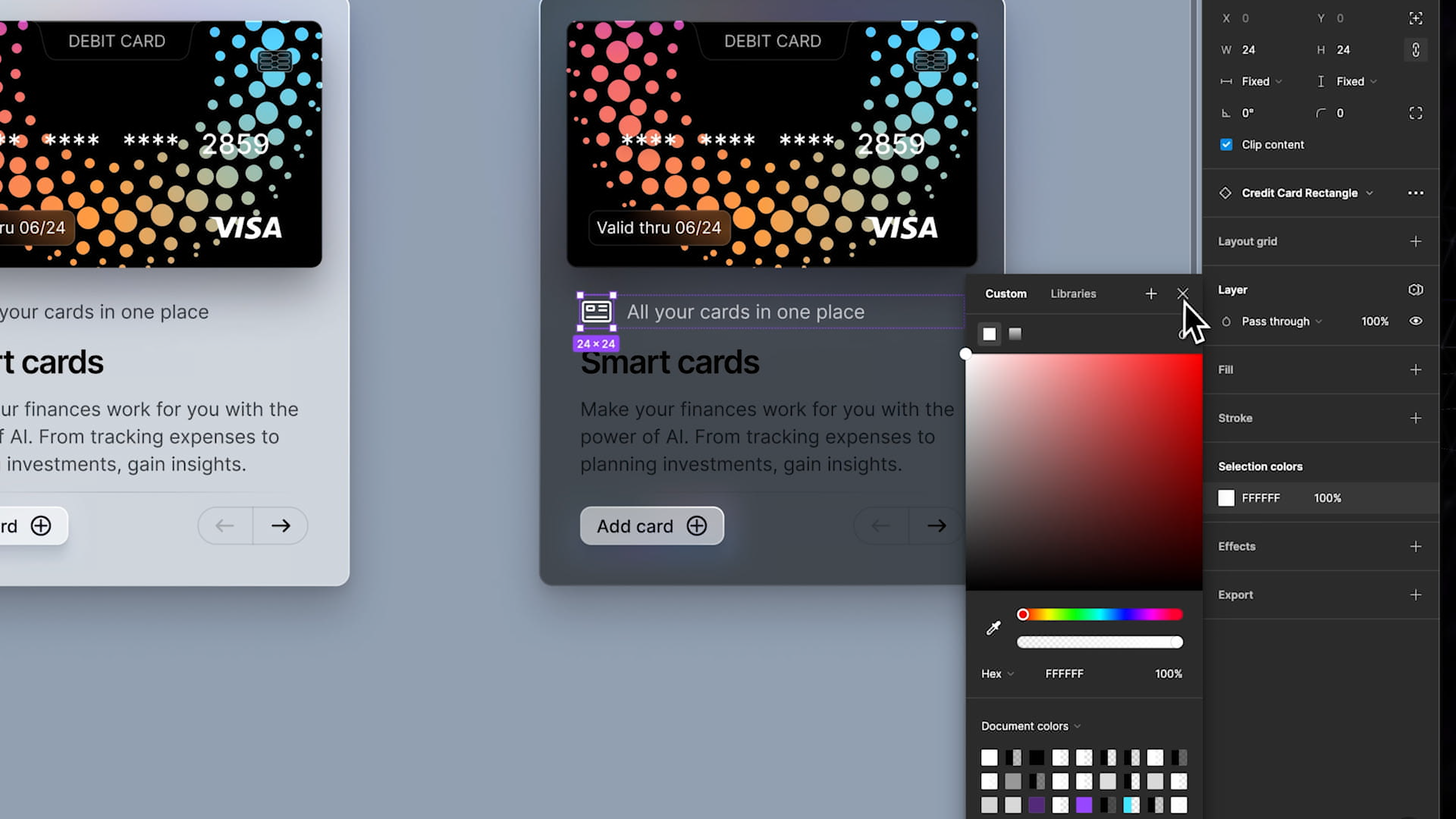
- For the icons and the title text, set their color to full white. This will make them stand out crisply against the darker background, ensuring they catch the user's attention effectively.
![Dark Mode Variables image 4]()
- We’ll set the paragraph text with the same setting as the previous text, using a white color at 70% opacity.
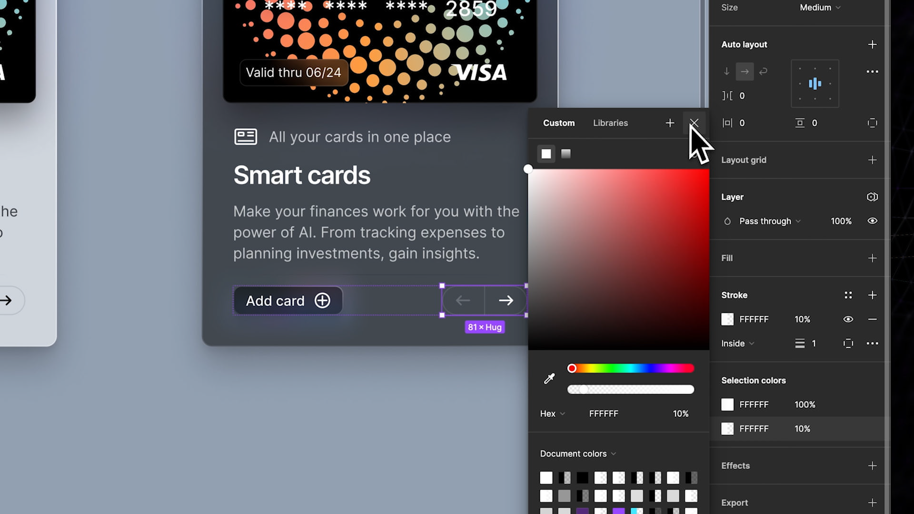
- Now, let's style the buttons. For the bottom left button, set the text color to full white and the background color to black with the same 55% opacity as the main background. This consistency helps maintain a cohesive look throughout the interface.
- For the bottom right button, set the content color to white again. However, for this button, add an outline with a white color at 10% opacity. This subtle detailing will distinguish the button slightly from the others while keeping the design sleek and minimal.
![Dark Mode Variables image 5]()
Creating Variables
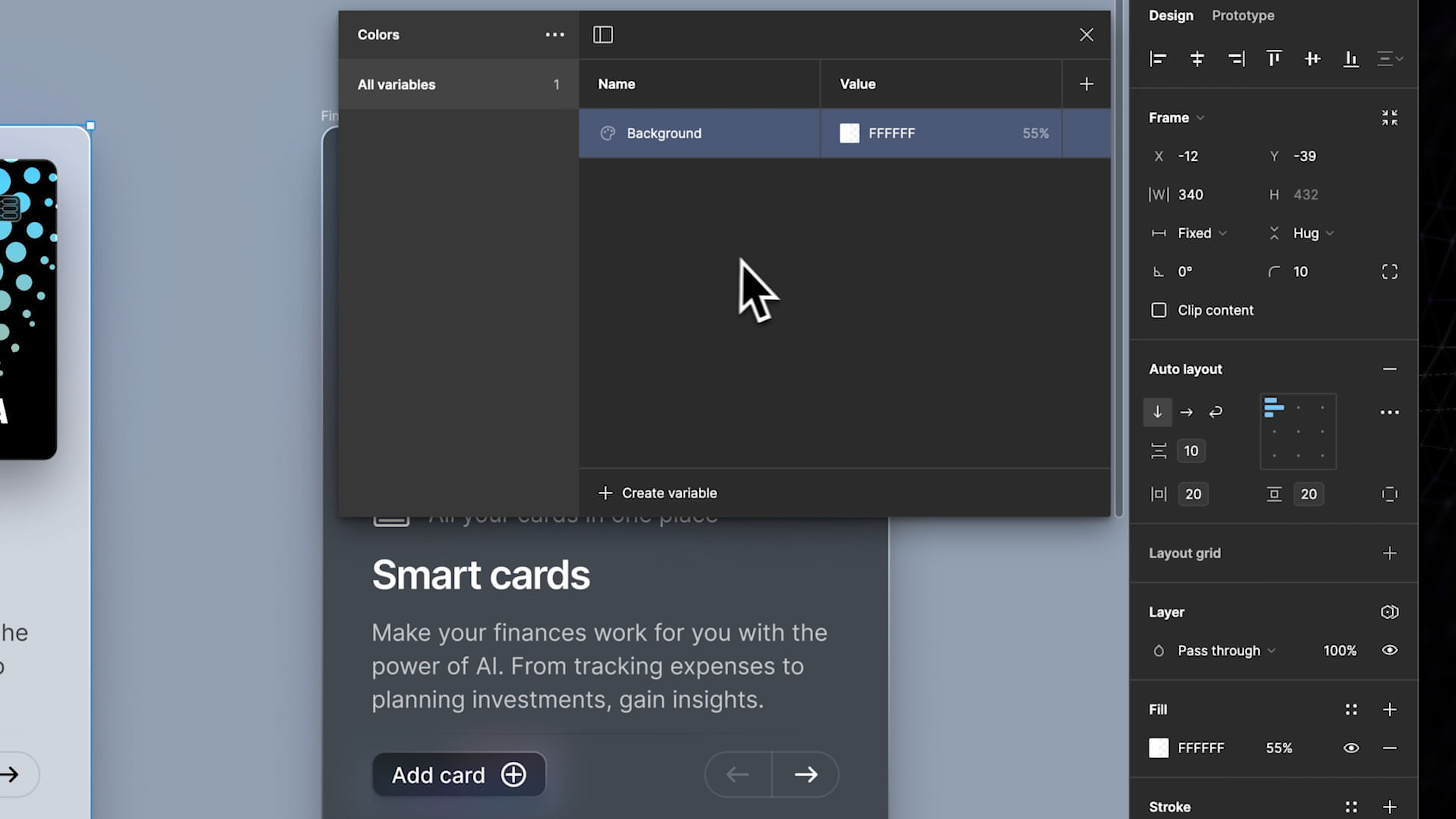
Now that our dark mode design is done, the next step is to create the variables. To define your color variables, start by deselecting all active elements in your design. You can press 'Escape' to ensure no elements are selected, then navigate to the 'Designs' tab and access the local variables section.
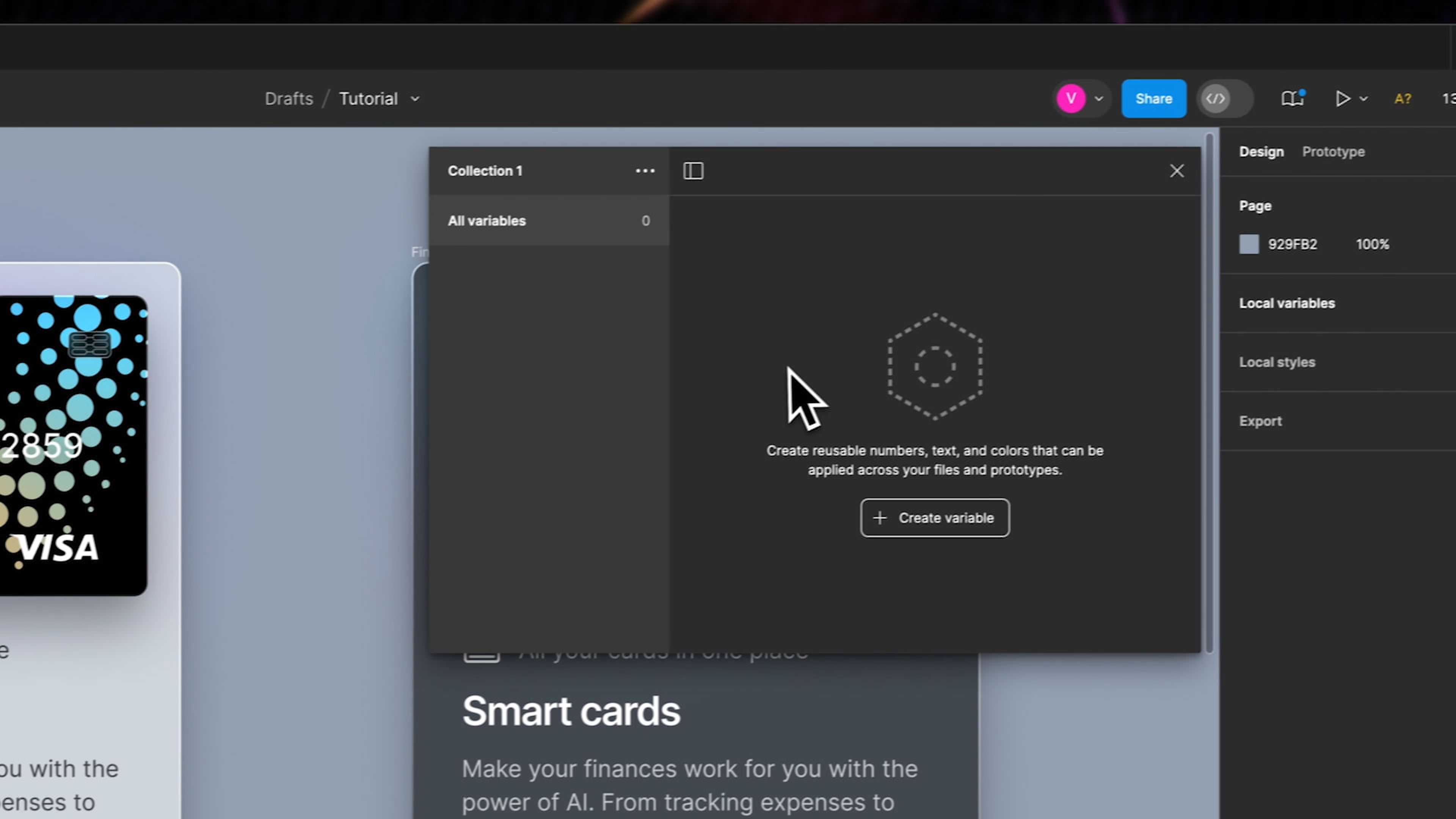
- First, let's rename our existing collection of colors to make it more descriptive and easy to reference. For the purposes of this tutorial, we'll rename our collection to "Colors."
- Click on the button and choose “color” to create our first variable.
- Now, we'll use the Light mode design as our reference point to ensure our colors are well adjusted for visibility and aesthetics in a lighter environment.
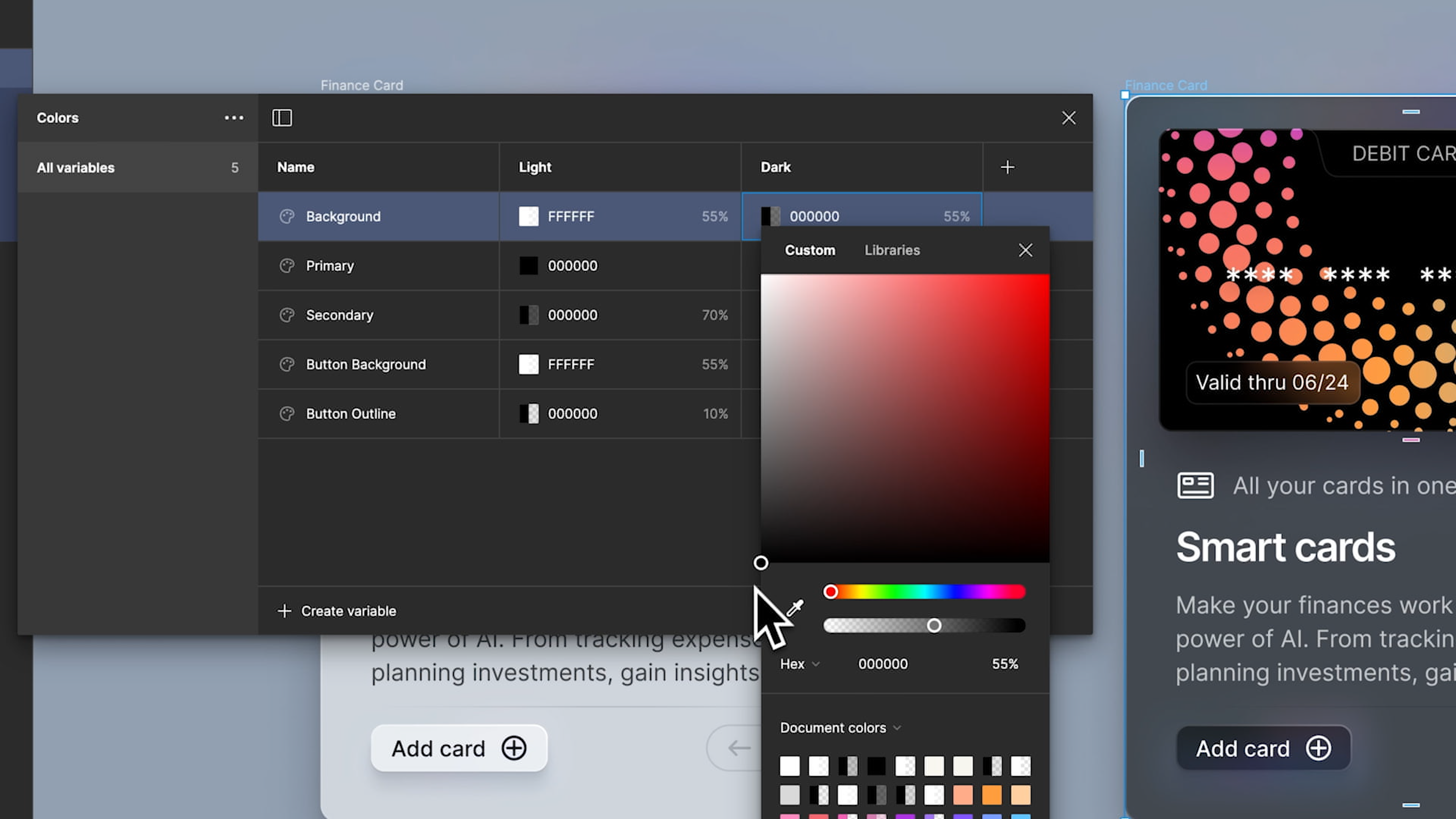
- Our first color variable will be for the card’s background. Set this variable to white with a 55% opacity. This specific setting will help maintain text readability while keeping the background subtle and not too stark.
![Dark Mode Variables image 7]()
- As we add more variables, it’s crucial to name each one clearly for better organization. Naming our variables systematically will save us time when we need to make adjustments or when applying these colors to different components in our design.
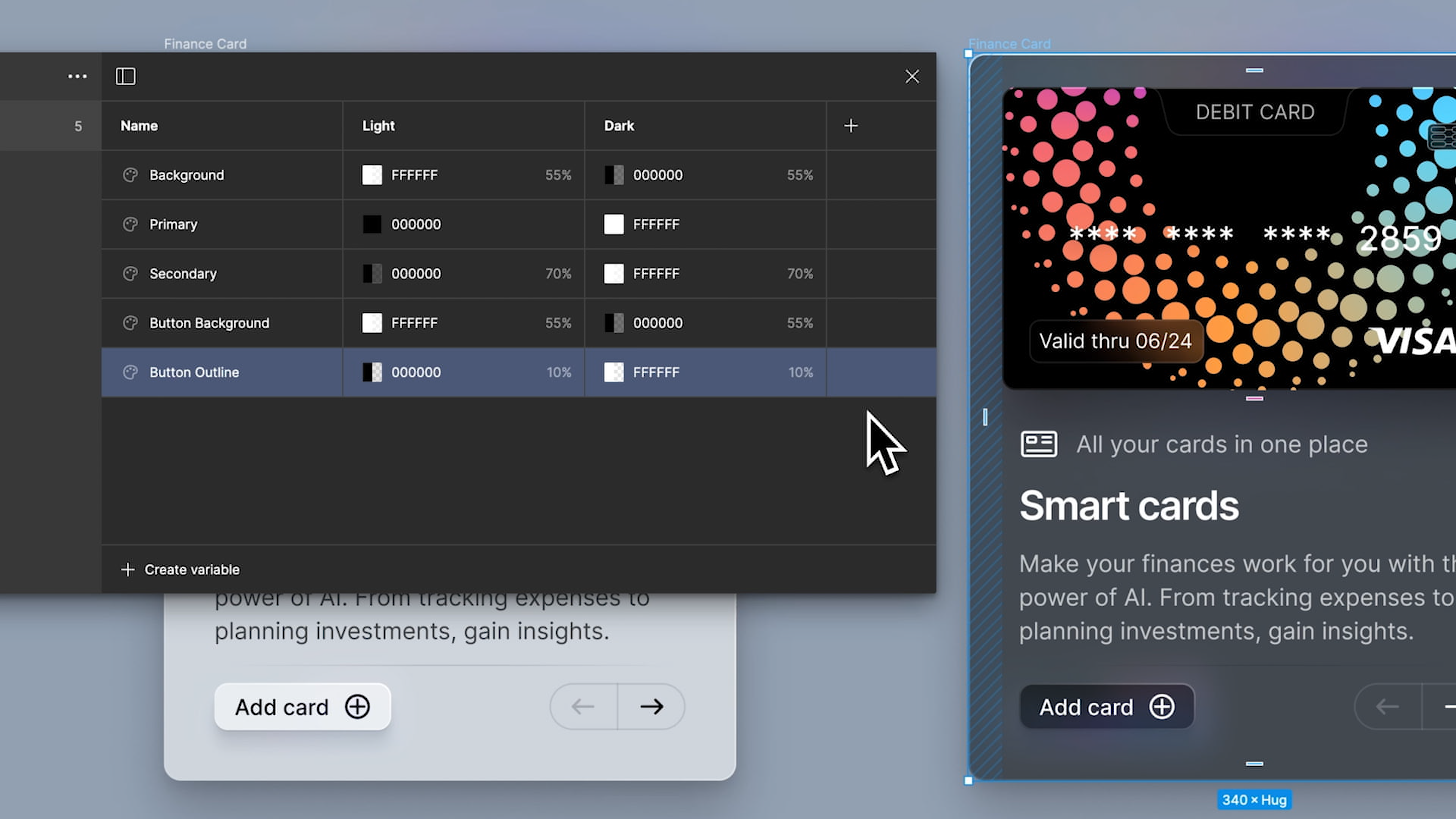
- Next, create a color variable named “Primary” and set this to a solid black. This will be used for text and other elements that require a strong contrast against lighter backgrounds.
- Following that, as we can see in our design, we need a “Secondary” variable with black at 70% opacity. This choice is ideal for less dominant elements that still need to maintain visibility without overpowering the primary content.
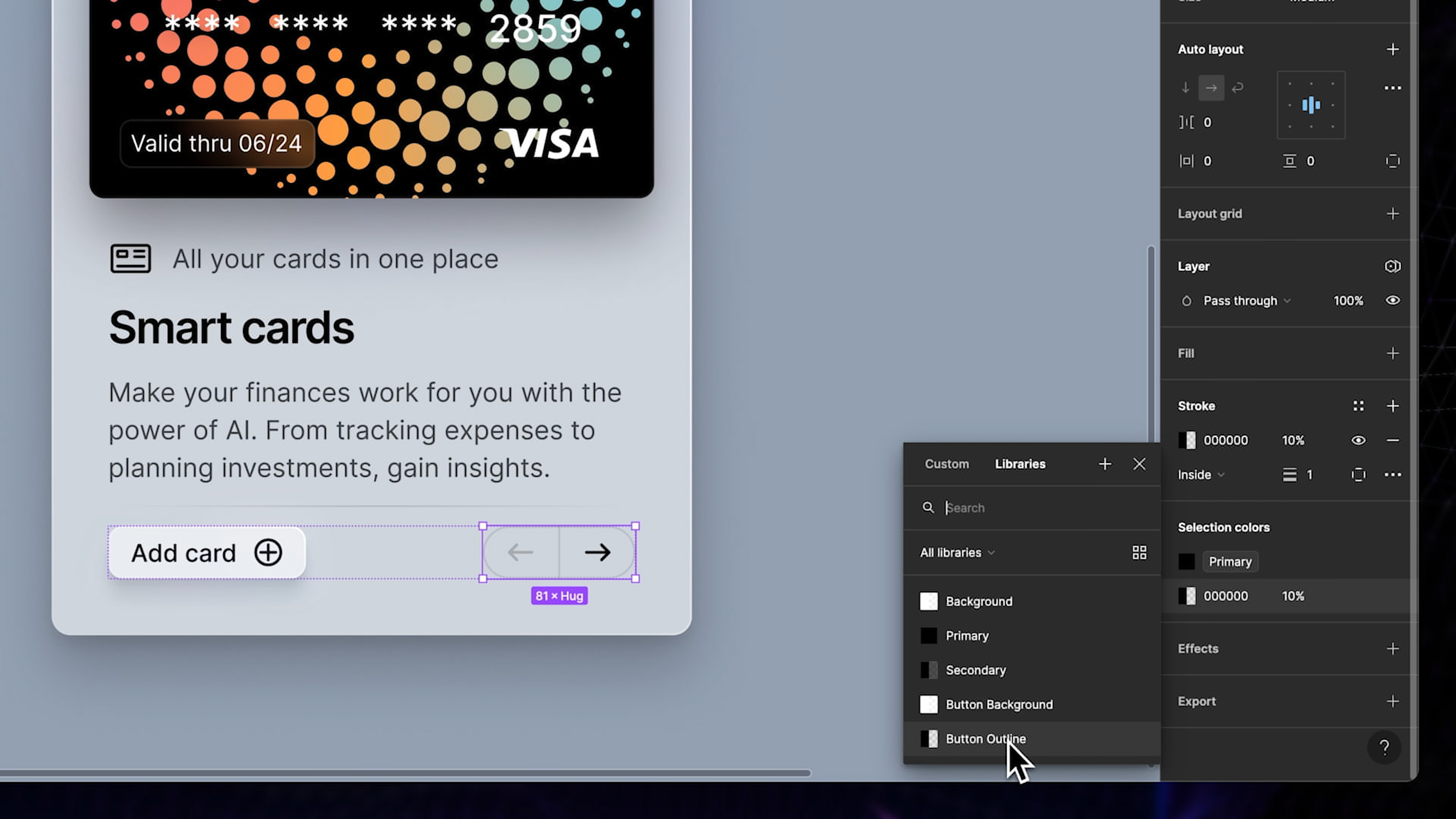
- For the buttons, let’s set up two more variables: one for the button background and another for the button outline. Name the first variable "Button Background" and set it to white with 55% opacity, mirroring our card background for consistency. Then, create the "Button Outline" variable and set it to black with 10% opacity. This subtle outline will help define the button's edges without making it too prominent, ensuring it blends seamlessly with the rest of the design.
![Dark Mode Variables image 8]()
Dark Mode
Having completed the light mode design, it's time to shift our focus to dark mode. We can now add the dark mode and rename it accordingly. Rename the existing mode to "Light" to reflect the design settings we've applied so far.
- Now, we'll begin setting up the dark mode by matching the design elements to their appropriate color variables, which will be adjusted to suit a darker theme. Start with the most fundamental element: the background.
- For dark mode, set the background color to black. This will serve as the base for all other components and ensure that everything contrasts well against a dark setting.
![Dark Mode Variables image 9]()
- Next, proceed to adjust and match the rest of your variable colors to align with our dark mode design.
- Set the primary and secondary color to white, maintaining the same opacity to ensure that every element stands out against the darker backdrop. Each variable should be carefully adjusted to maintain legibility and visual harmony across the interface.
- The button’s background will be black and the outline white. This maintains clarity and adds a stylish touch.
![Dark Mode Variables image 10]()
Apply Variables to Components
The variables are now set, we can proceed with the next step which is to replace the direct color selections (hex codes) with our variable names.
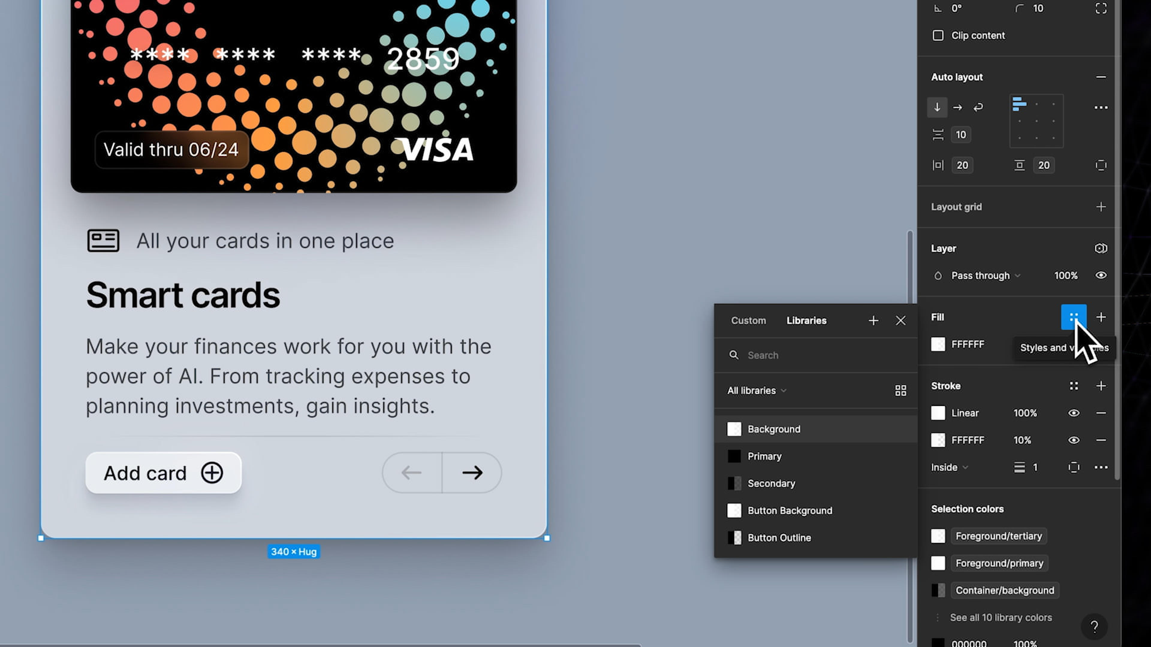
- For each component, start by clicking the four dots icon. This will open up a menu where you can select the appropriate color variable.
![Dark Mode Variables image 11]()
- Begin by assigning the first variable to the background.
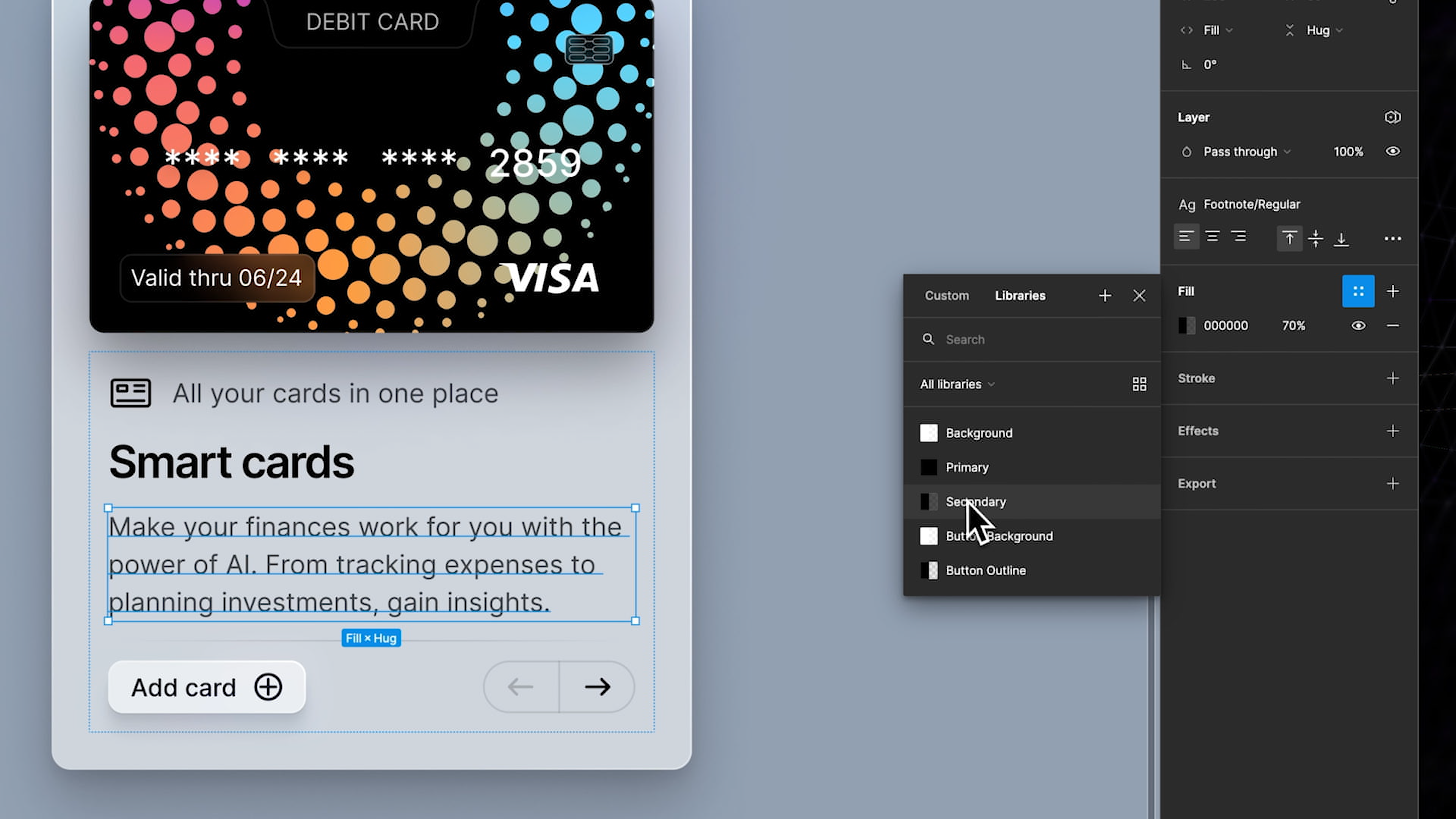
- Next, for the top content, set the text to the secondary color variable, ensuring it complements the background while remaining legible. For the logo, we’ll make it stand out by applying the primary color variable.
- Moving on, set the title below to the primary color as well, drawing attention and maintaining consistency with the logo. Then, assign the secondary color to the text paragraphs, enhancing readability and creating a visually balanced hierarchy.
![Dark Mode Variables image 12]()
- Lastly, set the text color of the bottom left button to primary and assign the button’s background variable. For the bottom right button, set its content to a primary color and apply the variable for the outline.
And just like that, all variables have now been assigned, and the project beautifully reflects the chosen color scheme.
Test and Adjust
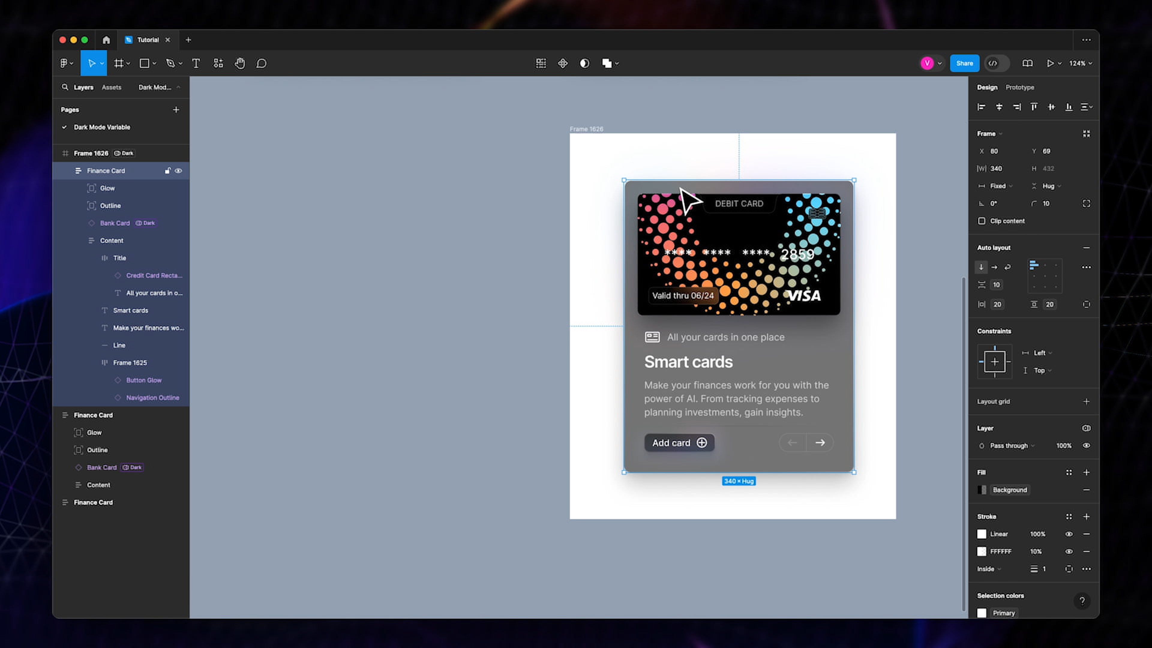
In the layer menu in the right sidebar, we can now choose a specific mode, and an indicator will appear in the layer menu on the left, showing its actual mode. A toggle at the bottom of the layer menu will also let us choose between the modes and we can now effortlessly switch between light and dark mode. Now that our dark mode variables are set, let’s take advantage of this setup. We can duplicate the design and create a dark mode version of it with just one click. This feature saves time and ensures consistency across different themes.
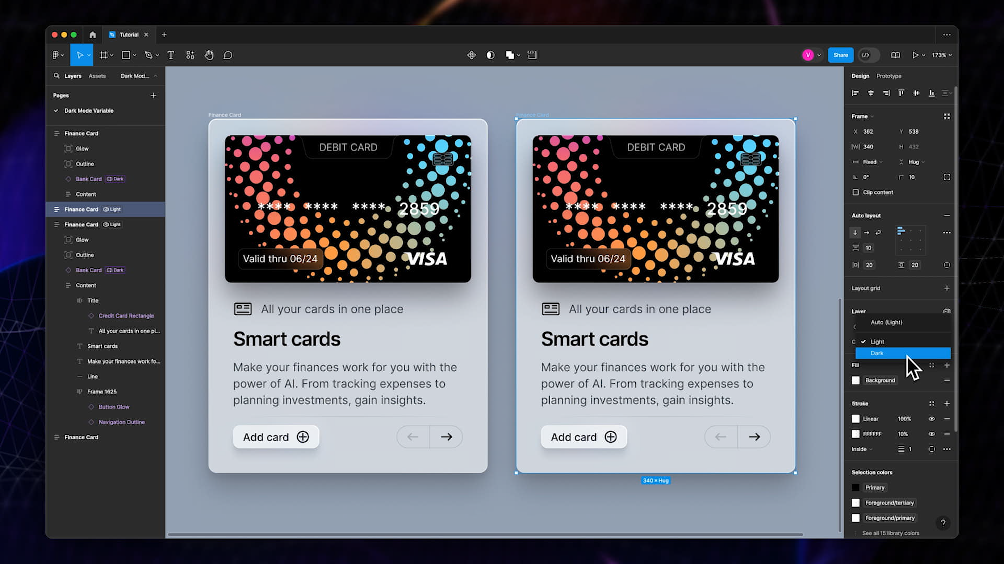
- Let’s now build a slightly bigger frame to test and demonstrate the effectiveness of our dark mode variables.
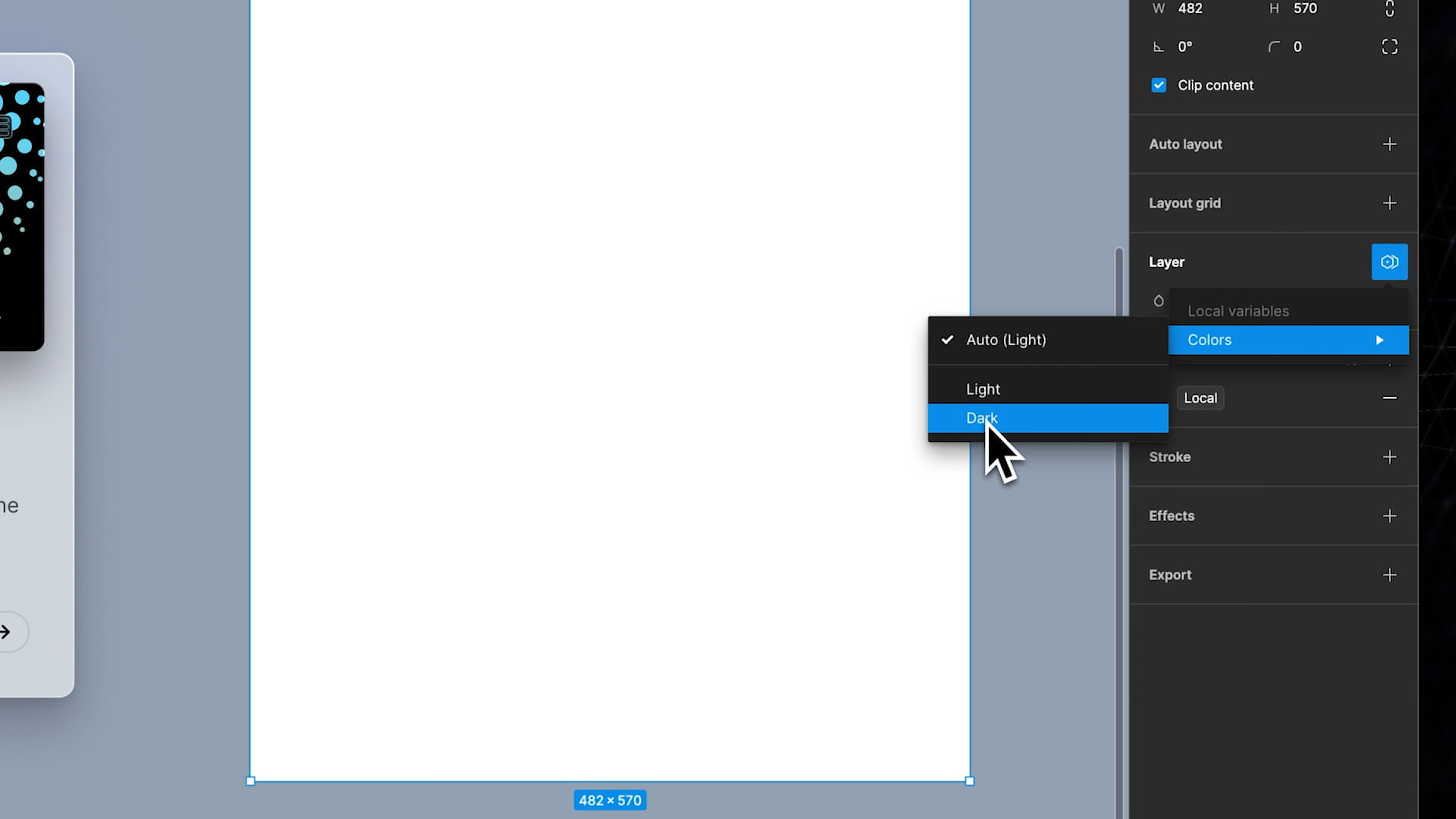
- For this tutorial, we need to assign the frame to dark mode. Click on the four dots icon in the layer menu and add a variable from the colors collection.
- Name it 'local.' Now, with this setup, you have the option to set the frame to dark mode. Simply click on the icon and choose 'dark.'
![Dark Mode Variables image 15]()
- Now, drag the design into the frame, and you’ll see that nothing changes. That's because our design is manually set and locked to light mode.
- You also have the option to set your design to 'auto,' which will allow it to adapt to the environment.
You can see that now, we can drag it in and out of the frame, and it will automatically switch between the two modes, showcasing the versatility of our design in different conditions.
Integration
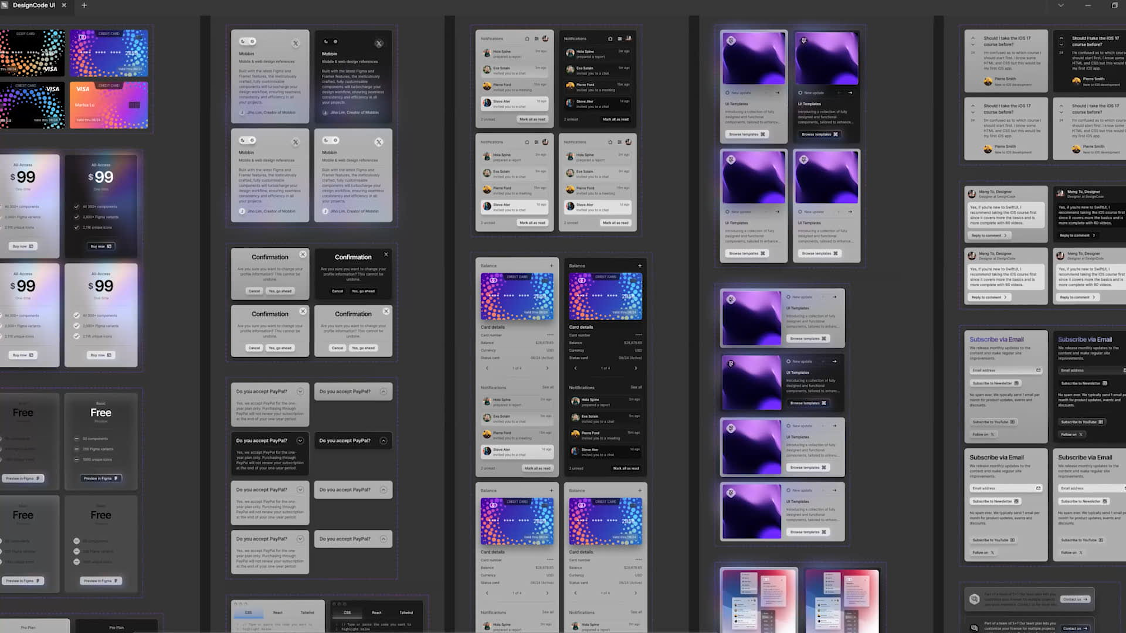
Integrating system-wide dark mode variables becomes especially beneficial when dealing with interactive elements like buttons. For instance, a button can have predefined styles for both light and dark modes that include text color, background color, and border styles. When these buttons are used within components like cards, switching from light to dark mode—or vice versa—can be accomplished swiftly and seamlessly. This not only speeds up the design process but also reduces the potential for errors, ensuring that every element behaves consistently under different visual conditions.
 Furthermore, the ability to implement these styles easily and quickly across various components means that projects can scale more effectively. As the number of components grows, maintaining uniformity and implementing theme changes can be managed with just a few clicks rather than adjusting each element manually. This makes Figma’s dark mode variables an indispensable tool in modern digital design, catering to the growing demand for adaptable and user-friendly interfaces that respect users’ preferences and environmental conditions.
Conclusion
The use of dark mode variables in Figma is a powerful feature that significantly enhances the design process, particularly when creating interfaces that need to adapt across different themes like light and dark modes. By defining and applying these variables to elements such as text, backgrounds, and buttons, designers can ensure consistency and efficiency throughout their projects.
Learn with videos and source files. Available to Pro subscribers only.
Purchase includes access to 50+ courses, 320+ premium tutorials, 300+ hours of videos, source files and certificates.
Templates and source code
Download source files
Download the videos and assets to refer and learn offline without interuption.
Design template
Source code for all sections
Video files, ePub and subtitles
Videos
Assets
ePub
Subtitles
1
The Figma Design Tool
Getting started with Figma as your design tool
0:54
2
The Editor in Figma
Getting familiar with the Figma interface
1:17
3
Basic Tools
Getting to know the tool panel in Figma
2:14
4
Position, Size, Rotation, & Corner Radius properties
Working with Position, Size, Rotation, & Corner Radius properties
1:27
5
Color Styles
Working with color styles on Figma
1:13
6
Masks
Using masks to clip content and compose your design in Figma
1:47
7
Dark Mode with Selection Colors
Learn to design and adapt for designs for Dark Mode with Selection Colors
1:17
8
Gradients
We'll walk through all the different ways to use gradients in your work, as well as techniques when creating them
1:36
9
Creating Backgrounds
Design backgrounds in Figma
2:37
10
Blending Modes
Learn to interesting techniques with Blending Modes
2:02
11
Alignment, Distribution, & Tidy up Properties
Exploring Alignment and Tidy up in Figma
1:24
12
Union and Corner Radius
Working on union and corner radius
2:53
13
Shadow and Blur Effects
Exploring ways to incorporate shadows and blur to your design
1:48
14
Using Images
Steps on how to use images in Figma
2:00
15
Fill, Stroke, & Advanced Stroke
Get to know more about the Fill and various Stroke options in Figma
3:21
16
Text Properties and Styles
Explore and learn about Figma's type properties
1:37
17
Google Fonts and Custom Fonts
Explore the differences between Google Fonts and custom fonts for your website
1:13
18
Accessibility
Exploring a11y in design
19
Responsive Design
Designing responsive layouts in Figma using Constraints and Auto Layout
3:07
20
Constraints
Working with Constraints in Figma
1:11
21
Layout Grid
Learn to design using grids, columns, rows and margins.
2:00
22
Auto Layout in Figma
Working with Auto Layout for responsive design
8:17
23
Vector Mode
Exploring vector mode to edit and customize vector shapes
0:55
24
Vector Network
Learn to use vector networks and design icons
1:19
25
Perspective Mockups
Use realistic mockups to present your designs
2:00
26
3D Mockups
Adding 3D mockups to design
1:20
27
Using Illustrations in Design
Incorporate illustrations into your design
2:03
28
Booleans
Using booleans to design icons
2:24
29
Icon Design
Learn how to design icons using the tools provided by Figma
1:48
30
Components
Make your design more reusable by using components.
1:50
31
Team Library
Publishing your design styles and components
2:14
32
Creating Confetti
Working with Confetti plugin
1:59
33
Looper Shape Duplication
Working with Looper Figma plugin
1:41
34
Apple Watch Ring
Creating apple watch ring in Figma
2:23
35
Exporting Assets in Figma
Learn about exporting assets in Figma for implementation
1:39
36
Exporting CSS Code
Working with CSS code on Figma
1:04
37
Designing with Data
Plugins to help you design with real content
1:57
38
Prototyping
Quickly create an entire flow for your app design in Figma
2:25
39
Version History
Working with version history on Figma
1:25
40
Multiplayer, Commenting, & Previews
Learn about collaboration & sharing with Figma
1:36
41
Variants
Combining similar components into variants
5:39
42
Interactive Components
Creating reusable interactions using interactive components
5:40
43
UIKits
Designing using UIKits in Figma
4:47
44
Plugins
Exploring and Designing using Plugins in Figma
5:47
45
Blob Background
Create a simple blob background in Figma
4:45
46
Wave Background
Create a wave design in Figma using the Bend tool and the Wave plugin
6:46
47
3D Shapes
Create 3D-looking shapes using vector tools in Figma
12:27
48
Parallax Prototyping in Figma
Learn how to create a parallax scrolling animation technique where the background and the foreground layers move at different speed
7:52
49
3D UI Perspective Design
Transforming your user interface with the power of three-dimensional perspective
7:16
50
Glass Icon
Learn how to design a creative icon using background blur
9:16
51
Crystal Ball with Water Effect Animation
Animate waves in a crystal ball using the prototyping tool
12:54
52
Design and code a line animation with letters
Learn how to animate lines using CSS in CodeSandbox
29:38
53
Futuristic line animation
Learn how to create a futuristic background with lines using the pen tool in Figma
19:30
54
Import from Adobe Illustrator to Figma
Best practices for importing an Illustrator file to Figma
3:16
55
Create an Illustration in Figma
Use the vector tool in Figma to create an illustration from scratch
4:07
56
Remove BG plugin
Remove an image background with the RemoveBG plugin in Figma
2:27
57
Circular Lines Advanced Stroke
Design a camera controller with clock lines in Figma
3:27
58
Publish Design to Community
Publishing design files in the Figma Community
4:49
59
Turn Image into Vector
Convert an image into vector in Figma
3:11
60
Prototype with Scrolling Content
Add vertical and horizontal scrolling on your Figma Prototype
3:42
61
Hug Content and Resizing
Learn how to choose the right resizing options including hug content, fixed width or height, fill container and text truncation
2:04
62
Advanced Auto Layout
Learn how to use spacing mode, canvas stacking, text baseline alignment, stroke values in advanced layout
4:13
63
Circular Text on Path
Make a circular text on path using ARC plugin in Figma
5:57
64
Mirror Prototype
View your prototypes on your mobile device using the Figma mobile app
2:39
65
Sticky Nav and Tab Bar Prototyping
How to fix the position with sticky Nav Bar and Tab Bar
4:37
66
Video in Figma Prototype
Apply a video as a fill using any vector network on your prototype
5:04
67
Mesh Gradients
Create beautiful and wave shaped gradients using shapes or the mesh gradient plugin in Figma
3:03
68
Figma Sections
Use sections in Figma to organize designs better and make it easier for collaboration
3:53
69
Unsplash Stock Photos
Insert beautiful images from Unsplash straight into your designs
2:07
70
Angular Gradient
Step-by-step guide to creating and customizing an angular gradient in Figma
4:17
71
Radial Gradient
Creating vibrant radial gradients in Figma for a professional design look
5:11
72
After Delay Animation Prototyping
The easiest way to animate anything on the web using simple after delay interaction in Figma
3:14
73
UI Wireframe
Use various tools and plugins to create a wireframe that helps you easily plan and design your user interface
2:53
74
Lottie Animations
Step-by-step guide to using Lottie animations in Figma to improve collaboration and enhance your designs
3:55
75
Design Sign Up Screen
Easily design a sign up screen in Figma for your app or website
6:42
76
Content Generator
Useful plugins that can help designers design with real content and save time
2:53
77
Design Lint Missing Style
Save time finding and fixing errors in your Figma designs with Design Lint
2:36
78
Slice Tool
Export your designs using the slice tool in Figma
2:04
79
Adaptive Layout with Breakpoints
Creating flexible and responsive web designs with adaptive layout and breakpoints
6:25
80
Chart Designs
Exploring the endless possibilities of chart designs for data visualization
4:51
81
Design Modals
How to design modals that enhance user interfaces
4:08
82
Batch Rename
Quickly and easily rename multiple files in Figma using the Batch Rename plugin
2:35
83
Design Onboarding Screen
Creating an engaging experience to drive user retention with onboarding design
2:28
84
Animated Button Prototype
How to create a dynamic interactive button
3:06
85
Smart Selection
Arrange layers more efficiently with smart selection
2:15
86
Component Properties
Reduce the number of variants in your design system by using component properties and editing them directly in the properties panel
4:37
87
RedLines
Measure distances and annotate your Figma designs before handoff with Redlines Figma plugin
2:54
88
Interactive Calendar
Learn how to use interactive components in Figma to create an interactive calendar with hover and clicked-on states
7:46
89
Measure Distance
Place your design elements in the right place with measure distance in Figma
3:33
90
Variable Fonts
Learn how to replace static fonts with the variable font version
2:51
91
AI Plugins
Enhancing design efficiency by exploring advanced AI tools in Figma to optimize your workflow
6:16
92
Text Animation
Create an impressive motion text animation using interactive component and after delay
3:11
93
Resize Layers
Resize layers using the scale tool
2:36
94
View Layer Outlines
Understanding and organizing your design with view layer outlines
2:23
95
Prototype Connections
Configure your prototypes so that anyone with view access can see the interactions
2:38
96
Export SVG Files and Code
Exporting your artwork as an SVG file allows you to easily embed it in your HTML and CSS code
2:47
97
3D Illustrations
Enhancing Project Design with 3D Illustrations
4:14
98
UI Placeholder
Insert a temporary element to visualize the design
2:38
99
Dark Mode Switch
Transform your design into dark mode in just one click
4:23
100
Dev Mode
Explore Figma's Dev Mode, your essential tool for simplifying design-to-code workflows
6:26
101
Dark Mode Variables
Learn how Figma's dark mode variable feature enhances design by allowing seamless transitions between themes
10:04
102
Figma to HTML
From Figma to Web: Simplifying HTML Export with Anima
10:51
Meet the instructor
We all try to be consistent with our way of teaching step-by-step, providing source files and prioritizing design in our courses.
Sourasith Phomhome
UI Designer
Designer at Design+Code
19 courses - 72 hours

Master AI Prompting for Stunning UI
Learn how to leverage AI tools like Aura for creating beautiful designs, working with templates, and experimenting with advanced prompts. A concise guide for designers and developers to level up their skills.
10 hrs

Design Multiple Apps with Figma and AI
In this course, you’ll learn to design multiple apps using Figma and AI-powered tools, tackling a variety of real-world UI challenges. Each week, a new episode will guide you through a different design, helping you master essential UI/UX principles and workflows
4 hrs

SwiftUI Fundamentals Handbook
A comprehensive guide to mastering Swift programming fundamentals, designed for aspiring iOS developers. This handbook provides a structured approach to learning Swift's core concepts, from basic syntax to advanced programming patterns. Through carefully sequenced chapters, readers will progress from essential programming concepts to object-oriented principles, building a solid foundation for SwiftUI development. Each topic includes practical examples and clear explanations, ensuring a thorough understanding of Swift's capabilities. This handbook serves as both a learning resource and a reference guide, covering fundamental concepts required for modern iOS development. Topics are presented in a logical progression, allowing readers to build their knowledge systematically while gaining practical programming skills.
2 hrs

Design and Code User Interfaces with Galileo and Claude AI
In this course, you’ll learn how to use AI tools to make UI/UX design faster and more efficient. We’ll start with Galileo AI to create basic designs, providing a solid foundation for your ideas. Next, we’ll refine these designs in Figma to match your personal style, and finally, we’ll use Claude AI to turn them into working code—eliminating the need for traditional prototyping.
4 hrs

Design and Prototype for iOS 18
Design and Prototype for iOS 18 is an immersive course that equips you with the skills to create stunning, user-friendly mobile applications. From mastering Figma to understanding iOS 18's latest design principles, you'll learn to craft two real-world apps - a Car Control interface and an AI assistant.
3 hrs

Master Responsive Layouts in Figma
Creating responsive layouts is a must-have skill for any UI/UX designer. With so many different devices and screen sizes, designing interfaces that look great and work well on all platforms is necessary. Mastering this skill will make you stand out in the field. In this course, we'll start from scratch to create this beautiful design using Figma. You'll learn how to make layouts that are easy to use and work well on any device. We'll cover key concepts and tools to help you master responsive design in Figma.
2 hrs

UI UX Design with Mobbin and Figma
Mobbin is a powerful tool for UI/UX designers seeking inspiration and innovative design solutions. This platform offers a vast collection of real-world mobile app designs, providing a treasure trove of UI elements and layouts.
2 hrs

3D UI Interactive Web Design with Spline
Learn to create 3D designs and UI interactions such as 3D icons, UI animations, components, variables, screen resize, scrolling interactions, as well as exporting, optimizing, and publishing your 3D assets on websites
3 hrs

Design and Prototype for iOS 17 in Figma
Crafting engaging experiences for iOS 17 and visionOS using the Figma design tool. Learn about Figma's new prototyping features, Dev Mode, variables and auto layout.
6 hrs

Design and Prototype Apps with Midjourney
A comprehensive course on transforming Midjourney concepts into interactive prototypes using essential design techniques and AI tools
8 hrs

iOS Design with Midjourney and Figma
Learn the fundamentals of App UI design and master the art of creating beautiful and intuitive user interfaces for mobile applications
1 hrs

UI Design for iOS, Android and Web in Sketch
Create a UI design from scratch using Smart Layout, Components, Prototyping in Sketch app
1 hrs

UI Design a Camera App in Figma
Design a dark, vibrant and curvy app design from scratch in Figma. Design glass icons, lens strokes and realistic buttons.
1 hrs

UI Design for iOS 16 in Sketch
A complete guide to designing for iOS 16 with videos, examples and design files
3 hrs

Prototyping in Figma
Learn the basics of prototyping in Figma by creating interactive flows from custom designs
1 hrs

UI Design Quick Websites in Figma
Learn how to design a portfolio web UI from scratch in Figma
1 hrs

UI Design Android Apps in Figma
Design Android application UIs from scratch using various tricks and techniques in Figma
2 hrs

UI Design Quick Apps in Figma
Design application UIs from scratch using various tricks and techniques in Figma
12 hrs

Figma Handbook
A comprehensive guide to the best tips and tricks in Figma. Not affiliated with or endorsed by Figma, Inc.
6 hrs

