3D Thermostat and Cloner
Add to favorites
Learn how to design a thermostat interface with basic shapes
Play video
Create 3D UI for iOS and visionOS in Spline
1
Intro to Spline for iOS and visionOS
7:25
2
Basic Shapes in 3D Smart Home
10:12
3
Materials, Lights and Effects
12:11
4
Camera Animation and States
7:05
5
3D Thermostat and Cloner
14:38
6
Buttons and Components
8:26
7
Path Animation and Rotation
7:10
8
Create a 3D iOS App Icon
7:09
9
Create a visionOS App Icon
9:53
10
Create 3D UI Scene
9:49
11
Particles Animation
20:30
12
Export to SwiftUI Project
16:20
We will develop a thermostat interface entirely from scratch, employing basic shapes, materials, and utilizing the cloner tool for replication purposes.
https://my.spline.design/thermostatpratice-179e5add31fe5c902002d8567f00a4c2/
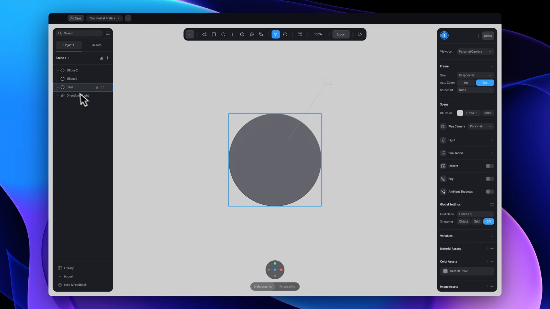
Step 1 : Creating the Base
Let’s start with the base.

3 Ellipses
Ellipse 1 (Rename to Base)
- Add an ellipse measuring 354 by 354 and ensure the ellipse is centered with coordinates 0 on the x, y, and z axes.
- Set the extrusion to 80.
- Adjust the bevel and the bevel sides to a value of 2.
Ellipse 2 (Rename to Ellipse 1)
- Create another ellipse with dimensions of 300 by 300.
- Center this ellipse at coordinates (0, 0) on the x and y axes, and position it at 81 along the Z axis.
Ellipse 3 (Rename to Ellipse 2)
- Duplicate the last ellipse and change its size to 264 by 264.
- Adjust the Z value to 82.
Base Layer Material
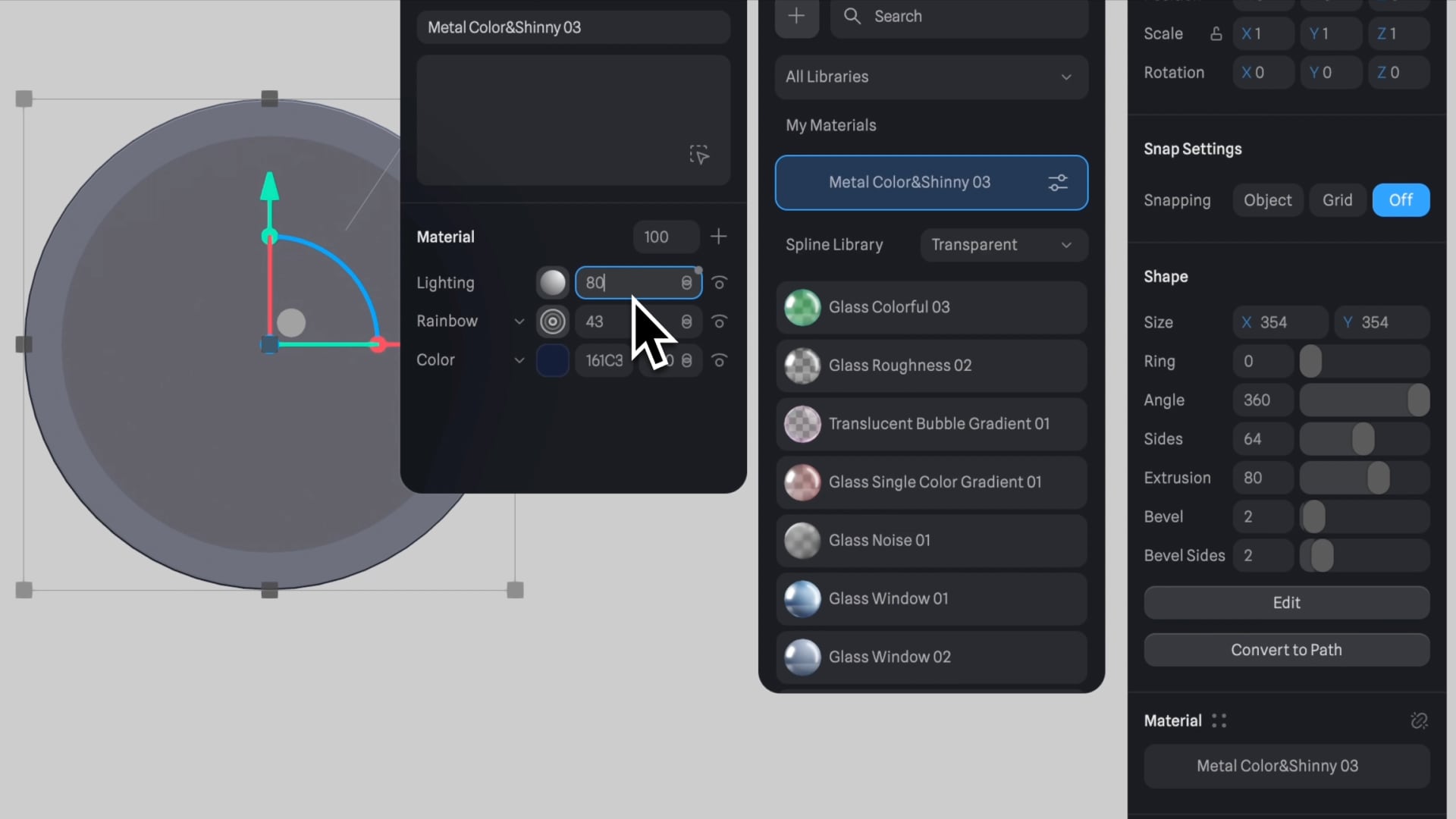
- Select the Base layer and apply a previously used material: metal color and shiny 03.
- Modify the material by changing its color to dark blue (#161C31) through the settings icon.
- Adjust the rainbow layer's opacity to 43% and the lighting to 80%.
- Click on the plus icon, add a new layer, and select "Depth."
- Set the color to green, with opacity at 82% and the blending mode to "Smooth."
- Adjust the origin values to X: -53, Y: 110, Z: 0.
- Set "Near" values to 55 and "Far" to 228.
- Change the second color to purple with an opacity of 0%.

- Add a new layer, select "Matcap," and choose the top left option.
- Adjust the blending mode to "Overlay."

Ellipses Customization
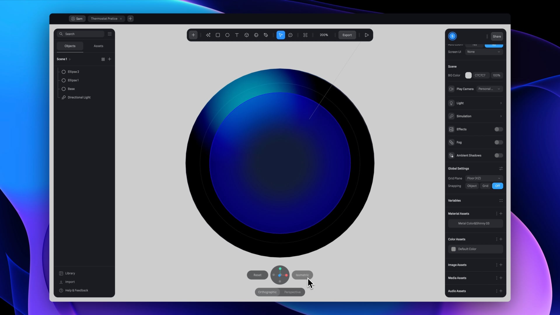
Ellipse 1
- Select "Ellipse 1" and change its color layer to "Outline."
- Set the outline color to white with a width of 1.
- Adjust the layer's opacity to 10% and hide the lighting layer.
Ellipse 2
- Select "Ellipse 2" and change its color layer to "Gradient."
- Set the gradient type to radial and the blending mode to smooth.
- The first color should be dark blue with an opacity of 100%.
- The second color should be blue with an opacity of 26%.
- Set the angle to minus 16 and move the lighting layer to the bottom.
- Add a new layer and choose "Outline."
- Set the outline color to white with a width of 1.
- Set the contour width to 0 and change the blending mode to "Overlay."
Step 2 : Small Progress Ring
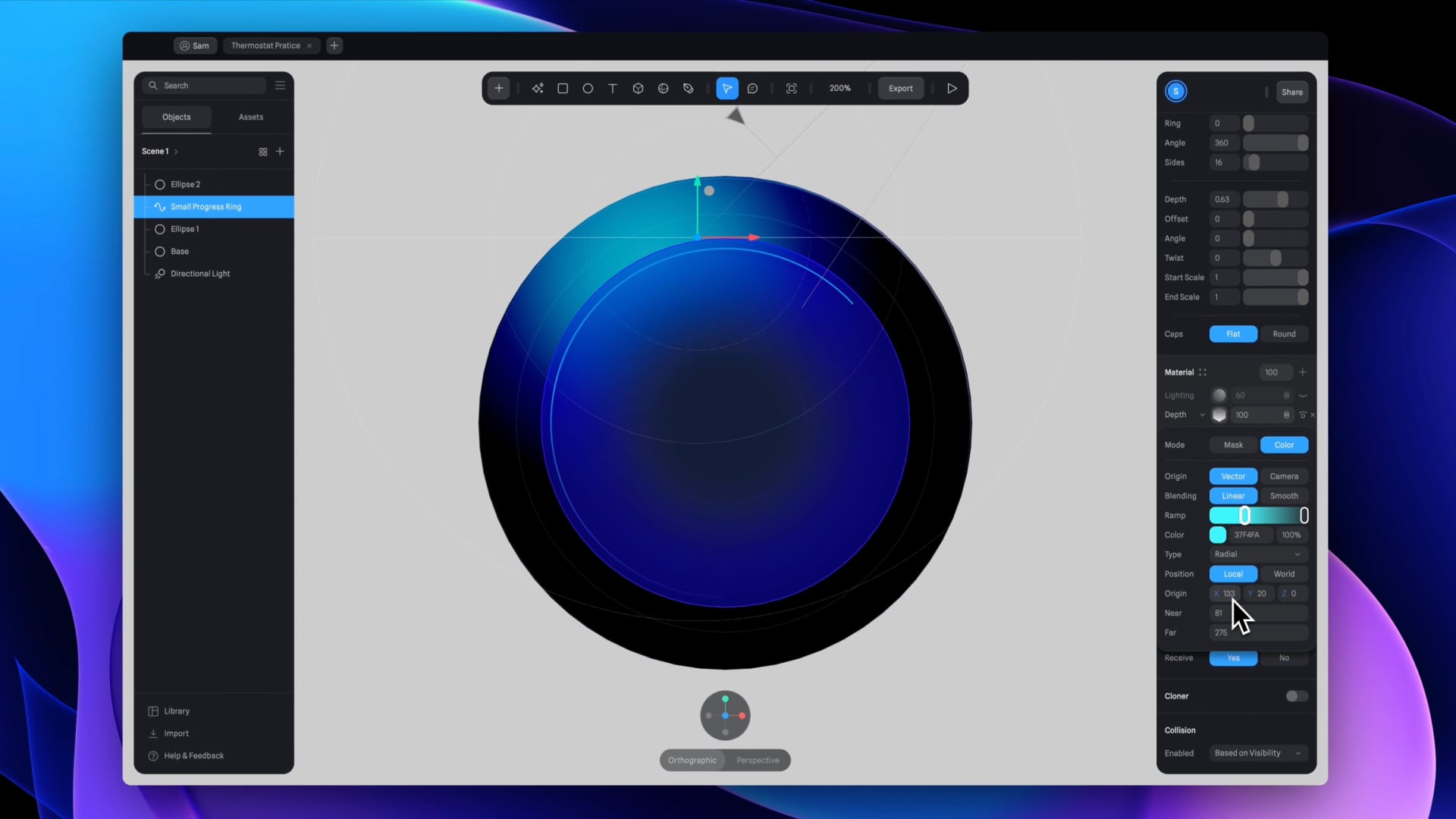
- Duplicate "Ellipse 1" and rename it to "Small Progress Ring."
- Apply a bright color to enhance visibility and aid in visualization.
- Change the size of the new ellipse to 250 by 250.
- Click on "Convert to Path," set the size to 1, and adjust the subdivision value to 30 for a smooth shape.
- Set the depth value to 0.63 and adjust the Z rotation to 90 degrees.
- Change the color material to "Depth" with the first color as green (opacity 100%) and the second color as purple (opacity 0%).
- Enter precise values for the origin (X: 133, Y: 20, Z: 0), near value (81), and far value (275) to replicate the original design.
Step 3 : Large Progress Ring
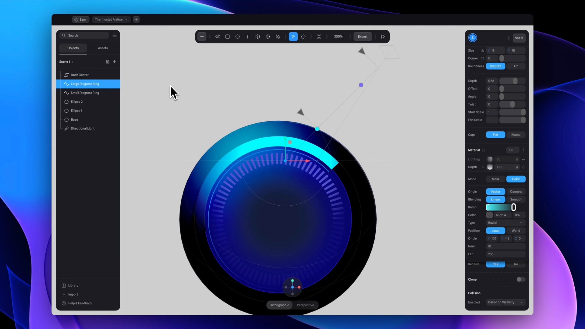
- Duplicate the last ellipse and rename it to "Large Progress Ring."
- Adjust the ellipse size to 280 and change the path extrusion shape to a rectangle with a size of 18.
- Under scale, change the Z value to 0.50.
- Edit the depth layer, placing the second color stop with origin X: 105, Y: -13, Z: 0, and setting near and far values to 81 and 236, respectively.
Step 4 : Center Dashes
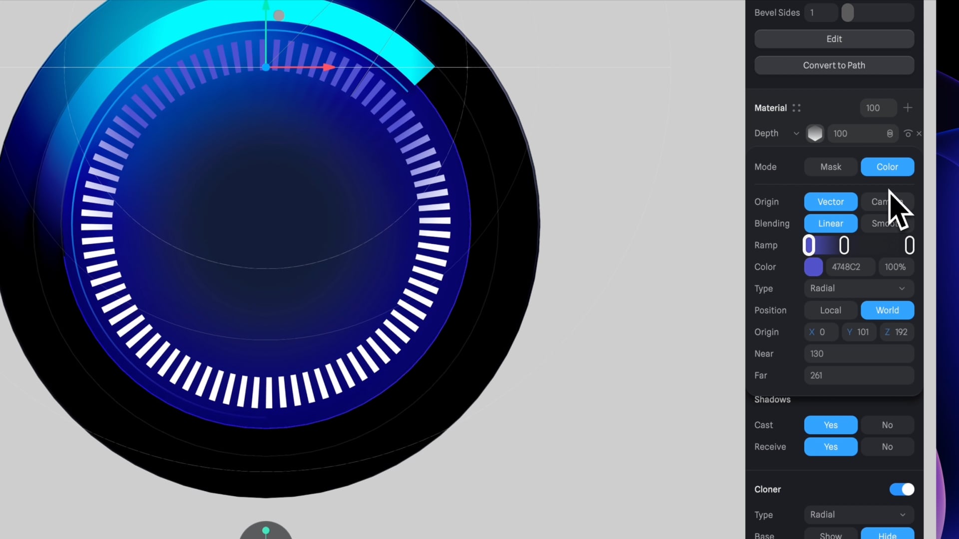
- Import an SVG file named "Center Dash" from the assets folder.
- If not visible, adjust the Z value to bring it forward, ungroup from its current group, and rename to "Dash Center."
- Set the extrusion value to 1 and activate the cloner tool at the bottom.
- Select "Radial" type in the cloner tool, hide the base layer, and set alignment to "Yes."
- Change the count to 80 for a circular path of dashes with a radius of 99 and Z-axis rotation of 180 degrees.
- Add a new material set to "Depth," with the first color as purple (opacity 100%), add a second color stop with the same shade of purple (opacity 2%), and the last color as white (opacity 0%).
- Set the position to "World" with values X: 0, Y: 101, Z: 192, "Near" value to 130, and "Far" value to 261.
- Finally, set the color material to 2% opacity.
Step 5 : Mini Dash
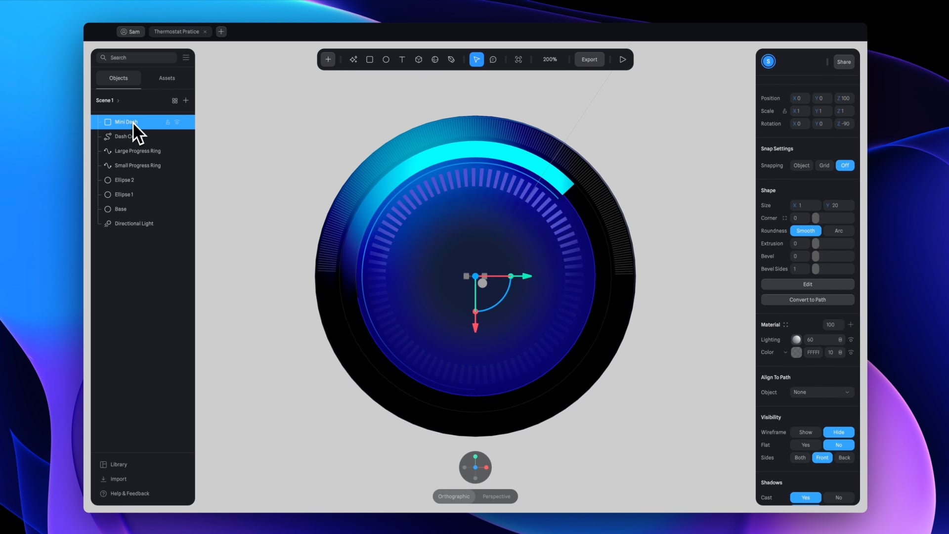
- Insert a rectangle measuring 1 by 20 and modify its color to white.
- Position the rectangle at 0 on both the X and Y axes, set the Z value to 100, and ensure rotation values are set to 0 for all axes.
- Activate the cloner tool, set the type to radial, hide the base, and set alignment to "Yes."
- Add values: count 200, radius 164, start 182.
- Adjust the Z-axis rotation to minus 90 degrees, modify the opacity in the color material settings to 10%, and rename this layer to "Mini Dash."
Step 6 : Degree Dash
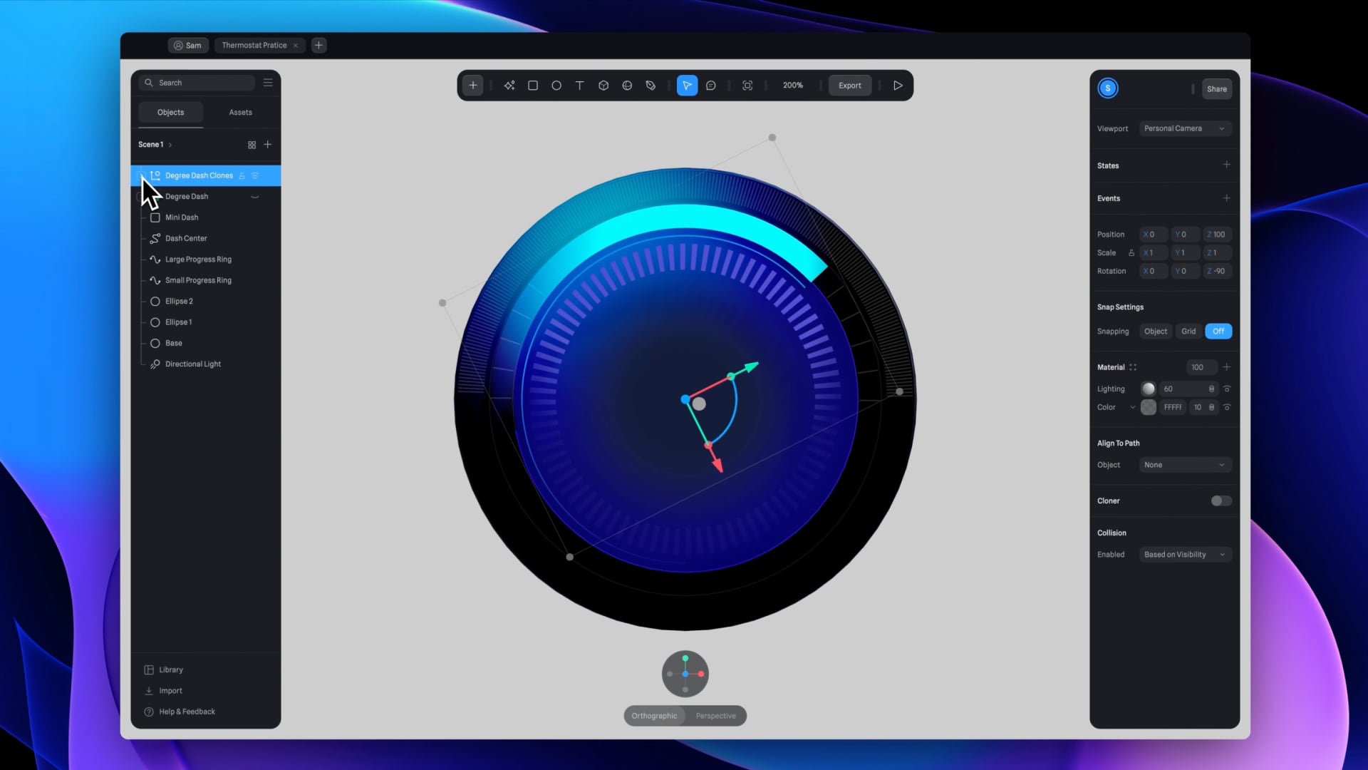
- Duplicate "Mini Dash" and rename it to "Degree Dash."
- Adjust the radius to 141, decrease the count to 40, and set the start point to 0.
- For the shape size, reduce the Y value to 16.
- Convert to Instances at the bottom of the panel.
- Components can be reused and will update across all instances if the main component is changed.
- A new group with 40 instances (the same as the count) is added.
- To hide the helpers guide, adjust settings in the global options.
- Delete instances 4 to 22, inclusive, to remove the bottom part, retaining only the top half portion.
Step 7 : Mask Dash
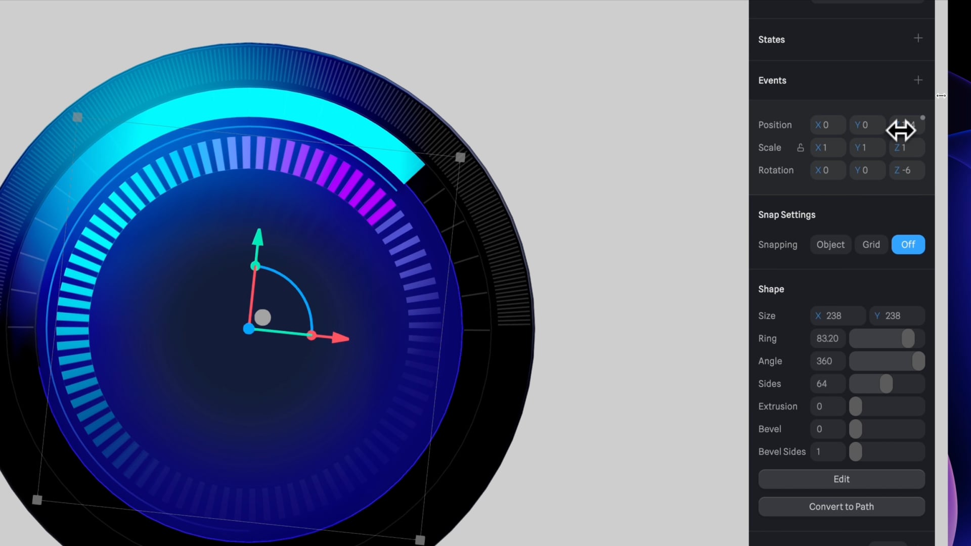
- Duplicate "Ellipse 2" and rename it to "Mask Dash."
- Change the size to 238 by 238 and delete the outline material.
- Modify the existing gradient material to "Polar" type, set the first color stop to purple (100% opacity), and the second and third to cyan (100% and 0% opacities, respectively).
- Add an angle of minus 45 degrees and under Shape, adjust the ring value to 83.20.
- Deactivate the lighting layer, add a new "Image" material, upload "Dash 3x" as a mask.
- Adjust the Z rotation to minus 6 and position it forward by increasing the Z value.
- Group layers together and rename the group to "Thermostat."
Step 8 : Incorporating Text
- Use the text tool with a size of 30 by 20 for the first text, applying "Inter" font, regular, size 15 for the next 3 texts.
- The first text will read "10 degrees," using the degree symbol (Shift + Option + 8 on a Mac).
- For alignment, use guides to position the text layer and thermostat group accurately on the X and Y axes.
- The color of the text should be white with an opacity of 60%.
- For the subsequent text, adjust the frame size to 120 by 60, font size to 62, font weight to medium, and opacity to 100% with content "22 degrees."
- Duplicate the last text layer for the final text, set the frame size to 120 by 22, font size to 17, font weight to bold, and update the content to "cooling." Adjust its position upward.
![13 Section 5 - Texts]()
Templates and source code
Download source files
Download the videos and assets to refer and learn offline without interuption.
Design template
Source code for all sections
Video files, ePub and subtitles
Assets
Videos
1
Intro to Spline for iOS and visionOS
Comprehensive 3D Design Course: From Basics to Advanced Techniques for iOS and visionOS using SwiftUI
7:25
2
Basic Shapes in 3D Smart Home
Transforming simple shapes into a 3D base for a house model scene
10:12
3
Materials, Lights and Effects
Enhance your 3D scene by incorporating elements from the lore ibrary and adding materials and lighting to add realism
12:11
4
Camera Animation and States
Creating dynamic scenes with the addition of animations
7:05
5
3D Thermostat and Cloner
Learn how to design a thermostat interface with basic shapes
14:38
6
Buttons and Components
Creating knobs and buttons elements and turning them to components
8:26
7
Path Animation and Rotation
Animating a Thermostat Interface: A Step-by-Step Guide
7:10
8
Create a 3D iOS App Icon
Crafting iOS 3D Icons: A Comprehensive Tutorial
7:09
9
Create a visionOS App Icon
Discover how to design the Photos app icon, enhancing the visual experience in visionOS.
9:53
10
Create 3D UI Scene
Learn how to design and implement 2D user interfaces to integrate within 3D scenes, enabling the triggering of actions on any 3D object
9:49
11
Particles Animation
Discover the new particle feature designed to create a range of visual effects like fire, smoke, rain, snow, and other dynamic phenomena
20:30
12
Export to SwiftUI Project
Crafting Stunning 3D Experiences: A Step-by-Step Guide with Spline for iOS Apps
16:20
Meet the instructor
We all try to be consistent with our way of teaching step-by-step, providing source files and prioritizing design in our courses.
Akson Phomhome
UI Designer
Designer at Design+Code.
13 courses - 60 hours

AI Design with Ideogram
Meet Ideogram, an AI-powered image generation tool that takes your ideas and transforms them into stunning visuals. Whether you're a designer, marketer, or just a visual enthusiast, Ideogram simplifies the creative process. In this guide, we’ll walk you through step-by-step instructions to create beautiful logos, social media posts, and more.
1 hrs

Build a SwiftUI app with Claude AI
This comprehensive SwiftUI course combines cutting-edge AI assistance with hands-on development, guiding you through the process of transforming Figma designs into fully functional iOS applications. Leveraging Claude 3.5 Sonnet, you'll learn to efficiently generate and refine SwiftUI code, create reusable components, and implement advanced features like animations and responsive layouts.
9 hrs

Prototype and Code iOS apps in Figma and SwiftUI
Welcome to our course on designing a sleek wallet interface with Figma! You’ll learn to create a visually appealing and functional wallet interface using DesignCode and Apple UI Kits. Master prototyping, swipe gestures, carousel animations, overlays, and reusable components. Plus, explore a Figma plugin to easily transition from design to SwiftUI. By the end, you’ll create dynamic, user-friendly prototypes.
3 hrs

Create 3D UI for iOS and visionOS in Spline
Comprehensive 3D Design Course: From Basics to Advanced Techniques for iOS and visionOS using SwiftUI
3 hrs

3D UI Interactive Web Design with Spline
Learn to create 3D designs and UI interactions such as 3D icons, UI animations, components, variables, screen resize, scrolling interactions, as well as exporting, optimizing, and publishing your 3D assets on websites
3 hrs

Design and Prototype for iOS 17 in Figma
Crafting engaging experiences for iOS 17 and visionOS using the Figma design tool. Learn about Figma's new prototyping features, Dev Mode, variables and auto layout.
6 hrs

Design and Prototype Apps with Midjourney
A comprehensive course on transforming Midjourney concepts into interactive prototypes using essential design techniques and AI tools
8 hrs

Web App Design using Midjourney and Figma
Get UI inspirations from Midjourney and learn UI design, colors, typography as a beginner in Figma
2 hrs
UI Design for iOS 16 in Sketch
A complete guide to designing for iOS 16 with videos, examples and design files
3 hrs

UI Design Android Apps in Figma
Design Android application UIs from scratch using various tricks and techniques in Figma
2 hrs

UI Design Smart Home App in Figma
Design a Smart Home app from scratch using various tricks and techniques in Figma
2 hrs

UI Design Quick Apps in Figma
Design application UIs from scratch using various tricks and techniques in Figma
12 hrs

Figma Handbook
A comprehensive guide to the best tips and tricks in Figma. Not affiliated with or endorsed by Figma, Inc.
6 hrs

