
Color and Text Styles
Add to favorites
Save time reusing design elements by creating color variable and text styles
Play video

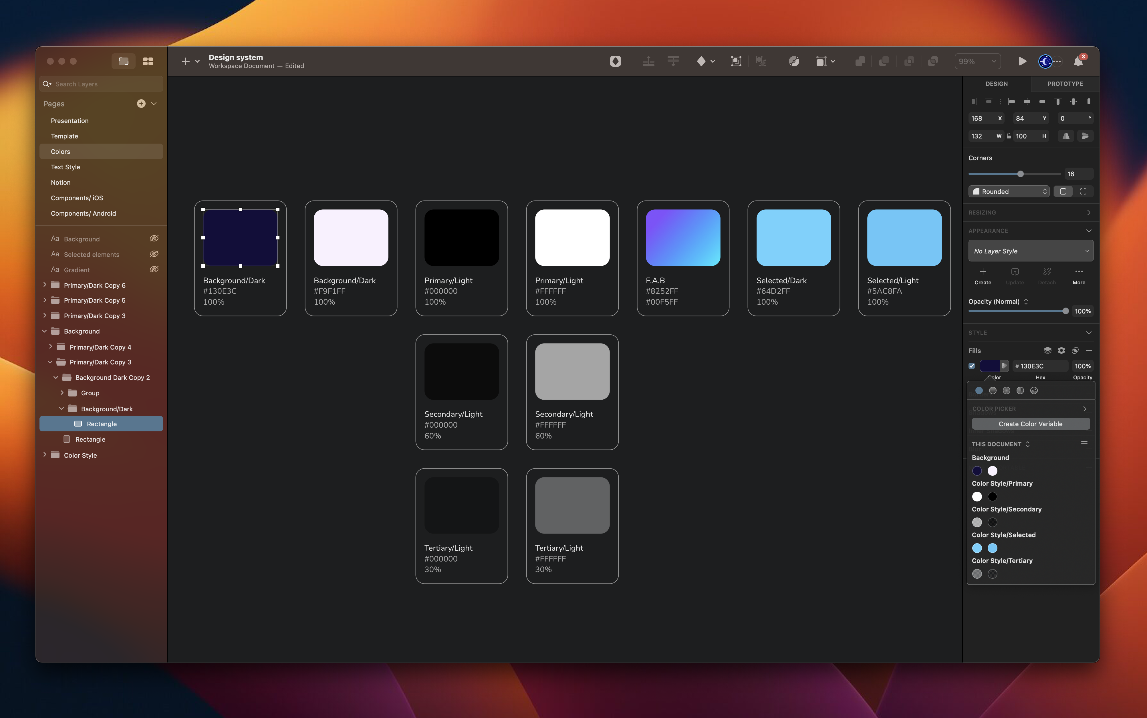
Color Variable
A color variable is a value that can be assigned to a color to use across a design. It allows for easy color management and consistency throughout the design. The color variable can be changed once and it will automatically update all instances of that color in the design. This helps in keeping the design consistent, especially if the color scheme changes.

Create color variable
You can create a new color variable from the Inspector, the Components View, or the Find and Replace menu in Sketch.
- Select a layer, then click on the color well in the Fill section. Select the solid color you want, then click Create Color Variable. Name it and click Create or press Enter to save.
![Color and Text Styles image 3]()

Apply Color Variable
Select the layer where you want to apply a Color Variable. In the color well for any style property you can select the Color Variable you want from the grid. You can switch between the Color Variables for that document or any Library you have enabled. You can also apply a Color Variable by clicking on the color swatch icon next to the color well.

Color Style
A color variable allows you to store and reuse a specific color value throughout your design. By creating and saving a color style, you can define a color once and apply it to multiple objects or layers in your design, making it easier to manage and maintain consistency in your color choices.
Text Styles
Text Style allows you to save and apply consistent formatting to text in your designs. It will enable you to set text properties such as font, size, color, letter spacing, line height, and more and apply them across multiple text layers in a Sketch document. By creating and using text styles, you can ensure that your text is consistent, making it easier to make changes and updates later on.

Create Color and Text Style
Select a layer, then click on the plus icon to create a text style in the Appearence section. Give it a name and save it.

Apply Text Style
Select a layer and choose the pop-up menu that reads No Text Style under the Appearance section. In the Components Popover, select the Text Style you want to apply. You can use the search bar at the top of the popover to help you find the style you need.

Colors
Colours are an essential part of the design process. As designers, we know how difficult it is to find the right colour combinations for the background, buttons, text styles and other layouts. We can add colour styles to fills, strokes, backgrounds and text, and you may even create colour styles for images or gradients. Color Theory The most important thing you need to learn is the colour wheel. Understanding how the colour wheel works and what colours go well together will help you create a more knowledgeable design.
 Primary Colors
The primary colours are those you can combine to create other colours. The main primary colours are red, yellow and blue. These colours cannot be formed or made from a combination of different colours.
Primary Colors
The primary colours are those you can combine to create other colours. The main primary colours are red, yellow and blue. These colours cannot be formed or made from a combination of different colours.
 Secondary Colors
These colours are the result of mixing the primary colours like purple (a combination of red + blue), green (a variety of blue + yellow) and orange (a combination of red + yellow).
Secondary Colors
These colours are the result of mixing the primary colours like purple (a combination of red + blue), green (a variety of blue + yellow) and orange (a combination of red + yellow).
 Tertiary Colors
The tertiary colours are created by combining a primary colour with secondary colours. Some examples include blue-green and orange-yellow.
Tertiary Colors
The tertiary colours are created by combining a primary colour with secondary colours. Some examples include blue-green and orange-yellow.
 Neutral Tones
The most crucial aspect of colours is the neutral tones. These are the neutralizers, and as such, these keep your designs from feeling too heavy. Most importantly, the neutral tones are easy on the eye and defer the user's attention to the content. You can use these as backgrounds.
Neutral Tones
The most crucial aspect of colours is the neutral tones. These are the neutralizers, and as such, these keep your designs from feeling too heavy. Most importantly, the neutral tones are easy on the eye and defer the user's attention to the content. You can use these as backgrounds.

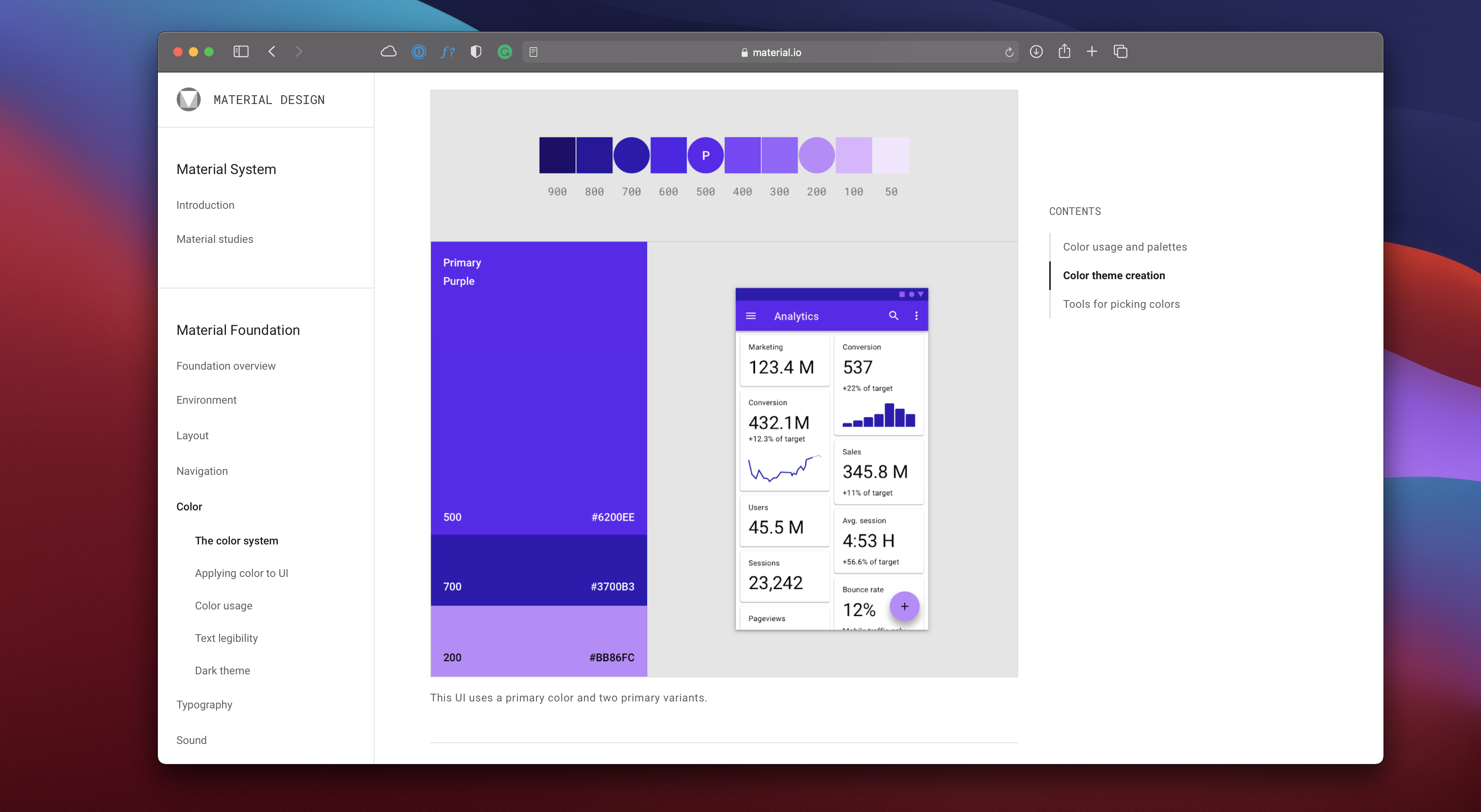
Material Design Color System
You can use the colour tool from the Material Design Color System. With that tool, you can create colour palettes for your UI. The app allows you to preview your colour palette in some UI samples they provide, and if you update a colour, you can see the new colour updated in real-time.
Playlist Design
Now, let's jump into the design! We're going to design the playlist screen. In the previous section, we already built the top card, so we will easily insert it into the artboard and then create the playlist layout.
- First, we'll duplicate the music player screen and delete everything except the status bar, home indicator and BG.
![Color and Text Styles image 15]()

Top Navigation
On this screen, the top navigation is different from the music player. We will replace the icon with a back arrow. The only action on this screen is to go back to the previous page.
- Select the top navigation, and delete the more icon. Replace the arrow down icon with the arrow-ios-left instead.
- Change the title to __Now Playing __and moves the title to the left next to the arrow back icon. The spacing from the text and arrow left icon is 8.

Insert a Symbol Instance
We will insert the top card we have built; if not made, you can choose from the symbols document. This card will define the album we have chosen, and then we will create our playlist.
- Click on the diamont icon on the top menu and add the top card. The spacing is 24 from the Top navigation group.
![Color and Text Styles image 17]()

Playlist Layout
So let's start preparing the base and adding a title for our playlist layout. With a strong foundation and an eye-catching title, we will be one step closer to creating a successful and engaging playlist for our audience.
- Create a rectangle of 390 by 395, corner radius 30, fill: color white 10%, blend mode: overlay, border: linear, color white, and overlay.
- Write a title Featuring using the __Subtitle __text style for iOS/Dark.

Create Music Layout
Once the base is in place, we will turn our attention to the next step of designing our playlist. We will build our playlist from scratch, or you can also integrate the pre-made List Layout that I have included in the symbols document.
- Create a rectangle 390 by 70, and make it transparent. Create a square of 50 by 50, fill it with an image, corner radius of 10. Write the title of the music and select body 1 text style. Write the artist's name using the body 2 text style. Create a separator using Line 359, color black 10%.

Conclusion
This is a simple way to add some polish to your design process in a short amount of time. It becomes super simple to update colors and text styles, so if you have a color scheme or style guide, it can become less important to have predefined colors and fonts applied to every object.
Templates and source code
Download source files
Download the videos and assets to refer and learn offline without interuption.
Design template
Source code for all sections
Video files, ePub and subtitles
Assets
Subtitles
Videos
1
The Sketch Design Tool
Design effectively in Sketch with the Sketch design tool handbook
3:21
2
Icons and Shapes
Unleashing the power of visual elements by mastering icon, font, and shape in Sketch design
18:28
3
Smart Layout
Turn your symbol into responsive components that automatically resize to fit their content when resizing
10:04
4
Color and Text Styles
Save time reusing design elements by creating color variable and text styles
8:05
5
Components and Tint
Design faster with reusable design elements for your next project
10:24
6
Libraries and Developer Handoff
The tools you need for a truly collaborative design process to share with your team
8:47
7
Annotations
Adding an annotation to your designs makes it easy to collaborate with team members and ensures you are on the right track with your project
10:45
8
Prototype Interactions
Learn the basics of the prototype, such as scrolling and animation
3:32
9
Overlays and Mirror App
Build a more complex prototype and preview it in your device using the Sketch mirror
4:09
Meet the instructor
We all try to be consistent with our way of teaching step-by-step, providing source files and prioritizing design in our courses.
Sourasith Phomhome
UI Designer
Designer at Design+Code
19 courses - 72 hours
Master AI Prompting for Stunning UI
Learn how to leverage AI tools like Aura for creating beautiful designs, working with templates, and experimenting with advanced prompts. A concise guide for designers and developers to level up their skills.
10 hrs
Design Multiple Apps with Figma and AI
In this course, you’ll learn to design multiple apps using Figma and AI-powered tools, tackling a variety of real-world UI challenges. Each week, a new episode will guide you through a different design, helping you master essential UI/UX principles and workflows
4 hrs
SwiftUI Fundamentals Handbook
A comprehensive guide to mastering Swift programming fundamentals, designed for aspiring iOS developers. This handbook provides a structured approach to learning Swift's core concepts, from basic syntax to advanced programming patterns. Through carefully sequenced chapters, readers will progress from essential programming concepts to object-oriented principles, building a solid foundation for SwiftUI development. Each topic includes practical examples and clear explanations, ensuring a thorough understanding of Swift's capabilities. This handbook serves as both a learning resource and a reference guide, covering fundamental concepts required for modern iOS development. Topics are presented in a logical progression, allowing readers to build their knowledge systematically while gaining practical programming skills.
2 hrs
Design and Code User Interfaces with Galileo and Claude AI
In this course, you’ll learn how to use AI tools to make UI/UX design faster and more efficient. We’ll start with Galileo AI to create basic designs, providing a solid foundation for your ideas. Next, we’ll refine these designs in Figma to match your personal style, and finally, we’ll use Claude AI to turn them into working code—eliminating the need for traditional prototyping.
4 hrs
Design and Prototype for iOS 18
Design and Prototype for iOS 18 is an immersive course that equips you with the skills to create stunning, user-friendly mobile applications. From mastering Figma to understanding iOS 18's latest design principles, you'll learn to craft two real-world apps - a Car Control interface and an AI assistant.
3 hrs
Master Responsive Layouts in Figma
Creating responsive layouts is a must-have skill for any UI/UX designer. With so many different devices and screen sizes, designing interfaces that look great and work well on all platforms is necessary. Mastering this skill will make you stand out in the field. In this course, we'll start from scratch to create this beautiful design using Figma. You'll learn how to make layouts that are easy to use and work well on any device. We'll cover key concepts and tools to help you master responsive design in Figma.
2 hrs
UI UX Design with Mobbin and Figma
Mobbin is a powerful tool for UI/UX designers seeking inspiration and innovative design solutions. This platform offers a vast collection of real-world mobile app designs, providing a treasure trove of UI elements and layouts.
2 hrs
3D UI Interactive Web Design with Spline
Learn to create 3D designs and UI interactions such as 3D icons, UI animations, components, variables, screen resize, scrolling interactions, as well as exporting, optimizing, and publishing your 3D assets on websites
3 hrs
Design and Prototype for iOS 17 in Figma
Crafting engaging experiences for iOS 17 and visionOS using the Figma design tool. Learn about Figma's new prototyping features, Dev Mode, variables and auto layout.
6 hrs
Design and Prototype Apps with Midjourney
A comprehensive course on transforming Midjourney concepts into interactive prototypes using essential design techniques and AI tools
8 hrs
iOS Design with Midjourney and Figma
Learn the fundamentals of App UI design and master the art of creating beautiful and intuitive user interfaces for mobile applications
1 hrs
UI Design for iOS, Android and Web in Sketch
Create a UI design from scratch using Smart Layout, Components, Prototyping in Sketch app
1 hrs
UI Design a Camera App in Figma
Design a dark, vibrant and curvy app design from scratch in Figma. Design glass icons, lens strokes and realistic buttons.
1 hrs
UI Design for iOS 16 in Sketch
A complete guide to designing for iOS 16 with videos, examples and design files
3 hrs
Prototyping in Figma
Learn the basics of prototyping in Figma by creating interactive flows from custom designs
1 hrs
UI Design Quick Websites in Figma
Learn how to design a portfolio web UI from scratch in Figma
1 hrs
UI Design Android Apps in Figma
Design Android application UIs from scratch using various tricks and techniques in Figma
2 hrs
UI Design Quick Apps in Figma
Design application UIs from scratch using various tricks and techniques in Figma
12 hrs
Figma Handbook
A comprehensive guide to the best tips and tricks in Figma. Not affiliated with or endorsed by Figma, Inc.
6 hrs