
Smart Layout
Add to favorites
Turn your symbol into responsive components that automatically resize to fit their content when resizing
Play video

Ressources
Smart Layout
With smart layout, you can optimize your symbol and turn them into responsive component that automatically resize to fit the content.
Smart Layout automatically adjusts the padding and spacing between layers in a Symbol when an override changes its size, once it has been set up. Changing an override in a Symbol's instance will resize the Symbol automatically.

Responsive Component
With Smart Layout, you can optimize your symbols and turn them into responsive components that automatically resize to fit their content. Instead of manually resizing each symbol instance, let Smart Layout take care of it. Go to the symbol master and choose its layout properties in the inspector.
Create a Symbol
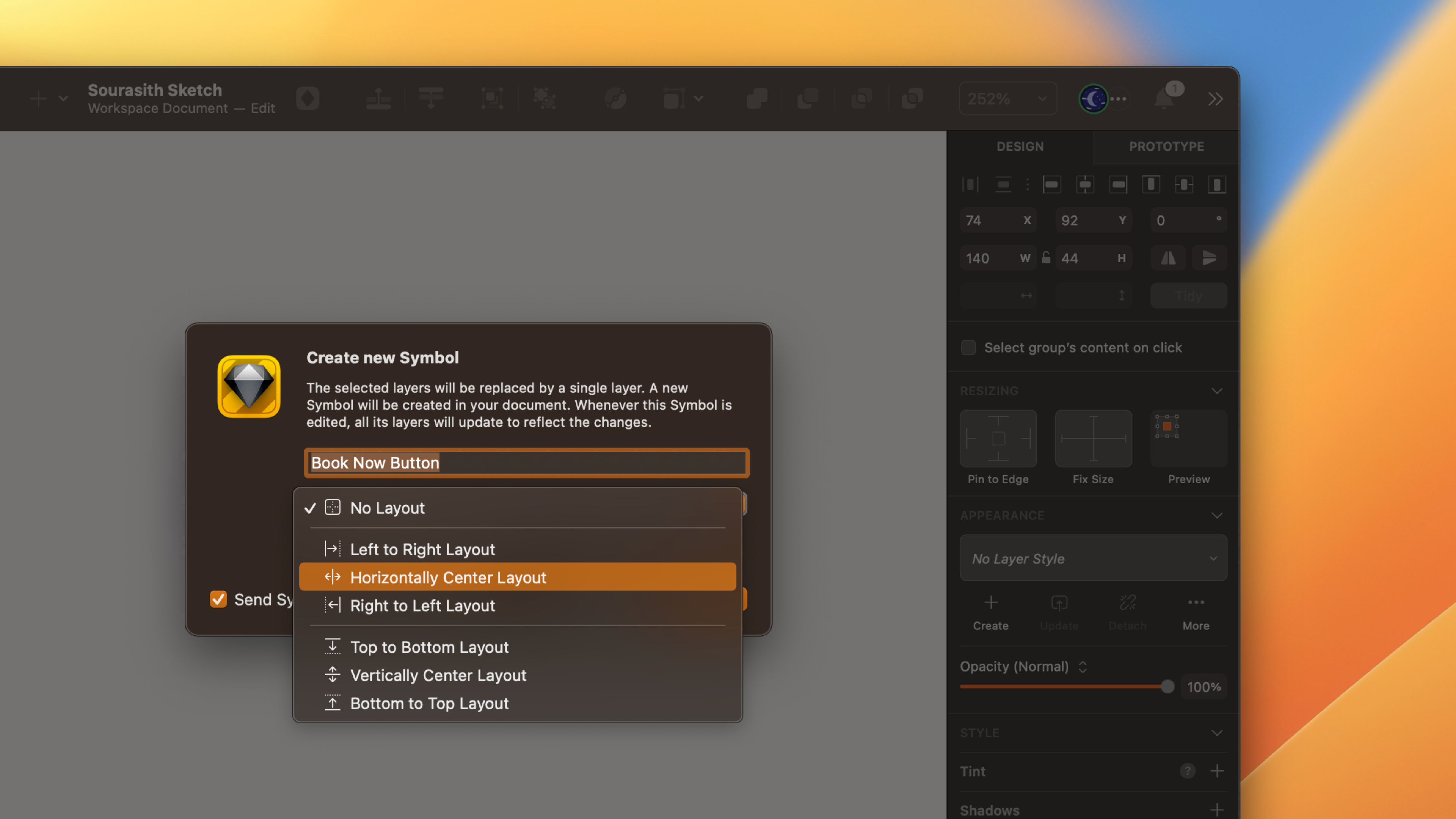
If you create a new symbol, you can choose the layout settings using this drop-down menu. You must designate a horizontal or vertical layout and the direction. Smart Layout will use the spacing and padding between the layers of the symbol to maintain consistency as you change the overlays and adjust the size of the symbol instances.
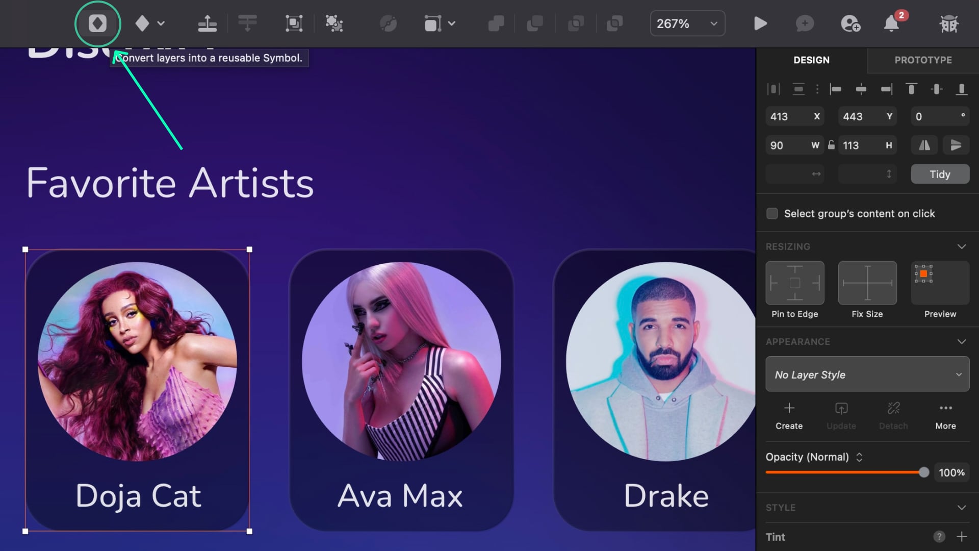
- Select a group, Artboard, or a selection of layers, and click "Convert layers into a reusable Symbol" in the toolbar or press "Command+Y" on your keyboard.
![Smart Layout image 4]()
- Choose whether your symbol resizes horizontally or vertically. You must define the direction from which it resizes and click “Create.”
![Smart Layout image 5]()
Manually resize
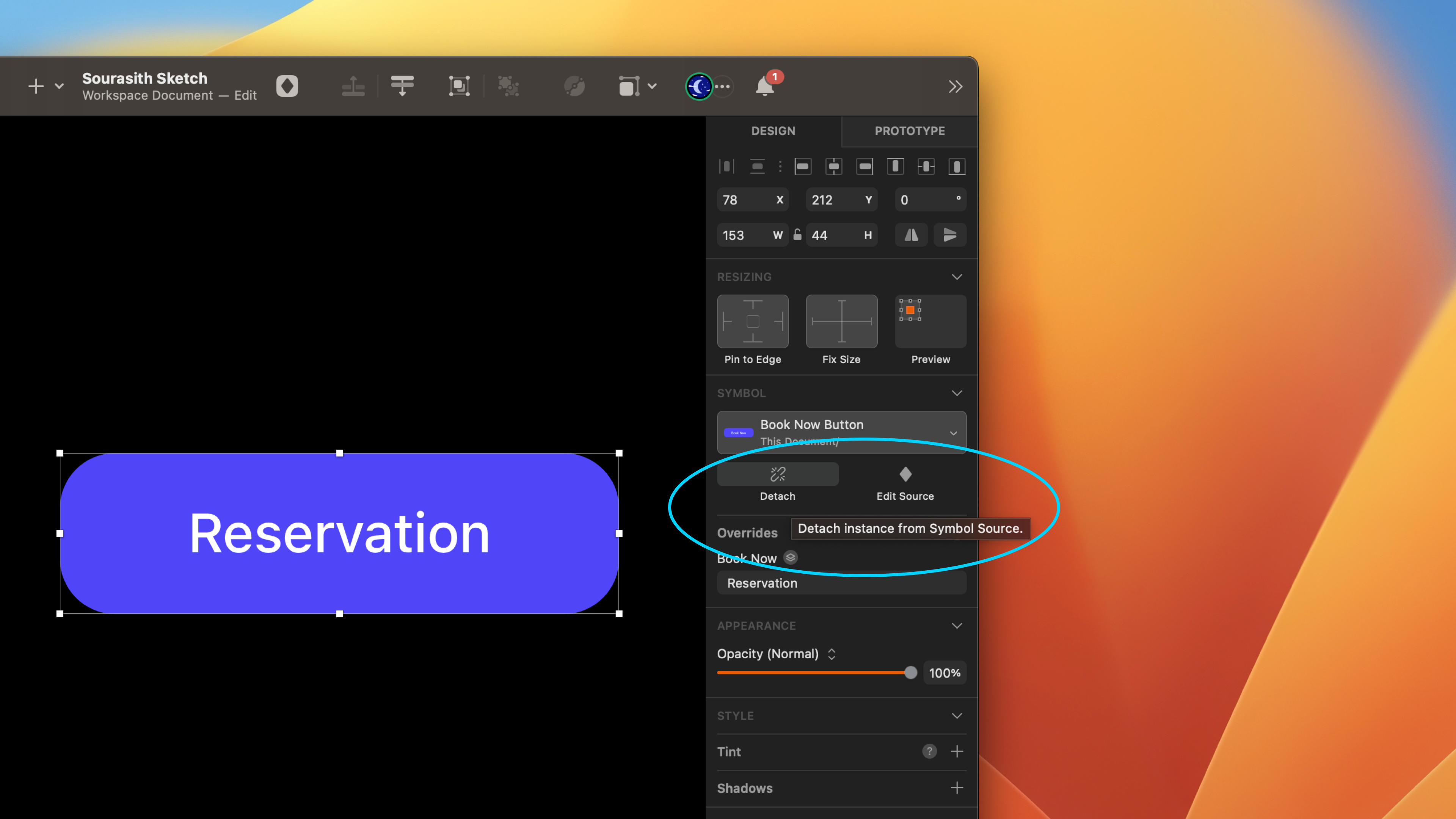
It would be best if you did not manually resize instances of a symbol with Smart Layout properties applied to them, as this may cause an unexpected appearance. To manually resize such a symbol instance, detach it or remove the Smart Layout properties from the symbol source.
Add Constraint
You can apply resizing constraints to layers of a symbol with smart layout properties. It can be helpful if you want a specific layer to ignore the layout settings of the symbol it is part of. For example, you can use resize constraints to fix the size of a layer and prevent it from resizing along with a symbol instance with a horizontal or vertical layout.

Adjust Content on Resize
When you resize an Artboard, you can control how its layers respond. You can choose to keep everything in place and at its original size or resize all the content. Additionally, you can use resizing constraints applied directly to the layers to control their behaviour further.
Resizing Option
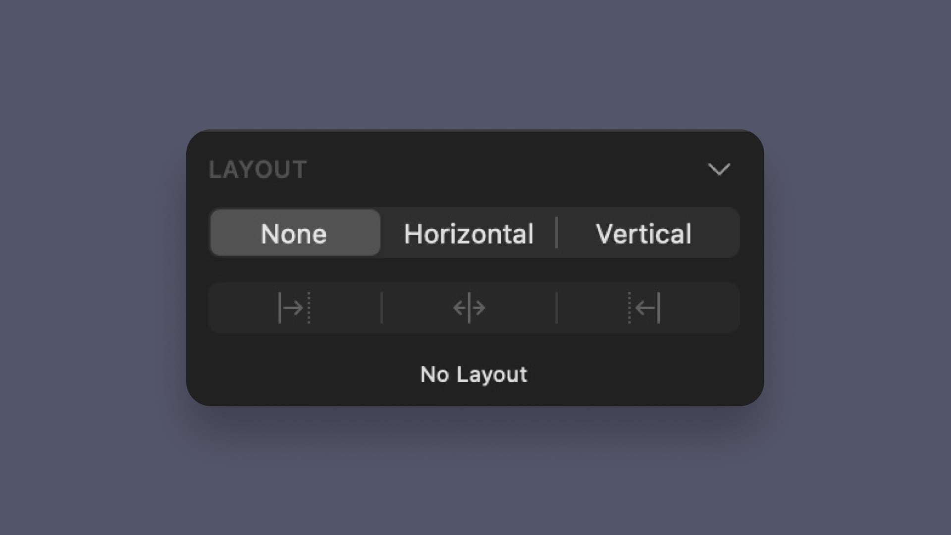
Resizing constraints in the Inspector allows you to control how layers behave when the Artboard, group, or Symbol they're a part of is resized. It ensures that the contents maintain their shape and proportion when scaled. It's useful when designing for multiple device sizes or desktops. The available Resizing constraints options are Pin to Edge, Fix Size and Preview.
- Pin to Edge allow you to choose the edges of a parent on which your layer will be pinned when resizing, click on the edges you want to activate.
- Fix Size lets you determines whether a layer's height and width should stretch or stay at a fixed size when the parent is resized.
- Preview shows how the controls you select affect your Layer’s behavior.

Button
Creating a button is an essential part of designing user interfaces. A button allows users to interact with your application by triggering an action when clicked or tapped.
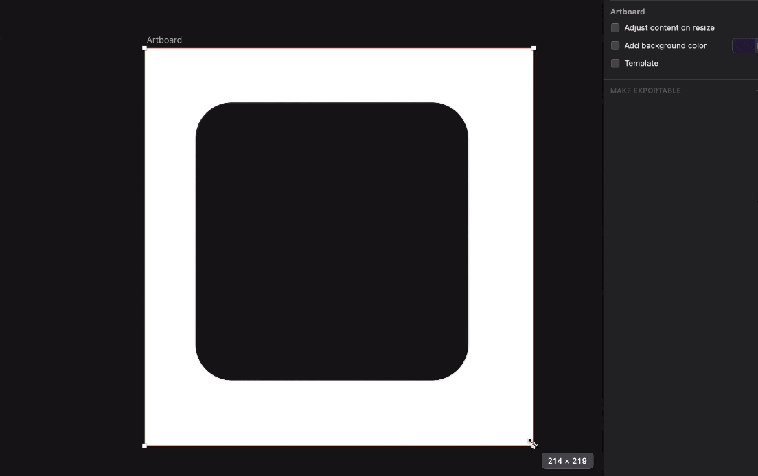
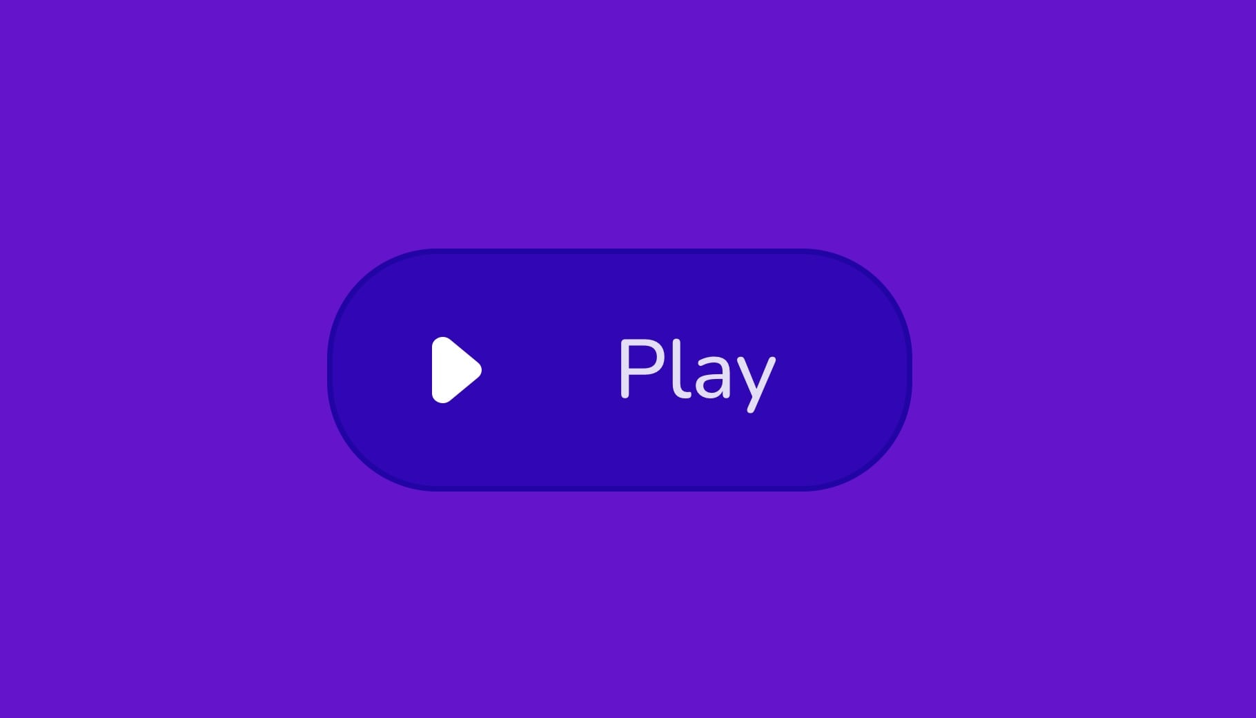
- Create a rectangle of 106 by 44, which will serve as your base. Take the "play" icon and put it in a 44 by 44 transparent frame. Group it and name it Play. Then put the icon on the rectangle and align it to the left. Press "T" and write "Play" using medium and size 15. The spacing between the icon and the text is 8.
- Fill color black 50%, overlay, border linear white black 30% witdh 1 , background blur 10 ou 5
![Smart Layout image 10]()
Top Card
A card is a UI design element used to display key information or highlight a specific item or content. Also, it draws attention to the most important or relevant information within a data set. This can be achieved through visual cues such as color, typography, and imagery.
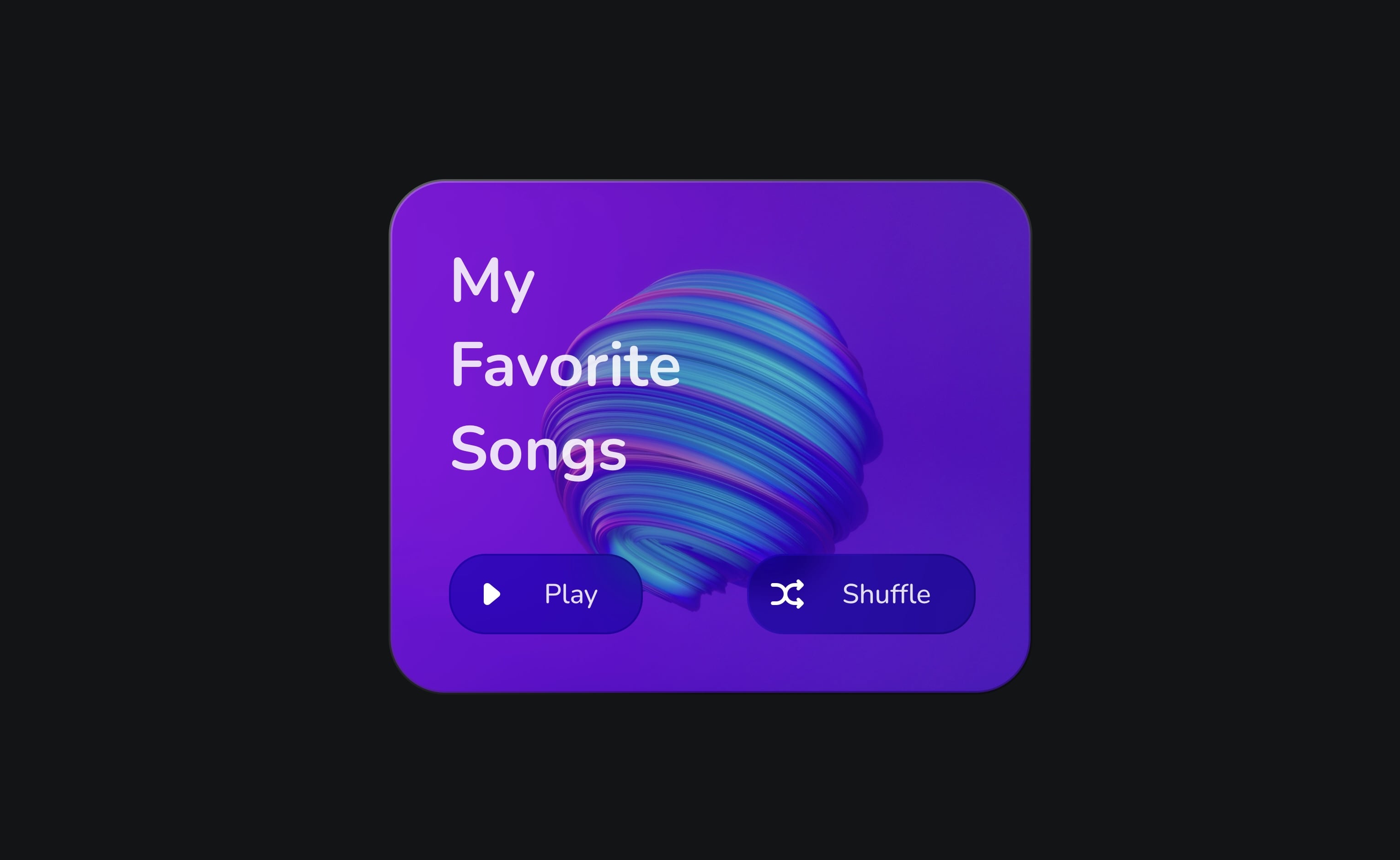
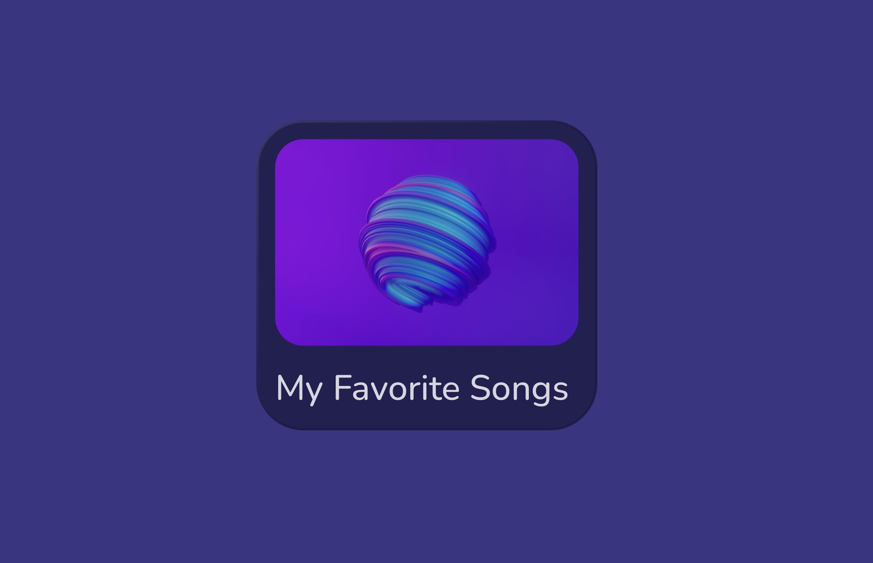
- Create a rectangle of 359 by 280, and fill it with an image. Add border, the Linear colour white and colour black, with 2. Add the button symbol, duplicate, and change the text to Shuffle and the icon.
- Press on T, write My Favorite Songs, bold, size 32, and the colour white. Add everything in a group and name Top Card.
![Smart Layout image 11]()
Creating Layout
A well-designed layout can improve the user experience and make it easier for users to access and use an application's features. A layout should be flexible and adapt to different screen sizes and orientations to be used effectively on various devices.
Medium Layout
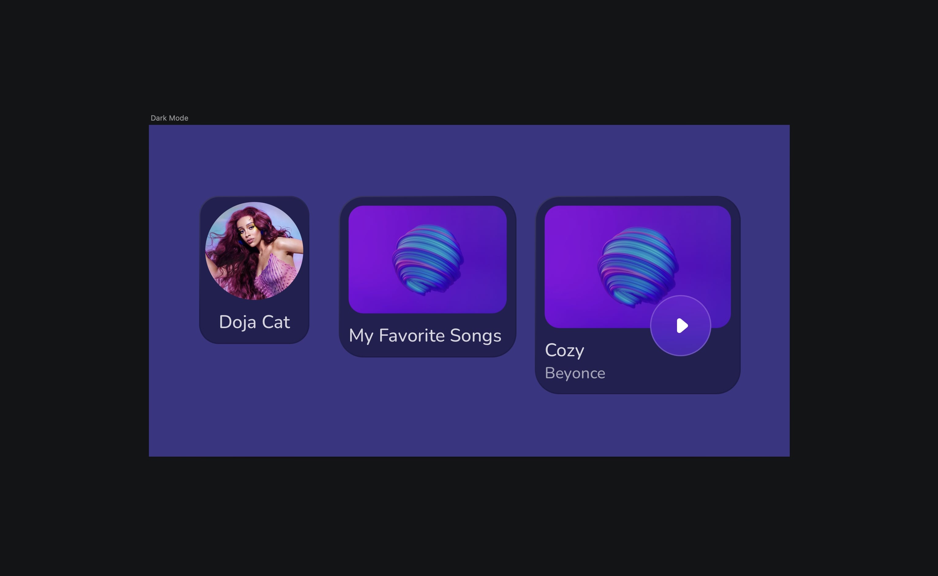
This medium-sized layout is perfect for displaying albums. Its optimized size and arrangement allow users to easily view and interact with their favourite albums, making for an enjoyable browsing experience.
- Create a rectangle of 145 by 130, corner radius 20. Fill, colour black 40%, and Overlay. Border starting colour: white 10%, ending colour: black, 10%, center and width 1. Name the layer Base. Create another rectangle of 129 by 88,corner 12, fill it with an image. Place on top of the base and the spacing is eight from the top, right and left. Add a text, regular, 15, white. Spacing is eight from the left, top and bottom. Put everything in a group and name by Layout Medium.
![Smart Layout image 13]()
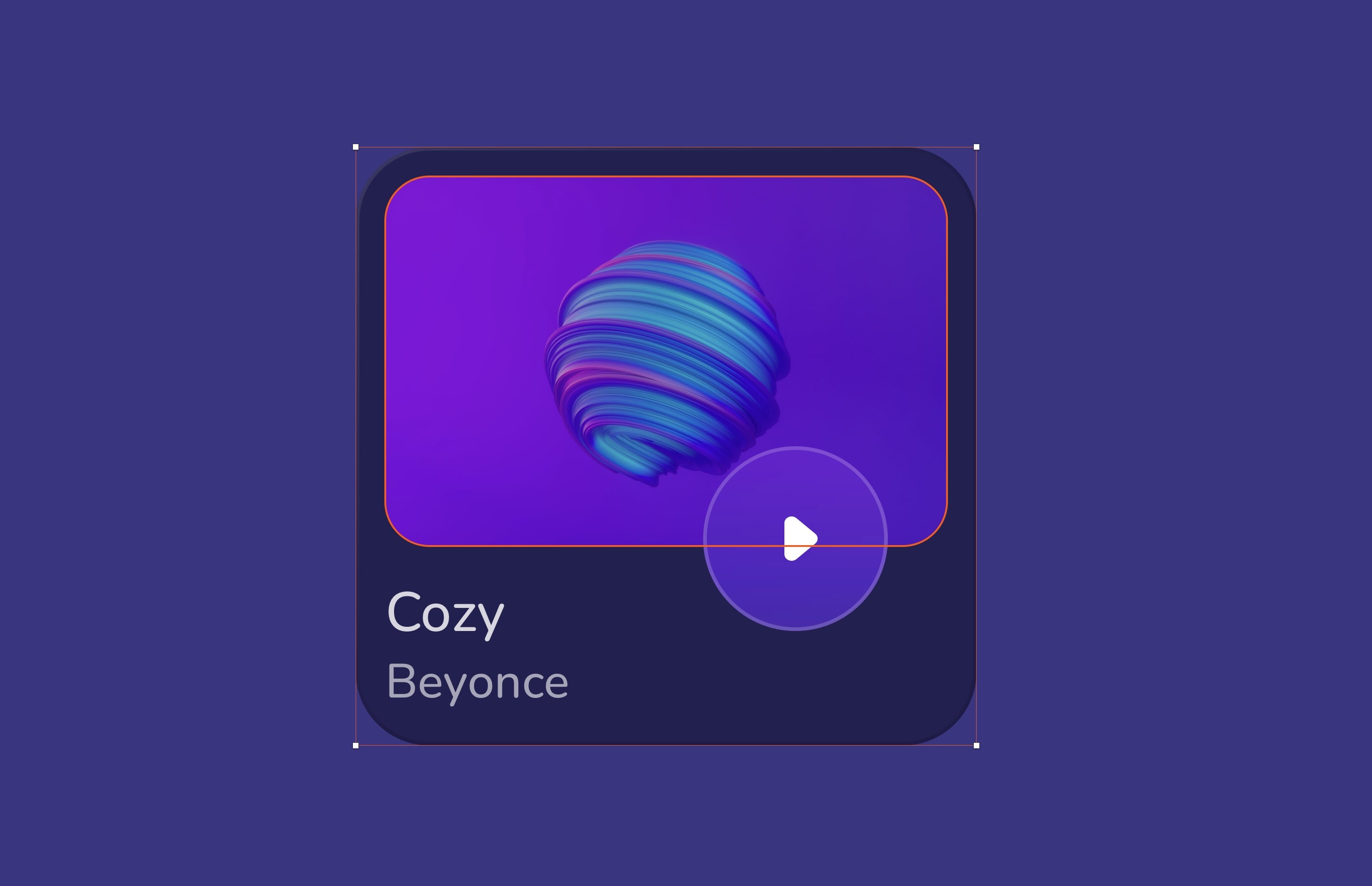
Large Layout
The large layout perfectly showcases complete artist profiles, including their name, image, and music. This layout provides ample space for displaying the music title, making it easy for users to quickly find the music they are looking for. With a play button, users can listen to their favourite tracks with just one click.
- Duplicate the medium layout, select the image , and pin the object on the left, top and right edges in the resizing option. Select the text and pin the object to the left and bottom. Select the right edge and drag to resize until you hit 168 by 162. Rename by Large Layout.
- Change the image size to 146 by 98. Duplicate the text and place it at the top of the other text. It's going to be the title of the song. Then, select the text at the bottom. It will be the singer's name, change the size to 13 and reduce the opacity to 60%. Duplicate the Play button. The spacing is 29 from the bottom and 24 from the right.
![Smart Layout image 14]()
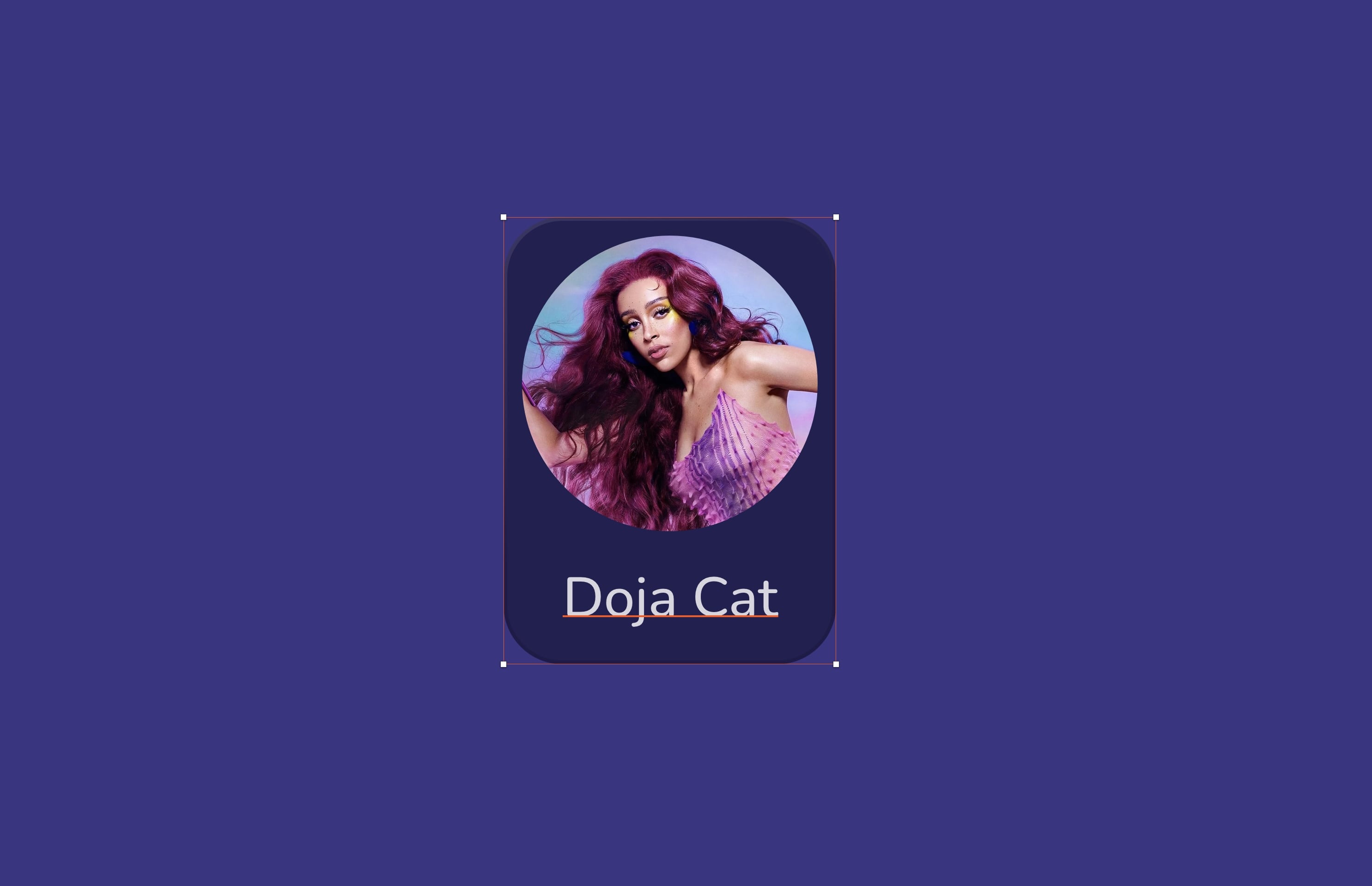
Small Layout
The small layout is ideal for showcasing individual artists or singers. Its compact size allows for quick and easy access to essential information about the artist, such as their name and image. Whether browsing on a mobile device or a desktop, the small layout provides a clear and concise presentation of the artist's profile.
- Duplicate the medium layout, delete the rectangular shape, and replace it with an 80 by 80 circle. Fill it with an image. Select the base of the layout, and resize it until you reach 90 by 121. The spacing between the circle and the rectangle is five from the right, left and top.
![Smart Layout image 15]()
Light Mode
We will create light versions of the three layouts by duplicating them and creating symbols for each layout to simplify the design process for both Android and desktop by selecting either the dark or light version, maintaining consistent layouts.
- Change the background color to white 30%. Add border, color black 30%, Overlay, center and width 1.
- Select the play button, change the color background to white 50%, and overlay. Add the border color black 10% and change the color icon to black.
![Smart Layout image 16]()

Conclusion
With these tools, you can create interfaces that adapt to different screen sizes and devices while maintaining a consistent look and feel. By utilizing Smart layout and Constraint, you can save time and effort in the design process while still delivering a high-quality product.
Templates and source code
Download source files
Download the videos and assets to refer and learn offline without interuption.
Design template
Source code for all sections
Video files, ePub and subtitles
Assets
Subtitles
Videos
1
The Sketch Design Tool
Design effectively in Sketch with the Sketch design tool handbook
3:21
2
Icons and Shapes
Unleashing the power of visual elements by mastering icon, font, and shape in Sketch design
18:28
3
Smart Layout
Turn your symbol into responsive components that automatically resize to fit their content when resizing
10:04
4
Color and Text Styles
Save time reusing design elements by creating color variable and text styles
8:05
5
Components and Tint
Design faster with reusable design elements for your next project
10:24
6
Libraries and Developer Handoff
The tools you need for a truly collaborative design process to share with your team
8:47
7
Annotations
Adding an annotation to your designs makes it easy to collaborate with team members and ensures you are on the right track with your project
10:45
8
Prototype Interactions
Learn the basics of the prototype, such as scrolling and animation
3:32
9
Overlays and Mirror App
Build a more complex prototype and preview it in your device using the Sketch mirror
4:09
Meet the instructor
We all try to be consistent with our way of teaching step-by-step, providing source files and prioritizing design in our courses.
Sourasith Phomhome
UI Designer
Designer at Design+Code
19 courses - 72 hours
Master AI Prompting for Stunning UI
Learn how to leverage AI tools like Aura for creating beautiful designs, working with templates, and experimenting with advanced prompts. A concise guide for designers and developers to level up their skills.
10 hrs
Design Multiple Apps with Figma and AI
In this course, you’ll learn to design multiple apps using Figma and AI-powered tools, tackling a variety of real-world UI challenges. Each week, a new episode will guide you through a different design, helping you master essential UI/UX principles and workflows
4 hrs
SwiftUI Fundamentals Handbook
A comprehensive guide to mastering Swift programming fundamentals, designed for aspiring iOS developers. This handbook provides a structured approach to learning Swift's core concepts, from basic syntax to advanced programming patterns. Through carefully sequenced chapters, readers will progress from essential programming concepts to object-oriented principles, building a solid foundation for SwiftUI development. Each topic includes practical examples and clear explanations, ensuring a thorough understanding of Swift's capabilities. This handbook serves as both a learning resource and a reference guide, covering fundamental concepts required for modern iOS development. Topics are presented in a logical progression, allowing readers to build their knowledge systematically while gaining practical programming skills.
2 hrs
Design and Code User Interfaces with Galileo and Claude AI
In this course, you’ll learn how to use AI tools to make UI/UX design faster and more efficient. We’ll start with Galileo AI to create basic designs, providing a solid foundation for your ideas. Next, we’ll refine these designs in Figma to match your personal style, and finally, we’ll use Claude AI to turn them into working code—eliminating the need for traditional prototyping.
4 hrs
Design and Prototype for iOS 18
Design and Prototype for iOS 18 is an immersive course that equips you with the skills to create stunning, user-friendly mobile applications. From mastering Figma to understanding iOS 18's latest design principles, you'll learn to craft two real-world apps - a Car Control interface and an AI assistant.
3 hrs
Master Responsive Layouts in Figma
Creating responsive layouts is a must-have skill for any UI/UX designer. With so many different devices and screen sizes, designing interfaces that look great and work well on all platforms is necessary. Mastering this skill will make you stand out in the field. In this course, we'll start from scratch to create this beautiful design using Figma. You'll learn how to make layouts that are easy to use and work well on any device. We'll cover key concepts and tools to help you master responsive design in Figma.
2 hrs
UI UX Design with Mobbin and Figma
Mobbin is a powerful tool for UI/UX designers seeking inspiration and innovative design solutions. This platform offers a vast collection of real-world mobile app designs, providing a treasure trove of UI elements and layouts.
2 hrs
3D UI Interactive Web Design with Spline
Learn to create 3D designs and UI interactions such as 3D icons, UI animations, components, variables, screen resize, scrolling interactions, as well as exporting, optimizing, and publishing your 3D assets on websites
3 hrs
Design and Prototype for iOS 17 in Figma
Crafting engaging experiences for iOS 17 and visionOS using the Figma design tool. Learn about Figma's new prototyping features, Dev Mode, variables and auto layout.
6 hrs
Design and Prototype Apps with Midjourney
A comprehensive course on transforming Midjourney concepts into interactive prototypes using essential design techniques and AI tools
8 hrs
iOS Design with Midjourney and Figma
Learn the fundamentals of App UI design and master the art of creating beautiful and intuitive user interfaces for mobile applications
1 hrs
UI Design for iOS, Android and Web in Sketch
Create a UI design from scratch using Smart Layout, Components, Prototyping in Sketch app
1 hrs
UI Design a Camera App in Figma
Design a dark, vibrant and curvy app design from scratch in Figma. Design glass icons, lens strokes and realistic buttons.
1 hrs
UI Design for iOS 16 in Sketch
A complete guide to designing for iOS 16 with videos, examples and design files
3 hrs
Prototyping in Figma
Learn the basics of prototyping in Figma by creating interactive flows from custom designs
1 hrs
UI Design Quick Websites in Figma
Learn how to design a portfolio web UI from scratch in Figma
1 hrs
UI Design Android Apps in Figma
Design Android application UIs from scratch using various tricks and techniques in Figma
2 hrs
UI Design Quick Apps in Figma
Design application UIs from scratch using various tricks and techniques in Figma
12 hrs
Figma Handbook
A comprehensive guide to the best tips and tricks in Figma. Not affiliated with or endorsed by Figma, Inc.
6 hrs