
Components and Tint
Add to favorites
Design faster with reusable design elements for your next project
Play video

Components
A component is a reusable design element used throughout a project. Under the "Components" tab in the sidebar, you can access various views for your document's design elements, including Pages, Symbols, Text Styles, Layer Styles, and Color Variables. These views help navigate your design system's libraries or examine local components in your design.

Symbols
Symbols can help speed up your workflow by allowing you to save and reuse common design elements. Making changes to a symbol will automatically update all instances of that symbol throughout your designs. Additionally, you can create overrides for specific parts of individual symbols, giving you more control over the design and appearance of your project.
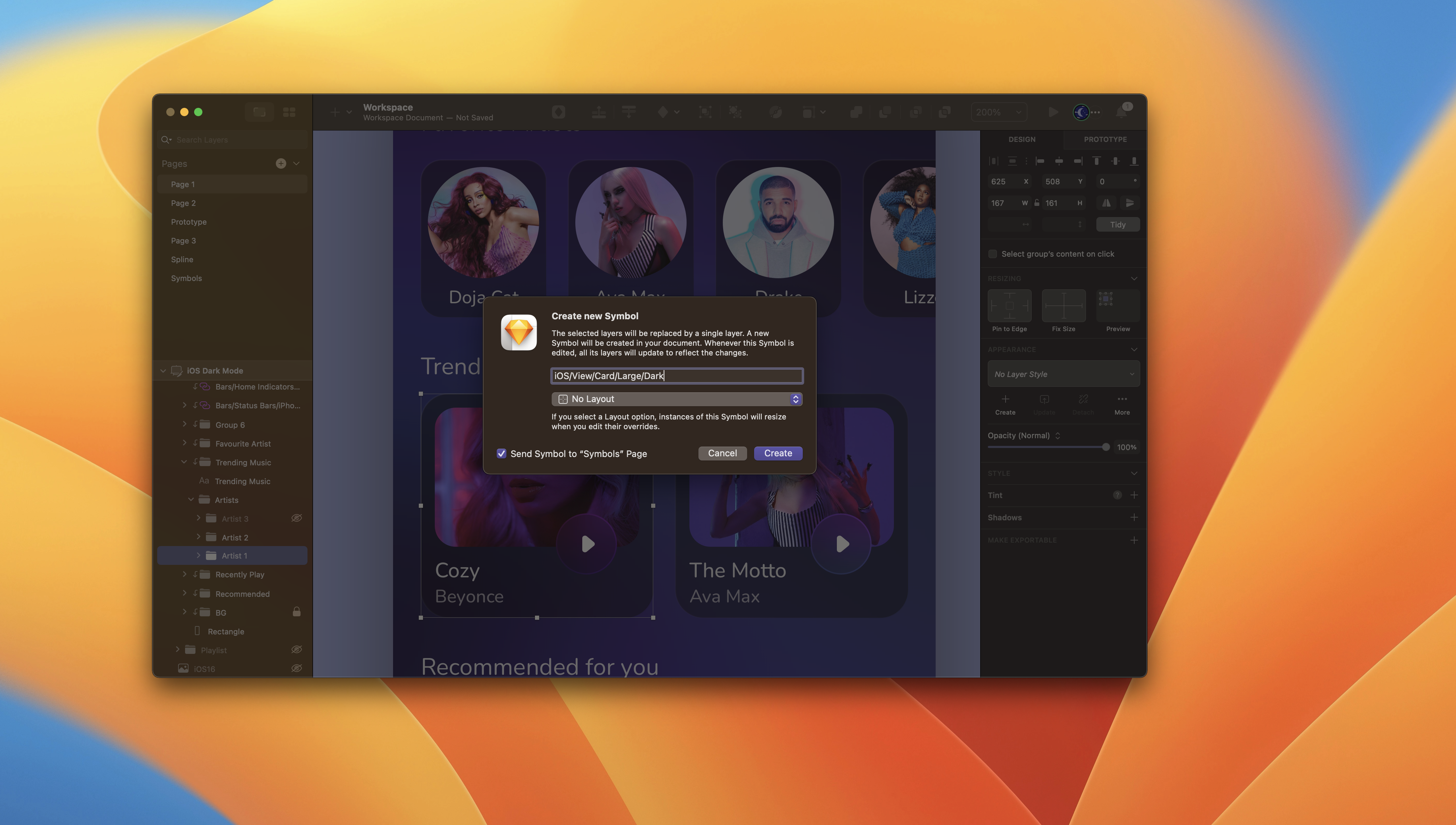
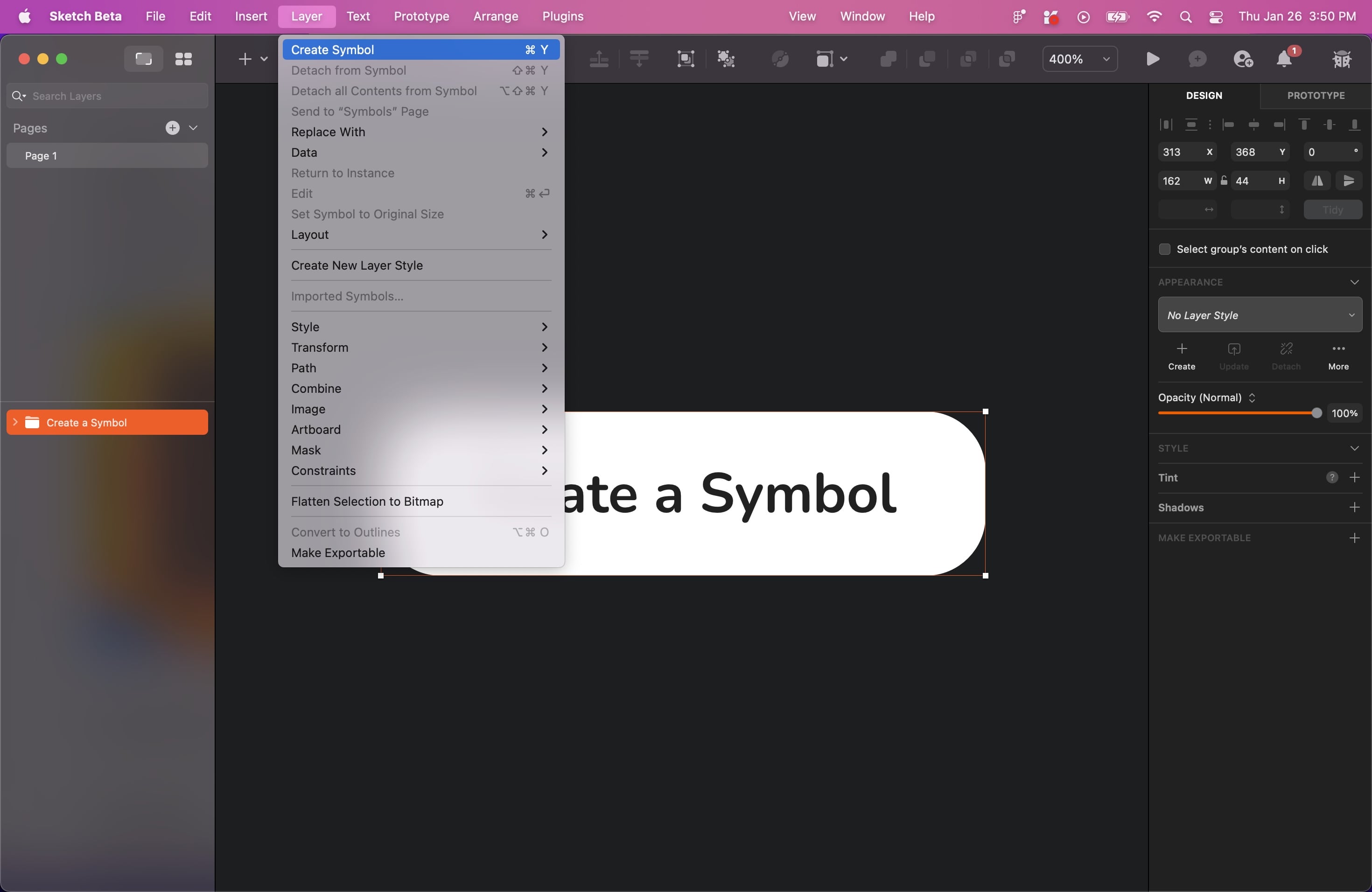
Creating a Symbol
To create a Symbol, select a group, Artboard, or a selection of layers and click on ”Create Symbol ” in the toolbar or press Command+Y on your keyboard. Give your Symbol a name and select the direction for the layout.
Nested Symbols
A nested symbol is a symbol within another symbol, allowing multiple instances of a symbol to be nested within another symbol, creating a hierarchy of symbols. This feature enables more complex designs to be made and managed more efficiently by breaking them down into smaller, reusable components. For example, a button could be a symbol; within that button symbol, there could be other symbols, such as an icon and text. These nested symbols can also be edited and updated while maintaining their relationship to the parent symbol.

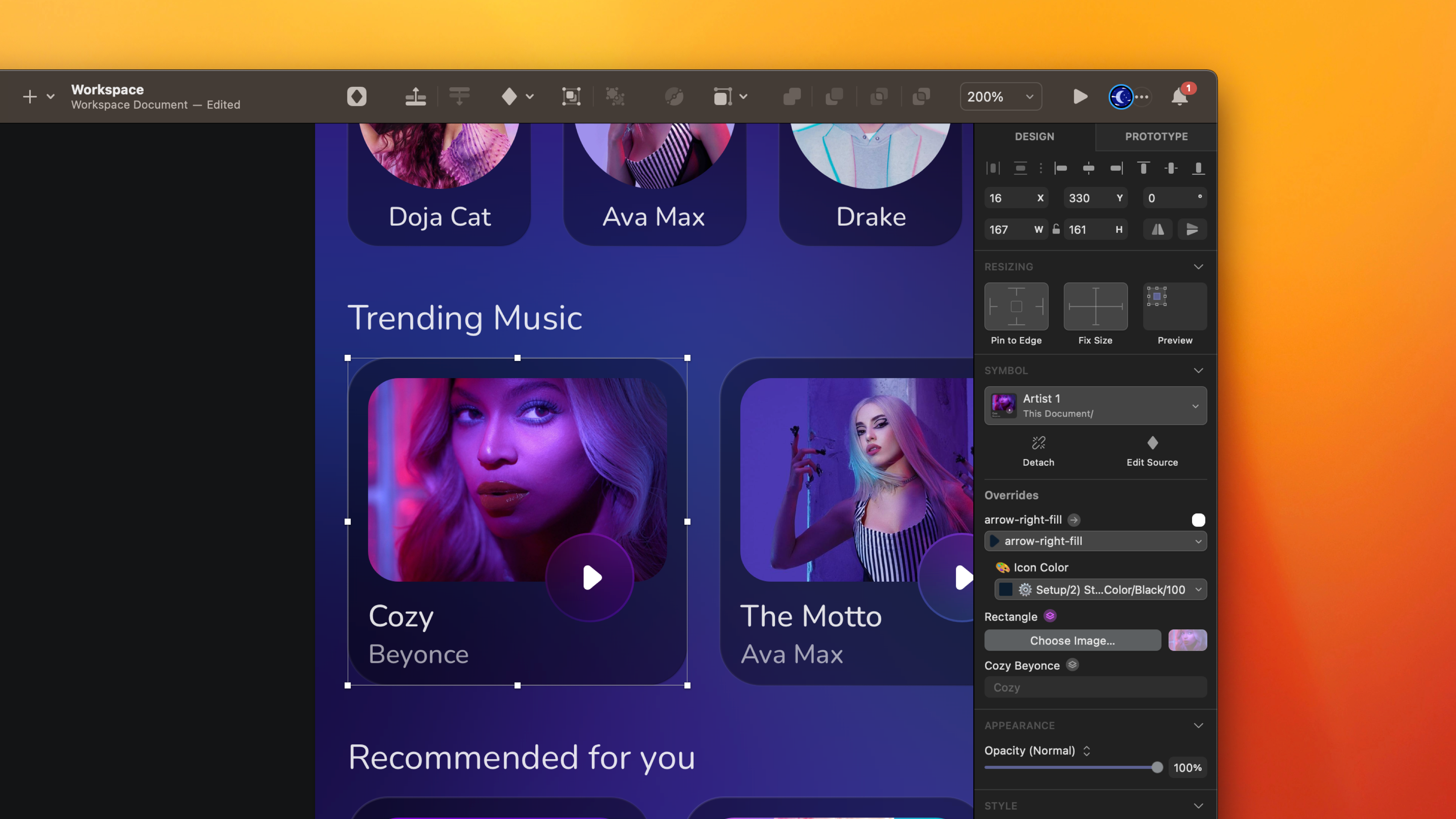
Overrides
The Overrides section in the Design tab of the Inspector allows for customization of consistent design elements by editing Symbol instances without changing the Source or affecting other instances.

Editing Symbols
You can easily edit by Selecting a symbol with an instance. The Overrides section of the Inspector displays all the customizable options, including colours, text values, text styles and layer styles, images, nested symbols and the hotspots they contain.
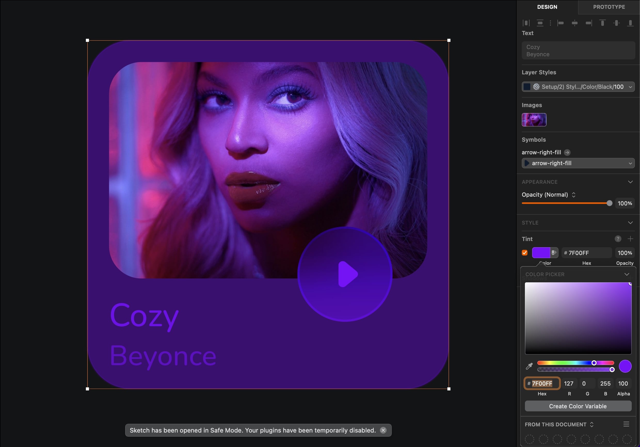
Tint
Tint allows you to change the colour of an image or shape defined as a symbol. Applying a tint to a symbol changes the colour of all instances of that symbol throughout your design. It helps create symbol variations or quickly update your design's colour scheme. Tint allows you to create variations of a symbol without creating separate symbols for each variation, saving time and keeping the design consistent. Tint can be applied to any symbol that contains a fill, border or text colour.
- Click the "+" icon in the Tint panel in the Inspector. Select your fill colour manually, or select the colour style by pressing on the icon at the right.
![Components and Tint image 8]()
Home Page
Let’s jump into the design! The layouts are ready to use, so we’re simply inserting them into the Artboard and creating the tab bar.
- Duplicate the music player Artboard, and delete everything except the status bar, top navigation and the BG group. Hide the BG group layer for the moment by clicking on the hide icon.
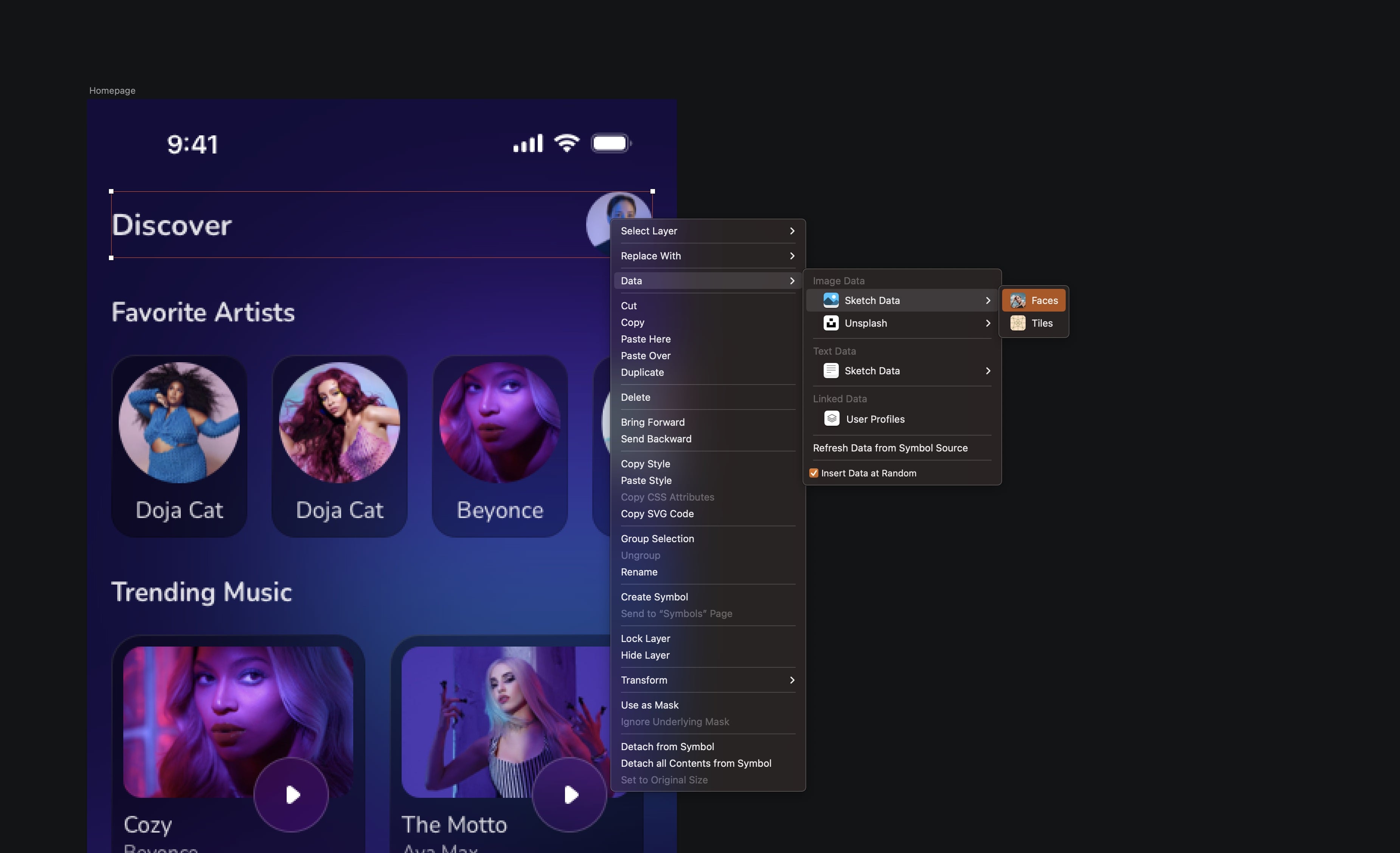
- Select the top navigation, delete the two icons. Select the title, change it to Discover,choose a text style__ iOS/Dark/Title. __Spacing is 16 from the left and align it with the avatar.
Sketch Image Data
Several data sources are included by default in the Mac application, such as Image data and Unsplash. You can add any face image directly to your designs with the image data. With Unsplash, you can search and insert an image from the Unsplash library or a random image.
- Create a circle of 44 by 44 and fill it with an image. You can use Image data or Unsplash pending the actual content. Spacing is eight from the Status bar and 16 from the right.
![Components and Tint image 9]()
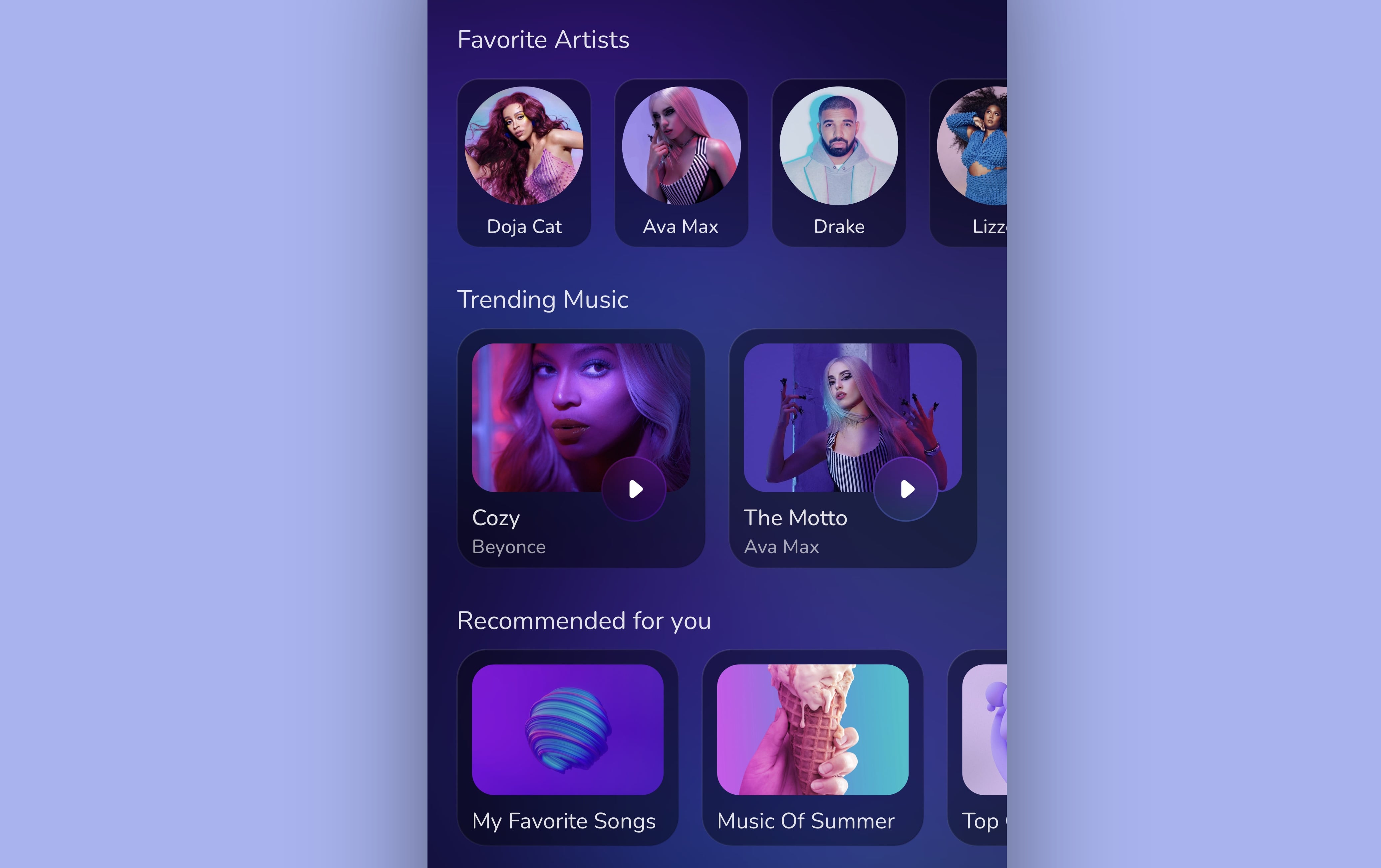
Insert a Symbol Instance on the Canvas
To insert a Symbol on the canvas, click on the diamond icon at the top menu, select “from this document,” and then see all the symbols. There will be three categories, Favorite Artists, Trending Music and Recommended for you.
- Write Favorite Artists and select the iOS/Dark/Subtitle text style. Add the __Small/Layout/Dark __Symbol, duplicate three more. The spacing between each element is 16.
- Write Trending Music and select the iOS/Dark/Subtitle text style. Add the __Large/Layout/Dark __Symbol, duplicate one more. The spacing between each element is 16.
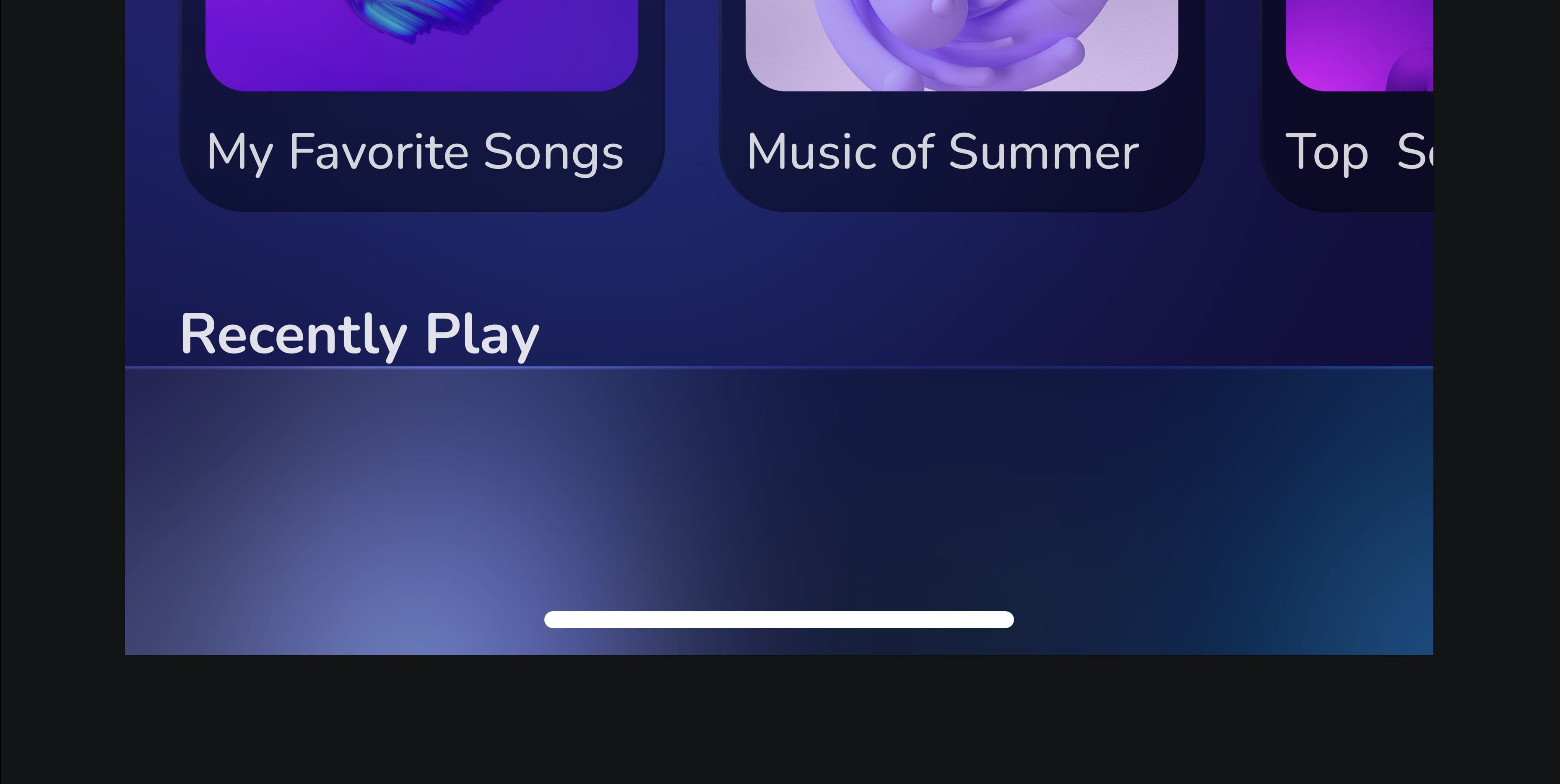
- Write Recommended for you and select the iOS/Dark/Subtitle text style. Add the __Medium/Layout/Dark __Symbol, duplicate two more. The spacing between each element is 16.

Overrides
Select a Symbol instance, and you'll see an Overrides section in Inspector's design tab. By editing these overrides in the Inspector, you can change the content inside an individual Symbol instance without changing the Source or affecting any other instance. Have fun and change the text and image.
Tab Bar
I have already created it for you. Take it from the symbol document, or learn to make it with me.
- Create a rectangle of 390 by 86, fill it with the color black 20%, Overlay. Add Border, linear, color white 100, black 0, Overlay. Add background blur 30, Saturation 50%.
- Add a home indicator and place it at the center and bottom of the rectangle.
![Components and Tint image 12]()
Tabs
We’re going to create the tabs for the tab bar. You have two choices: convert the layer to a symbol so you can quickly change the content. Or you can leave it as is. You can still easily change the icon in the override and the text directly in the canvas.
- Create a transparent container by creating a rectangle of 52 by 44. Write Listen, choose Boby 3 text style for iOS/Dark. Add the headphones-fill icon from Eva icons. Place everything in the center of the container. The spacing must be two from the top and bottom. Select the group and convert it into Symbol.
- Duplicate 4 more and change the icon and text. 1: grid-fill icon/ Library, 2: radio-fill icon/Radio, 3: music-fill icon/Playlist, 4: search icon/Search.
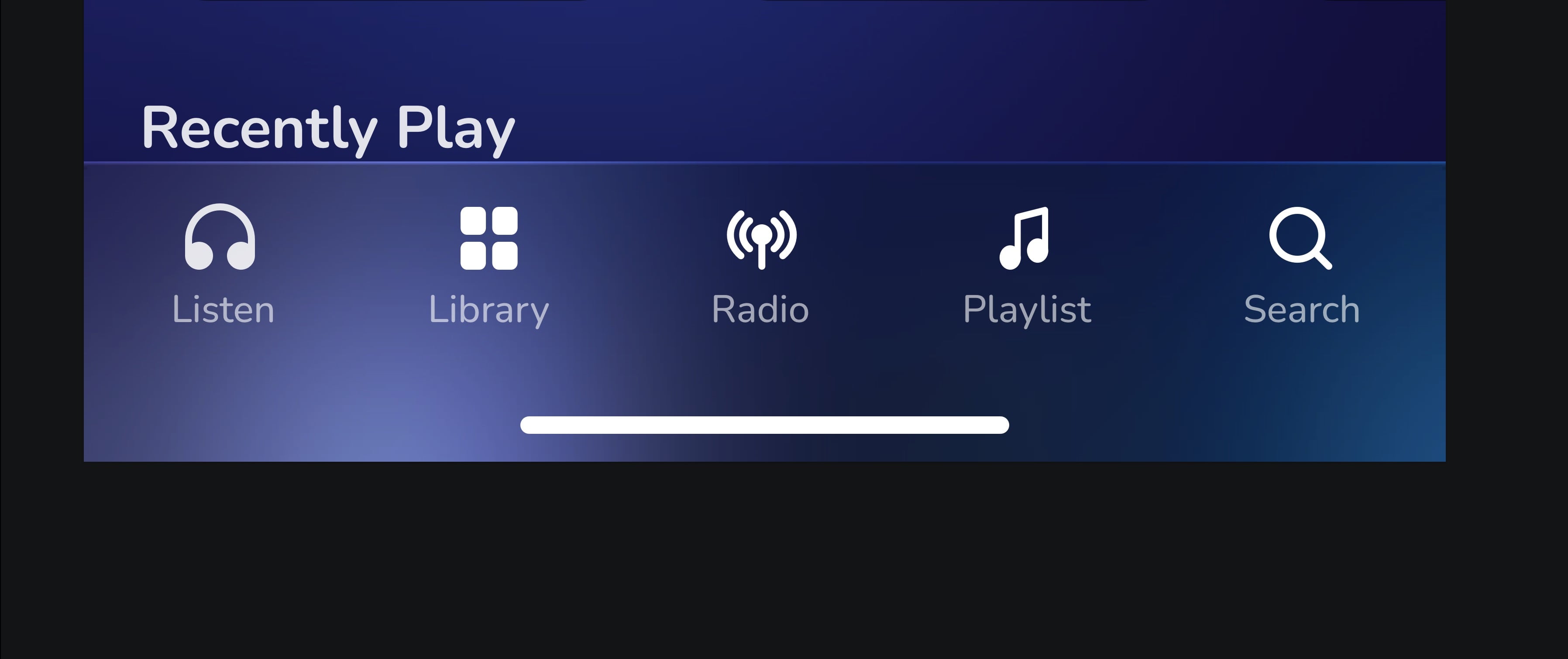
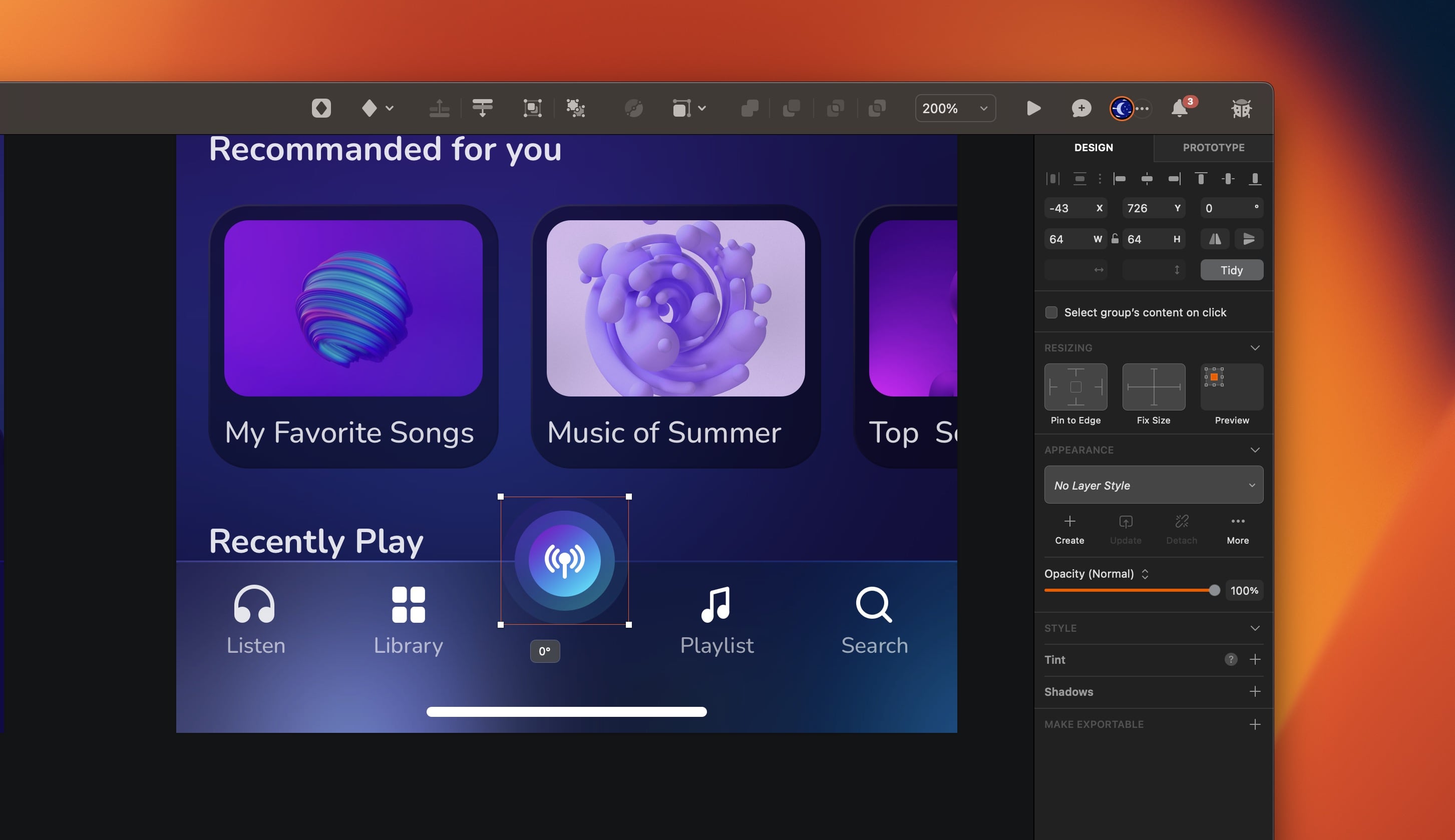
Circular Button
- Create an oval of 36 by 36, fill with Gradient 1 color style. Duplicate, press “K” to activate the scale tool, then scale it to 50 by 50. Reduce the opacity to 40% and add background blur top 8. Again, duplicate and scale it to 64 by 64, reduce the opacity to 10% and remove the background blur. Place the radio icon on top of the first circle and group everything. Name it by Radio.
- Now, it’s time to group everything: Rectangle, tabs group and the radio button and name it by Tab Bar.
Conclusion
Sketch offers powerful tools for creating and managing reusable design elements. Component, override and tint are three essential features that can help streamline your workflow and improve the consistency and flexibility of your designs. You can create more efficient and effective designs in Sketch by mastering these features.
Templates and source code
Download source files
Download the videos and assets to refer and learn offline without interuption.
Design template
Source code for all sections
Video files, ePub and subtitles
Assets
Subtitles
Videos
1
The Sketch Design Tool
Design effectively in Sketch with the Sketch design tool handbook
3:21
2
Icons and Shapes
Unleashing the power of visual elements by mastering icon, font, and shape in Sketch design
18:28
3
Smart Layout
Turn your symbol into responsive components that automatically resize to fit their content when resizing
10:04
4
Color and Text Styles
Save time reusing design elements by creating color variable and text styles
8:05
5
Components and Tint
Design faster with reusable design elements for your next project
10:24
6
Libraries and Developer Handoff
The tools you need for a truly collaborative design process to share with your team
8:47
7
Annotations
Adding an annotation to your designs makes it easy to collaborate with team members and ensures you are on the right track with your project
10:45
8
Prototype Interactions
Learn the basics of the prototype, such as scrolling and animation
3:32
9
Overlays and Mirror App
Build a more complex prototype and preview it in your device using the Sketch mirror
4:09
Meet the instructor
We all try to be consistent with our way of teaching step-by-step, providing source files and prioritizing design in our courses.
Sourany Phomhome
UI Designer
Designer at Design+Code.
10 courses - 43 hours
Build an Interactive Site with Wix Studio
Discover Wix Studio: the no-code platform ideal for agencies and enterprises. This beginner-friendly video course guides you through web design basics, using intuitive tools for building responsive, professional websites. Learn to create animations easily—no coding required. Gain the skills to craft your own standout sites confidently.
1 hrs
3D UI Interactive Web Design with Spline
Learn to create 3D designs and UI interactions such as 3D icons, UI animations, components, variables, screen resize, scrolling interactions, as well as exporting, optimizing, and publishing your 3D assets on websites
3 hrs
Design and Prototype for iOS 17 in Figma
Crafting engaging experiences for iOS 17 and visionOS using the Figma design tool. Learn about Figma's new prototyping features, Dev Mode, variables and auto layout.
6 hrs
Design and Prototype Apps with Midjourney
A comprehensive course on transforming Midjourney concepts into interactive prototypes using essential design techniques and AI tools
8 hrs
Learn Figma Prototyping
Master interaction design with Figma Prototyping. Create an animated app experience using after delay, scrolling content, video prototype
1 hrs
UI Design for iOS 16 in Sketch
A complete guide to designing for iOS 16 with videos, examples and design files
3 hrs
Prototyping in Figma
Learn the basics of prototyping in Figma by creating interactive flows from custom designs
1 hrs
UI Design Android Apps in Figma
Design Android application UIs from scratch using various tricks and techniques in Figma
2 hrs
UI Design Quick Apps in Figma
Design application UIs from scratch using various tricks and techniques in Figma
12 hrs
Figma Handbook
A comprehensive guide to the best tips and tricks in Figma
6 hrs