Tab Bar
Add to favorites
Flat navigation using a bottom bar
Play video
Swift Advanced
1
Tab Bar
22:13
2
Navigation Bar
19:42
3
Table View Controller
22:47
4
Web View Controller
21:15
5
Default Transitions
28:07
6
Custom Transitions
26:10
7
Gesture Interactions
49:24
8
CocoaPods
35:17
9
Keyboard Interactions
27:47
10
Progress Rings
43:55
11
Delegation
30:12
12
Multiple Storyboards
38:43
13
Dynamic Type
22:23
14
Implementing Dark Mode
25:49
15
JSON Parsing
21:13
16
Core Data
38:16
17
Realm
28:29
18
Networking Images and HTML
41:20
19
Implementing Search
30:04
20
Posting and Storing Data
31:48
21
TestFlight
22
Publish to the App Store
To follow this tutorial, you’ll need Xcode 9
Flat Navigation
Flat is the navigation paradigm that lets the user switch between a number of given context independent of order. Its inherent freedom and ease of use are the reasons it’s widespread.
Being also the simplest navigation pattern, its key characteristic is free flow. It’s built on the premise that the user is able to flow back and forth with no data loss or lock states.

Easy to Use
One main reason for choosing Tab Bar Navigation for your app is the convention behind it. Many of the most popular apps, these days, have it as their root navigation.
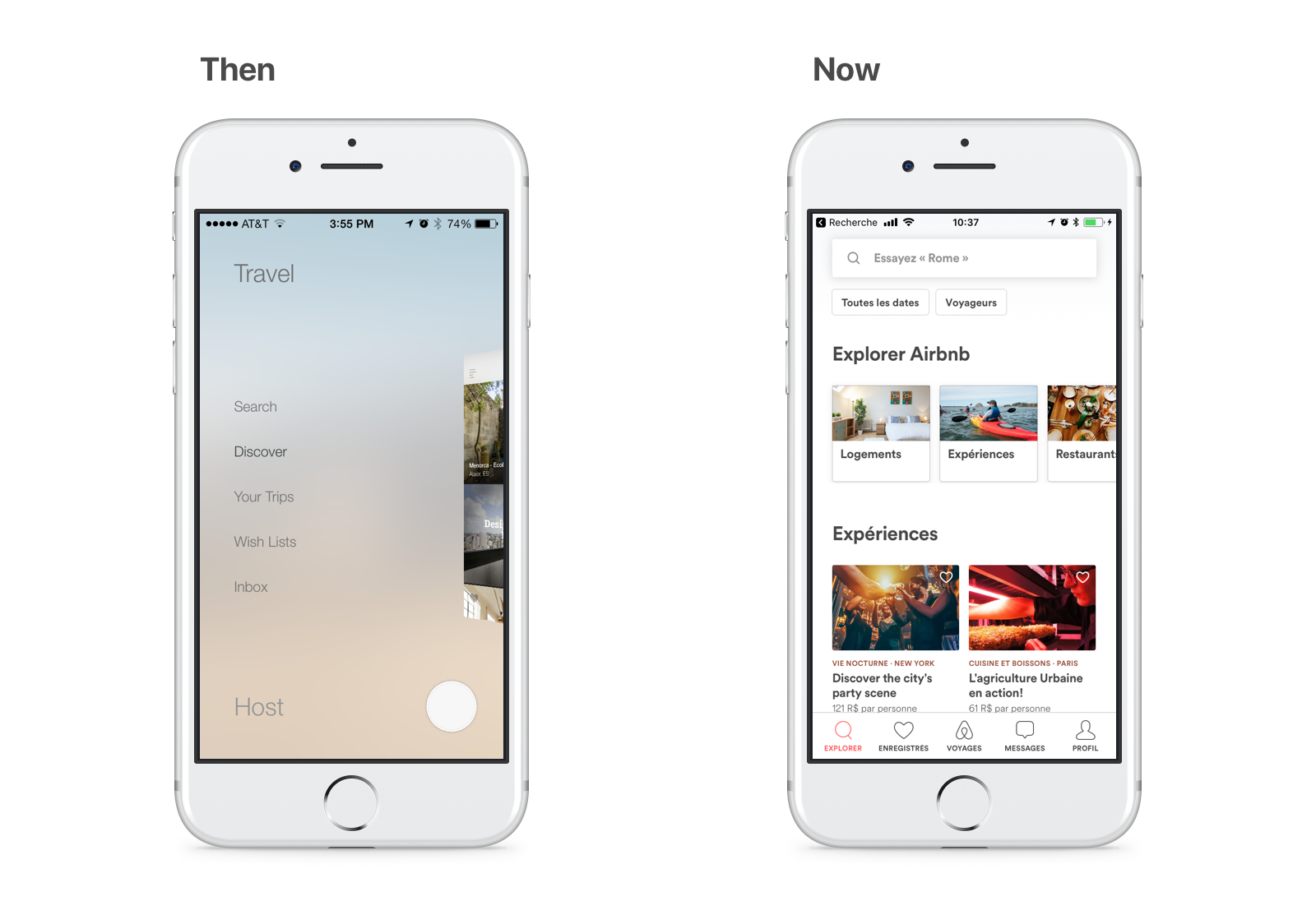
Among the examples of apps that converted to it is Airbnb. For many years, this app had used the sleekest of 3D animated hamburger menus. After being on the market for so long, it went back to basics on this.
The Tab Bar is easy to use and easy to place on your app because it leverages many iOS features and is widely recognized. For that reason, it’s recommended to place the Tab Bar at the root of the navigation. This ensures high usability and behavior conformance with other apps.
Importing Assets
The assets bundle comes with the iconography and place-holding elements needed to set our layout. If you have knowledge on how to export assets from the Sketch file built on previous sections, feel free to do so.
On the project’s outline, there is a file called Assets.xcassets. This file type is actually a folder that is interpreted in a symbolic fashion by Xcode. Drag and drop the assets bundle subfolders in its Outline so we have them accessible on Interface Builder.
Namespacing Assets
A good way to organize your project is by using a convention called namespacing. You might already be familiar with it by coding some Swift. You may be familiar that the initials to all classes that are contained in UI Kit are UISomething.
In Xcode, we have the same functionality for the Asset Catalog. Select the 3 downloaded asset folders and then, at the Attributes Inspector, check Provides Namespace.
This will ensure that you can use the same asset name in different contexts and this feature may come in handy sooner than you think.
Preparing Icons
A Tab Bar Item is the unit of both icon and labels you see in the Tab Bar. In the default Tab Bar, implementation all icons are tinted to your app’s main color, which is the default color iOS blue.
In the Design+Code app, the design requires that the Tab Bar icons are displayed in full color. There are many ways to enable this, the simplest way is to configure the image assets.
For each assets folders, select all the images and edit their Render As to Original Image so they show in full RGBA. For the Resizing attribute, check the Preserve Vector Data so that it shows crisp vector drawing on any screen resolution. Finally, set the Scales attribute to Single Scale as vector drawing need no pixel density directive.
Place-holding View Controllers
Before we place the Tab Bar, we need to create some place holding view controllers to act as the views we are going to develop further along.
In the Object Library, place beside the already present View Controller are 4 additional View Controllers that are going to be worked on in the next sections according to this list.
- View Controller for Chapters
- Table View Controller for Bookmarks
- Table View Controller for Exercises
- View Controller for More
PLACING THE TAB BAR
To add a Tab Bar Controller to the Storyboard, select the 4 placeholders that we just created and the View Controller. Then, go to Editor, select Embed in and Tab Bar Controller. This will envelop all those scenes in a single Tab Bar Controller. Put the new Tab Bar Controller on top of the other controllers.
Don’t forget to make the Tab Bar Controller the Initial View Controller in the Attributes Inspector. You may also use this Tab Bar Controller to customize the looks of the Tab Bar.
Coloring the Tab Bar
To style just like in the App, we are going to deselect the Translucent checkbox in the Attributes Inspector of the Tab Bar.
Optional: Code
Depending on your design, it may also be important to further customize the bar. This is possible using the Tab Bar’s appearance upon launching your app.
func application(_ application: UIApplication, didFinishLaunchingWithOptions launchOptions: [UIApplicationLaunchOptionsKey: Any]?) -> Bool {
    UITabBar.appearance().barTintColor = .black
    UITabBar.appearance().tintColor = .white
    return true
}
In this code, we change the background color for all the Tab Bars to black and the tint of their text and icons to white.
Bar Items
To customize the looks of each item, you should use the Tab Bar Item inside each View Controller.
In the System Item field, there are preset styles used in various iOS Stock Apps. For this project, we are going to use the provided icons for the Design+Code app. Select and change the items images by typing the image name for each bar item.
Home View Controller: Selected image: Tab Bar/home-active Title: Home Image: Tab Bar/home
Chapters View Controller: Selected image: Tab Bar/chapters-active Title: Chapters Image: Tab Bar/chapters
Bookmarks Table View Controller: Selected image: Tab Bar/bookmarks-active Title: Bookmarks Image: Tab Bar/bookmarks
Exercises Table View Controller: Selected image: Tab Bar/exercises-active Title: Exercises Image: Tab Bar/exercises
More View Controller: Selected image: Tab Bar/more-active Title: More Image: Tab Bar/more
Reordering Items
As the items are probably in the wrong order, in the Tab Bar Controller, re-order the items by Drag and drop. From left to right, it should be: Home, Chapters, Bookmarks, Exercises and More.
More Scene
By now, the project already provides access to the root interfaces that are going to build the experience. Now, it is required that we continue populating them piece by piece. In this part, we are going to build upon the More Scene that has an inner Dialog View.
Card Scrolling
The More Scene is composed of a self-sized card view that moves inside a Scroll View. Let’s start by opening the Document Outline, select the More View and uncheck Safe Area Layout Guide. Then, place a Scroll View inside the More View from the Object Library. Put constraints to 20 top and 0 for the rest. Don’t forget to uncheck Constraints to margins.
Dialog Inside
The Dialog View is going to float inside the Scroll View. Using the Object Library, place a view inside it and change the background color to Default. Proceed by constraining it to 20 points on every side.
So as to have rounded corners, turn on Clip to Bounds in the Attributes Inspector. Also, using the Identity Inspector, add a Runtime Attribute of layer.cornerRadius to the Number 14.
To make it easy to identify this element, set the Label field under Document to Dialog View.
Self-sizing
By now, your view must be presenting red constrain elements for sizing. This is an issue that leads to an underlying lesson. A Scroll View does not know how to move its inner elements, it is up to them to describe in which direction to scroll by sizing themselves bigger than their container. These criteria have not been met because the Dialog View sizes itself in relation to the Scroll View.
Auto Layout solves constraints by finding minimal situations in which all the criteria can be met. Let’s include yet another view inside this Dialog View to guide the system.
In the Identity Inspector or Document Outline, label this view Sizing View. Using the Add New Constraints, place constraint on all sides to 0 points to its parent, the Dialog View. Then, center it horizontally to the Scroll View. And finally, constrain its height to 680 points.
Using the Attributes Inspector, set its background color to an F0F3F5 blue color.
This gives Auto Layout enough information to infer the sizing and scrolling of elements. Later on, we will deactivate this constraint and have the inner elements fulfill this need.
My Progress Label
From the Object Library, add a label near the top and name it MY PROGRESS. The progress element is made of a Black 50%, 15 point Semibold System Font label placed 20 points from the top of the Sizing View. Constrain it to the Sizing View with Control + drag and choose Center Horizontally in Container. It should suffice to constrain it from the top and to the center.
Progress Placeholders
Let’s also put some placeholders for the Progress Rings, to which we are going to dedicate a whole section further on. Using the Object Library, place an Image View below the label and resize it a 70 point square in the Size Inspector. Then, constrain its width and height using the Add New Constraints.
Continue by triggering Embed In Stack and constrain this stack from the sides to 20 points and from the top nearest neighbor to 8 points. Using the Attributes Inspector, set its axis to Horizontal and its distribution to Equal Spacing.
Then, you just need to Copy and Paste it to have 3 elements inside the stack, which is going to size itself vertically accordingly. The image elements should be the placeholder rings provided in the assets bundle: Placeholder/image-ring-1, Placeholder/image-ring-2 and Placeholder/image-ring-3.
Action Button
The More Scene has 6 default action buttons. Place a Button element using the Object Library, customizing it with the More/logo image and labeling it Login. Then, style the attributed text to a Dark Gray Color 17 point Semibold System Font.
To distance the inner elements of a given button, you may use the Size Inspector to adjust insets. In this button template, we are going to use a 16 point left inset for the content and a 7 point left inset for the title. Also, set the control alignment to left and its background color to White Color.
More Action
The element we have just set is the template for all the actions. Push it under a stack by triggering Embed In Stack. Then, constrain the stack to 0 points to the left and right side, 20 points to the top nearest neighbor and to 360 of height. The stack should also be on the Vertical axis, on a Fill Equally distribution, and have a spacing of 1 point.
Finally, duplicate the button element until you reach 6 elements and customize name and image accordingly using the assets provided for:
Title: Login Image: More/logo
Title: Updates Image: More/info
Title: Read on Safari Image: More/safari
Title: Community Image: More/community
Title: Email Support Image: More/email
Title: Ambience Image: More/ambience
Epilogue
This element is a Label placed below the actions. If it gets difficult to reach elements in a small scene, you can always select the scene and set its simulated height using the Size Inspector under Freeform. A value that may be suitable is 800 points.
Place a Label element for the epilogue right below the Actions stack, center it horizontally and constrain it in width to 170 points and 34 points from the top nearest neighbor. The content of this epilogue on the app is Only made possible with your kind support. Thank you. Then, center its text and style it to System Font Italic 15 points in size, colored 50 percent Black Color. It should also be set to have 0 lines, simply put, decide how many lines it should have on its own.
Twitter Button
The Twitter label should be an imaged Button just like the actions. Place a Button from the Object Library and style it to a 10 percent, Black Color, 18 point System Font.
Also, constrain it to the horizontal center with 170 of width and 15 points to the top nearest neighbor.
Implicit Stack
To finish this layout, select the Twitter Button and, triggering the Add New Constraints dialog, apply the suggested constraint value for the bottom.
By now, you might have guessed that every element inside this Sizing View is able to position and size itself according to their parent and neighbors. This would correctly suggest that the height constraint for the Sizing View is no longer required.
Using the Outline View, select this constraint and uncheck Installed using the Size Inspector. No constraint should be marked red, indicating that Auto Layout has sufficient information to place and size all elements.
Conclusion
Also known as Bottom Navigation, the Tab Bar may be used to segregate content, advertise functionality, notify information, situate navigation, and much more. This is the stepping stone needed to access all other interfaces we are going to build forward.
The simplest way of building navigation on iOS is also the most recognizable. Don’t be afraid to use it in your app and reap its benefit.
Templates and source code
Download source files
Download the videos and assets to refer and learn offline without interuption.
Design template
Source code for all sections
Video files, ePub and subtitles
ePub
Videos
Assets
Subtitles
1
Tab Bar
Flat navigation using a bottom bar
22:13
2
Navigation Bar
The anchor of the layout
19:42
3
Table View Controller
Contacts, messages, bookmarks and all other vertical data
22:47
4
Web View Controller
Display and control web content without leaving the app
21:15
5
Default Transitions
Add an animation between your screens
28:07
6
Custom Transitions
Create a seamless animation from one screen to another
26:10
7
Gesture Interactions
Interface that follows your finger
49:24
8
CocoaPods
Dependency manager for your Xcode projects
35:17
9
Keyboard Interactions
Coordinating avoidance, appearance, and style
27:47
10
Progress Rings
Using third-party components and core animation
43:55
11
Delegation
One object acting on behalf of another
30:12
12
Multiple Storyboards
Divide and conquer
38:43
13
Dynamic Type
Accessibility made easy
22:23
14
Implementing Dark Mode
Automatically turn off the lights
25:49
15
JSON Parsing
Your data in an interchange format
21:13
16
Core Data
Persist your data using the built-in framework
38:16
17
Realm
A simpler, cross-platform database
28:29
18
Networking Images and HTML
Loading Images and HTML content asynchronously
41:20
19
Implementing Search
Filtering data
30:04
20
Posting and Storing Data
Interfacing with REST APIs using URL Session
31:48
21
TestFlight
Distribute your app to beta testers
22
Publish to the App Store
Working with iTunes Connect to get your app out there
Meet the instructors
We all try to be consistent with our way of teaching step-by-step, providing source files and prioritizing design in our courses.
Tiago Mergulhão
Interaction Designer
Pixel-crafting experiences for touch and click on a daily basis
3 courses - 15 hours

Create a Sketch Plugin
Overview of the Sketch Developer Portal by making you workflow even more productive using the plugin API
2 hrs

Swift Advanced
Learn Swift a robust and intuitive programming language created by Apple for building apps for iOS, Mac, Apple TV and Apple Watch
9 hrs

Learn Swift
Learn Swift a robust and intuitive programming language created by Apple for building apps for iOS, Mac, Apple TV and Apple Watch
4 hrs
Meng To
I design, code and write
Meng To is the author of Design+Code. Meng started off his career as a self-taught designer from Montreal and eventually traveled around the world for 2 years as his US VISA was denied. During his travels, he wrote a book which now has 35,000 readers.
40 courses - 194 hours

Master AI Prompting for Stunning UI
Learn how to leverage AI tools like Aura for creating beautiful designs, working with templates, and experimenting with advanced prompts. A concise guide for designers and developers to level up their skills.
10 hrs

Build SwiftUI apps for iOS 18 with Cursor and Xcode
In this course, we'll explore the exciting new features of SwiftUI 6 and Xcode 16 for building iOS 18 apps. From mesh gradients and text animations to ripple effects, you'll learn how to create polished, highly custom apps using the latest workflows. We'll also dive into using Cursor and Claude AI for AI-driven coding, helping you start strong and customize your apps.
5 hrs

Create your Dream Apps with Cursor and Claude AI
Learn to build your dream web apps from the ground up using Cursor, Claude AI, and a suite of powerful AI tools. This course covers everything you need, including React for frontend development, Firebase for backend integration, and Stripe for handling payments. You’ll also dive into advanced AI tools like Claude Artifacts, Galileo AI, v0.dev for UI, Ideogram for design generation, and Cursor Composer for full-scale development.
6 hrs

Build a React Site from Figma to Codux
In this course, you'll learn to build a website from scratch using Codux, starting with a Figma template. You’ll master responsive design, collaborate with developers on a real React project, export CSS from Figma using Locofy, set up breakpoints with media queries, add CSS animations, improve SEO, create multiple pages with React Router, and publish your site. By following best practices, you’ll bridge design and development, improve your web design skills.
2 hrs

Create 3D UI for iOS and visionOS in Spline
Comprehensive 3D Design Course: From Basics to Advanced Techniques for iOS and visionOS using SwiftUI
3 hrs

Master No-Code Web Design with Framer
In this free Framer course, you'll learn to create modern, user-friendly interfaces. Start with dark mode and glass designs, then move from Figma to Framer, using vectors and auto layout for responsive websites. Add animations, interactive buttons, and custom components with code. Finally, you'll craft a design system suitable for teamwork or solo projects, all in a straightforward and practical approach.
4 hrs

Build SwiftUI Apps for iOS 17
In this course, we’ll be exploring the fresh and exciting features of SwiftUI 5! As we craft a variety of iOS apps from the ground up, we'll delve deep into the treasure trove that is SwiftUI's user interface, interactions, and animations.
4 hrs

Build Beautiful Apps with GPT-4 and Midjourney
Design and develop apps using GPT-4 and Midjourney with prompts for SwiftUI, React, CSS, app concepts, icons, and copywriting
4 hrs

Build SwiftUI apps for iOS 16
Create animated and interactive apps using new iOS 16 techniques using SwiftUI 4 and Xcode 14
5 hrs

Build a 3D Site Without Code with Framer
Design and publish a responsive site with 3D animation without writing a single line of code
3 hrs

Create 3D Site with Spline and React
Design and code a landing page with an interactive 3D asset using Spline and CodeSandbox
1 hrs

Build an Animated App with Rive and SwiftUI
Design and code an iOS app with Rive animated assets, icon animations, custom layouts and interactions
3 hrs

Build a SwiftUI app for iOS 15 Part 3
Design and code a SwiftUI 3 app with custom layouts, animations and gestures using Xcode 13, SF Symbols 3, Canvas, Concurrency, Searchable and a whole lot more
4 hrs

Build a SwiftUI app for iOS 15 Part 2
Design and code a SwiftUI 3 app with custom layouts, animations and gestures using Xcode 13, SF Symbols 3, Canvas, Concurrency, Searchable and a whole lot more
3 hrs

Build a SwiftUI app for iOS 15
Design and code a SwiftUI 3 app with custom layouts, animations and gestures using Xcode 13, SF Symbols 3, Canvas, Concurrency, Searchable and a whole lot more
4 hrs

React Livestreams
Learn how we can use React Hooks to build web apps using libraries, tools, apis and frameworks
4 hrs

Design Founder Livestreams
A journey on how we built DesignCode covering product design, management, analytics, revenue and a good dose of learning from our successes and failures
2 hrs

SwiftUI Advanced Handbook
An extensive series of tutorials covering advanced topics related to SwiftUI, with a main focus on backend and logic to take your SwiftUI skills to the next level
4 hrs

iOS Design Handbook
A complete guide to designing for iOS 14 with videos, examples and design files
2 hrs

SwiftUI Handbook
A comprehensive series of tutorials covering Xcode, SwiftUI and all the layout and development techniques
7 hrs

Build a web app with React Hooks
Learn how we built the new Design+Code site with React Hooks using Gatsby, Netlify, and advanced CSS techniques with Styled Components.
4 hrs

UI Design Handbook
A comprehensive guide to the best tips and tricks for UI design. Free tutorials for learning user interface design.
2 hrs

Figma Handbook
A comprehensive guide to the best tips and tricks in Figma. Not affiliated with or endorsed by Figma, Inc.
6 hrs

SwiftUI for iOS 14
Build a multi-platform app from scratch using the new techniques in iOS 14. We'll use the Sidebar and Lazy Grids to make the layout adaptive for iOS, iPadOS, macOS Big Sur and we'll learn the new Matched Geometry Effect to create beautiful transitions between screens without the complexity. This course is beginner-friendly and is taught step-by-step in a video format.
3 hrs

SwiftUI Livestreams
This is a compilation of the SwiftUI live streams hosted by Meng. Over there he talks and teaches how to use design systems, typography, navigation, iOS 14 Design, prototyping, animation and Developer Handoff.
19 hrs

UI Design Livestreams
This is a compilation of the UI live streams hosted by Meng. Over there he talks and teaches how to use design systems, typography, navigation, iOS 14 Design, prototyping, animation and Developer Handoff.
26 hrs

UI Design for Developers
In this course we'll learn how to use design systems, set up break points, typography, spacing, navigation, size rules for adapting to the iPad, mobile and web versions, and different techniques that translate well from design to code.
3 hrs

Build an app with SwiftUI Part 3
This course was written for designers and developers who are passionate about design and about building real apps for iOS, iPadOS, macOS, tvOS and watchOS. SwiftUI works across all of those platforms. While the code is not a one-size-fits-all, the controls and techniques involved can apply to all platforms. It is beginner-friendly, but it is also packed with design tricks and cool workflows about building the best UIs and interactions.
4 hrs

Build an app with SwiftUI Part 2
This course was written for designers and developers who are passionate about design and about building real apps for iOS, iPadOS, macOS, tvOS and watchOS. SwiftUI works across all of those platforms. While the code is not a one-size-fits-all, the controls and techniques involved can apply to all platforms. It is beginner-friendly, but it is also packed with design tricks and cool workflows about building the best UIs and interactions.
4 hrs

Build a full site in Webflow
Webflow is a design tool that can build production-ready experiences without code. You can implement CSS-driven adaptive layouts, build complex interactions and deploy all in one tool. Webflow also comes with a built-in content management system (CMS) and Ecommerce for creating a purchase experience without the need of third-party tools.
3 hrs

Advanced Prototyping in ProtoPie
ProtoPie is a cross-platform prototyping tool that creates prototypes nearly as powerful as those made with code, with half of the efforts, and zero code. It's perfect for designers who want to quickly experiment with advanced interactions using variables, conditions, sensors and more.
3 hrs

Build an app with SwiftUI Part 1
This course was written for designers and developers who are passionate about design and about building real apps for iOS, iPadOS, macOS, tvOS and watchOS. SwiftUI works across all of those platforms. While the code is not a one-size-fits-all, the controls and techniques involved can apply to all platforms. It is beginner-friendly, but it is also packed with design tricks and cool workflows about building the best UIs and interactions.
4 hrs

React Native for Designers Part 2
React Native is a popular Javascript framework that builds on top of React by using native components to create a real mobile app indistinguishable from one made using Xcode or Android Studio. The main difference with native development is that you get to use CSS, hot-reload, Javascript and other familiar techniques that the Web has grown over the past decades. Most importantly, you're building for both iOS and Android using the same codebase.
3 hrs

React Native for Designers
React Native is a popular Javascript framework that builds on top of React by using native components to create a real mobile app indistinguishable from one made using Xcode or Android Studio. The main difference with native development is that you get to use CSS, hot-reload, Javascript and other familiar techniques that the Web has grown over the past decades. Most importantly, you're building for both iOS and Android using the same codebase.
5 hrs

Design System in Figma
Learn how to use and design a collaborative and powerful design system in Figma. Design Systems provide a shared library of reusable components and guidelines and that will let you build products much faster
3 hrs

React for Designers
Learn how to build a modern site using React and the most efficient libraries to get your site/product online. Get familiar with Grid CSS, animations, interactions, dynamic data with Contentful and deploying your site with Netlify.
3 hrs

Swift Advanced
Learn Swift a robust and intuitive programming language created by Apple for building apps for iOS, Mac, Apple TV and Apple Watch
9 hrs

Learn Swift
Learn Swift a robust and intuitive programming language created by Apple for building apps for iOS, Mac, Apple TV and Apple Watch
4 hrs

Learn Sketch
Learn Sketch a design tool entirely vector-based and focused on user interface design
5 hrs

Learn iOS 11 Design
Learn colors, typography and layout for iOS 8
1 hrs
