Weather App - Intro
Add to favorites
Build a weather app from custom design and prototype
Play video
UI and Animations in SwiftUI
1
Weather App - Intro
18:34
2
Weather App - Attributed String
9:01
3
Weather App - Custom Tab Bar
9:33
4
Weather App - Arc and Custom Shapes
9:52
5
Weather App - Bottom Sheet
13:18
6
Weather App - Background Blur
9:40
7
Weather App - Inner Shadow
9:37
8
Weather App - Parallax Effect
16:55
9
Weather App - Segmented Control
10:25
10
Weather App - Forecast Data Model
6:14
11
Weather App - Forecast Card
12:45
12
Weather App - Conditional Scroll View
7:10
13
Weather App - Custom Navigation Bar
9:55
14
Weather App - Weather Widget
9:13
15
Weather App - Search Bar
11:27
16
Smart Home Thermostat Part 1
18:40
17
Smart Home Thermostat Part 2
21:29
18
Smart Home Thermostat Part 3
16:00
19
Smart Home Thermostat Part 4
20:35
There will be lots of custom components involved and those are what makes an app standout. That’s why we’re going to custom build all these tab bar, navigation bar, search bar, this bottom sheet with a stunning layer of background blur.
I’ll show you how to implement all of that from scratch in SwiftUI and I will guide you through every step of the way. This course is beginner friendly and is made for you if you want to improve your UI and animation craft. Besides, I am confident you will pick up neat techniques along the way.
Figma Design
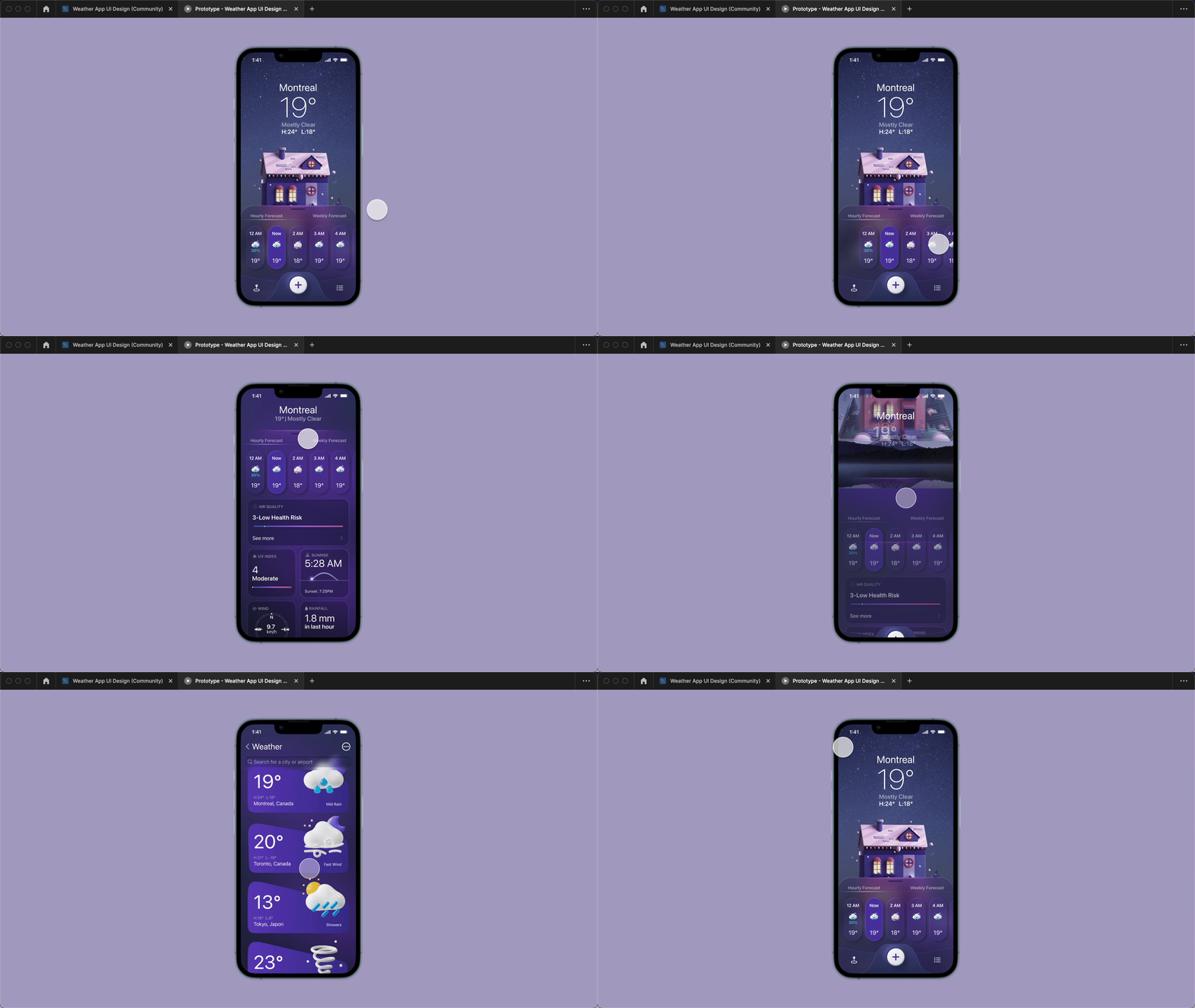
I will be providing the project’s design in Figma as part of the downloadable sources files, so that you can inspect the colors, typography, assets and animations. You can also search for it in the Figma community and duplicate it from there. All the UI and animations were designed by Aksonvady from the ground up.

Animation Prototype
To check the animations, you would have to run the prototype. Select the home screen and click on the play button. Then, you will be able to see how the animations and interactions are performing. Notice that all of the animations I showed you before are similar to the prototype here.
Download Xcode
Xcode is the tool for building iOS applications. If you haven’t already, you‘d need to download Xcode in the Mac App Store. Make sure its version is minimum 13 because we’ll be deploying the app on iOS 15.

Xcode Project
Now that you’ve got Xcode running, let’s create a new project with the iOS app template named Weather . The organization identifier is your domain in reverse. Make sure to select the interface SwiftUI and the language Swift. Once the project has been created, change the simulator device to the latest iOS device in regular size.

Import Assets
A comprehensive app has custom colors, icons, illustrations, images, and so on. So, I have prepared assets for you for this project so you can skip the tedious step of exporting them from Figma and setting up the color sets in Xcode. They are included with the source files and can be downloaded at the bottom of this course’s page.
To import assets, open the folder Assets and drag and drop all the subfolders from the downloaded Assets folder.
As an example on how to add a color set, right-click and select New Color Set . Open the Inspectors panel, select appearances None as we only have colors in dark mode. Then, click on the color card to change its attributes. Make sure the content is sRGB and select 8-bit Hexadecimal as the Input Method . Copy the HEX color from the design system and paste in the Hex text field.

Folder Structure
It is important to well organize your files in any project. Set up the folder structure as below.
-
Views
- Main
- Navigation
- Detail
- Components
- Models
- Utils
Once the folders have been created, move the ContentView file inside the Views/Main folder.

Color Extension
There are a lot of gradient colors in this project’s design. What can I say? They add a nice kick compared to a monotone color. But in SwiftUI, it’s long to code them. I’d recommend to set up a helper method to speed up the process. In another course, I showed how to make an extension to LinearGradient. This time, I’ll go with the Color extension since the gradients are lined in different directions. The added benefits are that the colors are all referenced in one place and it autocompletes for you.
Under Utils, create a new Swift file Extensions for storing extension methods.
Color is an instance of SwiftUI, so we’ll need to import it. We’ll declare static constant properties for each of the colors needed by using their color set names. Static property lets any Color instance access to it. You may write them up from scratch by checking the design or you could open the source files and drag and drop the Extensions file to your project, like how Apple does it with their tutorials.
// Extensions.swift
import SwiftUI

extension Color {
    static let background = LinearGradient(gradient: Gradient(colors: [Color("Background 1"), Color("Background 2")]), startPoint: .topLeading, endPoint: .bottomTrailing)
    static let bottomSheetBackground = LinearGradient(gradient: Gradient(colors: [Color("Background 1").opacity(0.26), Color("Background 2").opacity(0.26)]), startPoint: .topLeading, endPoint: .bottomTrailing)
    static let navBarBackground = LinearGradient(gradient: Gradient(colors: [Color("Background 1").opacity(0.1), Color("Background 2").opacity(0.1)]), startPoint: .topLeading, endPoint: .bottomTrailing)
    static let tabBarBackground = LinearGradient(gradient: Gradient(colors: [Color("Tab Bar Background 1").opacity(0.26), Color("Tab Bar Background 2").opacity(0.26)]), startPoint: .top, endPoint: .bottom)
    static let weatherWidgetBackground = LinearGradient(gradient: Gradient(colors: [Color("Weather Widget Background 1"), Color("Weather Widget Background 2")]), startPoint: .leading, endPoint: .trailing)
//    static let bottomSheetBorderMiddle = LinearGradient(gradient: Gradient(colors: [.white, .clear, .clear]), startPoint: .top, endPoint: .bottom)
    static let bottomSheetBorderTop = LinearGradient(gradient: Gradient(colors: [.white.opacity(0), .white.opacity(0.5), .white.opacity(0)]), startPoint: .leading, endPoint: .trailing)
    static let underline = LinearGradient(gradient: Gradient(colors: [.white.opacity(0), .white, .white.opacity(0)]), startPoint: .leading, endPoint: .trailing)
    static let tabBarBorder = Color("Tab Bar Border").opacity(0.5)
    static let forecastCardBackground = Color("Forecast Card Background")
    static let probabilityText = Color("Probability Text")
}
Starting View
With the preparation work out of the way, we can proceed with implementing the views.
Usually in a SwiftUI app, the child view put inside of ContentView is the starting view when the app launches because ContentView is referenced in the app file. Here, we’ll place the HomeView that we’ll create immediately as a SwiftUI file under the Main folder.
// ContentView.swift
struct ContentView: View {
    var body: some View {
        HomeView()
    }
}
Background Color
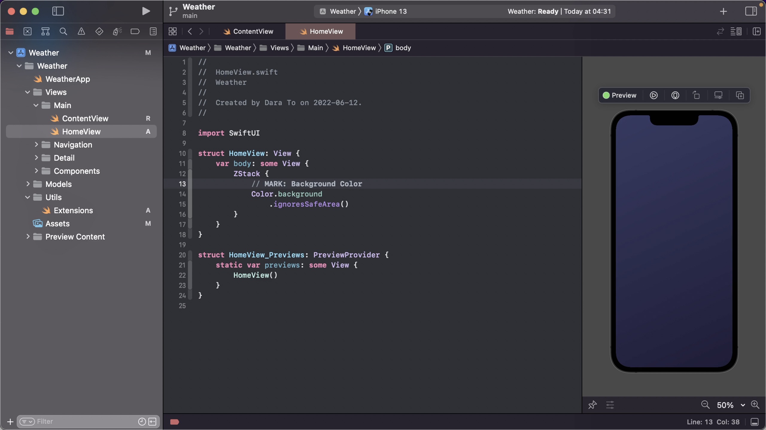
Let’s tackle the home view. At a glance, it’s obvious this screen has many layers stacked on top of each other. For this reason, we’ll start off with a ZStack . The bottom most layer is a purple-ish gradient color. We can easily retrieve that from our Color extension. See how easy that was? To eliminate the white space at the top and the bottom of the screen, which is the safe area reserved for the notch and home indicator of the iPhone, instruct it to ignore the safe area.
By the way, I like to add a marker for each UI element as a reference. This also lets you toggle between each marker in the path at the top under the tabs.
// HomeView.swift
ZStack {
	  // MARK: Background Color
	  Color.background
	      .ignoresSafeArea()
}
Background Image
Right above the background color is the night sky image. To display an image, initialize Image with the name of the asset. Usually, it’s a good idea to set the background image to resizable , so that it adjusts to the size of the device or mode, that is portrait or landscape.
// HomeView.swift
// MARK: Background Image
Image("Background")
    .resizable()
    .ignoresSafeArea()
House Image
Then, we’ll stack the house on top of the background. Why it’s not below the texts, you may ask. In the prototype, if I drag up the bottom sheet, the house gets underneath all the texts.
The current position of the house’s center is in the middle of the screen. Now, we could calculate that position versus where it should be and subtract by one another, but that’s going to be more complicated. So, the shortcut is to align the image at the top using the frame modifier and add a top padding because we know this number from the design.
// HomeView.swift
// MARK: House Image
Image("House")
    .frame(maxHeight: .infinity, alignment: .top)
    .padding(.top, 257)
Current Weather
On top of it all, we’ll display the current weather information as the hero of the home screen.
These informations are stacked vertically, so we’ll lay down a VStack . The top is a Text view with the city info. Make the font largeTitle . How did I get this font size? I compared the font size from the design with Apple’s typography to get the correspondent name. Add a Spacer to push the stack to the top as well as a top padding.
The rest of the info is grouped in another VStack . Ideally, there would be three upcoming Text views but first, let’s look at the version of the home screen when the sheet is up in the Components page to understand why we can’t do that. You can see that the final temperature and weather texts are combined together in one string. So, we have no choice but to do the same here. To force a line break, insert \n in the string.
// HomeView.swift
// MARK: Current Weather
VStack {
		Text("Montreal")
		    .font(.largeTitle)

		VStack {
        Text("19°" + "\n" + "Mostly Clear")

        Text("H:24°   L:18°")
            .font(.title3.weight(.semibold))
    }

    Spacer()
}
.padding(.top, 51)
To view the text colors in white, change the preview to dark mode.
// HomeView.swift
struct HomeView_Previews: PreviewProvider {
    static var previews: some View {
        HomeView()
            .preferredColorScheme(.dark)
    }
}
Up Next
In the next section, we’ll go on to format each part of the concatenated string in different styling.
Templates and source code
Download source files
Download the videos and assets to refer and learn offline without interuption.
Design template
Source code for all sections
Video files, ePub and subtitles
Videos
Subtitles
Assets
1
Weather App - Intro
Build a weather app from custom design and prototype
18:34
2
Weather App - Attributed String
Apply different stylings on portions of string
9:01
3
Weather App - Custom Tab Bar
Build a non-native tab interface for navigation
9:33
4
Weather App - Arc and Custom Shapes
Draw custom shapes with paths
9:52
5
Weather App - Bottom Sheet
Insert a slidable sheet with designated positions
13:18
6
Weather App - Background Blur
Blend in a blur backdrop between layers
9:40
7
Weather App - Inner Shadow
Create depth effect with diffused shadow inside a shape
9:37
8
Weather App - Parallax Effect
Add scrolling animations in background
16:55
9
Weather App - Segmented Control
Toggle between similar content with tab buttons
10:25
10
Weather App - Forecast Data Model
Model data and compose static data for weather forecast
6:14
11
Weather App - Forecast Card
Implement card component with different states
12:45
12
Weather App - Conditional Scroll View
Scroll animation on switch of card collection
7:10
13
Weather App - Custom Navigation Bar
Design sticky header for navigation
9:55
14
Weather App - Weather Widget
View weather details by cities
9:13
15
Weather App - Search Bar
Allow searching content inside navigation bar
11:27
16
Smart Home Thermostat Part 1
Create color assets and climate card
18:40
17
Smart Home Thermostat Part 2
Build round elements of the thermometer
21:29
18
Smart Home Thermostat Part 3
Draw scale lines and show summary
16:00
19
Smart Home Thermostat Part 4
Turn dial using drag gesture with animation
20:35
Meet the instructor
We all try to be consistent with our way of teaching step-by-step, providing source files and prioritizing design in our courses.
Dara To
Full-stack Developer
I'm a former financial analyst turned coder. Vegetarian, health-centered, dog owner.
5 courses - 25 hours

UI and Animations in SwiftUI
Level up your UI and animation skills by implementing various applications from custom designs in SwiftUI
4 hrs

Build an Expense Tracker App in SwiftUI
Design and code a SwiftUI 3 app in Xcode 13 with data modeling, data networking, Combine, MVVM and libraries for custom icons and charts.
3 hrs

Build Quick Apps with SwiftUI
Apply your Swift and SwiftUI knowledge by building real, quick and various applications from scratch
11 hrs

Advanced React Hooks Handbook
An extensive series of tutorials covering advanced topics related to React hooks, with a main focus on backend and logic to take your React skills to the next level
3 hrs

Build an ARKit 2 App
Introduction to ARKit and learn how to make your own playground. You will be able to add models or even your own designs into the app and play with them
4 hrs
