
Intro to iOS 18
Add to favorites
Master iOS 18 design: Create stunning apps with Figma. Learn UI/UX principles, prototyping, and Apple's latest design language for mobile
Play video
Design and Prototype for iOS 18
1
Intro to iOS 18
3:49
2
UI Kits
6:30
3
Wireframing
7:39
4
iOS 18 Typography
9:59
5
SF Symbol 6
10:10
6
Auto Layout
13:52
7
Colors
14:41
8
Gradients
15:08
9
Responsive Layouts
6:22
10
Layout Grids and Spacing
15:07
11
Components and Variants
10:42
12
Figma Variables
14:51
13
Overlays and Variable Mode Interactions
5:23
14
Interactive Form Fields with Variables
8:00
15
Gradient Animations
8:23
16
Master Conditionals for a Functional Keyboard
8:56
17
Preparing Design for Handoff
6:34
18
Exporting Your Design to Code
4:57
19
Customizing Code
5:46
20
React Native Animation
7:26
21
Getting Started with Reanimated
10:56

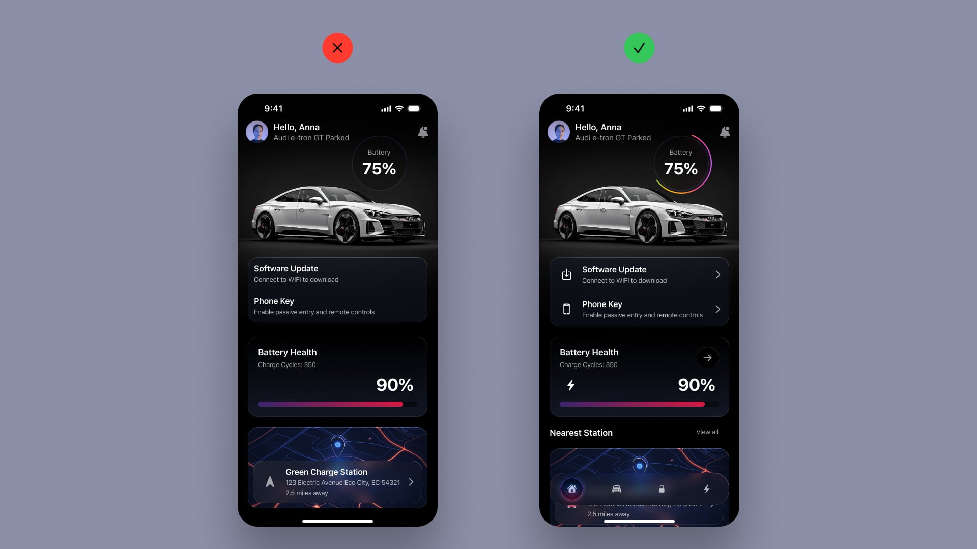
Car Control App Design
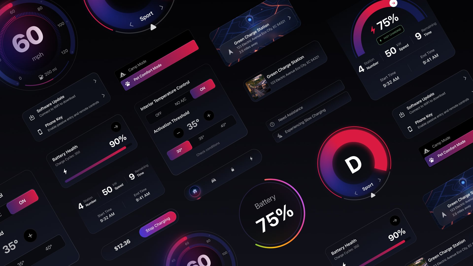
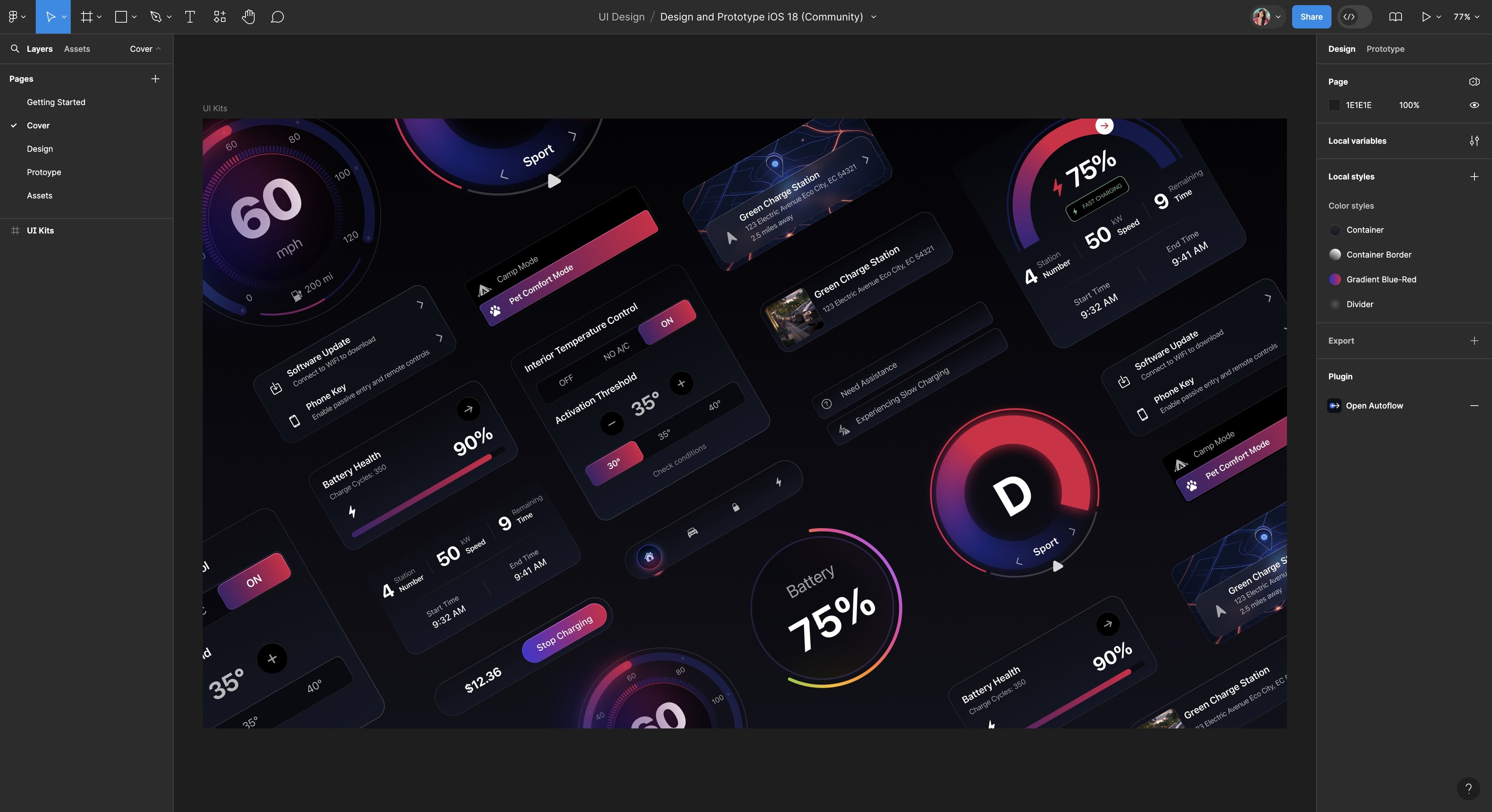
You will be excited to create two iOS 18 designs: a Car Control app and an AI app, each with its unique style. In the first part, we will design a Car Control app inspired by Apple's CarPlay, Tesla, and other car apps. This design will be more complex and will help improve your skills and teach you how to use Figma effectively. You'll use custom shapes, create progress rings with the arc tool, learn how to use gradients to achieve the desired effect, and use blurs to make your design stand out.

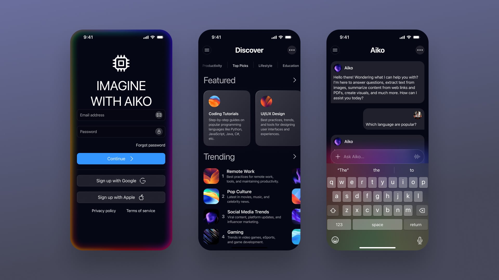
Artificial Intelligence App Design
In the second part of the design episode, we will design an AI app inspired by Apple's intelligence. This app will have a simple, clean design focusing on how information is organized and displayed. We'll also add special touches like gradients and blurs in certain areas.
What You'll Learn
The course is divided into three main parts: design, prototype, and implementation. Each section covers a key aspect of iOS design. We'll start with the basics and move to advanced topics, ensuring a strong foundation. You'll find practical examples, hands-on exercises, and tips to help you apply what you learn to your projects.
- UI Kits: Understand and use UI kits, and learn how to customize them to speed up your design process and ensure consistency.
- Create Wireframes: Develop wireframes that serve as the blueprint for your app, focusing on structure and functionality.
- Typography: Learn the basics of typography and apply Apple's typography guidelines to enhance readability and accessibility in your design.
- Integrate SF Symbols 6: Integrate SF Symbols into your design to create cohesive and attractive icons, making navigation easier for users.
- Implement Auto Layout: Leverage Figma's Auto Layout to build responsive designs that adapt to various screen sizes.
- Choose and Apply Colors: Understand color theory and Apple’s color guidelines, and create dynamic color styles and gradients.
Advanced Topics
The first part of the course is completely free! To learn about prototyping and implementation, just subscribe to DesignCode. You'll get access to all our past and future courses, including early access to upcoming ones. In the second part, we will design an AI app, inspired by Apple's intelligence. This app will have a simple, clean design focusing on how information is organized and displayed. We'll also add some special touches like gradients and blurs in certain areas. We will dive into more advanced topics to enhance your design skills and prepare you for real-world applications. Here's what you'll learn:
- Adaptive Layouts: Master the art of creating responsive designs that adapt seamlessly to different screen sizes and orientations.
- Layout Grids and Spacing: Understand how to use layout grids and manage spacing to create clean, organized, and visually appealing designs.
- Components and Variants: Learn how to build reusable components and create variants to streamline your design process and maintain consistency.
- Figma Variables: Discover how to use variables in Figma to simplify your design workflow and ensure consistency across your project.
- Advanced Prototyping: Take your prototyping skills to the next level by creating interactive and dynamic prototypes that closely mimic the final product.
- Preparing Design for Handoff: Learn best practices for preparing your design files for handoff to developers, ensuring a smooth transition from design to development.
- Exporting Your Design to Code: Explore how to export your design assets and turn them into code, bridging the gap between design and development.
- Customizing Code: Gain insights into customizing the exported code to fit specific project requirements and enhance functionality.
- React Native Animation: Get started with adding animations in React Native to create engaging and visually appealing user experiences.
- Getting Started with Reanimated: Learn the basics of Reanimated, a powerful library for building smooth and performant animations in React Native.
Figma File
To follow the course, you will need my Figma file. This file includes local color styles, color variables, assets, images, and components, including the original design and more.
iOS 18
Apple's iOS 18 introduces a host of new features and improvements designed to enhance the user experience on iPhone and iPad. The update includes advanced color variables for all system colors with light, dark, and dark elevated values, allowing for more dynamic and adaptive app designs. The updated app icon artwork and the new mode for switching between light, dark, and tinted app icons provide more customization options for users. Enhanced components like the new Control Center and Lock Screen, along with a new iPadOS floating tab bar, offer greater functionality and user-friendly interactions. With improved organization of instance properties and a comprehensive examples page, iOS 18 makes it easier for designers to create highly realistic and efficient app designs, fully aligned with Apple's design principles.

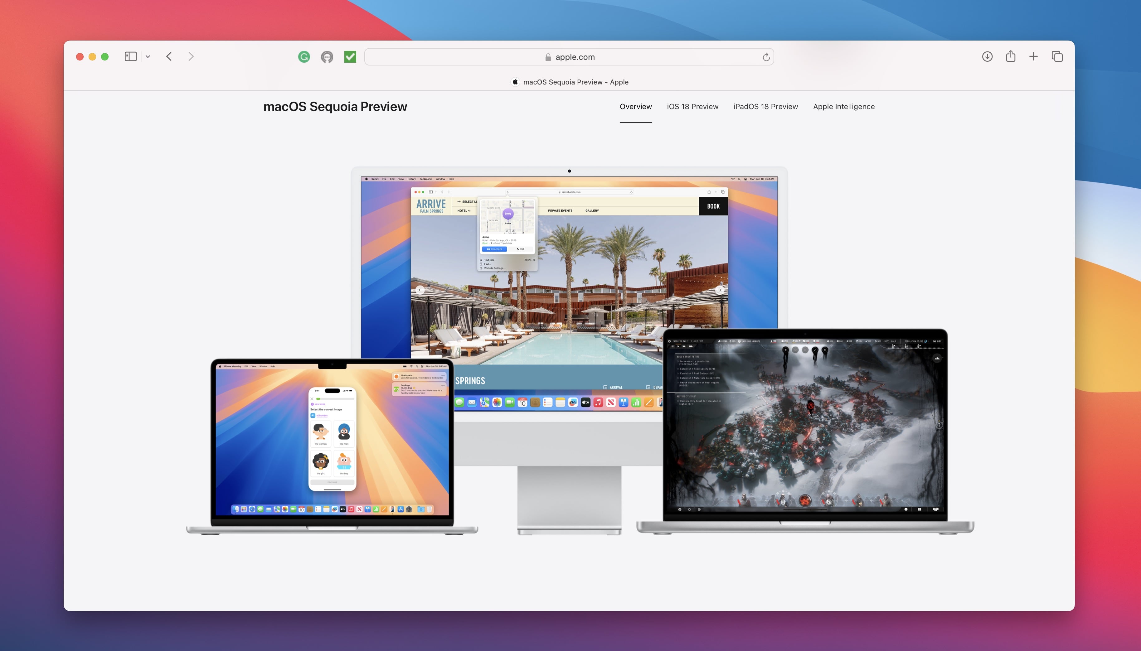
macOS Sequoia
macOS Sequoia introduces a range of new features and improvements for Mac devices. This update brings a refreshed user interface with smoother animations and a more cohesive design. Performance optimizations ensure faster multitasking, and new privacy features give users greater control over their data. Enhanced machine learning capabilities make applications smarter and more intuitive. Additionally, macOS Sequoia includes new productivity tools, better compatibility with iOS and iPadOS, and expanded support for developers with updated APIs and frameworks. This update offers a glimpse into the future of macOS, combining powerful features with a seamless user experience.
Apple Intelligence
Apple Intelligence uses advanced machine learning and AI to create smarter, more intuitive experiences across all Apple devices. It powers features like Siri, which offers personalized assistance, and the Photos app, which organizes and curates your photos. Apple prioritizes user privacy by processing as much data as possible on the device. Intelligent recommendations in the App Store, Apple Music, and News apps enhance user engagement by learning from your preferences. Apple Intelligence aims to make technology interactions more natural, efficient, and personalized.

Designing for iOS
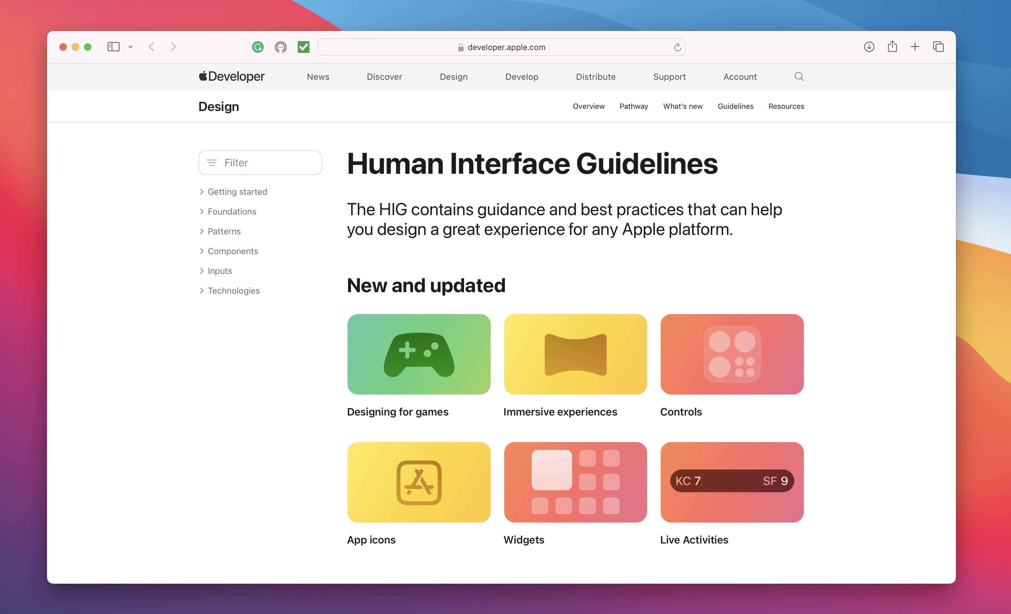
Designing for iOS means creating clean, intuitive, and visually appealing user interfaces that follow Apple's interface guidelines . This includes using clear typography, consistent icons, and balanced layouts for a smooth user experience. The focus is on clarity and simplicity, with careful attention to spacing, alignment, and color schemes for a cohesive look. Using tools like Figma, designers can create detailed prototypes to visualize the app's flow and functionality. The goal is to craft designs that are both aesthetically pleasing and easy to navigate and use.
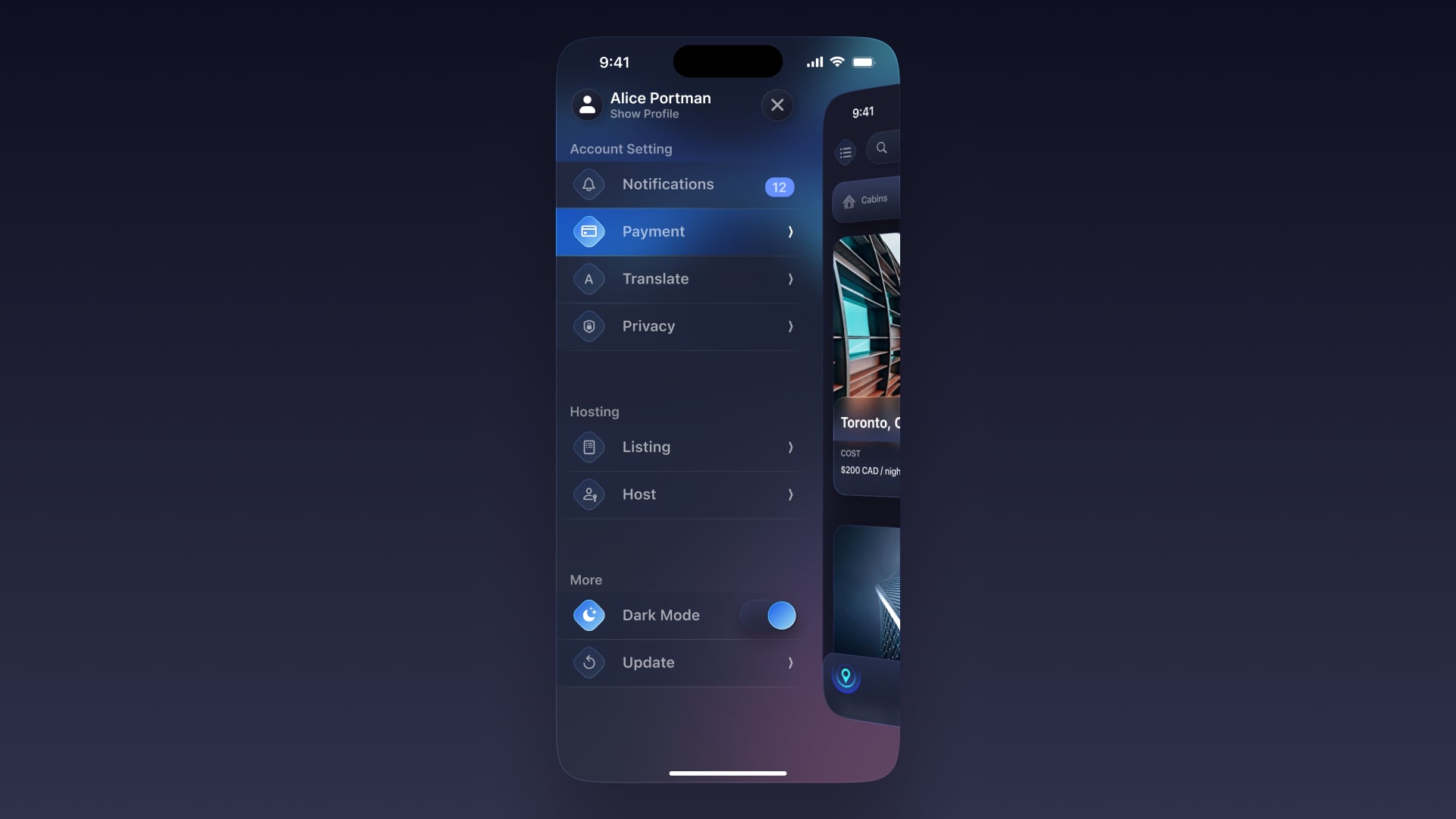
iOS 18 and iPadOS 18 UI Kit
We’re going to use Apple’s iOS 18 and iPadOS 18 UI Kit to help you quickly create accurate iPhone and iPad designs. It includes components for common controls, design templates, text styles, color styles, materials, and layout guides. New features include:
- Color variables for system colors
- Modes for switching between app icon styles
- Updated app icon artwork
- Examples page
- New iPadOS floating tab bar
- Improved instance properties for customization
- New Control Center and Lock Screen components with customizable controls
![Intro to IOS 18 image 11]()

Large Titles
Bold fonts have become more common, with titles appearing large and bold. This change is due to taller screens and the need for accessibility. In iOS, users can set very large fonts for apps that support accessibility, including all of Apple's built-in apps. This feature has become an expected standard for users.
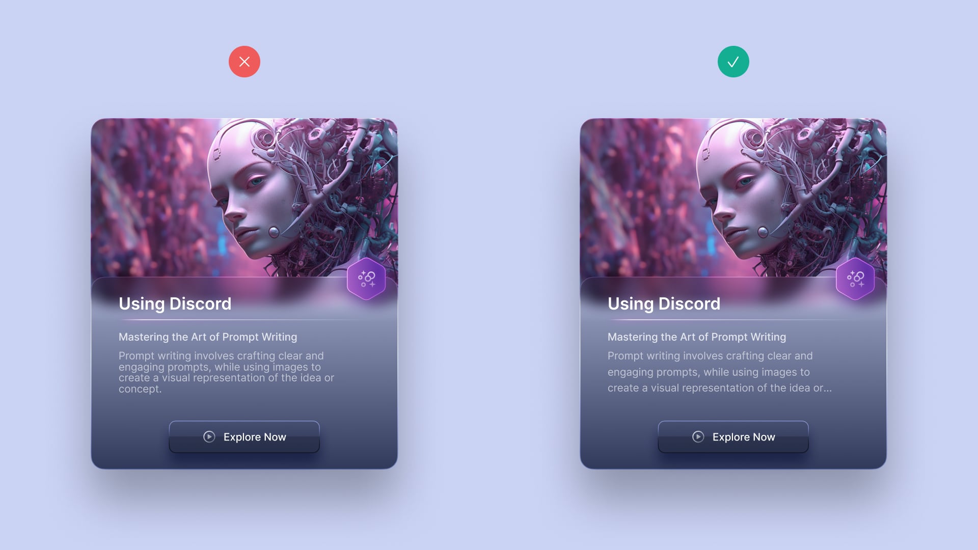
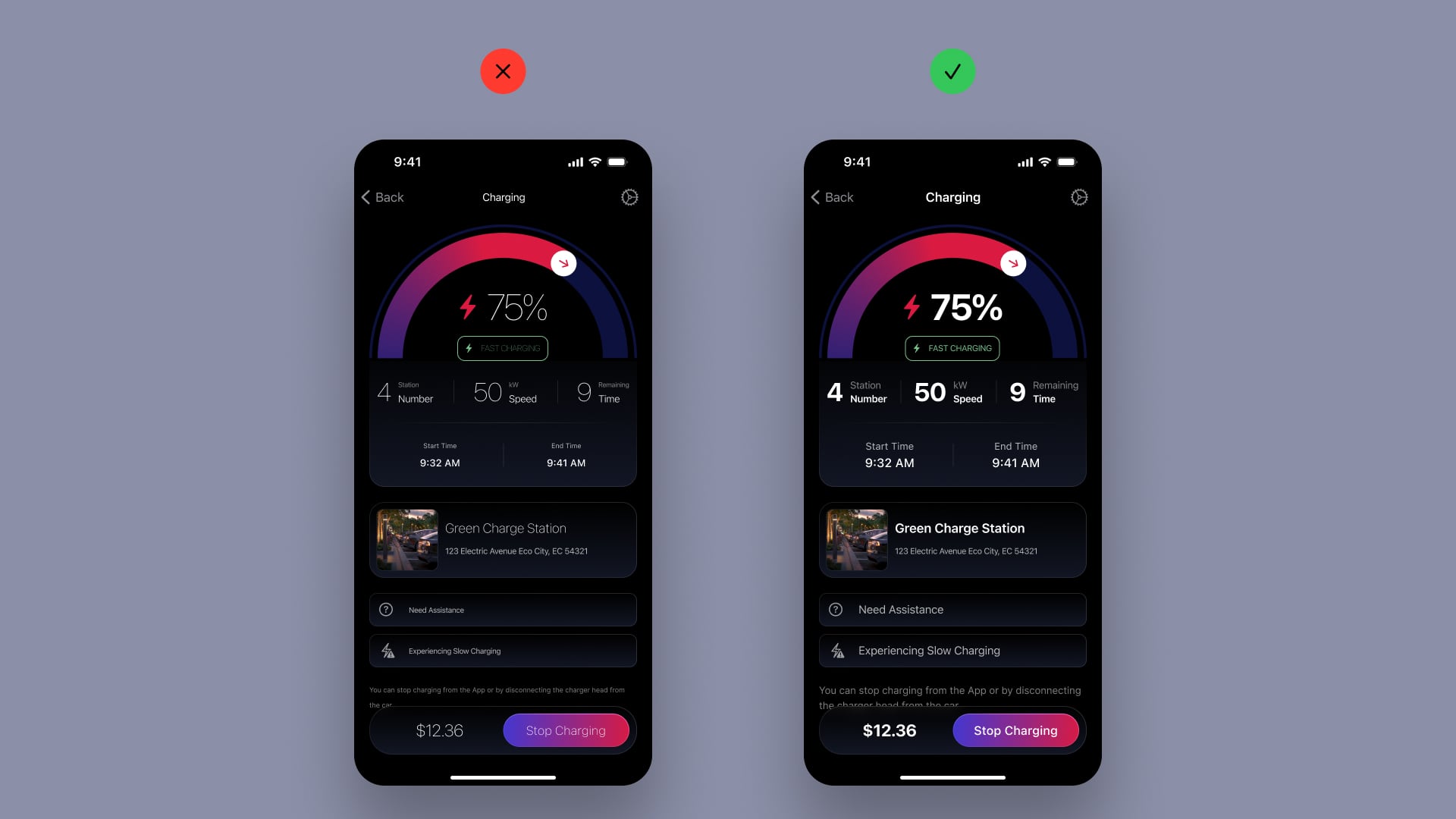
Cards
With larger screens, there's more room to showcase content. Using cards can help organize different sections more effectively. Rounded corners on these cards give them a tactile and friendly feel. To add depth and context to your design, you can incorporate blurred backgrounds and drop shadows.
Colors
Use noticeable colors to show that an element can be tapped or highlighted. For buttons and states, blue is a dependable and safe option. It's also a good idea to start with a light background and black text, or a dark background with white text for dark mode, creating strong contrast for readability.
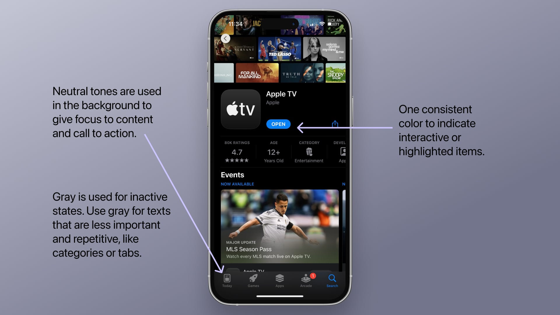
iOS Palette
Apple employs specific colors in their native apps. Blue is the most commonly used color across the system, representing buttons, icons, and actionable elements. Other colors establish brand identity, such as yellow for Notes, pink for Apple Music, and green for Messages. Red typically indicates destructive actions, while green signifies successful actions.

System Colors
System colors are predefined colors provided by Apple to ensure consistency and accessibility across different apps and interfaces. These colors automatically adapt to various system settings, such as light and dark modes, providing a seamless user experience.
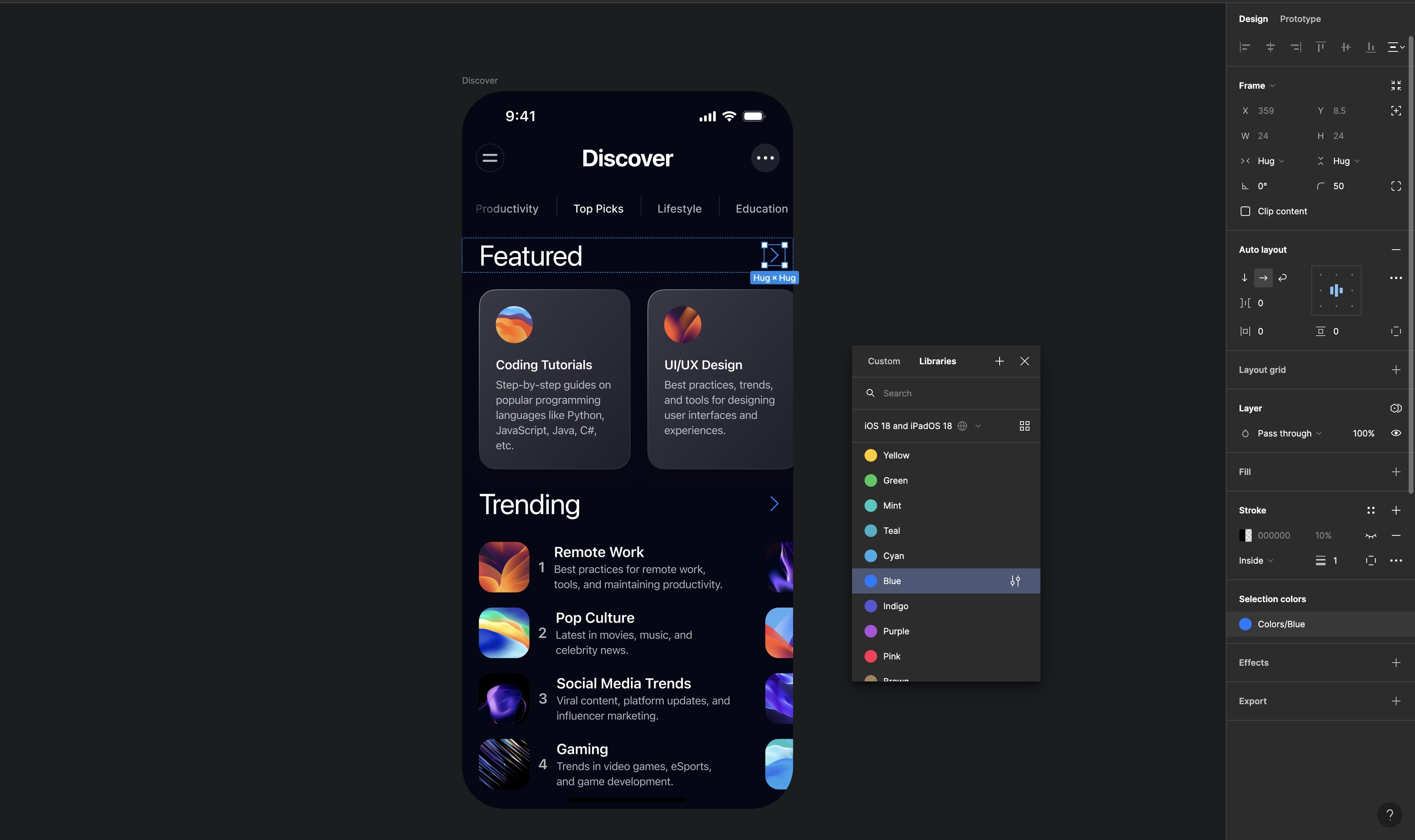
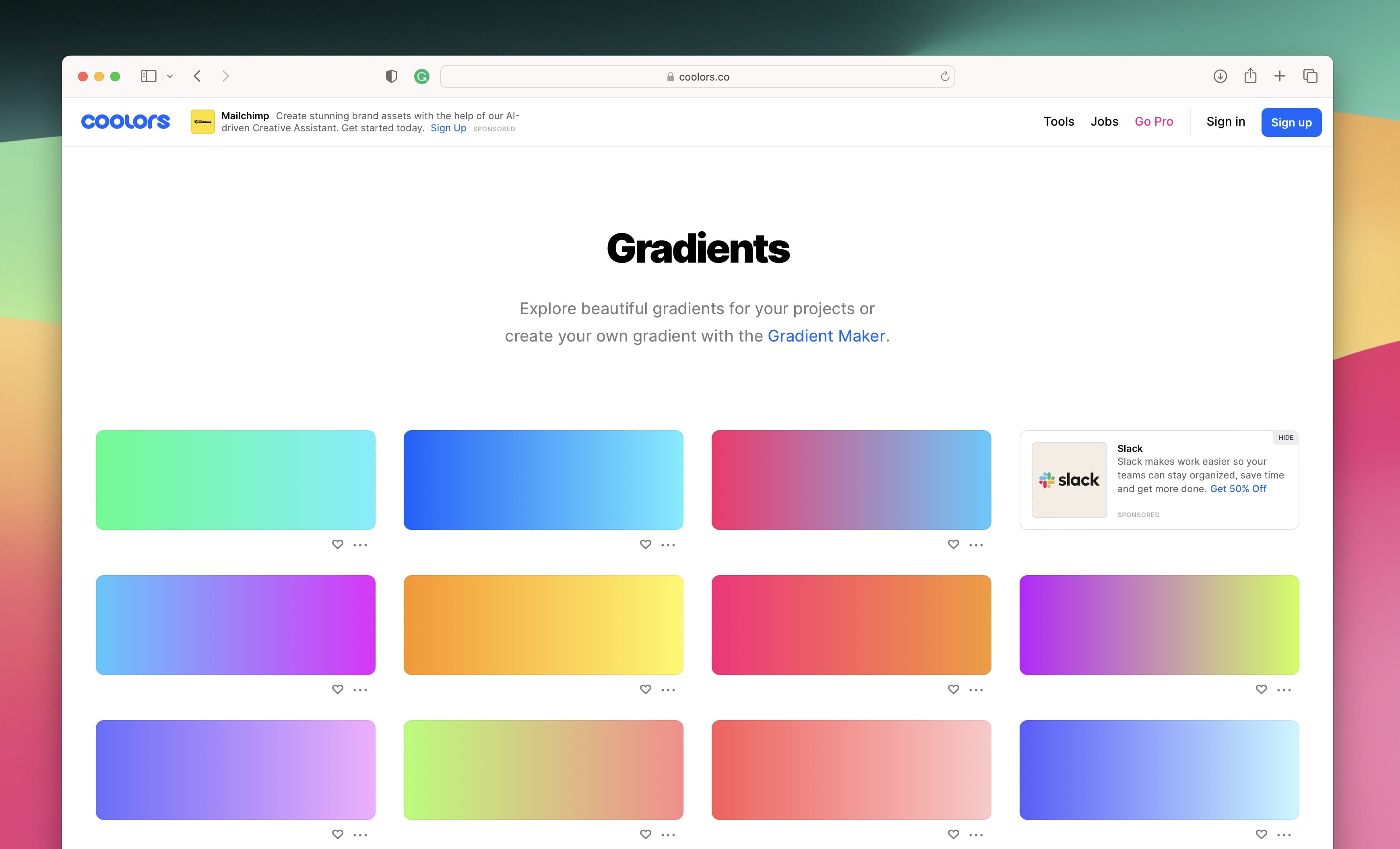
Gradients
A color gradient is a gradual change from one color to another, and it can include multiple shades. Gradients are also called color transitions. They can smoothly blend similar colors or create a contrast between very different ones. Different types of gradients can be chosen: linear , radial , angular, and diamond . Each type provides distinct ways to add gradient effects to your design.
Layout Design
Layout is the arrangement of visual and textual elements on a screen. It organizes these elements to create a clear, visually appealing interface. Effective layout design ensures content is easy to read and navigate, using principles like alignment, visual hierarchy, and spacing to guide the user's attention and create a logical flow. In iOS 18 design, a well-structured layout enhances usability and provides a seamless user experience.
8 pt layout grid system
The 8 pt grid system is a common UI design method that uses 8-pixel increments for spacing and sizing elements. It ensures consistency, alignment, and easy scalability across different devices. By using this system, designers can create clean, organized, and visually appealing layouts that work well on any screen size. This approach simplifies the design process and improves collaboration with developers, making it easier to maintain a uniform look and feel throughout the app.
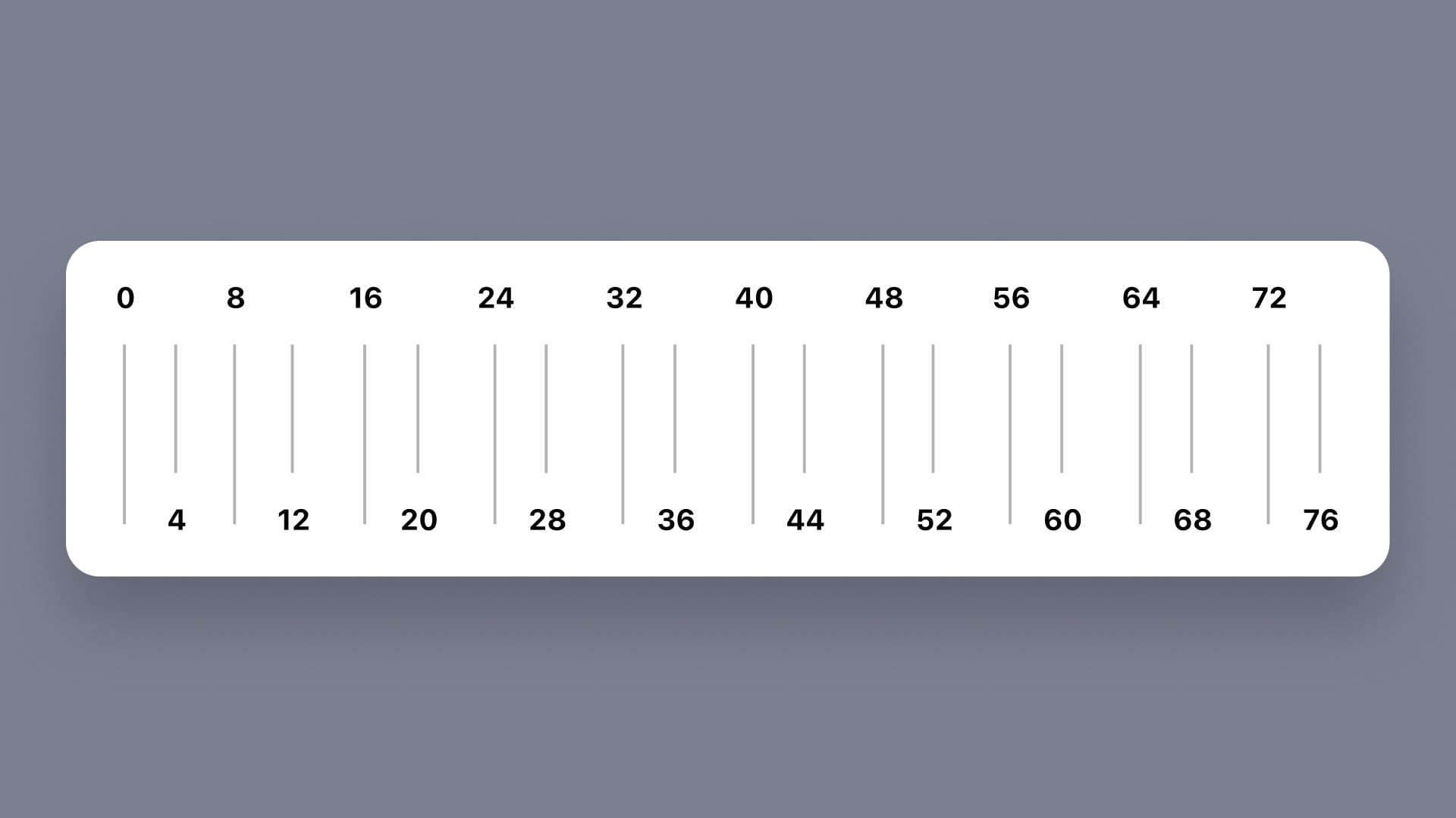
Spacing and Padding
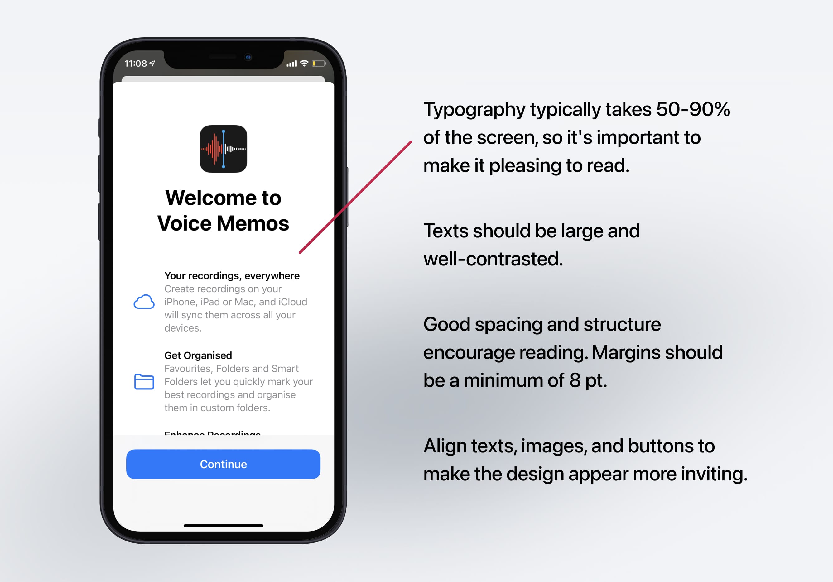
Spacing and padding are crucial for creating a clean and organized interface in iOS 18. Consistent spacing between elements ensures a clutter-free layout, making it easy for users to navigate. Padding within elements, like buttons and text fields, keeps content legible and touch-friendly. Apple recommends using margins and padding between 16 and 20 points to maintain a cohesive look. Proper use of negative space helps separate sections and prevents visual overload. By following these guidelines, designers can create balanced and user-friendly interfaces.
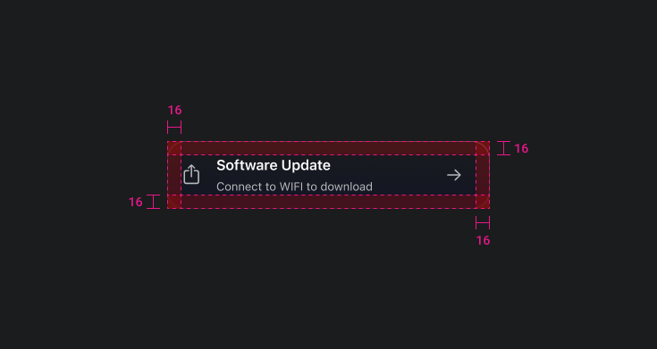
Margin and Safe Area
Use negative space to draw attention to content, creating breathing room and preventing visual clutter. Apple typically uses margins between 16 and 20 pt. The safe area defines the area within a view that isn’t covered by a navigation bar, tab bar, toolbar, or other views.

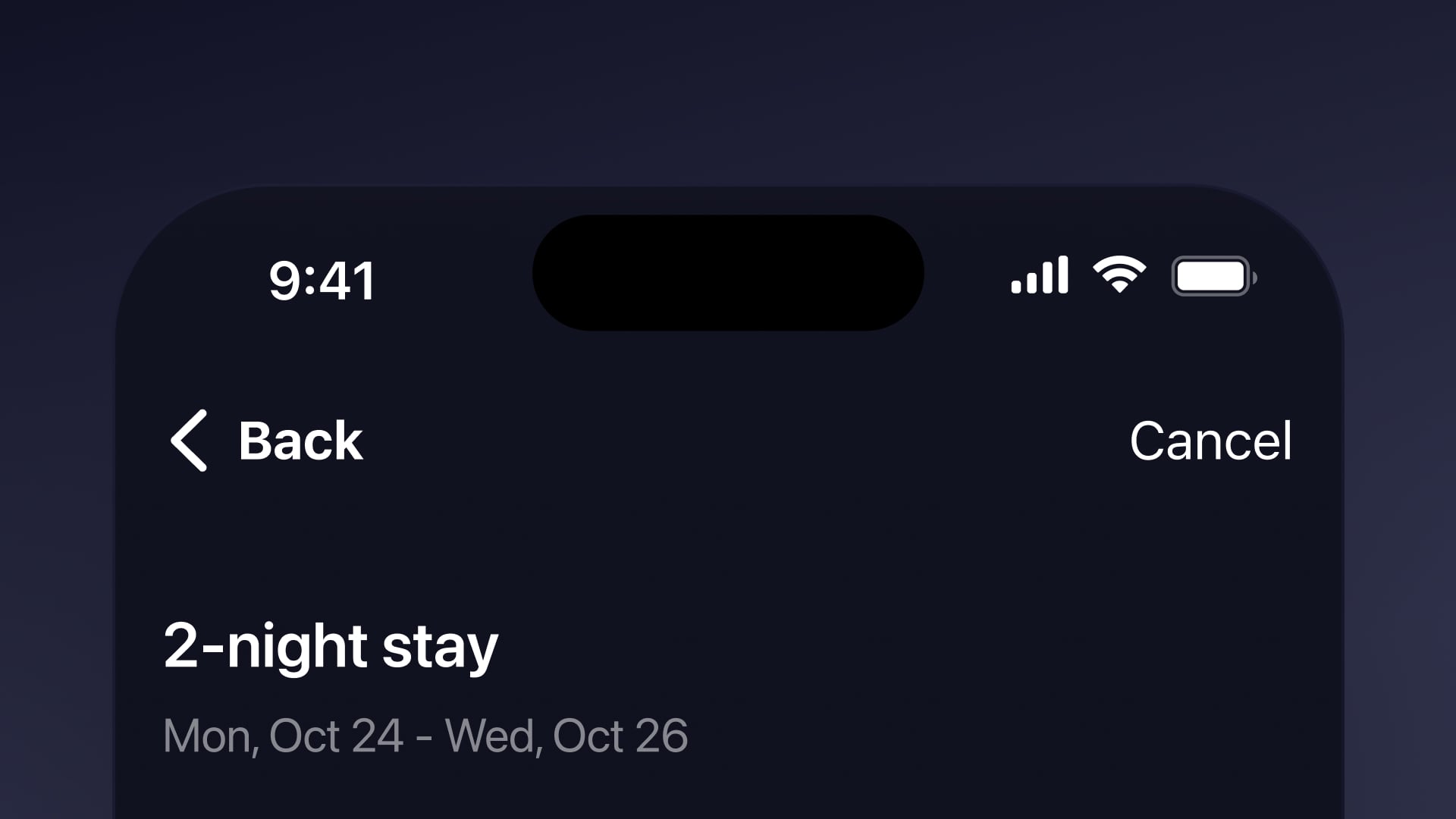
Navigation
Navigation directly impacts user experience and usability. Well-designed navigation ensures users can easily find their way around the app, reducing confusion and frustration.
Navigation bars
The navigation bar, located at the top of the screen, often contains a title or logo and navigation buttons. It helps users navigate back to previous screens or access additional options. visionOS uses a variable blur in the bar background, anchoring the bar above scrolling content.
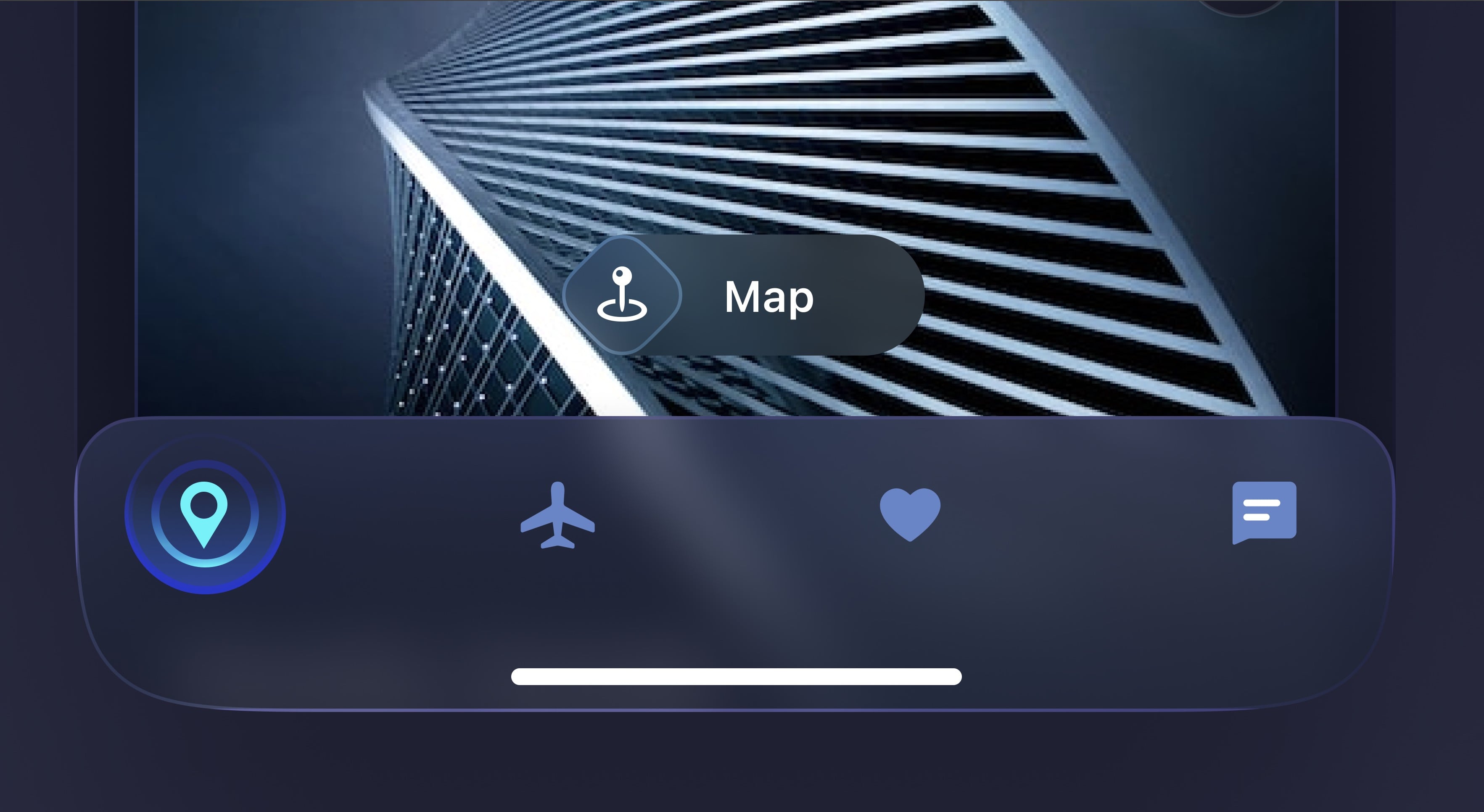
Tab Bar
A tab bar is a row of tabs typically placed at the bottom of the screen, allowing users to switch between different sections or views with a single tap. It’s recommended to use up to five tabs in iOS and up to six tabs in visionOS, iPadOS, and tvOS.
Sidebar
A sidebar is a panel next to the main content area, offering extra navigation, options, or additional information. It usually shows a list of sections, categories, or menu items for easy access.
Buttons
Buttons should be easy to tap and range from 30 to 60 points wide, with sufficient space around them for visibility and distinction from other screen elements. Standard iOS interfaces recommend buttons be at least 44x44 points . iOS and iPadOS have four button styles, each available in three sizes, with different levels of visual prominence.

Icons
Icons should be clear and easy to understand. Use text whenever possible to make their meaning clearer. Avoid using different versions of the same icon in different places to prevent user confusion.
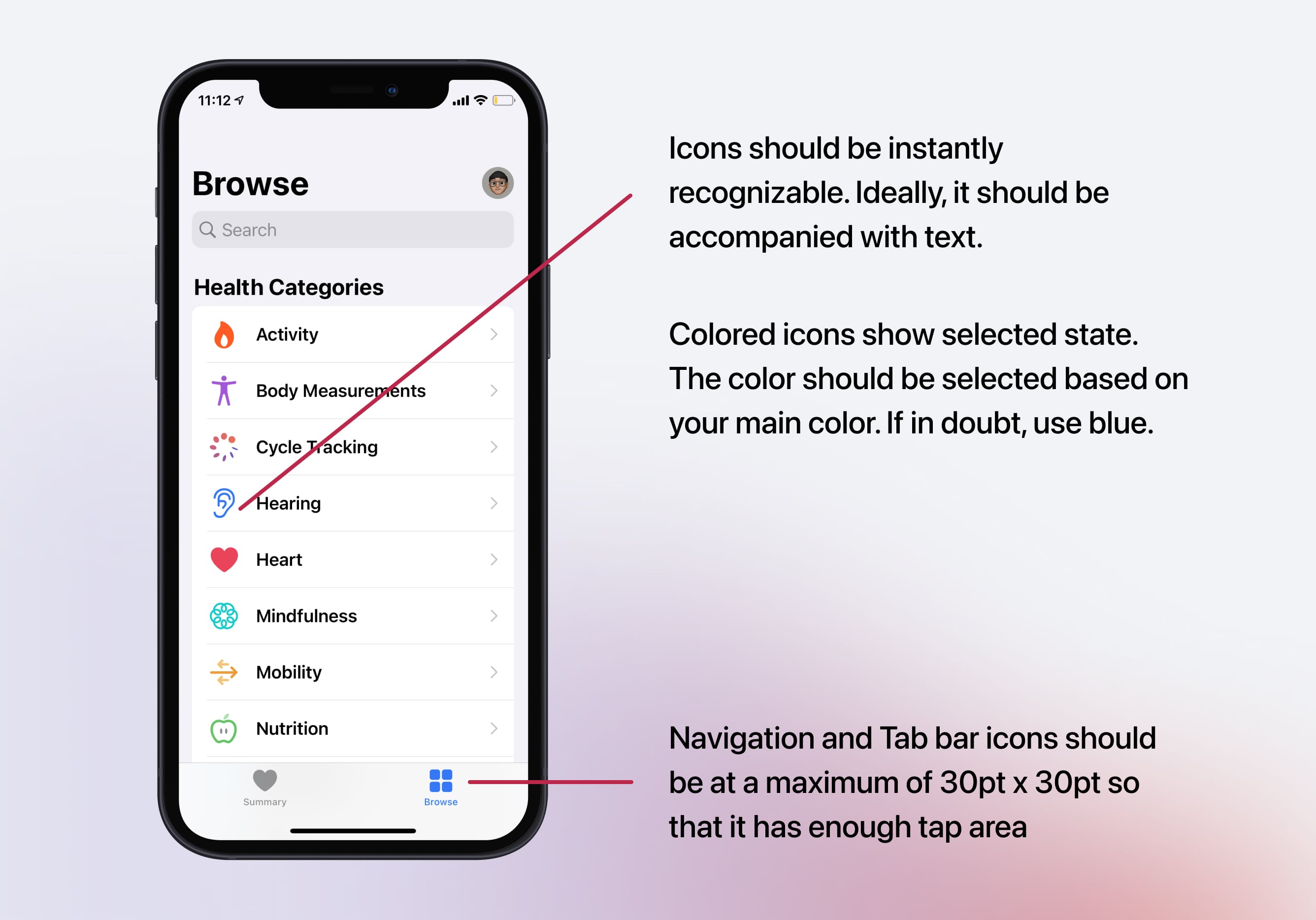
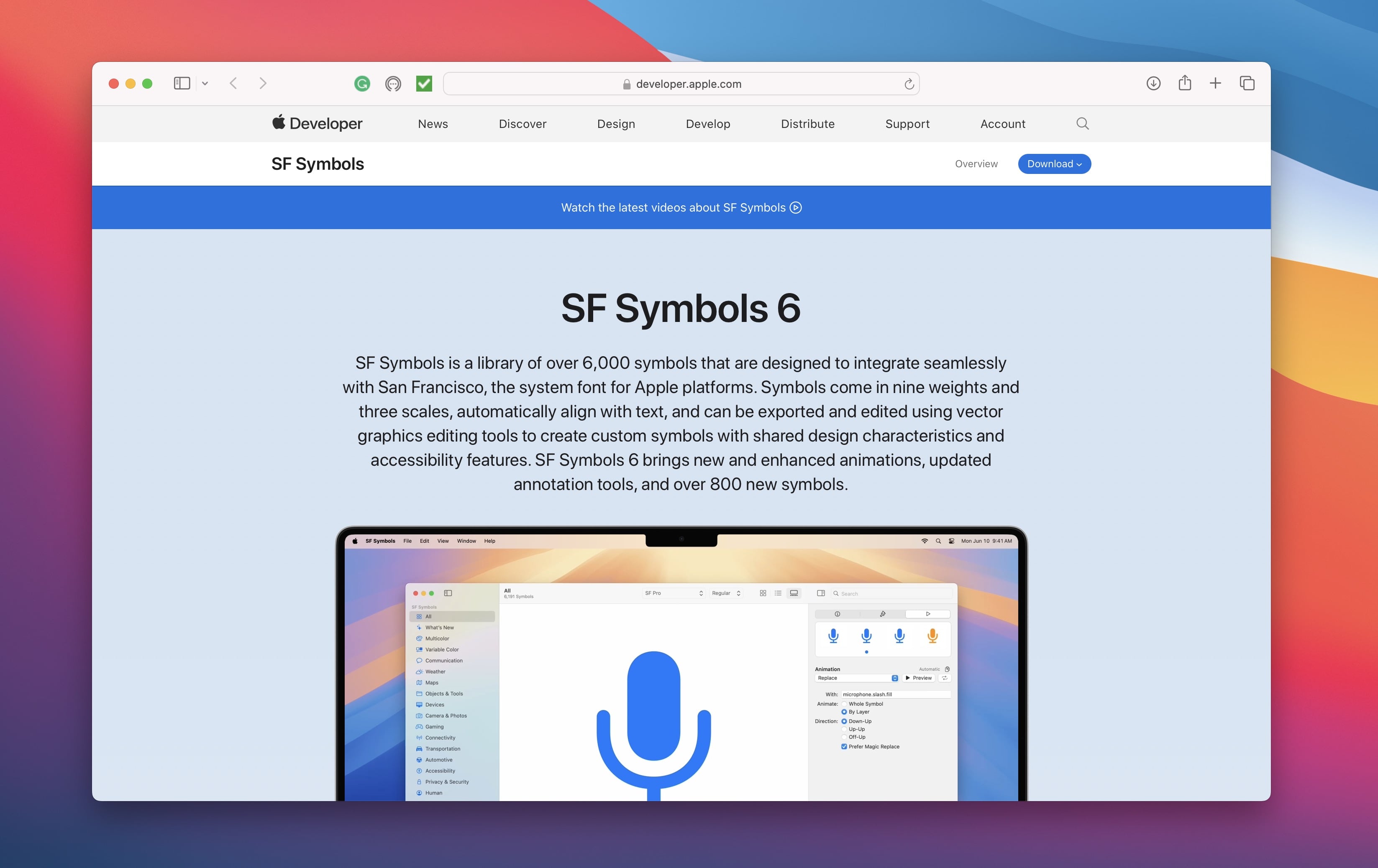
SF Symbols 6
SF Symbols is Apple’s extensive icon library, offering over 6,000 symbols designed for consistency and accessibility. SF Symbols 6 adds enhanced animations, improved annotation tools, and over 800 new symbols. Download and install the SF Symbols App from the Apple Developer website.
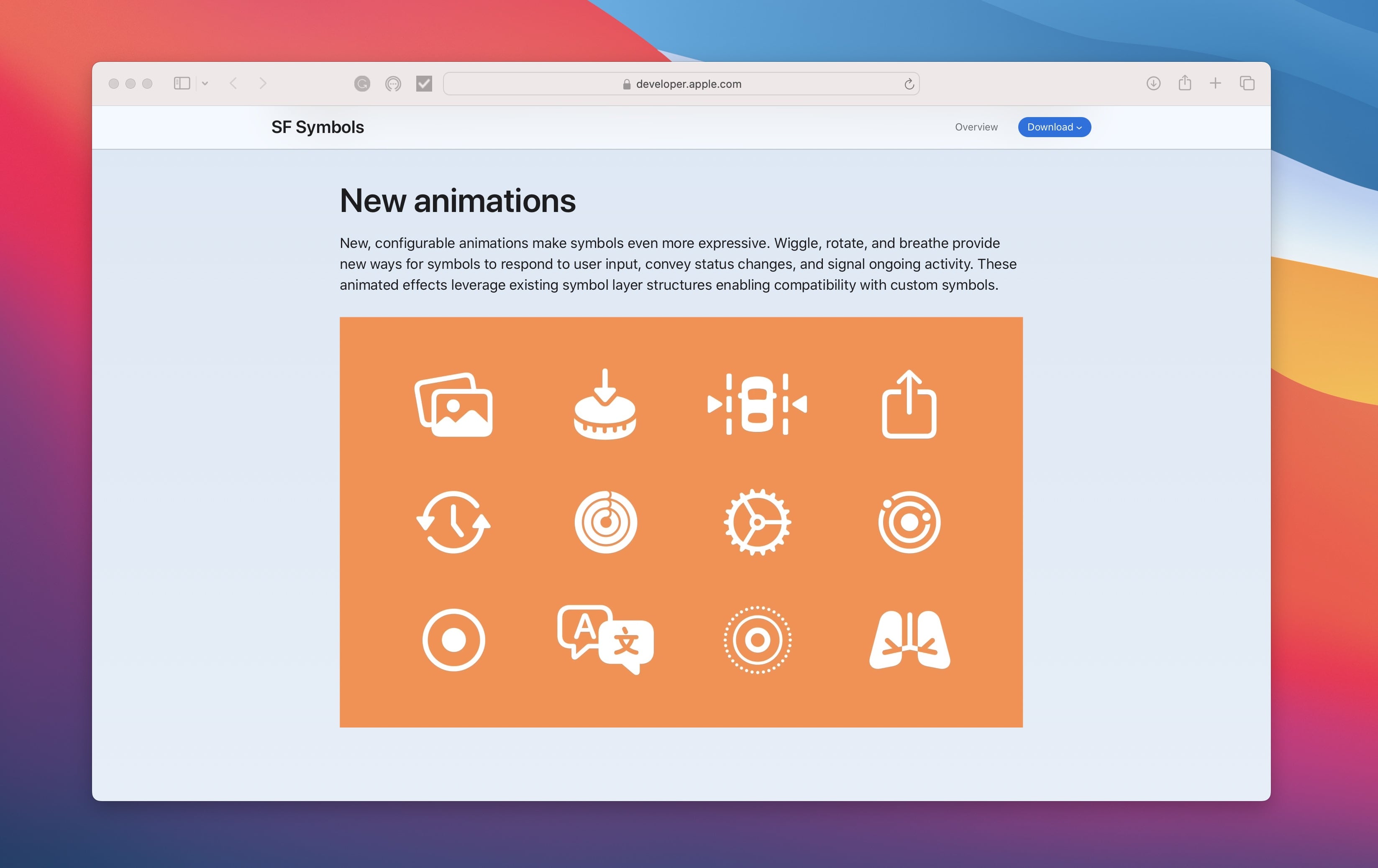
What’s New in SF Symbols?
This year, Apple has introduced exciting updates to SF Symbols. Three new animation presets—Wiggle, Rotate, and Breathe—make icons more dynamic and engaging. Existing presets like Replace and Variable Color have also been enhanced for smoother transitions and animations. The SF Symbols app has been updated with better tools for creating and customizing animated symbols. Additionally, over 800 new symbols have been added, bringing the total to over 6,000 unique icons, giving designers a wide range of options to enhance their designs.
Typography
Typography is essential for clear and visually pleasing communication. With a simple interface and focus on content, typography will occupy a large part of the screen. The default San Francisco font is recommended for its legibility and consistent use in Apple apps.
Line Height
It's also important to consider the line height, or the spacing between lines of text. A good line height can improve readability and reduce eye strain. A general guideline is to use a line height of 1.5 times the font size, but this can also vary depending on the font and layout.
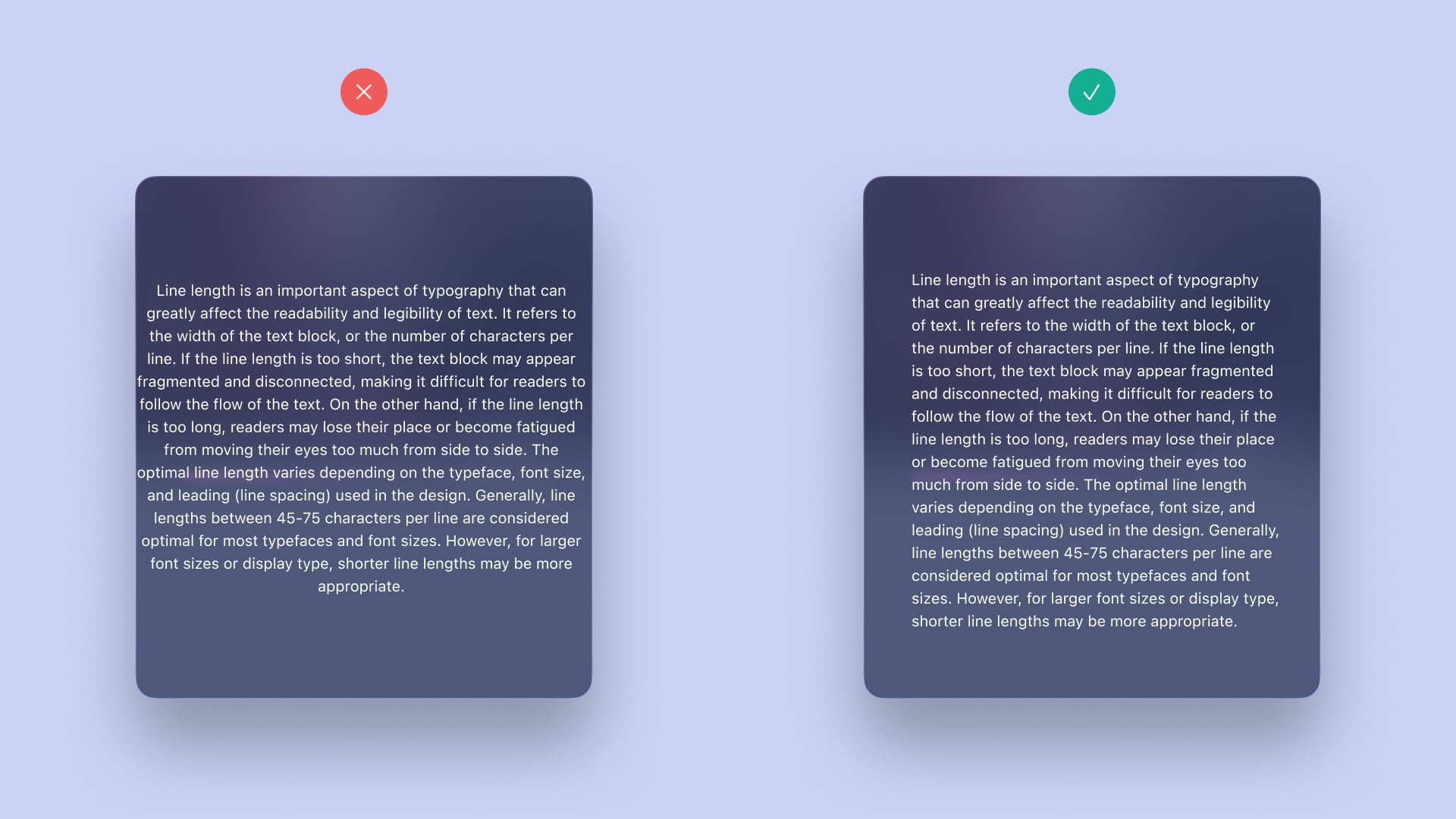
Line Length
Line length is crucial in typography, affecting how easily text is read. It refers to the width of the text block or characters per line. If too short, the text becomes disjointed and difficult to follow. If too long, readers may lose their place and experience eye fatigue. Optimal line length depends on typeface, font size, and leading. Generally, 45-75 characters per line are best for most typefaces and sizes. Larger fonts or display types may need shorter lines for readability.
Legibility
The text should be easy to read at any size. Use font sizes and weights that ensure readability for most people. For iOS, use a minimum font size of 11 pt. Avoid using light font weights; choose Regular, Medium, Semibold, or Bold weights instead.
Hierarchy
Use different font sizes, weights, and styles to create a clear visual hierarchy. This helps users understand the content structure and navigate it easily. Typography hierarchy arranges and organizes text visually to guide the reader's attention and show the importance of different elements.
Contrast
To make text easy to read, it's important to have enough contrast between the font and the background. Using black or white colors is usually a safe option as they create strong contrast with most color schemes.

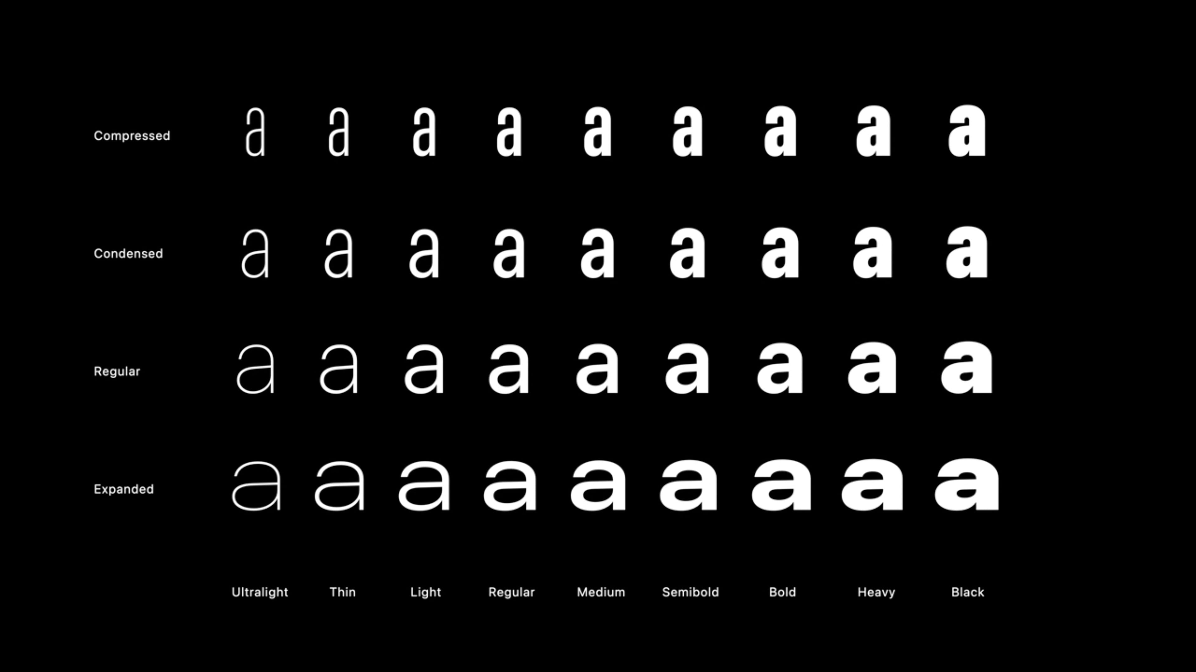
Font Weights and Widths
These are all the new available Widths in SF, which, when combined with the existing Weights, unlock an abundance of possibilities. This expansion introduces a diverse range of voices and functionalities, catering to a wide range of applications.
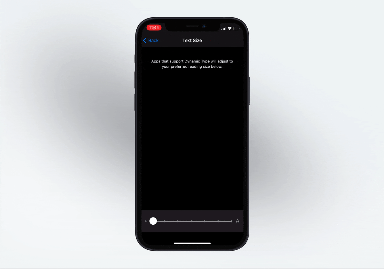
Dynamic Type
Dynamic Type is an essential feature that allows users to adjust the text size across the system to suit their reading preferences. When designing for iOS 18, ensure that your app supports Dynamic Type by using the built-in text styles provided by Apple. This ensures that your text remains readable and accessible, regardless of the user's preferred text size.
Accessibility is a prominent theme in iOS design. Apple provides dynamic font presets that automatically adjust the text size based on the user's preferences. For example, if you set your text to Body and enable Dynamic Type, the system will increase the size based on the user's settings.
Templates and source code
Download source files
Download the videos and assets to refer and learn offline without interuption.
Design template
Source code for all sections
Video files, ePub and subtitles
Videos
Assets
1
Intro to iOS 18
Master iOS 18 design: Create stunning apps with Figma. Learn UI/UX principles, prototyping, and Apple's latest design language for mobile
3:49
2
UI Kits
Explore the best UI Kits and save time while creating unique designs
6:30
3
Wireframing
Building the Foundation of Your UI Design and Learning About the Different Types of Wireframes: Low, Mid, and High Fidelity
7:39
4
iOS 18 Typography
A beginner’s guide to master the art of typography for iOS and enhance your design skills with the latest typography techniques
9:59
5
SF Symbol 6
Discover what's new in SF Symbols 6, and learn how to integrate these icons into your design for a better user experience
10:10
6
Auto Layout
Learn how to create flexible layouts that adapt to different screen sizes and content changes by mastering Auto Layout
13:52
7
Colors
Bring your design to life and learn how to seamlessly integrate colors and gradients into our design
14:41
8
Gradients
Learn how to create complex gradient effects that make your designs stand out
15:08
9
Responsive Layouts
Ensure our layout is responsive to provide a smooth user experience on all devices
6:22
10
Layout Grids and Spacing
Explore Figma's grid systems to create precise, visually appealing designs
15:07
11
Components and Variants
Learn and create components for our layouts to easily reuse design elements, ensuring our design remains consistent and efficient
10:42
12
Figma Variables
Explore how to use variables, create a sign-up page, and switch to dark mode
14:51
13
Overlays and Variable Mode Interactions
Learn how to create interactive transitions with overlays and easily switch between light and dark modes using variables in your prototype
5:23
14
Interactive Form Fields with Variables
Bring your designs to life with responsive form fields using variables and conditional logic
8:00
15
Gradient Animations
Discover how to bring gradients to life with smooth transitions using After Delay and Smart Animate
8:23
16
Master Conditionals for a Functional Keyboard
Animate a chat screen with a functional keyboard that looks and feels real using conditionals
8:56
17
Preparing Design for Handoff
Best Practices for Preparing Design for Handoff
6:34
18
Exporting Your Design to Code
Best Practices for Exporting Design to Code
4:57
19
Customizing Code
Step-by-Step Guide to Customizing Code
5:46
20
React Native Animation
Animating UI Components in React Native
7:26
21
Getting Started with Reanimated
Reanimated Essentials for React Native Developers
10:56
Meet the instructor
We all try to be consistent with our way of teaching step-by-step, providing source files and prioritizing design in our courses.
Sourasith Phomhome
UI Designer
Designer at Design+Code
19 courses - 72 hours
Master AI Prompting for Stunning UI
Learn how to leverage AI tools like Aura for creating beautiful designs, working with templates, and experimenting with advanced prompts. A concise guide for designers and developers to level up their skills.
10 hrs
Design Multiple Apps with Figma and AI
In this course, you’ll learn to design multiple apps using Figma and AI-powered tools, tackling a variety of real-world UI challenges. Each week, a new episode will guide you through a different design, helping you master essential UI/UX principles and workflows
4 hrs
SwiftUI Fundamentals Handbook
A comprehensive guide to mastering Swift programming fundamentals, designed for aspiring iOS developers. This handbook provides a structured approach to learning Swift's core concepts, from basic syntax to advanced programming patterns. Through carefully sequenced chapters, readers will progress from essential programming concepts to object-oriented principles, building a solid foundation for SwiftUI development. Each topic includes practical examples and clear explanations, ensuring a thorough understanding of Swift's capabilities. This handbook serves as both a learning resource and a reference guide, covering fundamental concepts required for modern iOS development. Topics are presented in a logical progression, allowing readers to build their knowledge systematically while gaining practical programming skills.
2 hrs
Design and Code User Interfaces with Galileo and Claude AI
In this course, you’ll learn how to use AI tools to make UI/UX design faster and more efficient. We’ll start with Galileo AI to create basic designs, providing a solid foundation for your ideas. Next, we’ll refine these designs in Figma to match your personal style, and finally, we’ll use Claude AI to turn them into working code—eliminating the need for traditional prototyping.
4 hrs
Design and Prototype for iOS 18
Design and Prototype for iOS 18 is an immersive course that equips you with the skills to create stunning, user-friendly mobile applications. From mastering Figma to understanding iOS 18's latest design principles, you'll learn to craft two real-world apps - a Car Control interface and an AI assistant.
3 hrs
Master Responsive Layouts in Figma
Creating responsive layouts is a must-have skill for any UI/UX designer. With so many different devices and screen sizes, designing interfaces that look great and work well on all platforms is necessary. Mastering this skill will make you stand out in the field. In this course, we'll start from scratch to create this beautiful design using Figma. You'll learn how to make layouts that are easy to use and work well on any device. We'll cover key concepts and tools to help you master responsive design in Figma.
2 hrs
UI UX Design with Mobbin and Figma
Mobbin is a powerful tool for UI/UX designers seeking inspiration and innovative design solutions. This platform offers a vast collection of real-world mobile app designs, providing a treasure trove of UI elements and layouts.
2 hrs
3D UI Interactive Web Design with Spline
Learn to create 3D designs and UI interactions such as 3D icons, UI animations, components, variables, screen resize, scrolling interactions, as well as exporting, optimizing, and publishing your 3D assets on websites
3 hrs
Design and Prototype for iOS 17 in Figma
Crafting engaging experiences for iOS 17 and visionOS using the Figma design tool. Learn about Figma's new prototyping features, Dev Mode, variables and auto layout.
6 hrs
Design and Prototype Apps with Midjourney
A comprehensive course on transforming Midjourney concepts into interactive prototypes using essential design techniques and AI tools
8 hrs
iOS Design with Midjourney and Figma
Learn the fundamentals of App UI design and master the art of creating beautiful and intuitive user interfaces for mobile applications
1 hrs
UI Design for iOS, Android and Web in Sketch
Create a UI design from scratch using Smart Layout, Components, Prototyping in Sketch app
1 hrs
UI Design a Camera App in Figma
Design a dark, vibrant and curvy app design from scratch in Figma. Design glass icons, lens strokes and realistic buttons.
1 hrs
UI Design for iOS 16 in Sketch
A complete guide to designing for iOS 16 with videos, examples and design files
3 hrs
Prototyping in Figma
Learn the basics of prototyping in Figma by creating interactive flows from custom designs
1 hrs
UI Design Quick Websites in Figma
Learn how to design a portfolio web UI from scratch in Figma
1 hrs
UI Design Android Apps in Figma
Design Android application UIs from scratch using various tricks and techniques in Figma
2 hrs
UI Design Quick Apps in Figma
Design application UIs from scratch using various tricks and techniques in Figma
12 hrs
Figma Handbook
A comprehensive guide to the best tips and tricks in Figma. Not affiliated with or endorsed by Figma, Inc.
6 hrs