
Intro to Responsive Layouts
Add to favorites
Mastering Figma Techniques for Flexible and Adaptive Design Across Different Devices
Play video
Master Responsive Layouts in Figma
1
Intro to Responsive Layouts
3:10
2
Resizing, Spacing and Alignment
15:01
3
Wrap, Min and Max Width and Padding
11:05
4
Absolute Position and Constraints
9:14
5
Adaptive Design, Breakpoints and Grid Systems
12:38
6
Figma Handoff Introduction
4:30
7
Responsiveness
4:44
8
Creating a Responsive Desktop Design
15:34
9
Dark Mode
9:16
10
Tablet and Mobile version
12:22
11
Locofy Introduction
3:01
12
Conversion with Locofy Classic
15:24
13
Lightning: One-Click Design to Code
7:19
14
Locofy Responsiveness
9:18
15
Exporting Your Project to Code
9:59

Project Management Web Design
We'll create a project management web design using a flat, bento-style for a minimalist and clean look. This means we'll focus on the information architecture and avoid unnecessary gradients, shadows, and blurs. We'll use only Auto Layout to make sure the entire web design is fully adaptive.

Course Outline
Throughout the course, we'll cover essential topics like Auto Layout features such as "Fill Container," "Min and Max Width," and "Wrap." You'll also learn about Constraints, the grid system, and Breakpoints for creating adaptive layouts. By the end of this course, you'll have the knowledge and skills to create designs that are not just responsive but truly flexible and adaptive.

Figma File
Before starting the course, you'll need access to my Figma file. This file contains the original design, prototype, assets, components, variables, and more. It will be your main resource throughout the course, helping you easily follow along with the lessons and exercises.

What is a Responsive Layout?
Responsive layouts are designs that automatically adjust and rearrange themselves to fit any screen size or device. This means that whether you're viewing a website or app on a phone, tablet, or computer, the layout will change smoothly to look good and work well. It ensures a consistent and user-friendly experience across all devices.

What is Adaptive Design?
Adaptive design is a way of creating websites or apps that adjust to different screen sizes and devices. Instead of just resizing everything to fit, adaptive design uses specific layouts for different screen sizes. This means the design changes to provide the best user experience on each device, whether it's a phone, tablet, or computer.

Auto Layout
Traditional frames in Figma require manual adjustments for each screen size, which can be time-consuming and prone to errors. Auto Layout makes it easy to create dynamic and responsive designs in Figma. It allows elements in a frame to adjust automatically based on their content and the rules you set, like padding, spacing, and alignment. This ensures components resize and reposition themselves smartly as content changes, which is great for designing user interfaces that need to work well on different screen sizes and orientations. Also, Auto Layout is developer-friendly, creating clear layouts that are easy to code. This makes the handoff to developers smoother, reduces the need for constant adjustments and clarifications, and makes the whole process more efficient.

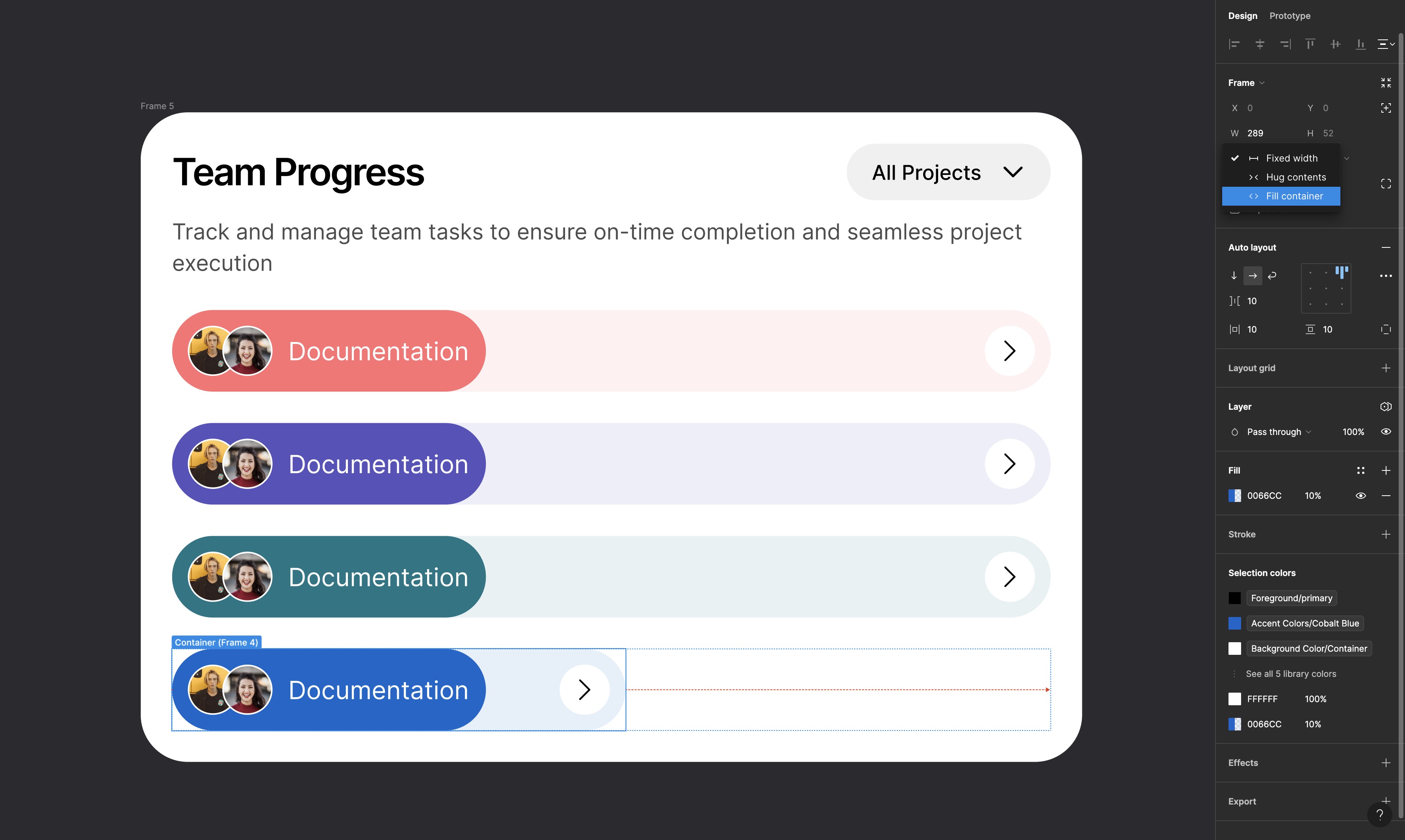
Fill Containers
Fill containers allows design elements to dynamically adjust their size to fill the available space within their parent frame. When an element is set to fill container, it stretches or shrinks to occupy the entire width or height of the container, ensuring a flexible and responsive design. This is particularly useful for creating buttons, input fields, or any UI components that need to adapt seamlessly to different screen sizes and layouts. By leveraging fill containers, designers can maintain a consistent visual hierarchy and alignment, enhancing the overall user experience by ensuring that the interface remains balanced and functional across various devices and resolutions.
Min and Max Width
Min and max width settings provide designers with granular control over the sizing behavior of elements within a responsive layout. By specifying minimum and maximum width values, designers can ensure that components do not shrink below a certain size or expand beyond a set limit, maintaining the design's integrity and usability. These constraints are particularly useful for creating flexible designs that need to adapt to different screen sizes while preserving readability and aesthetic appeal. For instance, setting a min width prevents text boxes from becoming too narrow to read, while a max width ensures that buttons and other elements do not become disproportionately large on wider screens. This balance helps create a responsive and visually consistent user interface.

Wrap
The Wrap feature allows elements within a frame to flow onto multiple lines when there isn't enough space to display them in a single line. This is particularly useful for creating responsive designs where components need to adjust dynamically to varying screen sizes and container dimensions. When Wrap is enabled, items within the auto layout frame will automatically move to the next line when they reach the edge of the container, ensuring that the layout remains organized and visually appealing. This feature is ideal for designing complex UI elements like navigation menus, tag lists, or galleries, where content needs to be flexible and adaptable without compromising the overall structure and user experience.

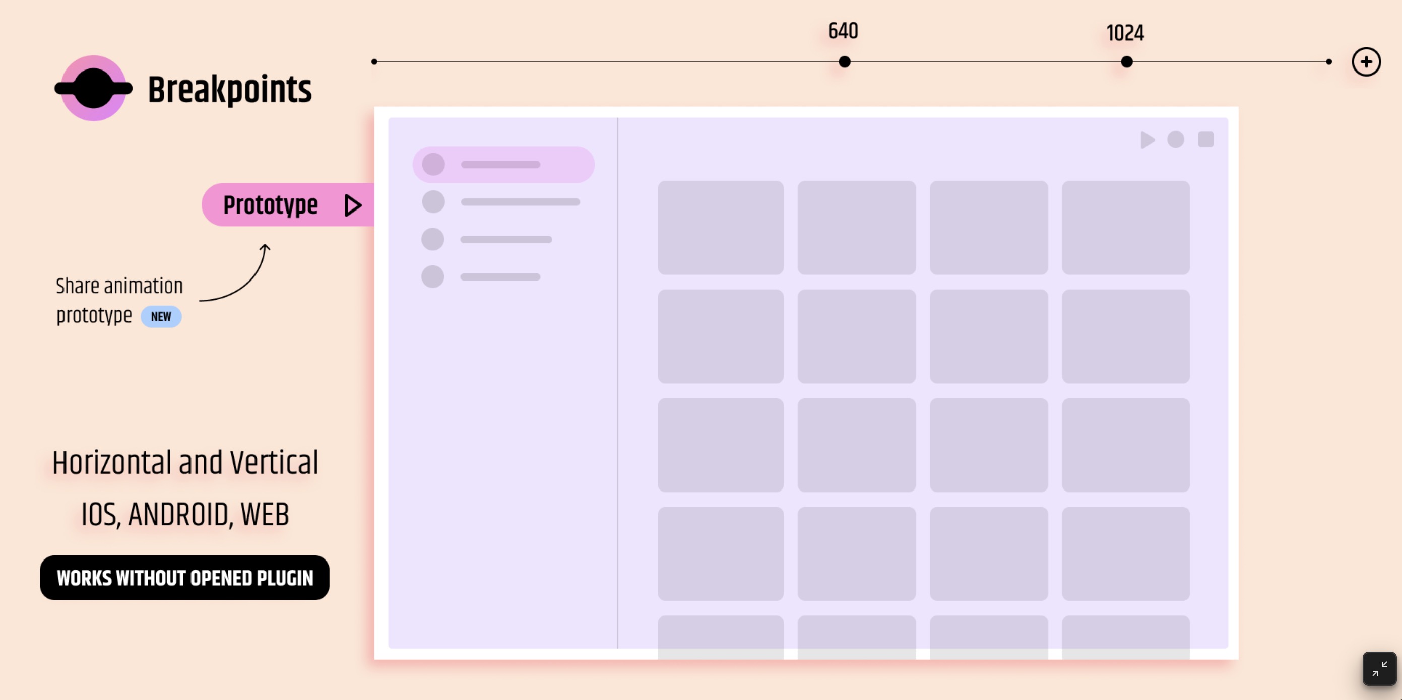
Breakpoints
Breakpoints in responsive design are specific points defined by designers where the layout of a website or application changes to accommodate different screen sizes and device orientations. These breakpoints ensure that the user interface is optimized for usability and aesthetics across a range of devices, from mobile phones and tablets to desktops and large monitors. By setting breakpoints, designers can create adaptive layouts that reflow and adjust the placement and size of elements to provide an optimal viewing experience. In Figma, breakpoints are used to guide the design process, allowing designers to preview how their designs will look and function at various screen widths, ensuring consistency and usability regardless of the device being used.

Breakpoints Plugin
The Breakpoint plugin by Floweare in Figma is an invaluable tool for designers looking to create responsive and adaptive layouts. This plugin allows designers to define and manage breakpoints within their Figma projects, making it easier to visualize and adjust designs for various screen sizes and device orientations. With Breakpoint, designers can set specific width thresholds where the layout will change, ensuring a seamless user experience across different devices. The plugin simplifies the process of previewing how designs will respond to different breakpoints, helping to maintain consistency and usability. By integrating the Breakpoint plugin into their workflow, designers can enhance their efficiency and create more flexible, responsive designs effortlessly.
Constraints
Constraints are essential for creating responsive layouts in Figma, as they define how elements behave when their parent frames are resized. By setting constraints, you can control whether an element remains fixed to one side, stretches with the frame, or maintains a constant distance from multiple sides. This flexibility allows you to design interfaces that adapt seamlessly to various screen sizes and orientations. For instance, setting a button's constraints to both left and right ensures it stretches horizontally as the screen width changes, while keeping it fixed to the bottom maintains its position relative to the frame's bottom edge. Proper use of constraints ensures that your layout remains functional and visually consistent across different devices and resolutions.

Grid System
A grid system is a fundamental framework in web and UI design that helps designers create organized and visually appealing layouts. It involves dividing a page into a series of rows and columns, creating a structure that ensures consistency, alignment, and balance across the design. This system allows for the flexible placement of elements, making it easier to manage responsive layouts that adapt to different screen sizes. By using a grid system, designers can maintain a clear visual hierarchy, ensuring that content is easy to navigate and aesthetically pleasing. It also streamlines the design process, providing a solid foundation for creating cohesive and professional-looking interfaces.

Templates and source code
Download source files
Download the videos and assets to refer and learn offline without interuption.
Design template
Source code for all sections
Video files, ePub and subtitles
Videos
Assets
1
Intro to Responsive Layouts
Mastering Figma Techniques for Flexible and Adaptive Design Across Different Devices
3:10
2
Resizing, Spacing and Alignment
Learn the basics of Auto Layout, resizing, alignment, spacing, and padding to create responsive and adaptable designs.
15:01
3
Wrap, Min and Max Width and Padding
Gain an Understanding of Auto Layout Directions, Wrap, Min and Max Width, and padding to Design a Responsive Landing Page
11:05
4
Absolute Position and Constraints
Create complex cards using absolute position and constraints with nested frames and then adding the finishing touches to our landing page
9:14
5
Adaptive Design, Breakpoints and Grid Systems
Create adaptive designs and discover how to create grid systems, set breakpoints, and ensure your designs look great on all screen sizes.
12:38
6
Figma Handoff Introduction
Foundations for an Efficient Design-to-Development Workflow
4:30
7
Responsiveness
Transforming Static Designs into Dynamic Layouts
4:44
8
Creating a Responsive Desktop Design
Transforming Static Layouts into Responsive Interfaces
15:34
9
Dark Mode
Implementing Dark Mode: A Guide to Figma Color Variables
9:16
10
Tablet and Mobile version
Responsive Interfaces: Designing Tablet and Mobile Versions in Figma
12:22
11
Locofy Introduction
What You Will Learn In This Course
3:01
12
Conversion with Locofy Classic
The Step-by-Step Guide to Locofy Classic
15:24
13
Lightning: One-Click Design to Code
Effortless Conversion from Design to Code
7:19
14
Locofy Responsiveness
Using Media Queries for Responsive Styling
9:18
15
Exporting Your Project to Code
Sync, Export or Deploy your project
9:59
Meet the instructor
We all try to be consistent with our way of teaching step-by-step, providing source files and prioritizing design in our courses.
Sourasith Phomhome
UI Designer
Designer at Design+Code
19 courses - 72 hours
Master AI Prompting for Stunning UI
Learn how to leverage AI tools like Aura for creating beautiful designs, working with templates, and experimenting with advanced prompts. A concise guide for designers and developers to level up their skills.
10 hrs
Design Multiple Apps with Figma and AI
In this course, you’ll learn to design multiple apps using Figma and AI-powered tools, tackling a variety of real-world UI challenges. Each week, a new episode will guide you through a different design, helping you master essential UI/UX principles and workflows
4 hrs
SwiftUI Fundamentals Handbook
A comprehensive guide to mastering Swift programming fundamentals, designed for aspiring iOS developers. This handbook provides a structured approach to learning Swift's core concepts, from basic syntax to advanced programming patterns. Through carefully sequenced chapters, readers will progress from essential programming concepts to object-oriented principles, building a solid foundation for SwiftUI development. Each topic includes practical examples and clear explanations, ensuring a thorough understanding of Swift's capabilities. This handbook serves as both a learning resource and a reference guide, covering fundamental concepts required for modern iOS development. Topics are presented in a logical progression, allowing readers to build their knowledge systematically while gaining practical programming skills.
2 hrs
Design and Code User Interfaces with Galileo and Claude AI
In this course, you’ll learn how to use AI tools to make UI/UX design faster and more efficient. We’ll start with Galileo AI to create basic designs, providing a solid foundation for your ideas. Next, we’ll refine these designs in Figma to match your personal style, and finally, we’ll use Claude AI to turn them into working code—eliminating the need for traditional prototyping.
4 hrs
Design and Prototype for iOS 18
Design and Prototype for iOS 18 is an immersive course that equips you with the skills to create stunning, user-friendly mobile applications. From mastering Figma to understanding iOS 18's latest design principles, you'll learn to craft two real-world apps - a Car Control interface and an AI assistant.
3 hrs
Master Responsive Layouts in Figma
Creating responsive layouts is a must-have skill for any UI/UX designer. With so many different devices and screen sizes, designing interfaces that look great and work well on all platforms is necessary. Mastering this skill will make you stand out in the field. In this course, we'll start from scratch to create this beautiful design using Figma. You'll learn how to make layouts that are easy to use and work well on any device. We'll cover key concepts and tools to help you master responsive design in Figma.
2 hrs
UI UX Design with Mobbin and Figma
Mobbin is a powerful tool for UI/UX designers seeking inspiration and innovative design solutions. This platform offers a vast collection of real-world mobile app designs, providing a treasure trove of UI elements and layouts.
2 hrs
3D UI Interactive Web Design with Spline
Learn to create 3D designs and UI interactions such as 3D icons, UI animations, components, variables, screen resize, scrolling interactions, as well as exporting, optimizing, and publishing your 3D assets on websites
3 hrs
Design and Prototype for iOS 17 in Figma
Crafting engaging experiences for iOS 17 and visionOS using the Figma design tool. Learn about Figma's new prototyping features, Dev Mode, variables and auto layout.
6 hrs
Design and Prototype Apps with Midjourney
A comprehensive course on transforming Midjourney concepts into interactive prototypes using essential design techniques and AI tools
8 hrs
iOS Design with Midjourney and Figma
Learn the fundamentals of App UI design and master the art of creating beautiful and intuitive user interfaces for mobile applications
1 hrs
UI Design for iOS, Android and Web in Sketch
Create a UI design from scratch using Smart Layout, Components, Prototyping in Sketch app
1 hrs
UI Design a Camera App in Figma
Design a dark, vibrant and curvy app design from scratch in Figma. Design glass icons, lens strokes and realistic buttons.
1 hrs
UI Design for iOS 16 in Sketch
A complete guide to designing for iOS 16 with videos, examples and design files
3 hrs
Prototyping in Figma
Learn the basics of prototyping in Figma by creating interactive flows from custom designs
1 hrs
UI Design Quick Websites in Figma
Learn how to design a portfolio web UI from scratch in Figma
1 hrs
UI Design Android Apps in Figma
Design Android application UIs from scratch using various tricks and techniques in Figma
2 hrs
UI Design Quick Apps in Figma
Design application UIs from scratch using various tricks and techniques in Figma
12 hrs
Figma Handbook
A comprehensive guide to the best tips and tricks in Figma. Not affiliated with or endorsed by Figma, Inc.
6 hrs